Park Restaurant & Distillery by Glasfurd & Walker
Opinion by Richard Baird Posted 26 October 2015
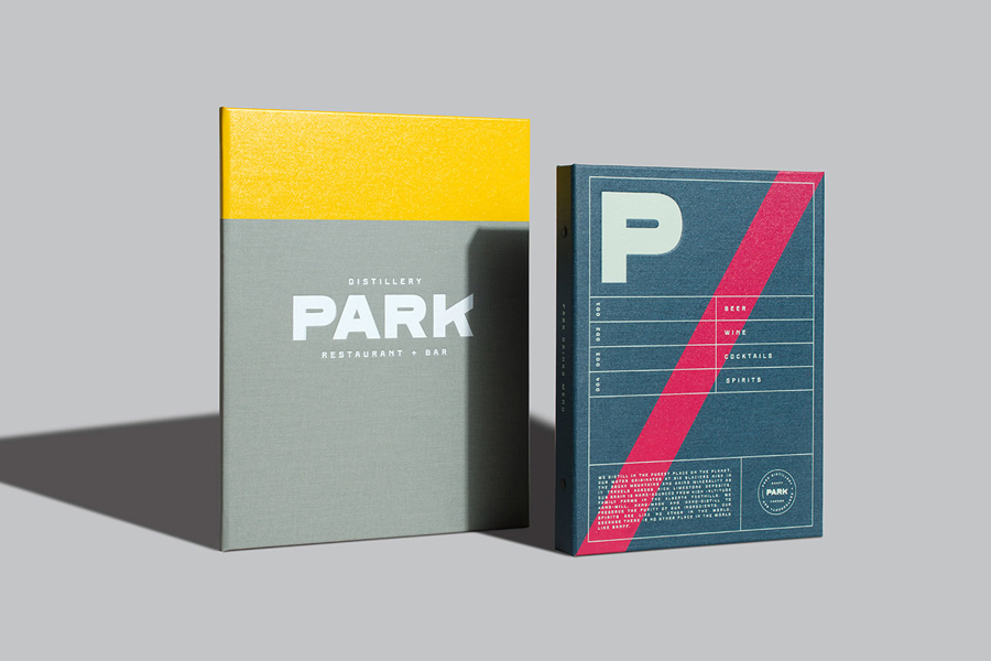
Park is a bar, restaurant and distillery located in the Canadian resort town of Banff, within the Banff National Park, and the province of Alberta. It is a region of diverse natural beauty which includes mountains, prairies, forests and desert badlands, and that attracts walkers, campers and skiers locally and internationally.
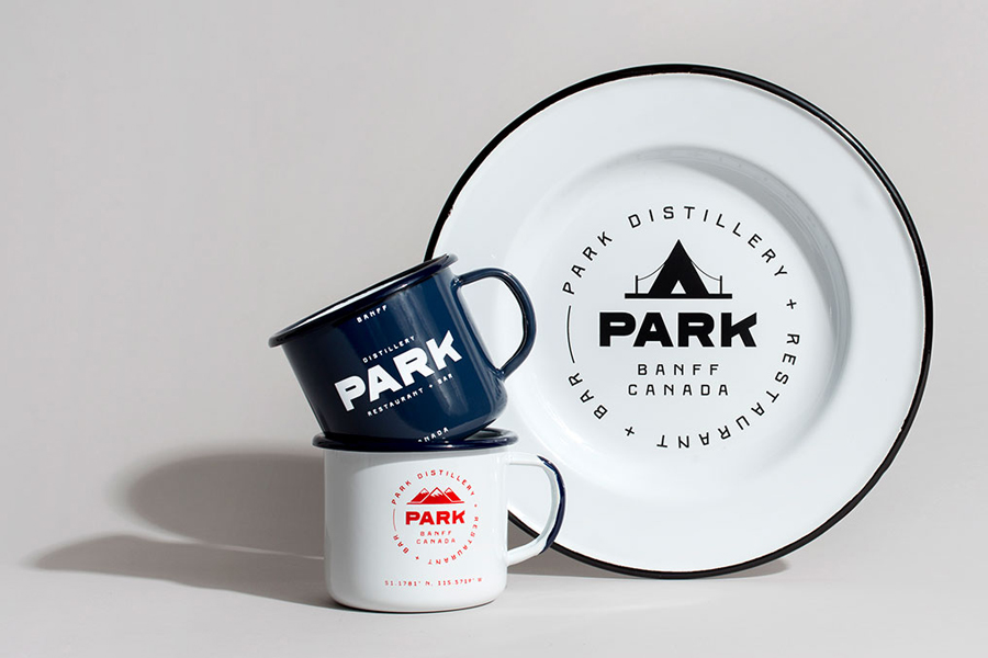
The restaurant is a celebration of Banff’s alpine history and lifestyle. This runs throughout an interior of warm lighting, long dining tables, enamelware, exposed stone walls and beams, antlers and wood panelling, a campfire-inspired menu of spit-roasted, wood-fired and smoked flavours, and a bright and robust brand identity developed by Vancouver based graphic design studio Glasfurd & Walker.
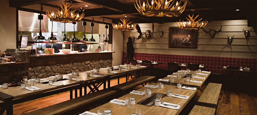
Where the restaurant’s menu and interior draws on and celebrates the flavours of open fires, the communal experience of shared tables and the alpine spirit of log cabins, Glasfurd & Walker layers this with the visual vernacular of mountain trails and the utility associated with walking and camping.
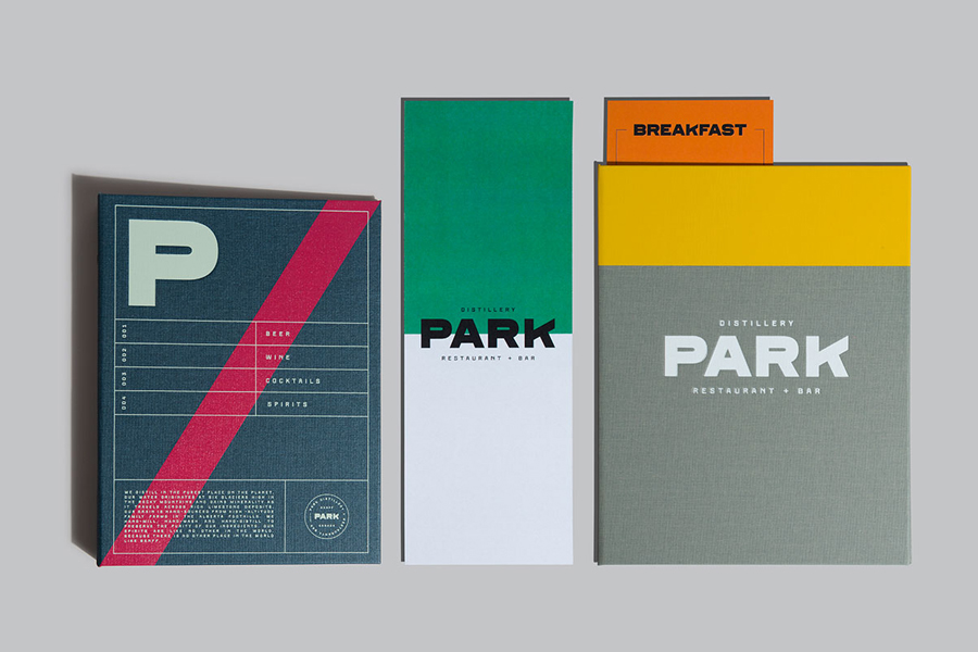
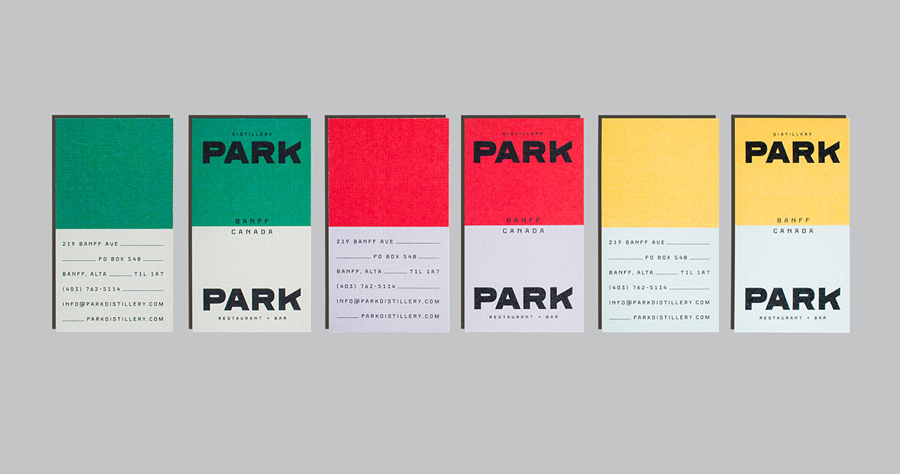
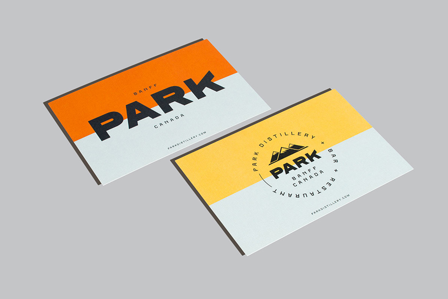
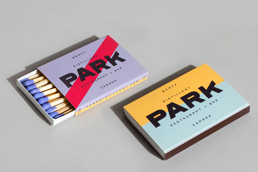
This comes through a high contrast palette of bright and subdued ink, weighty material choices, heavy sans-serif typography and grids across ring binder, business cards and menus. These appear to touch upon high visibility path markers and signs, the texture, colour and robustness of tent, jacket and rucksack fabrics, and the general toughness associated with the equipment and wear of the outdoors, particularly those of the past.
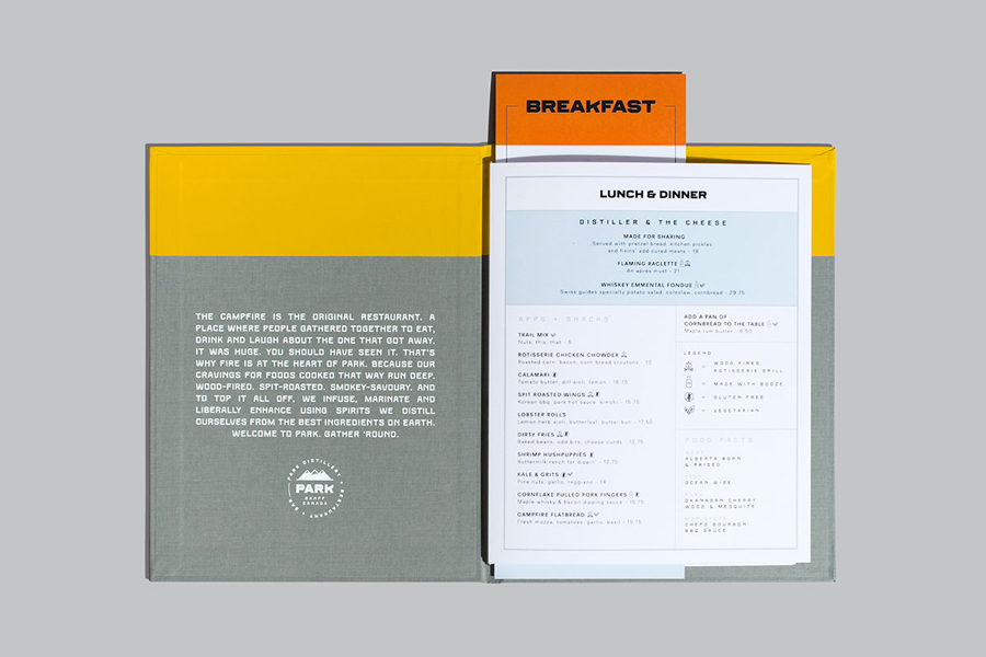
While there is plenty of character in the logotype and headings—particularly within the K, the small counters and a large P in print—colour really leads and defines identity. It is distinctive, well-founded and introduces shots of brighter colour in amongst the wood, stone and bone of the interior, and appears contemporary within the context of a current website design.

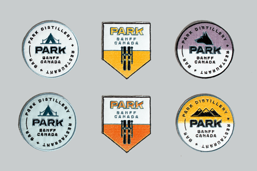
Typesetting is unusual. Existing somewhere between the mechanically monospaced and awkward. It would not be a surprise if this was taken from, or at least inspired by, the old way finding of the region, favouring authenticity over modern typesetting standards. This also extends to the roundels. These are not particularly well-composed or weighted, are a touch too general in their iconography and the spacing loose, especially at large sizes. However, as stitch badges, these look great.
Kumla, the secondary typeface, although inspired by the signage of a Swedish factory from the 1920s, remarkably shares similarities with signage of Banff National Park, a great coincidence that makes a connection with the area whilst also having a utility to it that sits comfortably within the overall concept.
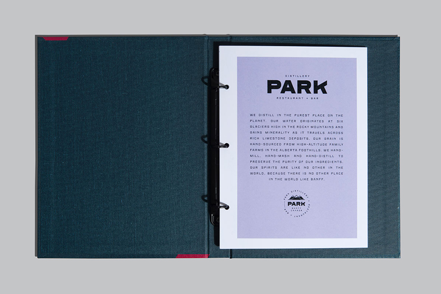
Visual identity and restaurant detail work well together, with identity adding to rather than simply replicating interior experience. Contrast is used to good effect, not just in colour but also in type size, and the aesthetic flourish drawn from a high visibility functionality.
Although drawing on the visual vernacular of the region may mean some contemporary typographical standards are moved to one side, this does, alongside colour, texture and heavy material choice, secure a unique and well-founded character.
Although big on the log cabin, trail and camping aesthetic, Park never feels gimmicky. It appears genuine in its desire to be true to the area but with the polish expected of a good quality restaurant. More from Glasfurd & Walker on BP&O.
Design: Glasfurd & Walker. Opinion: Richard Baird. Fonts Used: Ferry & Kumla.
