Cooke Curtis & Co. by The District
Opinion by Richard Baird Posted 12 February 2016

Cooke Curtis & Co. is an award-winning estate agent with an office in Cambridge, United Kingdom. It has a portfolio and a thorough understanding of properties throughout the city and in neighbouring villages. Although the business was established last year, its founders have over thirty-five years of industry experience.
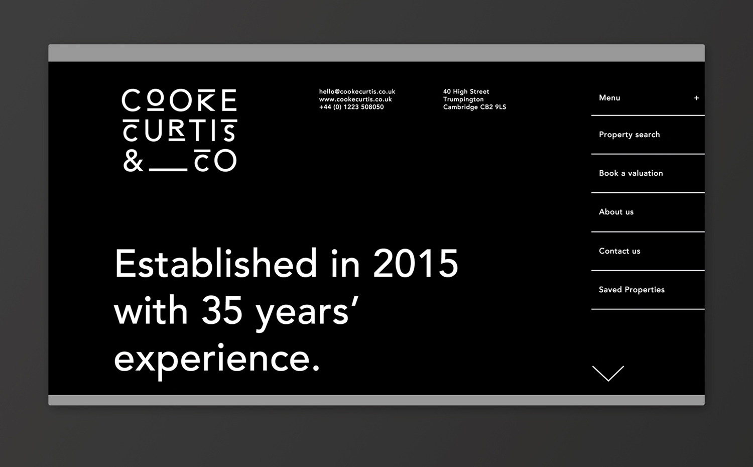
Local graphic design studio The District were commissioned by the estate agent to develop a visual identity that would work across a broad range of printed and digital media, from business cards, letterheads, brochure and website to ‘for sale’ signs, vehicle graphics and key rings.
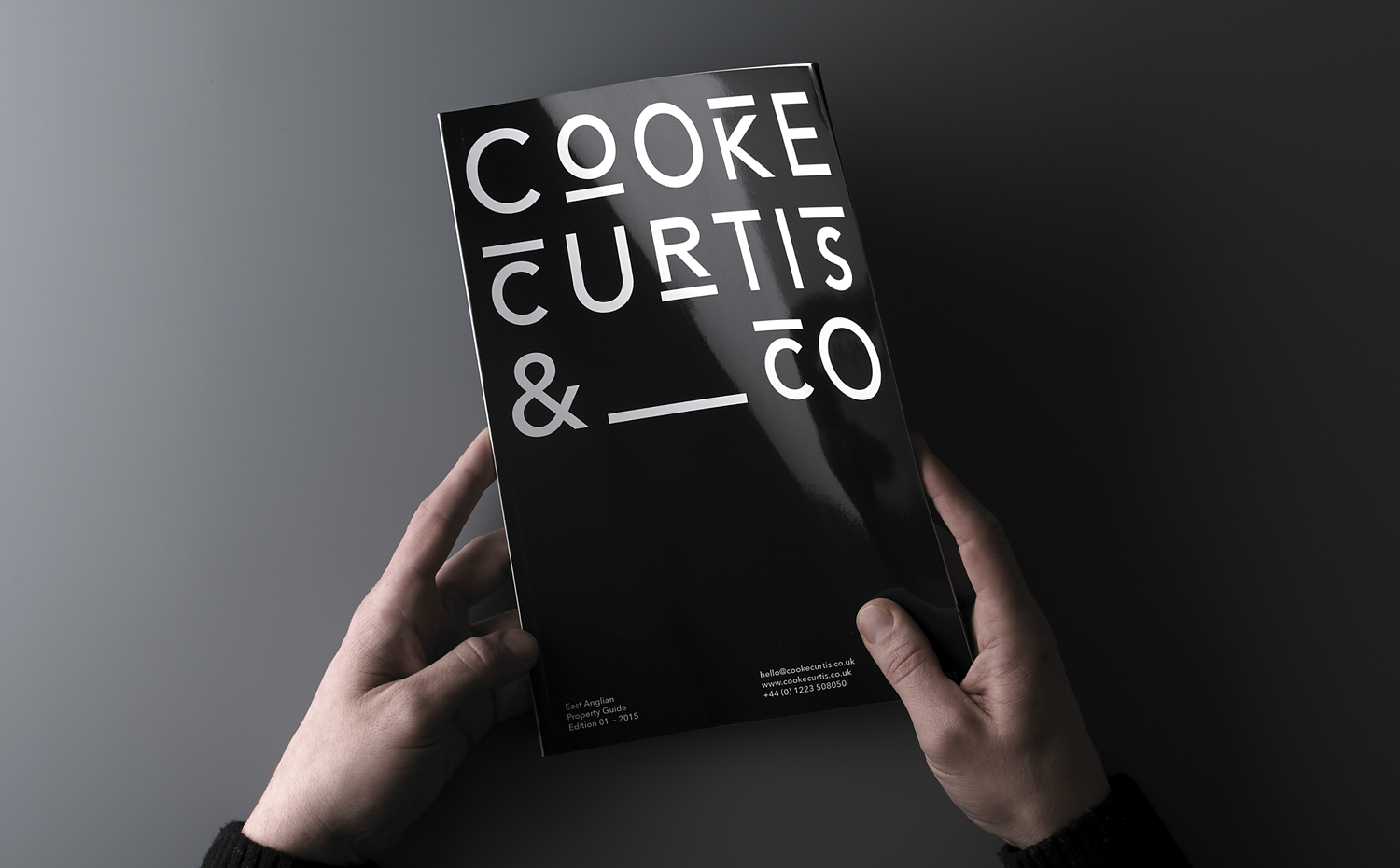
With the intention of delivering a distinctive and impactful solution sensitive to the heritage of the founders, and the will to cut through the hyperbole of the industry, The District took a bold typographic approach that discards photography in favour of a monolinear geometric sans-serif and underlines, emphasised by a black and white colour palette.
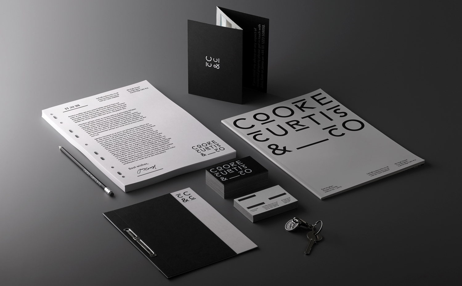
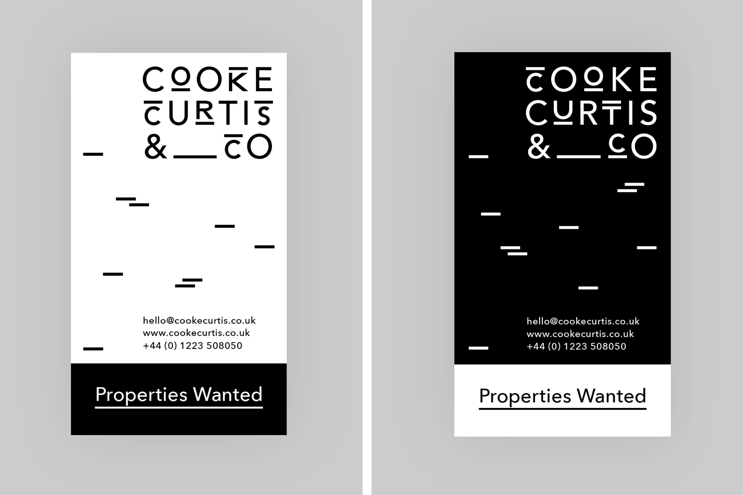
Although The District attribute the underlines of the logotype, and the way that these play out in print and online, to brickwork, these read more as old street signs and their traditional typesetting, which has become a bit of a heritage shorthand. So while perhaps not the exact intention, communicatively it remains a nice mix of property and experience.
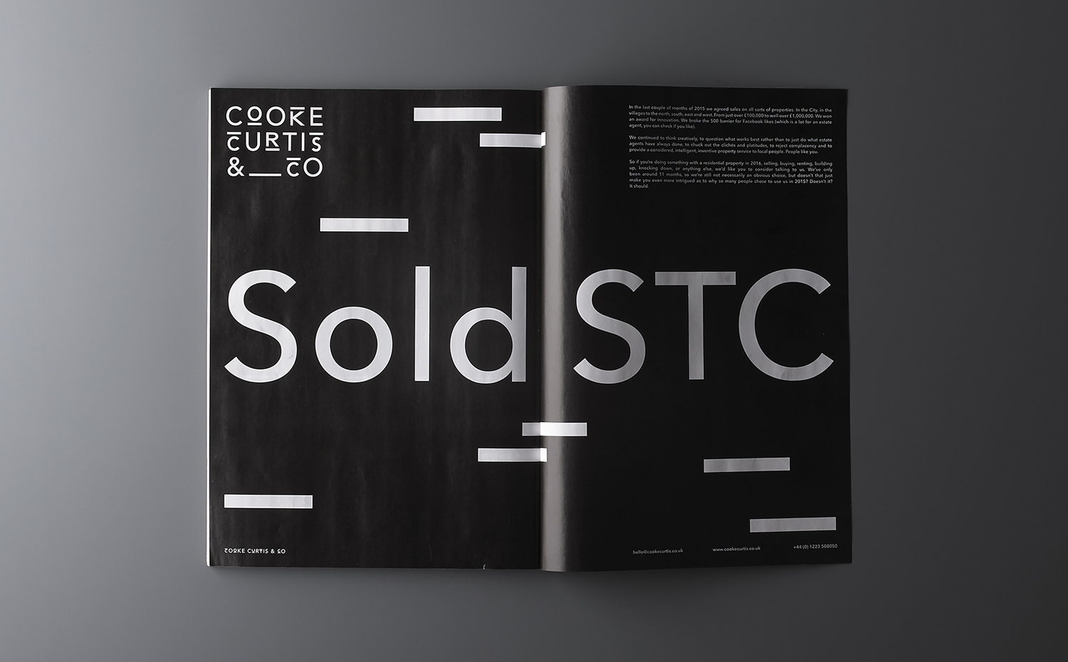
The consistent weight of these lines, in conjunction with a similarly weighted geometric sans-serif, alongside monolinear pictograms and their collective implementation, draws a modernity from a familiar and retrospective detail in a simple but impactful way. This very current quality continues in the use of lines without type, the use of space, structure, type size and proportion in print and responsively online.
Stacked geometric type, the recurring C and O, underlines and overlines (for want of a better word), and particular letter shapes make for a quirky appearance and slightly exaggerated and memorable visual expression within the context of a consistent and type-only identity design. The compressed and underlined type translates well into monogram, bringing character to the repetition of the C.
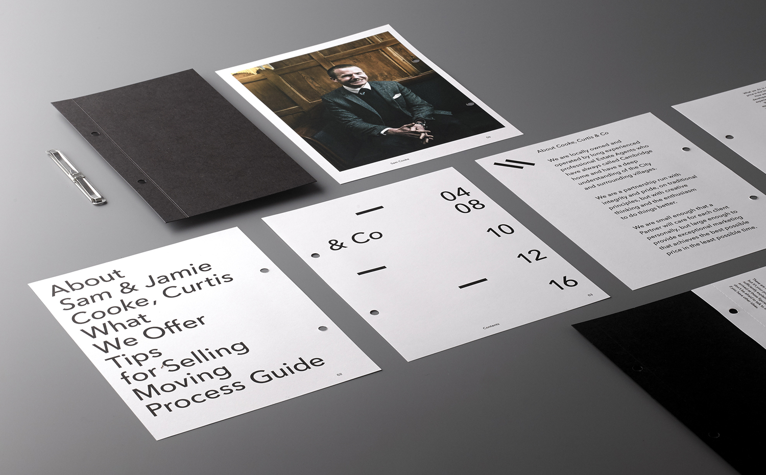
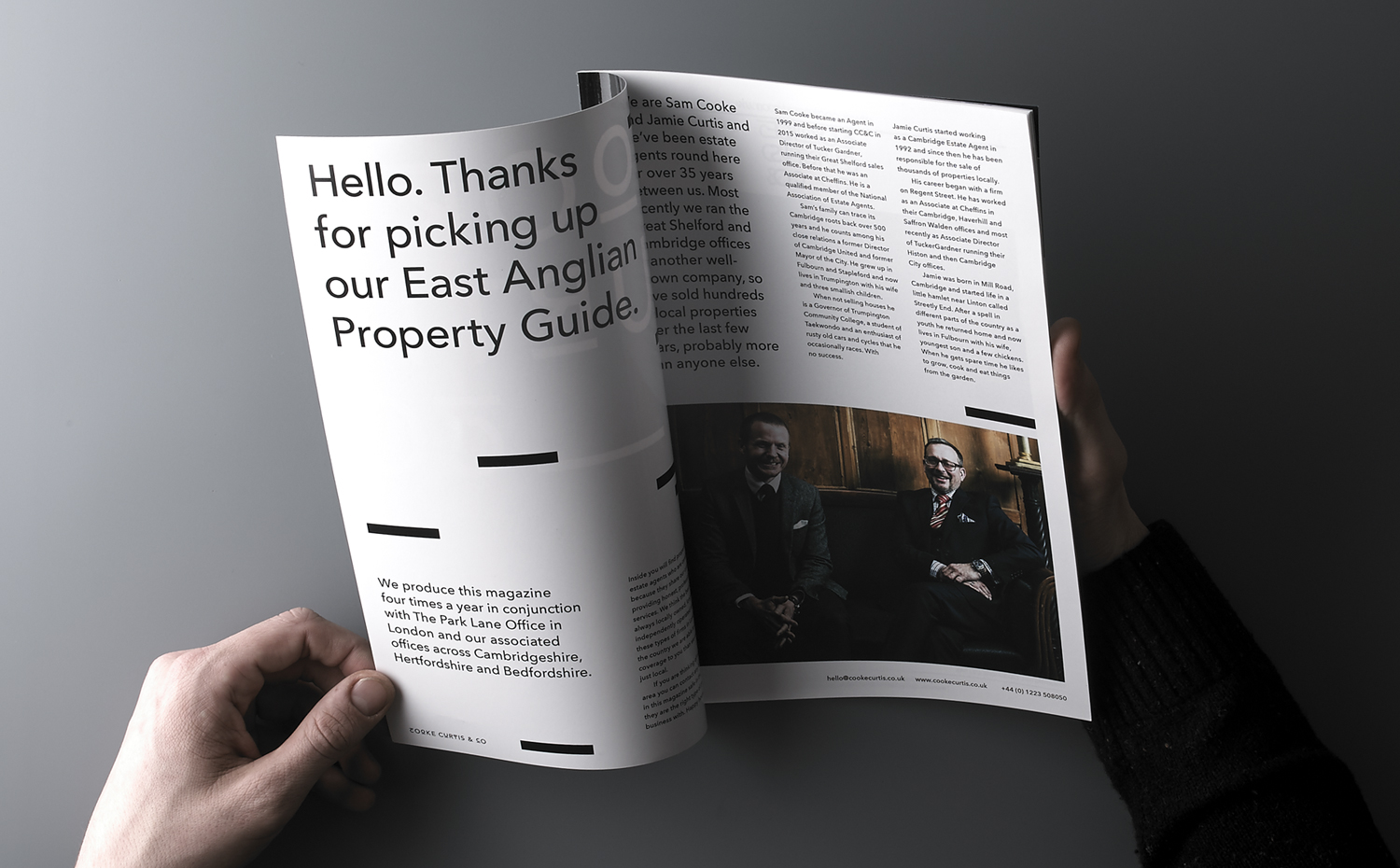
The absence of image, apart from the reassuring and friendly profile picture of founder and the conventions of the property guide, is acute, with a preference for confident straight talking language rather than glamour shots of property. This approach, in many ways, shares the reactionary qualities of banks to austerity—a good example would be Spain’s EVO and the UK’s First Direct—yet manages to pull a bit more character and moments of interest from the serious and reductive.
If you have luxury, palatial and distinctive properties on the books, fine—take a look at Fox Real Estate by Parallax—but this approach seems well-suited to the mid-market, where specifications and descriptions might have a lot more to say than image.
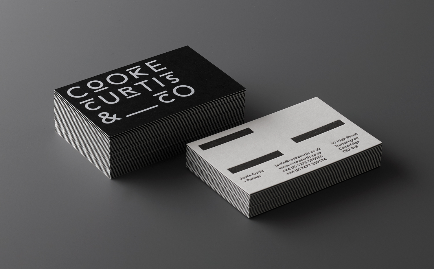
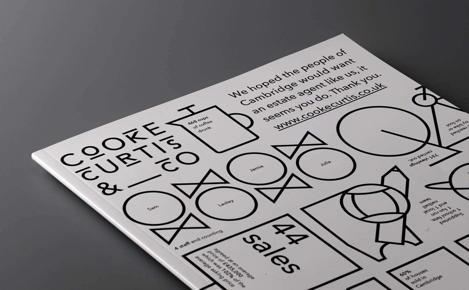
There is a strong continuity between print and online experience, both in the more obvious use of colour and type, but also the in use of space and the absence of some of the industry conventions, such as property imagery. Line art illustration begins to push against the austerity of type, and introduce a moment of play without undermining the plain speaking positioning of the business through identity.
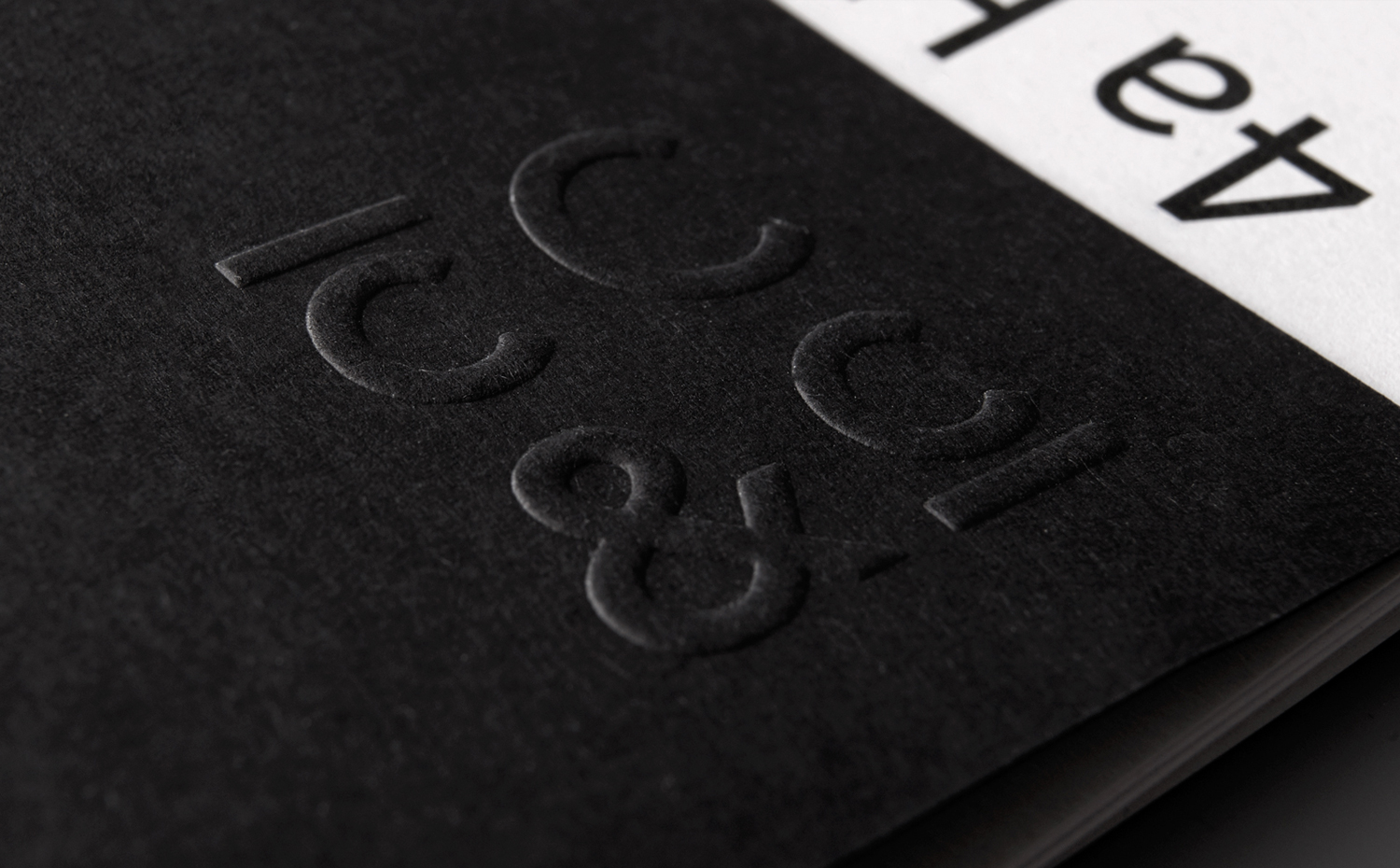
The seriousness of colour is tempered by material texture in the form of uncoated and glossy papers and boards, the finish of a blind emboss, and the perceived value and quality associated with a weighty duplex business card. After so much matt varnish and the ubiquity of uncoated surfaces, it is interesting and satisfying to see glossy cover again.
The lines that proliferate the logotype function well, alongside space and some good formatting, to break up content across the magazine, operate as a distinctive aesthetic detail across the signage, and begin to look more like brickwork.
Design: The District. Opinion: Richard Baird. Fonts Used: Avenir.
