Shuang Shuang by ico Design
Opinion by Richard Baird Posted 23 February 2016
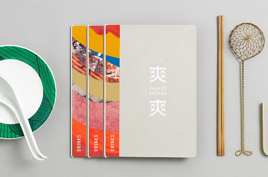
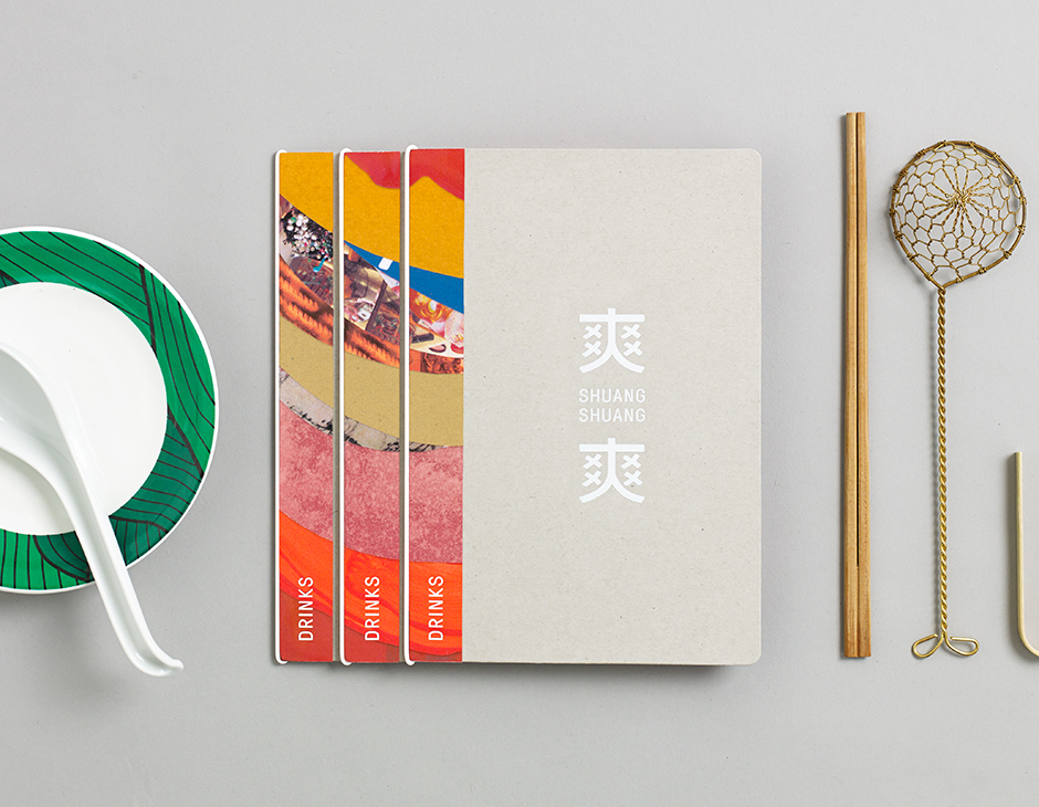
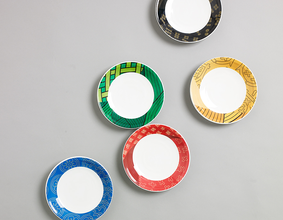
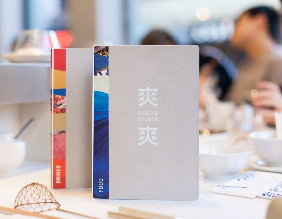
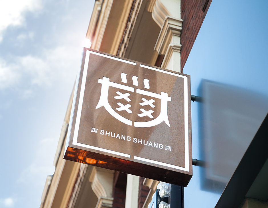
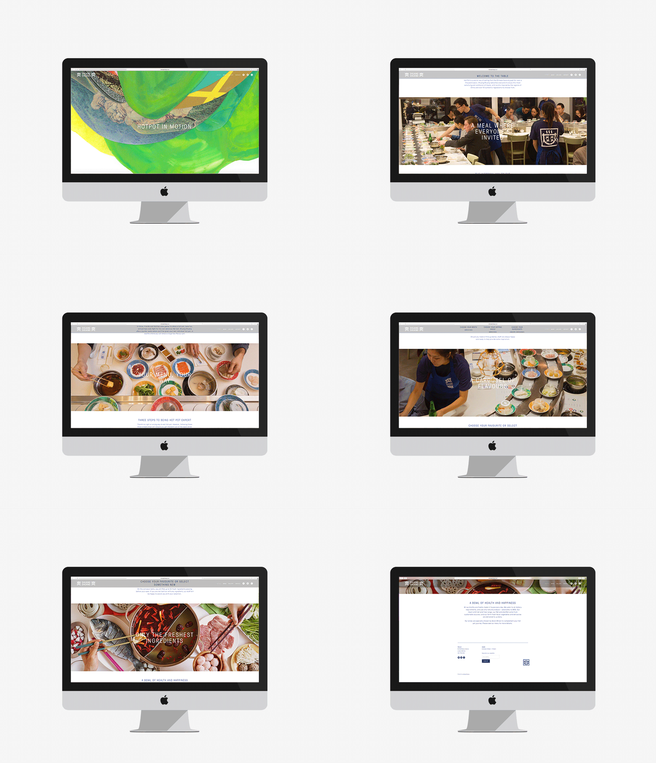
Shuang Shuang is new restaurant experience, located on London’s Shaftesbury Ave, that brings a contemporary twist on hotpot—a long-established and family favourite throughout China and East Asia, and a fun and social way of eating—to the United Kingdom. Shuang Shuang worked with London based graphic design studio ico Design on naming and interior design, as well as brand identity. This extends across signage, tableware, menus and website.
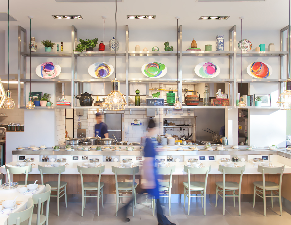
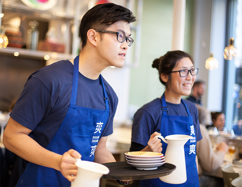
‘Shuang Shuang’ is a play on Chinese slang that is said to roughly translate as ‘feeling good, with a bit of oh yeah!’. With this in mind, ico created a light, bright and playful interior design. This confidently mixes stainless steel, white tiles and a favour for the linear with bright colour and organic paint texture, as well as setting a kitchen utility alongside the character of well-selected and diverse cultural ornament, with not a maneki-neko in sight.
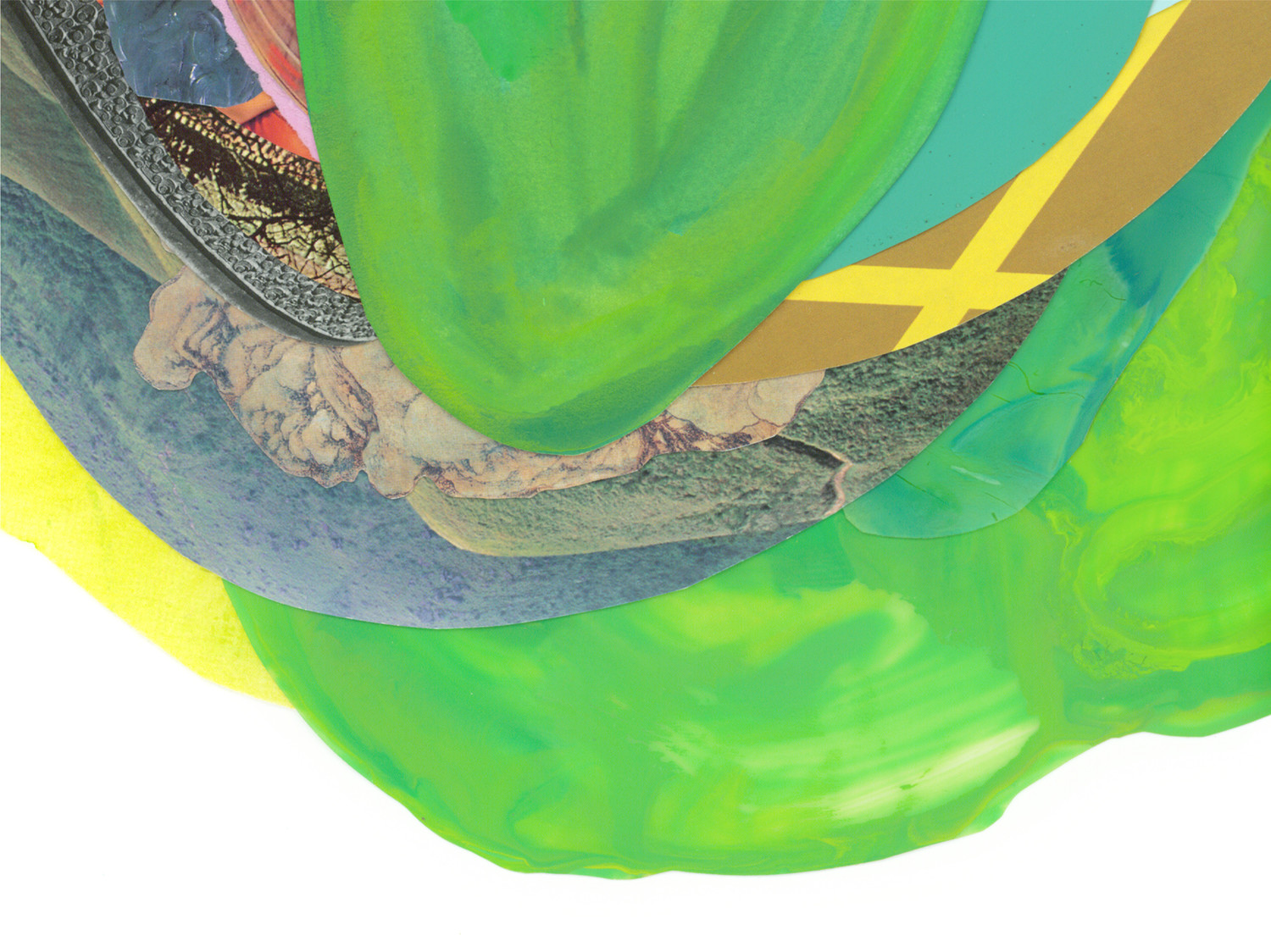
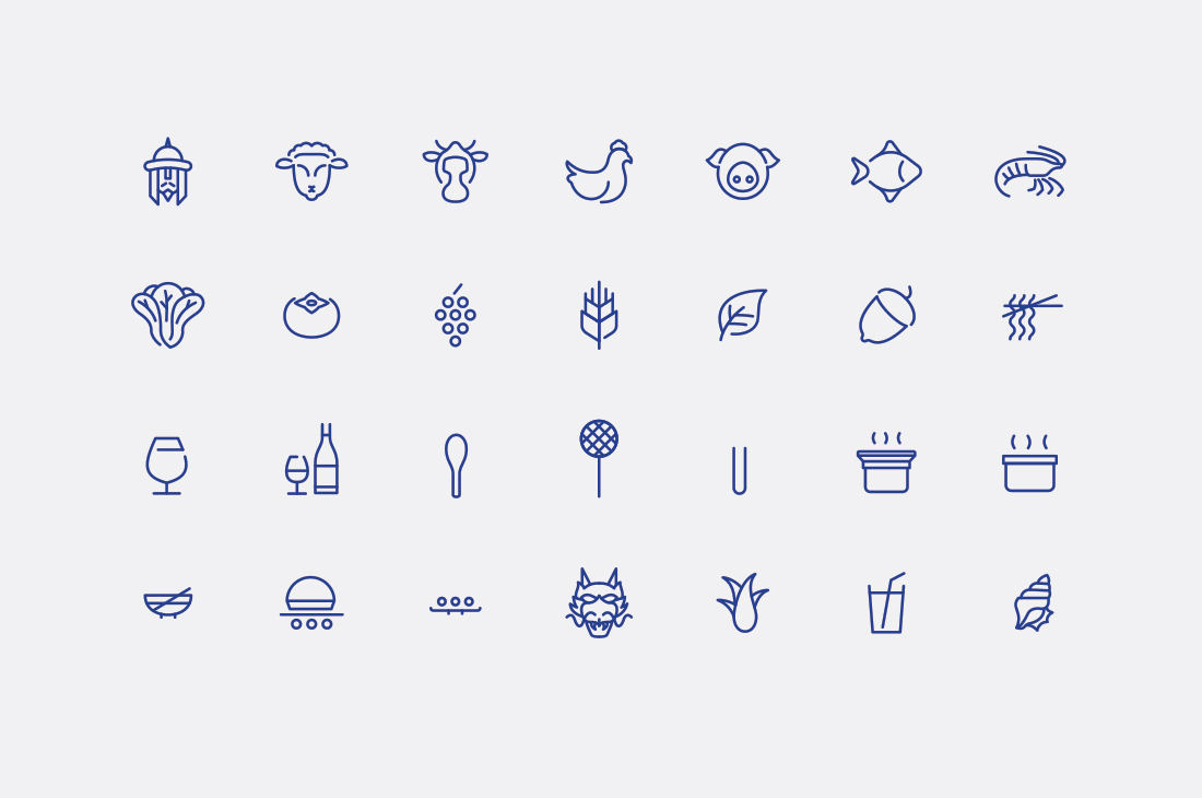
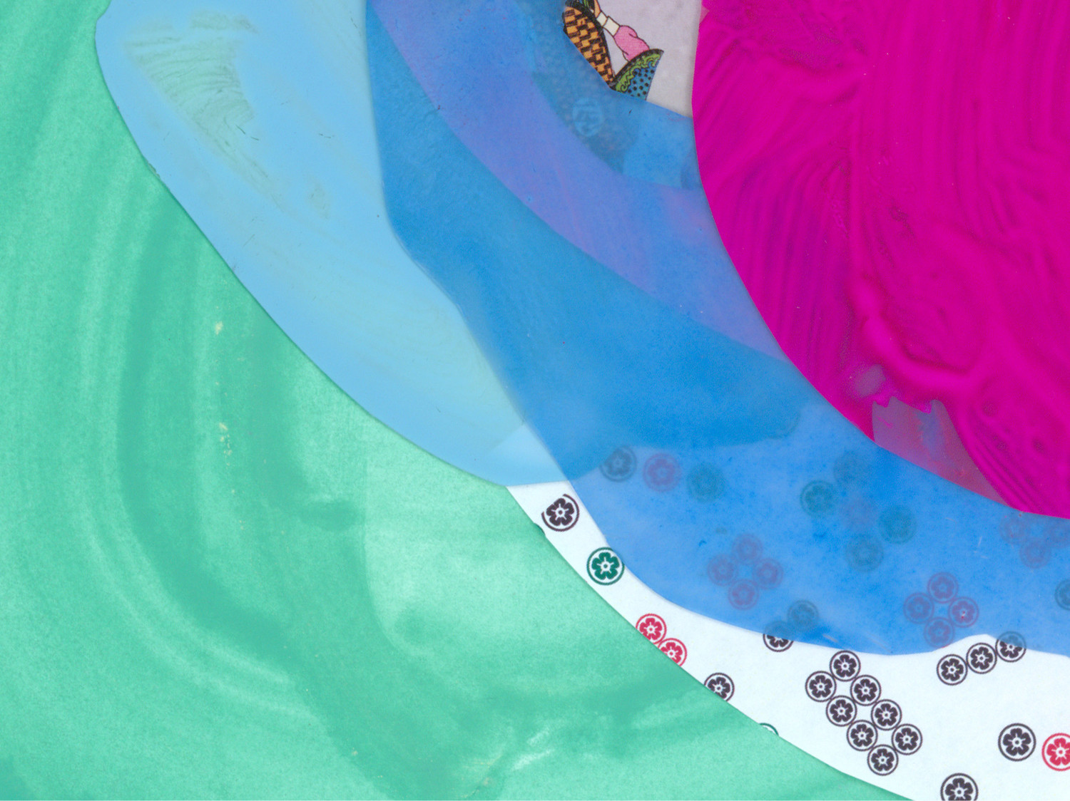
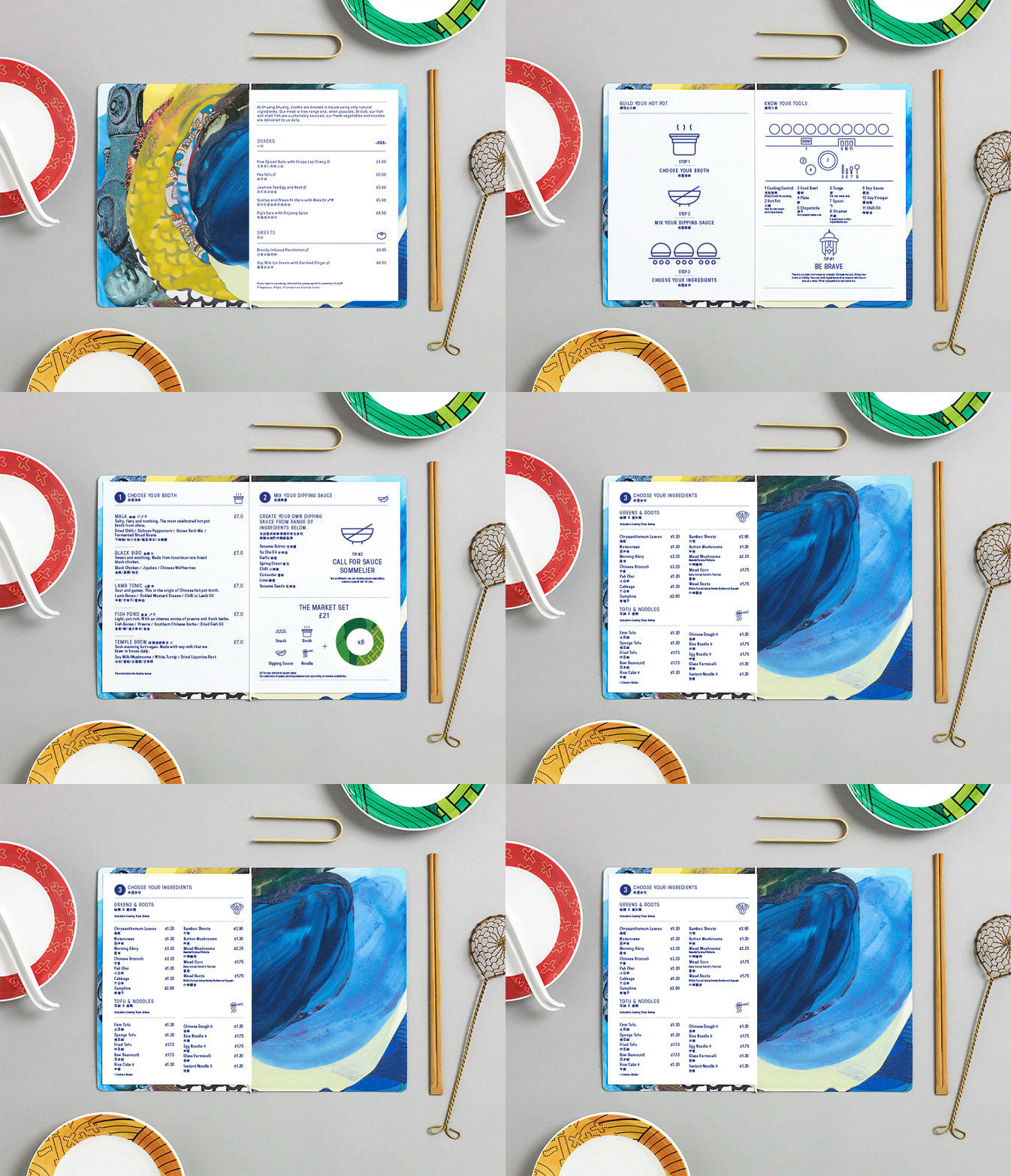
This richness of interior design is clearly expressed through visual identity both in print and online using a mix of bright paint strokes, collage and patterns inspired by contemporary Chinese culture and created by U.S. based artist Xochi Solis, and the monospaced characters of GT Pressura, and similarly weighted monolinear iconography.
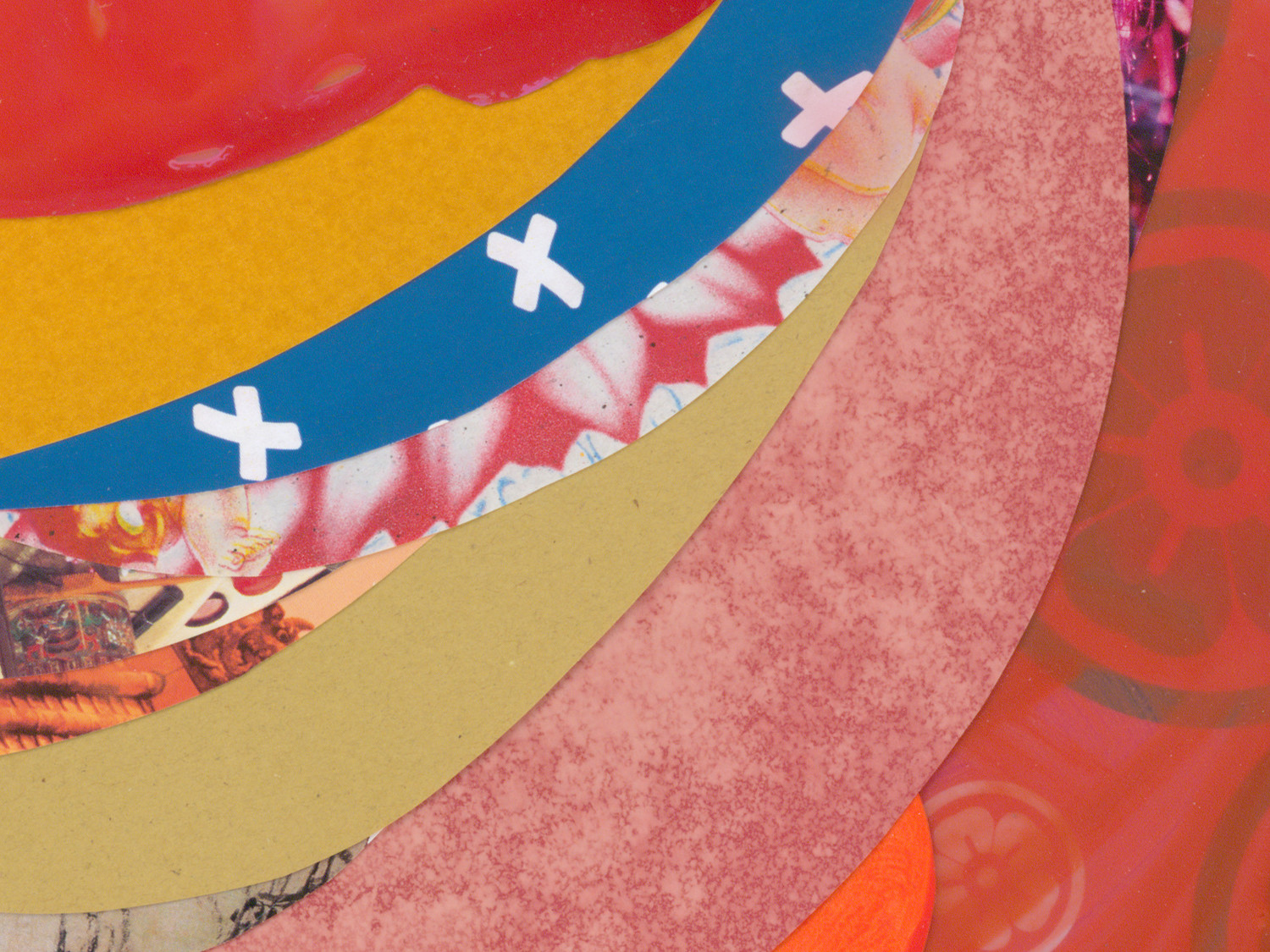
Image is distinctive, crafted and largely avoids cliche but is clearly rooted in Chinese and East Asian culture, while type and icon introduce a very current Western aesthetic simplicity and provides communicative clarity alongside visual impact and interest. This is very much in keeping with the concept of the restaurant. Contrast is used to good effect, not only in type and image, but also in the choices of material texture and print finish.
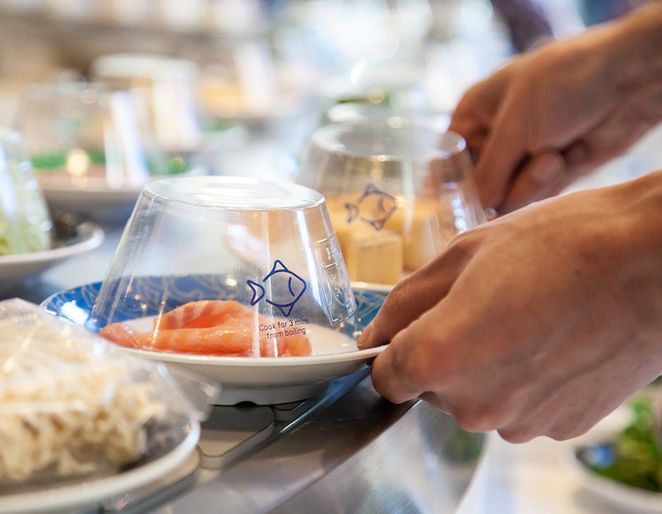
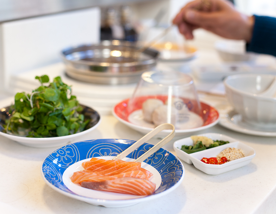
Theses key assets secure a satisfying continuity between brand identity, interior design and website, but also across tableware, which is a particular highlight, and balance cultural reference and vibrancy with modernity and moments of restraint. More from ico Design on BP&O.
Design: ico Design. Collage: Xochi Solis. Opinion: Richard Baird. Fonts Used: GT Pressura.
