Frameline 40 by Mucho
Opinion by Richard Baird Posted 25 May 2016
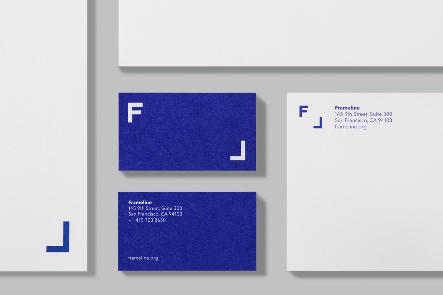
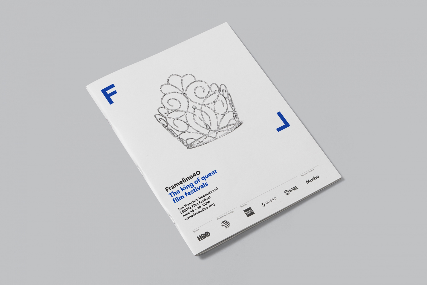
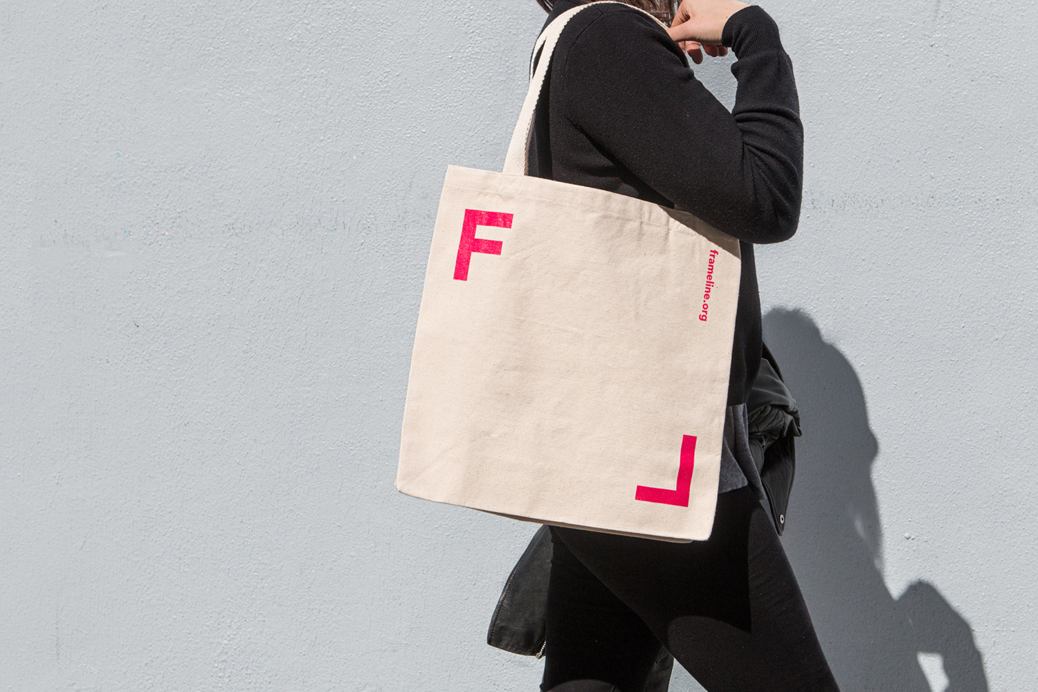
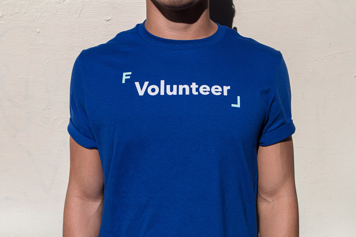
Frameline is a San Francisco-based nonprofit arts organisation and LGBTQ film festival that intends to change the world through the power of gay cinema, and to connect filmmakers with audiences locally and internationally. Graphic design studio Mucho worked with Frameline on its brand identity and campaign for its 40th LGBTQ film festival, delivering a system based around a framing device, a bright and diverse colour palette and contemporary sans-serif typography. This links membership cards, stationery, business cards and tote bags, as well as campaign material such as invitations and posters. This post was updated June 2017 with images of Framline 41 campaign material, also designed by Mucho.
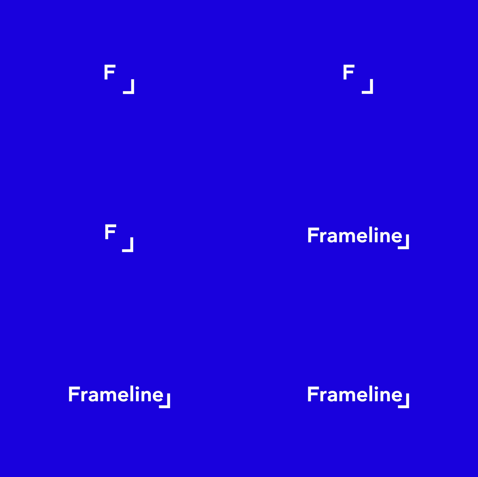
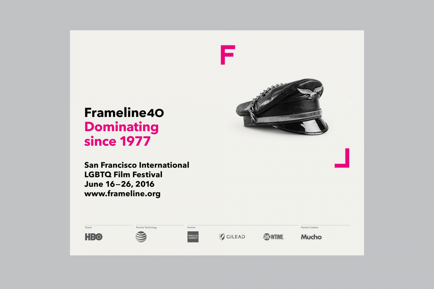
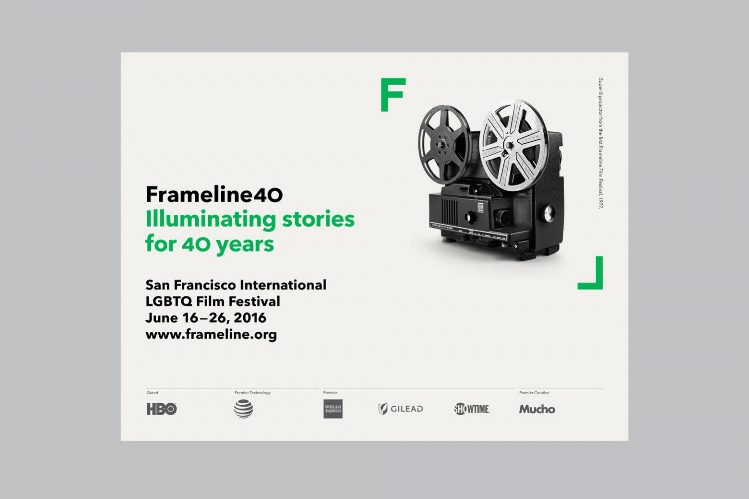
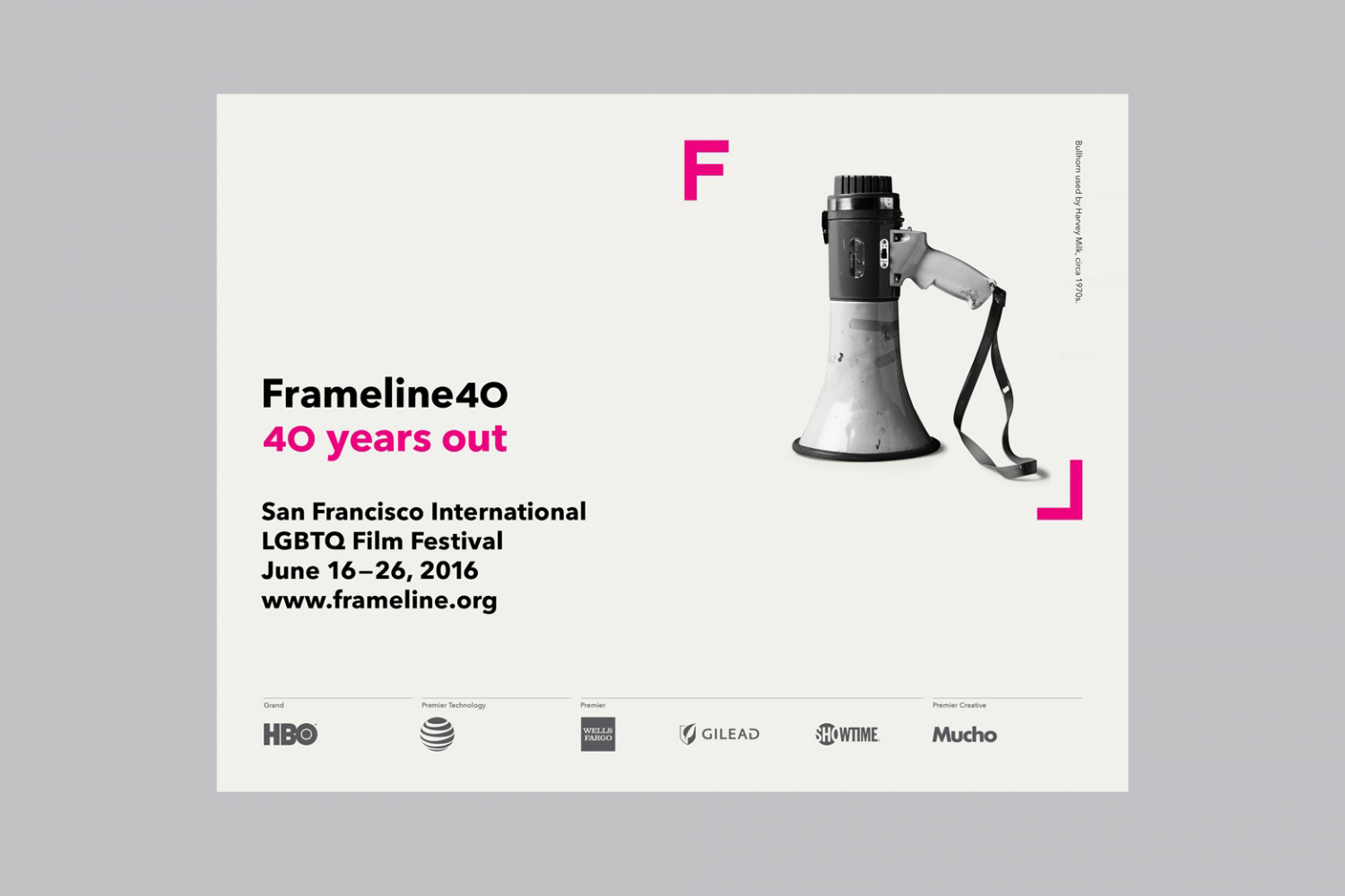
Mucho’s work for Frameline is a mix of good observation and happenstance (in the right angles of the initials), and rationalisation (in the description of the backwards L as being queer). Although the framing device is far from original, both conceptually and aesthetically, it is, however, universal and relevant, and finds a comfortable meeting point between an expression of inclusivity and filmmaking whilst remaining simple.
This is appropriately built on and communicated more explicitly through images held within the frame and tied to captions written by David Begler, implemented across posters and programmes.
The logo functions well as a square asset, perfect for social media and totes, and expands and contracts within the context of print and t-shirts, giving it a much needed visual and communicative variety whilst also serving to unify.
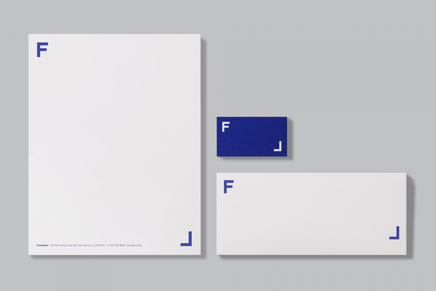
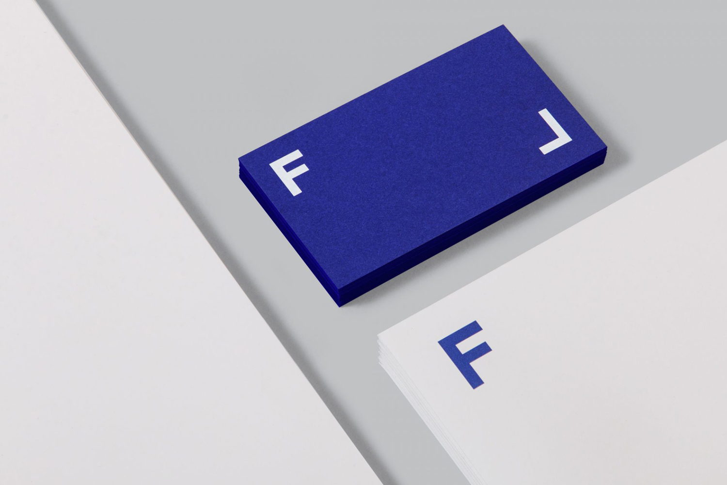
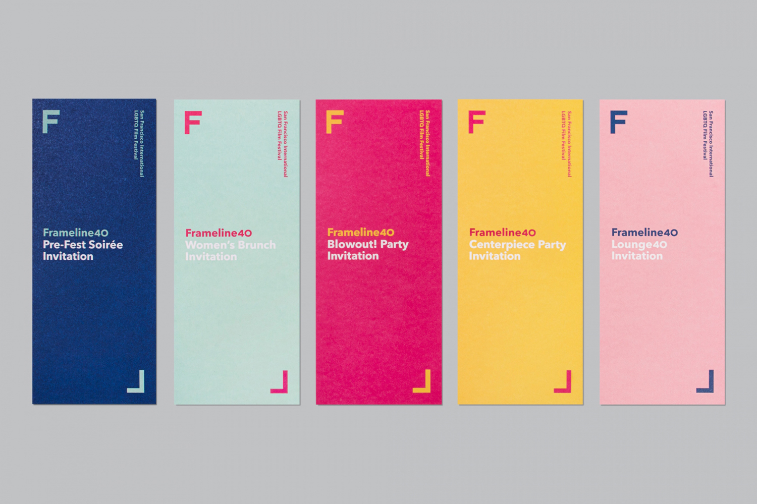
Colour, much like the logo, relies on well-established association but manages to draw something of a more sophisticated quality from this, moving between the rainbow representative of the LGBTQ community, implemented in a more contemporary manner as solid colour and less saturated hues across individual assets, and dials down the ostentatious and glamorous qualities of silver and gold through some good material choice and within the setting and conventions of premium membership.
Type choice does not stray too far from what is a current and generally accepted sense of modernity and accessibility. But alongside logo, the structure of print communication, copy and colour palette, and within the context of a nonprofit organisational body, appears expressive and professional whilst avoiding the corporate.
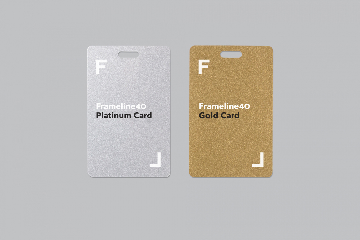
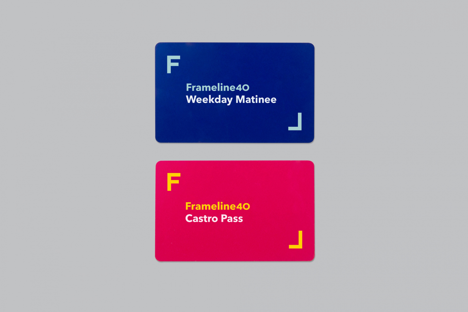
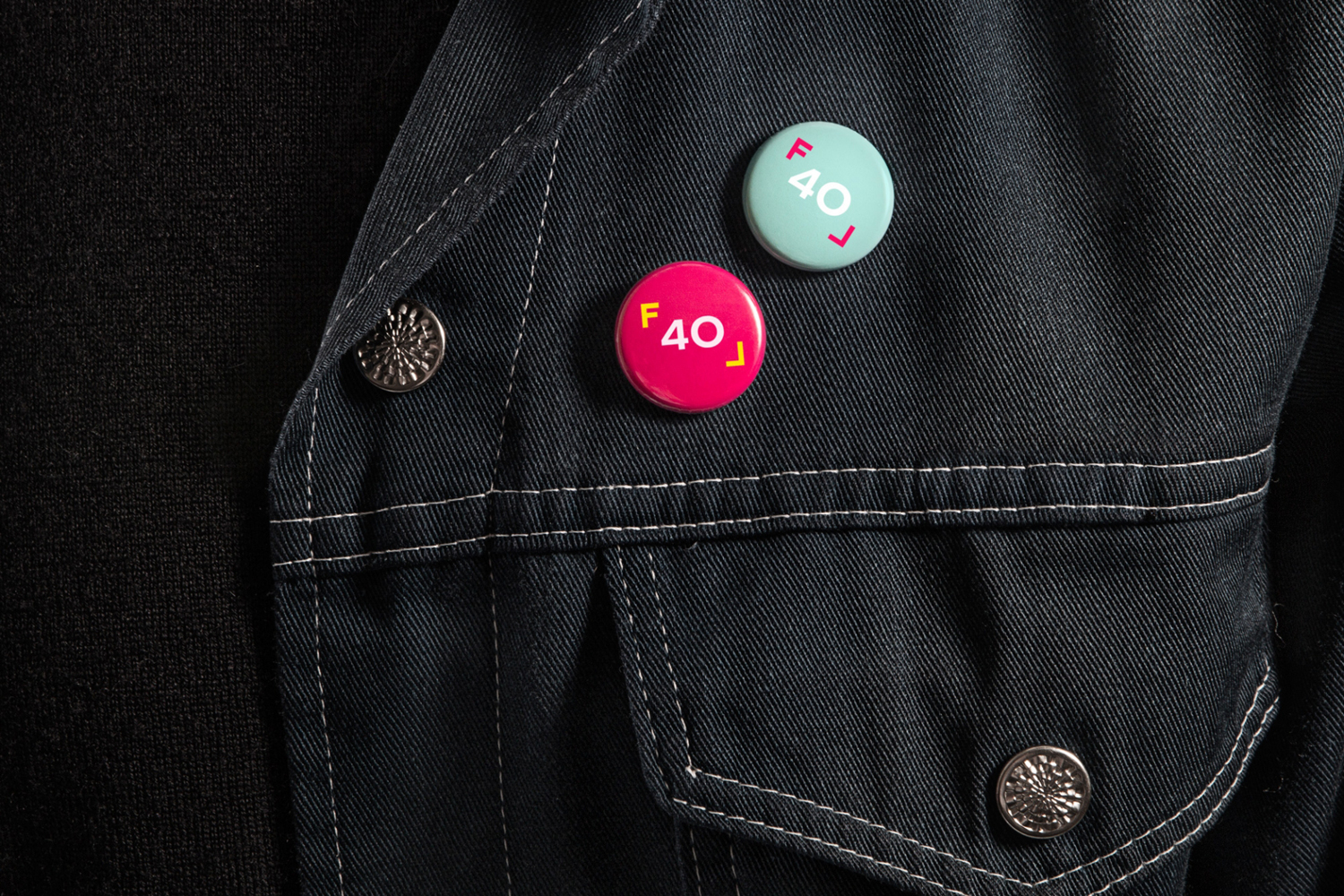
Although much of what Mucho draws on is familiar, the studio manage to create something smart and distinctive from their combination while also retaining much of their associative value. The direction feels restrained but well-suited to a professional organisation looking to engage with a diverse community, with room for creativity and a range of expression in image and language choice, much like film itself, that can freely move between specificity and breadth, and remain cohesive. More from Mucho on BP&O.
Design: Mucho. Copywriting: David Begler. Opinion: Richard Baird. Fonts Used: Avenir Next.
