Gretas by 25AH
Opinion by Richard Baird Posted 6 July 2016
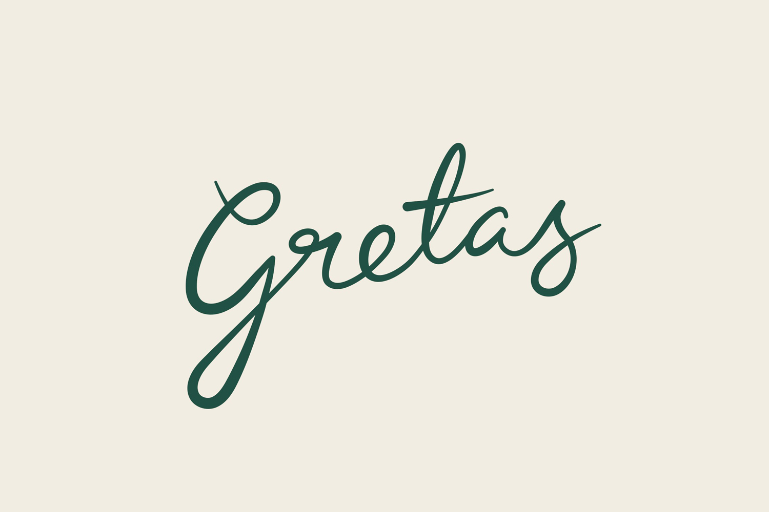
Gretas is a café set within the Haymarket, a hotel located at the heart of Stockholm, Sweden. The building was formerly home to a famous department store that dates back to the early 20th century and was the place where actress Greta Garbo was discovered while working at one of the concessions.
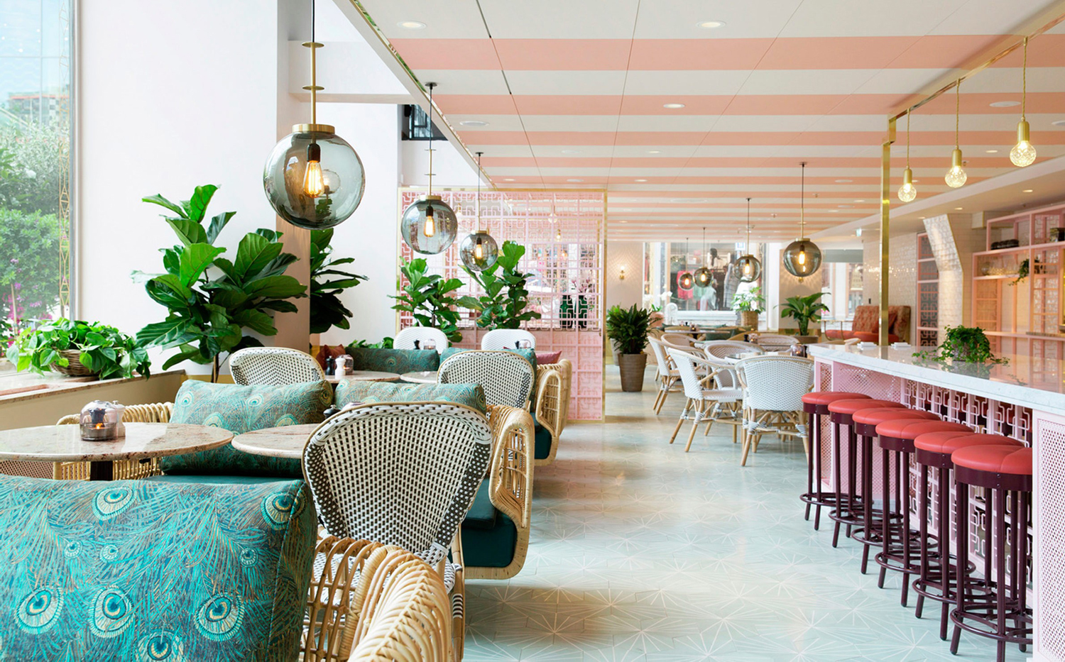
25AH, the Scandinavian graphic design studio behind Haymarket’s own brand identity, as well as Paul’s, a restaurant also situated within the hotel, worked on the brand identity for Gretas. Where Paul’s was darker and more robust in colour and type, inspired by the hotel’s signage, Greta’s is light and personable, drawing on an informal interior, whilst working in the iconic status and history of its location through name and illustration. The project went on to include signage, packaging, menus, stationery and business cards.
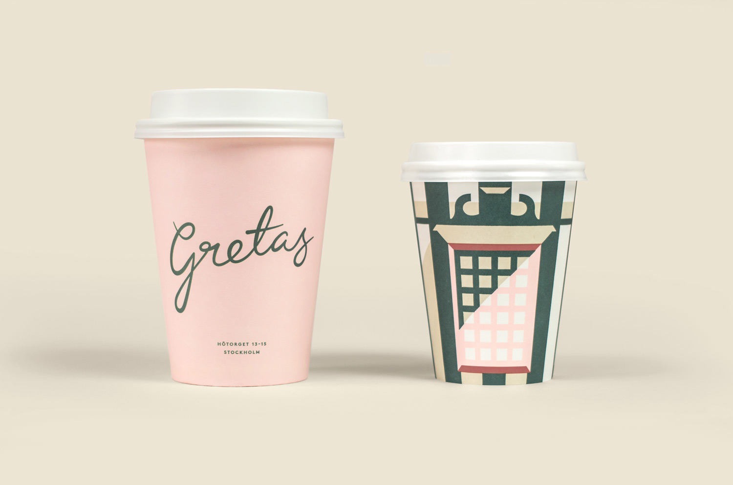
25AH’s brand identity for the café is based around an illustration of the Haymarket, a distinctive and historic structure with an iconic status nationally and internationally. This gives Gretas a very strong sense of place and, alongside name, draws on the hotel’s legacy and appropriates a bit of Hollywood glamour.
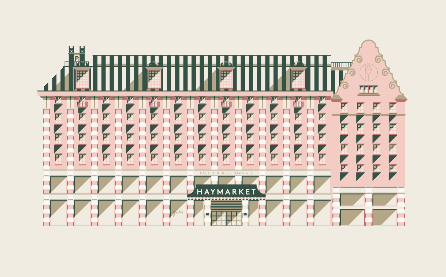
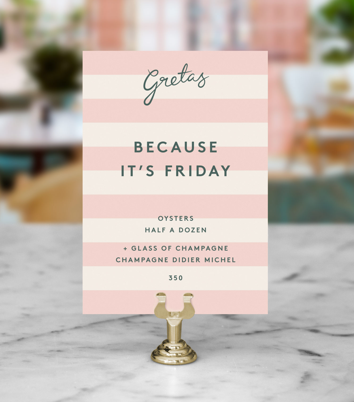
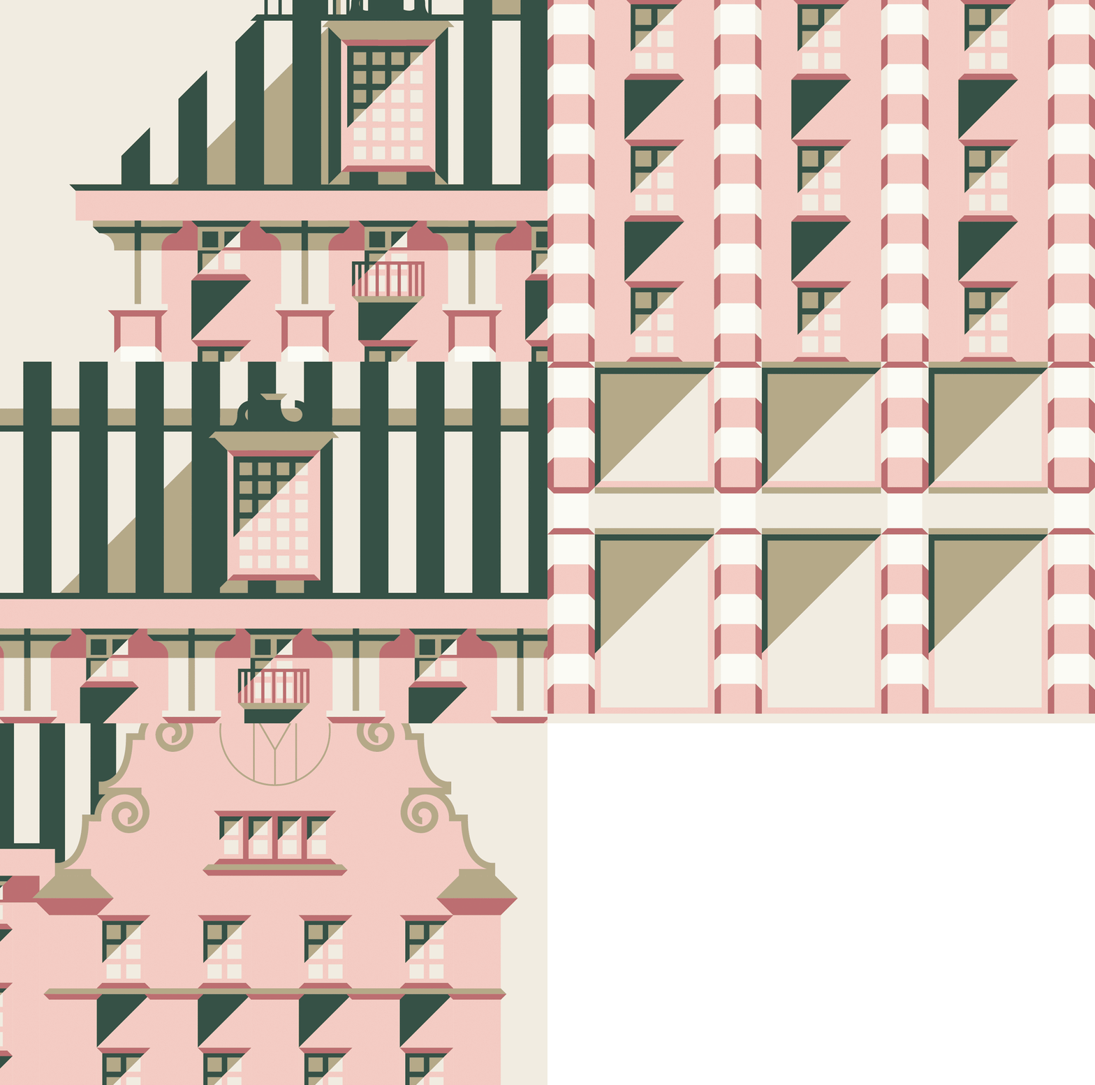
Artwork is well-realised and benefits from the well-proportioned nature of the building and its three distinct tiers, with the use of long shadows giving it a strong sense of depth. There are embellishments that deviate slightly from structure but enhance the character and detail of illustration. This is particularly true for the contrast of vertical and horizontal stripes, which are then used a simple patterns to deliver variation but continuity between a variety of printed assets, alongside crops of the illustration. The way illustration has been wrapped around simple structural designs is a particular highlight.
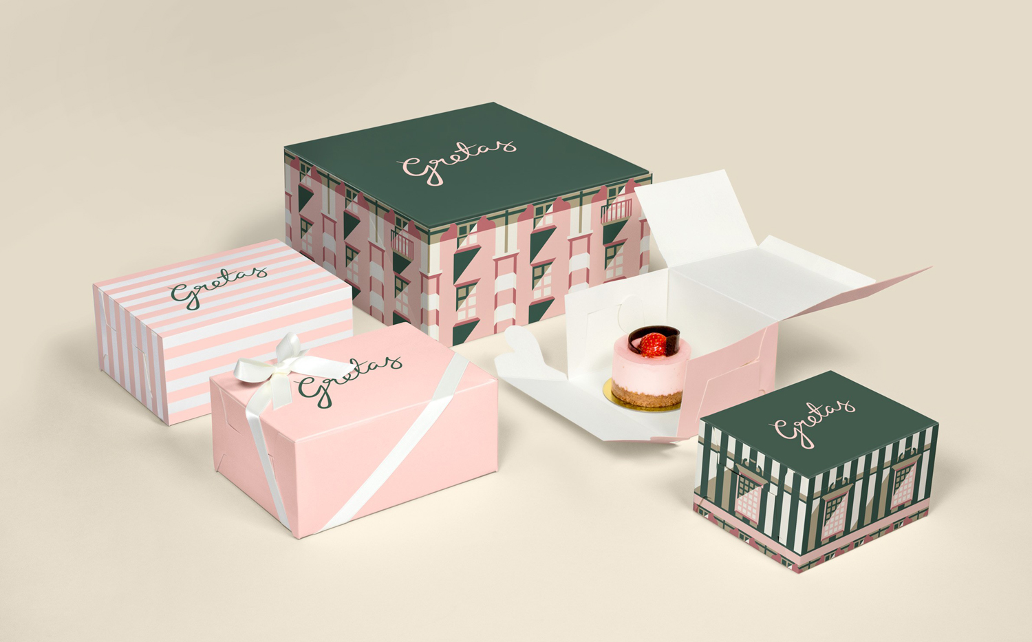
Colour palette takes its cues from a light and bright pink and green interior, and an exterior of darker pink and an oxidised copper roof. This is gives the artwork a Grand Budapest Hotel-like quality, which is probably happenstance, but not a bad association to have, particularly within the context of the café’s name. The use of gold foil also fits in with Hollywood glamour and the gold fixtures and fittings that punctuate soft furnishing.
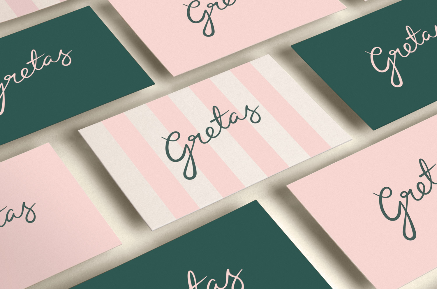
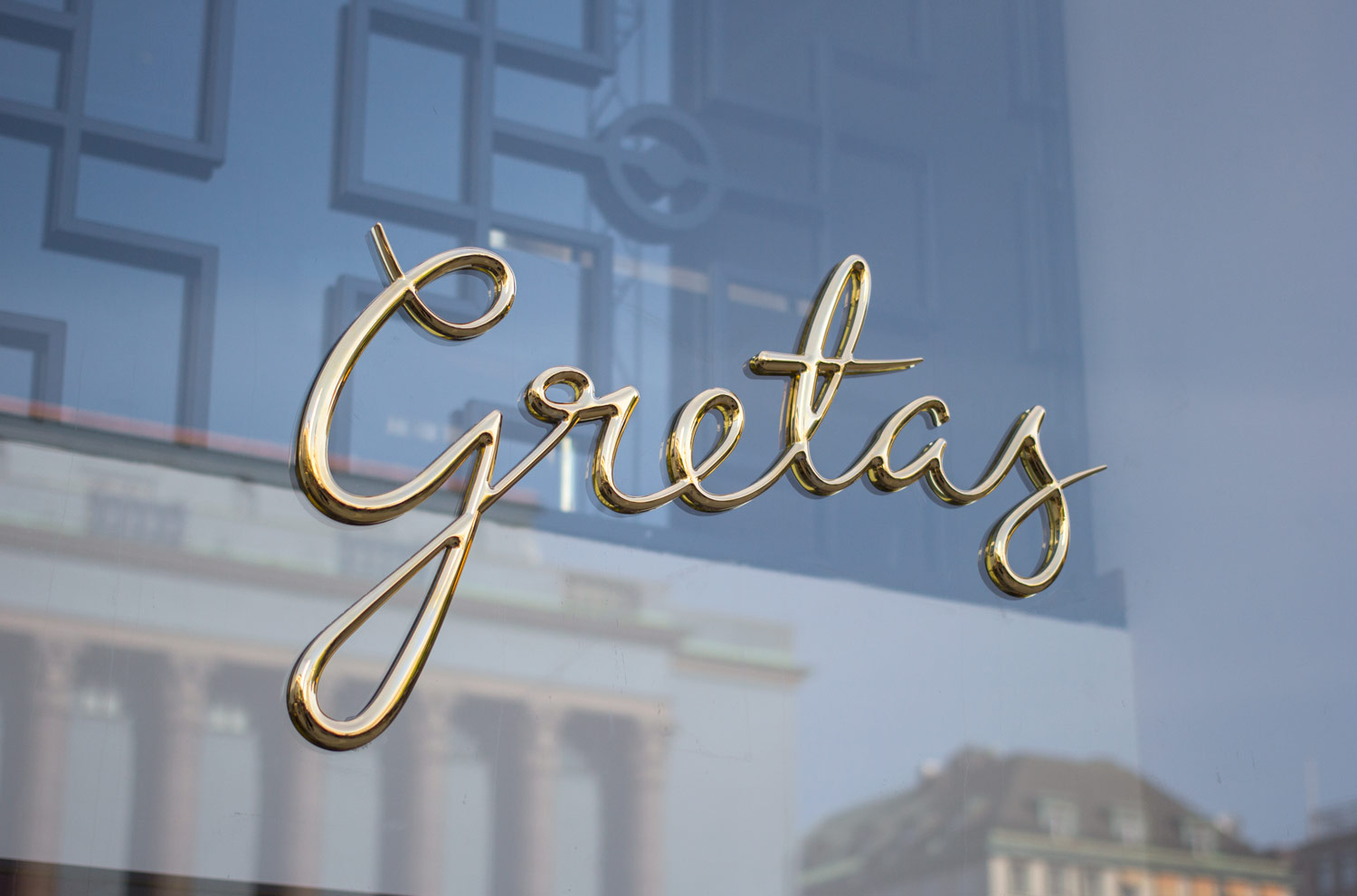
The logotype is well-drawn with some natural ligatures, loops and breaks, good legibility and a personable hand drawn quality rendered with a practical vector precision. Should there be an apostrophe, probably. Logotype is personable and has a nice sense of motion through the letters, and although it does not borrow from the hand of Greta Garbo, does have a period character to it. This is emphasised by the way this has been made into signage. Script introduces contrast to the geometric and robust structure of building, its illustration and the use of Brown which links all hotel venues, and feels like a fair reflection of the casual interior and presumably atmosphere and service.
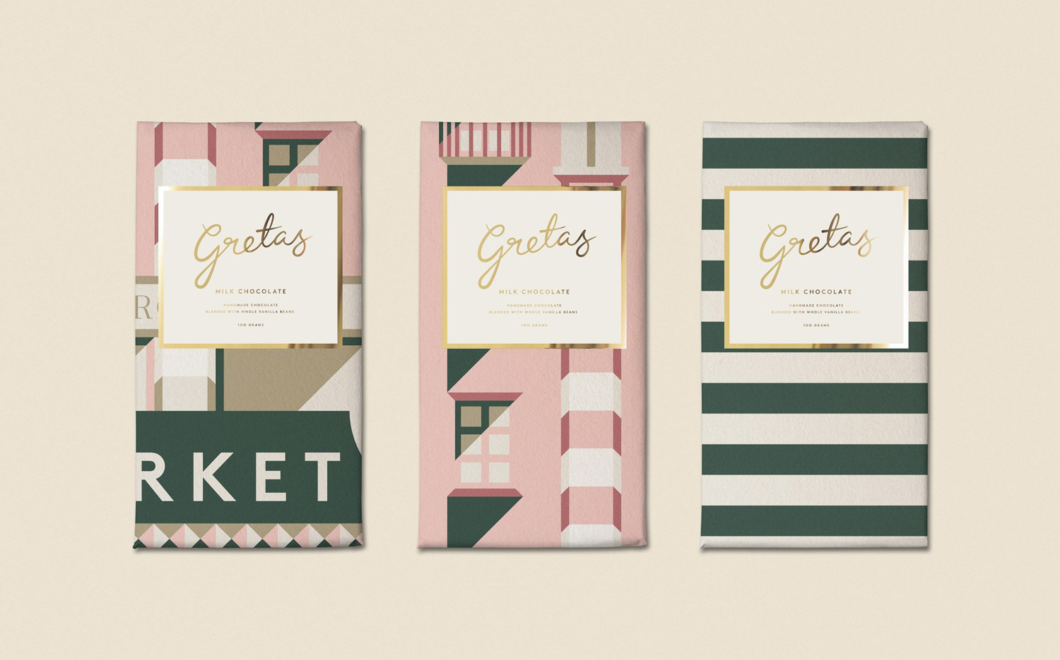
There is a strong sense of continuity throughout, with moments of contrast and variation that keep it interesting, and grounded in a straightforward but appropriate concept that weaves together an element of place, history and glamour. More from 25AH on BP&O.
Design: 25AH. Opinion: Richard Baird. Fonts Used: Brown.
