Embla by A Friend Of Mine
Opinion by Richard Baird Posted 18 July 2016
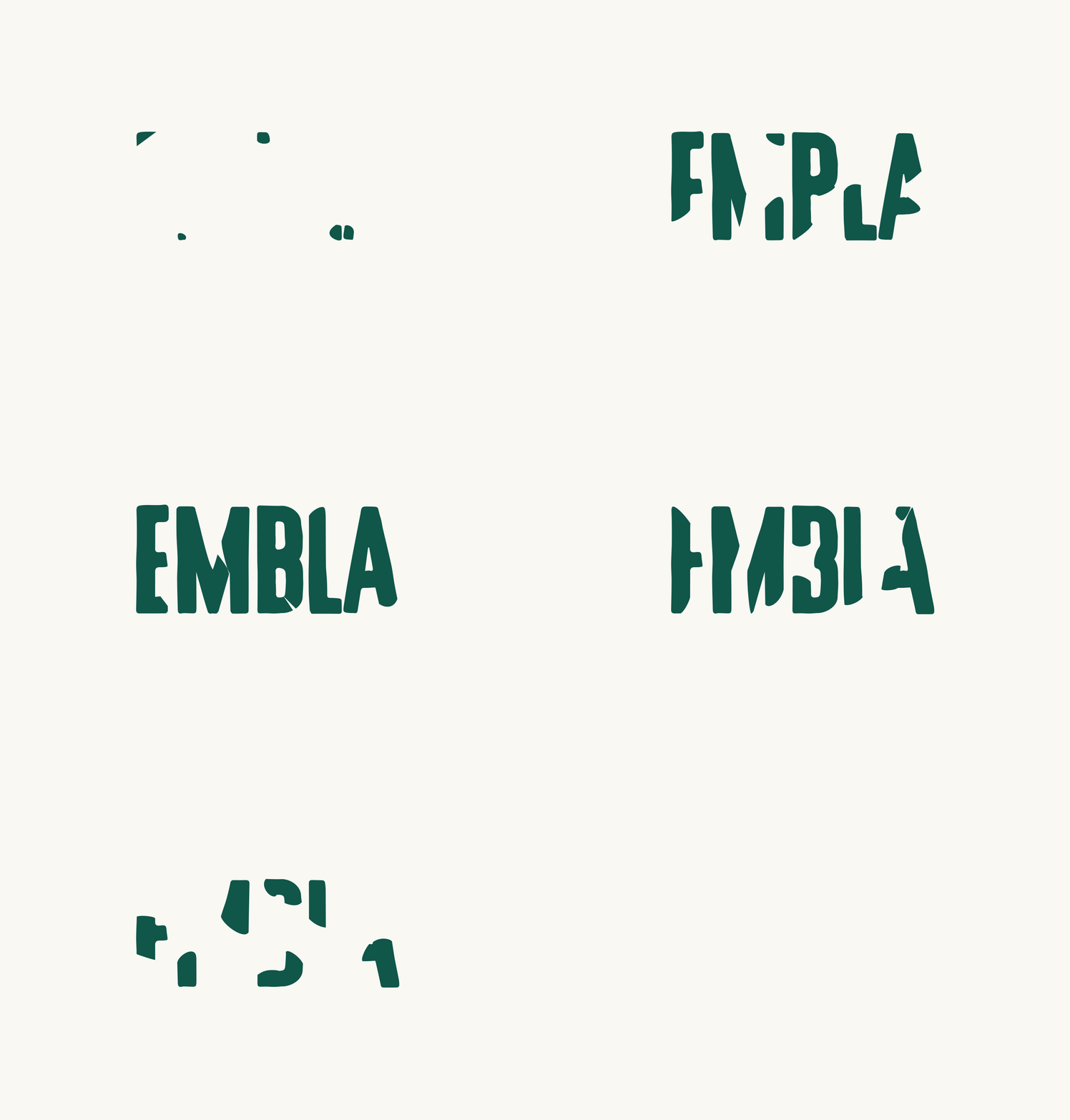
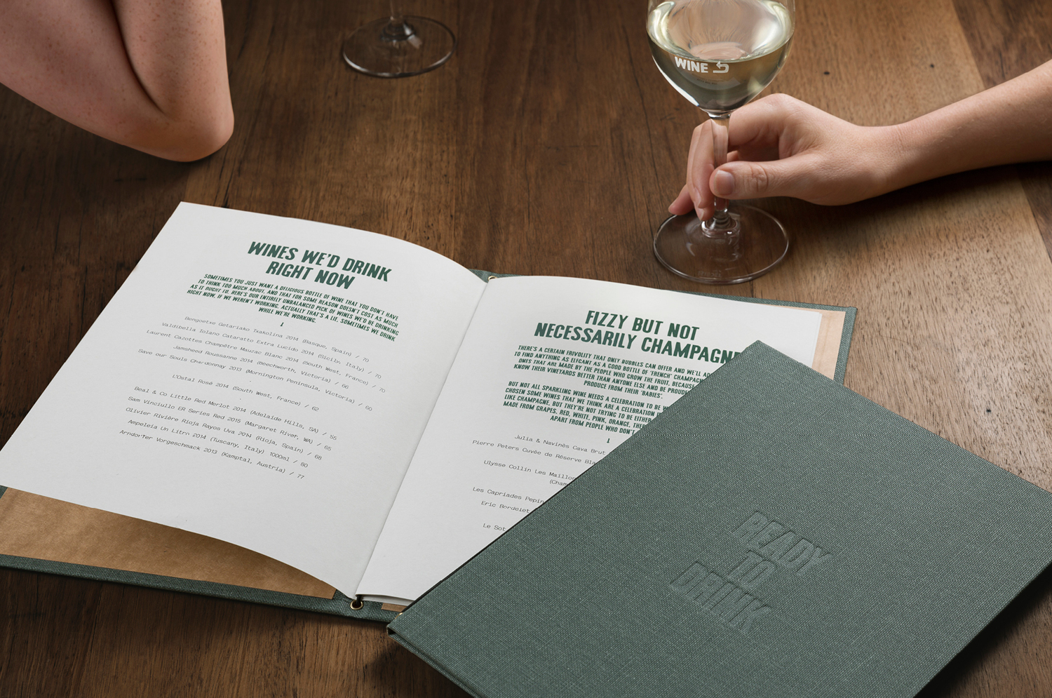
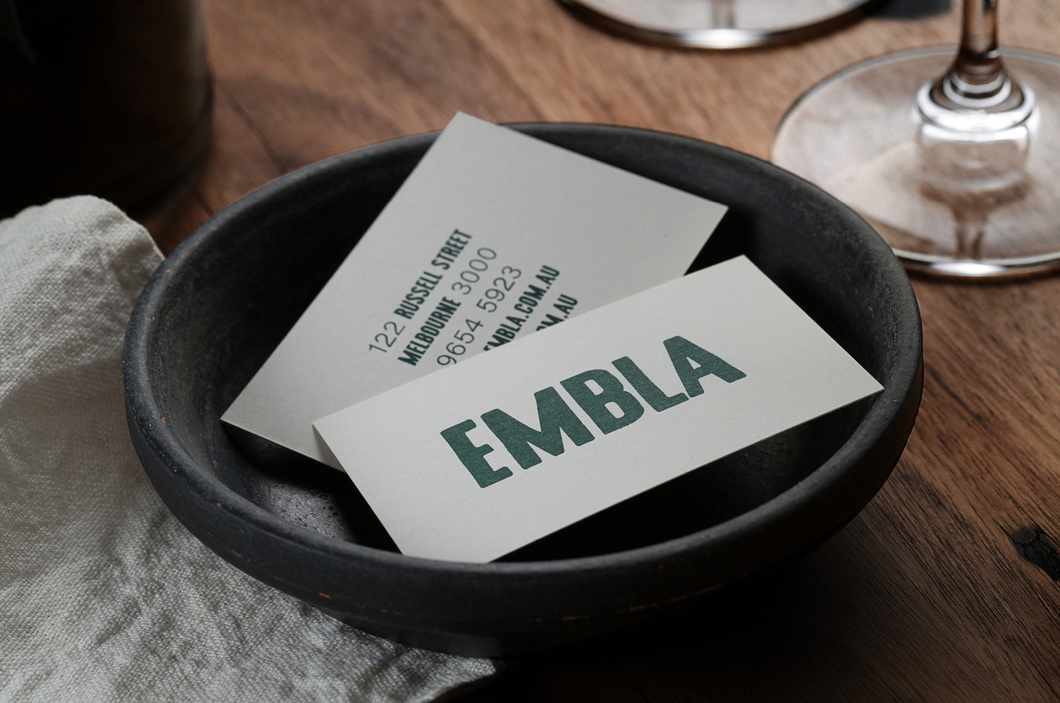
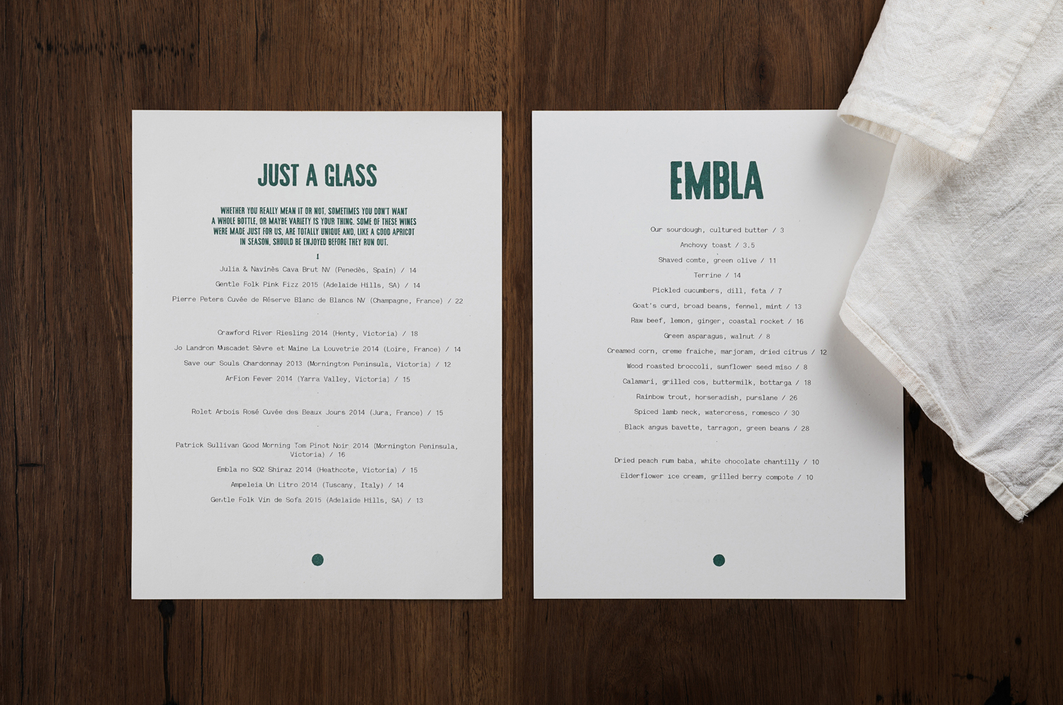
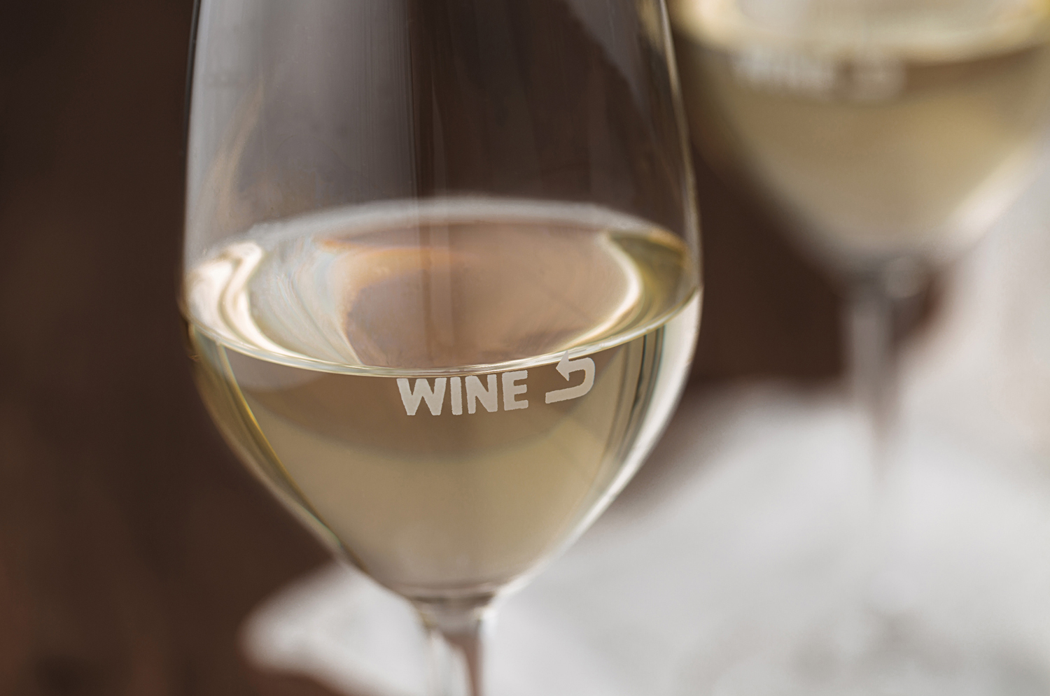
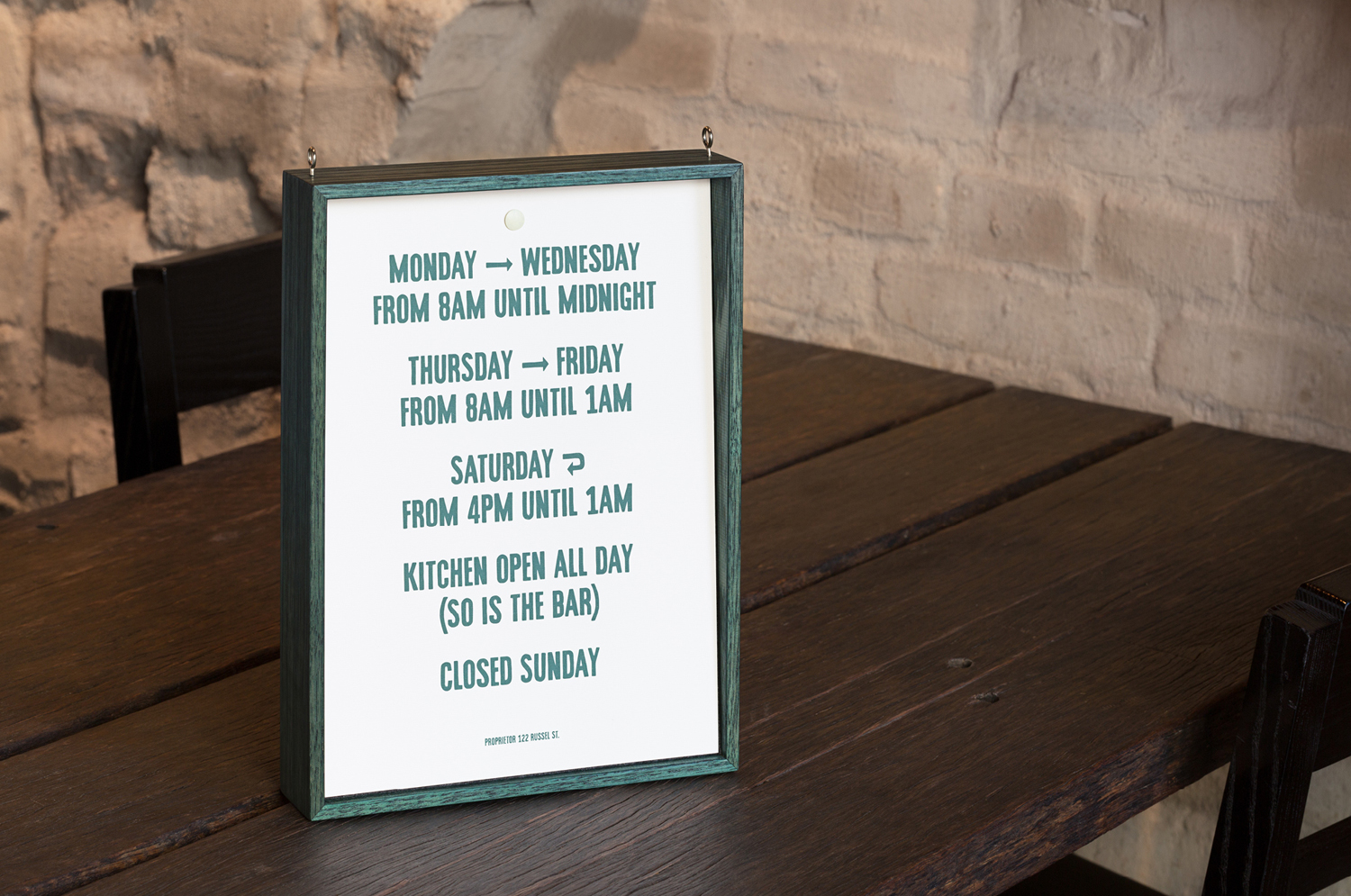
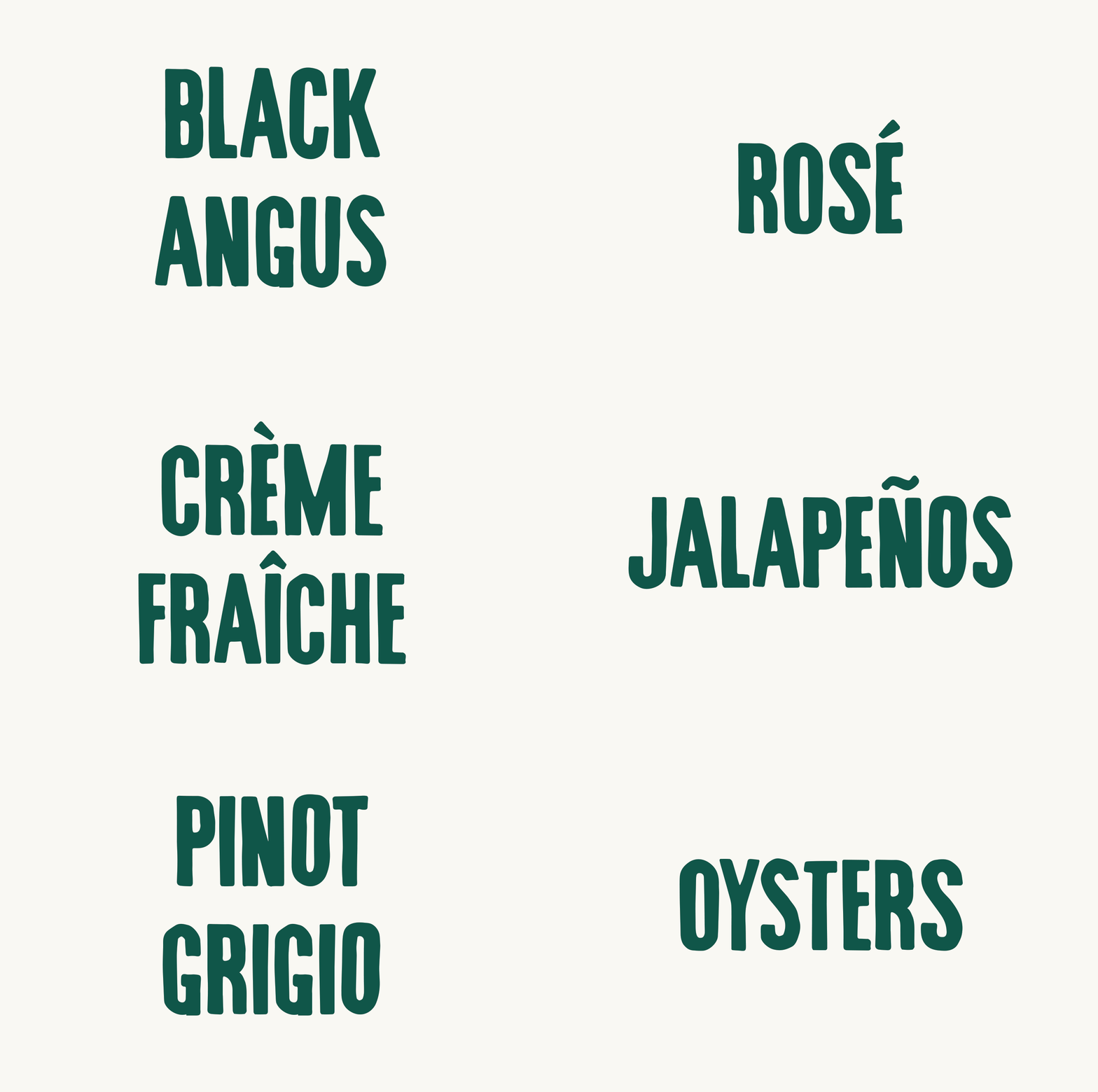
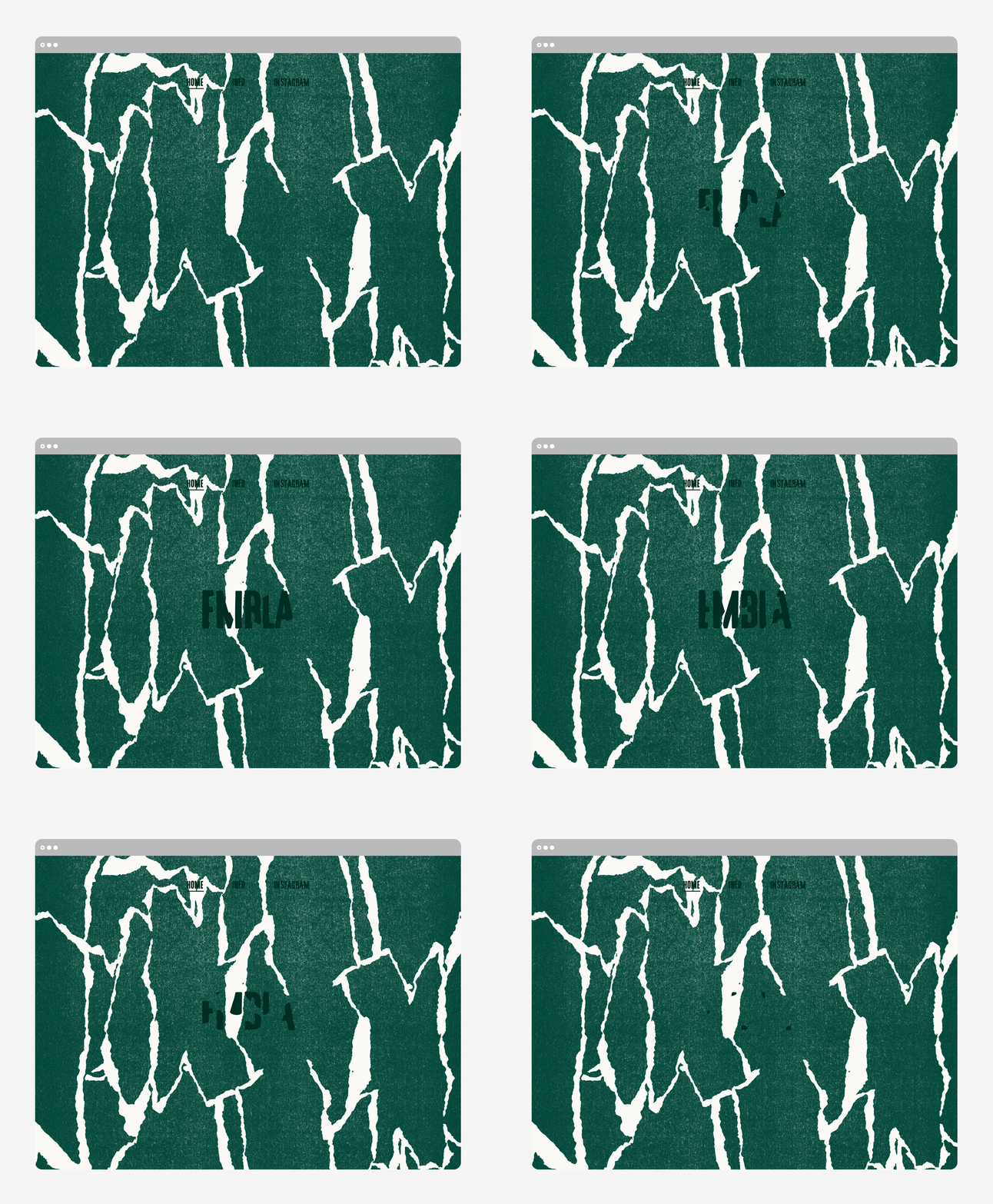
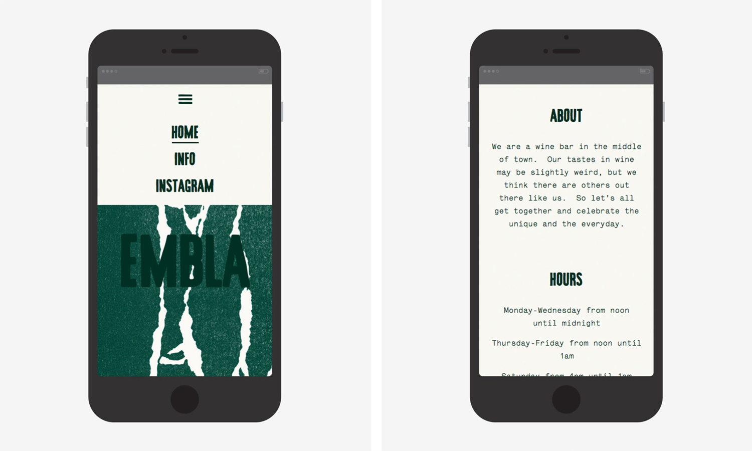
Embla is a new wine bar and restaurant located in Melbourne’s inner city, created by Christian McCabe, the man behind The Town Mouse. It has an interior of wood surfaces, exposed floor beams and brick walls, warm low hanging lighting and a large frameless glass front. Embla’s brand identity, designed by local graphic design studio A Friend Of Mine and based around a custom typeface, draws its inspiration from the hand painted vintage signage that proliferates the neighbourhood, and is visualised as a custom typeface. Alongside torn paper, fabric texture and stained timber, this links menus, business cards and website.
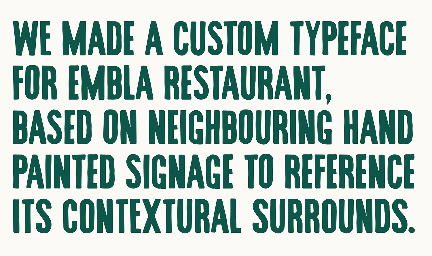
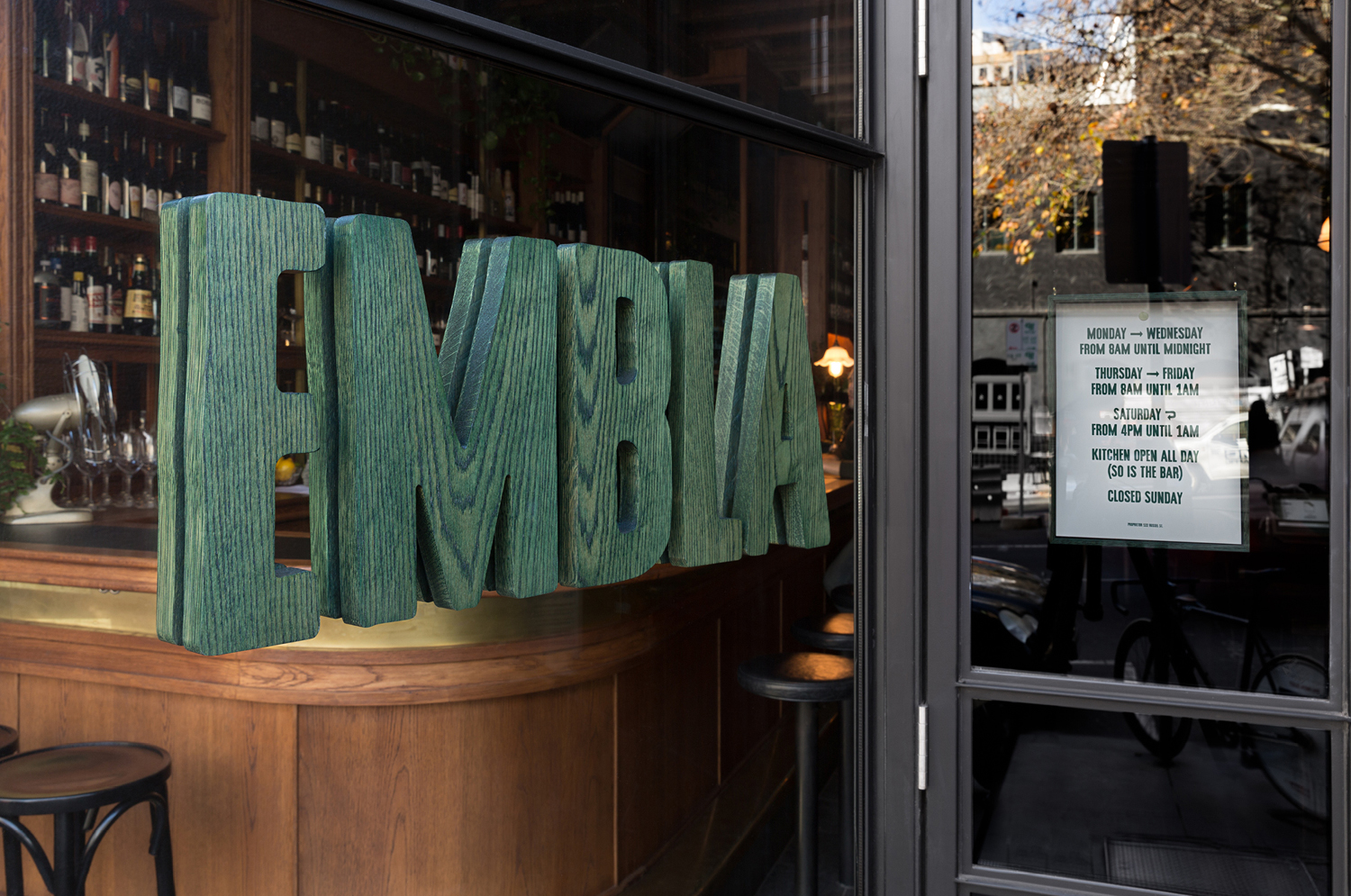
Embla’s custom typeface is impactful in its bold, uppercase and condensed forms, but personal, tactile and crafted in its loose lines and implementation. There is pleasant a commonality in the roughness of type and the exposed structural qualities of the Embla’s interior and a sense of place in its reference whilst remaining distinctive in the extent of use.
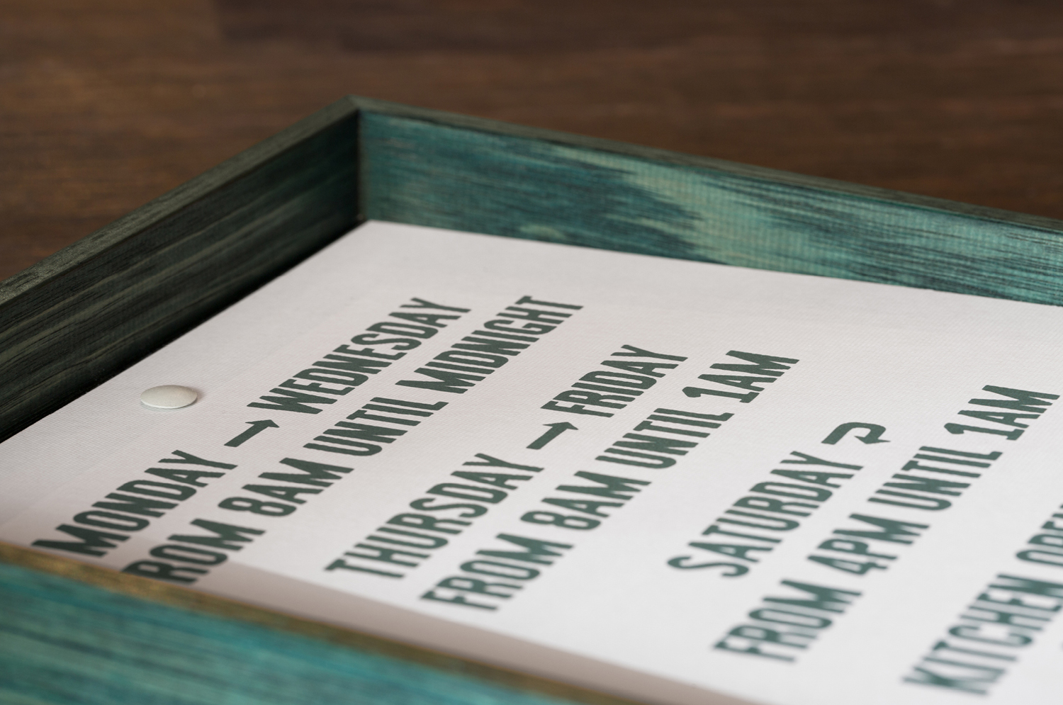
The creation of a complete custom typeface, rather than just a wordmark, and the addition of alternate characters, delivers a clear continuity but also some variation throughout all of Embla’s printed materials without being logo-centric. This is also the case in the materiality of identity; the use of green stained wood, dyed fabric, blind deboss and torn paper. This gives a organic handmade quality not only to the physical but to the digital, and introduces visual breadth to type.
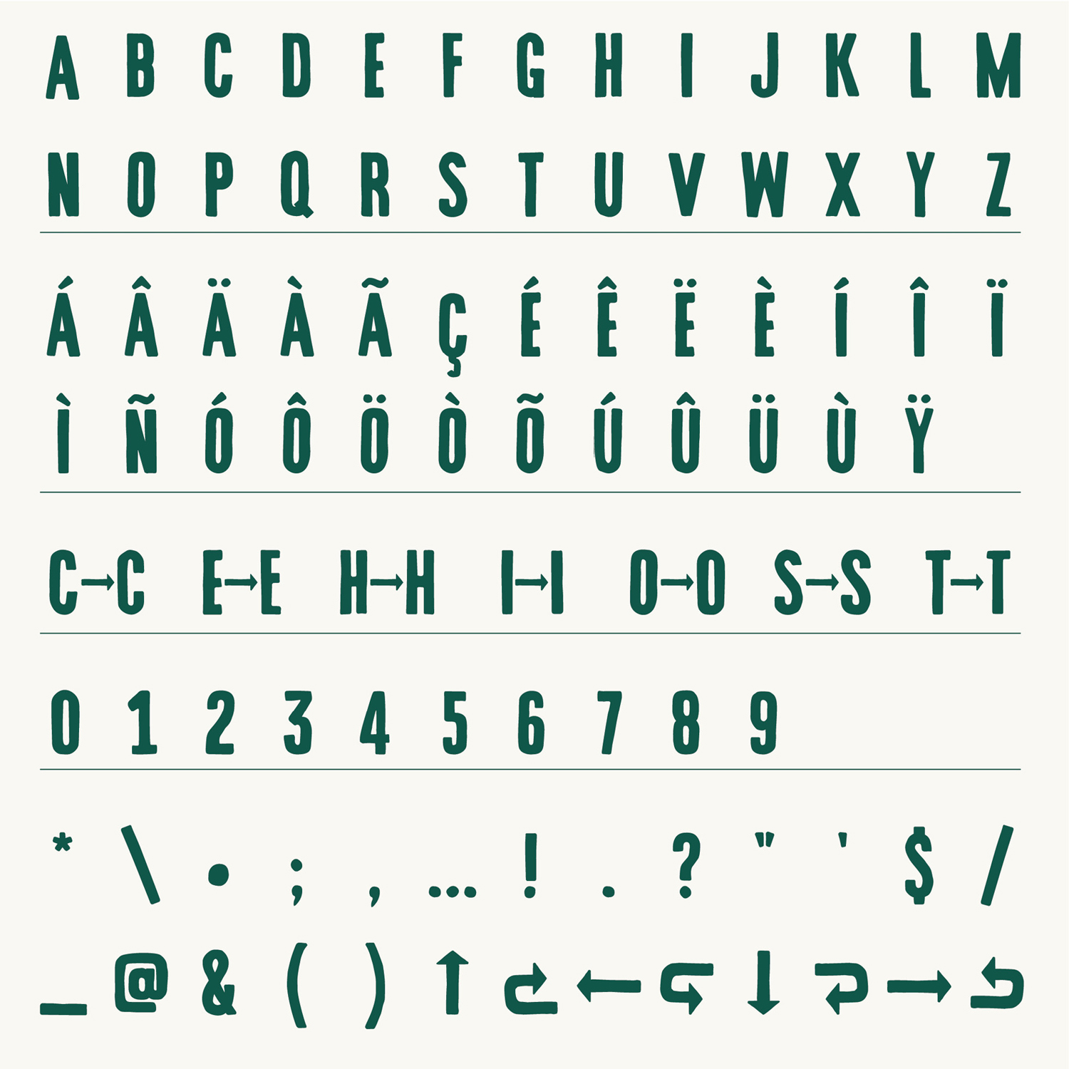
The arrows are an unusual addition. These appear as digital artefacts drawn into a very physical and tactile identity. This works in the opposite direction as well, with the background of the website being populated by torn edges and printed texture, designed to soften website experience.
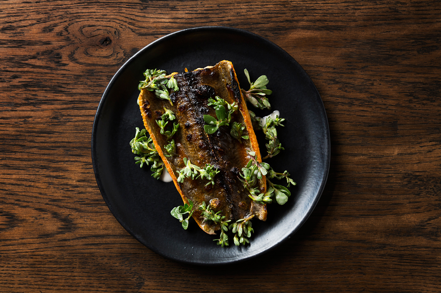
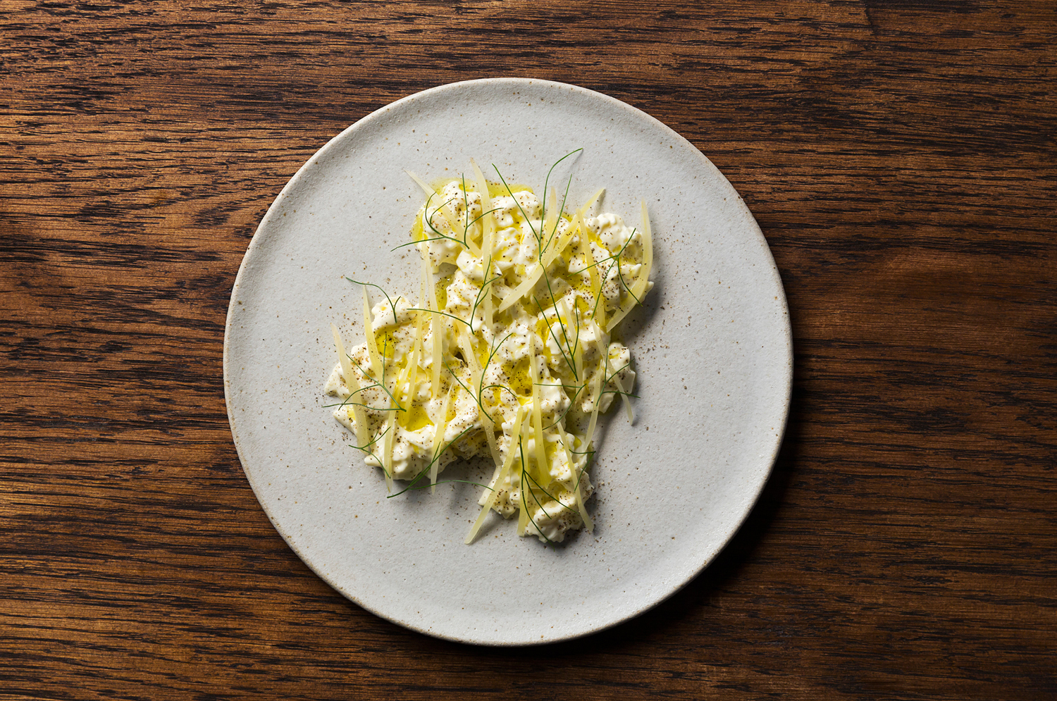
Food photography by Sarah Anderson looks great, with visual identity and interior effectively worked in through the wood texture. There is consistency in the top down approach, and like the organic edges of the typography, dishes appear crafted in their irregular surfaces, and through colour draw out the quality of the menu.
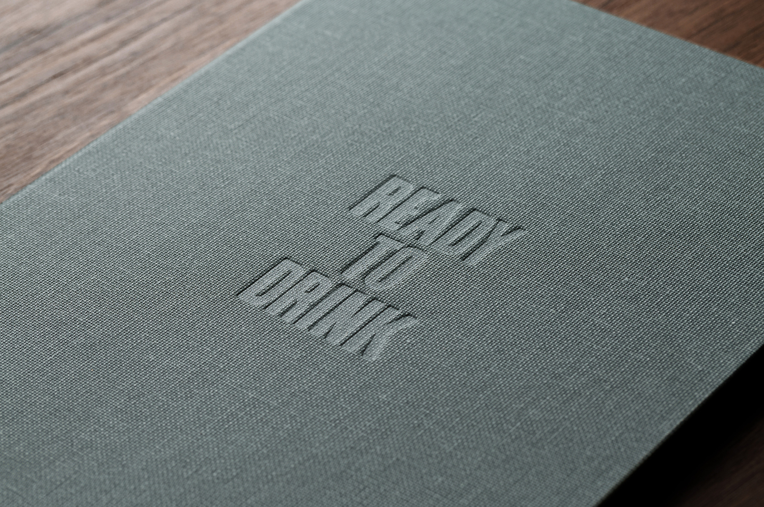
Although there is personality in type, much of Embla’s character comes through contrast and continuity. Signage is large and textured, in opposition to the smooth polished qualities of glass, the use of stained timber mirrors the interior but stands out with its distinctive green stain, and the letterforms neatly draw on the wider community. More from A Friend Of Mine on BP&O.
Design: A Friend Of Mine.
Collaborators: Unit Measures & Decently Exposed.
Photography: Sarah Anderson.
Opinion: Richard Baird.
Fonts Used: Lettera.
