Helbers by Only
Opinion by Richard Baird Posted 22 August 2016
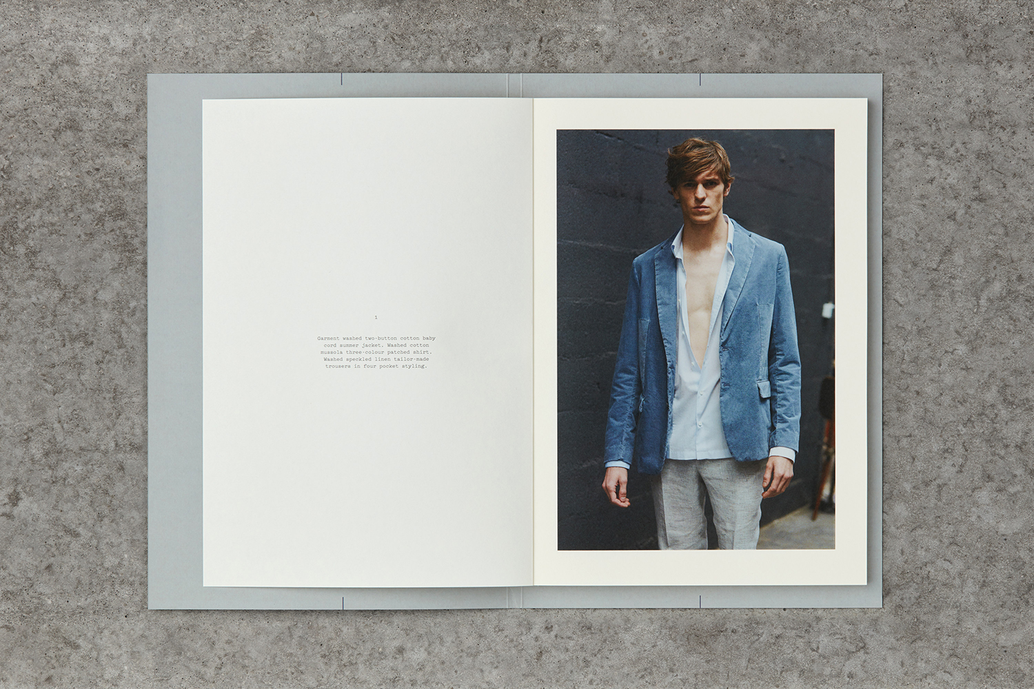
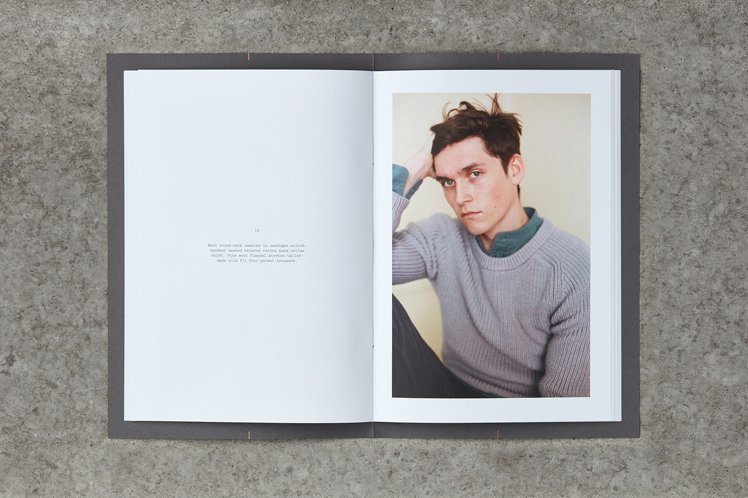
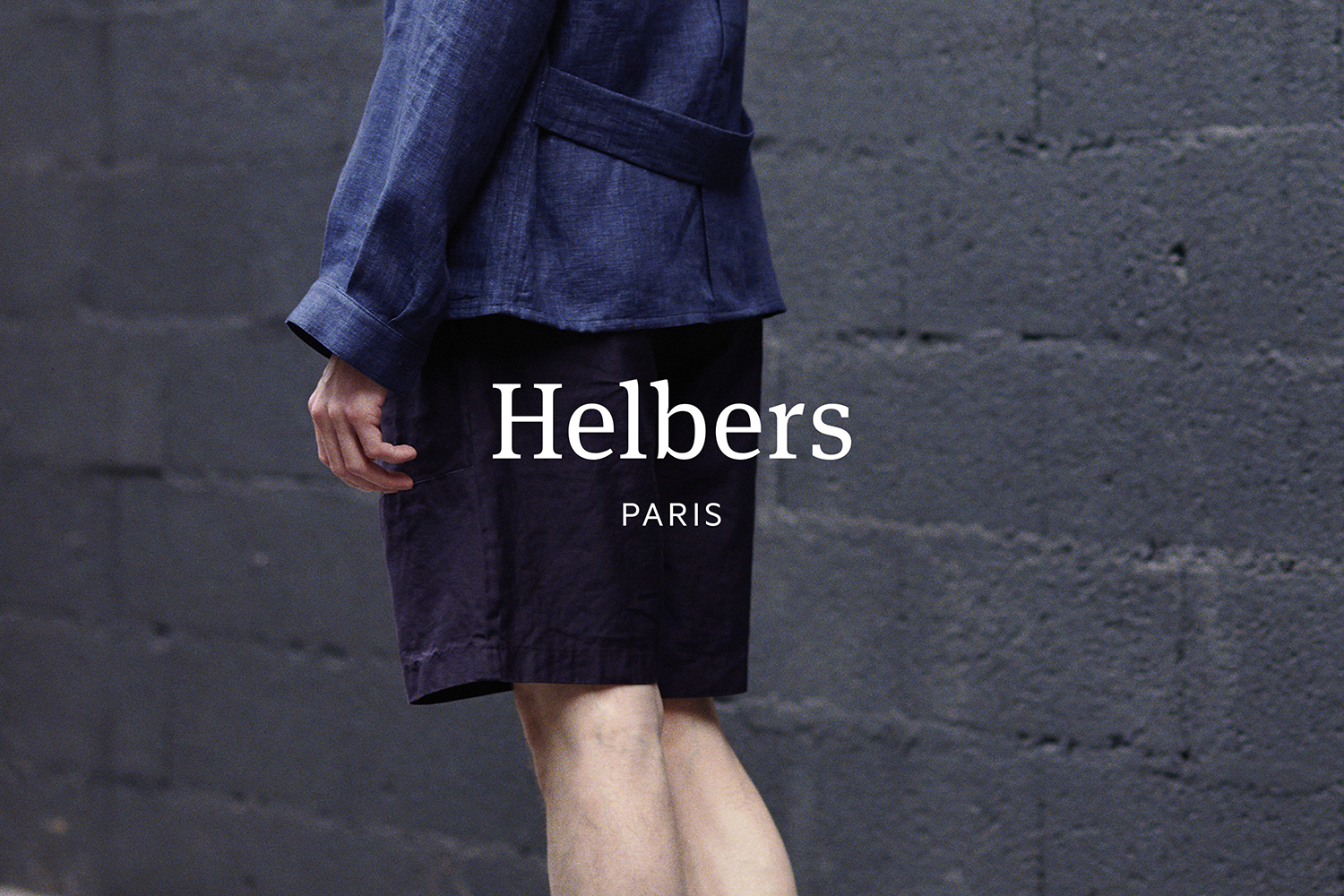
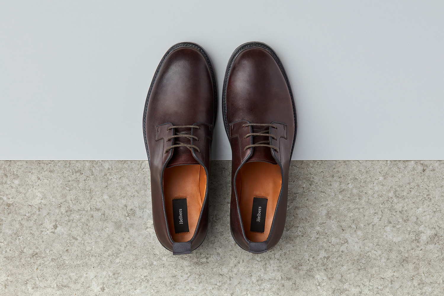
Helbers is a Parisian menswear label created by Paul Helbers, the former Head of Menswear at Maison Margiela and ex-Menswear Director at Louis Vuitton. The label has a carefully curated lookbook of garments and footwear with an unpolished elegance, and feature a subtle contrast of materials. Helbers has secured early acclaim for his AW16 collection, and is due to appear in stores around the world in the coming weeks.
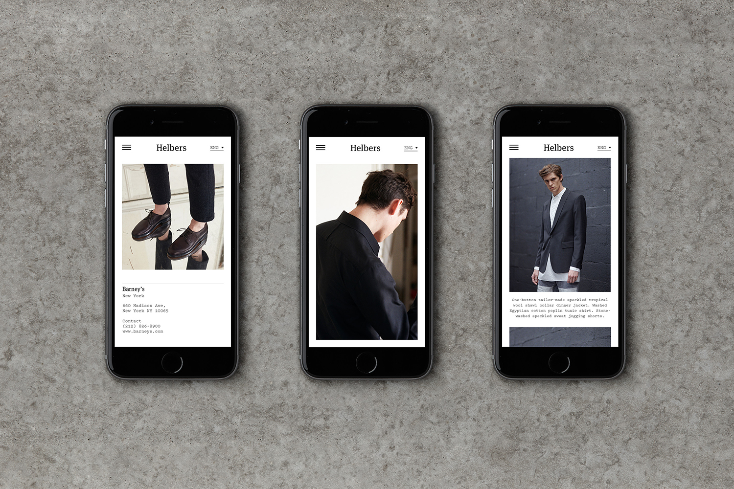
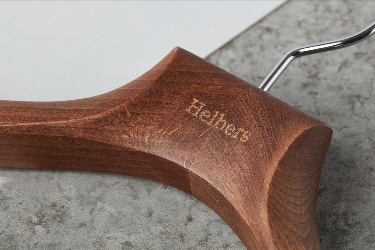
Paul worked with Leeds-based graphic design studio Only to create a brand identity that would clearly express the meeting of what the studio describe as the contemporary and the antiquarian, craftsmanship and utility. This is visually articulated in the simplicity and materiality of identity, type contrast and a limited colour palette that runs across a variety of assets. These included tags, labels, stationery, business cards, hangers, packaging, lookbook and responsive website.
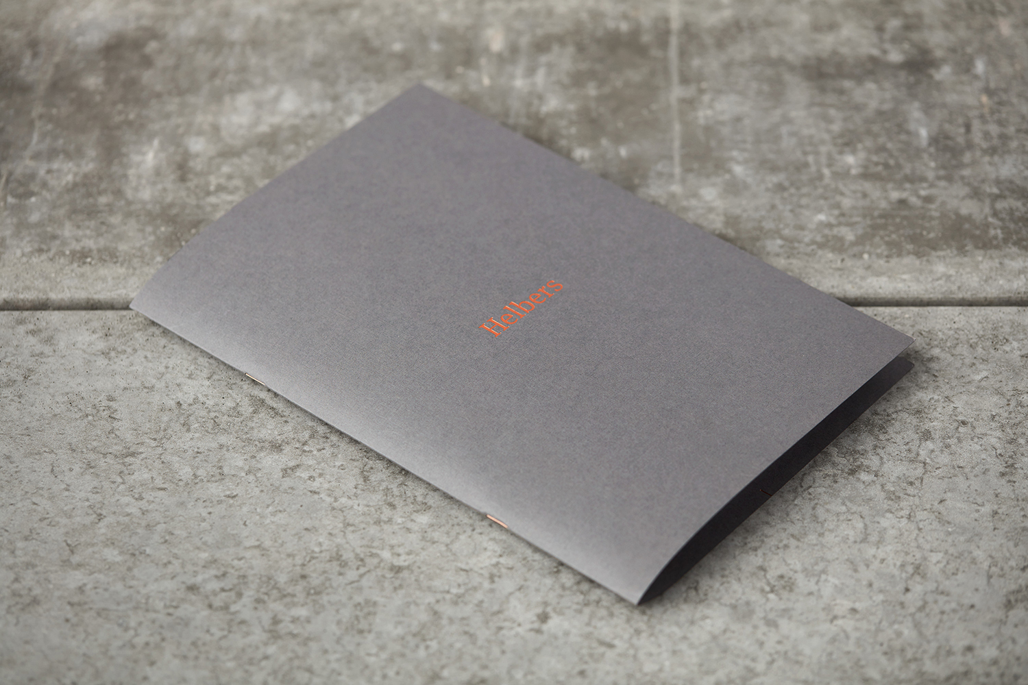
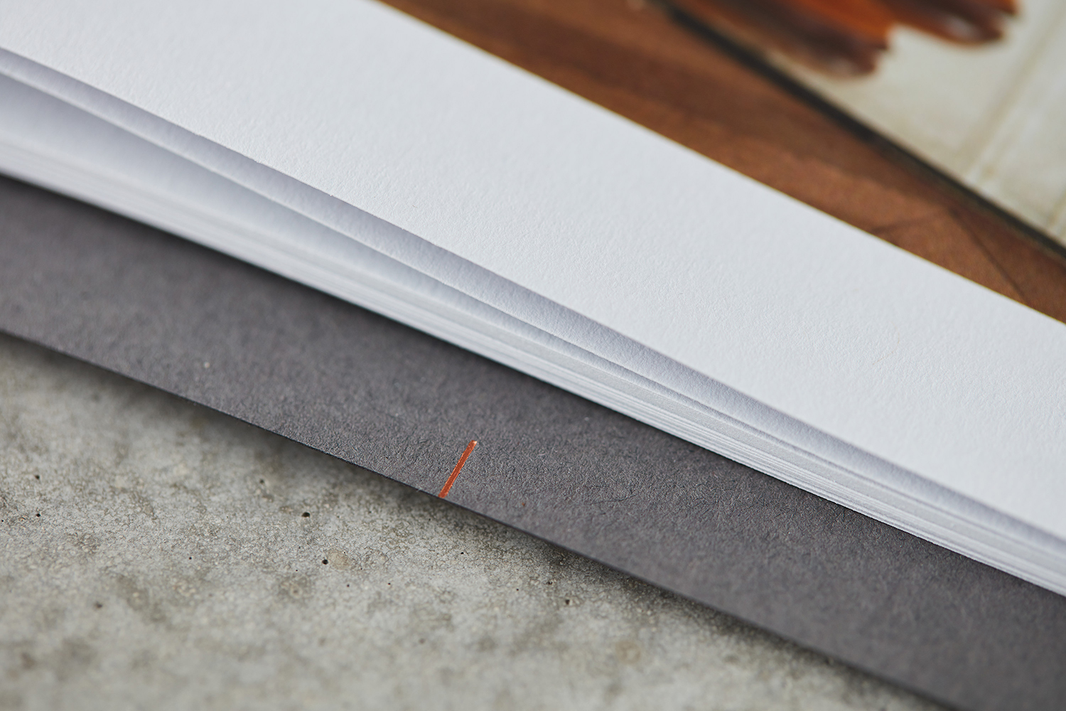
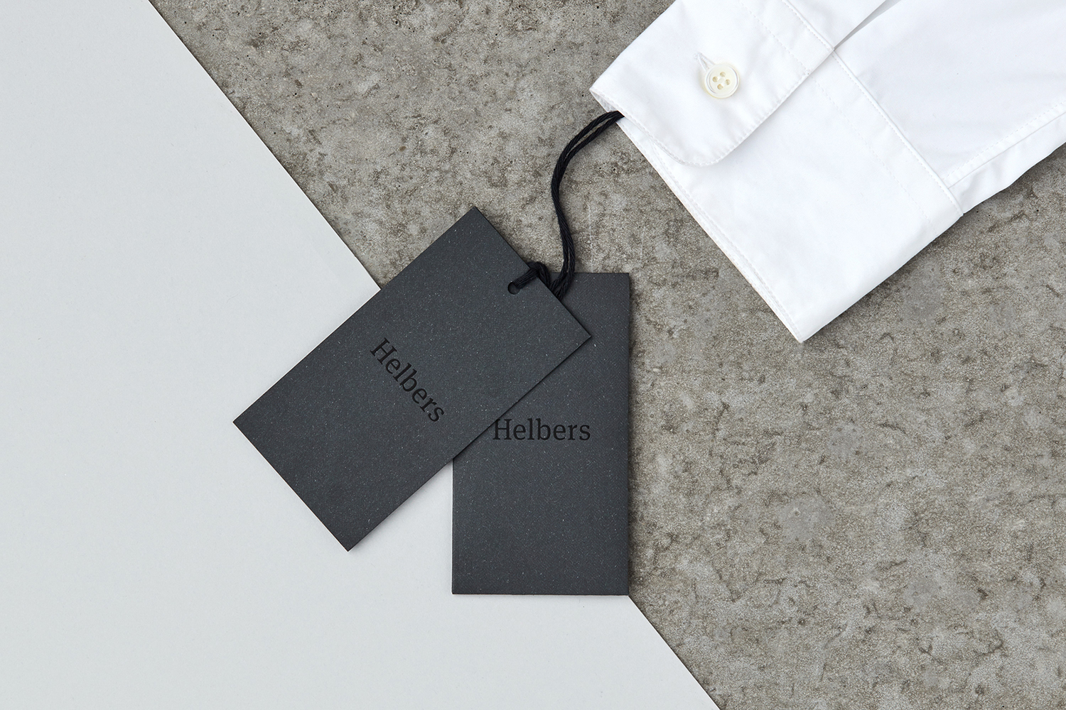
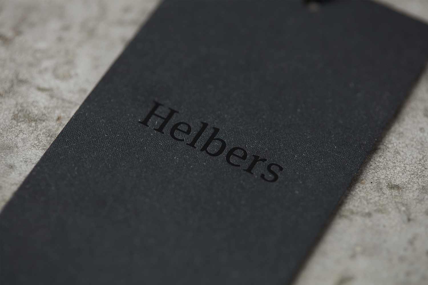
The subtle material contrast that exists within Helbers’ garments, and the utility, modernity and classically crafted foundation of brand, is subtle but prevalent throughout visual identity. This can be discerned in the meeting of wordmark — a customised version of Meta Serif — its sans-serif second line and the monospaced Pitch, a glossy black block foil over an uncoated, embossed and mixed-fibre board, the urban grey of the lookbook and a copper block foil print finish and colour matched staples. These feel clear and concise in their communicative intentions with enough in the way of variation to keep it visually interesting but also avoid any sense of the ostentatious or superfluous.

Other small details include the oversized portfolio-like cover of the lookbook, and stitch markings at the head and foot of business cards and on the inside of the lookbook cover. The intention here, as Only explains, was to frame content, draw on the markings associated with handmade production processes, and intersect collateral to form the negative space of an H, much like Mucho’s work for Héctor Ayuso. Although perhaps a touch too subtle to really be considered clearly referential, nor pronounced enough to be a distinctive and memorable visual asset, it is a neat idea.
While brand identity may seem initially limited to wordmark and the material, there is a craft in build, choice and resolution, and the way these are effectively emphasised by a generous use of space, simple layouts and typesetting, and supported by a couple of other thoughtful details. These are referential and communicative, rooted in the values of brand, visually compelling and high-quality in their expression, while utility really comes to the forefront online.
Design: Only. Opinion: Richard Baird. Fonts Used: Pitch & Meta Serif.
Material & Print Specifications:
Swing Tags & Button Envelope:
Fedrigoni Dark Grey Saville Row Tweed
Black Foil
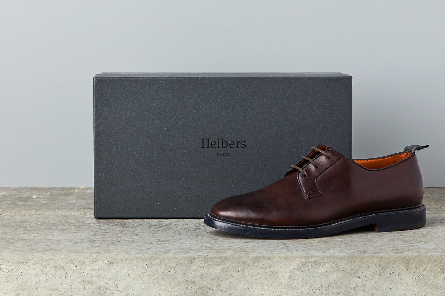
Shoebox:
Fedrigoni Dark Grey Saville Row Tweed 100gsm
Glued over a more robust board
Black Foil Emboss
Lookbook Cover:
Colorplan Dark Grey 350gsm
Silkweave Emboss
Copper Foil
Lookbook Inner Pages
FW16 Colorplan Cool Grey 135gsm
SS17 Colorplan Natural 135gsm
