Park Bench Deli by Foreign Policy
Opinion by Richard Baird Posted 26 October 2016
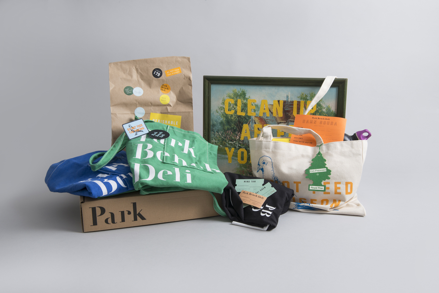
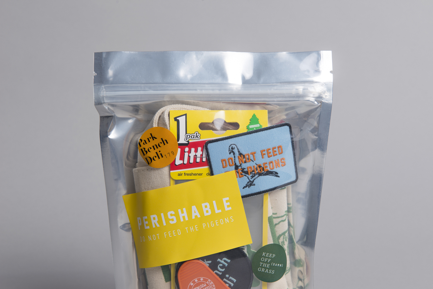
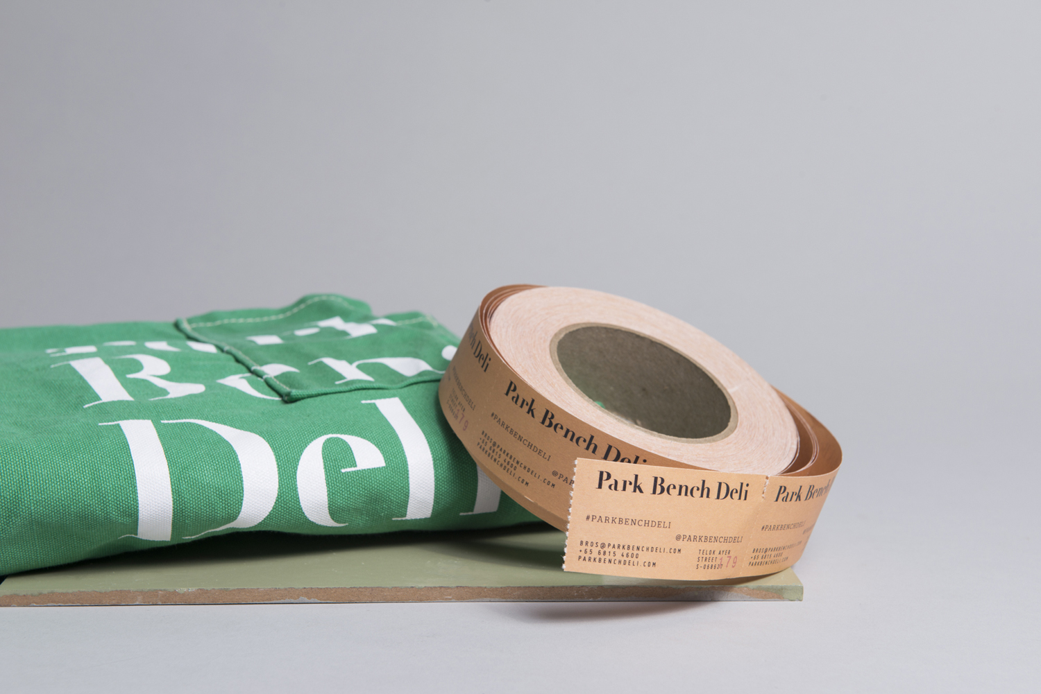
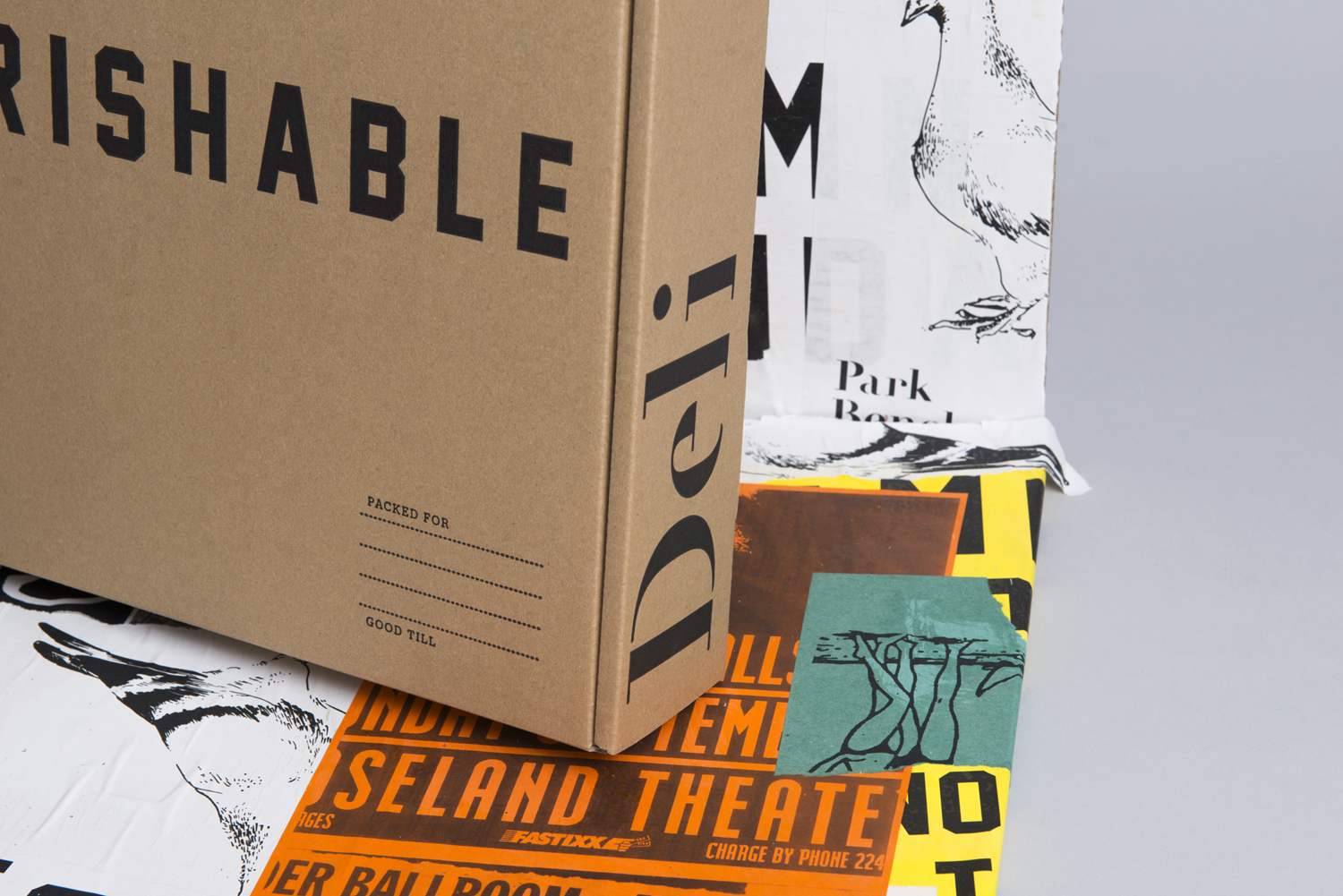
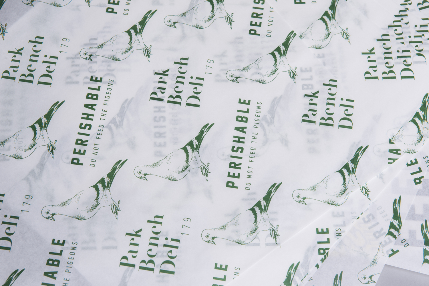
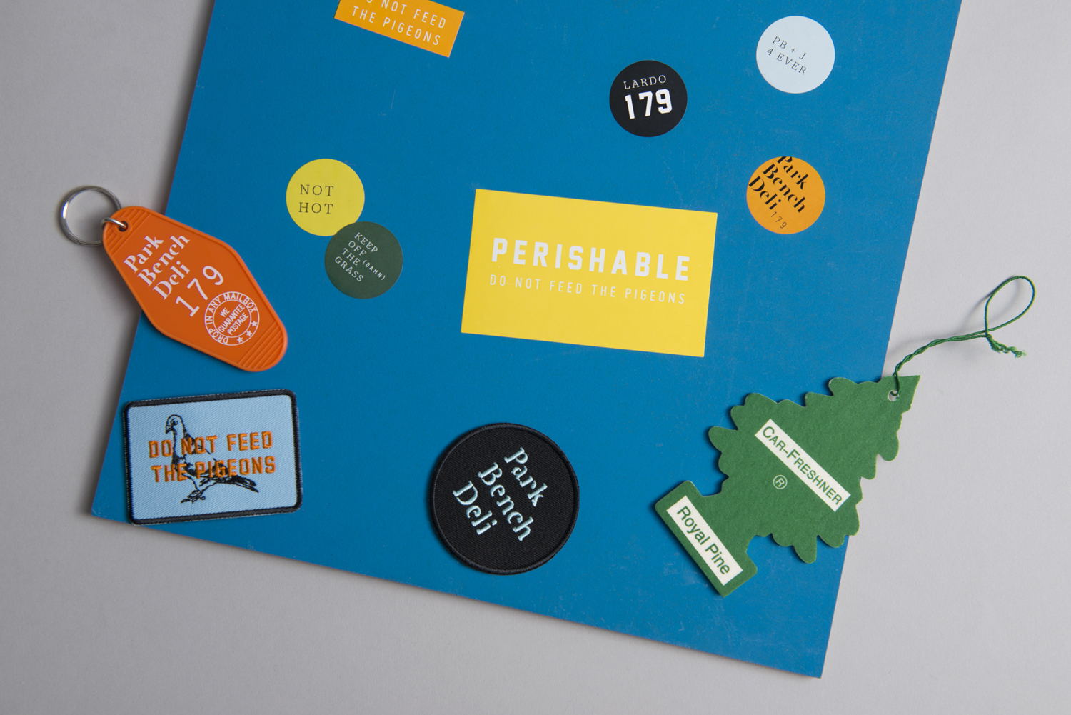
Park Bench Deli is located on Singapore’s Telok Ayer St and features a rich interior design, styled on the all-American deli, that mixes a variety of vintage textures and ornament. These include tiled floors and wood panelled walls alongside personal items of the shop owners. Visual identity shares a similarly busy and material quality, referencing park life, but introduces the multi-coloured. This connects menus, packaging, and lots of small takeaways such as stickers, embroidered patches and key rings. Although launched in 2015, Foreign Policy, the studio behind both brand identity and interior design, recently documented and published the project on their newly launched website.
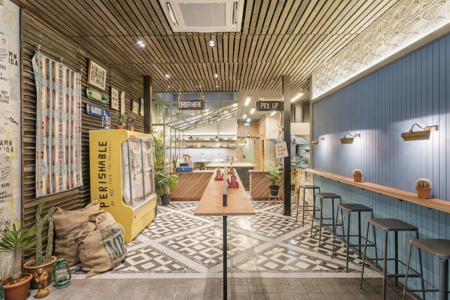
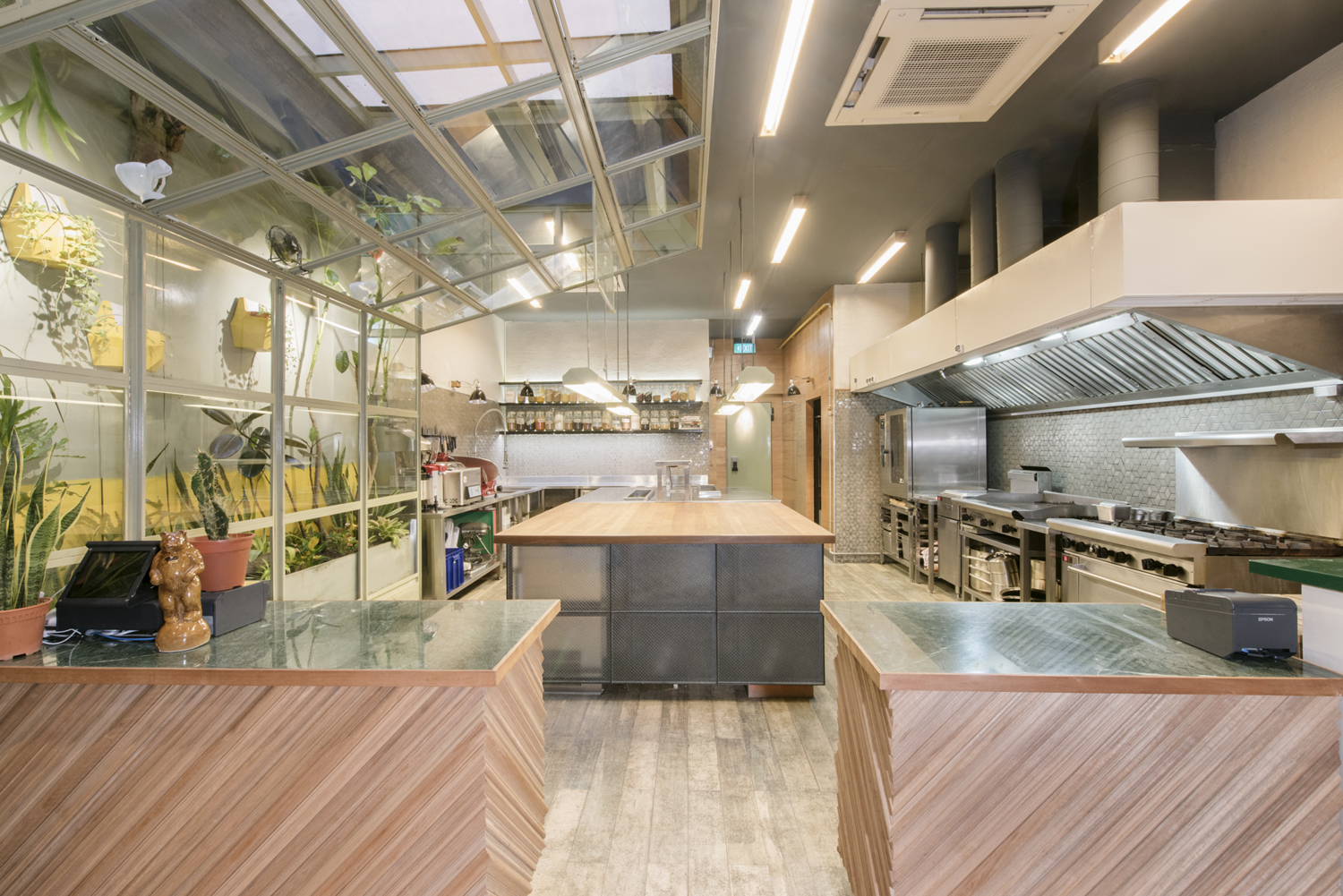
Interior design is full of detail, and although it leverages many current trends in cafe, deli and restaurant design, its balance of reclaimed materials, wall to wall wood, flora, personal details such as skateboards and pictures, inner-city texture of overlapping posters, utilitarian furniture and the elegance of flooring and cornicing make for a very distinctive and welcoming space.
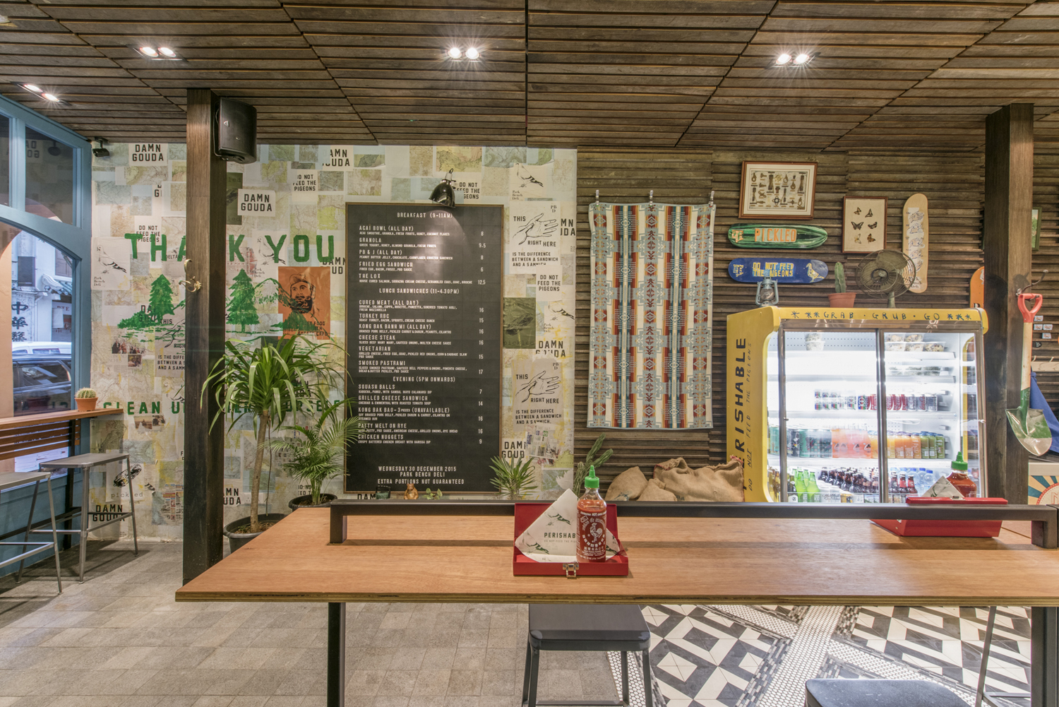
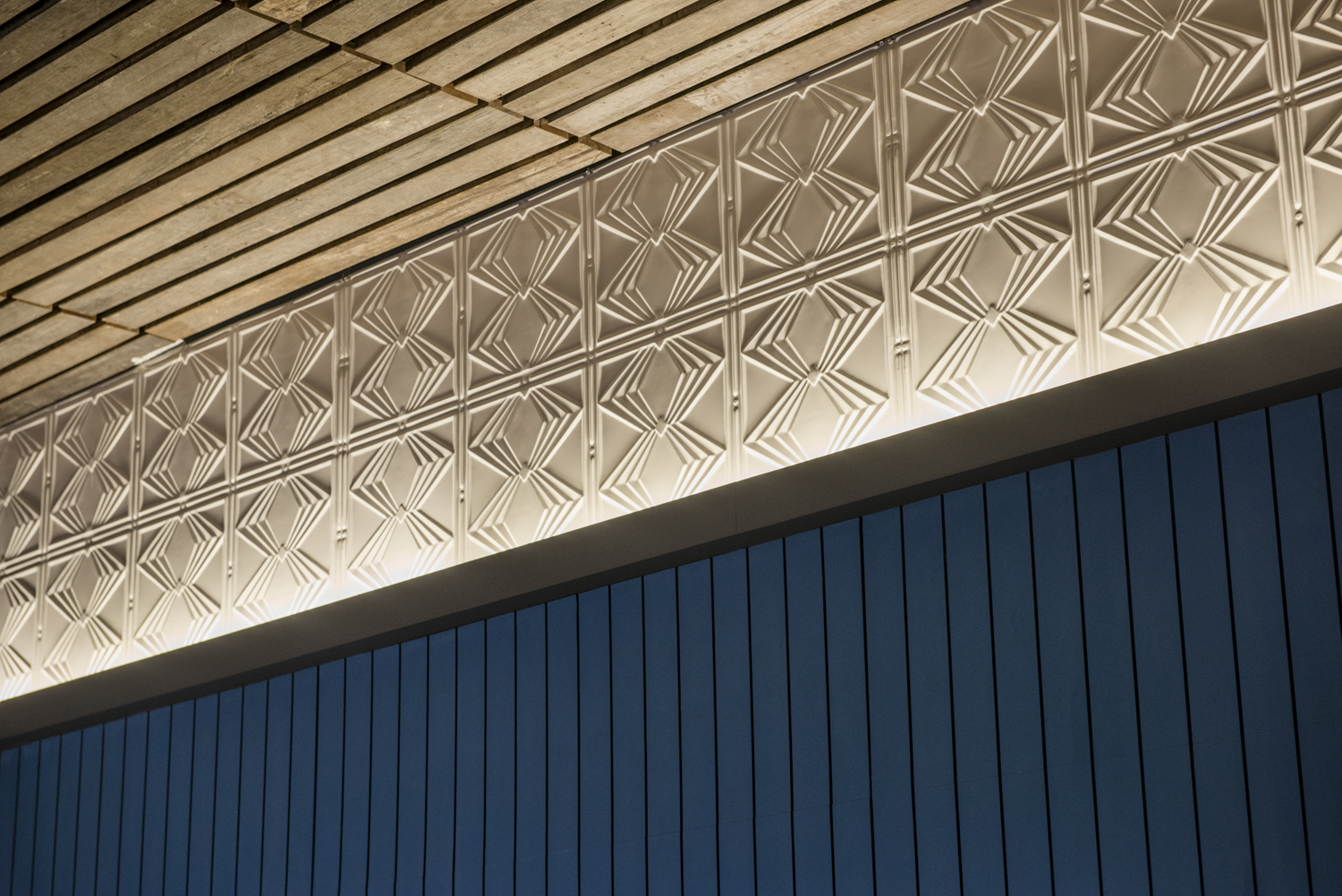
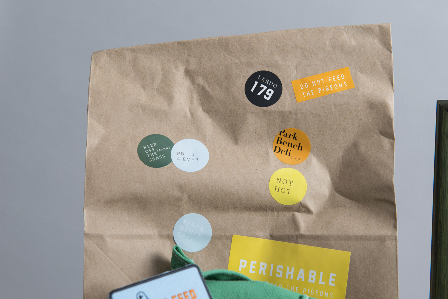
It is a visually and conceptually interesting piece of work, big on ornament, texture and detail, with an indoor/outdoor big city duality in concept, split between interior design and brand identity. Where interior leans on the more earthy and the reclaimed, capturing some of the current interior design trends of high-end big city deli’s, visual identity draws on the scruffier more urban qualities of communal parks in its use of brightly coloured and irregular stickers, choice of language, image and mix of type.
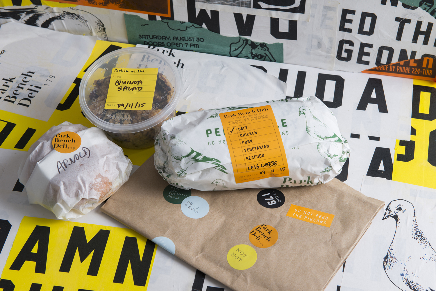
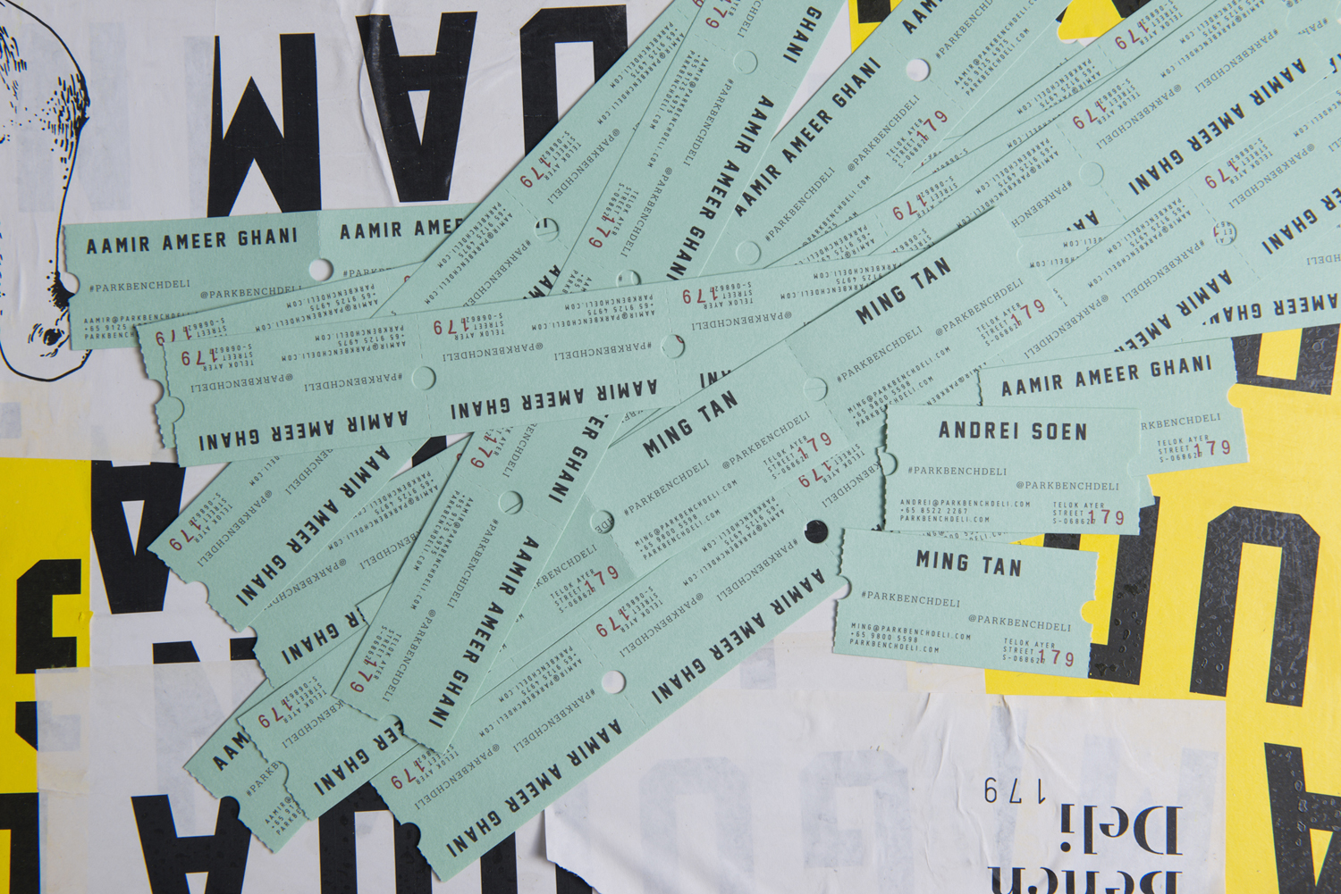
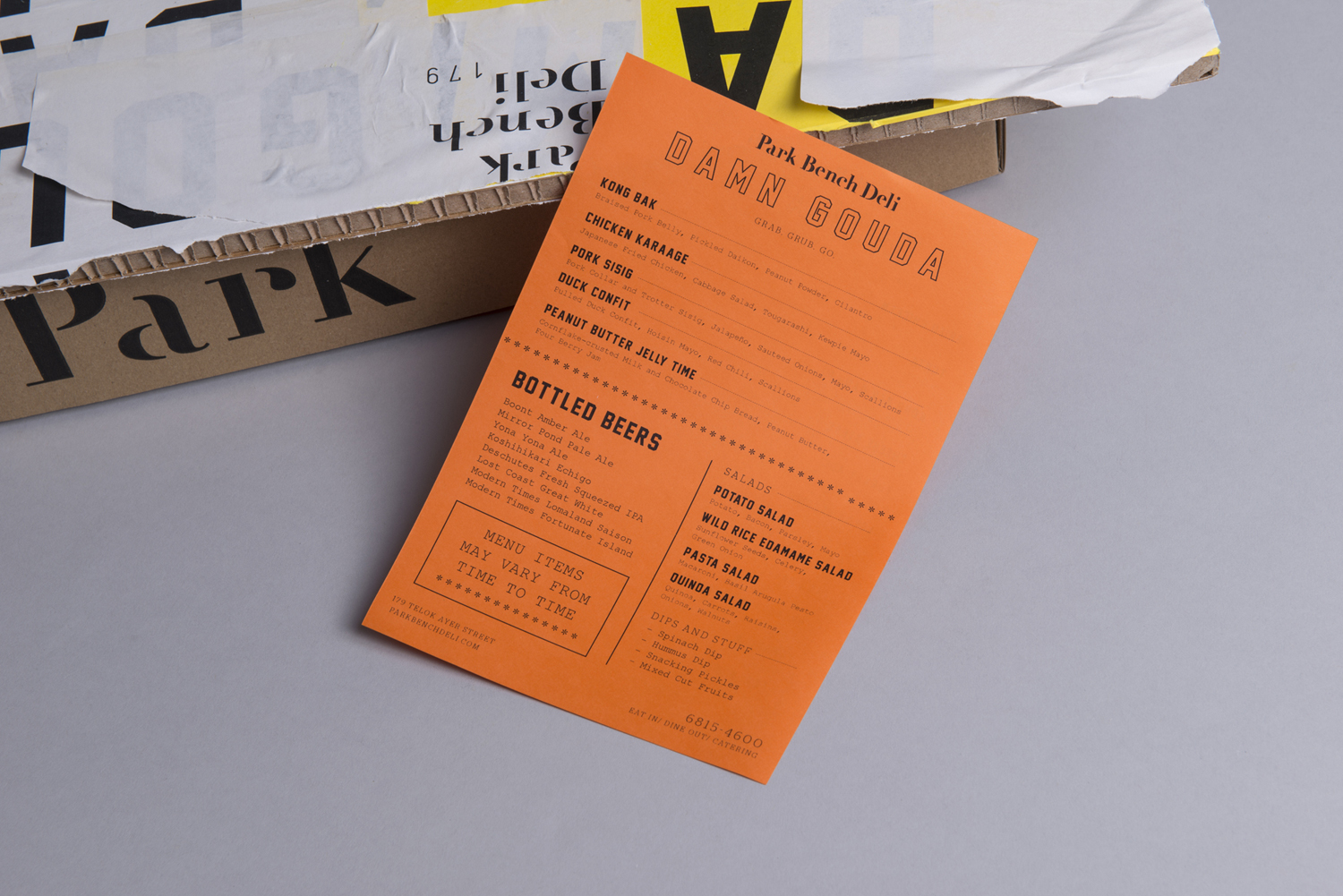
Visual identity plays with the aesthetics of discarded ticket stubs, fly-postering, by-law notices, show flyers and the political stickers that often punctuate, with bright colour, the grey concrete and worn park bench wood of the urban environment. This does, however, deviate slightly with trail patches and illustrations of bears that, although perhaps park-based and with an American flavour, are more rural in their references.
The way the project has been shot, emphasising urban decay through backdrops of layered posters, confuses and distracts from the nature of the work, making it appear more chaotic. If some of the backgrounds were removed, and given the context of the interior, assets begin to feel more balanced.
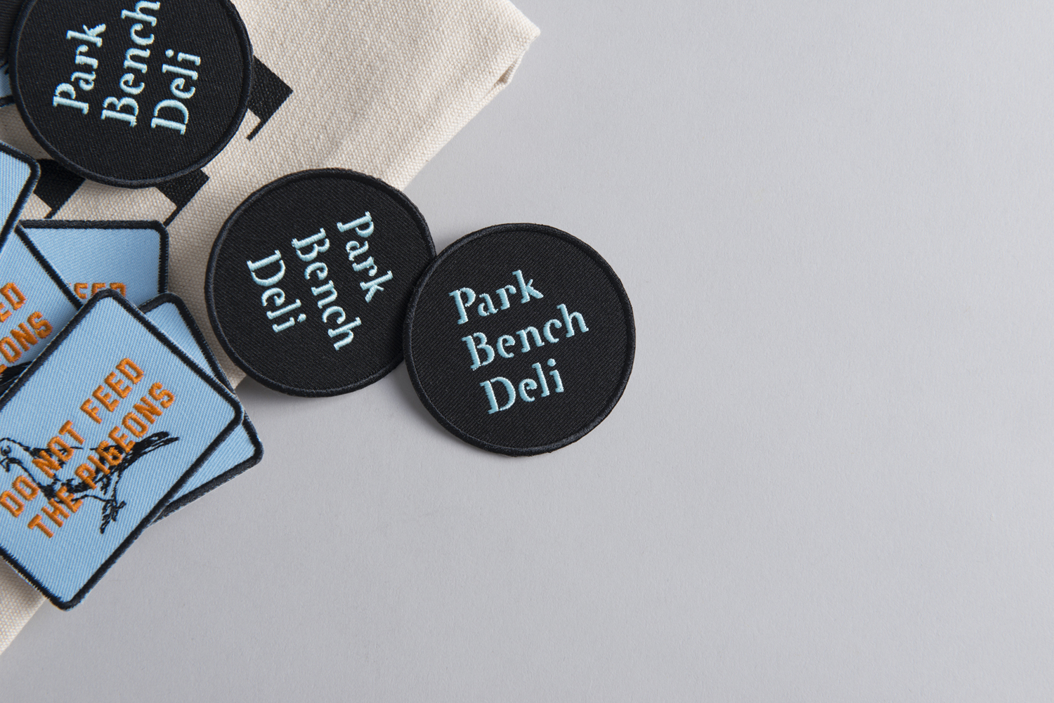
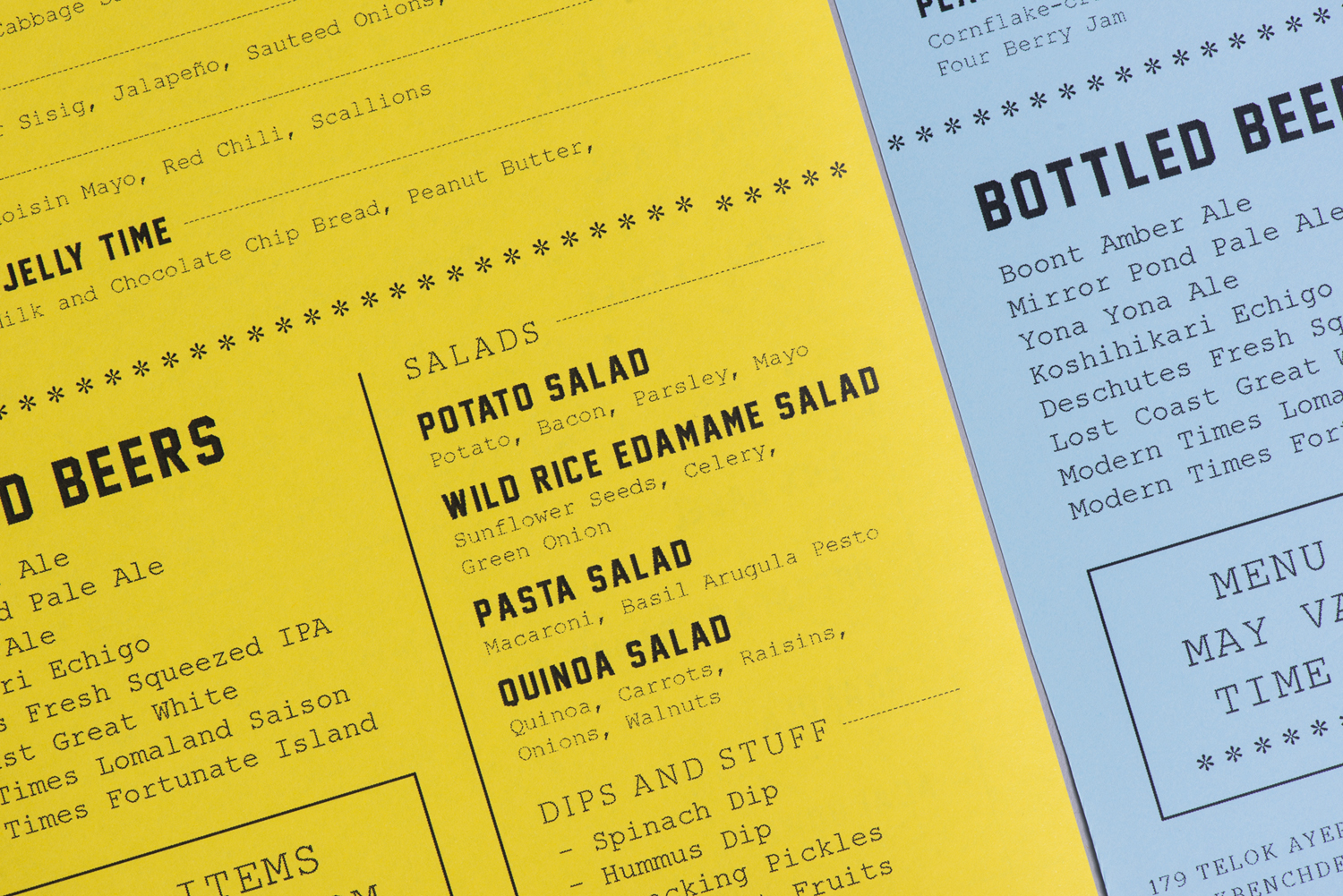
The choice of type again plays with the tension between the polished and reclaimed interior design and the more utilitarian outdoor world and its chaotic communication. This can be seen in the current qualities of a slab serif wordmark with cuts, and the louder and more direct quality of condensed and uppercase sans-serifs.
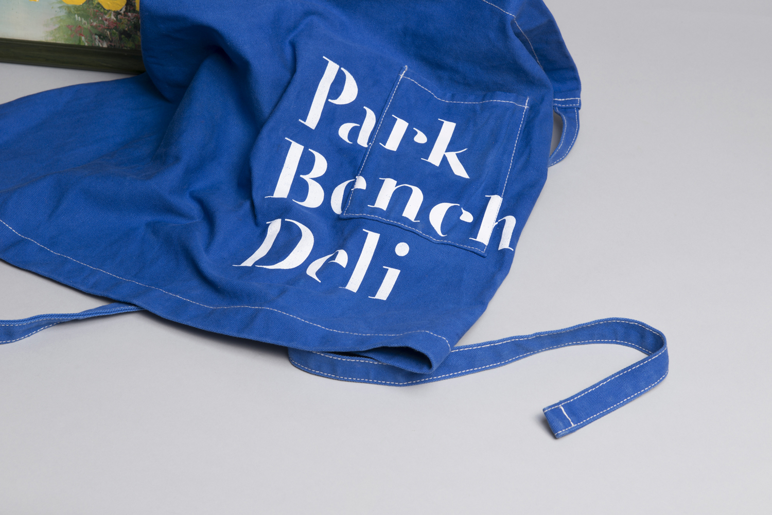
Type occasionally appears a touch haphazard but draws on the less organised communication that proliferates cities. There are some nice layouts, particularly in menus that have a discarded show-flyer structure and typesetting, which continues in the use the ticket stubs. The pigeons are perhaps in opposition to good quality food but there is plenty of personality in their use alongside stickers, and clearly tied to the urban environment. More from Foreign Policy on BP&O.
Design: Foreign Policy. Opinion: Richard Baird. Fonts Used: Courier New, Stag Stencil, Jersey M54 & Miso.
