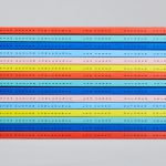
Galerija Kranjčar by Bunch
Opinion by Richard Baird Posted 16 February 2017

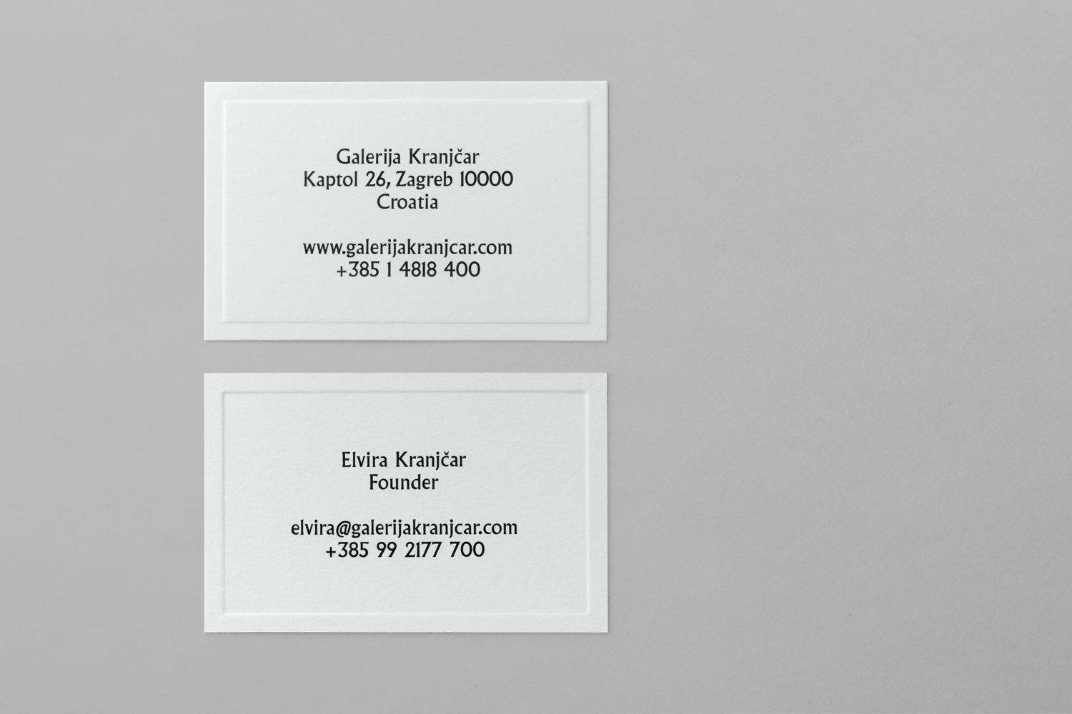
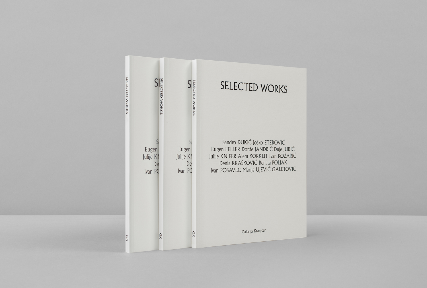
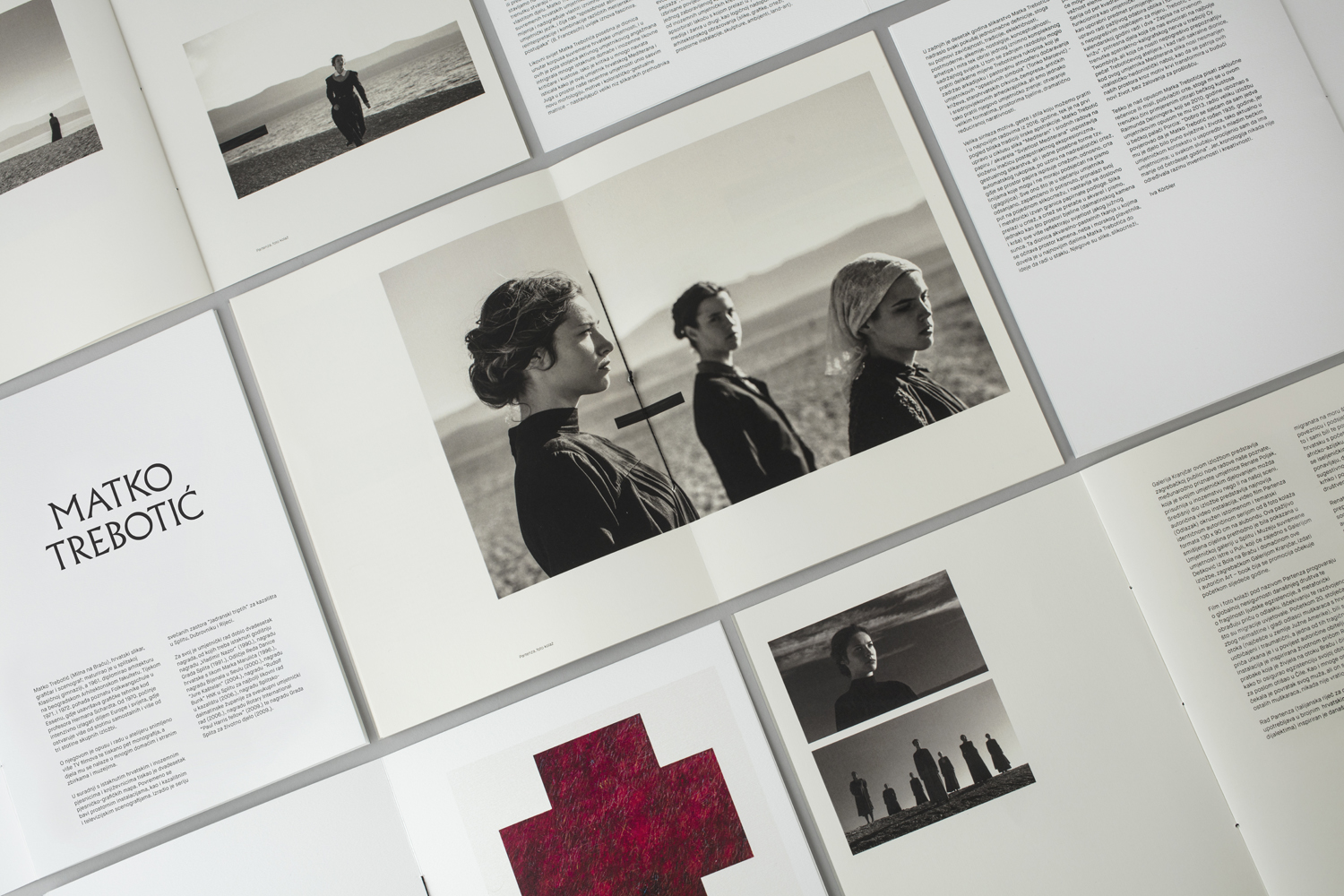
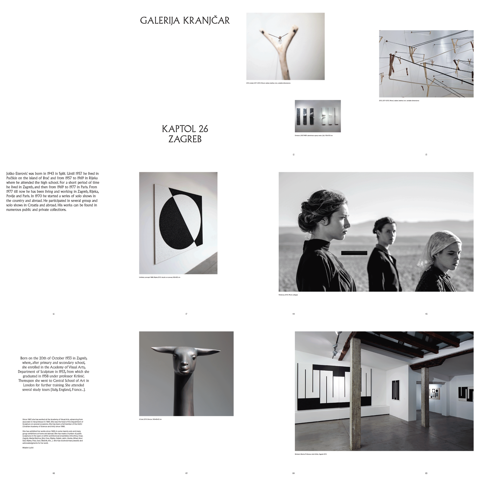
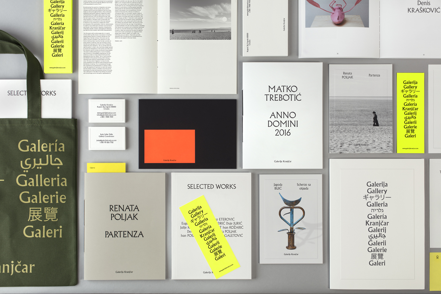
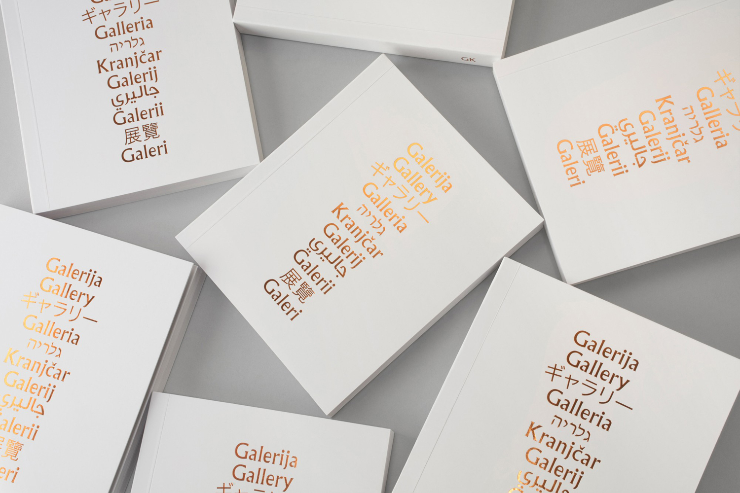
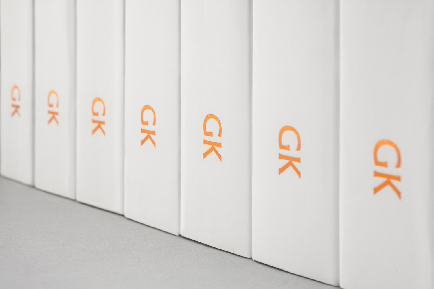
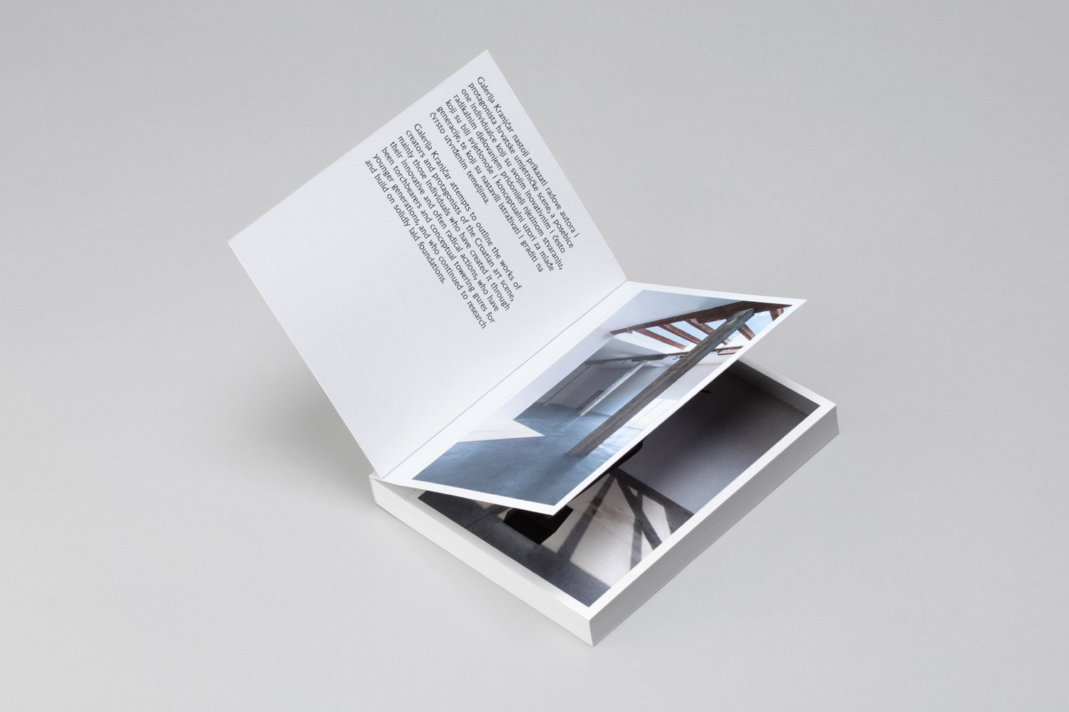
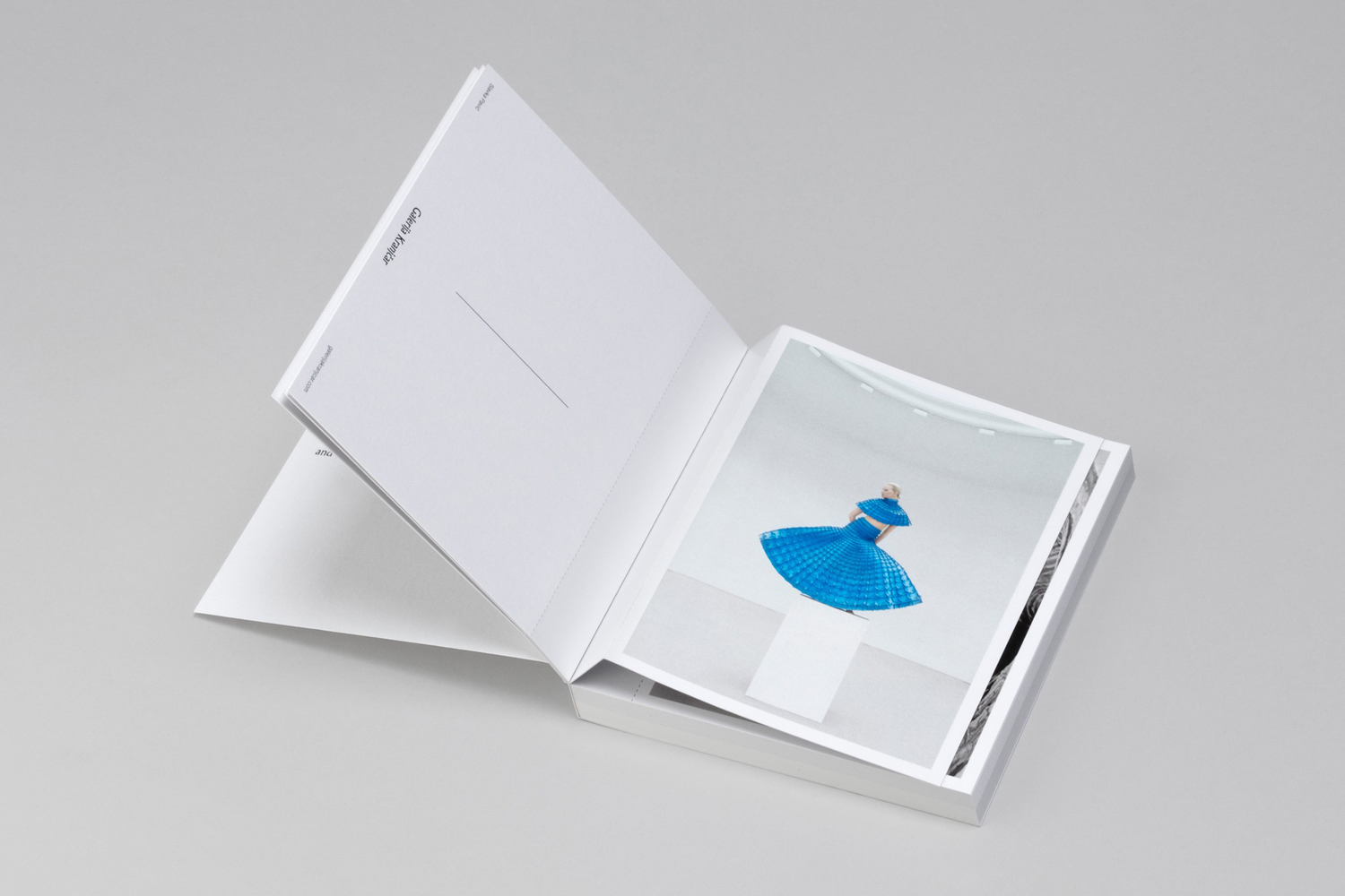
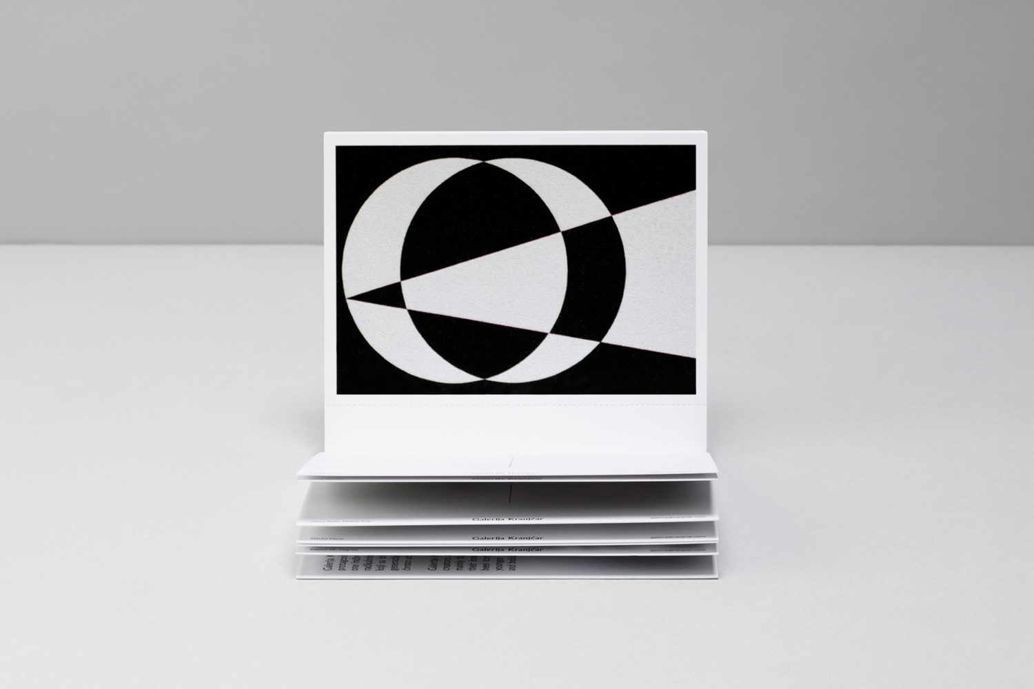
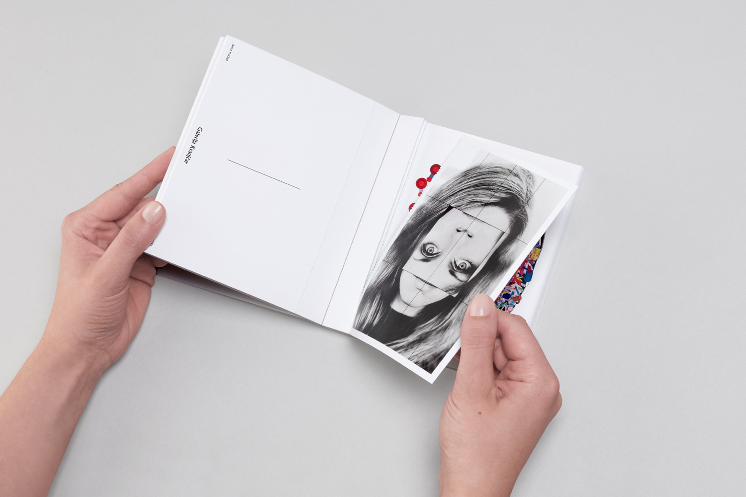
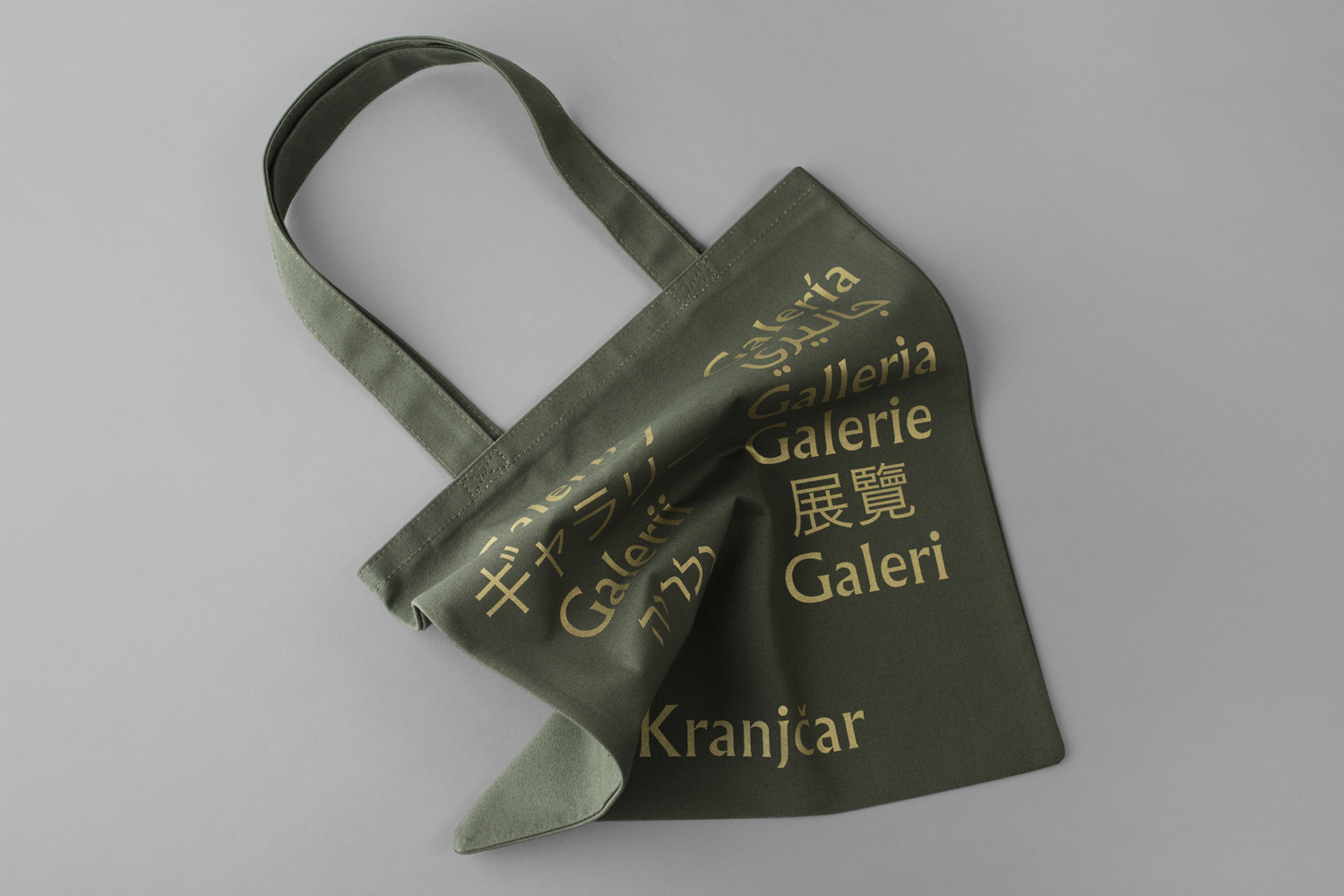
Galerija Kranjčar is an art gallery, located at the heart of Zagreb, opened in 2006 to showcase the work of Croatian contemporary artists and function as hub for a variety of cultural activities. The gallery is a long and unique space, one that balances the modern and historic. This can be seen in the meeting of smooth white walls, concrete floor and pillars alongside exposed room-length solid wood beams. Legacy, space and a diversity of artwork is reflected within the gallery’s brand identity, developed by Bunch, in the choice of type, which links stationery, business cards, print communication, brochures, tote bags and soon to launch website, and in the use of colour, paper choice and print finish.
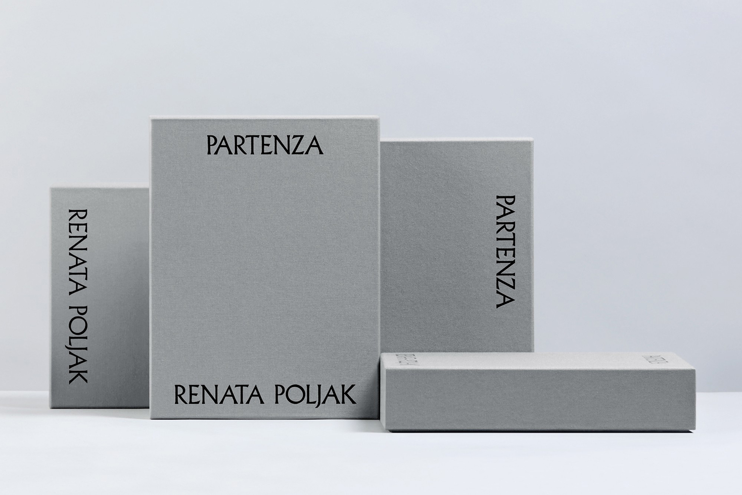
This post was updated in 2018 with a look at Bunch’s continued work for Galerija Kranjčar which included limited edition package design for Partenza, the video component of Renata Poljak’s installation at the gallery. Poljak’s work explores the global insecurities of contemporary society and the fragility of human existence. This is presented as projection, photo collages and production photographs inside the gallery, and outside through two laser-engraved USB keys, packaged within a custom box and alongside a certificate of authenticity.
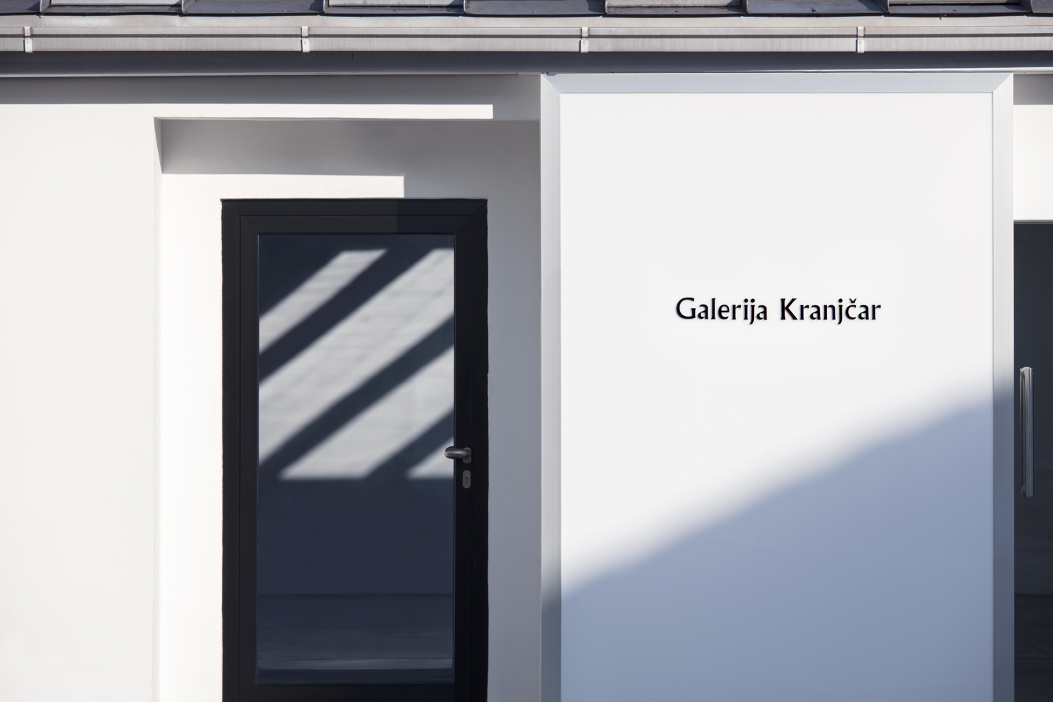
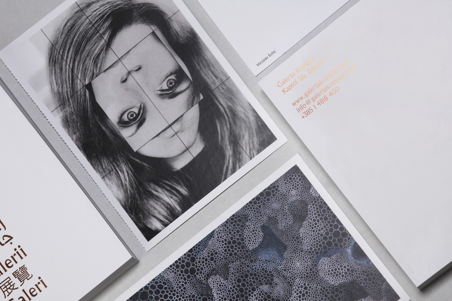
Bunch’s work for Galerija Kranjčar is an interesting mix of modern art gallery conventions and an element of the unexpected. Plenty of white space, black text and a framing device work well to leverage the familiar, reassuring and universal for international visitors, while the choice of Albertus, a font designed by Berthold Wolpe for Monotype between 1932 and 1940, subvert the expectations of the neutral and current in favour of character, craft and a sense of legacy. This feels well-suited to a gallery dedicated to and invested in long-term support of the art, craft and cultural activities of the country.
Although type leans heavily into craft and legacy, a modern and considered use of space, the approach to layout and fluorescent colour offers a communicative counterpoint and aesthetic balance. Together, these act as neat bookends for artwork that goes from the reductive and austere to the visually and materially detailed and expressive.
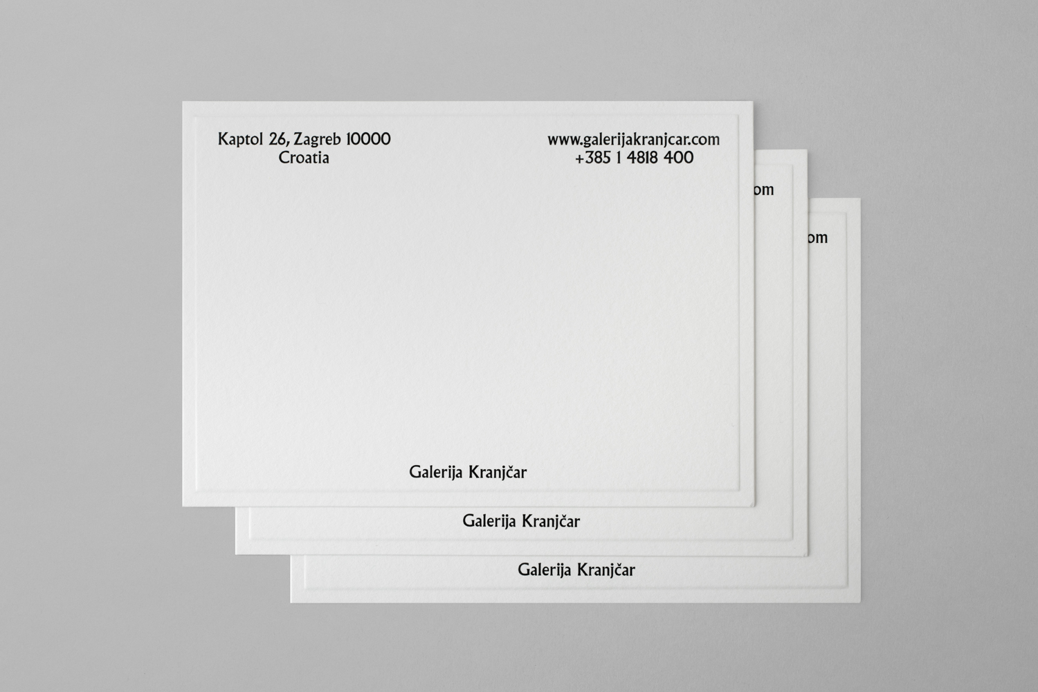
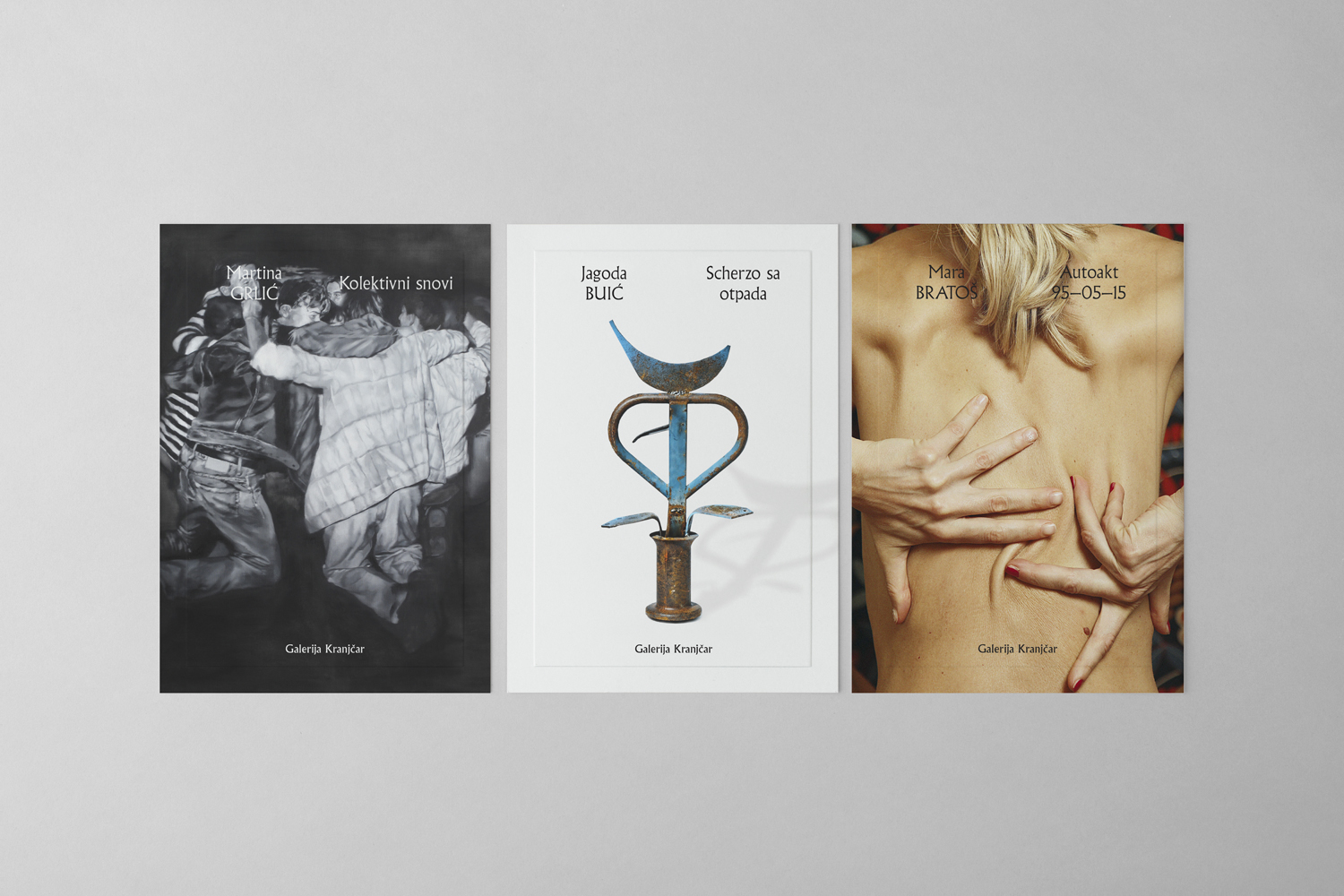
The framing device, a frequent tool of gallery brand identity programmes, is neat in its use of a blind emboss, framing space through highlight and shadow rather than ink. It is a small detail, but one that manages to draw something new from a familiar concept. This also works well to inject an element of identity into full bleed images without distracting from their content.
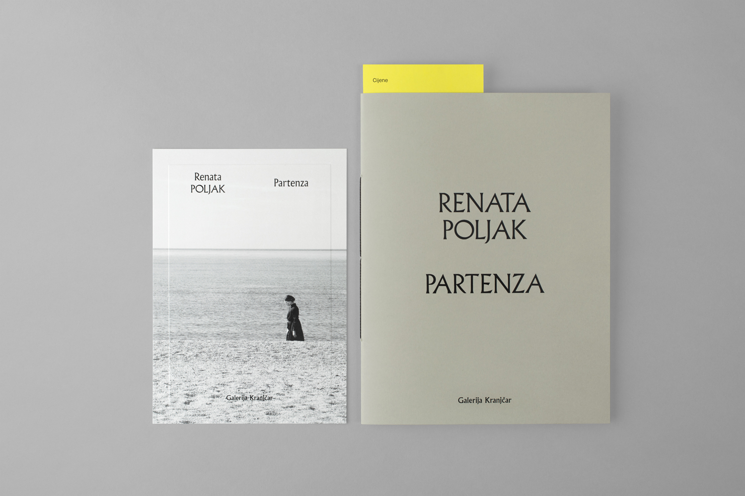
The period carved wood qualities of type and the gallery neutrality of white space and black ink are emphasised by the modernity and impact of Vibrant Arsenic from G.F Smith which intersects the white of brochure. Much like the framing device, it is a small detail, but one that works in the unexpected and memorable, and is grounded in the contemporary nature of the gallery.
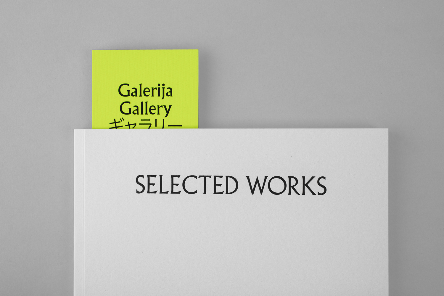
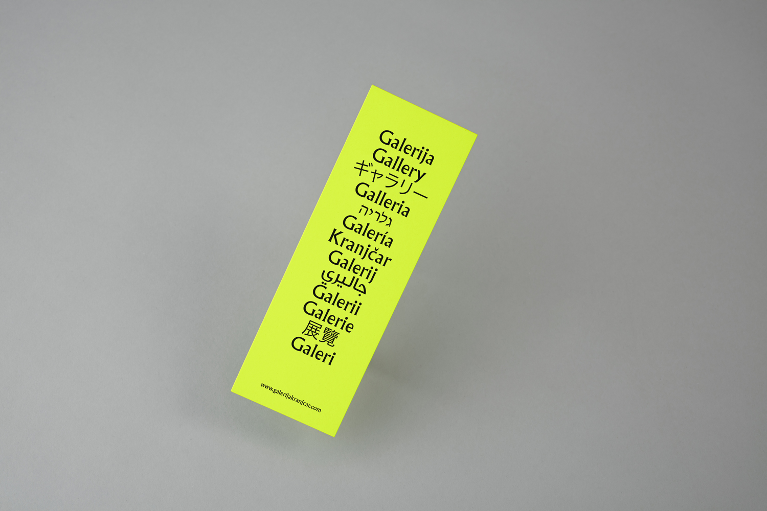
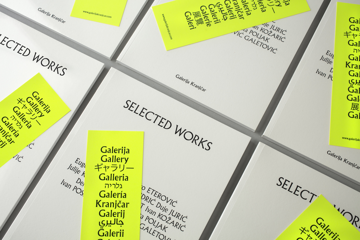
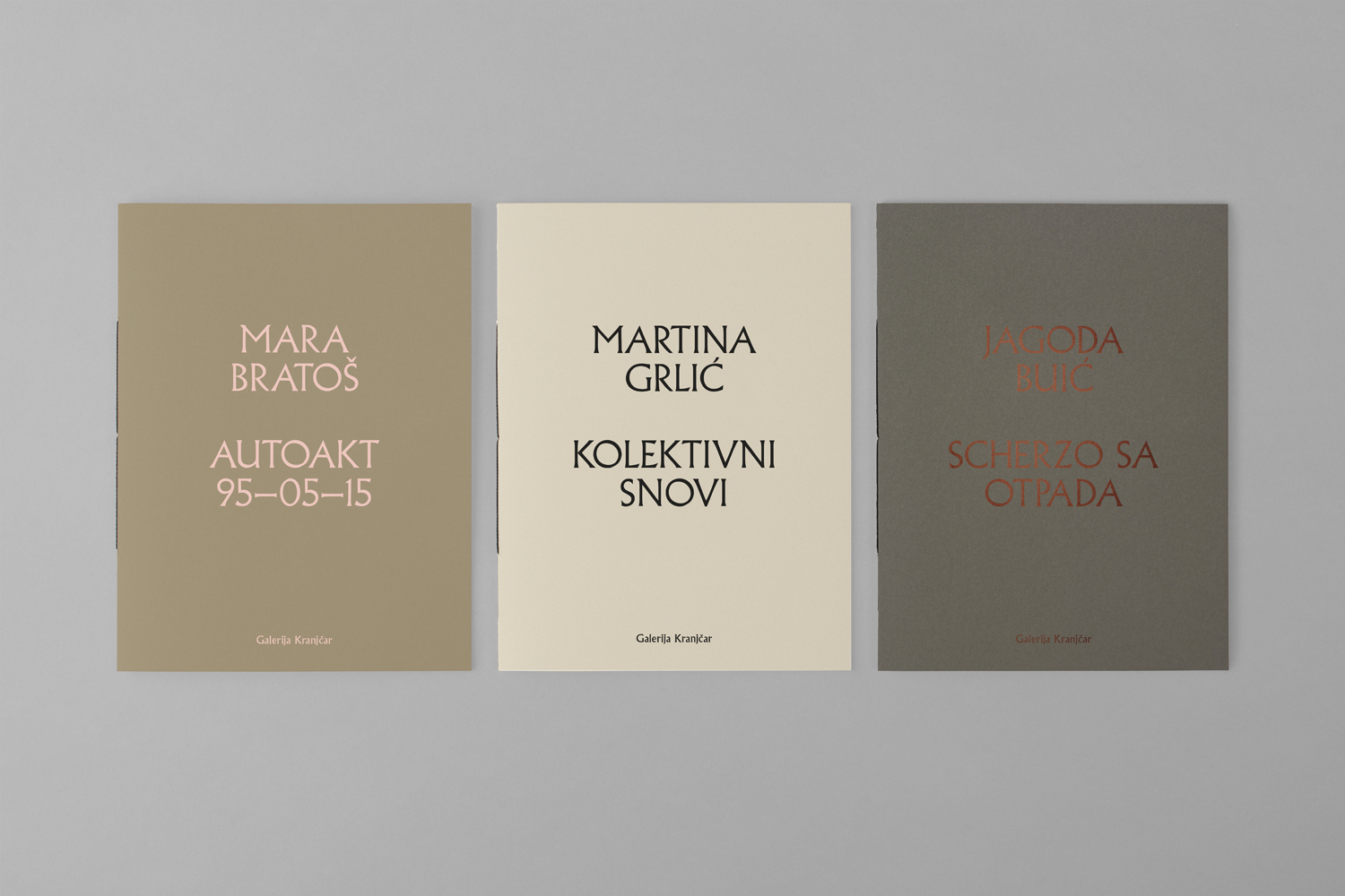
A sense of legacy, established by type, continues through to layout and typesetting which moves between the more retrospective centre-aligned and a modern framing of image, and in the use colour across further printed assets; the white of gallery brochure and neon of bookmark, and the more earthy and traditional colour of individual exhibition brochures and their block foiling. Much like type and its implementation, papers and print finish frame through polarity, a diversity of work, and brings a bit more visual breath to identity, while the idiosyncratic qualities of type successfully hold these all together. More work by Bunch on BP&O.
Design: Bunch. Opinion: Richard Baird. Fonts Used: Albertus.
Material Specifications.
Stationery: Fedrigoni Old Mill Bianco (300 gsm) offset print and emboss frame.
Exhibition brochures: A selection from Arjowiggins Pop’set range (240 gsm) screenprint, digital print and foiling.
Bookmark: Colorplan Vibrant Arsenic (430 gsm), digital print.
Tote bag: Cotton canvas (450 gsm) gold print.

Partenza by Renata Poljak
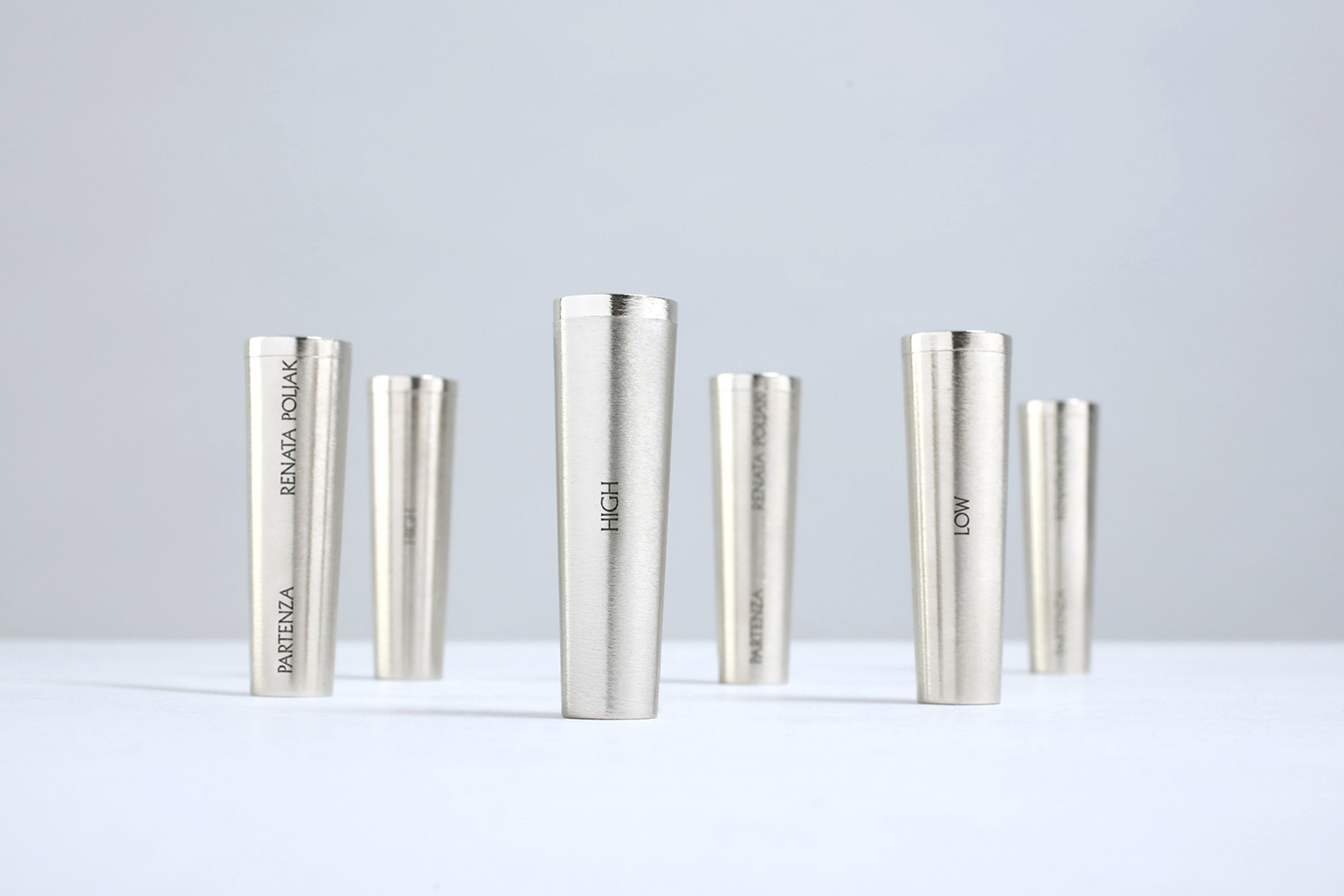
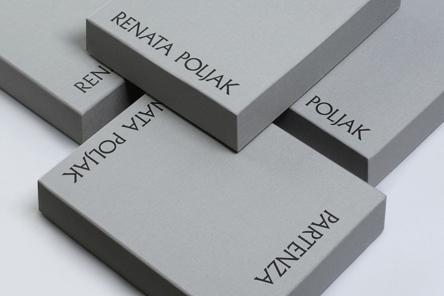
Bunch also worked with Galerija Kranjcar to create limited edition packaging for the video component of the installation Partenza by Renata Poljak, an artist represented by the gallery. Through Partenza the artist explores the global insecurities of contemporary society and the fragility of human existence. This is presented inside the gallery as a mix of video projection, photo collages and production photography, and outside of the gallery in the form of two laser-engraved USB keys, packaged within a custom box and certificate of authenticity.
Bunch bring a material value to a digital artefact through size, structure and the proportionality of the box to USB keys, and forge a connection to the gallery in the intersection of the graphic and the surface, and the type and blind embossed frame of the certificate. There is also an interesting play with an associated preciousness in the custom design, volume, padding and robustness of box.
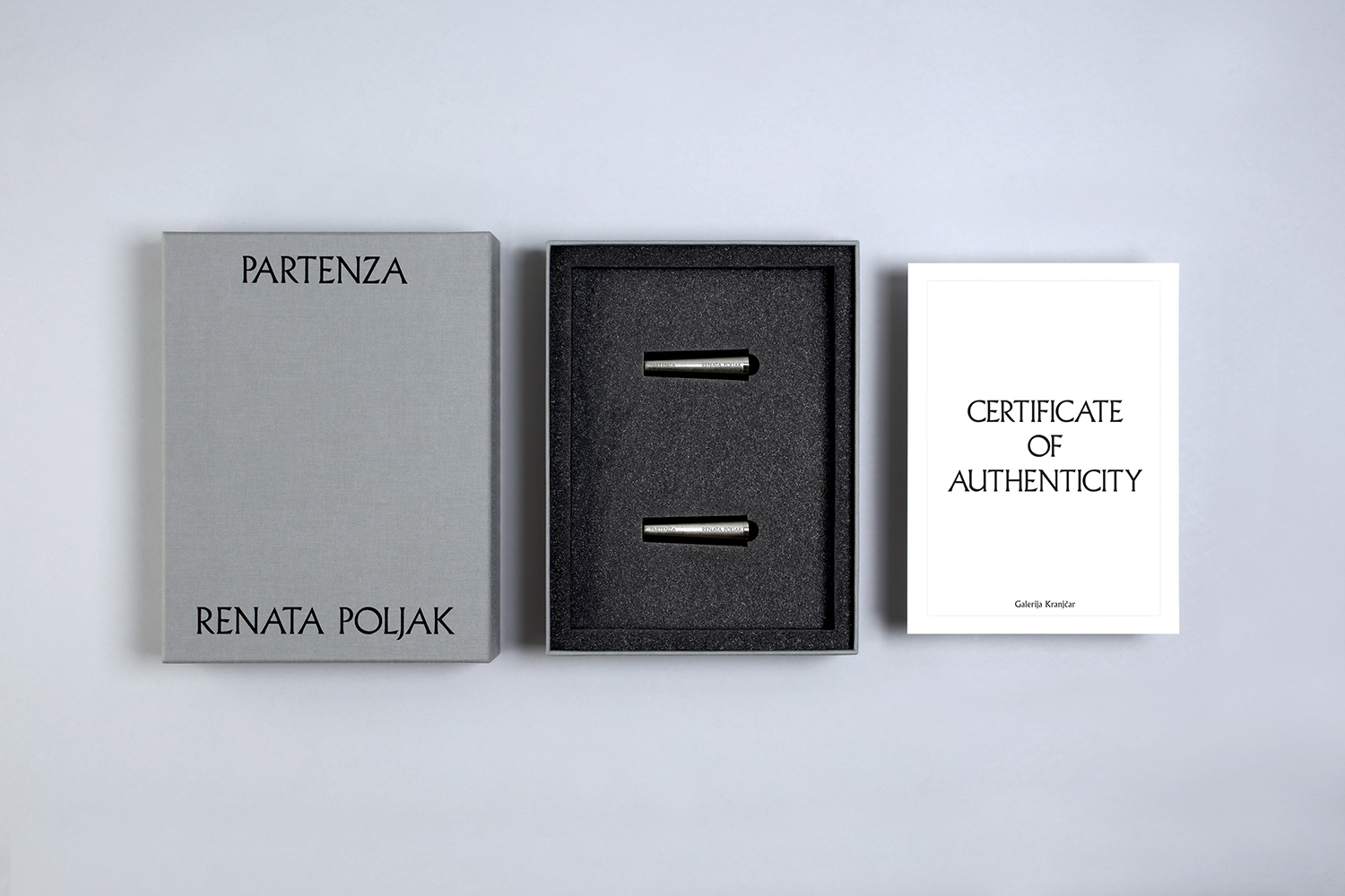
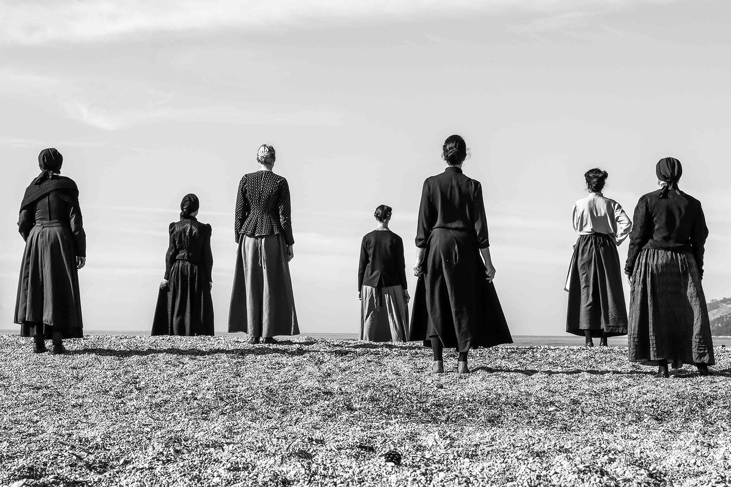
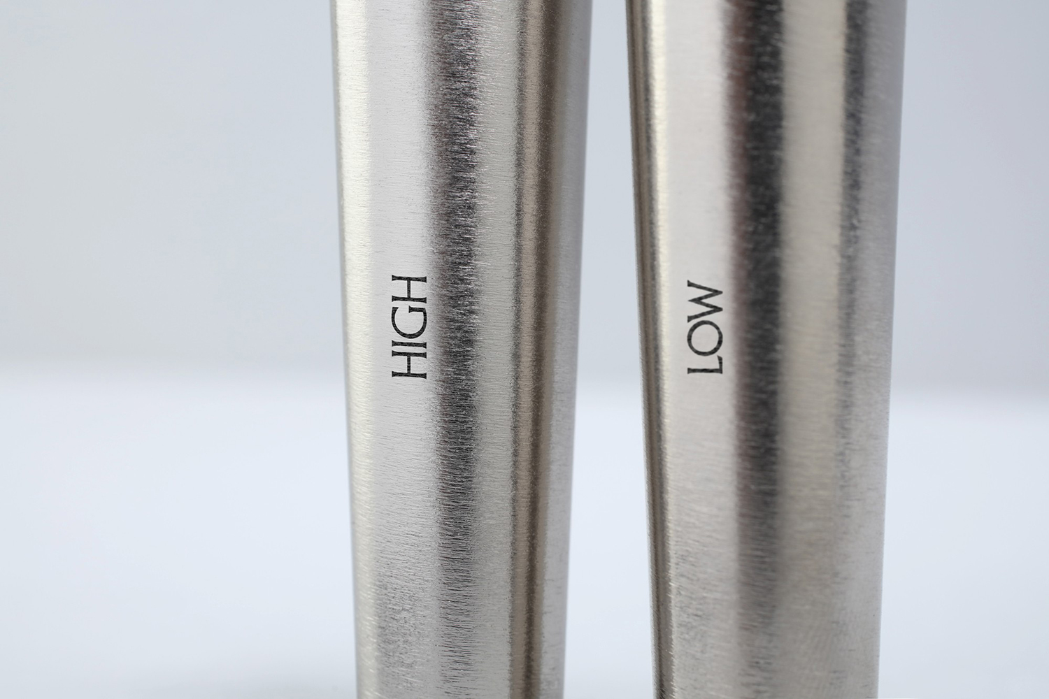
The choice of USB key is a particular highlight. Its tapered cylindrical shape and metal body, designed by Constance Guisset, calls to mind, initially, the figures of the artwork—a connection made more explicit in the way Bunch have documented the keys (below)—and secondarily, ancient urns in form or a time capsule in industrial-strength material. Both of these would be thoughtful and contextually relevant considerations within the context of the work stored.
This meeting of past and present is evident in the gallery’s typeface Albertus and its laser engraving on to a digital device. The video explores a sensitive and pressing issue, and the form, material and colour language of packaging acknowledges and reflects this by maintaining a graphic simplicity alongside moments of design craft and conceptual thinking.
