Sant Francesc by Mucho
Opinion by Richard Baird Posted 2 March 2017

Sant Francesc is a 5-star hotel located in the Placa Sant Francesc, beside the Church of the Templarios, within the city of Palma on the Spanish island of Mallorca. The hotel is set inside the walls of a restored historical landmark built in a neoclassical style during the 19th century and has 42 rooms and suites. Some of these rooms include wood-beamed ceilings, original frescos and moldings but also feature modern renovation, furnishings and interior design.
Drawing on the symbol of the Templarios, and taking inspiration from the colours and textures of the island, design studio Mucho developed a brand identity for the hotel that conveys something of its modern urban interior, its history and location. This comes through in type and marque, colour and pattern, and in the variety and combination of materials across brochures, stationery, business cards, menus and signage.
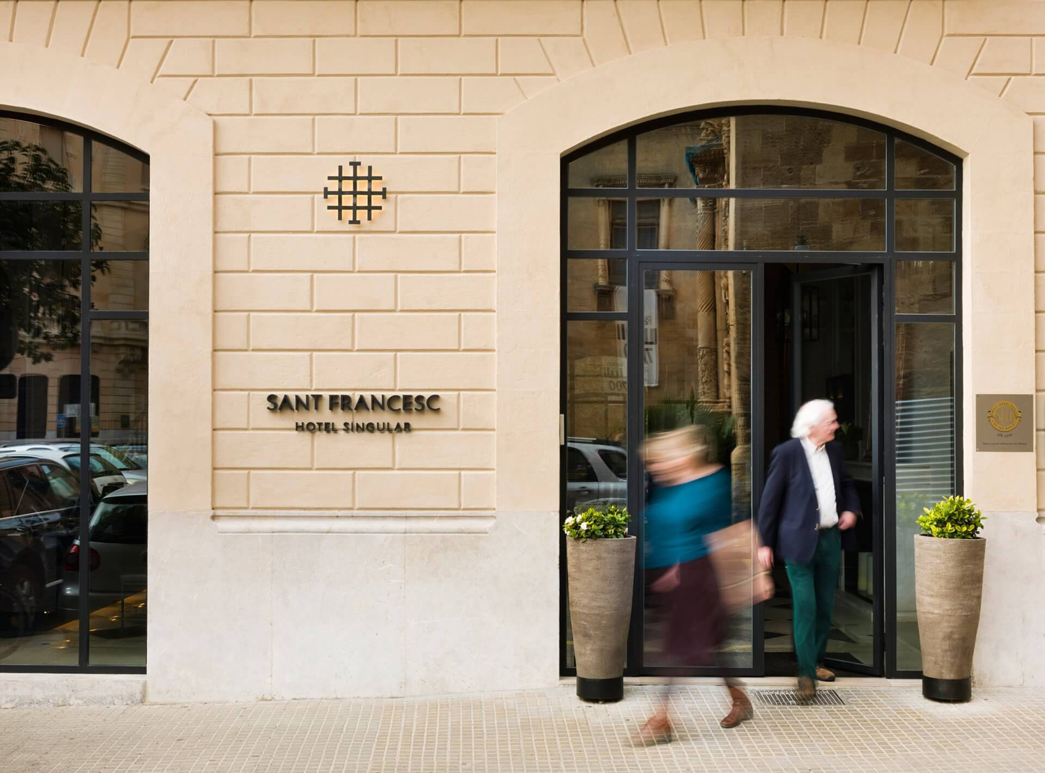
Mucho manage to strike, throughout Sant Francesc’s visual identity, a pleasant balance between the history of the building, its surrounding area (the oldest quarter of the city) and a carefully crafted and contemporary urban hospitality experience.
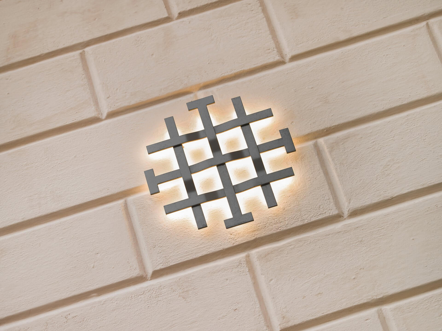
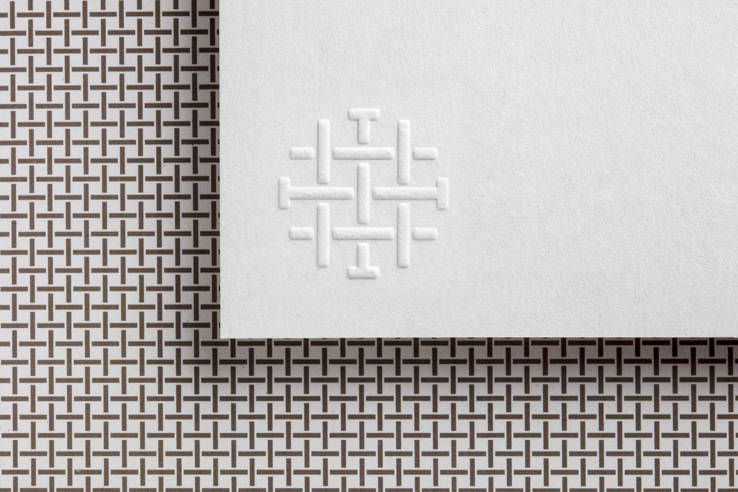
This can be understood initially by a logo modern in its monolinear simplicity, use of space and structure, and its retrospective regional references, and the handcrafted and traditional qualities of logotype, characterised by the small serif flourishes and calligraphic strokes of Linotype’s Brewery.
These form the basis of Sant Francesc’s brand identity, either expanding out into pattern, influencing the construction of image or informing interior design detail in the case of the logo, and the consistent use of Brewery to deliver information consistently across stationery, menus and door hangers.
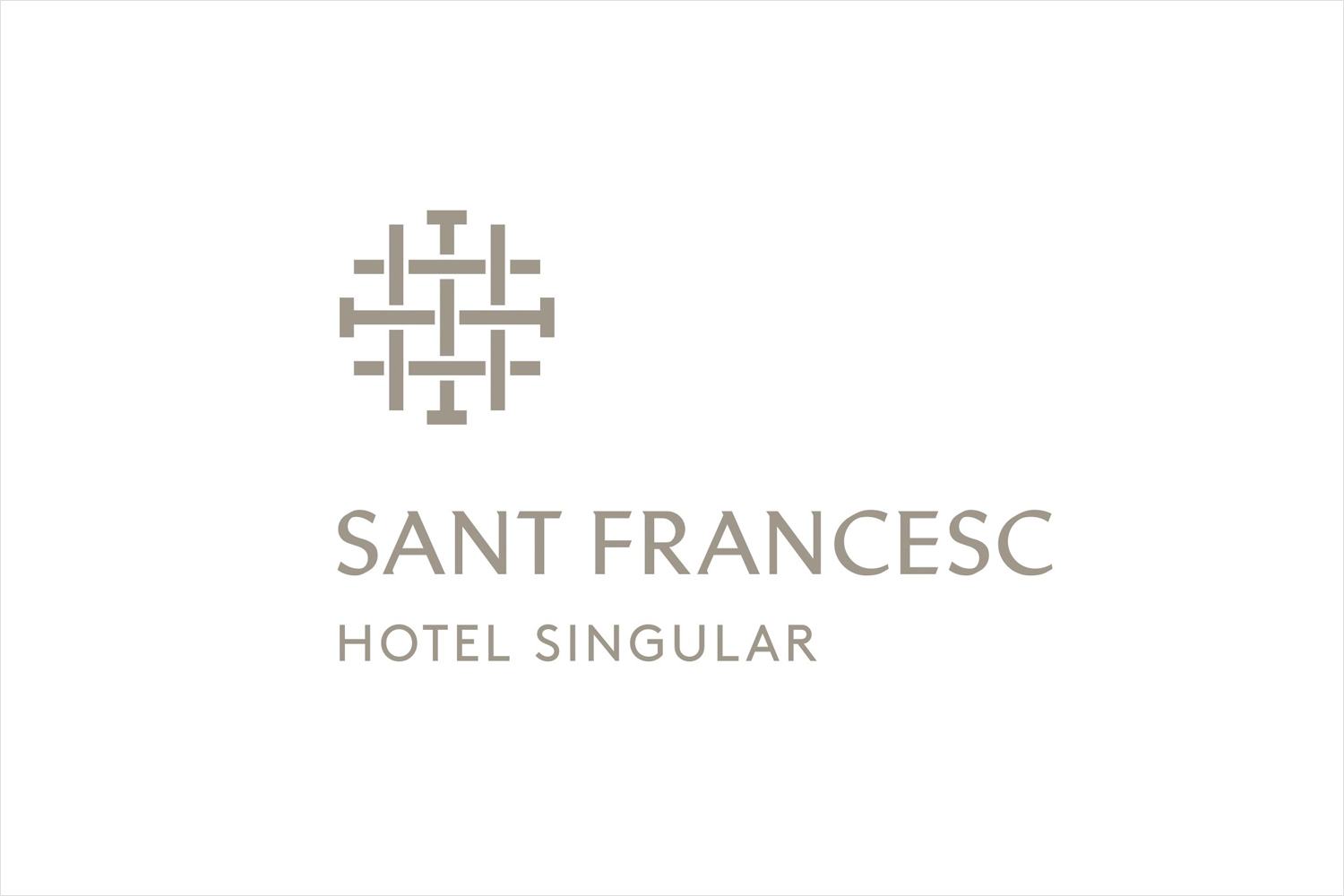
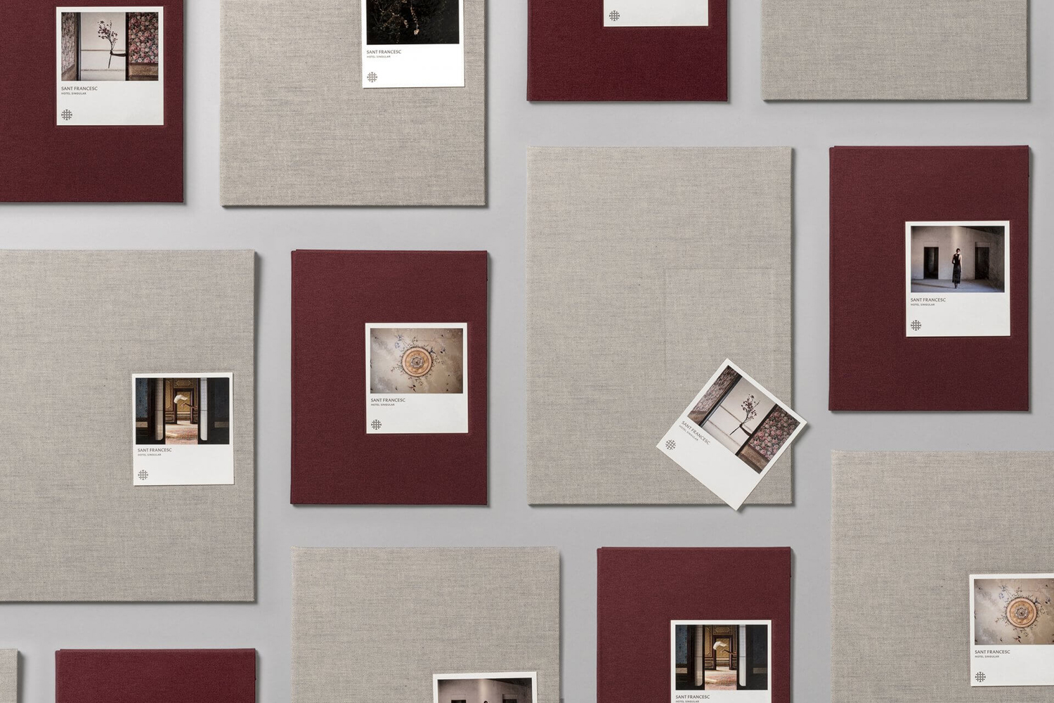
There is a strong material quality to identity, both in its graphic expression—made up of patterns, motifs and logo with a shared woven quality that make a connection between fine textiles expected of a luxury hotel and the metal of historical structures—and in its implementation. This features a variety of papers and boards, wood, fabric, twine, metal and blind embossing. Even colour palette has some material association in its earthy Mediterranean mix of something close to linen, drying clay and red tiles.
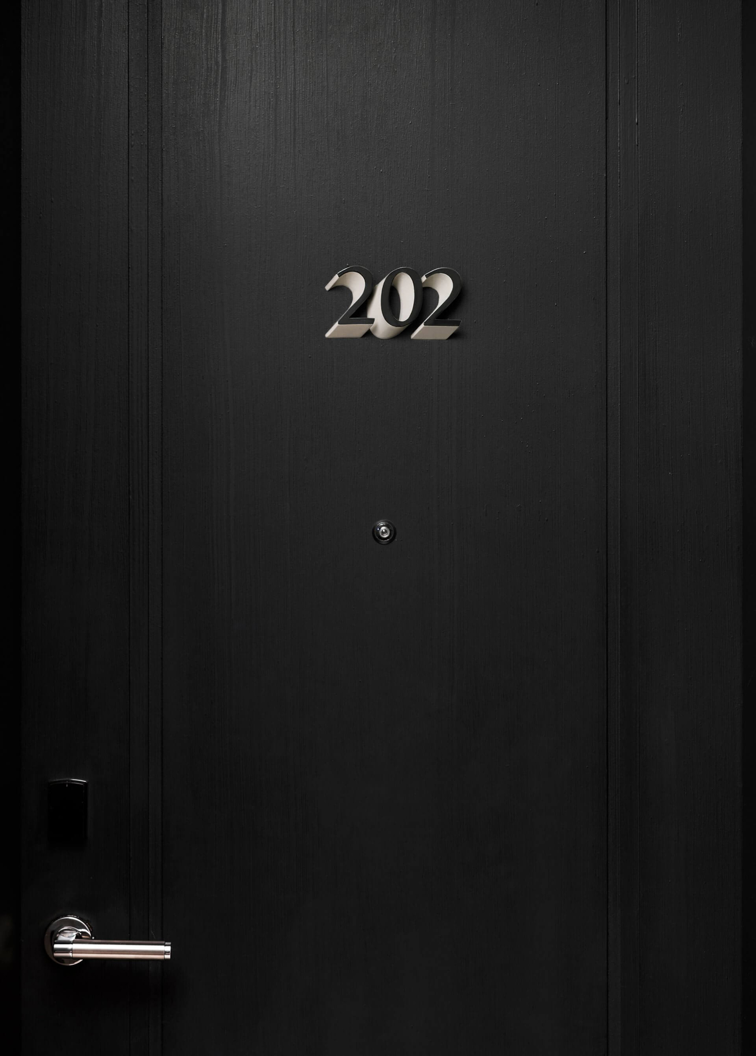
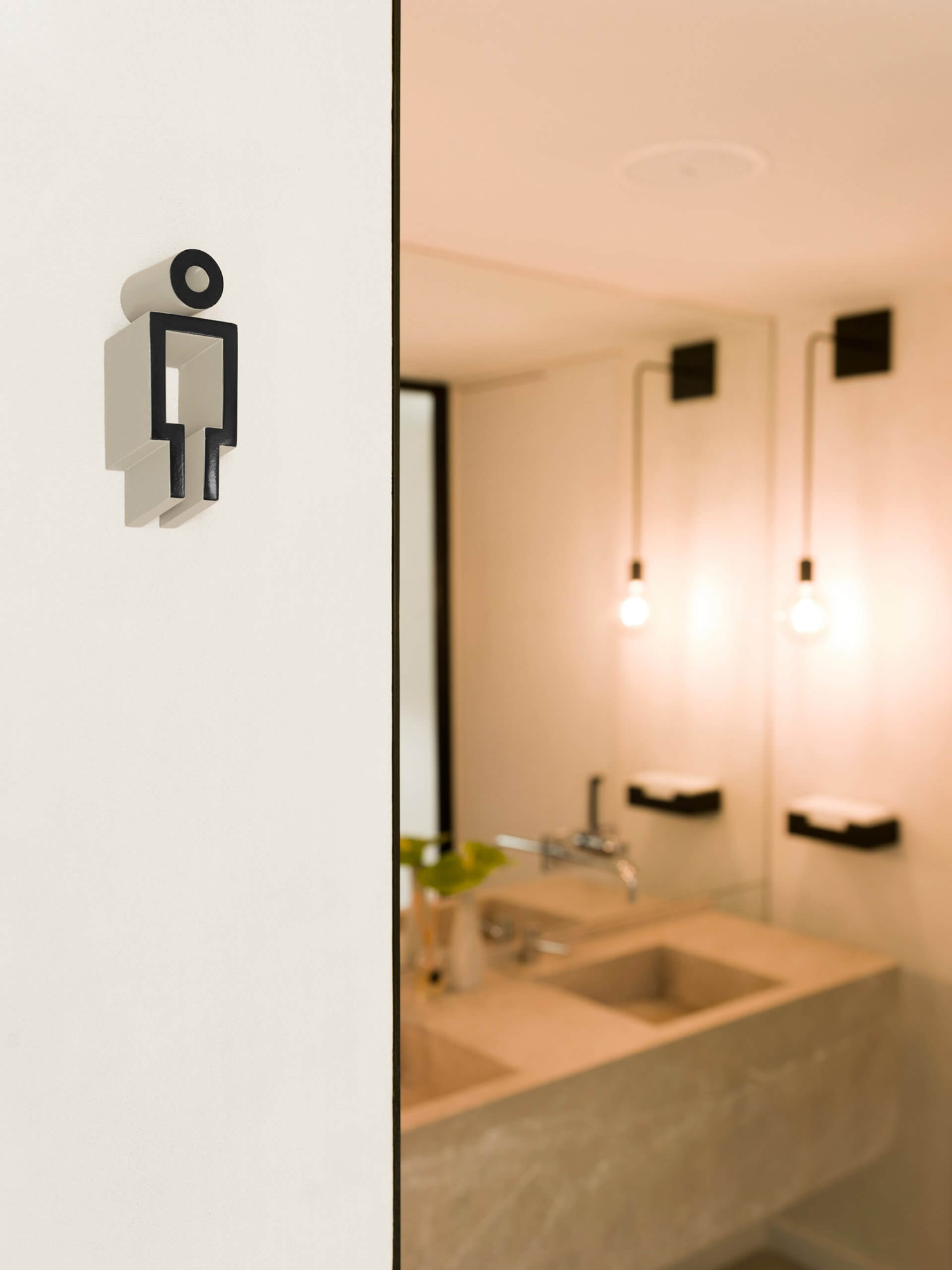
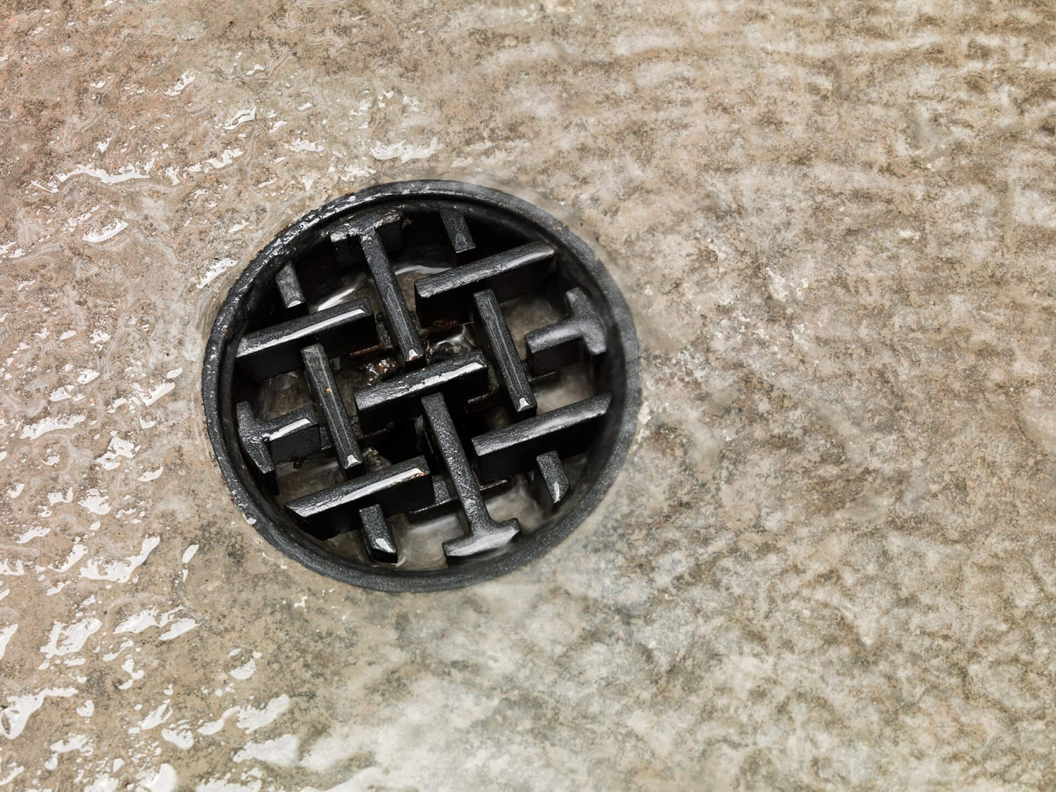
Together, these manage to weave together a sense of historical time and place with a contemporary eye for a distinctive, modern and structured identity system. There are a lot of ideas here that draw on traditional material craft and contemporary graphic design. Particular highlights include the logo cast as a drain cover for sinks, door numbers and WC signs that play with perspective, and photography that draws out interior details and set within fabric covers.
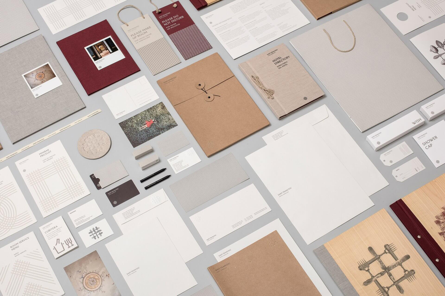
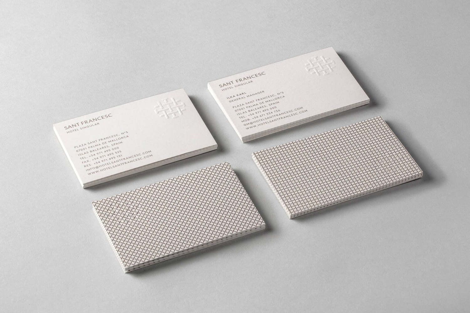
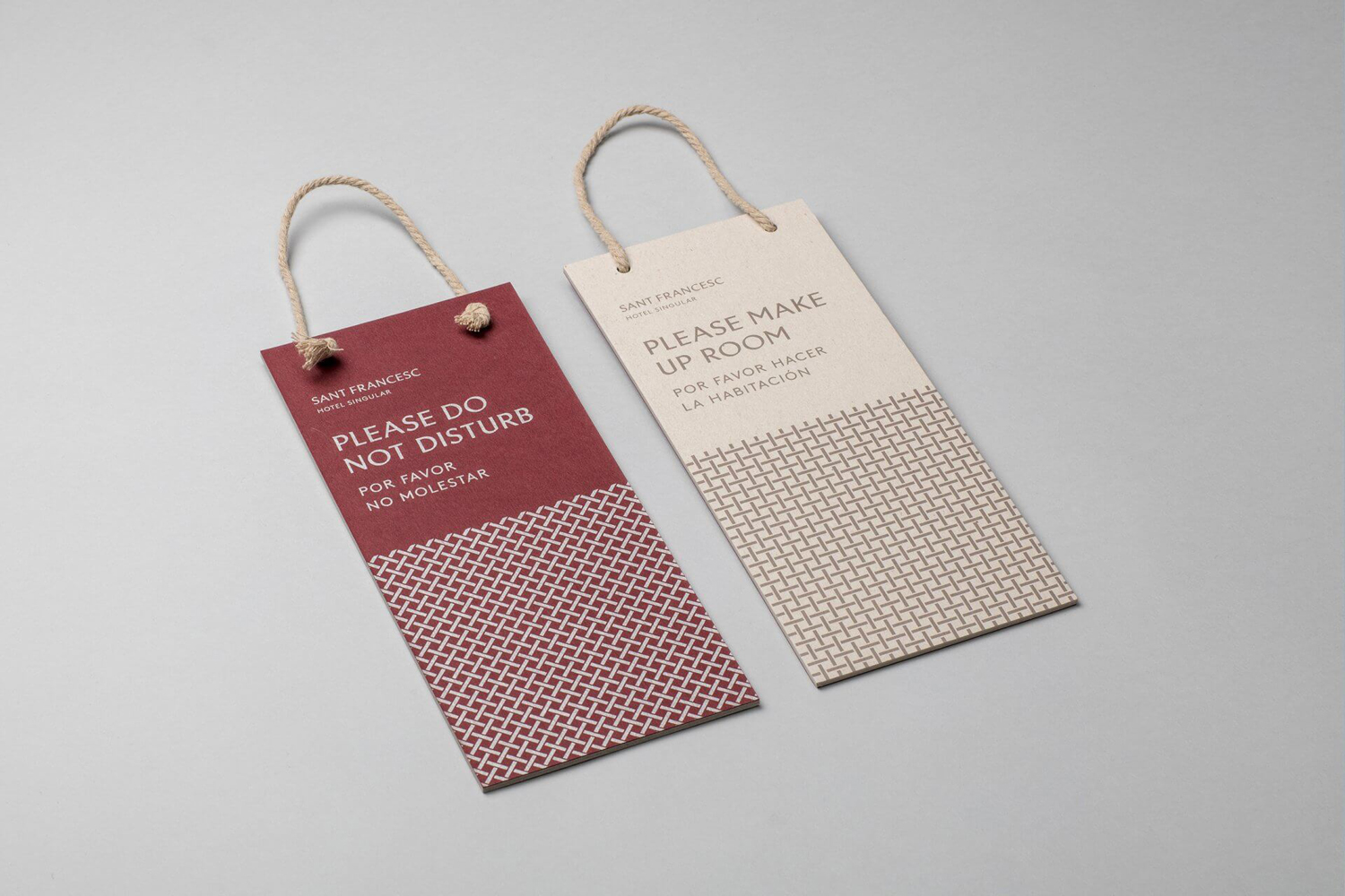
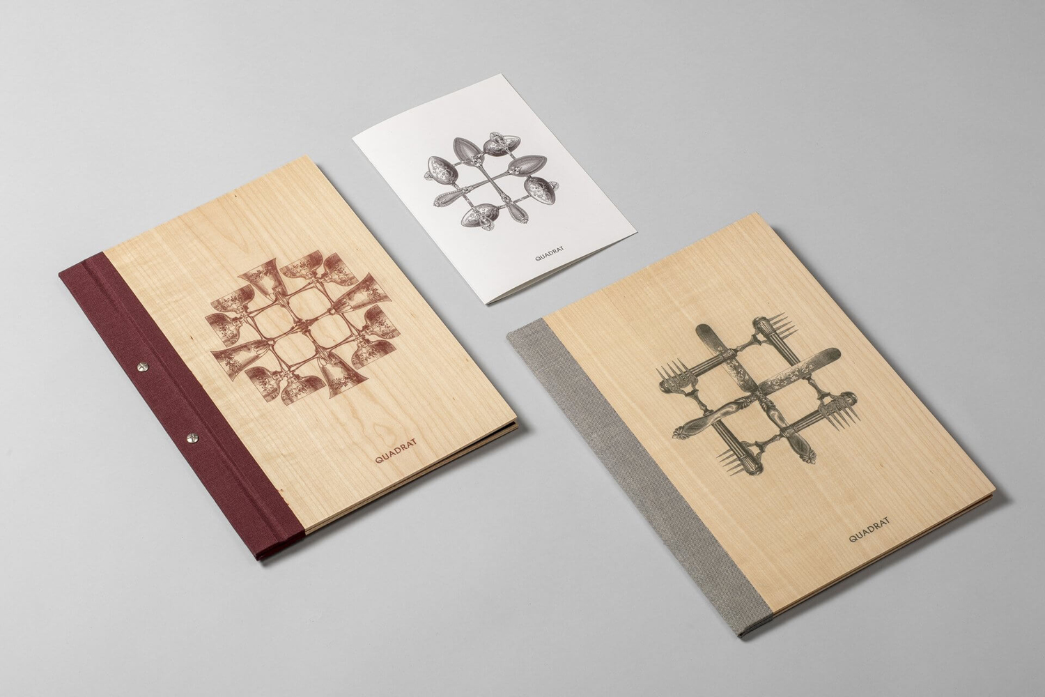
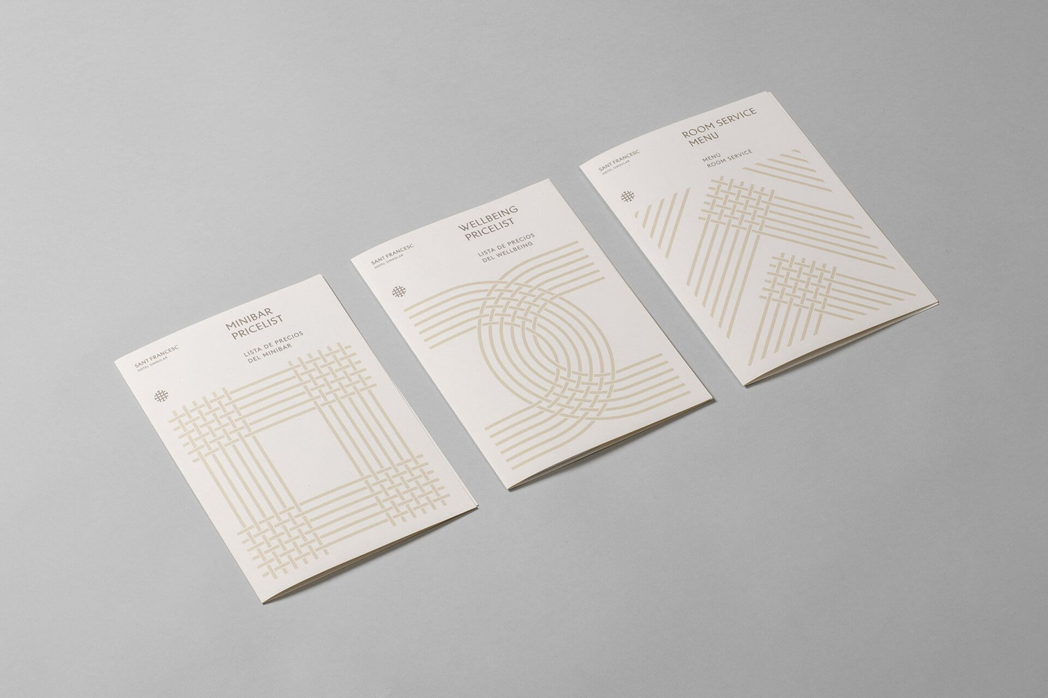
The patterns and motifs, based on logo, move from the decorative to the communicative, with silverware and chalices woven together and used across menu covers, and business cards and door hangers featuring a close up linen quality. Although clearly grounded in concept, it does, occasionally, feel like there are a few too many ideas going on, particularly between the menu covers and the pricelists. Type, pattern and material all have their own subtleties but these larger motifs, while clearly well-done, do not appear as restrained, often simply filling space where material contrast or typographical detail is of interest.
The result is a neat balance of traditional and local material detail and modern graphic expression rooted in hotel experience. There are moments of continuity and contrast, details that both link and differentiate a number of assets. These are is varied and interesting, grounded in some nice ideas that are either clearly and more subtly referential and applied consistently, linking print, signage and interior design. More work by Mucho on BP&O.
Design: Mucho. Opinion: Richard Baird. Fonts Used: Linotype Brewery.
