Filmore by Freytag Anderson
Opinion by Richard Baird Posted 3 April 2017
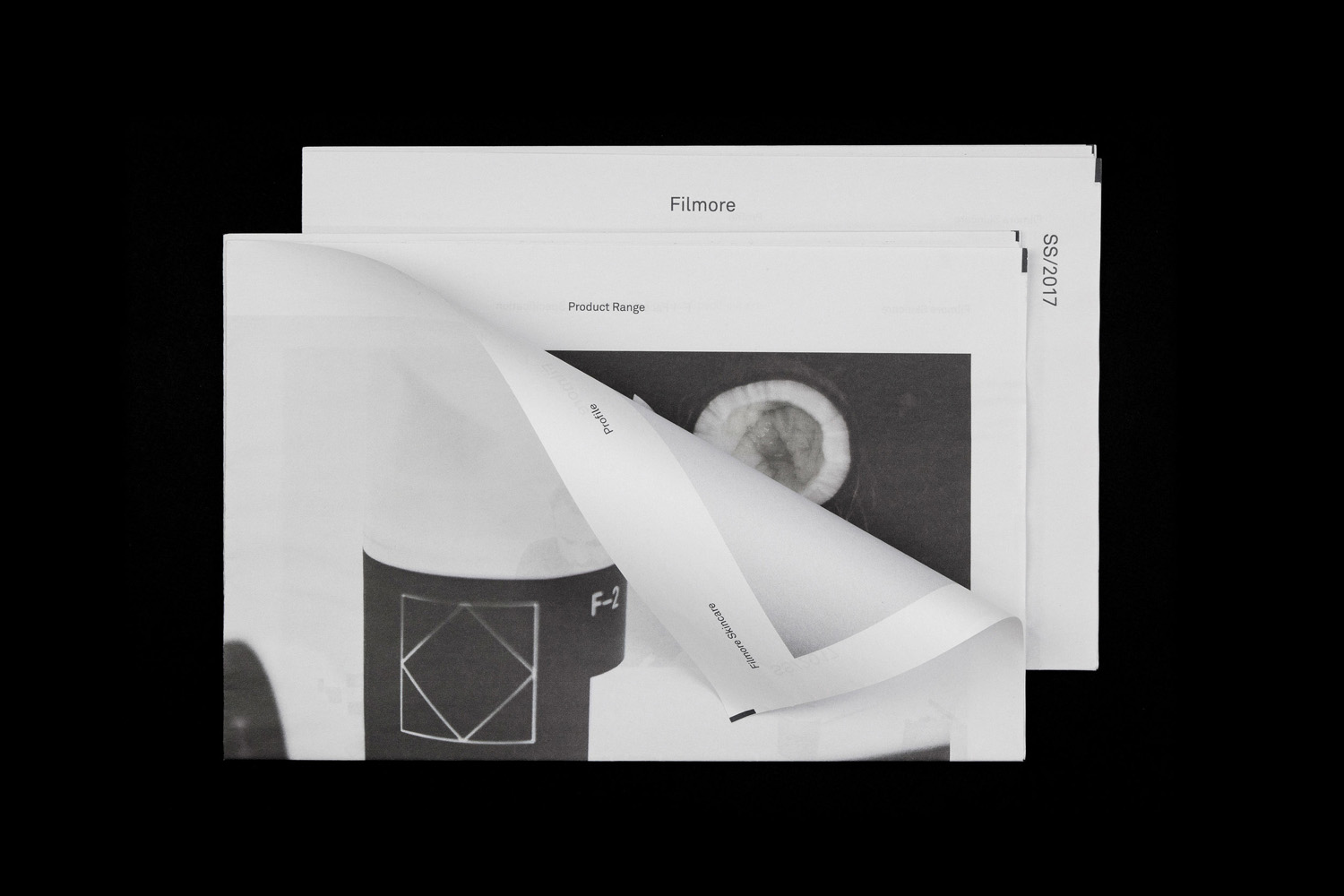
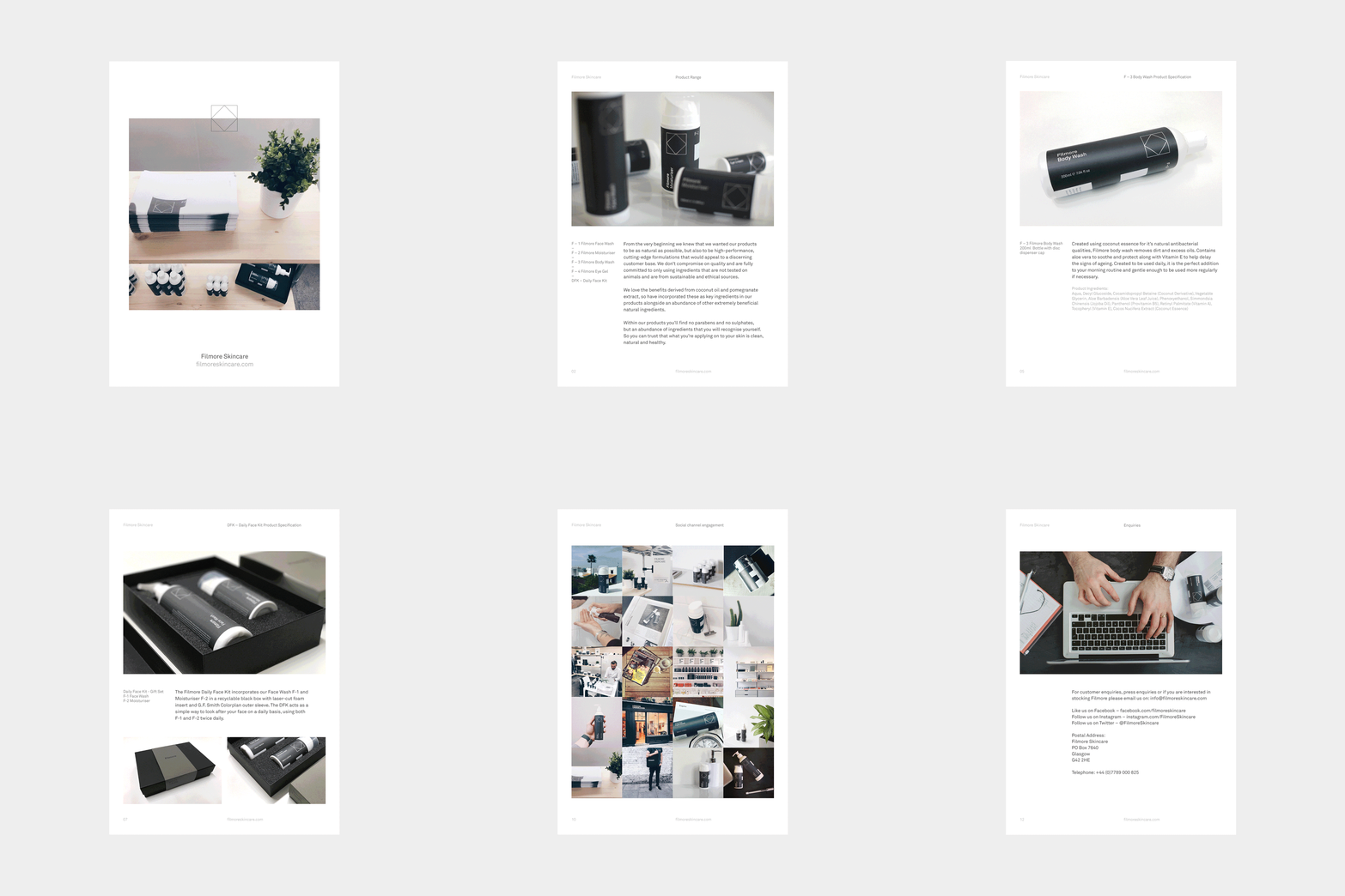
Filmore is a unisex skincare range and everyday routine. It is produced in Scotland for the national and international market using effective natural ingredients and Scottish water. Glasgow-based studio Freytag Anderson worked with Filmore on brand identity and packaging design. Referencing the International Code of Signals (ICS) and informed by their client’s love of Scandinavian design, the studio created a minimal graphic expression. This is characterised by a simple logo, interlocking F’s, grid structure and utilitarian naming system, paired with a high quality material detail and finish.

Freytag Anderson establish a simple and contemporary brand expression for Filmore that delivers impact from a distance in the interlocking F’s and detail up-close in the choice of material and ink, type and line. Logo, based on the ICS flag “F”, feels current in its reduction, internal space and fine monolinear lines. Although this preference for the reductive and referential is not particularly ownable, and to most it will seem abstract in its reference to Scottish water, it functions well as one part of a more distinctive whole. Type has similar qualities, both in its shapes and lines, but also in the consistency of its typesetting and grid-based layout.
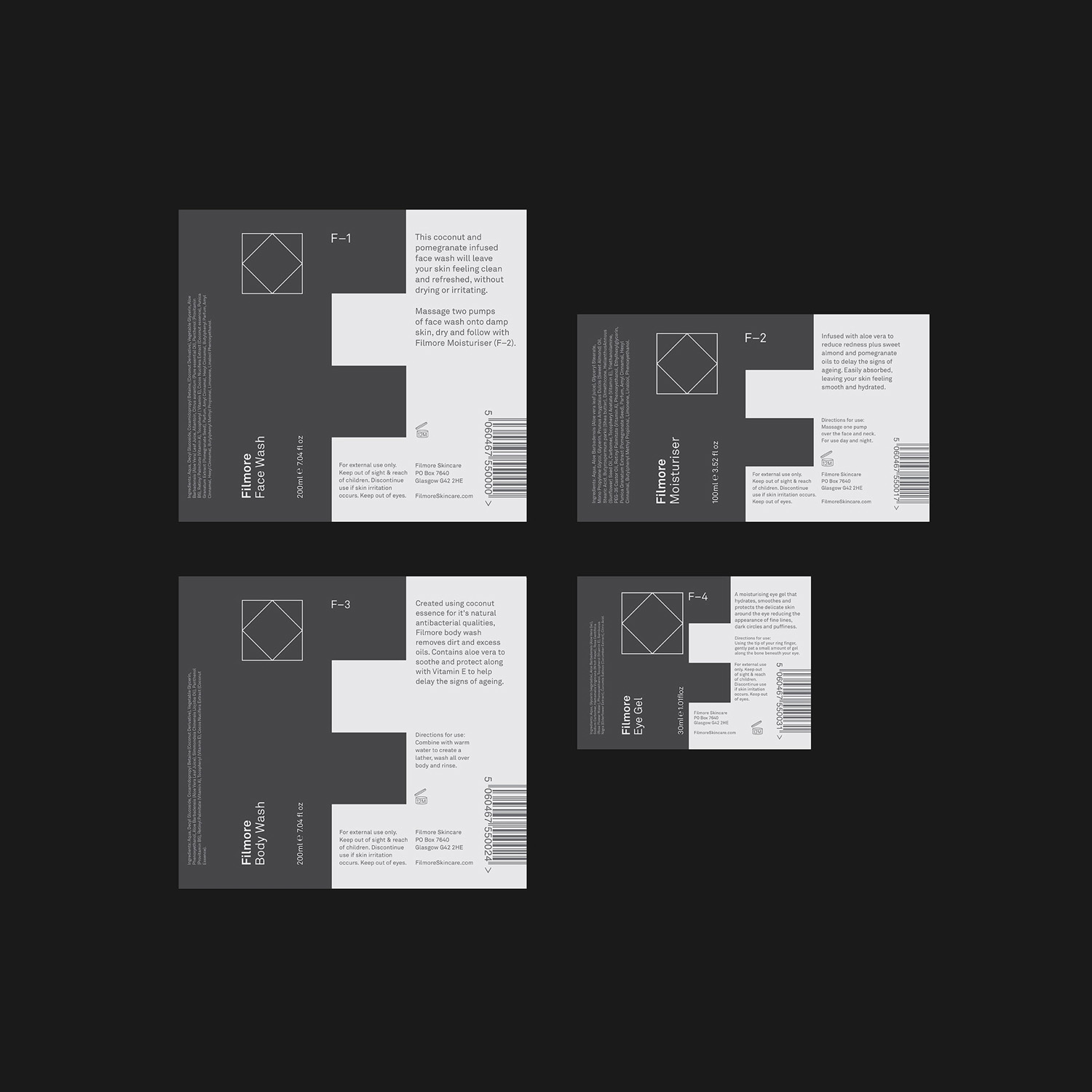
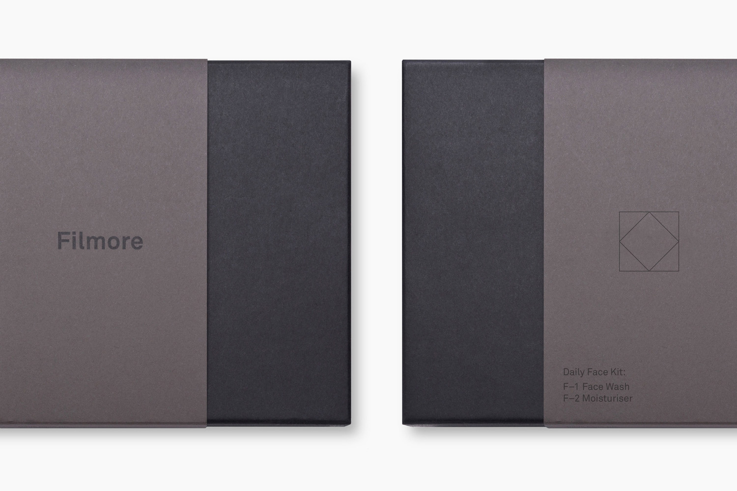
There is a good sense of layering to the work. This comes through in the bold initial impact and flexibility of the interlocking F’s, the finer lines, internal space and proportionality of logo, and in the blocking and orientation of text. A box and sleeve of dark dyed uncoated boards frame product and provide a convenient method of presenting and sending bottles when ordered online.

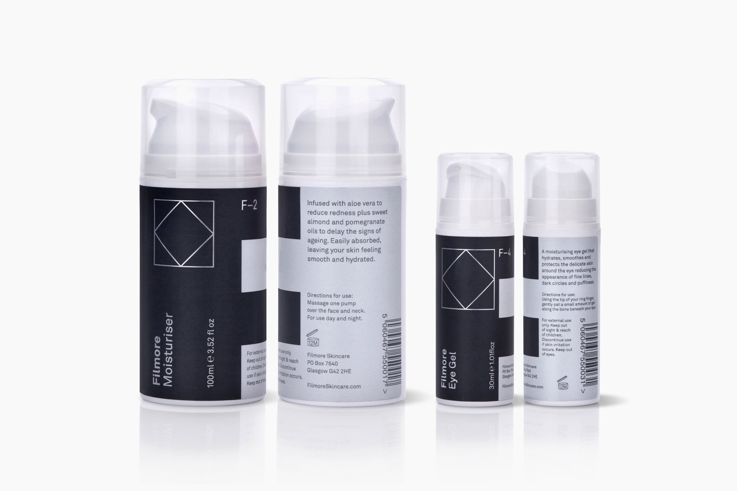
Colour finds a neat balance between modern urban utility and high quality in the mix of slate grey, silver ink and block foil. And a pleasant duality and contrast in the use of light and dark, perhaps a nod to the unisex nature of the range. These choices emphasise form, which in turn hints at the idea of a structured routine. This also plays out in the practical approach to number-based naming.
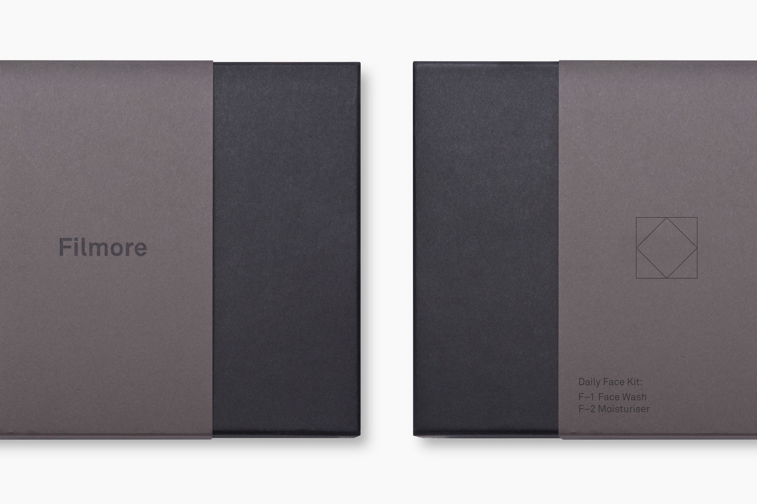
Graphic assets, material and finish are individually familiar but well-intentioned and collectively memorable. They feel well-resolved, and although there is not a more visceral or literal connection to provenance, be that through photography or story online, these touch upon a very current favour for utility and luxury, while also being clear in its Scandinavian-inspired simplicity and expression of a structured routine. More work by Freytag Anderson on BP&O.
Design: Freytag Anderson. Opinion: Richard Baird.
