Quad Cinema by Pentagram
Opinion by Richard Baird Posted 3 May 2017
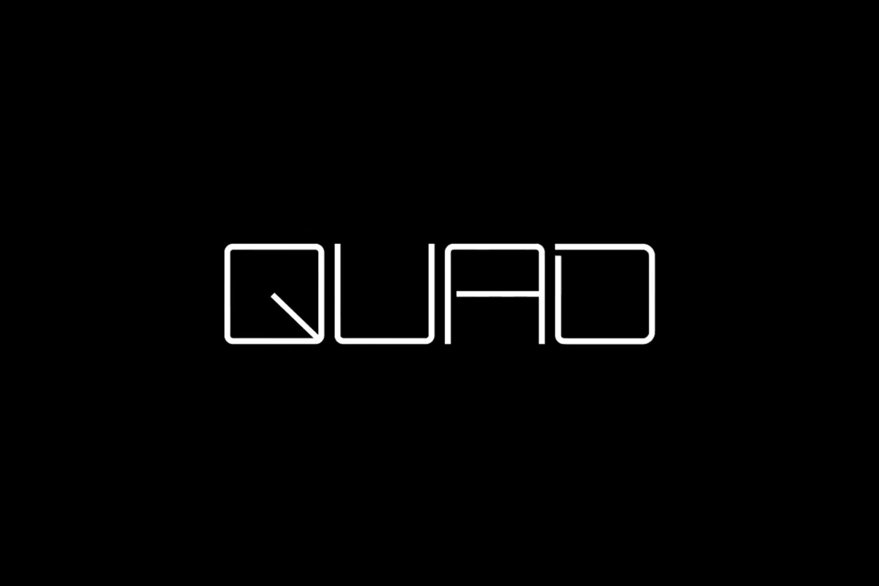
Quad opened in 1972 and was New York’s first multi-screen cinema. Since then its four screens have been dedicated to playing a diverse programme of independent, classic and first-run films. To coincide with its contemporary state-of-the-art refurbishment, completed earlier this year, Quad’s new owner Charles S. Cohen and his independent film production and distribution company Cohen Media Group worked with Pentagram partner Paula Scher and her team on brand identity. This included logotype and custom typeface, environmental graphics, signage and digital installations informed by the visual language of cinema.
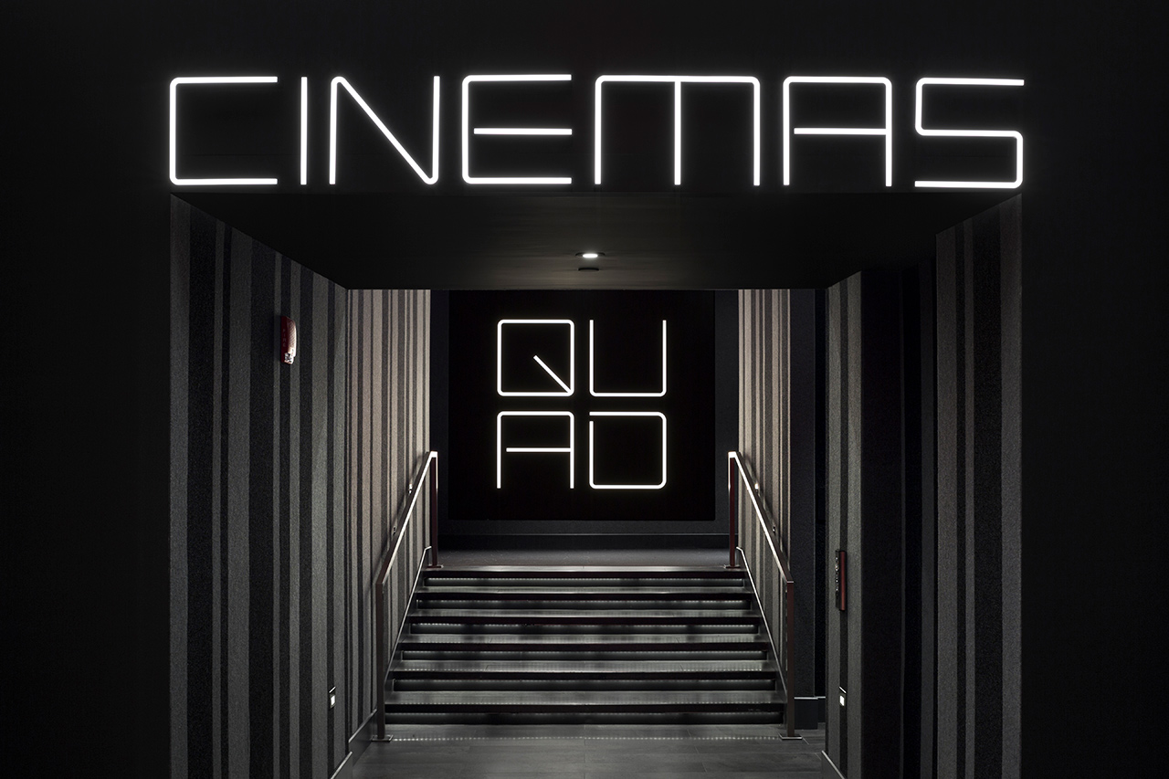
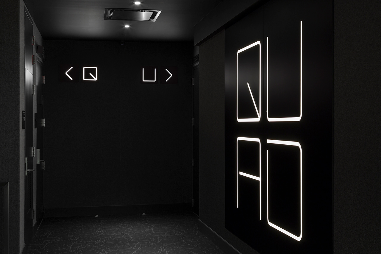
Taking inspiration from movie screens and film sprockets, the four-screen nature of venue and name, Paul Scher and team created a custom typeface of simple monolinear letterforms and a logo with a square modular quality arranged 2×2, vertically and horizontally. There is a clear continuity between logotype and custom typeface. The references that informed design are not obvious, but a relevant starting point, and play out in interesting ways elsewhere. Although perhaps not particularly visually arresting in lettershape, custom typeface and logo’s character, impact and distinction really comes from their implementation.
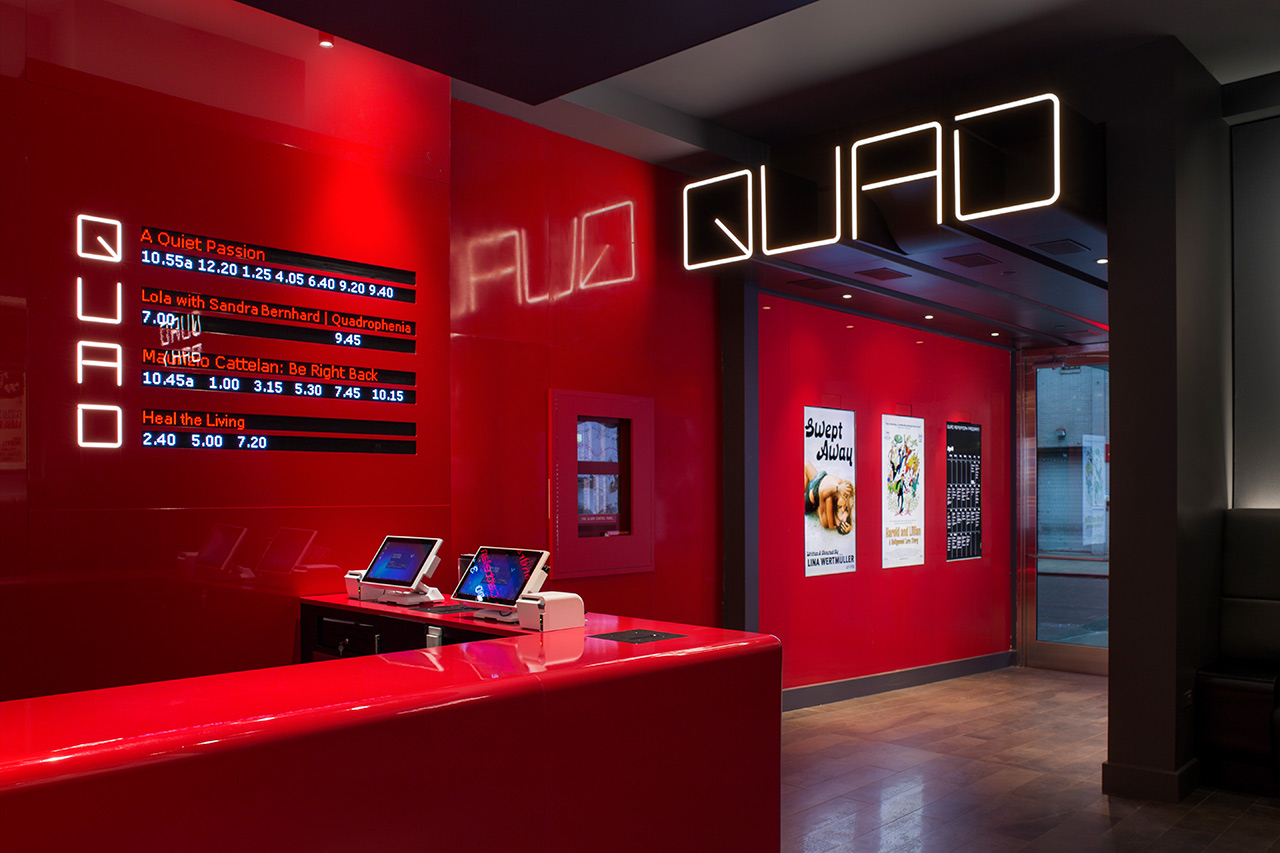
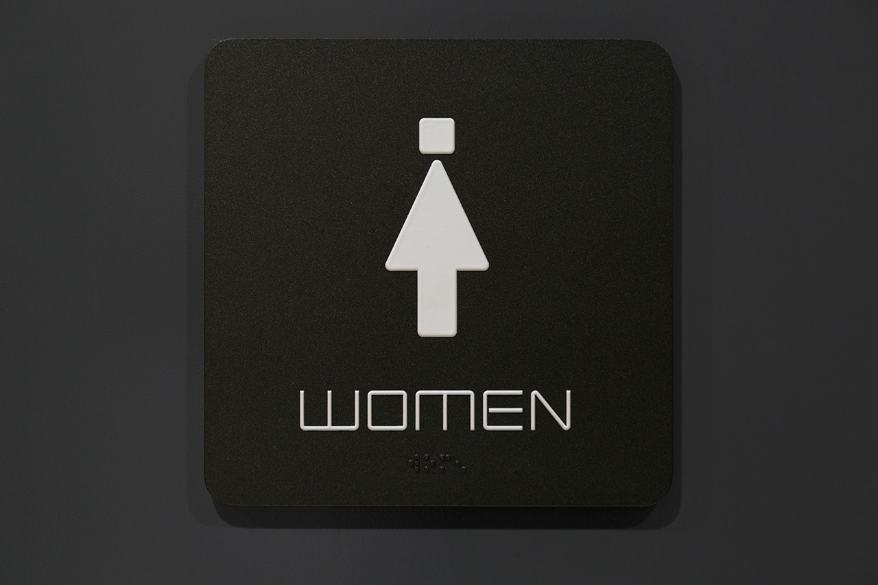
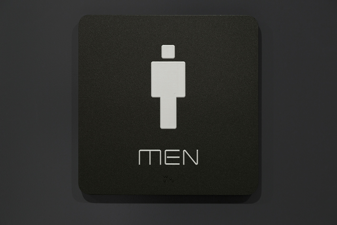
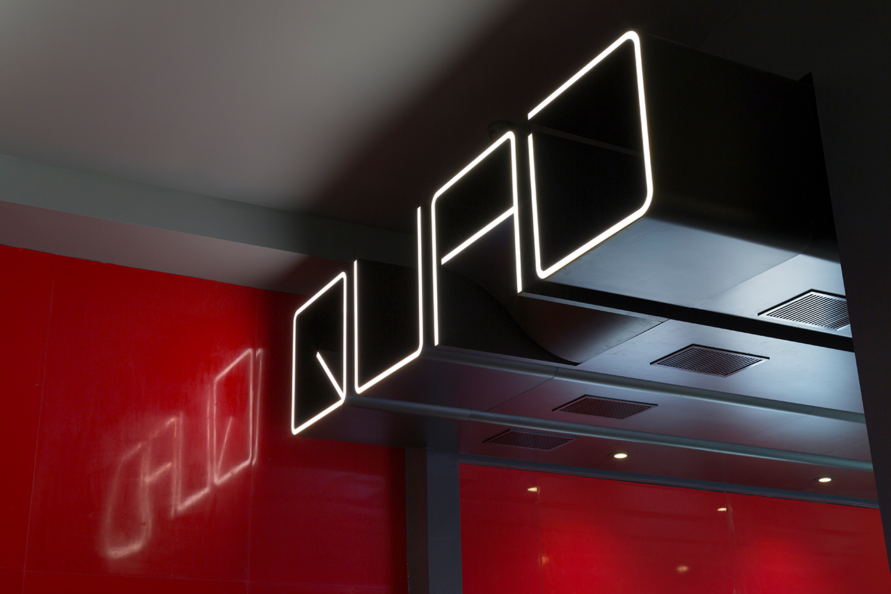
There is a strong linear quality to interior, and this is emphasised by the approach to digital signage and environmental graphics, the lighting of screening rooms and typographical form. Much of this is illuminated, which ties in well with the theme of projection, and physical, often emerging from surfaces. This is the real highlight. Elevating type. Giving it a prominent and architectural quality, particularly in the way many of these details are integrated into space. Where typographical form is consistent, there is plenty of variation and visual interest in the way it has been implemented.
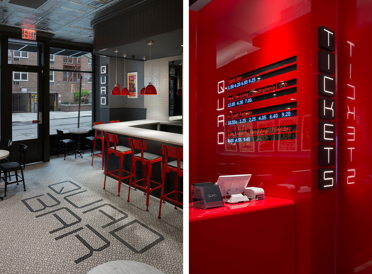
Although renovation brings Quad Cinema right up to date, there remains some period elements. In particular, the glossy red surfaces, and in the furnishing of the bar. It is cohesive and thoroughly distinctive, and manages to work together elements that articulate something of a historical legacy, not just of the venue, but also of film itself.
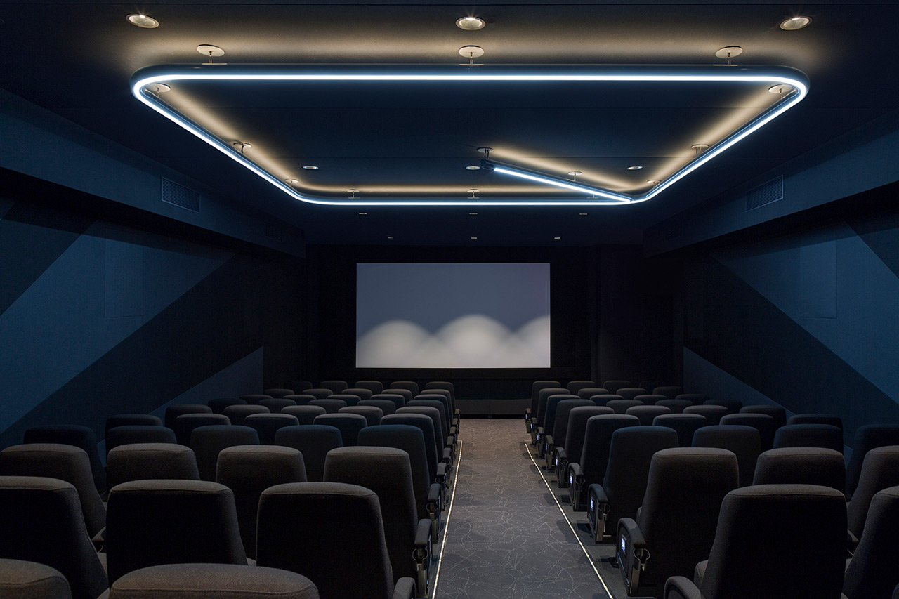
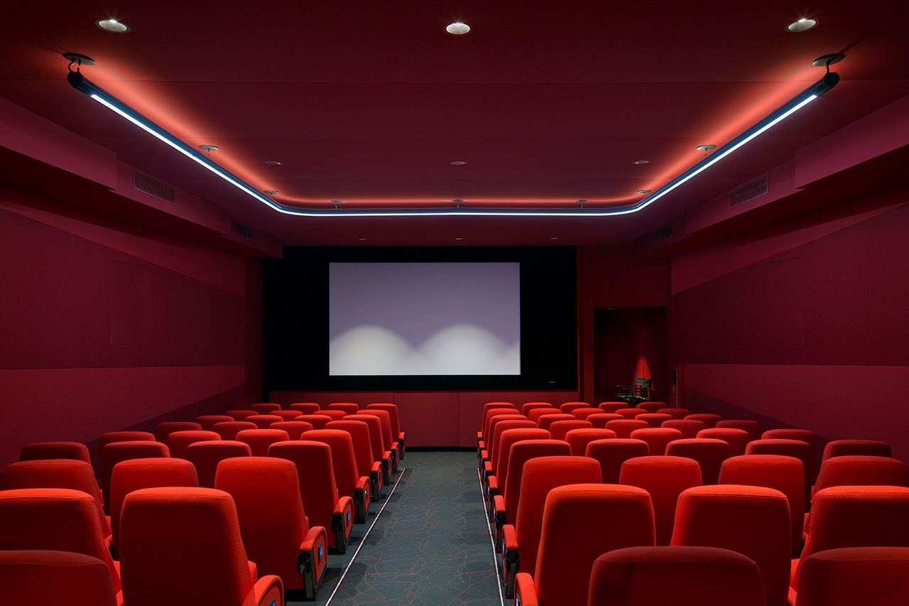
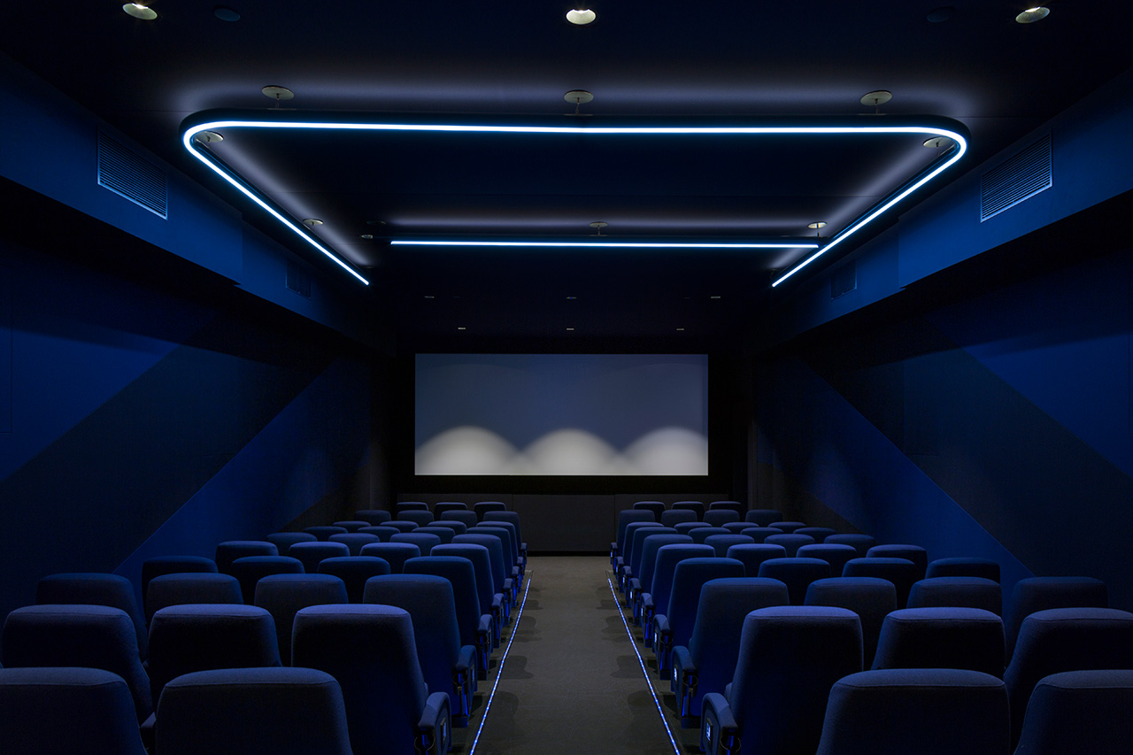
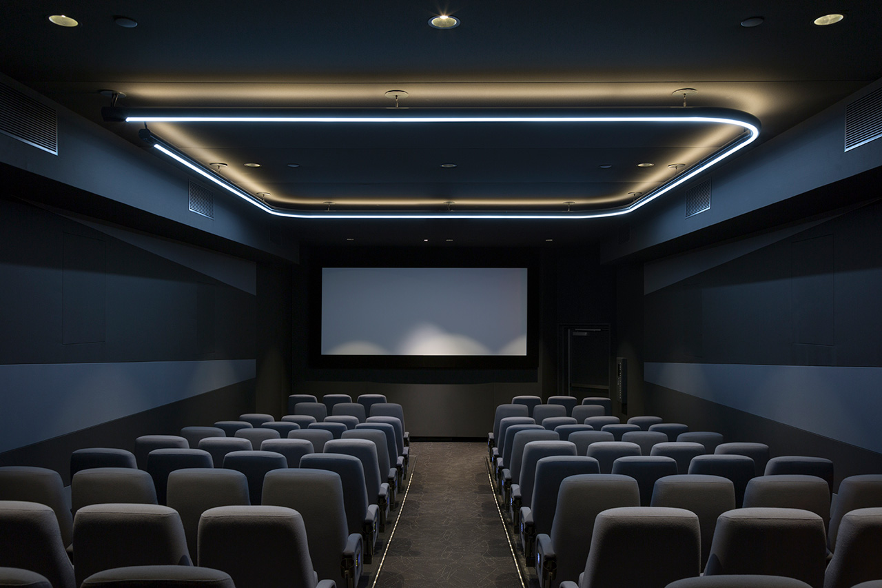
It is difficult to brand a space that is supposed to focus the eye forward, and offer little in the way of distraction, but lighting, built around the letters of the quad name, and colour that calls out each of the four screens, does this without feeling overbearing. These also helps to qualify the breaks that occur in some of the custom typefaces letterforms.
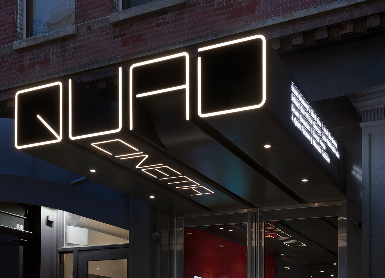
Exterior signage is bold, extending out with a landmark confidence, and a typographical/sculptural attitude and distinction. It neatly forms a through line from the street right through foyer and into the lobby. It is a particularly neat detail. It takes the larger-than-life character often associated with cinema and presents this as oversized signage, intersecting the everyday life of the street.
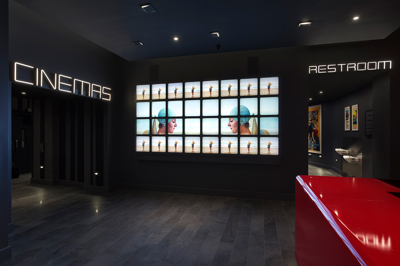
Other highlights include a 12 x 6 foot video wall composed of 32 flat screens. These display sequences from the Cohen Film Collection intercut with information on showtimes and theater amenities. The grid-based element of identity also plays out as an animated component. Changing weight, the dynamic interweaving of lines and the folding and unfolding of letters works incredibly well to give some fairly innocuous type a lot of character. As a venue of moving image, these kind of stings are perfectly suited. Below, there is a mid-century title sequence-like quality to animation, that again touches on the legacy of film.
Effective brand identity design, working in conjunction with environment, will trigger associations. Much of these will be subjective experience rather than blunt references. Here, the monolinear qualities of type calls to mind the strip lights of cinema aisles and the highlights of state-of-the-art movie Tron, while the extruded qualities of signage shares something in common with the exaggerated depth of type often used to advertise out the 3d presentation of a 70’s movie. Much of this is elevated and enhanced by type’s interaction with interior.
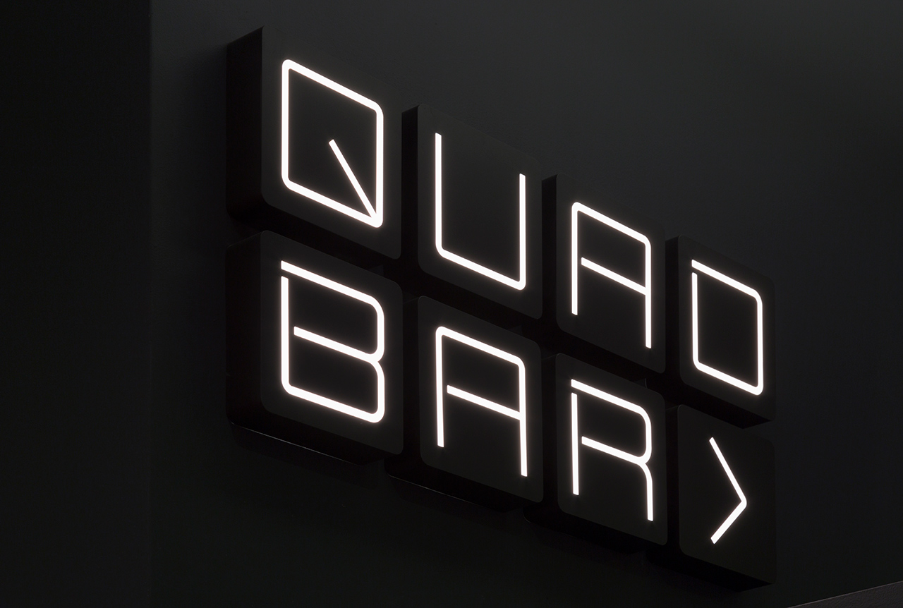
Type is simple. It is grounded in some appropriate ideas, has character in its neon-like line breaks, its modular qualities and the occasional quirky character. Much of its personality emerges from its implementation, its interaction with space, and its motion on screen. There is a play with light and dark, colour and the absence of colour, past and present that touches upon cinematic legacy, and this continues in interior design which moves from the period qualities of bar and lobby to the technology and modern comfort of the screening rooms. Paul Scher counts film as a longstanding influence, and you can see this in her work for Quad. More work by Pentagram on BP&O.
Design: Pentagram. Partner-in-Charge, Designer: Paula Scher. Designer: Rory Simms. Video Wall Graphics: Claudine Eriksson. Project Manager: Sarah McKeen. Photos: Peter Mauss/Esto. Opinion: Richard Baird.
