June’s by Föda
Opinion by Richard Baird Posted 22 June 2017
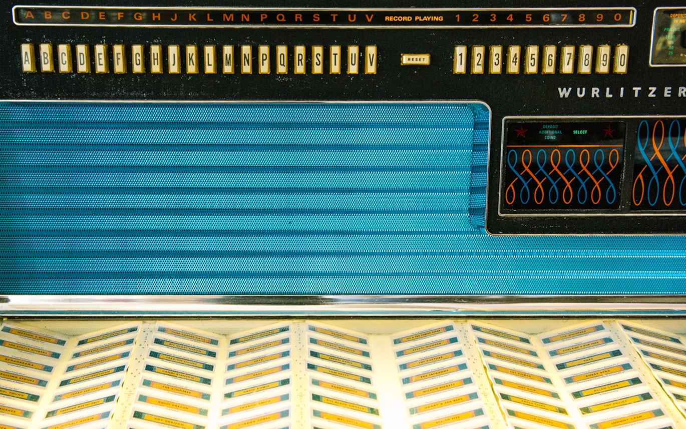
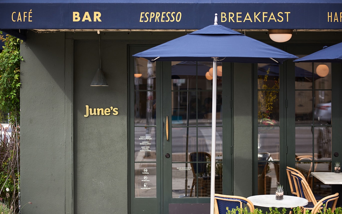
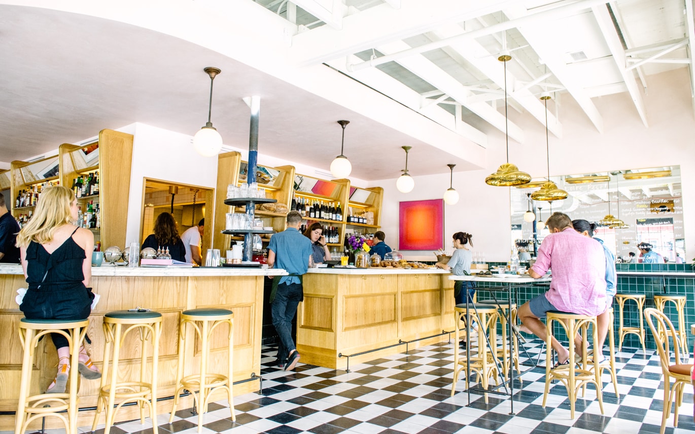
June’s is a cafe and bar located on the corner of South Congress Avenue, Austin, Texas. It offers breakfast, brunch, and grab-and-go pastries and coffee throughout the morning, and has an all day bistro menu that is served late into the evenings. The bistro menu is complemented by a changing wine and bar program managed by Master Sommelier June Rodil. June’s features a light interior design full of natural light, a black and white chequered floor, light bent wood furniture, banquette and bar seating, marble surfaces, white walls, gold details and a vintage Wurlitzer.
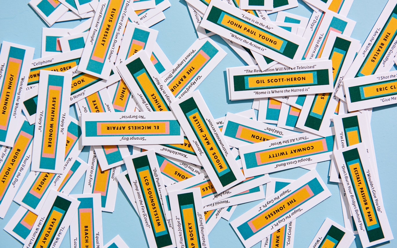
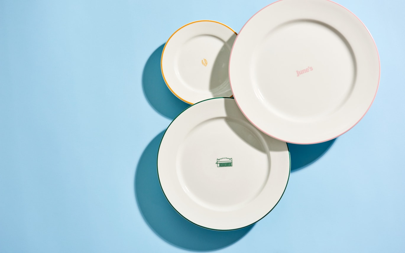
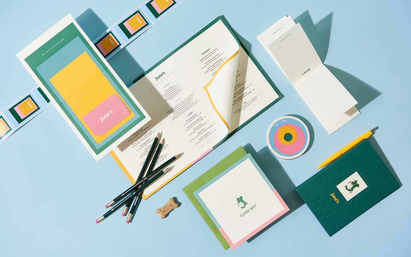
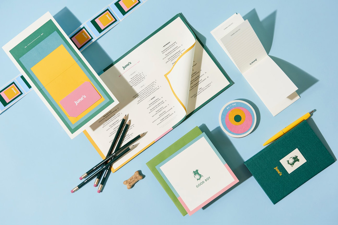
Graphic design studio Föda worked with June’s on visual identity. This compliments the interior’s period elements and cheerful ambiance through colour, type and form, and runs across menus, business cards, tableware, website, signage and the track cards of the Wurlitzer.
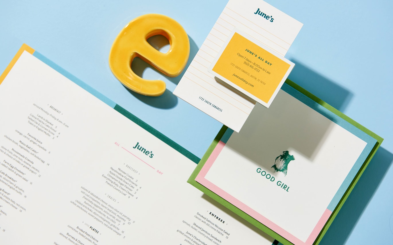
The European qualities of interior design, the distinctly American period focal point of jukebox, and a light and personable character are effectively channeled by Föda into June’s visual identity. This comes through in composition, which calls to mind the work of German-born American artist Josef Albers, the choice of a cheerful colour palette, and the soft and friendly forms of Oz, designed by Patrick Giasson as an tribute to American Oswald Cooper and Cooper Black, designed in 1922.
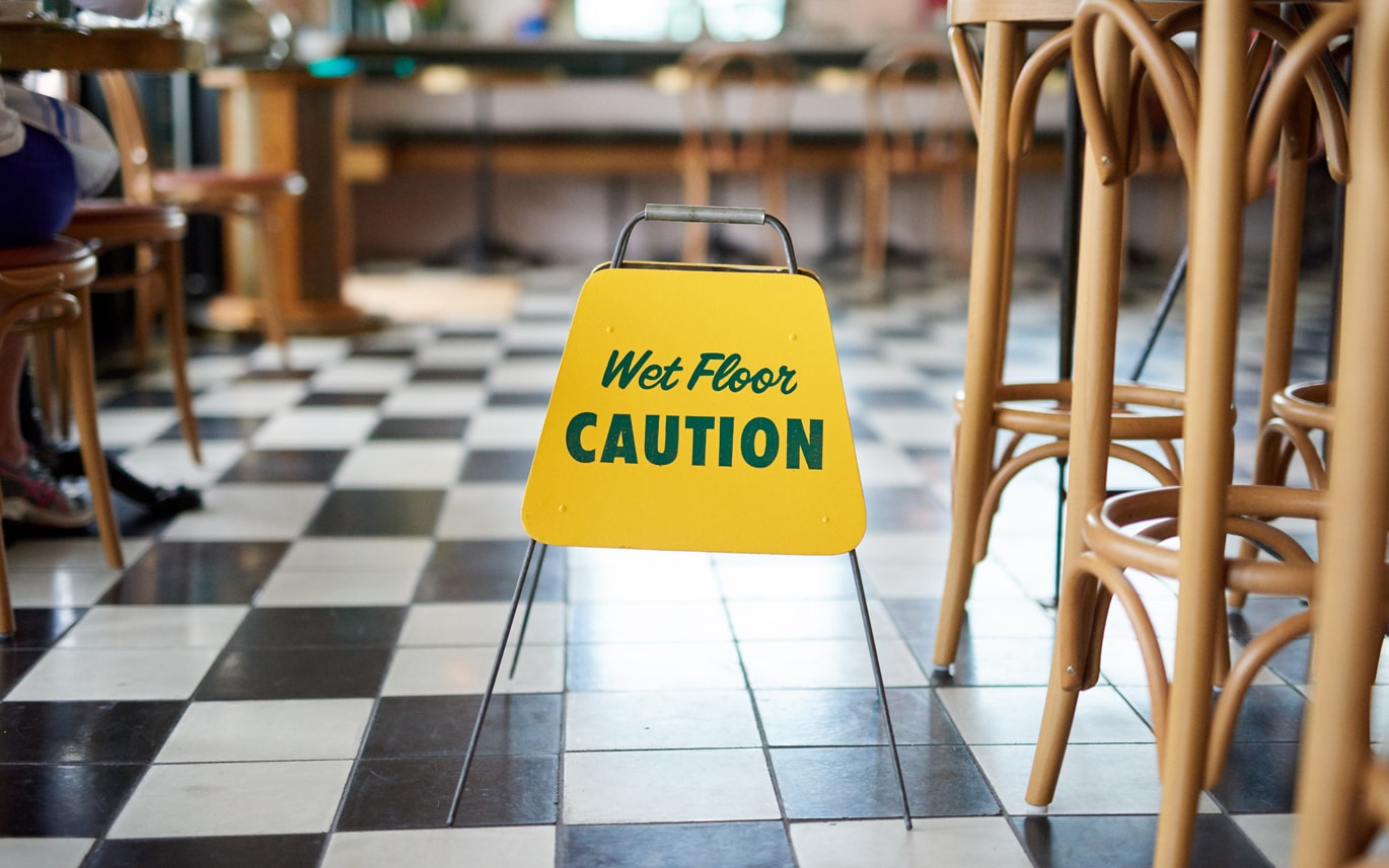
The intersection of American and European influences also emerge in the contrast of Oz and Futura, and in the rather American wet floor sign across black and white chequered tiles and at the feet of classic bent wood furniture.
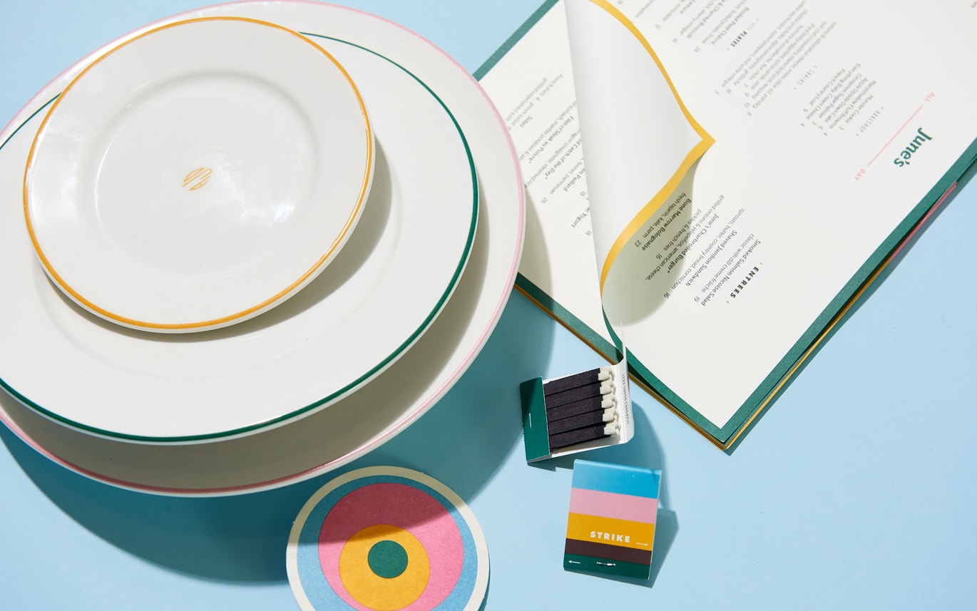
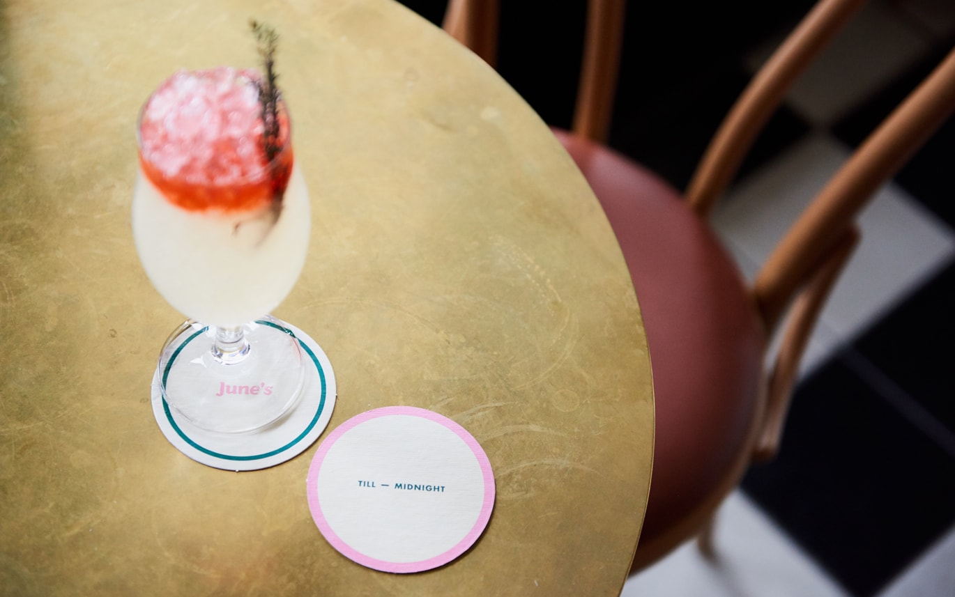
Colour palette and composition is the real highlight. This works well across a variety of printed elements, and also makes its way online. There are some pleasant variations. These include coloured outlines framing menus, the stacked blocks of matches, the gift card neatly slotted into card, the block insets more in line with the work of Albers, the circular version used across coasters and the track cards of the Wurlitzer.
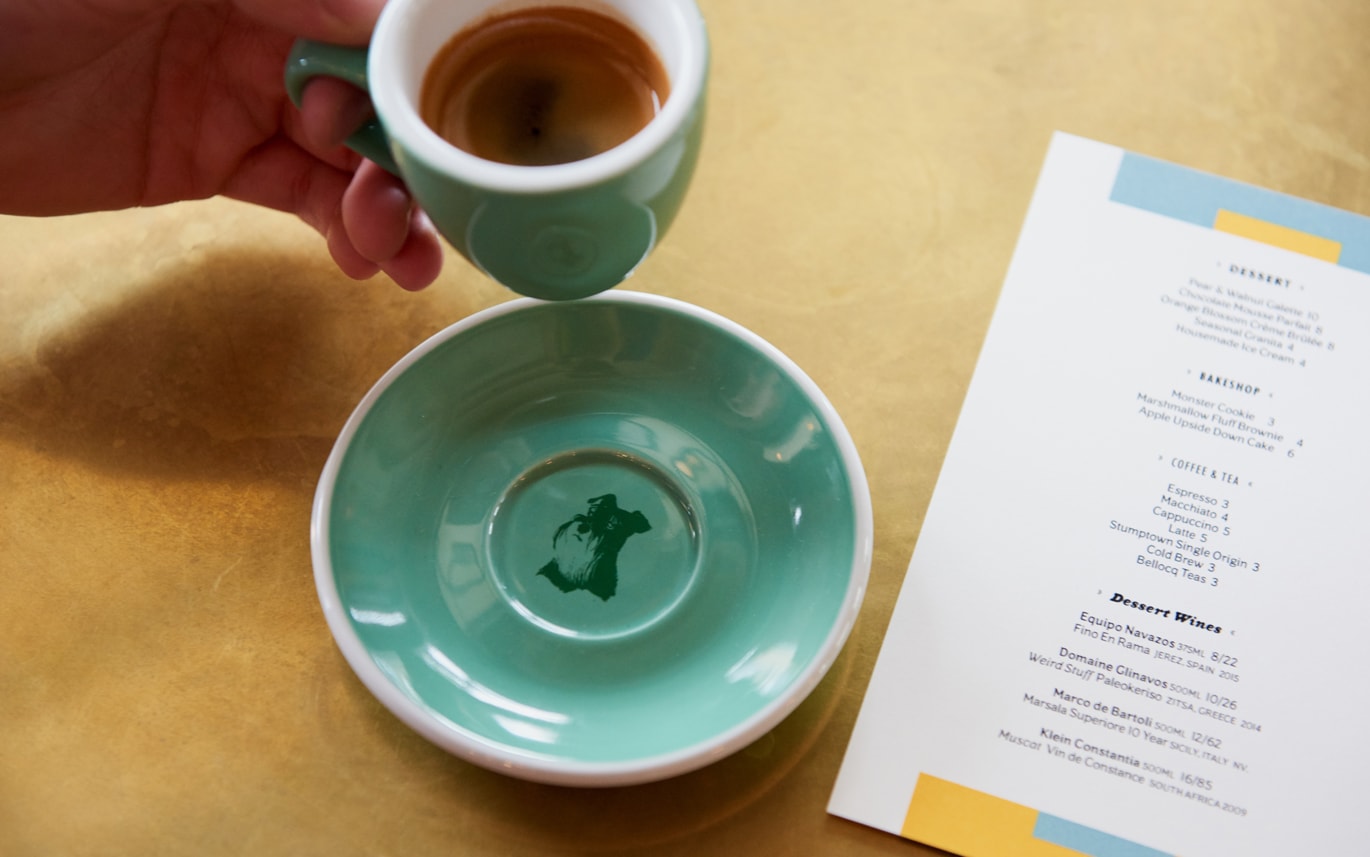
The dog illustration is fine, colour helps to integrate a slightly disparate detail, although it still feels a little at odds, a disparate detail amongst the geomtric, however, much like name and logotype, has something of a personable quality to it. More work by Föda on BP&O.
Design: Föda. Opinion: Richard Baird. Fonts Used: Oz & Futura.
