BP&O Collections — Best Awards Finalists 2017
Opinion by Richard Baird Posted 10 August 2017
The Best Awards is an annual celebration of interactive, graphic, product and spacial design work from New Zealand and Australia, run by The Designer’s Institute. This year’s event will take place on Friday 6th October at Auckland’s Viaduct Events Centre where winning studios will be awarded a Gold Pin for best in category, a Supreme Pin for best in discipline or a Purple Pin for those considered to have lifted the bar of design.
Other awards include The John Britten Black Pin, which will be given to an individual for their leadership, vision and achievements nationally and internationally, and The Designer’s Institute of New Zealand Black Pin for Outstanding Achievement. This will be awarded to a member who has made a lasting and valuable contribution to the design profession and design culture in New Zealand. The judging process and criteria can be seen here.
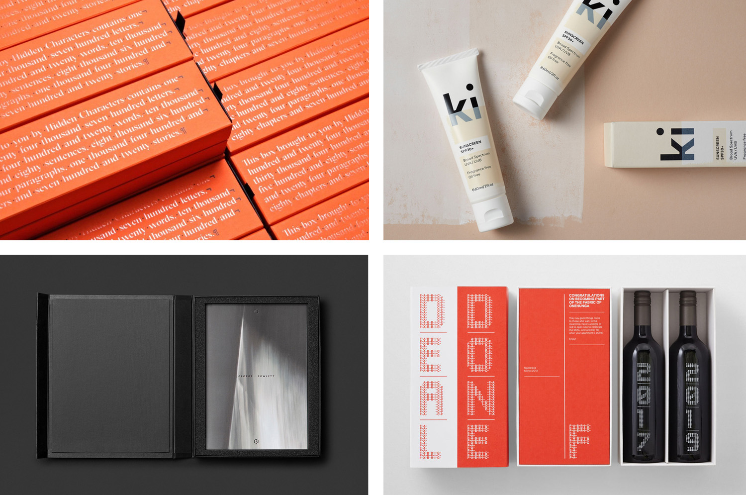
To coincide with the publication of the finalists BP&O looks back at those projects reviewed on the site and up for awards in October. Finalists include Re, Frost, Akin, Studio Brave and Richards Partners. Congratulations from BP&O to all the studios up for awards.
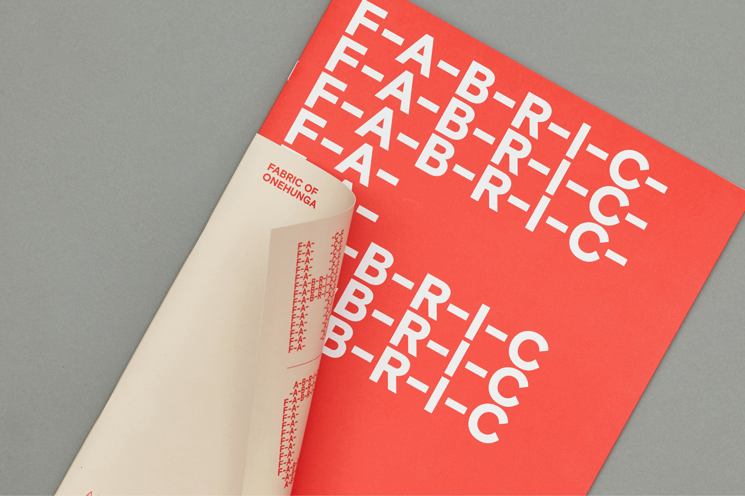
Fabric of Onehunga by Richards Partners, New Zealand
Fabric is a residential property development project and new pocket neighbourhood within the area of Onehunga, one of Auckland’s oldest suburbs and a brownfield site of warehouses with a light industrial heritage. Developers Lamont and Co., alongside Colliers International, commissioned graphic design studio Richards Partners to create a brand identity for the development that would link brochures, specifications pack, website and a variety of print communications for the showroom.
Richards Partners’ concept reflects the architecture and surrounding context of Fabric, which takes its name from the historical use of the site as a clothing factory, through logotype connected by the thread-like qualities of hyphens, built up into a custom display typeface, and the material quality of uncoated dyed papers, fabric cover and blind deboss.
See more of this project here
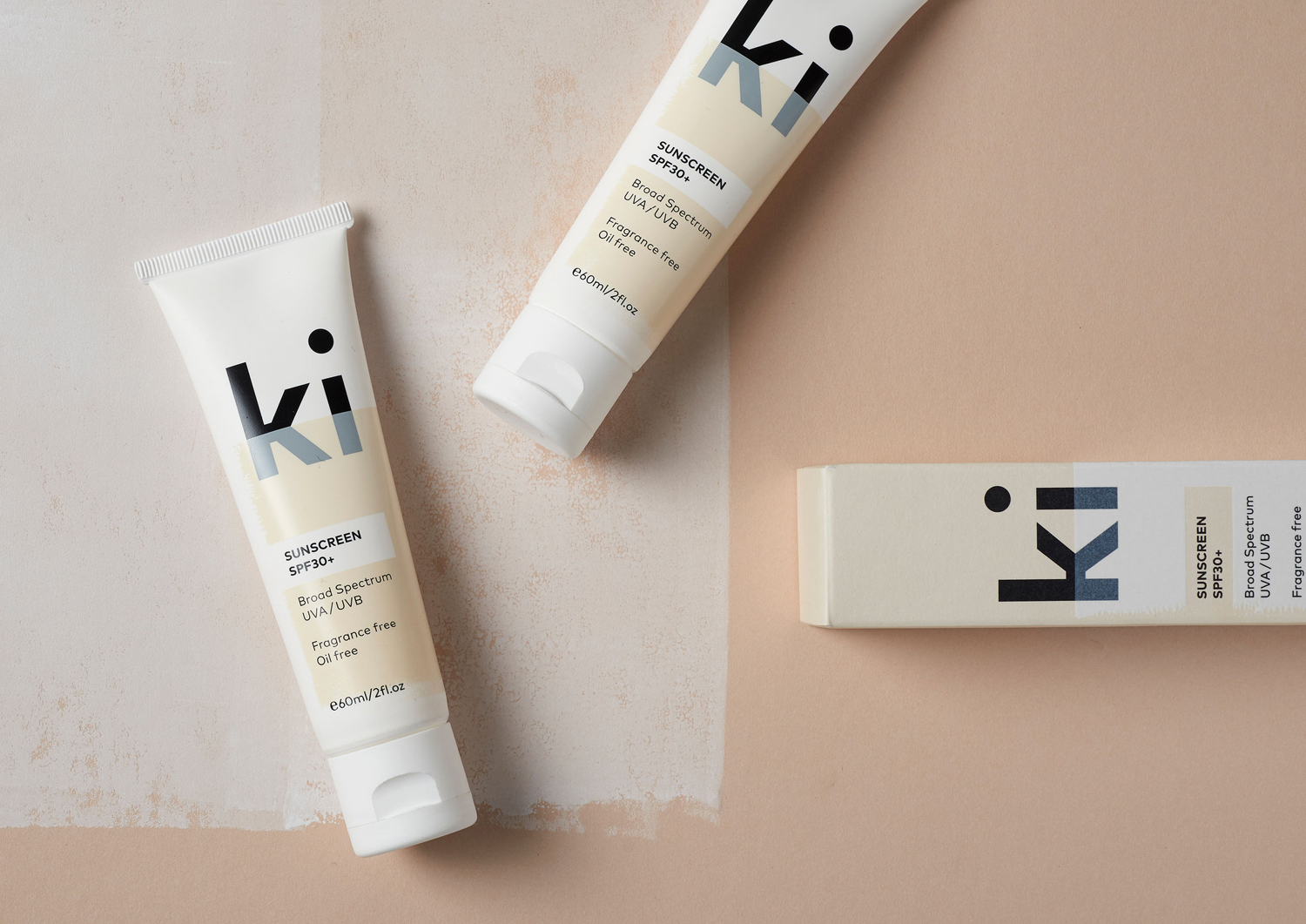
Ki Sunscreen by Akin, New Zealand
Ki Sunscreen was developed by national skincare clinic Caci to protect against the harsh New Zealand sun, and the skin damage and premature ageing that UVA and UVB rays can cause. It is made from the latest generation of ingredients proven to protect, and those that help to control oils and maintain a matt finish. This balance between clinically proven effectiveness and cosmetic mindfulness is expressed by its brand identity and packaging design, developed by Auckland studio Akin, in the meeting of bold black logotype, and the material interaction between uncoated paper and print finish.
See more of this project here
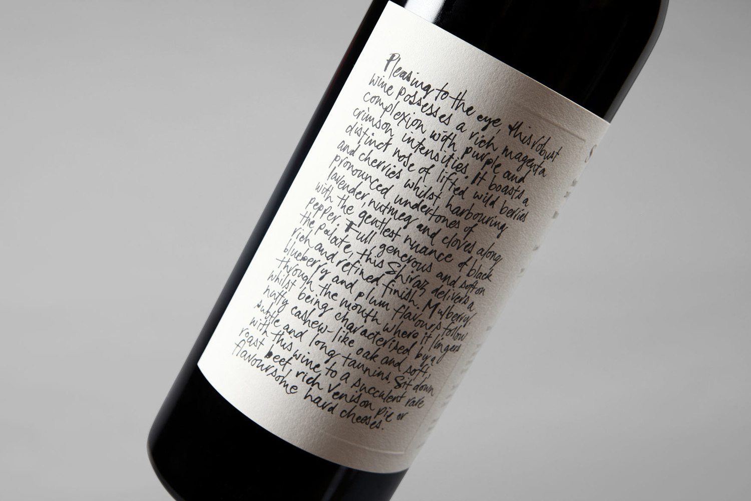
Niche Wine Co. — Somm by Frost, Australia
Somm is a limited edition Australian Shiraz from Niche Wine Co., a winery that embraces an innovative dry farming process that yields fewer yet higher quality grapes with an intensity of flavour and colour. With a desire to convey an established, old vineyard feel, and a sense of heritage and sophistication, Niche Wine Co. worked with Sydney-based design studio Frost to develop name and packaging.
Inspired by the sommelier, a trusted and knowledgeable figure in the world of wine, Frost developed an idea based around the sommelier’s notebook, literally translating the spontaneity, insight and personable qualities of this directly onto label and tissue paper, then packaging bottle into bespoke wooden box.
See more of this project here
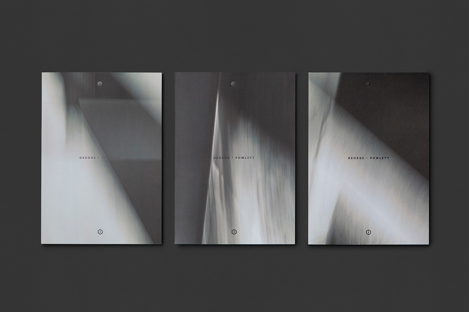
George + Powlett by Studio Brave, Australia
George + Powlett is a residential property development of 11 apartments, created by ICON Developments, and located in East Melbourne. ICON’s properties are described as having a precision and balance, and this continues through to their latest project, which was designed by acclaimed architectural practice Powell & Glenn. The development is set within an environment of what is described as a place of elegant contrasts. This can bee seen in the strong geometric forms of structure, and the surrounding leafy suburb of East Melbourne. Balanced contrast informs brand identity, designed by Studio Brave, with each element said to express the seamless connection between environment and structure. This connects brochure, material sample pack, foldout floor plan and website.
See more of this project here
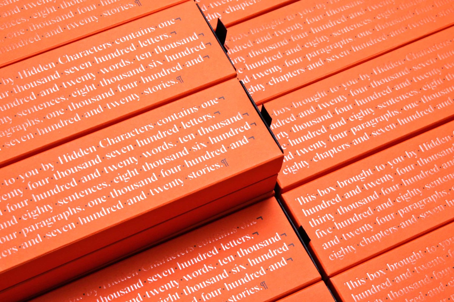
Hidden Characters by RE, Australia
Hidden Characters is the latest PR offering from international advertising agency network M&CSaatchi. It replaces/is an evolution of Bang PR, developed in response to the changing public relations landscape.
With the advent of social media and the subsequent growth of non-traditional influencers and an increase in inauthentic product placement, Hidden Characters intends to make sure that their client’s reach is handled in an ethical and authentic way.
Sydney-based graphic design studio RE worked to created a brand identity for Hidden Characters that articulates this intention with a concept that makes a connection between the hidden characters that shape how text appears and the creative behind the scenes shaping of a brand’s public perception. The idea of the seen and unseen plays out in a number of ways in print, and links business cards, headed paper, stationery and brochure.
See more of this project here
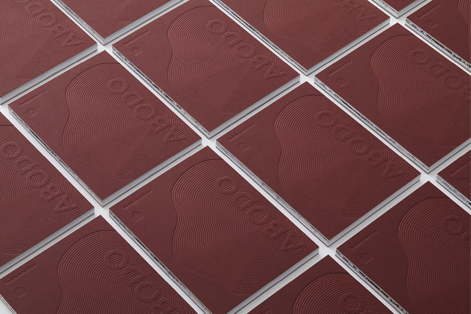
Abodo by Richards Partners, New Zealand
Abodo is a New Zealand-based timber specialist producing high performance and carefully crafted materials for architectural and structural contexts, and has a catalogue of cladding, decking, screening and timber panelling. Abodo worked with Richards Partners to better articulate its brand story, bring clarity to and emphasise the company’s respect for timber; where it comes from, where it is used and by whom, while also clearly communicating its ambition to architects and designers around the world.
See more of this project here

