Maven by Design By Toko
Opinion by Richard Baird Posted 11 August 2017
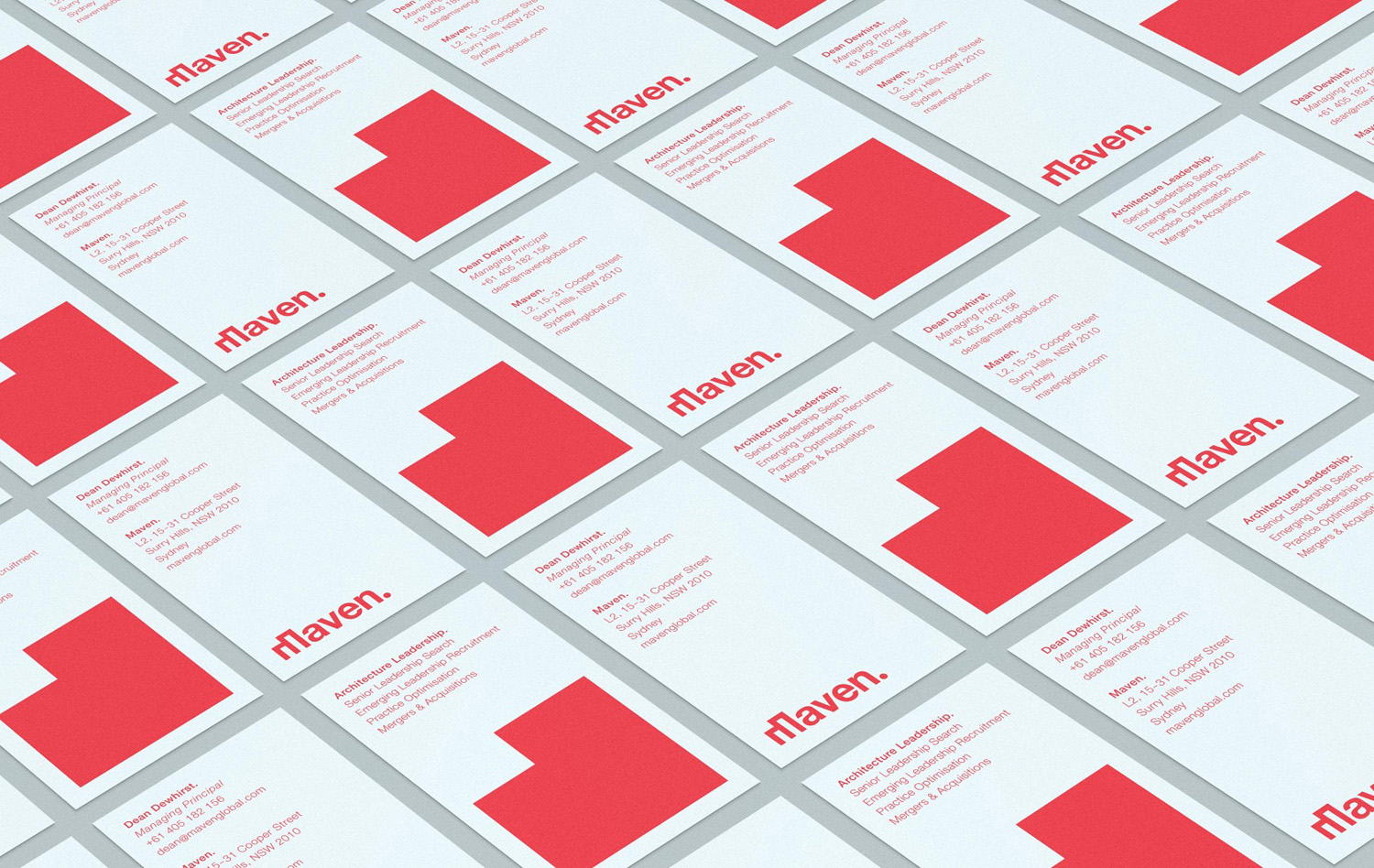
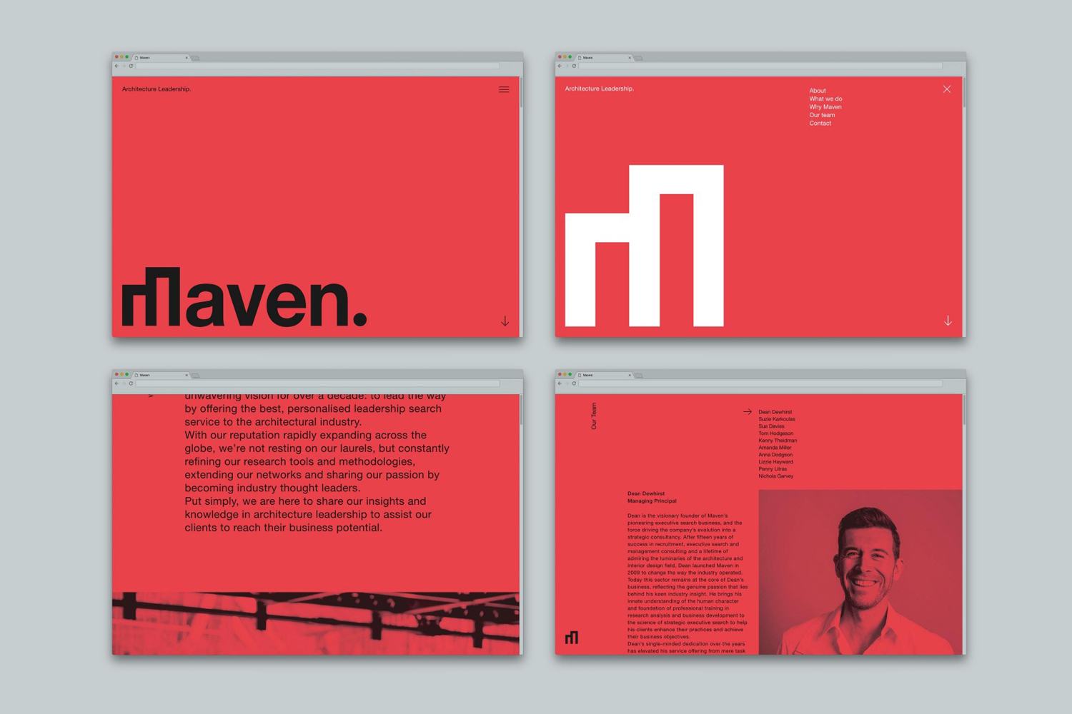
Maven is described by Design By Toko, the Sydney-based design studio behind its recent rebranding, as a top-tier architecture recruitment agency operating worldwide. Drawing on the built environment and with the intention of expressing the agency’s prominence within the architecture industry Toko developed a brand identity of simplicity and impact through bold solid form and single colour that links business cards, brochure and soon to launch website. This use of form and colour, its dominance across each touchpoint, establishes a strong continuity, yet is softened using lighter colour and over-print in its implementation across Maven Publishing’s Chasing the Sky, a book that showcases twenty of Australia’s leading women in architecture.

There are four distinguishable components to Toko’s visual identity for Maven. Logotype with its distinctive M, something close to a marque in the filling in and scaling up of that M, a vibrant and singular red ink, and image, shot by London-based architecture and editorial photographer Rory Gardiner.
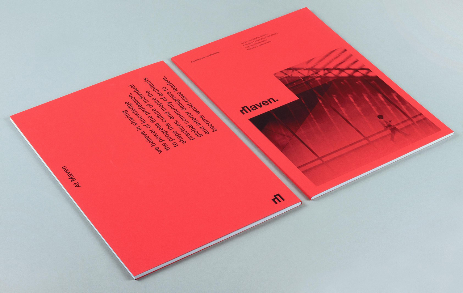
Where the distinctive M of the wordmark is quick to establish a strong sense of the architectural in a simple, singular and memorable way, in print Toko builds on this, expressing architectural themes such as space in arrangement, and flow in orientation of type.
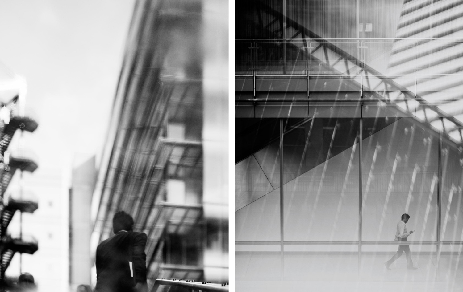
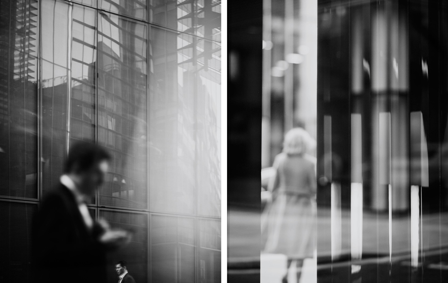
Rory Gardiner’s photography introduces something more human and visceral, in contrast to the robust and structural. An important component within the context of recruitment. There is a pleasant interplay between human form and dominant structure, bold forms and finer textures, moments of the dynamic alongside the static. Changing focal points, architecture as a frame, or where light, shade or reflection is more interesting than structure, provides a pleasant and thoughtful variation. Where the graphic components are striking and literal, image is layered and nuanced.
The red functions well to deliver impact and differentiate itself from the concrete greys, and black and white often employed by architecture studios, an important distinction to make. Tinting the work of Rory Gardiner is a bold move, but retains much of the shape, texture, light, shade, focus and flow inherent to his work.
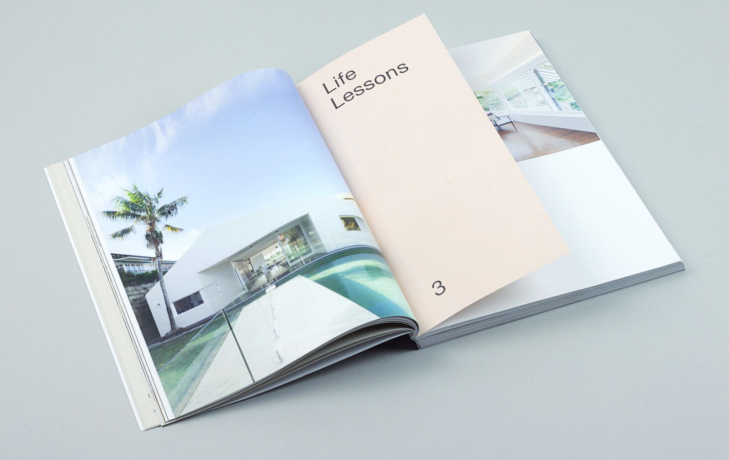
Chasing the Sky, Maven Publishing by Design By Toko
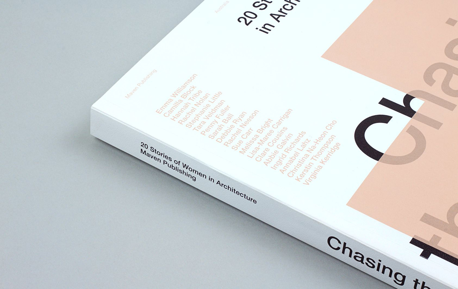
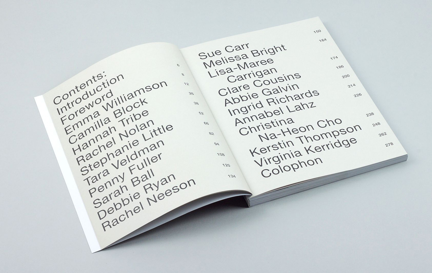
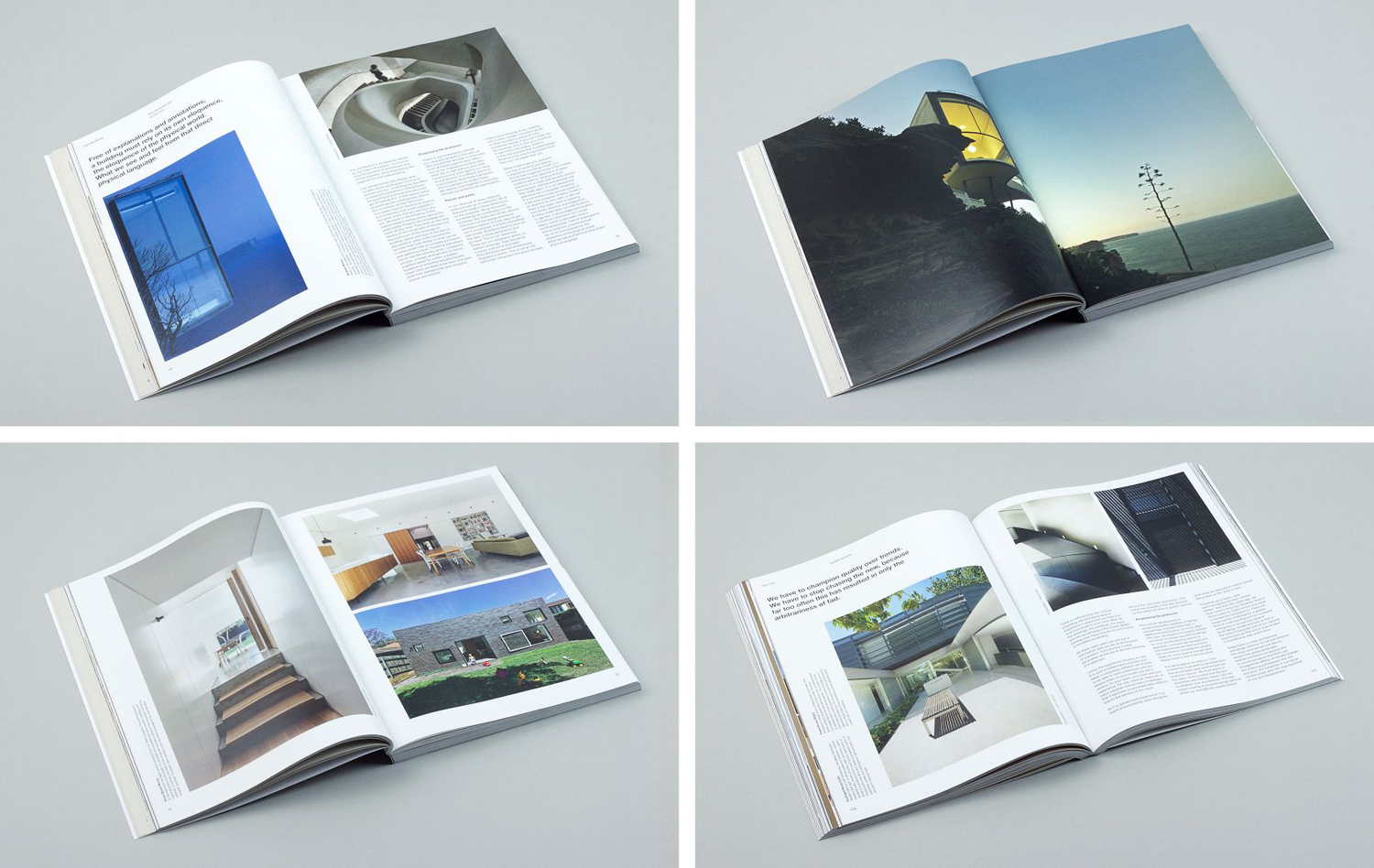
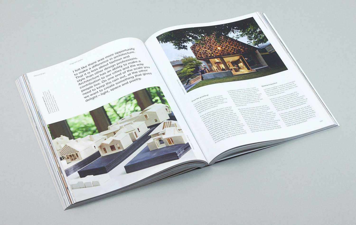
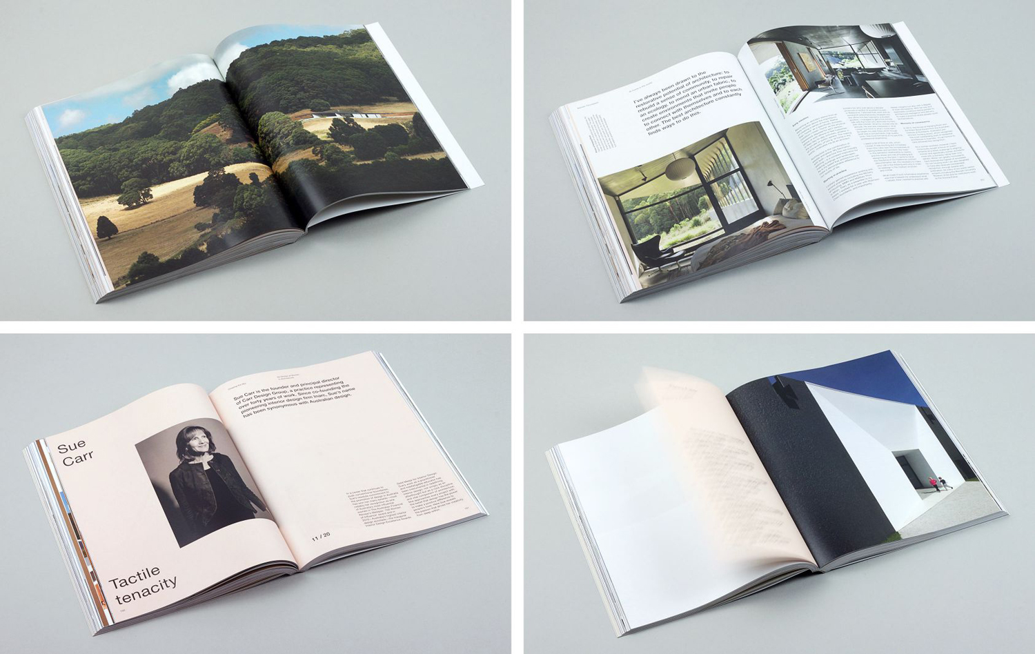
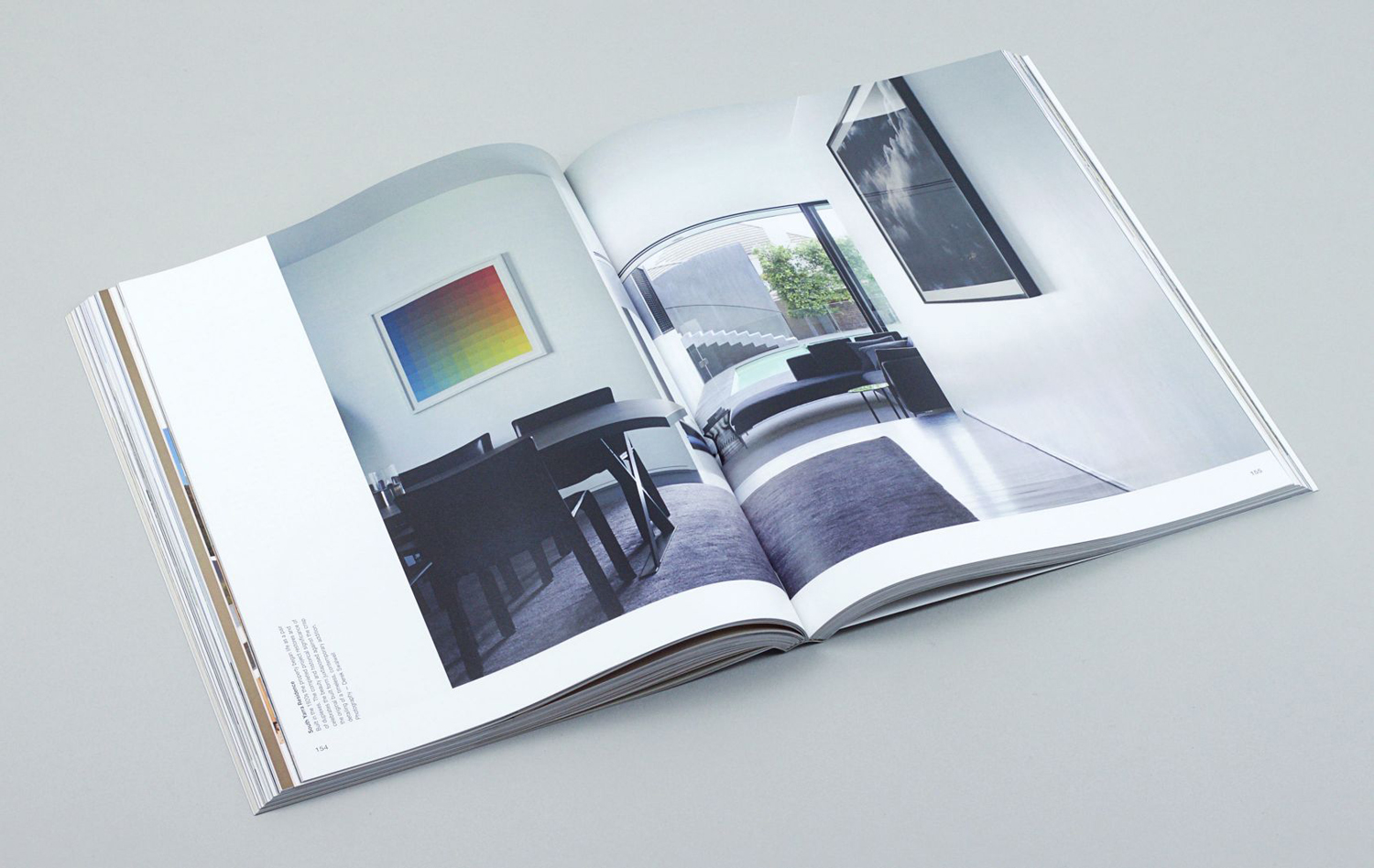
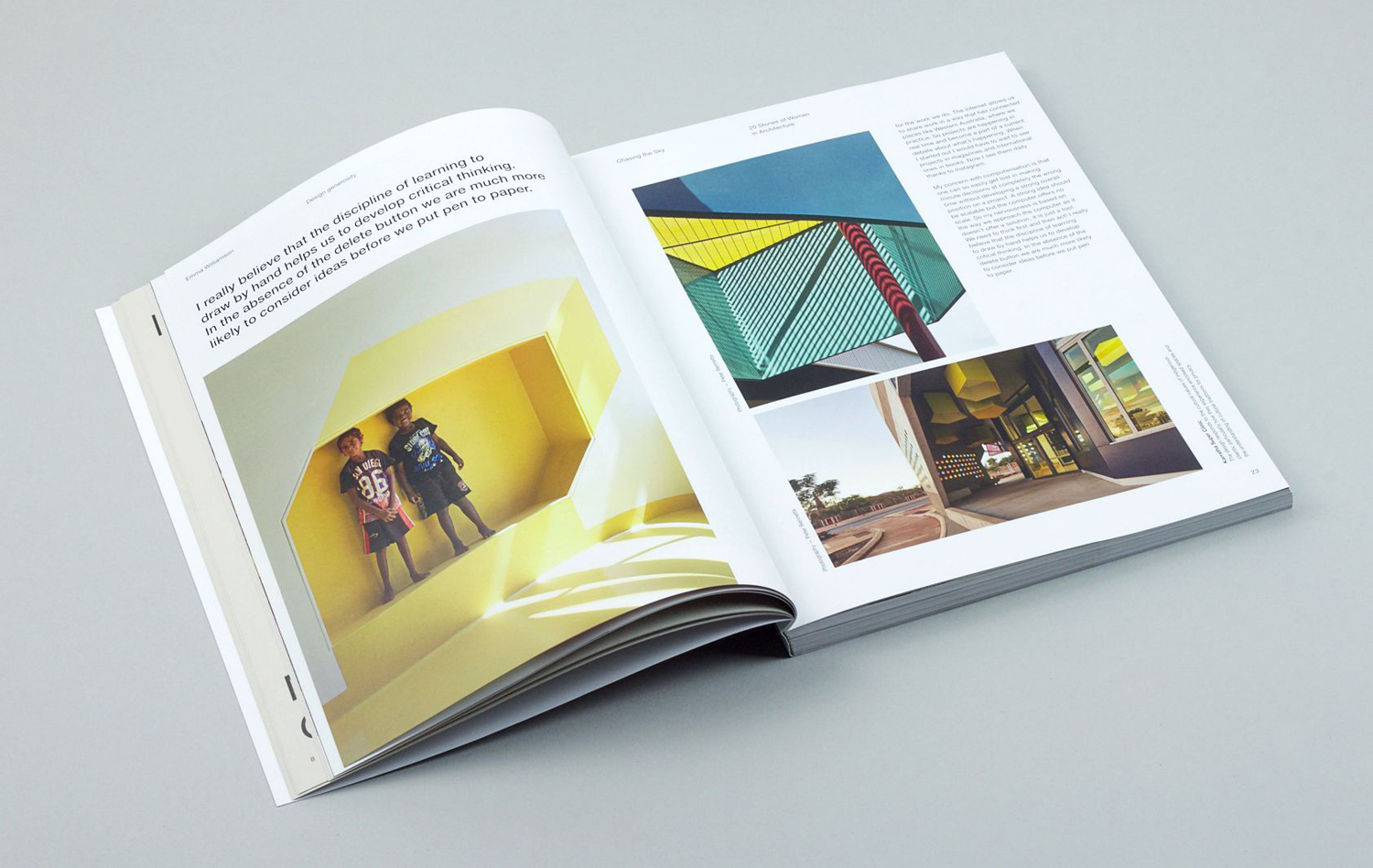
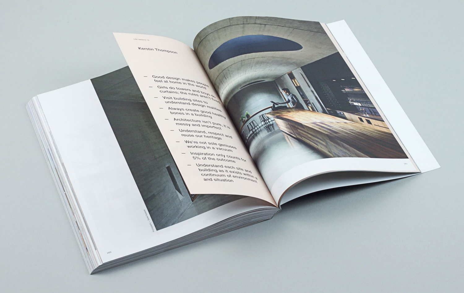
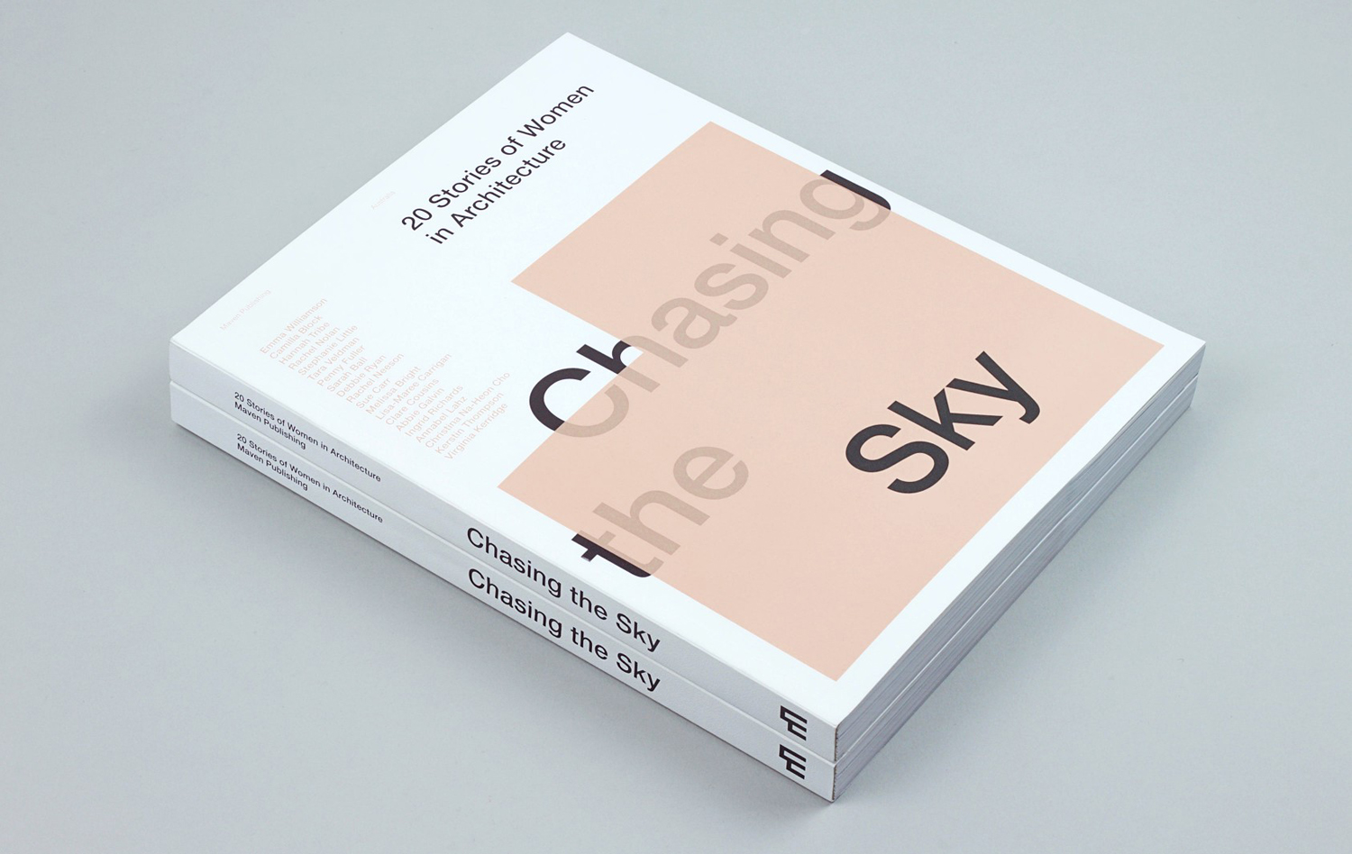
Chasing the Sky, also by Designed By Toko, is a book showcasing the work and insights of Australia’s leading women in architecture. This was designed for Maven Publishing, and sees the Maven identity take on a new context. There is both a clear continuity and communicative difference here, driven by the women in architecture theme.
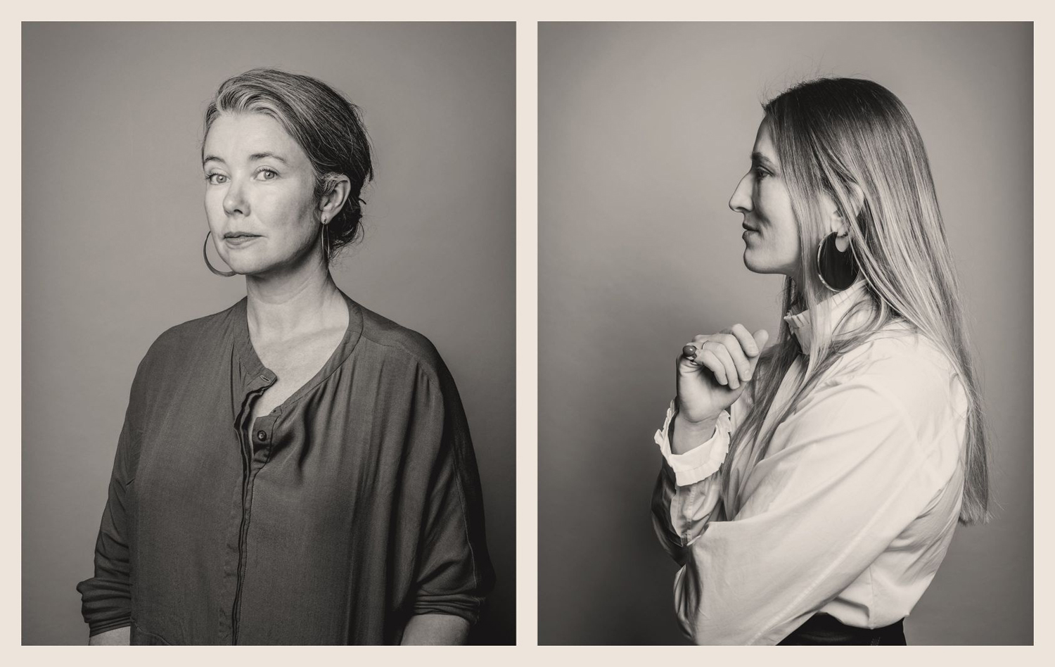
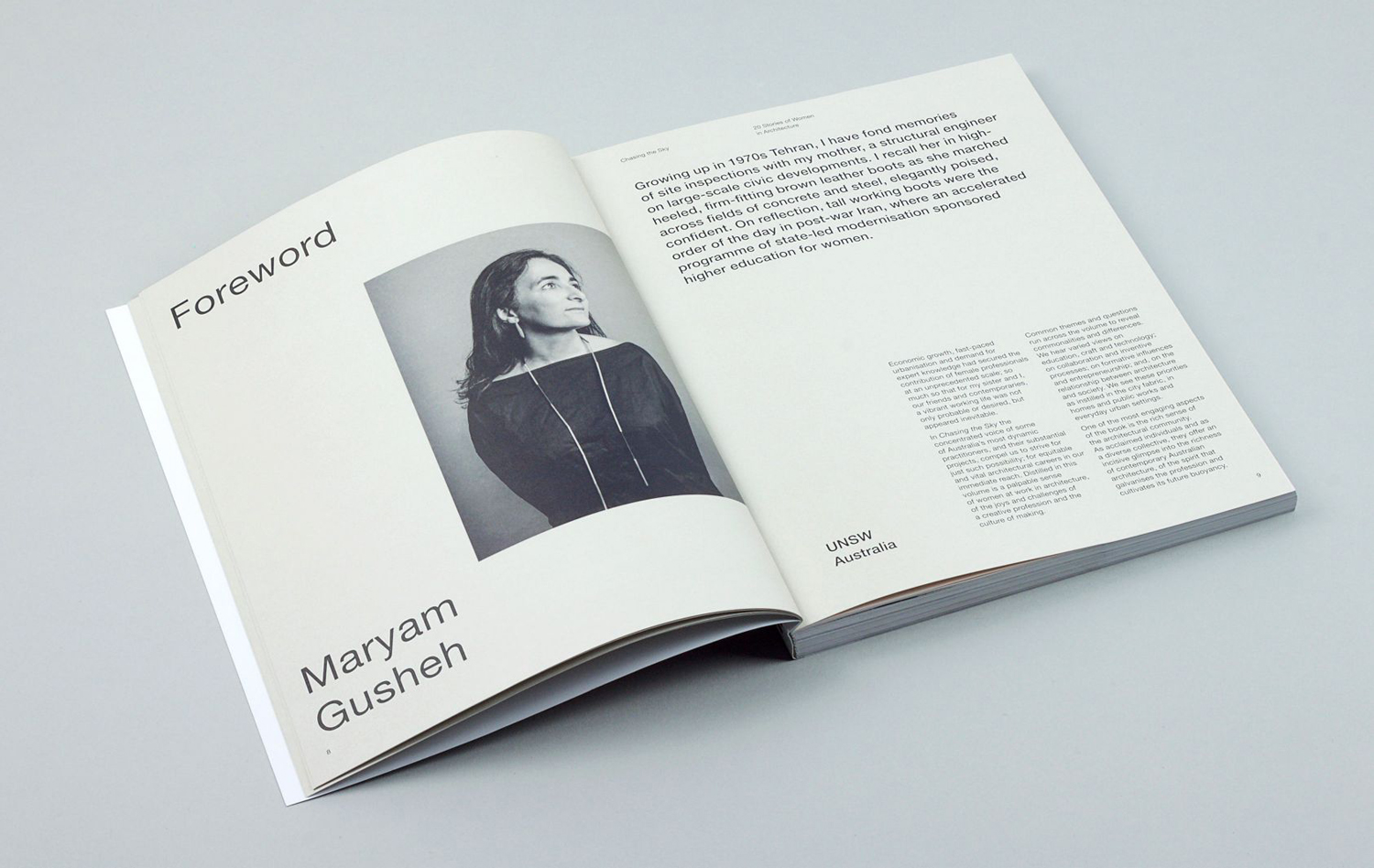
The book broadens some of the architectural associations of space and layout established by visual identity to include layers and light in the use of overprinting, a softer human quality in the choice of colour, and partitioning in the changing paper sizes that punctuate. Much like identity, photography plays a role, and is key to the Maven identity, this time Jessica Lindsay contributes portrait images of the book’s contributors.
The M of the wordmark is pulled out and used alone and at the base of the spine. Its asymmetrical qualities, the progressive scaling and flow of its forms effectively distill down the architectural foundations explored more explicitly elsewhere. More work by Design By Toko on BP&O.
Design: Design By Toko. Opinion: Richard Baird.
