Superkül: Rain, Gravity, Heat, Cold by Blok
Opinion by Richard Baird Posted 28 August 2017
Superkül is an Canadian architectural studio with a portfolio described as having an understated boldness, subtlety and spacial richness, and a process that intends to find the essence of each project and remain true to this throughout design and development. Superkül has won many awards and is considered one of Canada’s most progressive architecture firms.
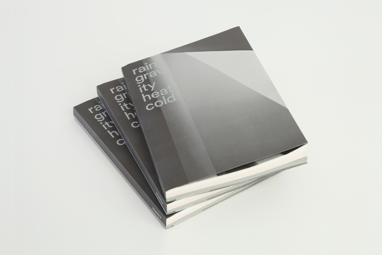
To celebrate the studio’s first ten years Superkül worked with Toronto-based Blok on a book that would serve as both a collection of work but also as a tool to articulate the firm’s unique philosophy and design approach. This beame an exercise in discovery and a clarity of positioning which was then conveyed materially through subtle paper transitions, finishes and printing techniques.
This is a companion piece to BP&O’s review of Superkül’s visual identity, published earlier this year. With a desire to broaden the content on the site to include the design of books, and with the site’s favour for material thinking and the architectural, Rain, Gravity, Heat, Cold felt like an appropriate addition. This is an initial impression, based on the press release and images provided by Blok, if you would like to read BP&O’s hands on review, click here.
Rain, Gravity, Heat, Cold preceded Blok’s work on Superkül’s visual identity, designed a year apart, yet forms a key part of visual identity development. It is an exercise in strategic positioning—the clarification of approach, values and principles. Superkül’s visual identity distills down and visually articulates many of the ideas first set out by Rain, Gravity, Heat, Cold and made physical in the intersection of the textual, graphic and material.
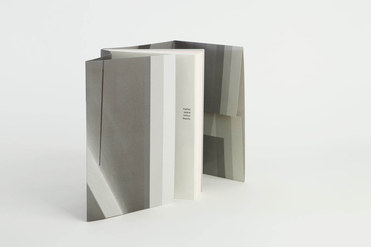
Although this is a review of the material and graphic properties of book, these augment the textural richness of content, in the same way that this post is intended to augment BP&O’s review of Superkül’s visual identity.
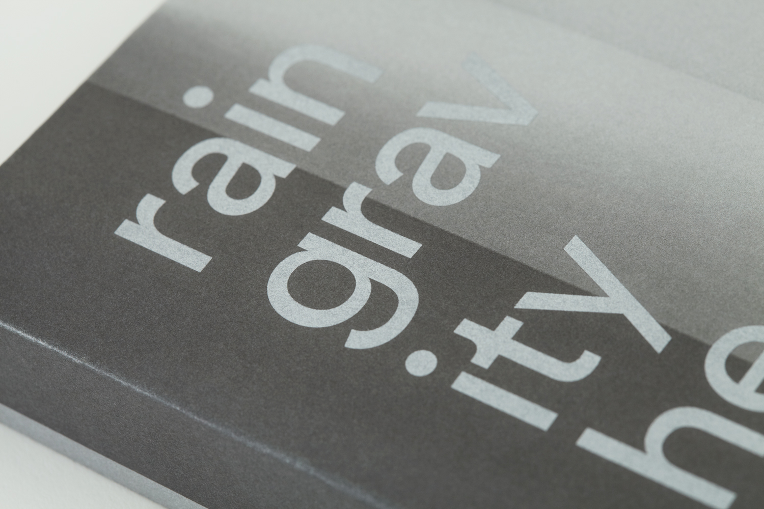
In what is said to be a deliberate departure from glossy monograms, Blok set out to create a deeply personal and intuitive reading experience, one that would express the firm’s unique philosophy and design approach. This began with title, and extends to the exploratory nature of the book’s format.
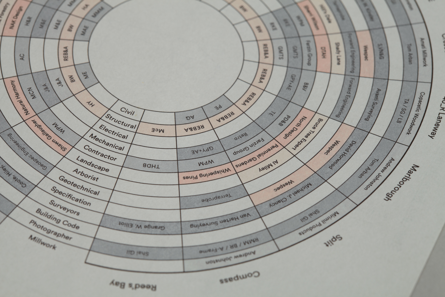
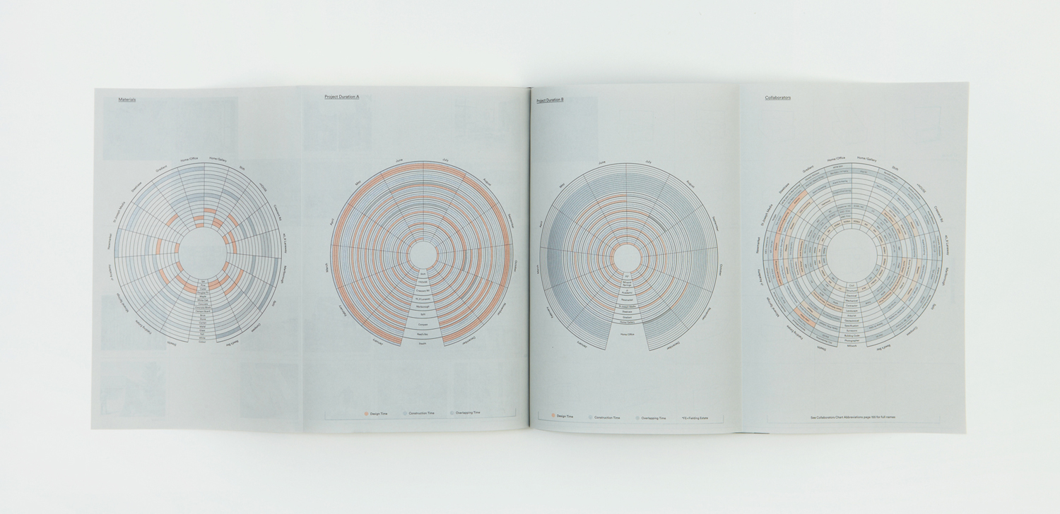
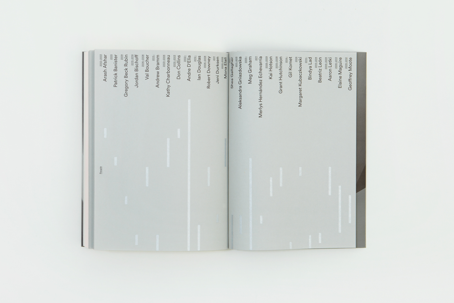
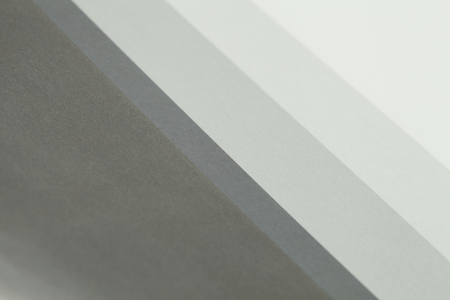
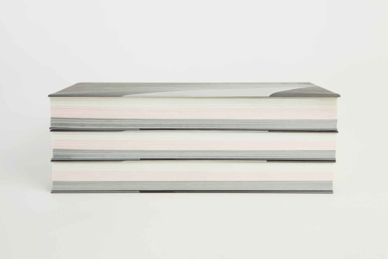
Subtle dyed paper transitions, silver print finish, folds, cuts and different printing techniques used in production, mirror the organization of materiality that is said to characterise and define the studio’s work.
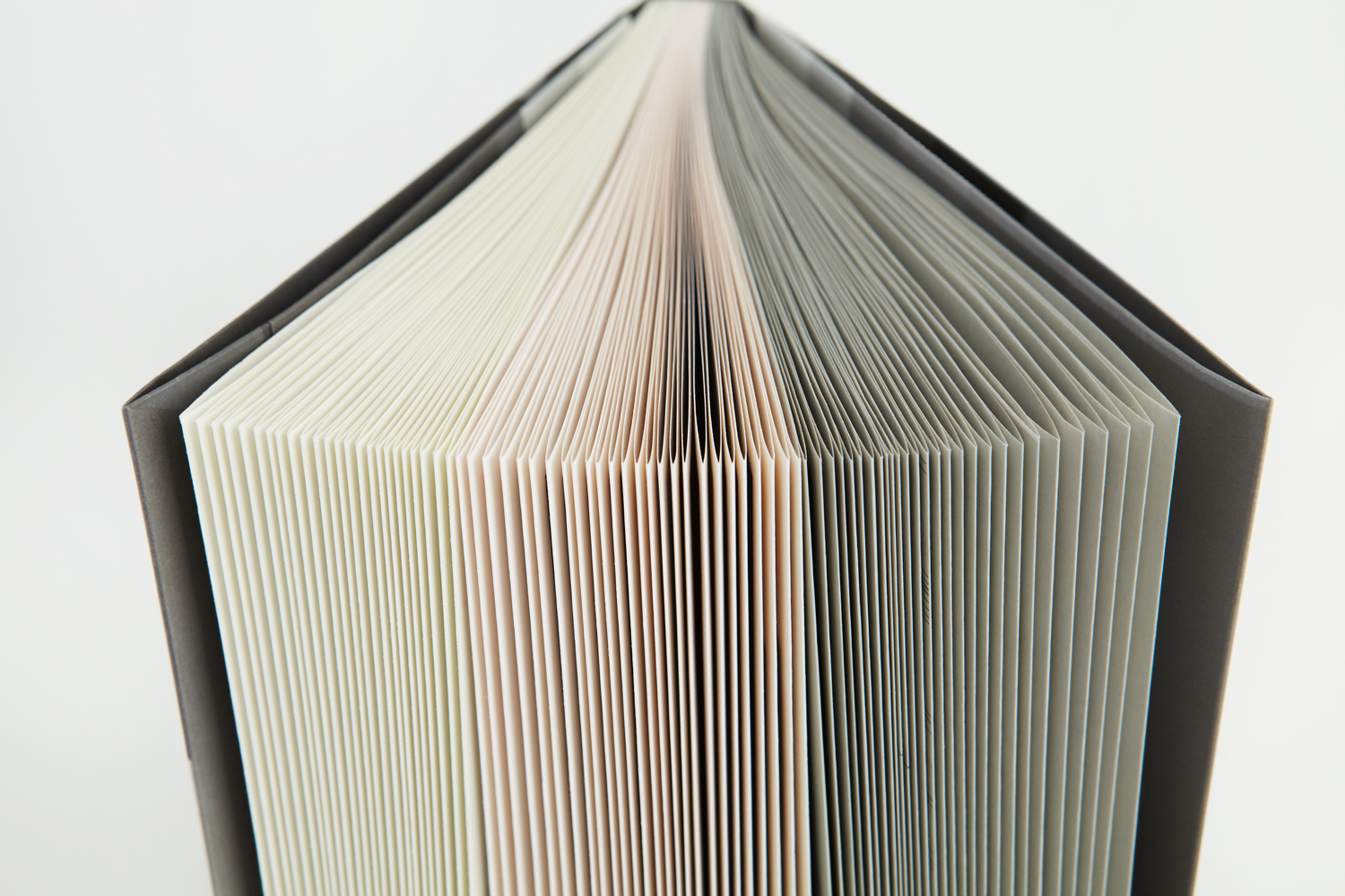
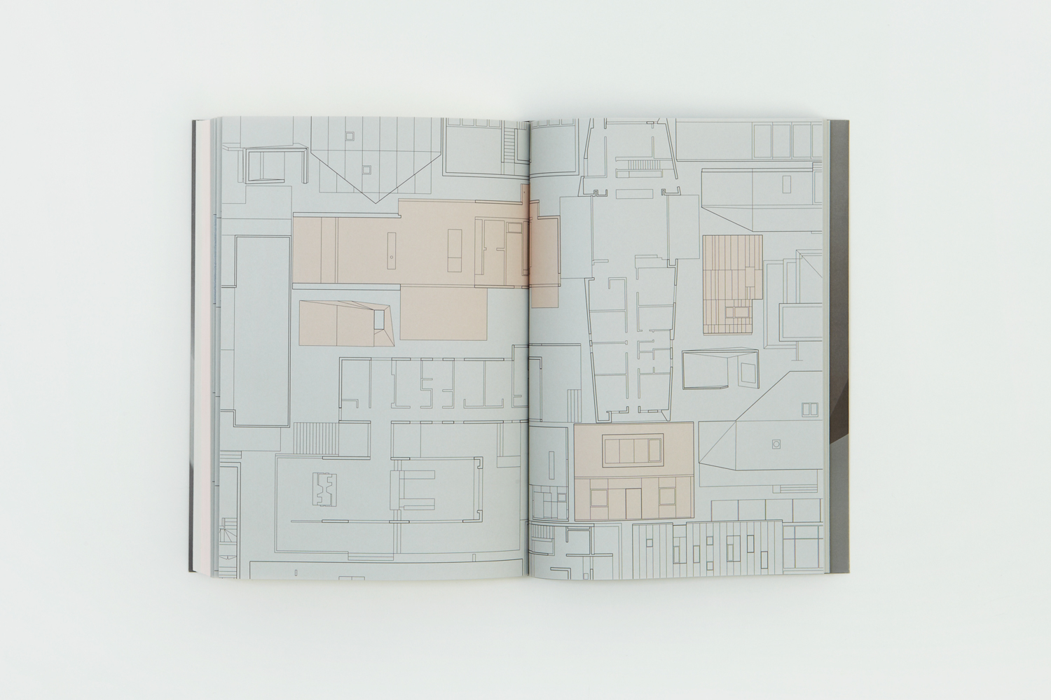
There are some neat ideas present throughout the book. Those that make a connection to architectural practice, moments where the graphic and material intersect with both an aesthetic pleasure and conceptual sensitivity, details that find new ways to visualise common structural considerations, and ways that guide the reader, alongside the convention of chapter titles. check out the use of colour above.
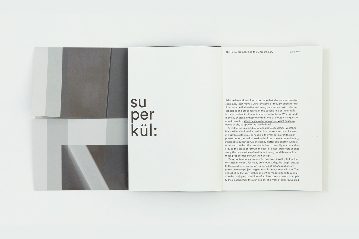
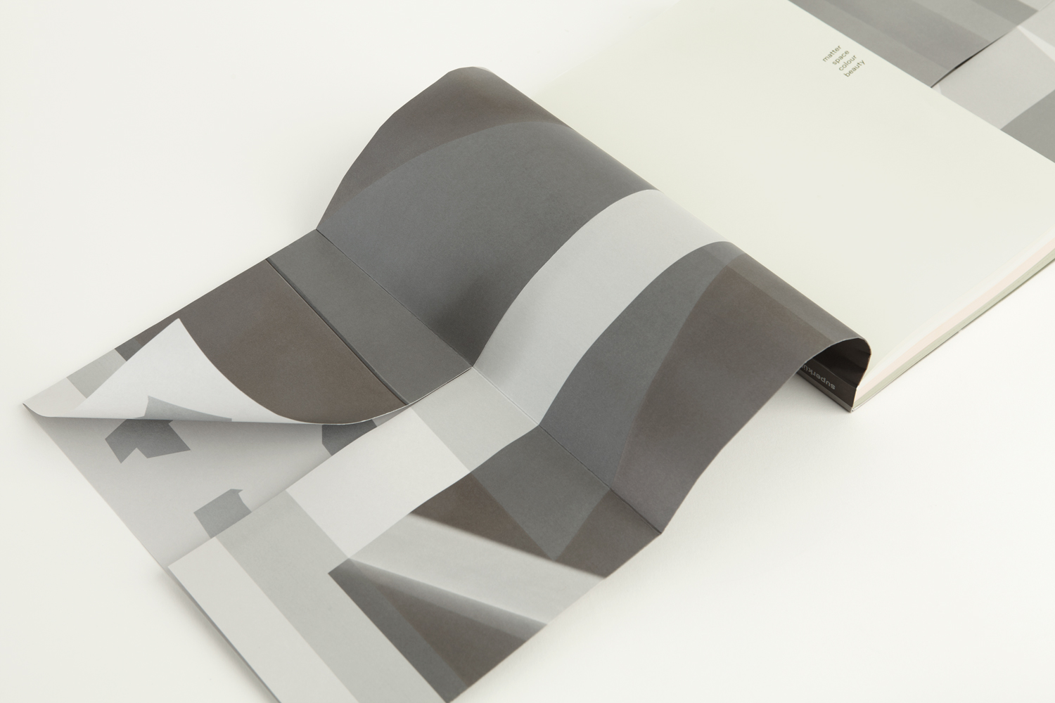
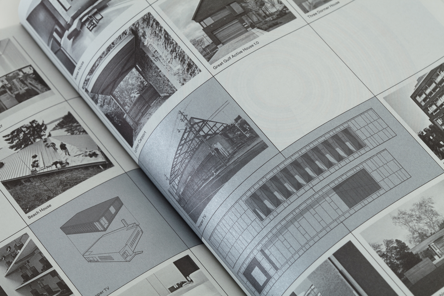
There is a strong preference for the architectural in the choice of colour, concrete greys, the shades created by light and shadow, the reflective qualities of metallics, are paired with the humanist warmth of cream and a light pastel pink. This tension between pragmatic and the emotional, the natural and the man made also emerges in the intersection of photography, often warm or with a strong environmental context, and the spacial in areas of unprinted space.
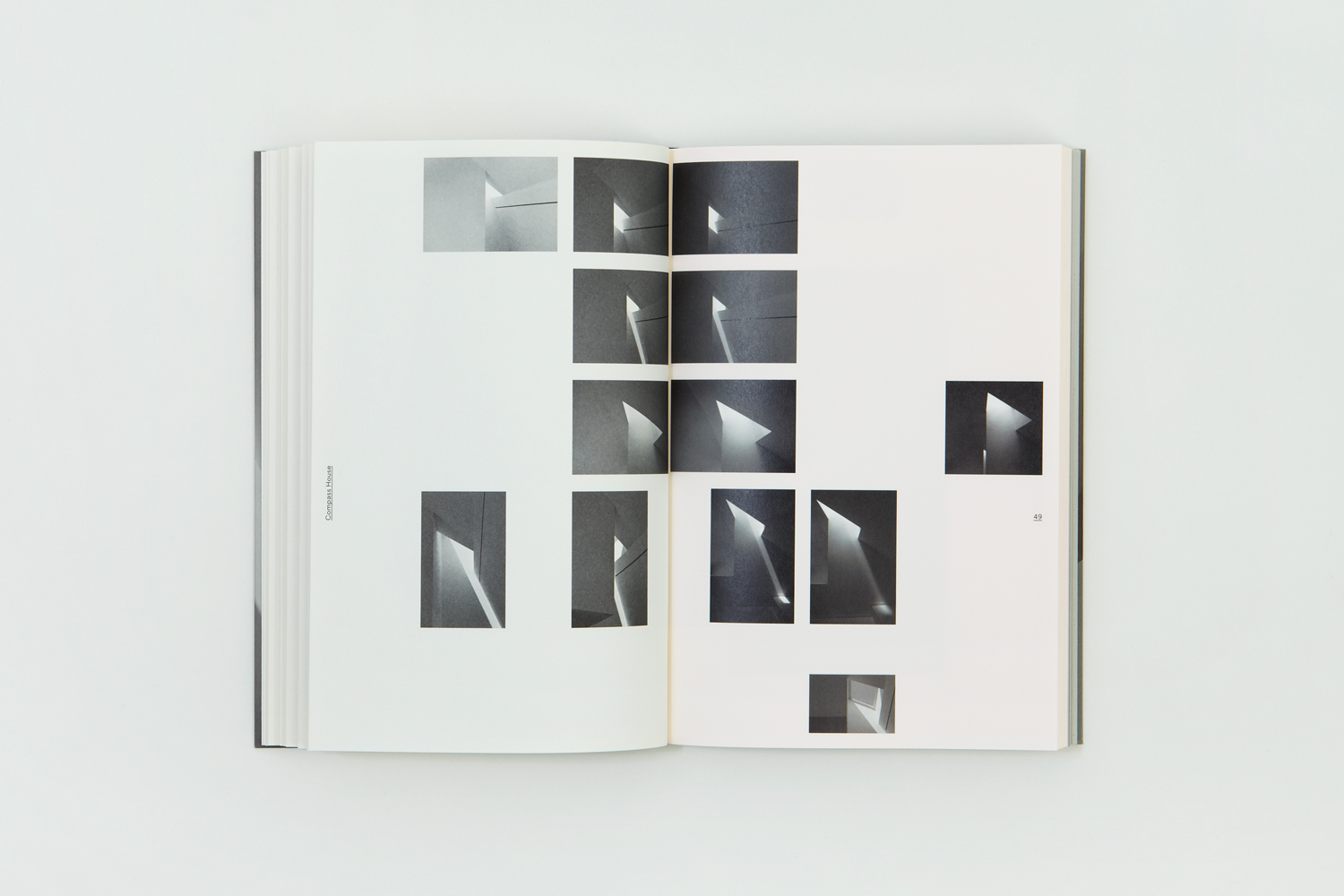
The highlight of visual identity was a splash page animation. Process, image and communicative intention combined within the context of time-lapse photography that captured the forms–drawn by changing light and shadow–of Superkul’s award-winning building Compass House.
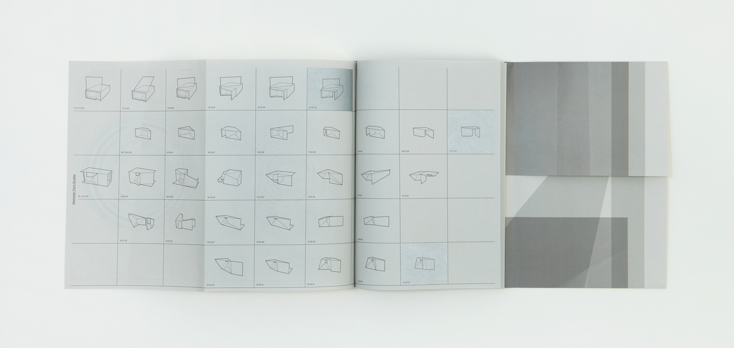
The passing of time, seasonality, and its influence on the natural lighting and shadow cast inside structure, drawing and changing its shapes, was a thoughtful detail. This formed a through-line between website and visual identity, but originally appeared inside the book as a sequence of still images, effectively bringing to light, in an unusual and contextual way, a vital consideration and the relationship between structure and its environment.
The interplay between light and the material is touched upon throughout the book, in the gradation of colour, the reflective qualities of ink and other print finishes, but also in the lighting and cropping of interior photography.
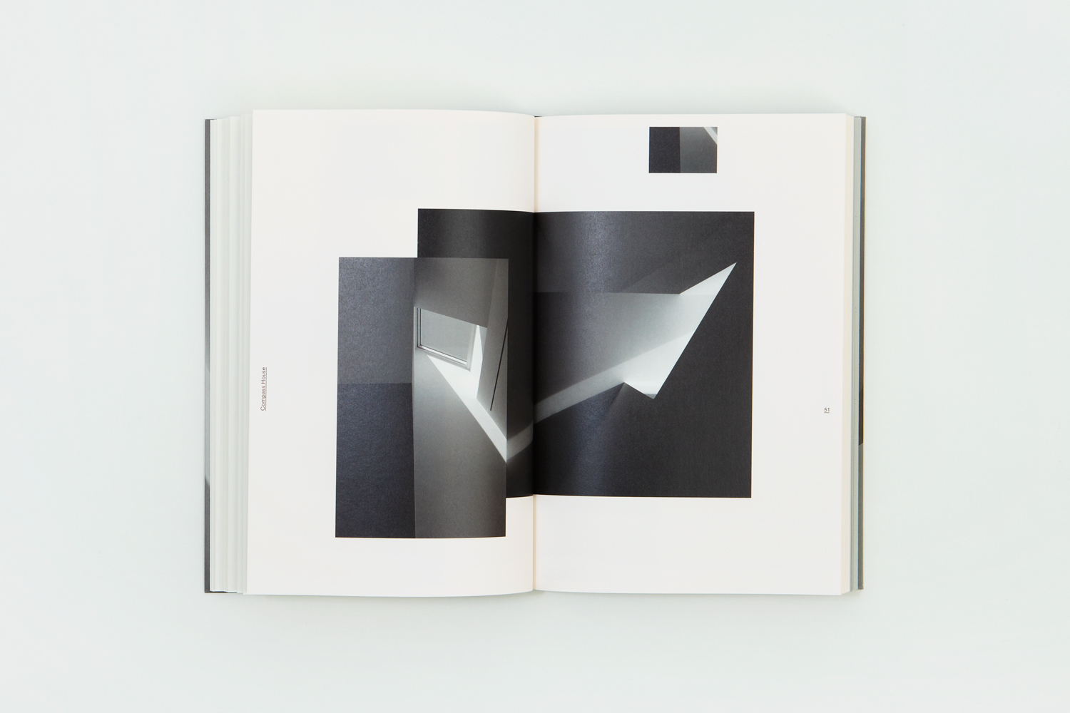
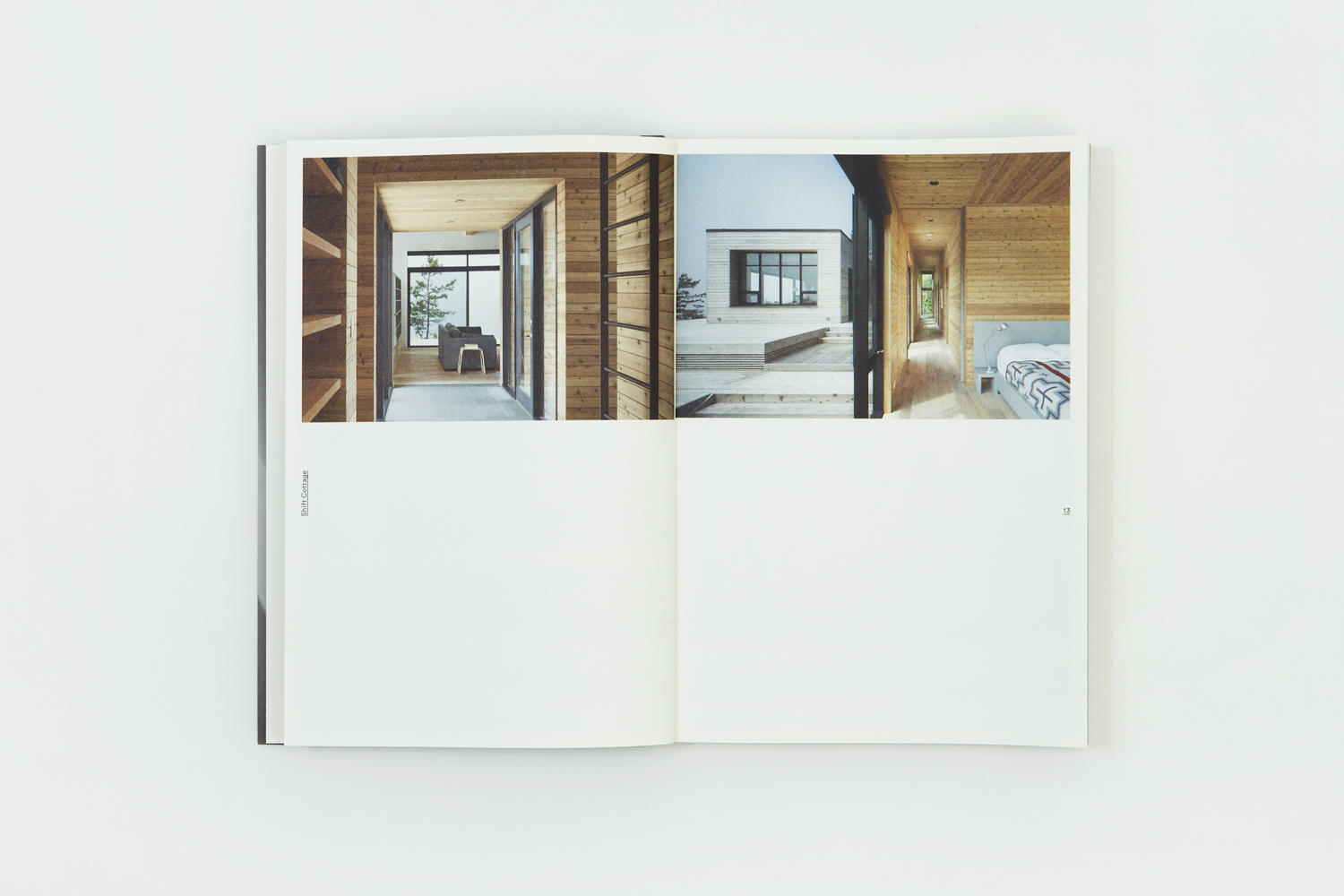
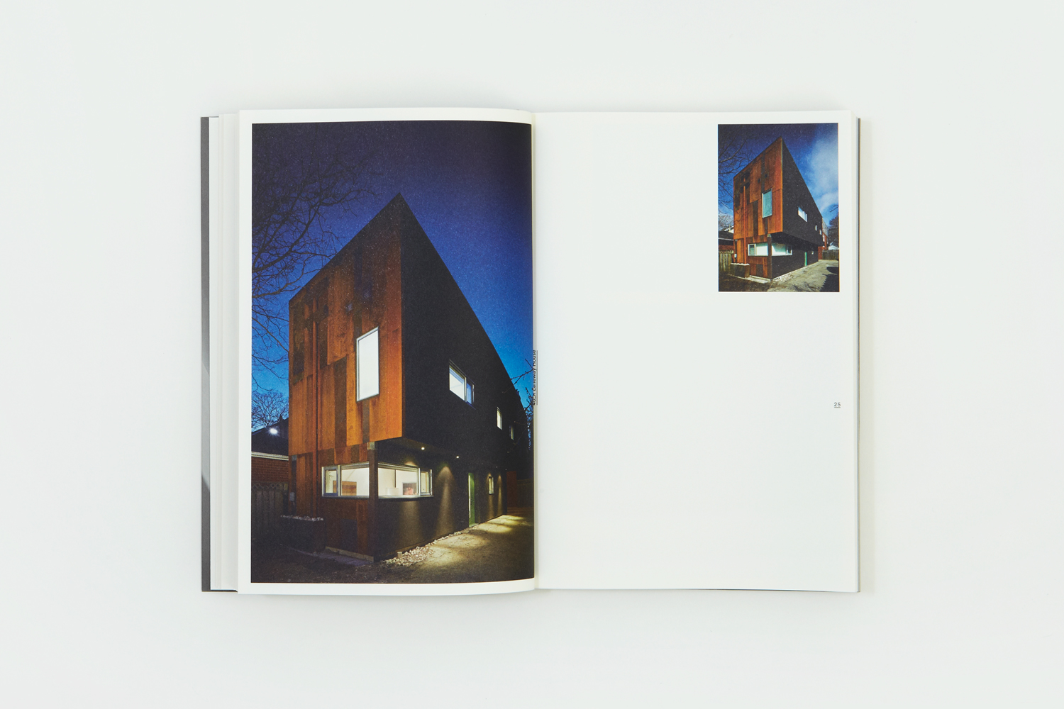
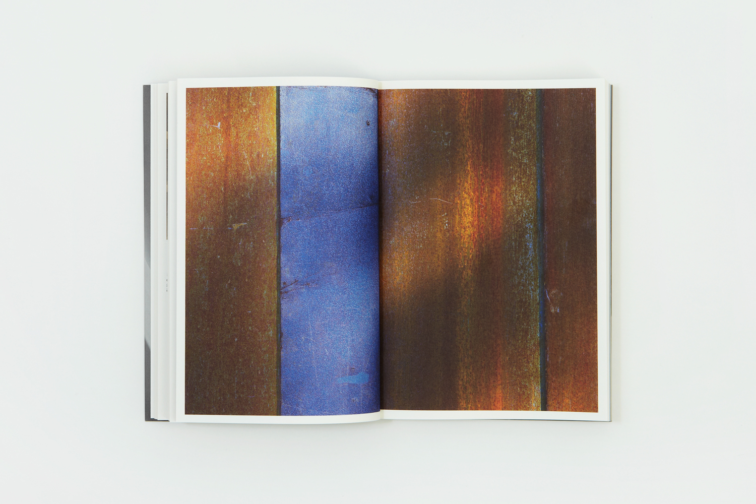
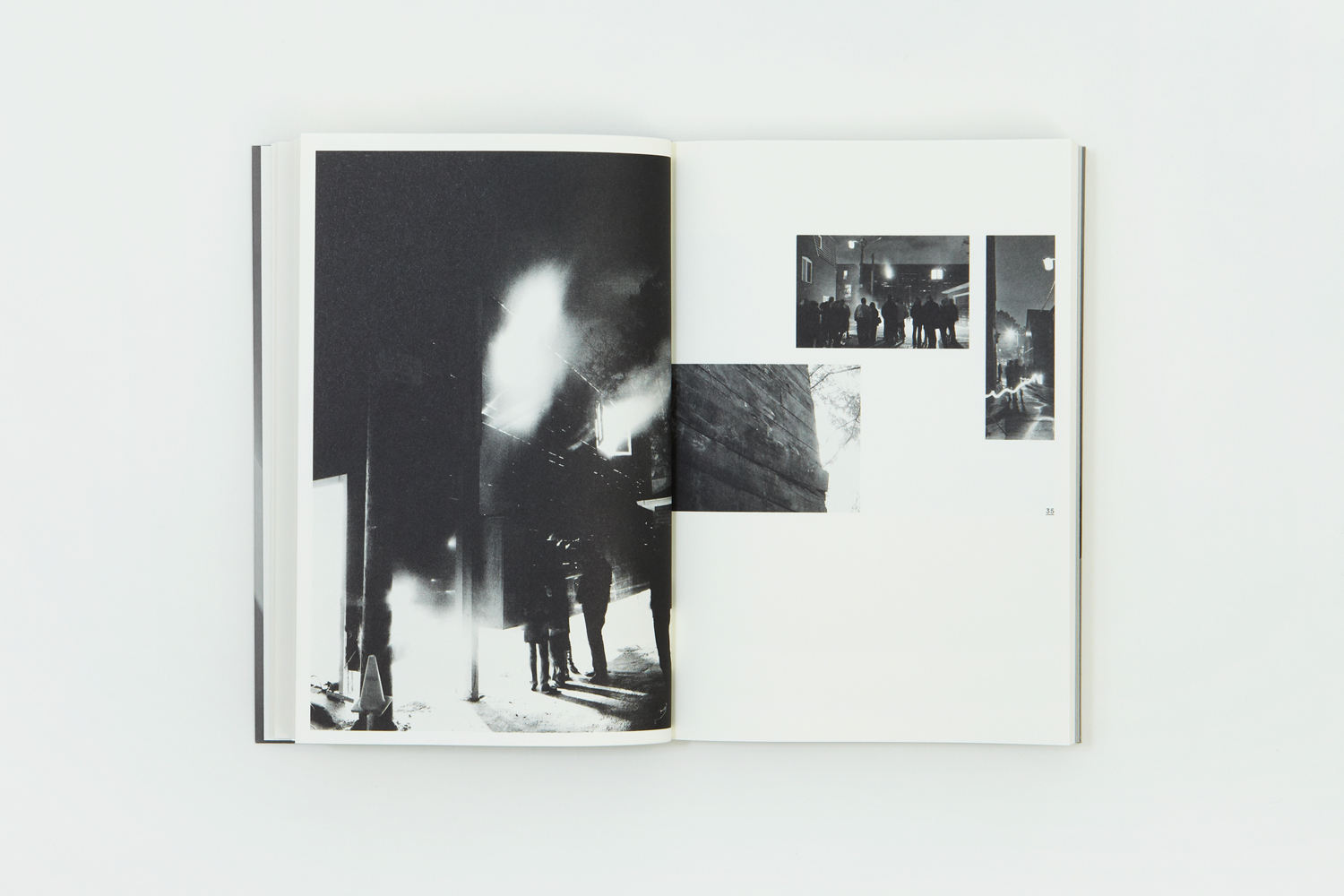
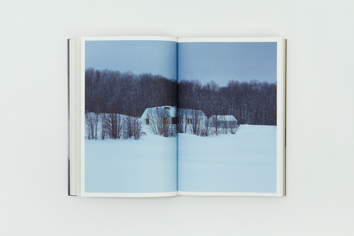
The images used in Rain, Gravity, Heat, Cold effectively move between tight crops of small material detail and complete structure. It utilises context and the absence of context with the intention of playing with perception. There are images that focus on form, light and shadow, the passage of time, the material, and both contrast and continuity in the way structure punctuates nature emphasised through a considered juxtaposition of colour and form (see below). In the size and arrangement of image, and within the context of pages of open space Blok also play with familiar architectural considerations of space and proportion.
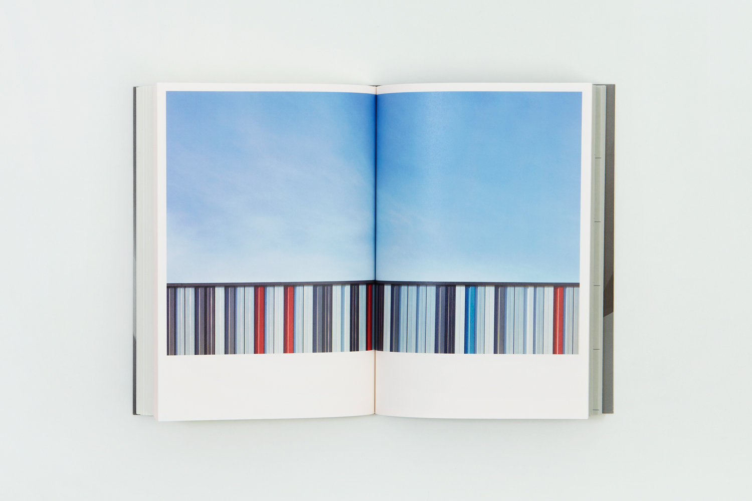
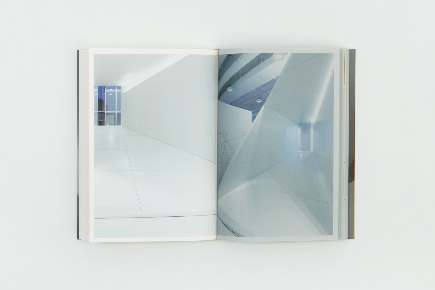
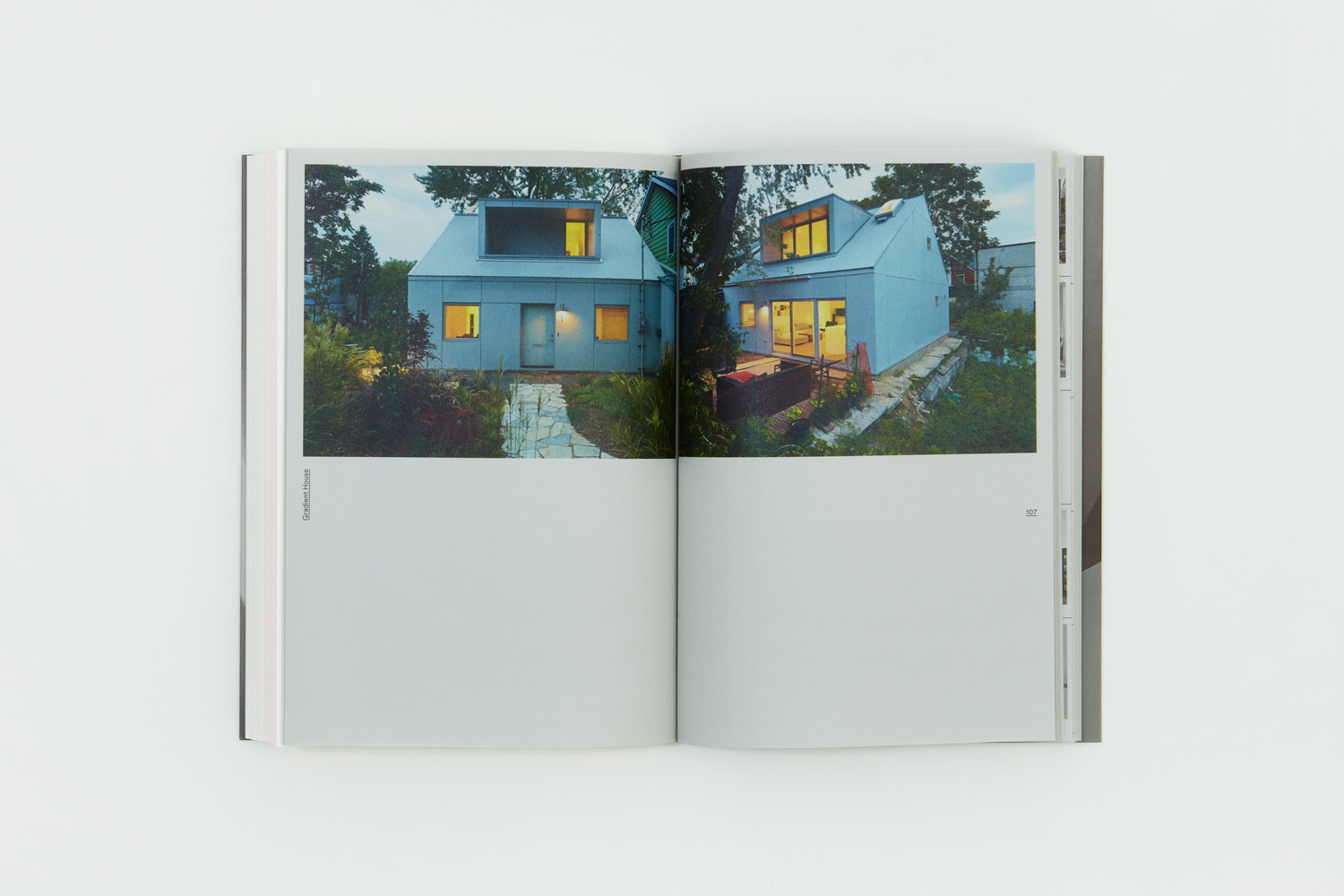
Much like visual identity that followed it, the book feels both introductory and sophisticated in its mix of the familiar and the nuanced. It is a product open to a broad demographic, of informed corporate clients and those looking to commission for the first time. It is visual rich yet restrained, underpinned by thoughtfulness and clarity.
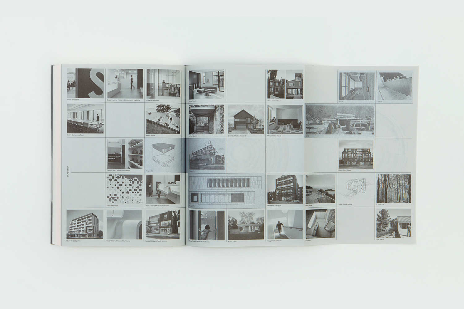
The book, in its comprehensive yet singular form is the strategic component of branding. It clarifies approach and helps drive outcome with a visual and textual pleasure. Visual identity functions as a distillation of this across of variety of new assets. These included wordmark, business cards, notebooks, packaging, stationery and website. Book and visual identity function as two volumes, one of the textural, technical and bound, but with some interesting and thoughtful material details, and the more refined, precise and unbound visual articulation of this. Both play with familiar ideas and themes, but often in new ways or with new combinations. More work by Blok on BP&O.
Design: Blok. Opinion: Richard Baird.
