Loupedeck by Bond
Opinion by Richard Baird Posted 5 December 2017
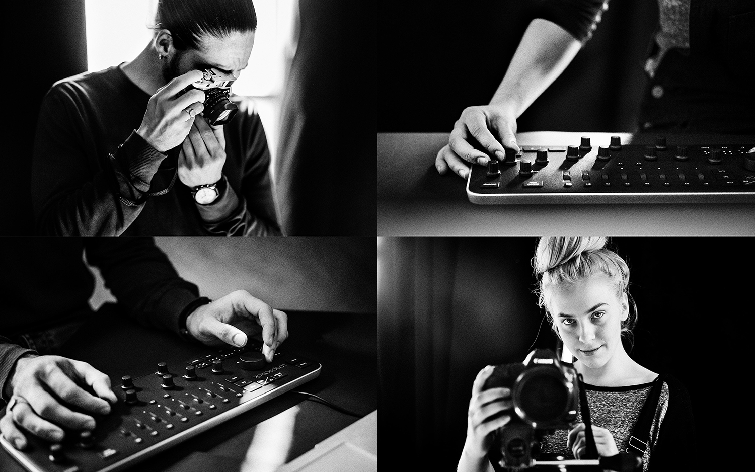
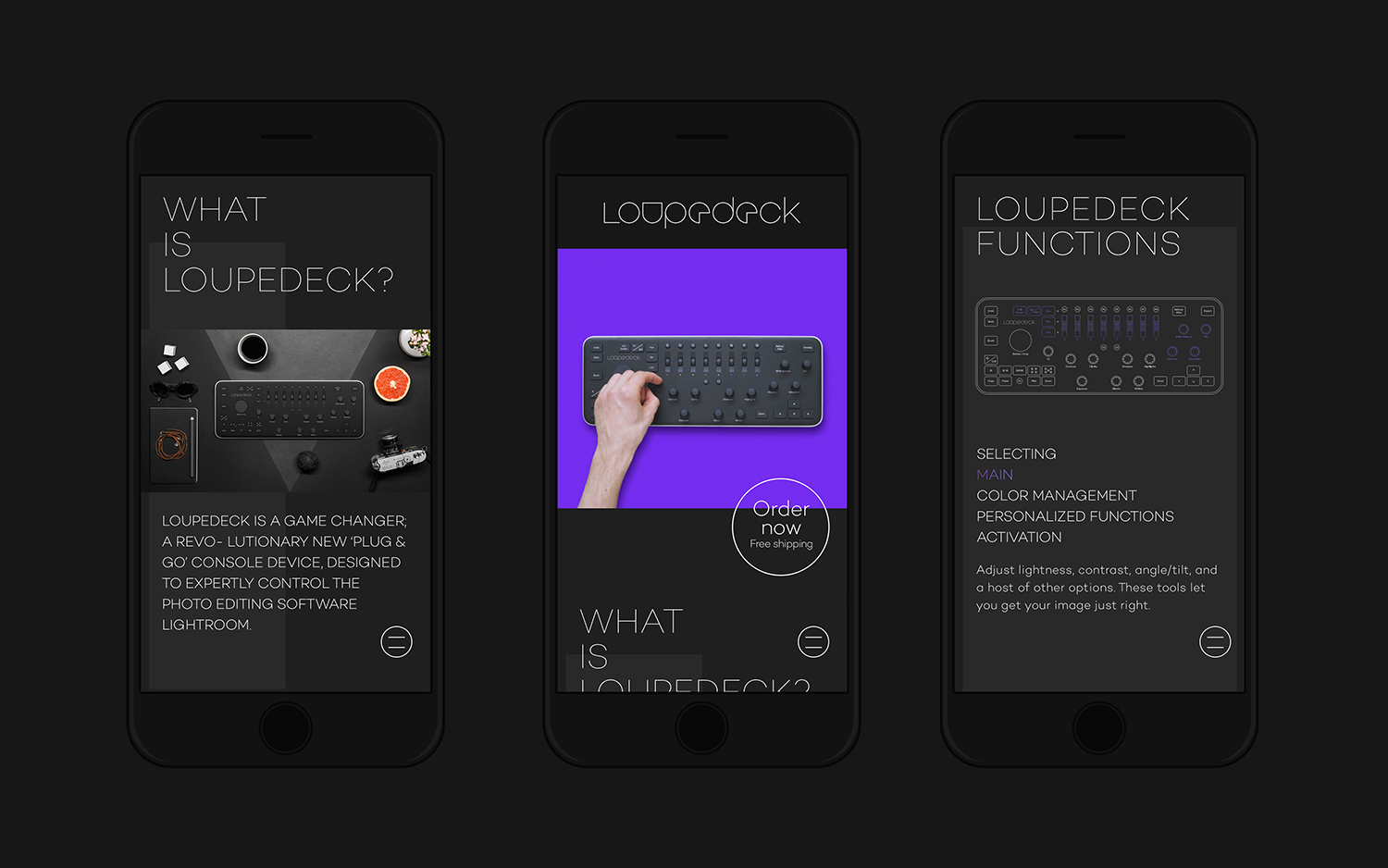
Loupedeck is a Finnish startup and photo editing console designed to make the process of image manipulation faster in Adobe Lightroom for both Windows and Mac users. It is described as being an intuitive replacement for keyboard and mouse, is mapped exactly to Lightroom to encourage creative spontaneity and experimentation, and suited to beginners and professionals alike.
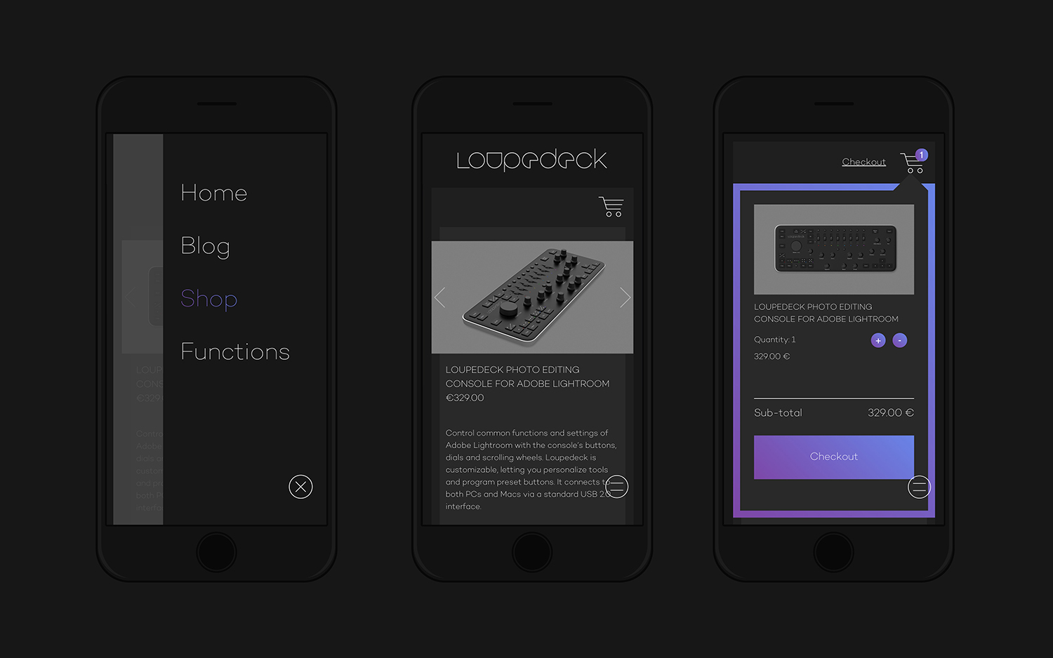
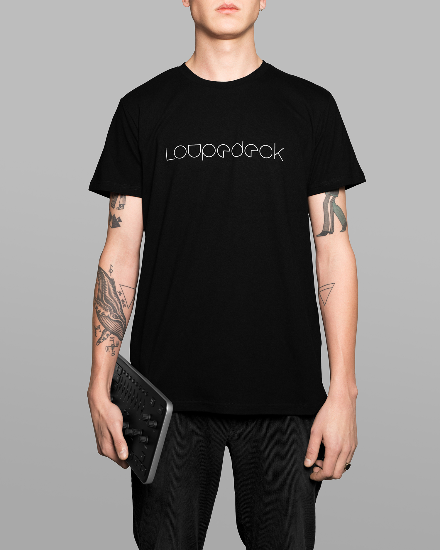
To help establish and grow their business, the startup worked with Scandinavian graphic design studio Bond to develop a graphic identity that would run across and link business cards, packaging, website and promotional materials that included beanies, t-shirts and tote bags.
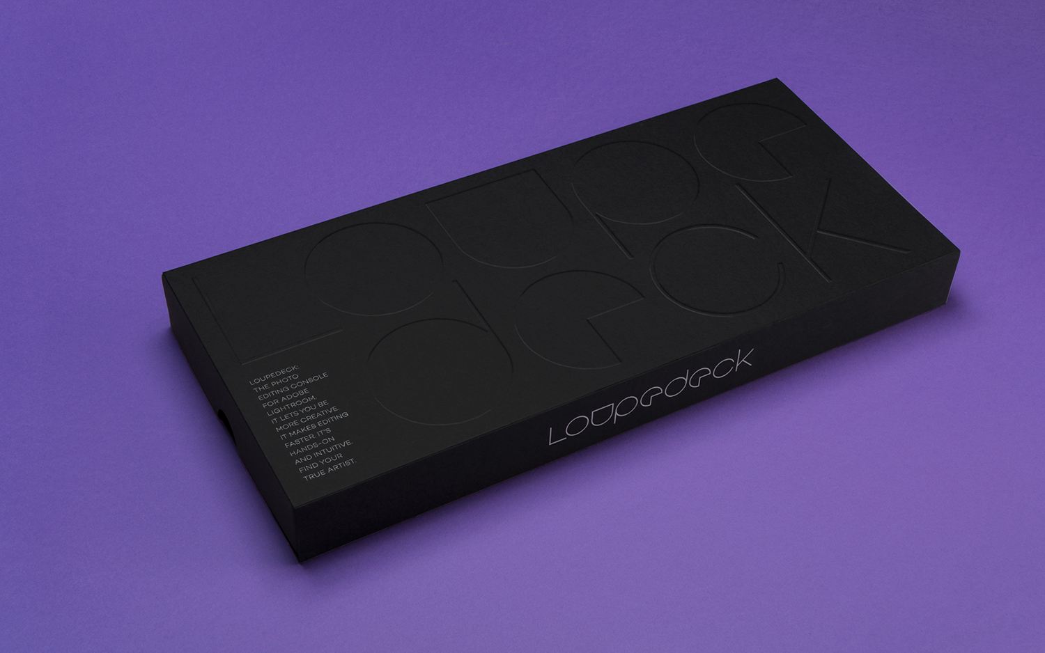
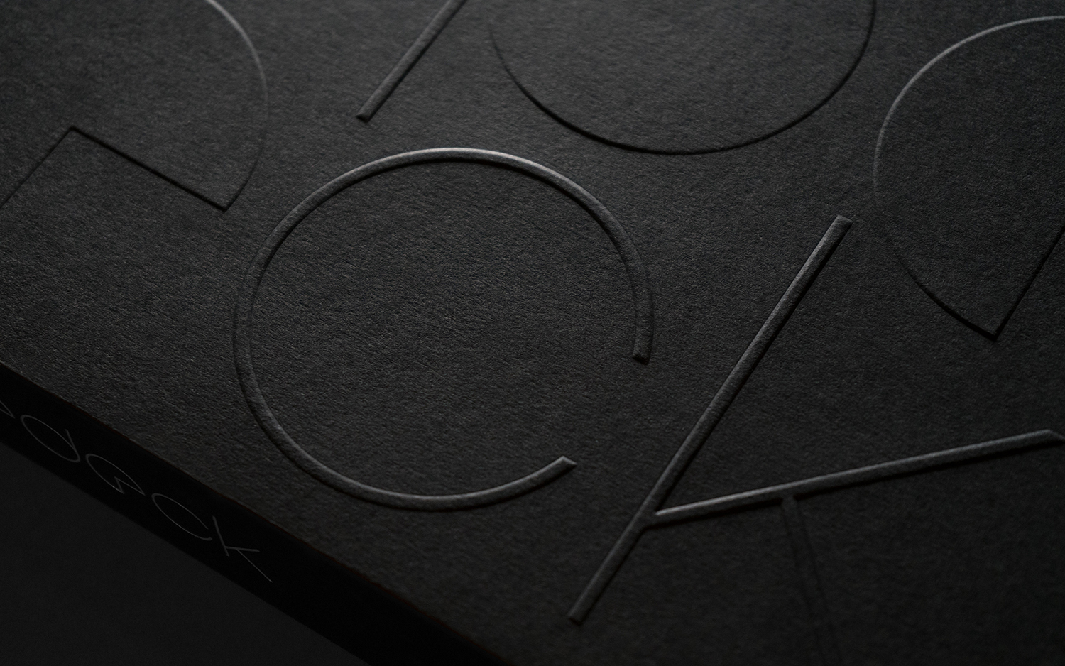
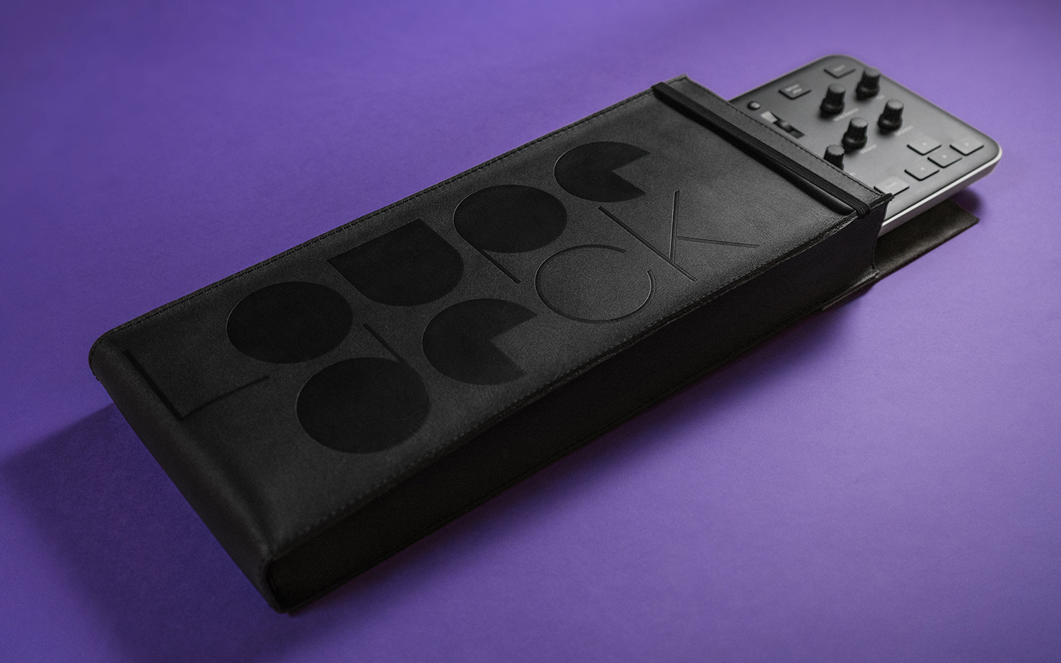
Loupedeck’s design utilises height, form, texture, arrangement and motion across the console to allow editors to manipulate images without looking down. This forms the basis of an identity system of distinct typographical shape and layout, the impression and relief of blind embossing, the texture of uncoated dyed substrate, and in the use of motion online.
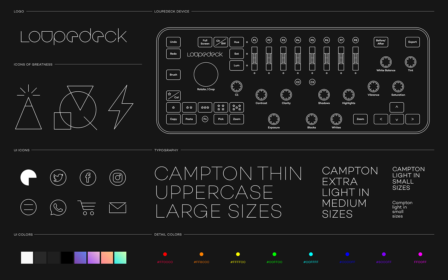
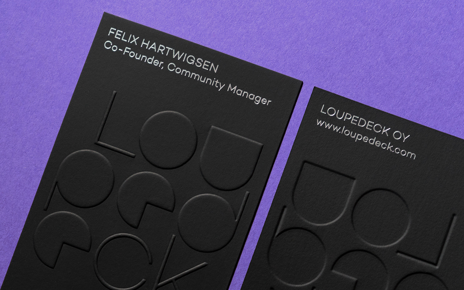
Bond’s graphic identity for Loupedeck effectively channels the shapes, colours, material qualities and interactive components of the console to establish a distinct visual language and a strong continuity between product, website and promotional assets. Much of this is fairly straightforward and intelligible, which is its strength. The matt black and silver finish of Loupedeck comes through in the use of dyed dark and uncoated boards, and a silver block foil print finish. While the stepped elevation of its dials and buttons, and the way that these help keep an editor’s eyes on the screen, are neatly represented by the impression and relief of debossing and embossing.
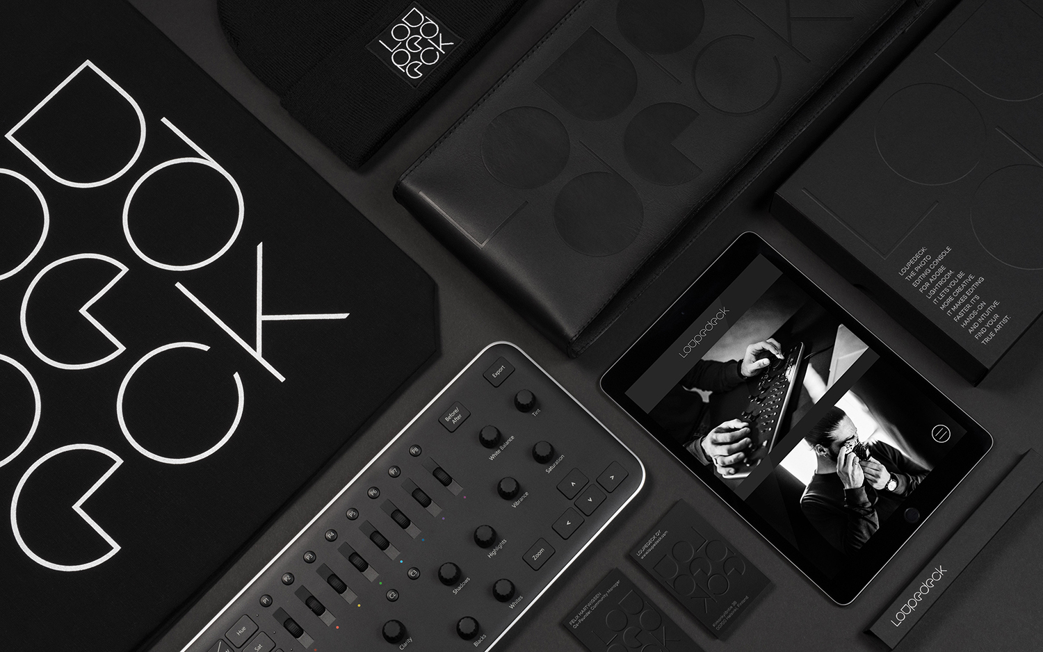

The radial nature of dials informs type choice—one with a clear geometric foundation and narrow apertures—the build of the logotype and the way that the G, C and Q’s rotate online when scrolling through content. This animated detail is a small flourish, alongside a neat software update icon, but one that recognises the key interaction with product, and builds it out into a unique and recurring set of graphic elements.
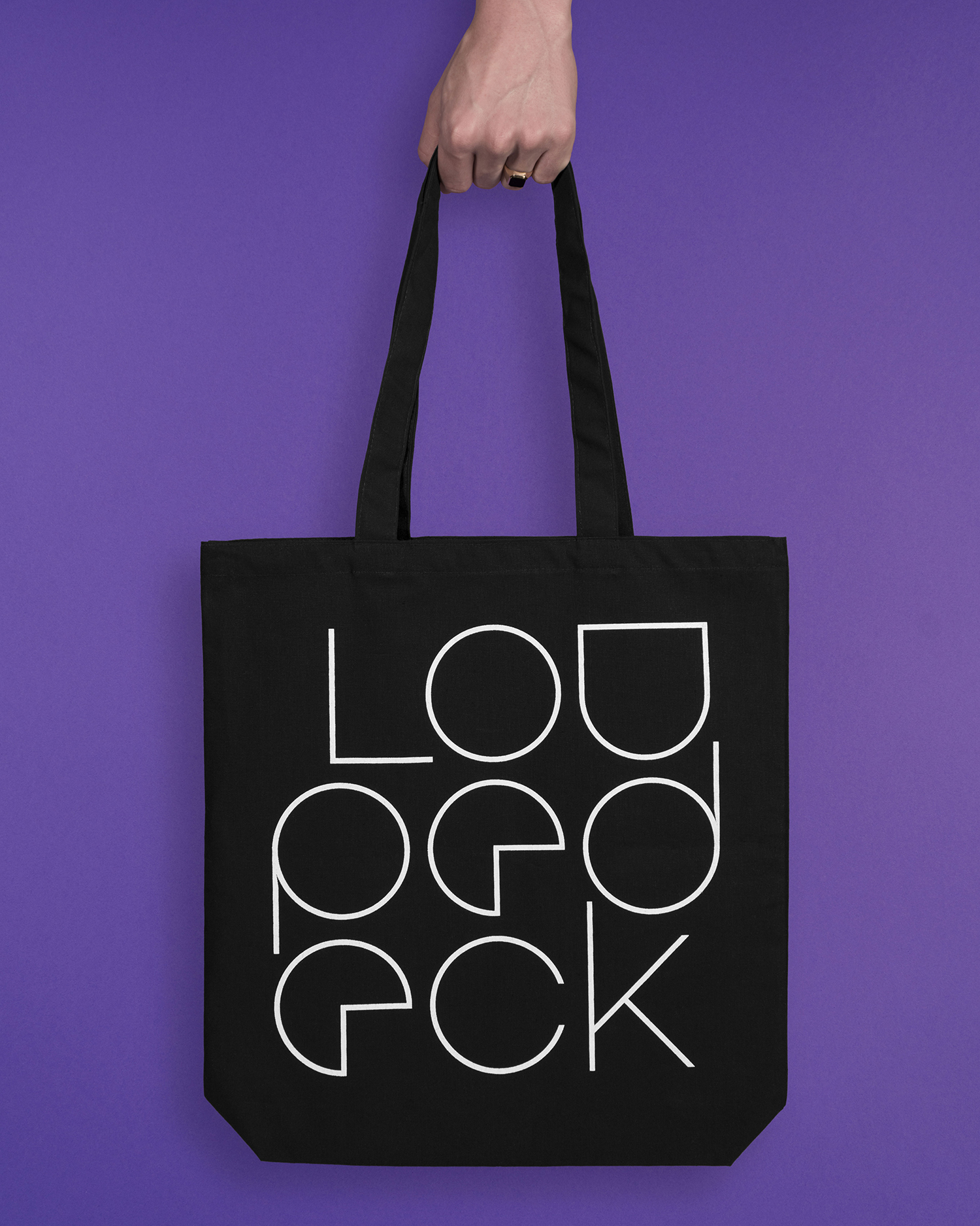
The monolinear lines, geometric shape and white of the logotype, singular type choice, illustration and iconography, in conjunction with a dark background that draws on the surface of the console, forms a clear continuity throughout, and uses contrast and recurring forms to make the most of association and establish recognition. The logotype does challenge readability, particularly when stacked. It functions more as a recognisable confluence of shapes, informed by the arrangement of the dials of product. Dials are common to image editing hardware, yet Bond manage to extract a distinctive and referential gesture from this ubiquity.
Online, panels of bright modern colour introduce significant contrast, sense of creativity and energy. These draw on the LEDs of product and, through video, make a connection with the responsive control the console affords its users, transitioning through colours in conjunction with the turn of a dial.
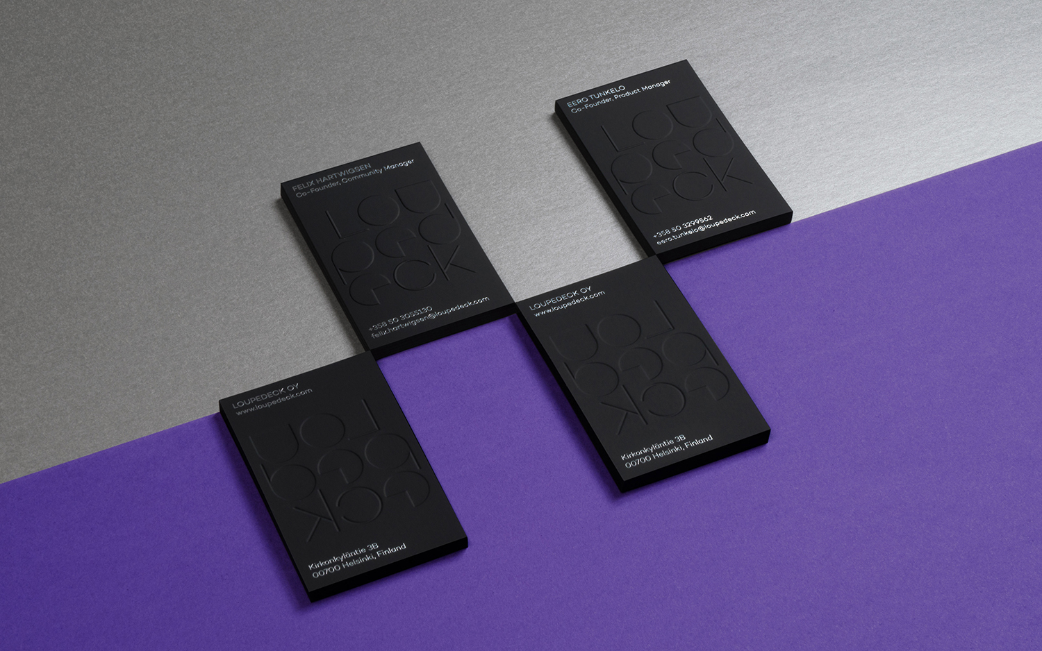

Conceptually it is simple. It plays with the technical and modular, elevates basic functionalities such as the turning of a dial, and the common forms of consoles into something distinctive and memorable, through both the static and animated, and finds a balance between creative play and professional use. More work by Bond on BP&O.
Design: Bond. Photography: Kaapo Kamu. Opinion: Richard Baird. Fonts: Campton.
