Enter Arkitektur by Lundgren+Lindqvist
Opinion by Richard Baird Posted 24 April 2018

Enter Arkitektur is a Swedish two-office architectural practice located in the cities of Jönköping and Gothenburg. It has a rich history that goes back to the 1950’s and a portfolio that moves between residential housing and commercial building projects.
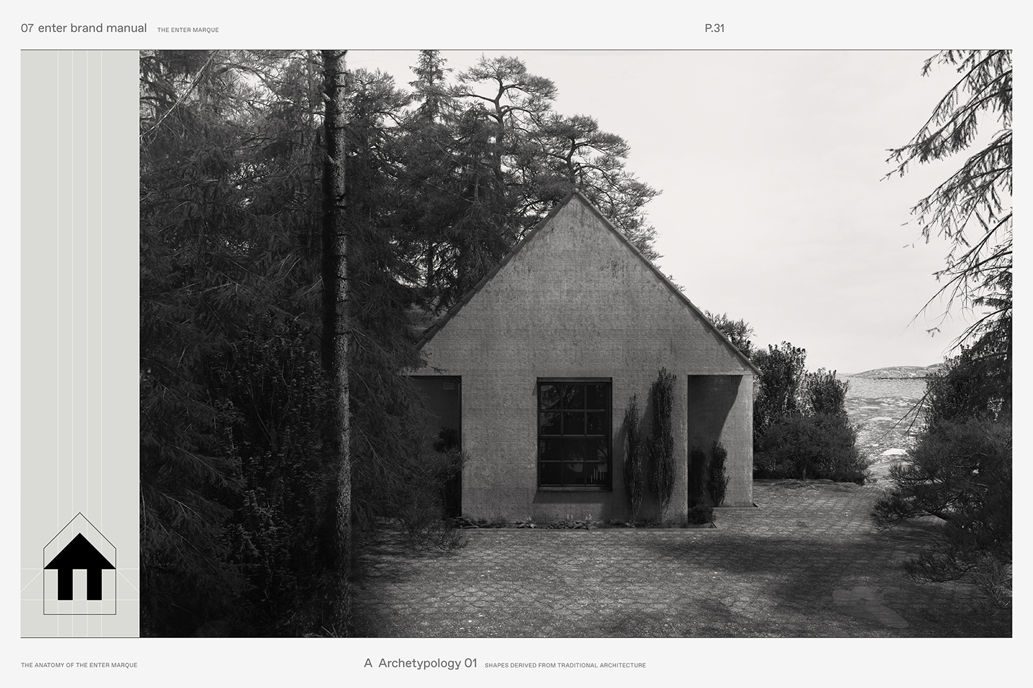
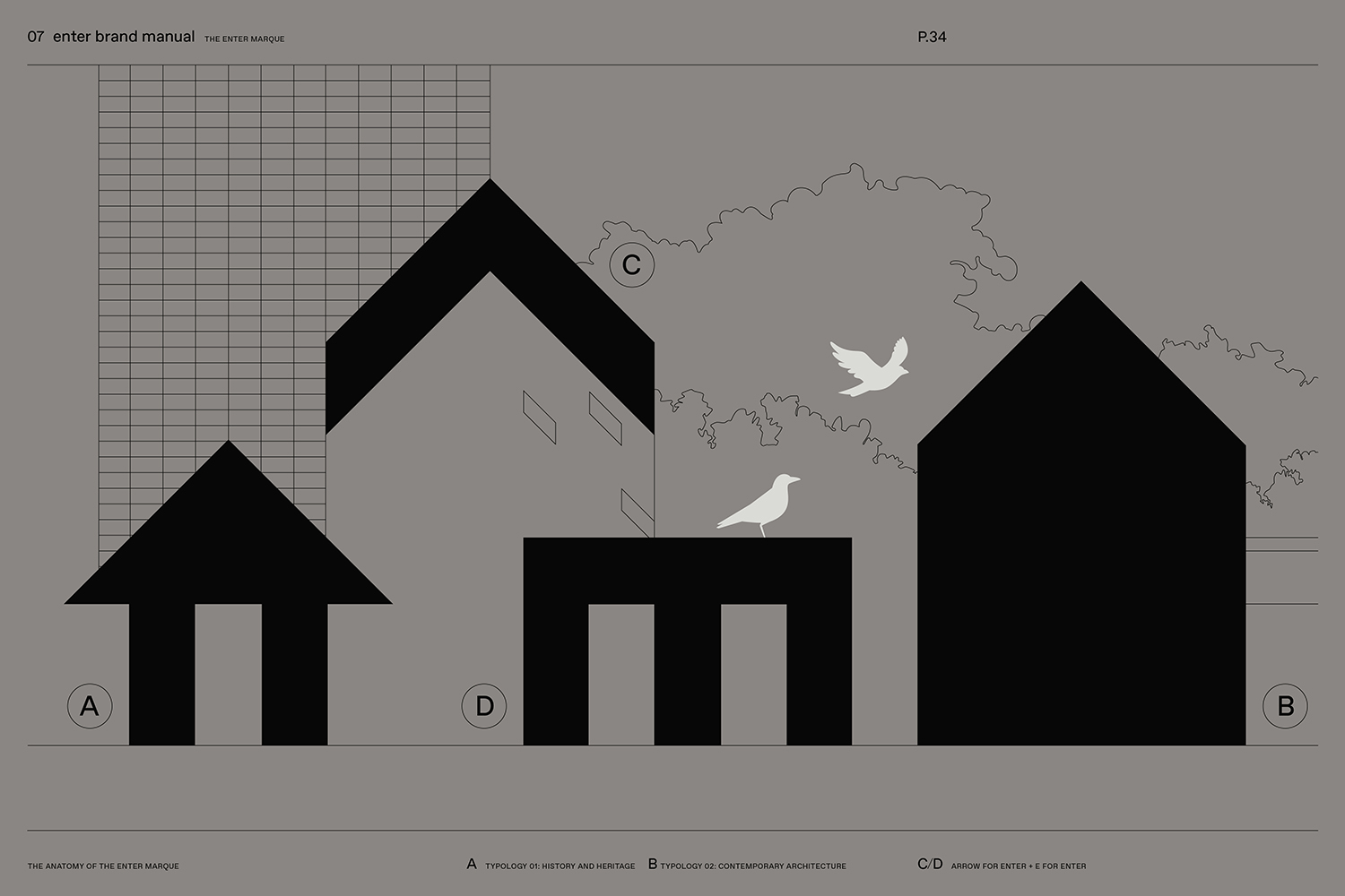
In response to restructuring and expansion, the practice worked with Lundgren+Lindqvist to develop a graphic identity that would better represent their legacy, contemporary structures and forward outlook. This builds out the arrow of their original identity—maintaining some form of continuity—into a more distinctive and immediate architectural motif, pairing this with type, introducing a broader colour palette and creating a new online platform to showcase Enter Arkitektur’s work.
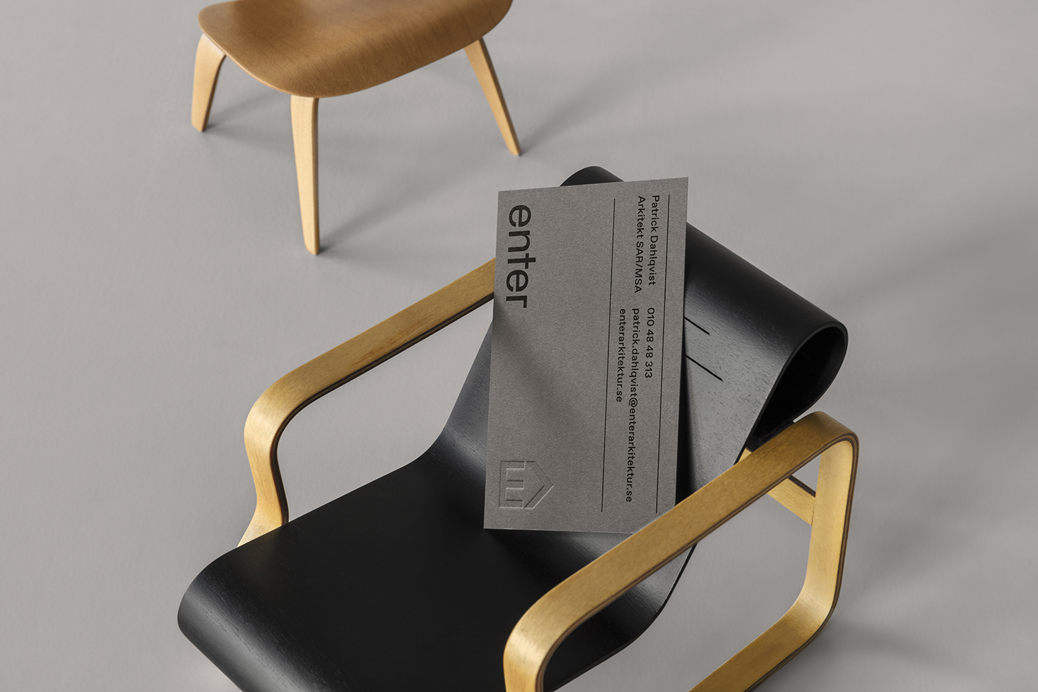
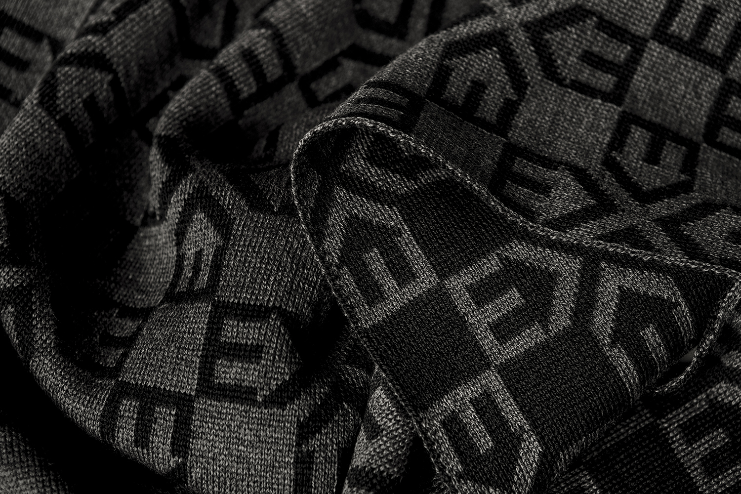
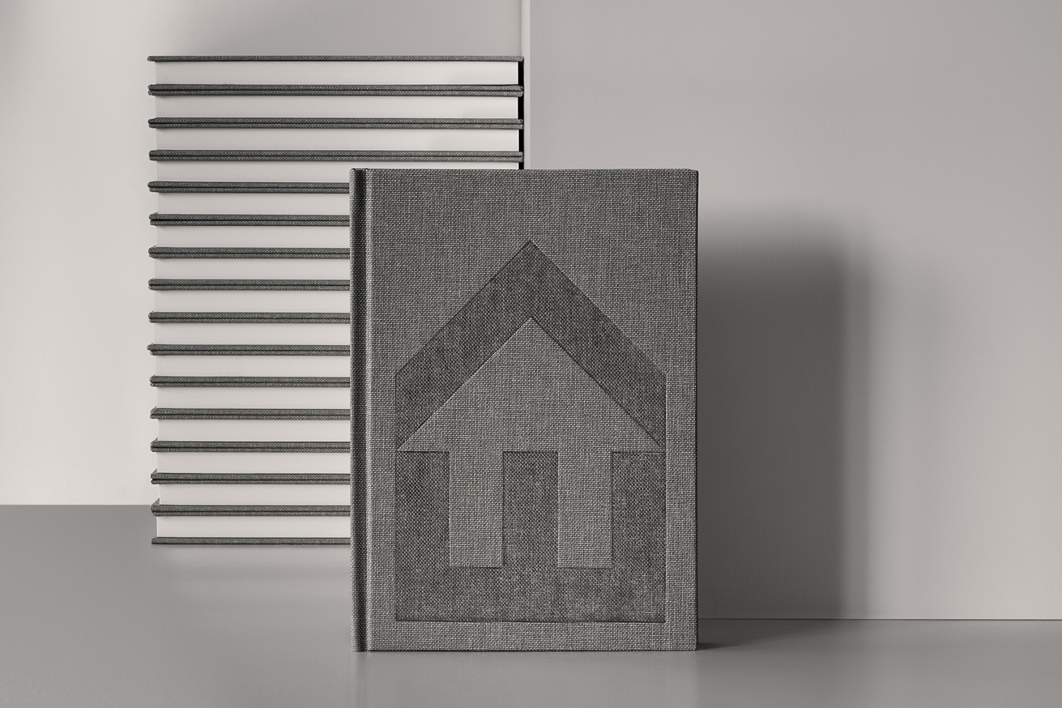
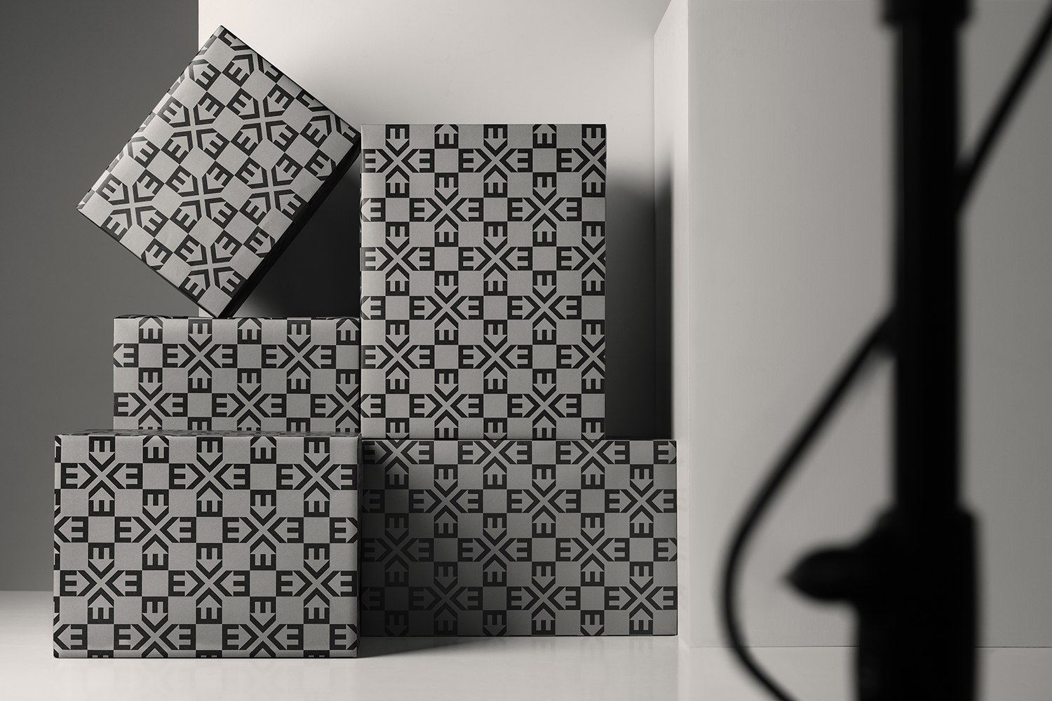
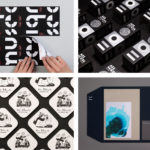
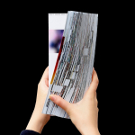
To mark the launch of their new graphic identity, Lundgren+Lindqvist developed a range of gifts. These included illustrative A5 postcards, gift wrap to coincide with Christmas, knitted scarves, silkscreened tote bags and hand-bound notebooks alongside more formal documents and assets such as brand guidelines, stationery set, business cards and website.
Enter Arkitektur has a long history and an associated experience. They continually seek to employ this experience within the context of contemporary architecture, pairing extensive historical insight with a sensitivity to the needs of the present and the challenges of the future. This legacy, experience and outlook are critical and interrelated components of the practice and a useful differentiator within an industry of fledgeling practices.
Although what could be described now as a mid-century modernity has seen a resurgence, with a few brands returning to earlier logos and simplified graphic systems in an effort to recapture the spirit and visual simplicity of a romanticised and occasionally fetishised past, within the context of an architectural practice which began in the 50s, the direction feels well-founded, particularly when paired with a responsive web presence.
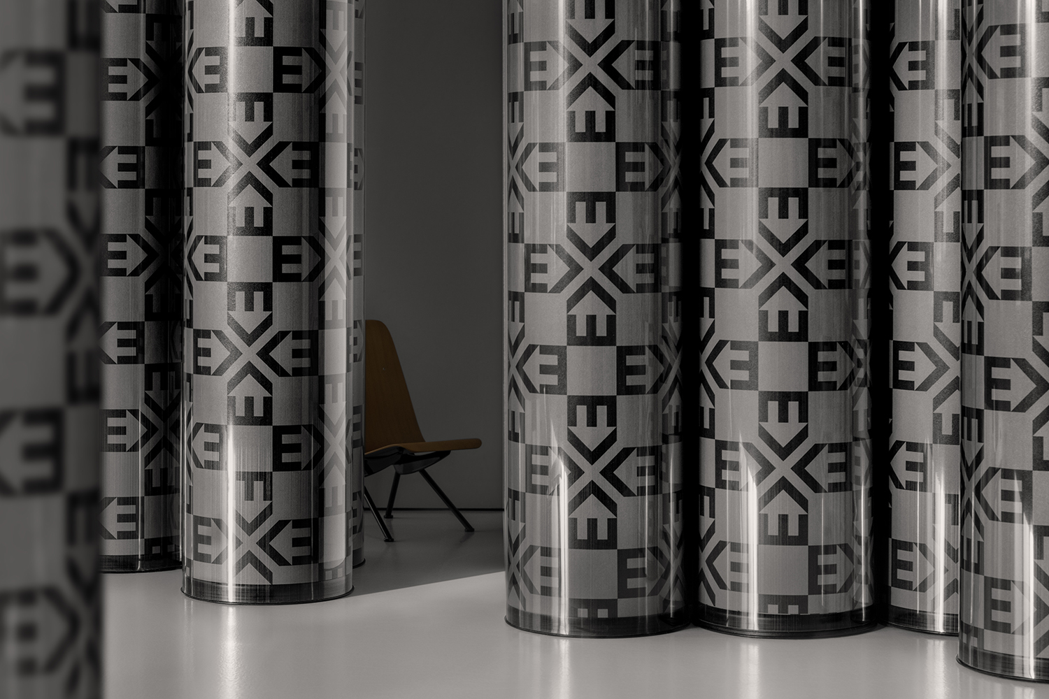
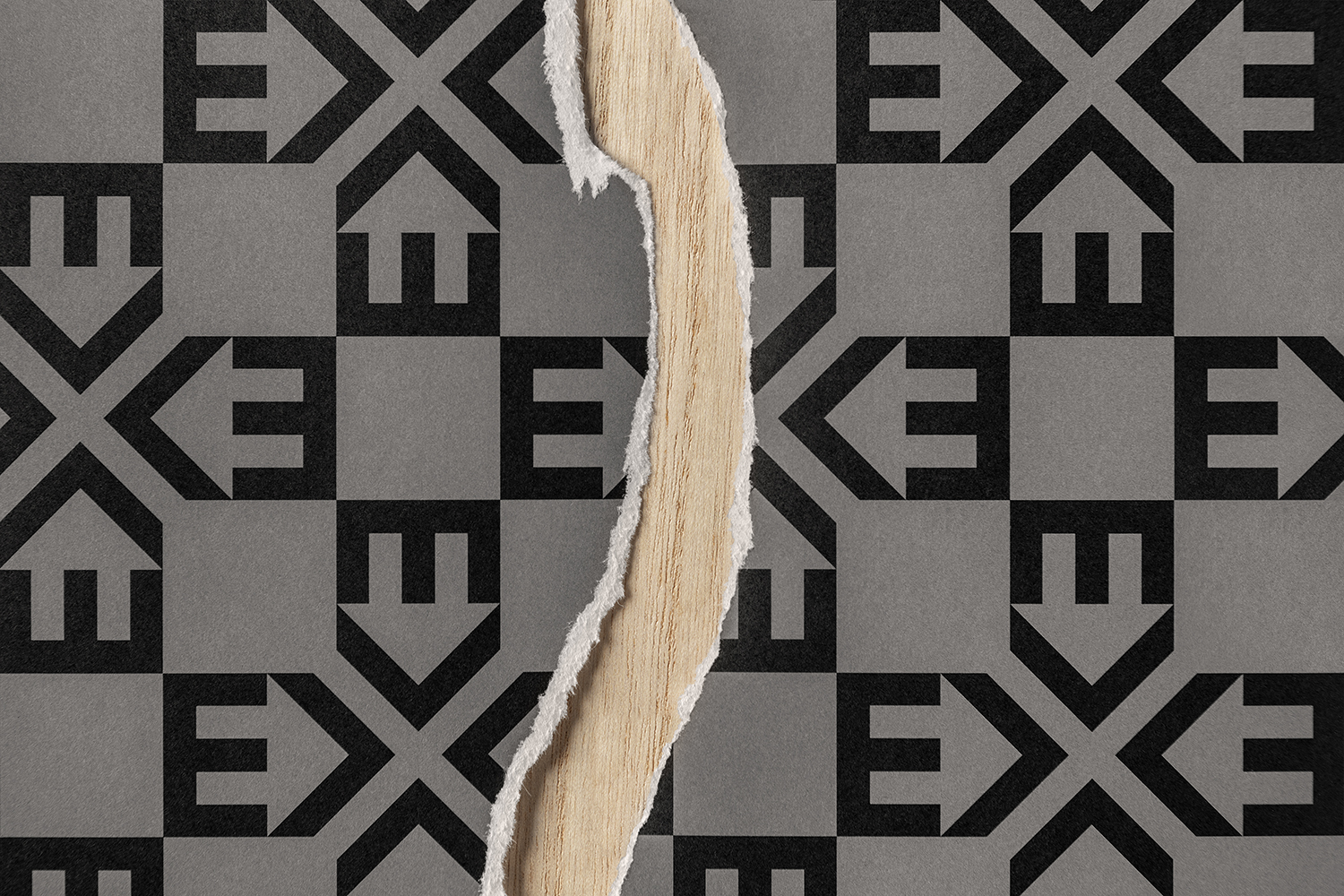
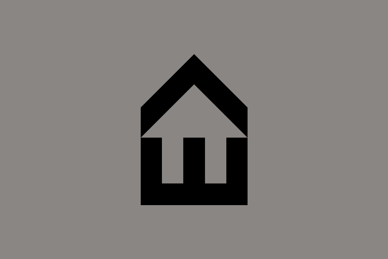
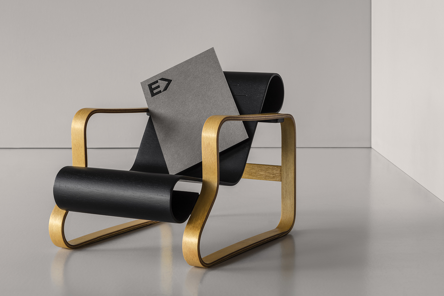
There are the obvious mid-century modern qualities to the drawing of the logo, and an immediate form language in the combination of an E and an arrow viewed one way, and the universal motif of a house another. There is an economy of form at play, a balance of positive and negative space, as well as the iconographic and the typographic, well-weighted and clearly rooted in architectural practice, the structural language of modern homes, as well as the name and the arrow of the earlier version.
The logotype introduces contrast in its all lowercase typesetting and the lightness of it lines, and commonality in its play with internal space. These small details, the right angles of the “r” and “t” and straight lines set within the negative space of curved letterforms tie it to modern architectural language; the framing of space, and outside expectation subverted by inside experience.
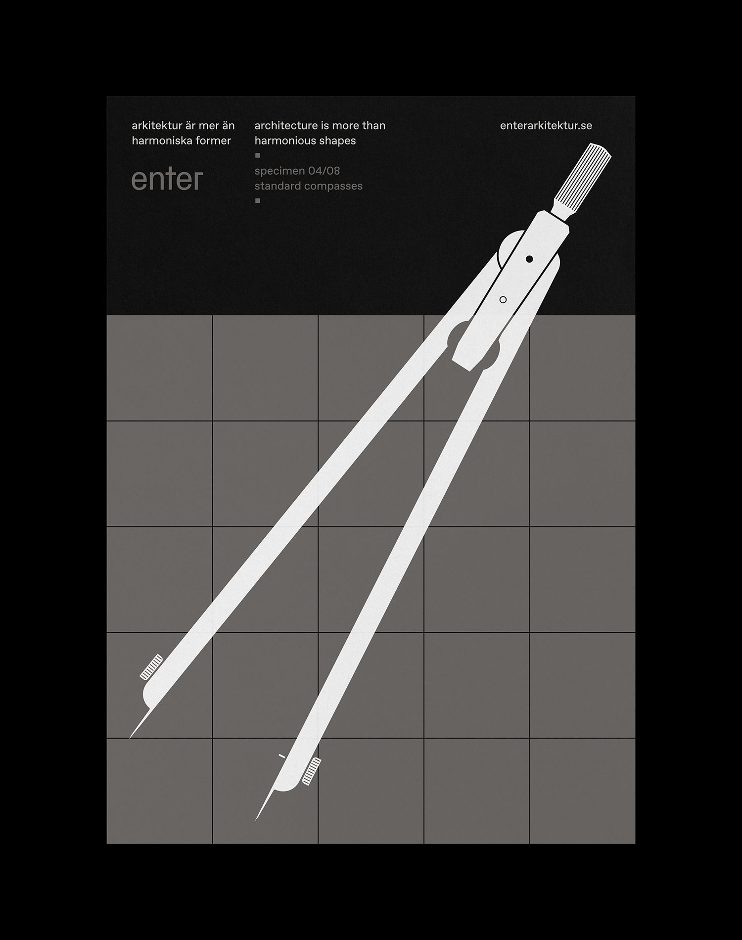
Other neat details include an illustrative component that also draws on the mid-century in its style and architecture in its content. The material craft of hand-bound notebooks and experimentation with heat and pressure settings of blind embossing to resemble concrete and deliver slight variation across 200 editions. And a colour and material palette of dyed papers and boards that touches on light cast on walls through windows and the passage of time associated with this. Elsewhere there is a logo-centricity, again, in the spirit of mid-century corporate identities. Logo is deployed small and large, rotated into a pattern and applied to a few different things.
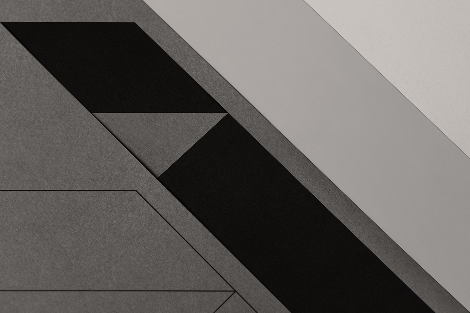
Architectural considerations and themes are touched upon throughout. These include positive and negative space, orientation, perspectives, structure, light and shade in colour and embossing, and the implication of architectural materials, either in substrate or finishing.
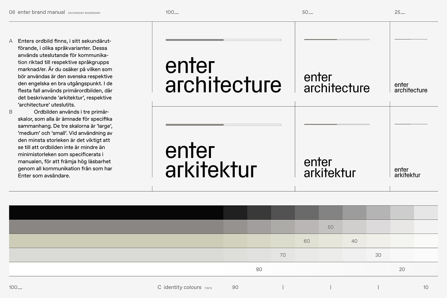
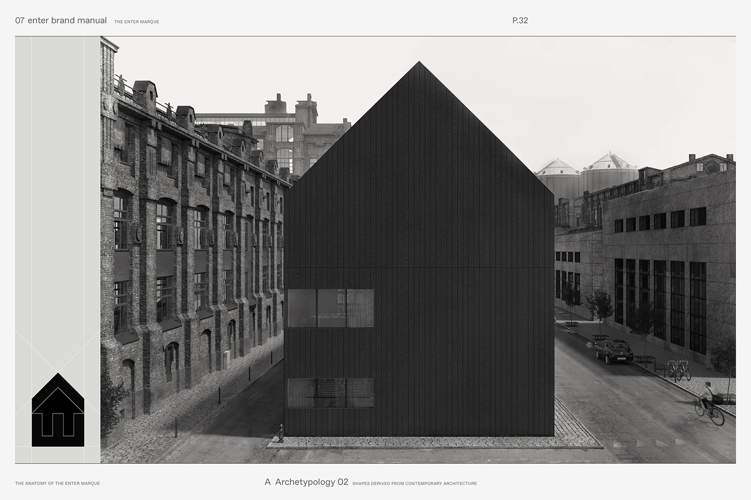
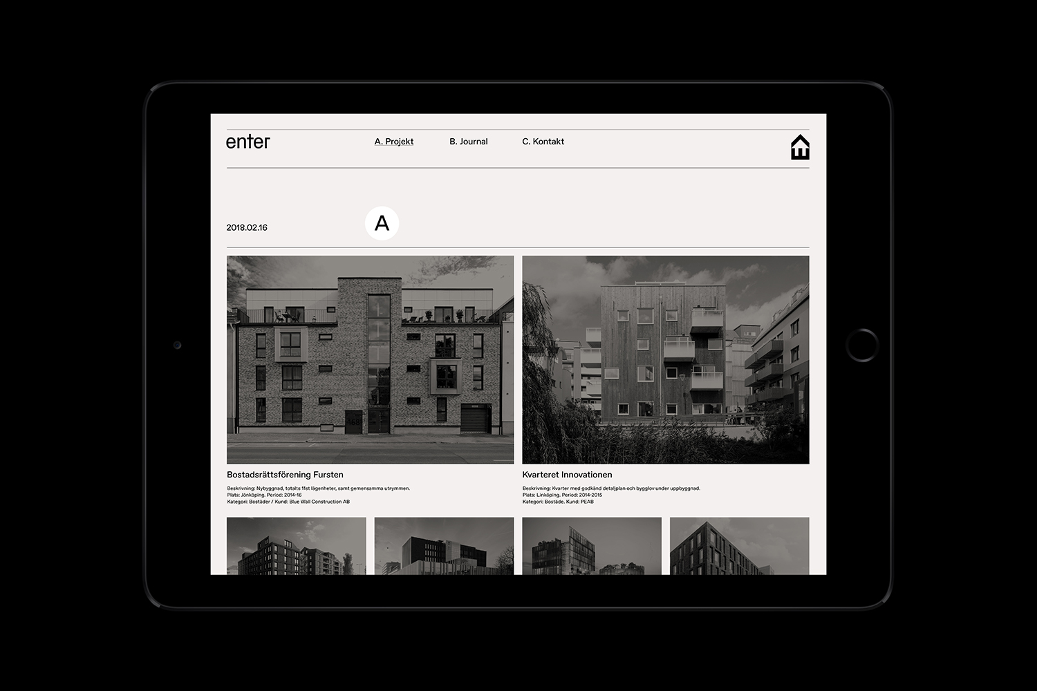
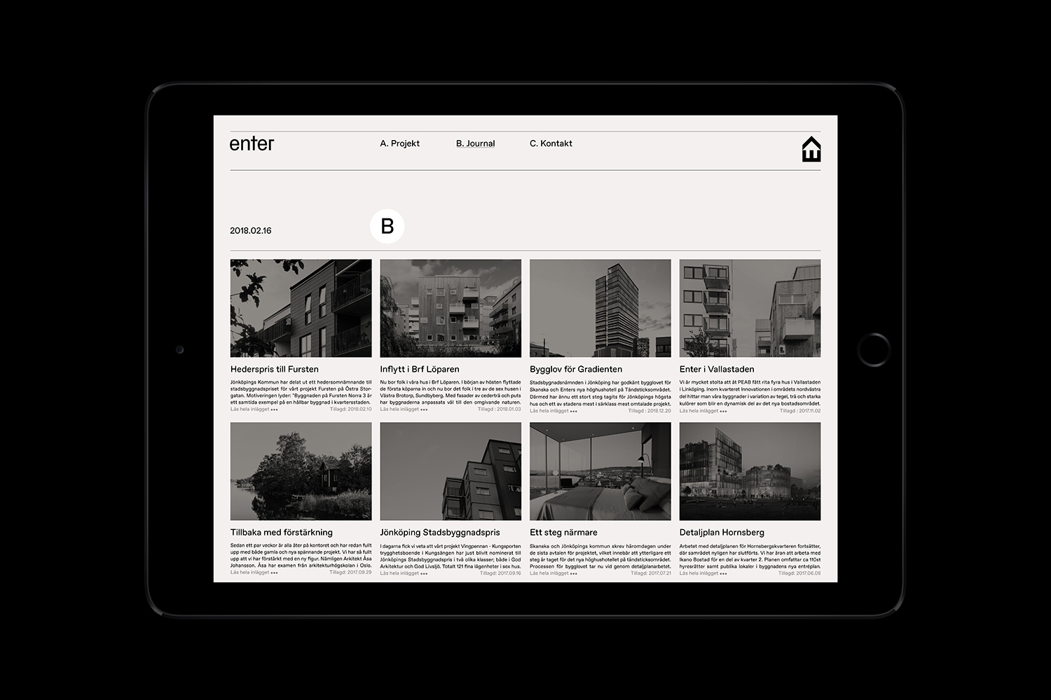
Website functions as a modern and practical framework to organise and draw focus to projects, insight and journal entries. It follows industry convention somewhat in its grids, use of space and arrangement. Built with new CSS Grid standards it works in future considerations alongside a logo that has a retrospective quality. Hierarchy is increasingly granular, beginning with two latest projects, followed by plenty of previews and ending in a contrasting text-based archive of all work completed.
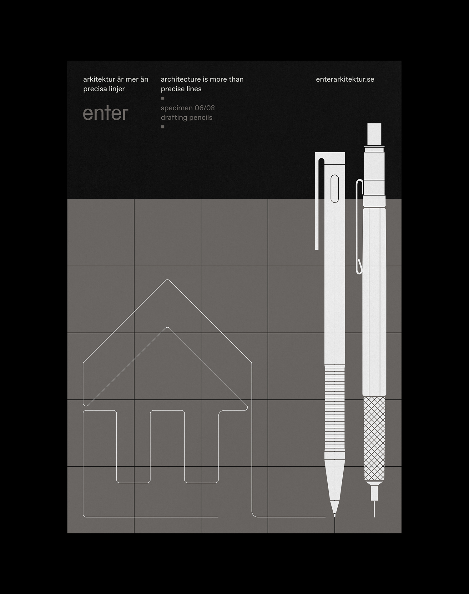
There is a logo-centricity to the work. And the logo will invariably be compared to a dozen others. It really gains its strength from the positioning of business; a genuine 1950s legacy and experience, and a determination to take this and pair it with present day and future considerations, which is reflected in the design and build of the website. More work by Lundgren+Lindqvist on BP&O.
Design: Lundgren+Lindqvist. Print: Göteborgstryckeriet. Opinion: Richard Baird. Fonts: Favorit.
