The Best of BP&O — August 2018
Opinion by Richard Baird Posted 30 August 2018

August’s highlights included Paul Belford Ltd’s logo for New Chapter, Studio South’s graphic identity work for The Conference Company and Akin’s packaging for Skinsmiths. There were, however, five projects that stood out and have made it into BP&O’s Best Of Series. Between them these typically balance a strong singular concept or an appropriate confluence of ideas with a compelling visual character and clear communicative intention that appropriately play with form, colour, type and layout, as well as material, texture, image and print finish.
Assembly by Ragged Edge

Assembly is a new hotel from Criterion Capital located on London’s Charing Cross Road. It throws out expensive amenities to instead focus on delivering fun yet sophisticated rooms in a central location. These rooms are aimed at experience-hungry young travellers and competitively priced with interiors inspired by London fashion icons and furnished with best in class beds, showers, sound-proofing and wi-fi.
Brand strategy, developed by Ragged Edge, positions Assembly as the antithesis of the stay in and cosy offering of other hotels. “Get Up And Go” delivers this in a concise and impassioned manner. This is supported by emotive and enthusiastic copywriting and a graphic identity of typographical juxtaposition and imagery that focuses on access to an exciting and diverse urban experience rather than an interior indulgence. This connects posters, interior and exterior signage, social media imagery, tote bags, key cards and packaging.
See more of this project here

David Collins Studio by Bibliothèque Design

David Collins Studio is an award-winning interior architecture practice working with brands, businesses and private clients who share their passion for detail, craft and refinement. These include Harrods, Nobu Berkeley, The Connaught Bar and those working within the hospitality, residential and retail sectors.
The studio’s work is described as being iconic, timeless and having a dramatic glamour rooted in a methodology that begins with an idea (this could be lateral and oblique to begin with) which then evolves into a palette of materials, colours and moods, often transforming the familiar into the exotic. This is expressed in the collaborative actions of Bibliothèque Design (brand identity) and Future Corp (digital art direction) to redesign graphic identity and website. This features a subtle intersection of typographic form (custom typeface), material and finish (stationery and business cards) and viewpoints (website).
See more of this project here
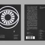
Repair by Studio Round

Under the title Freespace the 16th International Architecture Exhibition, Biennale Architettura 2018 in Venice, asked international participants to “encourage reviewing ways of thinking, new ways of seeing the world, of inventing solutions where architecture provides for the well being and dignity of each citizen on this fragile planet”.
The response from Australia; a pavilion titled Repair and a collaboration between the Australian Institute of Architects, Creative directors Louise Wright and Mauro Baracco of Baracco+Wright, and artist Linda Tegg, investigates the relationship between architects and their use of land.
The pavilion brings to material reality a belief held by Wright and Baracco that architecture should actively engage in the ecological repair of place and that this action will in-turn catalyse other types of social, economic and cultural repair.
Working with the Australian Institute of Architects and Baracco+Wright, Melbourne-based Studio Round developed a graphic identity for Repair. This is included a graphic and material design language that connects catalogue, newsprint and website about the pavilion and its concept.
See more of this project here
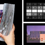
Next To The Ocean by Lundgren+Lindqvist

Valand Academy in Sweden offers a complete range of undergraduate, postgraduate and artistic research opportunities. This is a unique educational environment, the only one of its kind in Sweden. Next to the Ocean is an exhibition of works created by 23 of the students from the BFA, MFA and research programmes, which was held at Röda Sten Konsthall in Gothenburg.
The exhibition serves two purposes. The micro; a look at the individual interests and concerns of those on Valand Academy’s photography programme, and the meta; an intention to position this a representation and overview of what is happening in young contemporary photography in Sweden today. To express this proposition The Valand Academy approached Scandinavian design studio Lundgren+Lindqvist to develop the visual identity and catalogue for the exhibition. This is characterised by an immediacy of form language and a material appeal, and a conceptual subtlety in the relationship and direction of essay and image.
See more of this project here
Morris+Company by Bob Design

Morris+Company dovetails the individual strengths of founder Joe Morris and the talents of a wider company of designers. This is expressed by a recent renaming, moving from Duggan Morris Architects to Morris+Company, and throughout the studio’s new graphic identity, designed by Bob Design. This is codified within a brand guidelines document of type, imagery, texture, pattern, words (by Emma Keyte) print finish and material experimentation implemented across signage, tote bags, stationery, business cards, brochure and website.
See more of this project here