The Best of BP&O — Packaging of 2018
Opinion by Richard Baird Posted 17 December 2018
2018’s package design highlights included Commission’s work for Unfolded, Here Design’s packaging for Riso Duomo and Base Design’s copy-led approach to the packaging of Garden 13. However, there were five projects that stood out, and have made it into BP&O’s Best Of Series. These typically balance a strong and appropriate concept with a compelling graphic and material response. Between them, these play with image, colour, texture, layout, structure, type, print finish and occasionally mechanism and sequence in a distinctive and memorable manner, and hint at an interesting story. There are those that are esoteric and luxury, and others that are playful and universal. In their collation, they collectively show the creative opportunities available to designers. These are BP&O’s favourites and are presented in no particular order.
Packaging Shortlist 2018
Honom by Folch, Spain
Piccolo by Here Design, United Kingdom
Unfolded by Commission, United Kingdom
Riso Duomo by Here Design, United Kingdom
Garden 13 by Base Design, Belgium
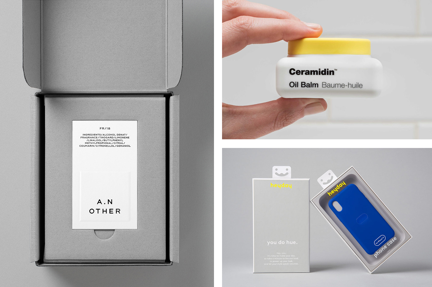
A.N Other by Socio Design, United Kingdom
Espelma by Commission, United Kingdom
Dr Jart by Pentagram, United States
Heyday by Collins, United States
Teatulia by Here Design, United Kingdom
Piccolo by Here Design, United Kingdom

Piccolo is an Italian seed brand with a particular favour for those that are ideal for urban growers, people with small balcony gardens or working with limited space. It is a brand with character, with product naming that includes Slim Jim Aubergine and Spacemaster Cucumber expressing the space-smart dwarf varieties of the range.
Piccolo worked with UK-based studio Here Design to develop a new graphic identity that would establish a distinct and cohesive visual language across their packaging. With a miniature storybook-like quality and an illustrative approach that plays with both the bold and the granular, these tell the story of Piccolo, bring to light the rewarding experience of growing, and intend to engage with the many urban gardeners of the world.
See more of this project here

A.N Other by Socio Design, United Kingdom

A. N Other gives its perfumers the creative room to craft limited edition, luxury and high concentration fragrances free from the pressures of consumer trends, market segmentation and budgetary constraints. These are then sold directly to consumers through its website. A.N Other places greater value on the internal composition of each of its fragrances, and the inspirations and aspirations of its creators, than the outward expression and associated expense of boutique spaces, lavish adverts, glossy magazine coverage and celebrity endorsements. This direct to consumer approach and a focus on ingredient quality, concentration and sustainability, as well as perfumer and fragrance story, is distilled down and projected by graphic identity, developed by Socio Design, initially online through website, and continuing into packaging. These are linked by naming and strategy, and by details that include bespoke typeface and logotype, brand imagery and copywriting, also created by Socio Design.
See more of this project here
Espelma by Commission, United Kingdom

Espelma is a clean-burning natural wax candle company. They have an online store and have hosted pop-ups in London and New York. Each candle comes in a refillable glass vessel, designed by Espelma founders Clara and Claudia, and handmade on the Italian island of Murano. Espelma is distinguished by its mix of glass craft, distinctive colour and form, the clean-burning nature of the candle’s formulation and the thought given to sustainability by way of refills. Further, each fragrance is inspired by the two founder’s summers spent as children at their grandmother’s house near Barcelona. This regional reference, and the implication of a story can be seen woven throughout Espelma’s brand identity, designed by Commission, in the arched white architecture present in still life imagery, and in the colour and texture, shape and structure used across packaging.
See more of this project here
Heyday by Collins, United States

Heyday is a range of 150 moderately-priced high-quality own-brand consumer tech products from American retailer Target and their first foray into the electronics and tech accessories sector. The range includes battery packs and chargers, cables, covers and wireless speakers amongst many other products. These share a form language that balances an everyday simplicity, robustness and utility with novelty and cheerfulness by way of shape, colour and materiality. Heyday’s visual identity and packaging design, developed by New York and San Francisco-based Collins in collaboration with Target Creative, is deceptively simple, it is loaded with a bunch of neat ideas that recognise, not just how product is presented and its value and functionalities communicated in store, but also how these products migrate and seek attention online. This can be seen in the approach to product, packaging and lifestyle photography.
See more of this project here
Dr Jart by Pentagram, United States

Dr Jart+ is a South Korean skincare brand that formulates its various ranges to tackle specific conditions, and derives its name from the positioning phrase “Doctor Joins Art”, an articulation of the brand’s unique fusion of dermatological science and art, presumably, something along the lines of pragmatism combined with creative leaps.
The balance between the psychological and physiological components of skincare—internal feelings and external sensation, the aesthetic and the remedial—are touched upon, alongside practical considerations such as a spacial sensitivity, shelf impact and range fragmentation, in the design of Dr Jart+’s new packaging and graphic identity, developed by Pentagram’s Paula Scher and team.
The design currently links Dr Jart+’s Ceramidin creams and liquids, which were launched in South Korea during 2017 and are due to roll out internationally in 2018, but will go on to include other ranges. These will share the same form language, but will be differentiated by colour and material.
See more of this project here