The Best of BP&O — Graphic Identities of 2018
Opinion by Richard Baird Posted 19 December 2018
2018 was a great year for graphic identity design. Highlights included Collins’ bold and evocative work for technology festival PopTech, the cheerful riso-printed approach taken by Spy for Hackney Forest School, and Fabio Ongarato Design’s work for 85 Spring Street. There were, however, five projects that stood out, and have made it into BP&O’s Best Of Series. These typically balance a strong strategic approach and interesting concept with a compelling aesthetic and communicative intention. Between them appropriately play with photography, colour, texture, layout, form, type and print finish. These are BP&O’s favourites and are presented in no particular order.
Graphic Identity Shortlist 2018
Helsinki by Werklig, Finland
The Clydesdale Distillery by Manual, United States
Rimowa by Commission, United Kingdom
PopTech by Collins, United States
Arper by Clase bcn, Spain
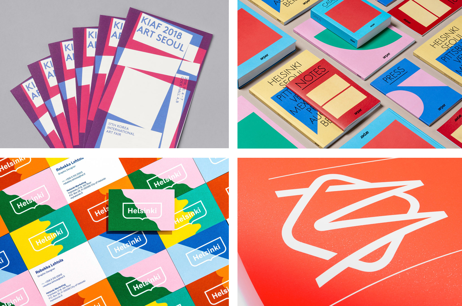
Korea International Art Fair 2018 by Studio fnt, South Korea
Innsbruck International, Biennial of the Arts by Studio Mut, Italy
Hackney Forest School by Spy, United Kingdom
85 Spring Street by Studio Ongarato, Australia
David Collins Studio by Bibliothèque Design, United Kingdom
Repair by Studio Round, Australia
Assembly by Ragged Edge, United Kingdom
The East Cut by Collins, United States
Nunchi by Bedow, Sweden
Arper by Clase bcn, Spain

Arper is an Italian furniture company producing chairs, tables and furnishings for community, work and home spaces. They seek an elegant resolution of function, form and finish which is founded on a total design philosophy that covers design, production and long-term impact. Arper commissioned Spanish studio Clase bcn to develop and design a new on and offline graphic identity for all their 2018 communications and promotional materials. These included catalogues, notebooks, press packs and tote bags, were complemented by distinctive art direction and newsprint. These draw on and add to the essential forms and colours of Arper’s Salone del Mobile stand designed by MAIO Architects.
See more of this project here

Clydeside Distillery by Manual, United States

The Clydeside Distillery was set up in 2014 with the intention of reviving distilling in Glasgow and telling the story of Scottish Whisky through a visitor’s centre. The distillery was set up by the Morrison’s, a family with a century-long history within the Scottish Whisky industry as both owners and operators.
San Francisco based Manual travelled to Glasgow to work closely with founders, architects and experience designers over a three year period to develop a brand that would live up to and bring to light a rich city heritage of industry and export through a broad variety of visual communications and material experiences. This included logo and a custom typeface, packaging and signage.
See more of this project here
Korea International Art Fair 2018 by Studio fnt, South Korea

Each year KIAF plays host to and brings to the Korea domestic market the artworks of international artists and galleries. This year, the 17th Korea International Art Fair took place between the 4–7 October in the city of Seoul.
With a desire to become the pre-eminent art platform of South Korea, serve as a conduit between the Asian and international art scene, and function as a tool in which to introduce vibrant new Korean art to a global audience of curators and collectors KIAF seeks out, collates and presents the groundbreaking and thought-provoking.
Studio fnt worked with KIAF to develop a new visual identity for the fair. With such a wide variety of works on display; those of different origins, techniques, physicalities and modes of expression, the confluence of spot colour, proportionality and abundance serve as a unifying visual language that links posters, catalogues, tickets, banners and tote bags.
See more of this project here
Rimowa by Commission, United Kingdom

Rimowa, an abbreviation and then compound of founder Richard Morszeck Warenzeichen name, is a Cologne-based manufacturer of luxury luggage. It has a significant history, beginning in 1898 as a travel and leather goods maker known for its innovative approach, and growing to become an international brand with a distinctive line of polycarbonate and aluminium products.
Rimowa’s first fully aluminium designs were created following a fire in 1937. This destroyed all the materials except for the metal, and led to the development of durable and lightweight aluminium product which is now complemented by an equally lightweight and durable range constructed from polycarbonate. Both feature Rimowa’s distinctive ribbed relief across their surfaces.
To help reaffirm Rimowa’s position as a global leader and celebrate its 120th year, Commission worked with Chief Executive Alexandre Arnault and Chief Brand Officer Hector Muelas to develop a new “timeless” and “stylish” graphic identity to support future activities and deliver a considered and cohesive brand experience for Rimowa customers.
Commission introduce a monogram, new typographic style, colour palette and pattern motif to the wordmark designed by Munich-based Bureau Borsche. And through graphic identity, material language and mechanism link a variety of touch points. These include packaging, retail experience and in-luggage items, as well as gift boxes, retail bags, owner manuals, guarantee cards, luggage tags, dust bags and liquids bags.
See more of this project here and here
Helsinki by Werklig, Finland

In August 2017 Scandinavian design studio Werklig was commissioned to develop the graphic identity for the Finnish city of Helsinki, a capital with an urban region of roughly 1.4 million inhabitants and 751,000 jobs. The challenge was to resolve a disparate and fragmented visual system that represented a broad range of public services, departments and development projects that were helping and informing a diverse group of people. These included locals, national and international visitors, those looking to make their home in Helsinki or seeking asylum. Although each entity had its own logo, these were often tenuously linked by the city’s coat of arms. This served as the beginnings of a new and integrated identity program.
See more of this project here