The Best of BP&O — Logos of 2018
Opinion by Richard Baird Posted 28 December 2018
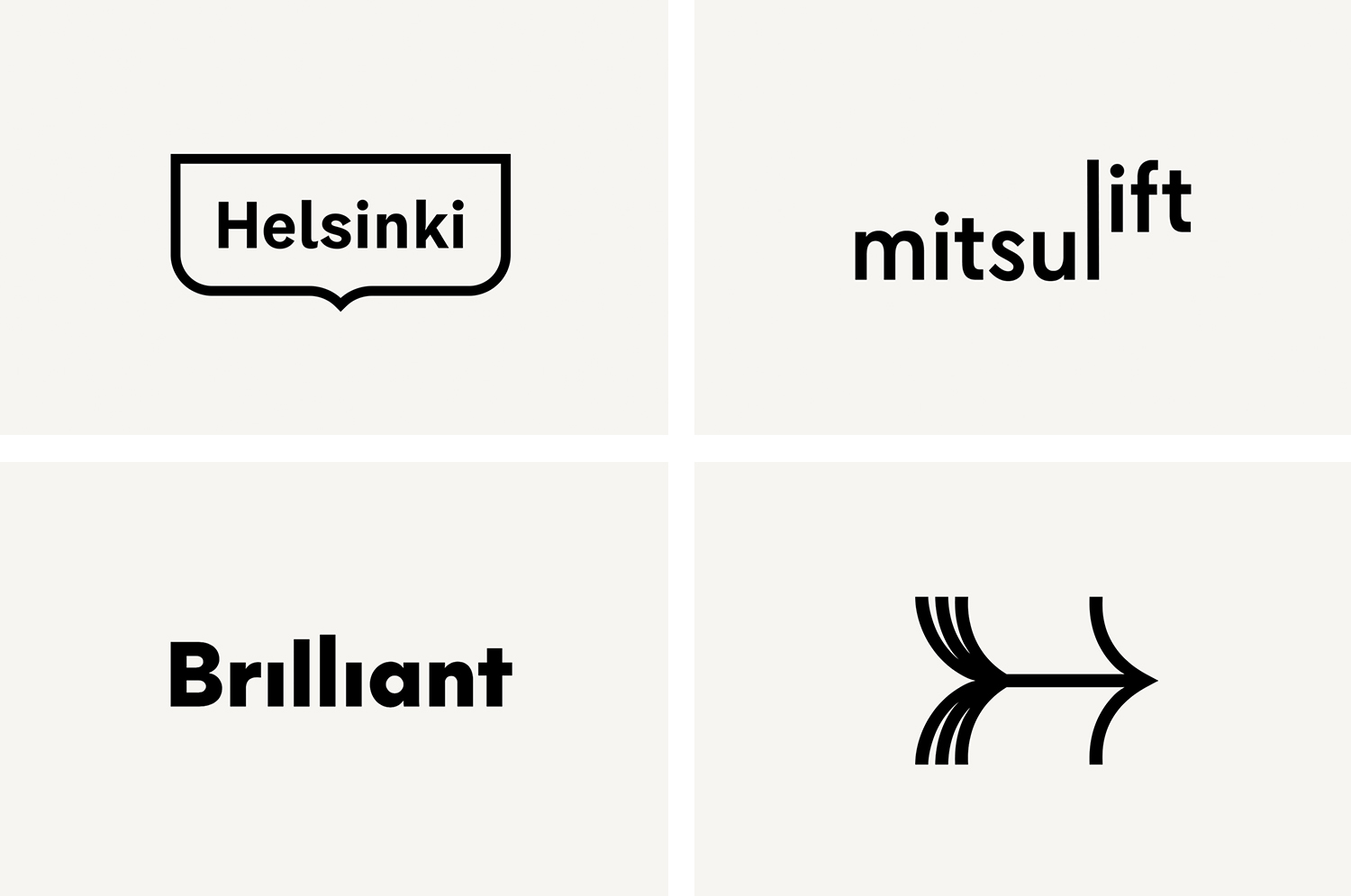
As brand identity programmes become increasingly more sophisticated, as sound, touch and smell become folded into this experience, communicative weight has eased off of the logo. This has seen the logo become increasingly marginalised and the logotype stylistically ubiquitous. However, the mobile screen and signage, the bookmark and the supergraphic, where these multi-sensory tools are unavailable, are spaces in which a smart logo can function, building an association, utilising memorability and developing an immediate recognition. Highlights in 2018 included Commission’s monogram for Rimowa, Nunchi by Bedow and Enter Arkitektur by Ragged Edge.
This post, the last of five—also check out Packaging of 2018, Graphic Identities of 2018, Books and Magazines of 2018 and Studios of 2018, features techniques such as playful allusions, a sequential out-of-the-box quality, a smile in the mind moment, and an adaptive and invitational container for custom type and different languages. These draw a visual and communicative value from simple graphic gestures and used within both large and small-scale identity programmes and projects.
Brilliant by The Studio, Sweden
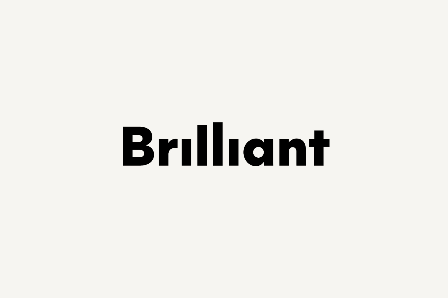
Swedish employee engagement consultancy Netsurvey and Bright, experts in customer surveys, have been merged and rebranded as Brilliant by The Studio. This merger and rebranding intended to create a new platform capable of encapsulating the skills and corporate cultures of both companies and develop a visual expression that people from each could identify with and stand behind.
In the same spirit as The Studio’s visual identity design for Netsurvey, reviewed on BP&O back in 2015, the direction for B2B company Brilliant, shuns a corporate austerity in favour of a concept based around “Serious Playfulness”. This manifests itself in the form of a dynamic logotype and extensive pictogram set, a vivid colour palette and bold typography with an immediacy and friendly quality. These choices link business cards, folders, envelopes, correspondence cards, signage and website.
See more of this project here
New Chapter by Paul Belford, United Kingdom
New Chapter is a UK-based word therapy start-up that offers a unique approach to counselling. This involves participants being invited to express themselves through the written word. The synergy between personal development, a forward momentum and the written word as a mode to achieving this forms the basis of New Chapter’s clever logo design created by Paul Belford Ltd. This appears on signage and bookmarks, and is complemented by a similarly weighted grotesque wordmark.
See more of this project here
Mitsulift by Base Design, Belgium
New Chapter is a UK-based word therapy start-up that offers a unique approach to counselling. This involves participants being invited to express themselves through the written word. The synergy between personal development, a forward momentum and the written word as a mode to achieving this forms the basis of New Chapter’s clever logo design created by Paul Belford Ltd. This appears on signage and bookmarks, and is complemented by a similarly weighted grotesque wordmark.
See more of this project here
BBC Creative by Spin, United Kingdom
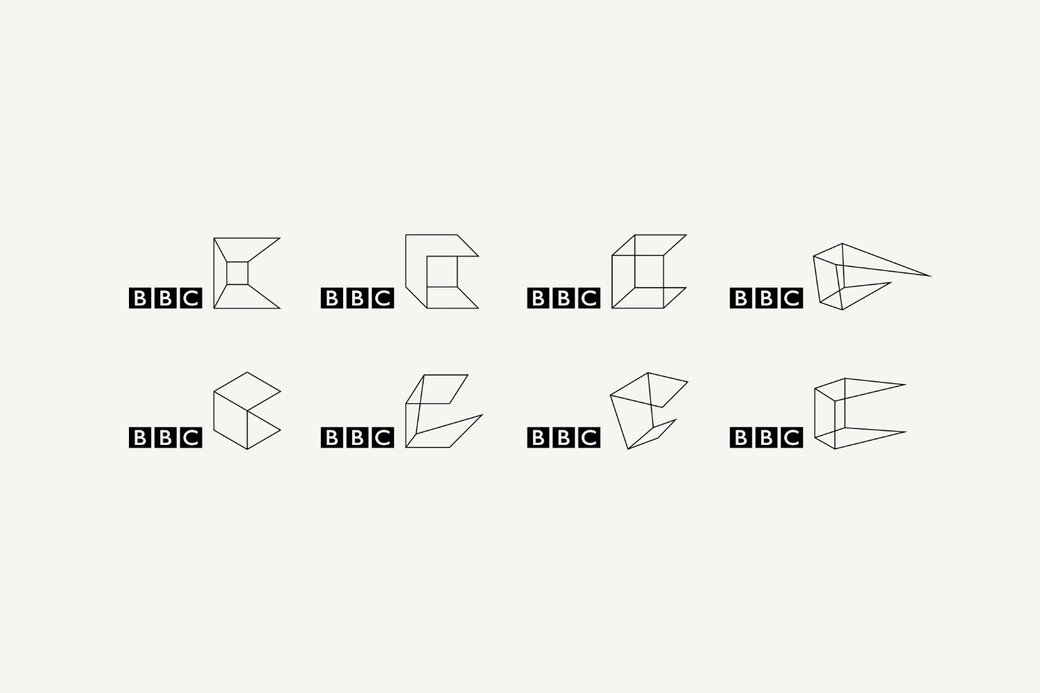
With the intention of being the most creative organisation in the world the BBC has developed its own in-house agency, BBC Creative, to develop cross-platform marketing materials such as trails and idents to engage with a global audience and bring to their attention the vast range of BBC programmes and services available. To express this unified vision and creative potential, BBC Creative worked with London based studio Spin to develop their graphic identity. Drawing on the iconic three blocks associated with the BBC, Spin introduce a fourth, a creative box and abstract C as a way to form a critical and essential relationship between the BBC and creative thinking in a concise and dynamic manner. This is deployed as small details across mugs and tote bags all the way up to supergraphics.
See more of this project here
Helsinki by Werklig, Finland
In August 2017 Scandinavian design studio Werklig was commissioned to develop the graphic identity for the Finnish city of Helsinki, a capital with an urban region of roughly 1.4 million inhabitants and 751,000 jobs. The challenge was to resolve a disparate and fragmented visual system that represented a broad range of public services, departments and development projects that were helping and informing a diverse group of people. These included locals, national and international visitors, those looking to make their home in Helsinki or seeking asylum. Although each entity had its own logo, these were often tenuously linked by the city’s coat of arms. This served as the beginnings of a new and integrated identity program.
See more of this project here

