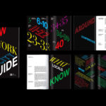
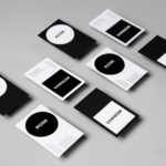
NOR Specialties by Re-public
Opinion by Richard Baird Posted 9 January 2019
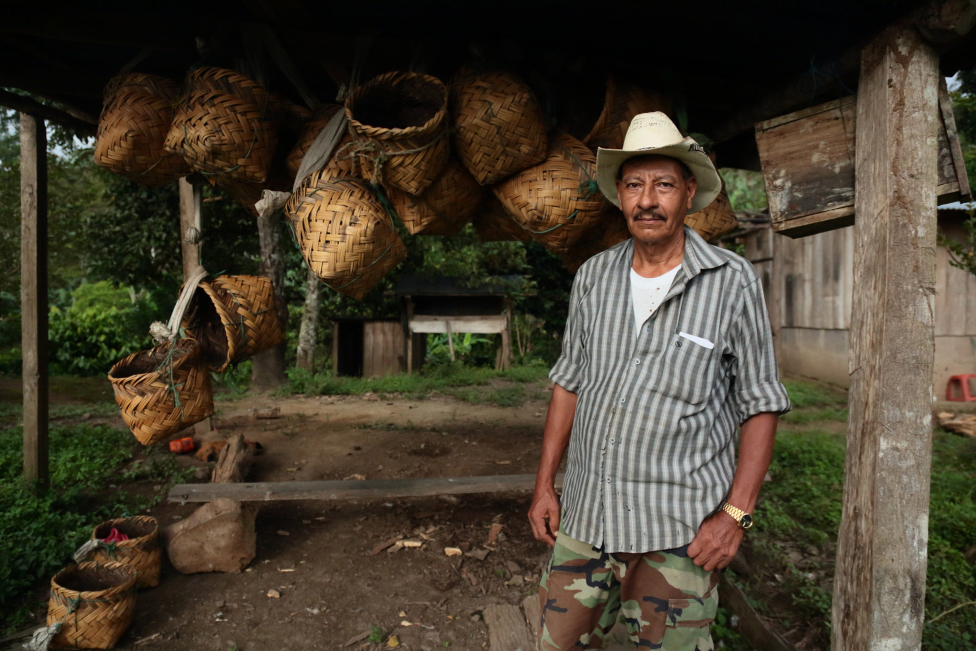
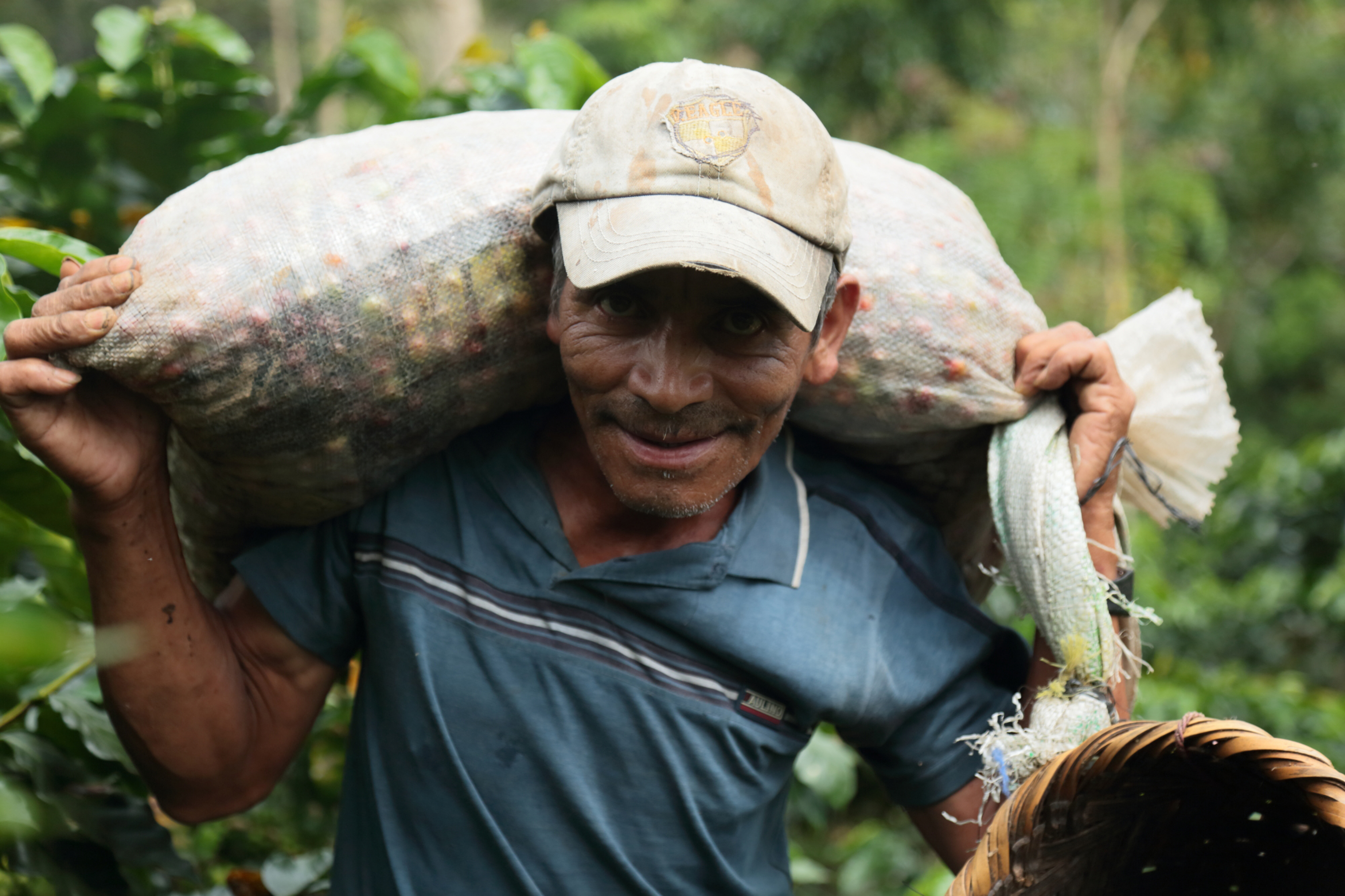
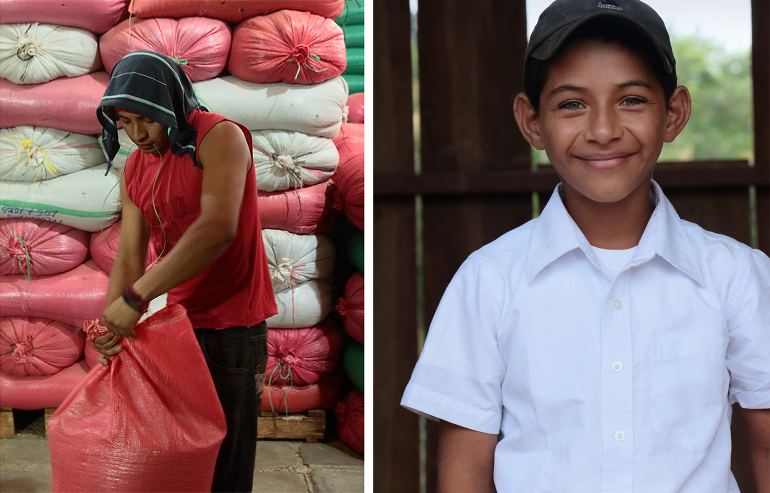
NOR Specialities supports the development of plantation farmers and helps sustain local communities across Colombia, Guatemala, Nicaragua and Bolivia by way of its range of chocolate, cocoa nibs, roasted coffee beans and cold brew coffee products. NOR trades directly with family farms and producers of its raw ingredients, working with them to develop transparent and sustainable practices.
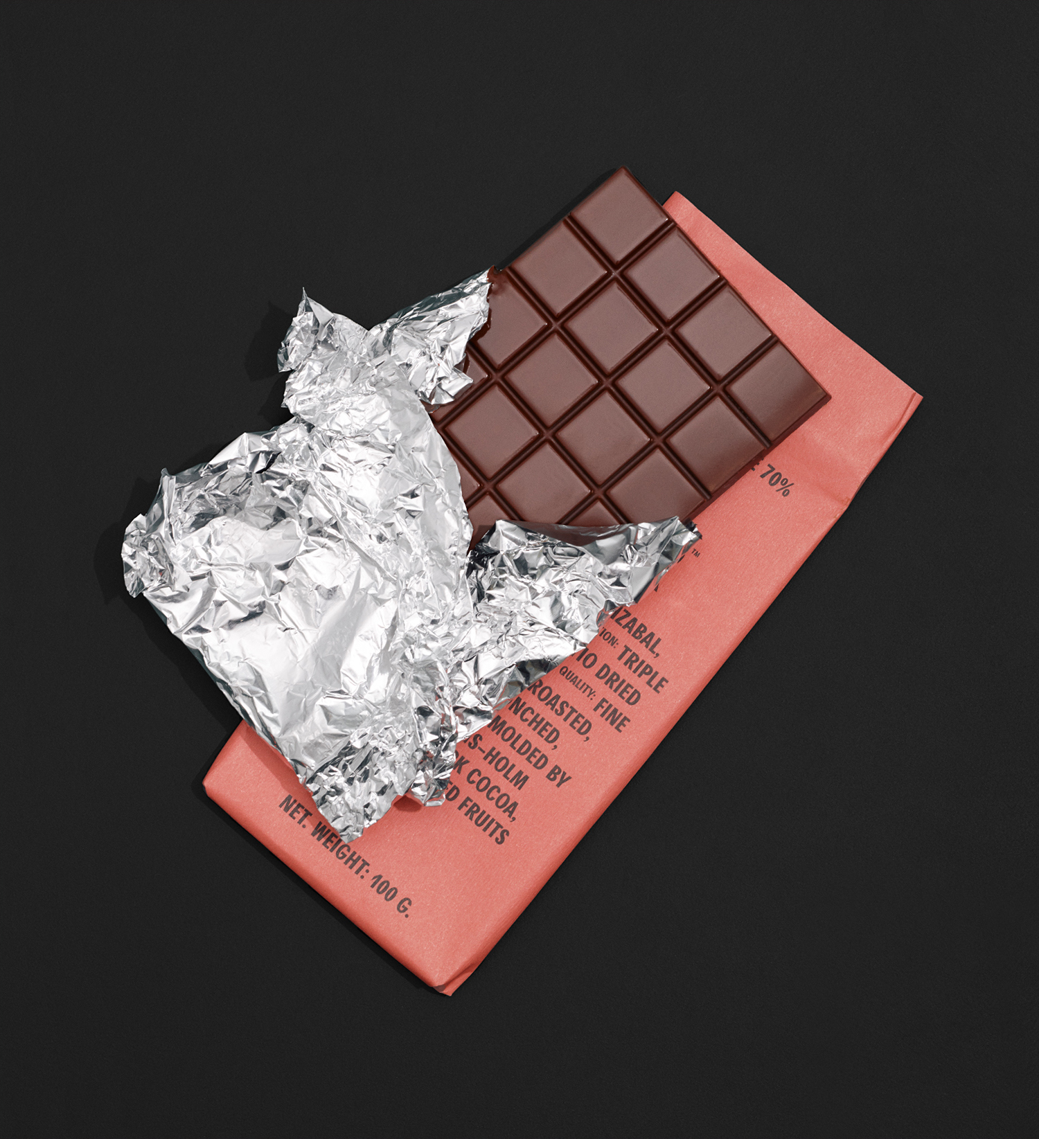
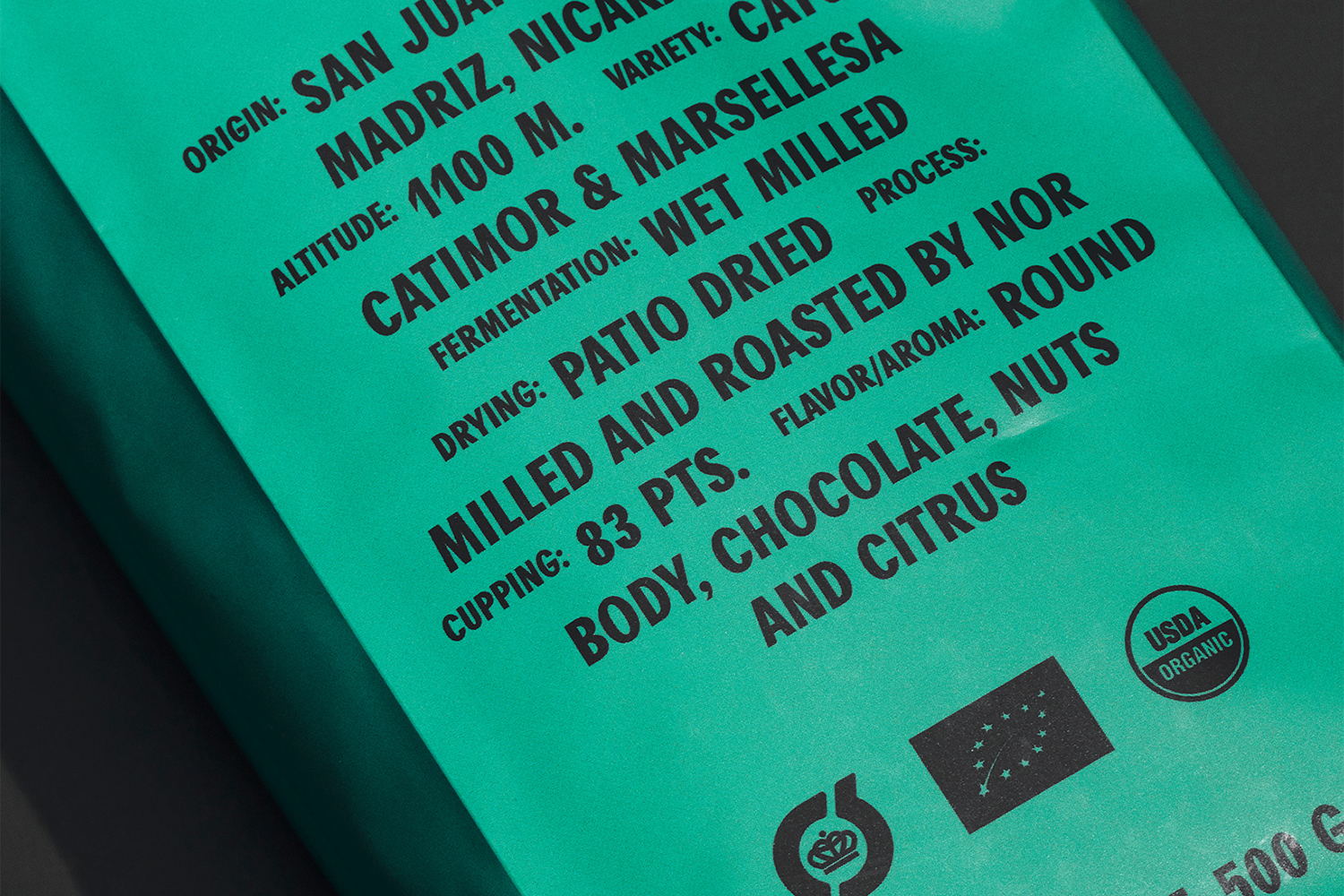
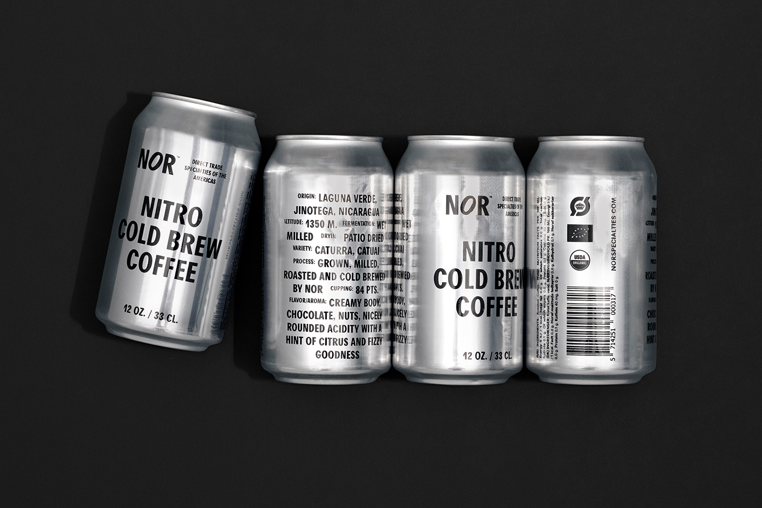
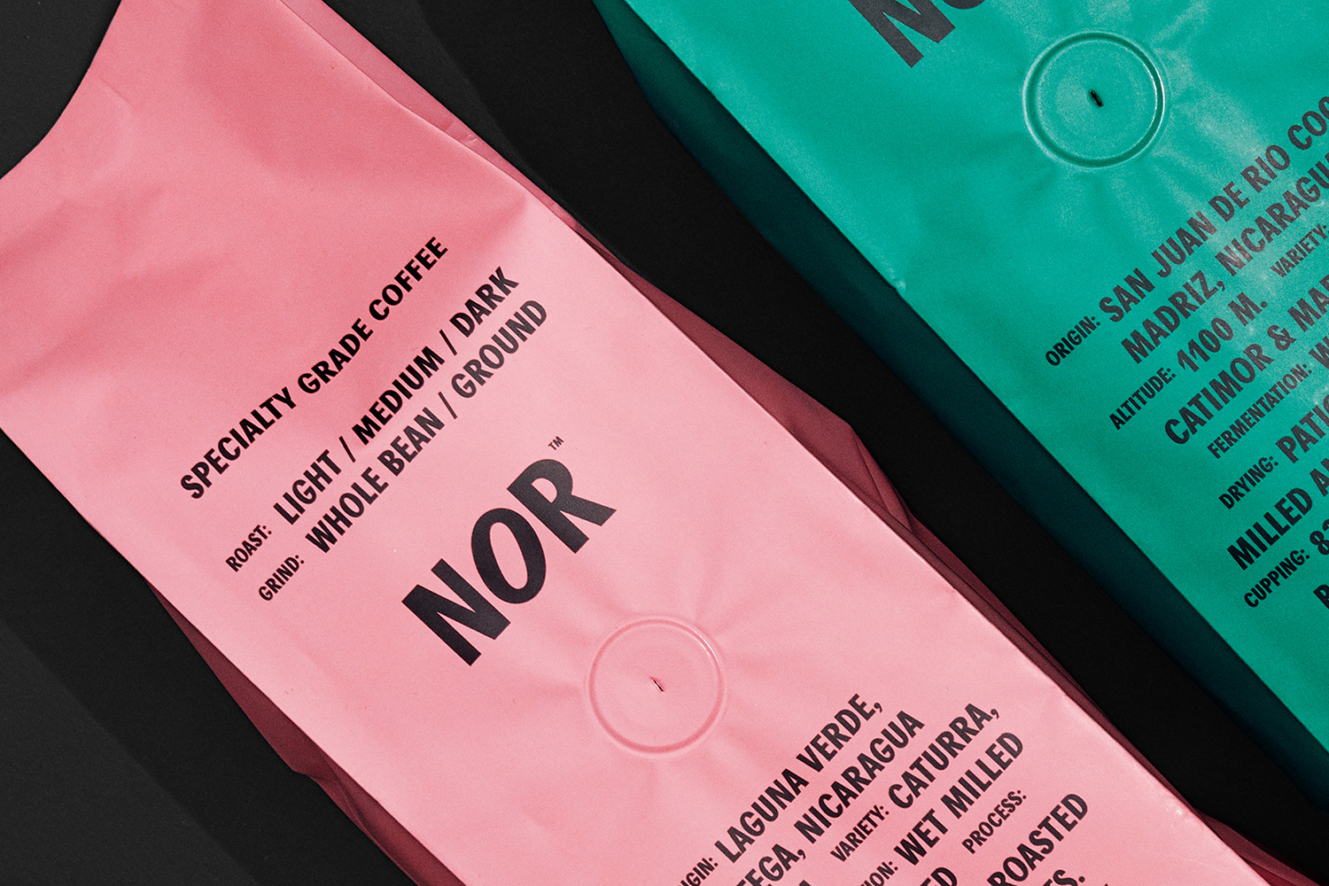
Danish design studio Re-public worked with NOR to launch the brand into the highly competitive Western market, delivering creative direction and visual identity. This included packaging for coffee beans, chocolate bars and cold brew coffee cans. These are linked by a visual language based around the typographic simplicity, communicative immediacy and character of Agipo and its typesetting, paired with a material language drawn from the vessels and sacks of export.
Re-public describes their intention as one that steers clear of the recurrent themes that proliferate the coffee and chocolate retail landscape, although they do not elaborate on the particulars. Their solution, a design rooted in the raw aesthetic of standardised industrial packaging; boxes, containers and vessels of exportation, is the visual language that characterises many of the direct trade chocolate and coffee packaging of today. However, the project manages to convey the potential that still remains within this reference, a visual language that still connects with people. Picking out the brighter colours of synthetic polypropylene coffee bean sacks, rather than, say, the unbleached robust kraft virgin fibre sacks (and maximising the craft shop kraft paper association and, by extension, handcrafted coffee), offers differentiation and eye-catching immediacy, as does the height of the bags which are available in 500g and 1000g weights.
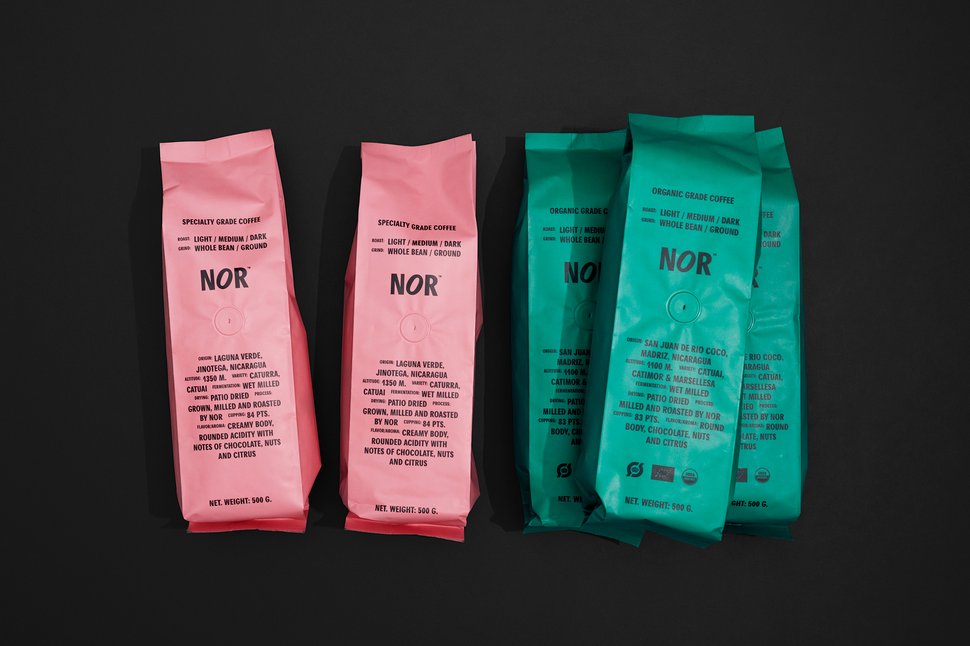
Re-public goes on to describe the visual language as no-nonsense with a functionality free of decoration and veneer yet with lots of flavour and a striking shelf presence. Again, this communicative immediacy and utility is a common thread within the market, but through arrangement and sizing, type takes on a graphic form, a visual texture that makes the most of the surfaces of bag, wrap and can. Form and “features” coalesce, and within the context of colour and material language, create a strong graphic gesture, drawing further value as an expression an ideology that seeks to deliver as much product information as possible (read: transparency).
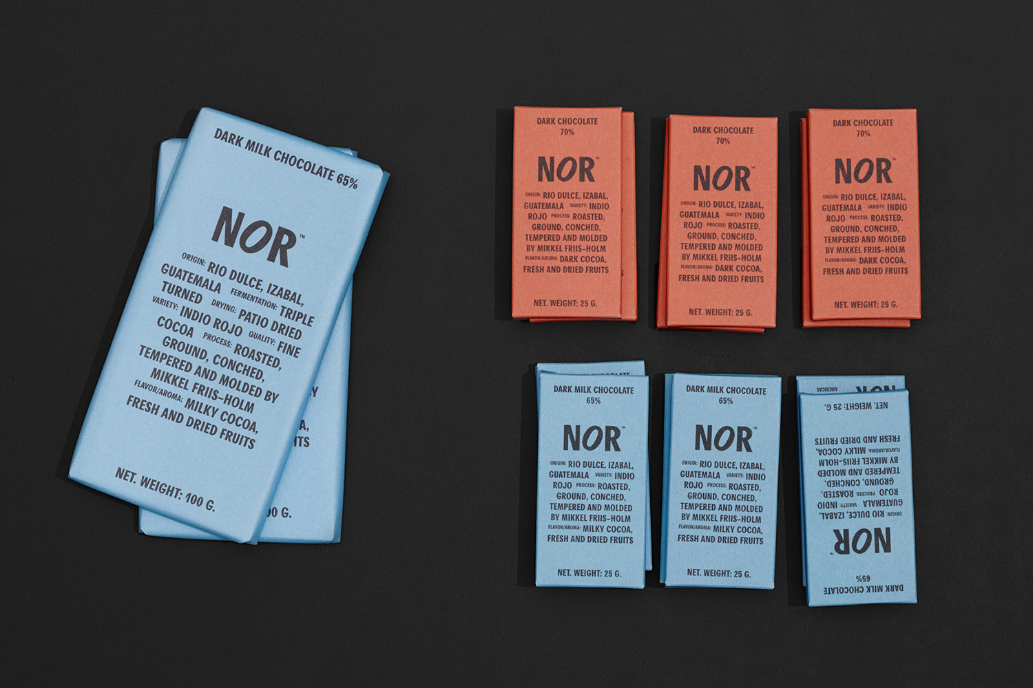
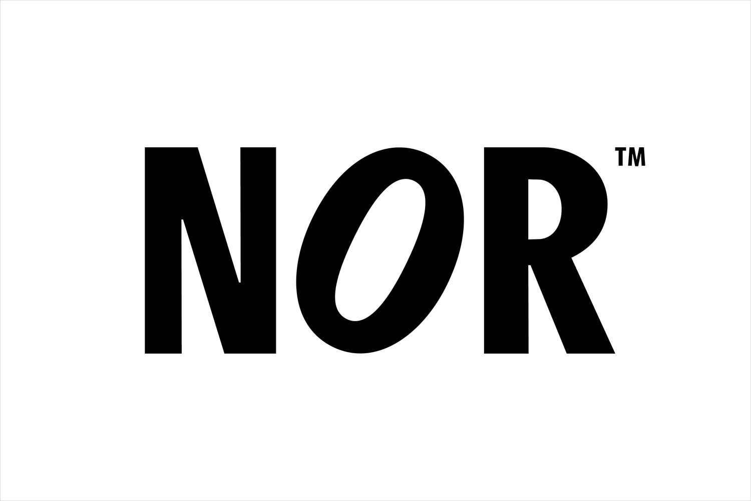
A small rotational trick applied to a near-neutral typeface (the slight stroke variation sends it towards the caligraphic) delivers a logotype with an initial ambiguity (and character but rooted in use) that asks the mind to seek meaning, and to then see a cocoa or coffee bean. This logo, the typestyle and arrangement across packaging–running like the credits of a film–establishes a continuity when colour is absent. The untreated surface of the cold brew coffee can, again, a familiar raw industrial gesture, gains more from a relationship with other products in the range, and in the choice of supportive imagery. More from Re-public on BP&O.
Design: Re-public. Opinion: Richard Baird. Fonts: Agipo.
