Atlantic Theater 2019 – ’20 Season by Pentagram
Opinion by Richard Baird Posted 12 September 2019
Atlantic Theater Company was founded in 1985 by playwright David Mamet and actor William H. Macy and, since then, has established itself as an influential Off-Broadway theatre group. It is also known for having a bold and original voice, producing groundbreaking new works by both emerging and established playwrights. This bold and original voice was central to the design of the theatre’s visual identity back in 2015. The first iteration was a visually loud mix of Hoefler&Co’s Tungsten, red and blue ink, an iconic spotlight/ megaphone-like A, a postmodern freedom from formal grids and the overprinting of type and shape. Designed by Pentagram partner Paula Scher, and reconfigured between seasons, this has been a striking and recognisable foundation of the theatre’s communications. Having designed the campaign identities for 2017–18 and 2018–19 Paula Scher returns to design the campaign for the 2019–20 season, introducing photography for the first time and a new material component.
The visual language of each new season has been defined by a simple but striking arrangement of type and form, by a change of colour and the introduction of secondary elements. Much like Public Theater in New York, also designed by Paula Scher and team, the graphic identity is reconfigured over time. Identity becomes an incrementally evolving expression, rather than being rigidly codified. This serves seasonal changes in programming and new creative directions and affords the theatre the opportunity to play with variety within a continuum. The approach continues to surprise, avoids a communicative lethargy and contributes to the building of a visual legacy.
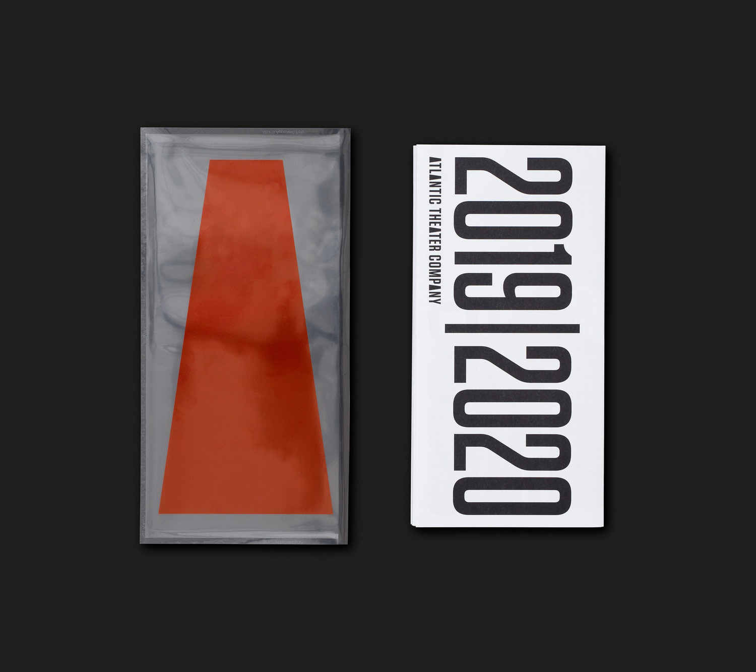
Paul Scher’s work has been based around expressing Atlantic Theater’s bold and original voice. This vocalisation was given form by way of a central graphic motif that calls to mind the profile of a megaphone or the downward beam of a spotlight. It is joyful, confident and intelligent in its simplicity, duality and relevance, and establishes a strong focal point from which to hold things in and place elements over and around.
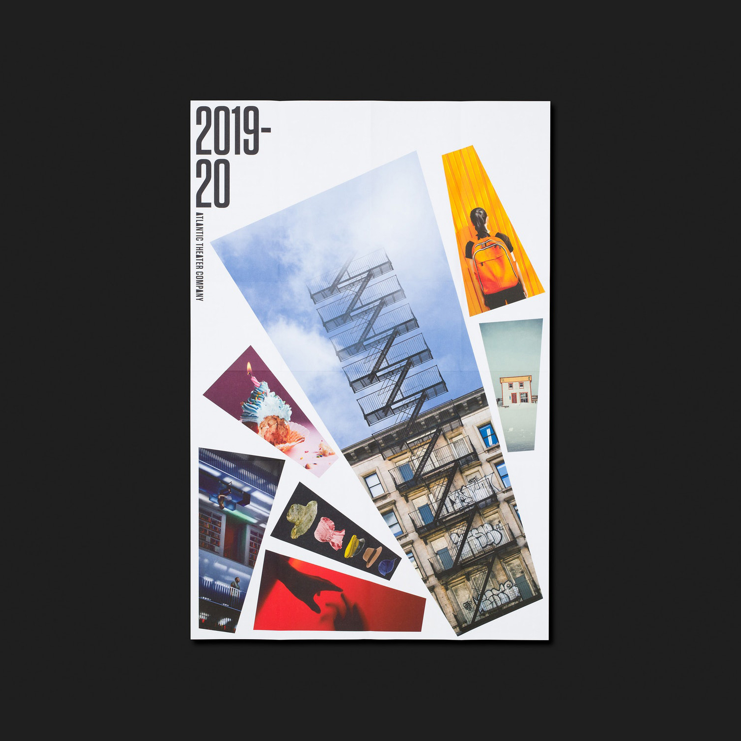
Where colour for previous seasons have been bright spot colours this season is paired down with in-camera lighting of photography feeling more naturalistic. This is now contained within the shape of the A, elevating the contrast between form, type, colour and space. In some ways, it has lost some of its postmodern provocation, its bluster, (although the irregularity remains across the cover) favouring more of an observable grid. however, within a continuum, an ongoing project, and tied to the season’s programming, this feels well-suited.
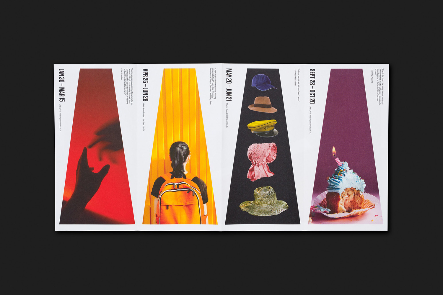
The megaphone has, for the most part, served as a backdrop with type overlaid. Here, it is a container, a frame for a variety of performance-related visuals, or a threshold in which to enter another world. The unusual form, the individual cropping of imagery, is a useful technique to allude to more happening outside of the frame, a provocation to discover more. Collectively, there is the suggestion of a seasonal variety and a pleasing colour palette on the printed page.
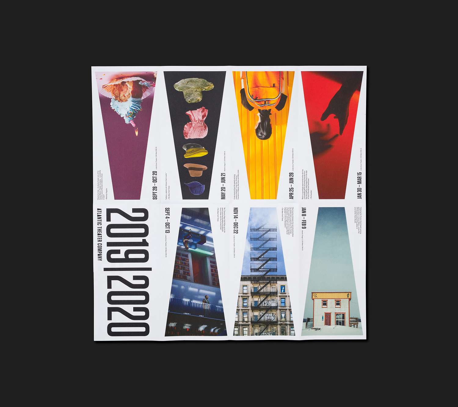
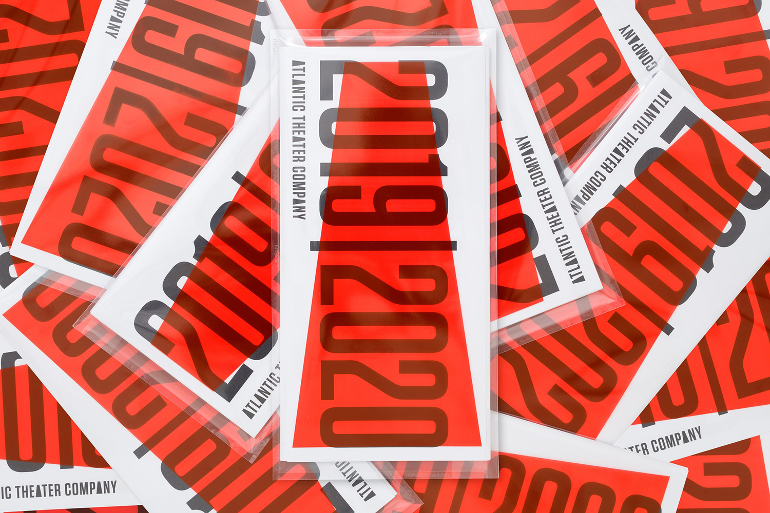
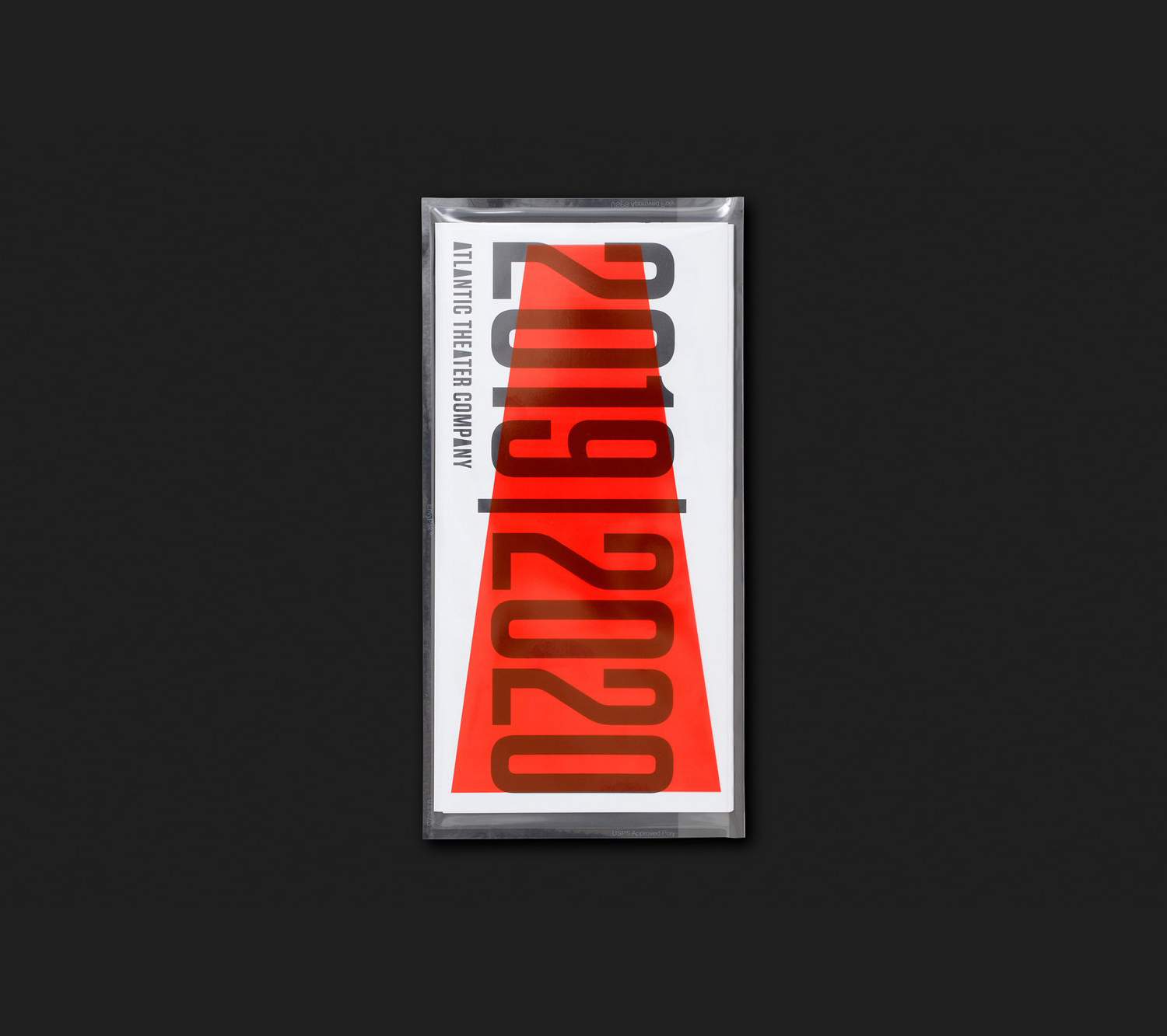
Previously, type and form where overlaid, either creating an inversion or overprint effect. Here, a new material interaction is formed in the introduction of a clear printed sleeve, hopefully starch-based / compostable. The megaphone and 2019|2020 now sit independently on different surfaces, coming together and separating at the whim of the holder. There is, of course, the opportunity here to suggest an allusion to participation and the audience “completing” the performance.
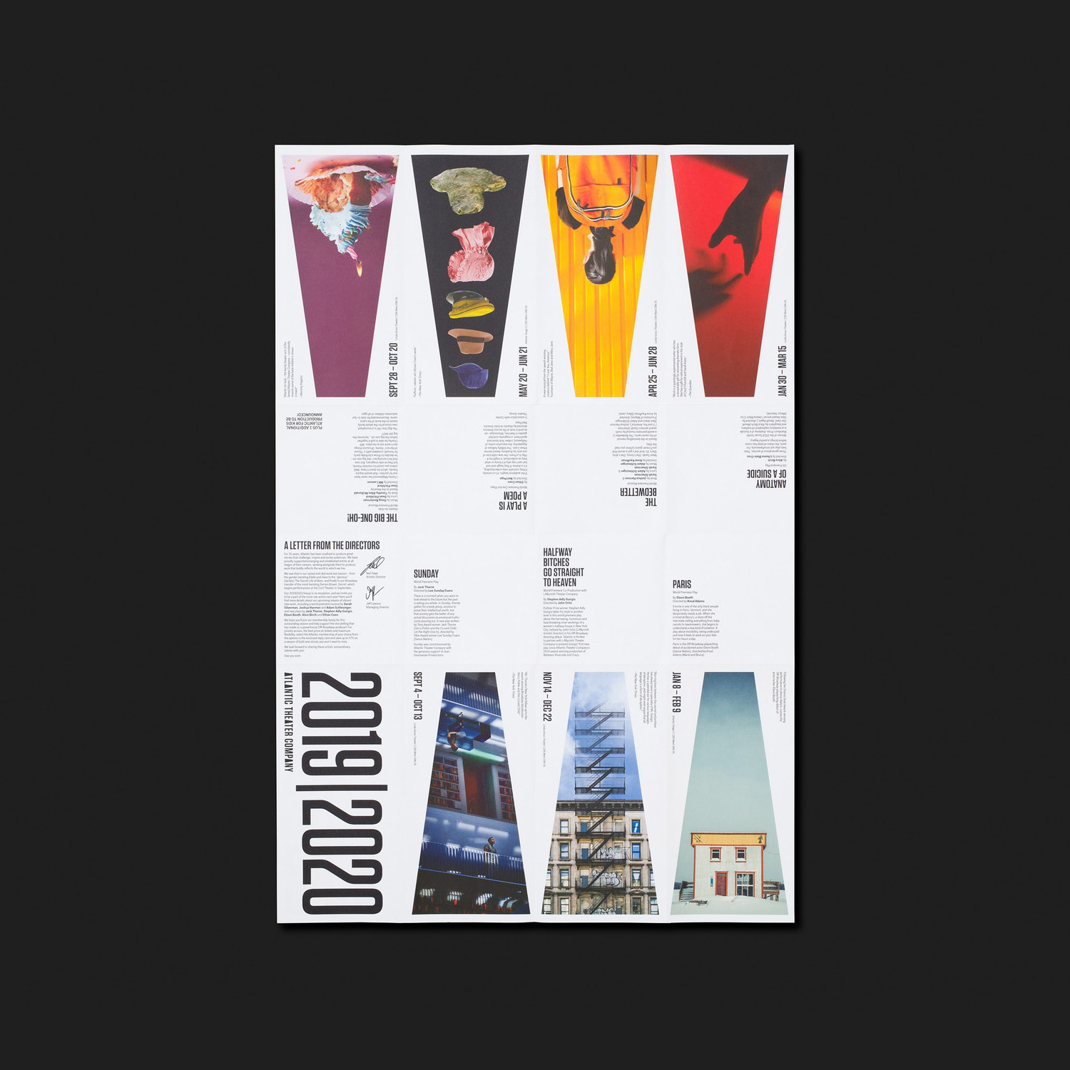
The direction for this new season effectively delivers an eye-catching and stylistically pleasing expression. The logo as container for imagery tied to independent productions and collectively presented on the page plays with the naturalistic and architectural, it draws even more from a form already loaded with association. More work by Pentagram on BP&O.
Fonts: Tungsten & Fakt (Online)
