Oji by Seachange
Opinion by Richard Baird Posted 6 August 2020
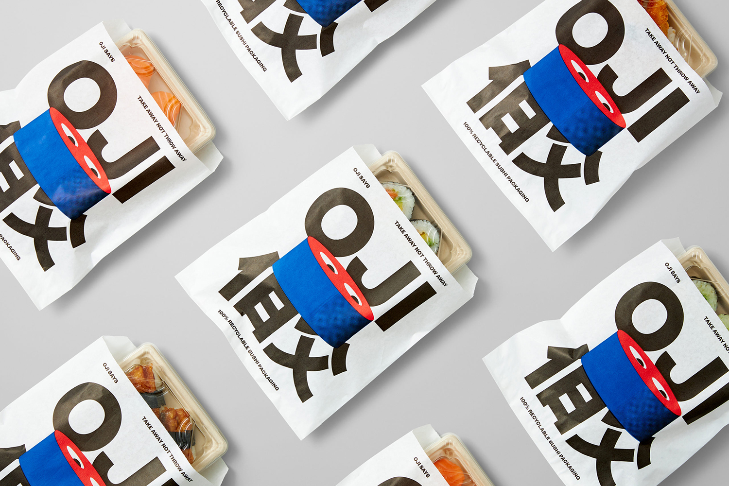
Oji is a sushi brand of firsts. It is the first in New Zealand to use fully recyclable and biodegradable packaging and the first to use all free-range products. This is a significant move forward and marks the brand out from well-established competitors. Oji opened in New Zealand with two locations in Auckland’s Commercial Bay, a place where they source their salmon, with the intention of franchising and developing smaller service station, mall and food court concessions in the future.
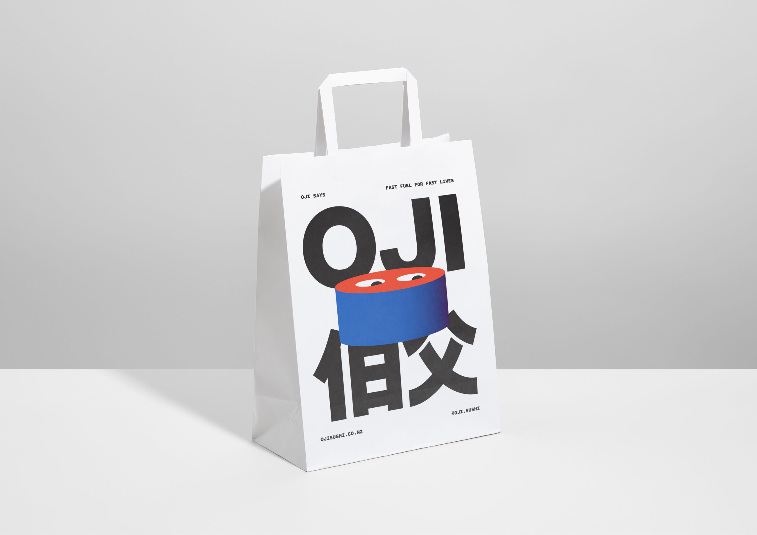
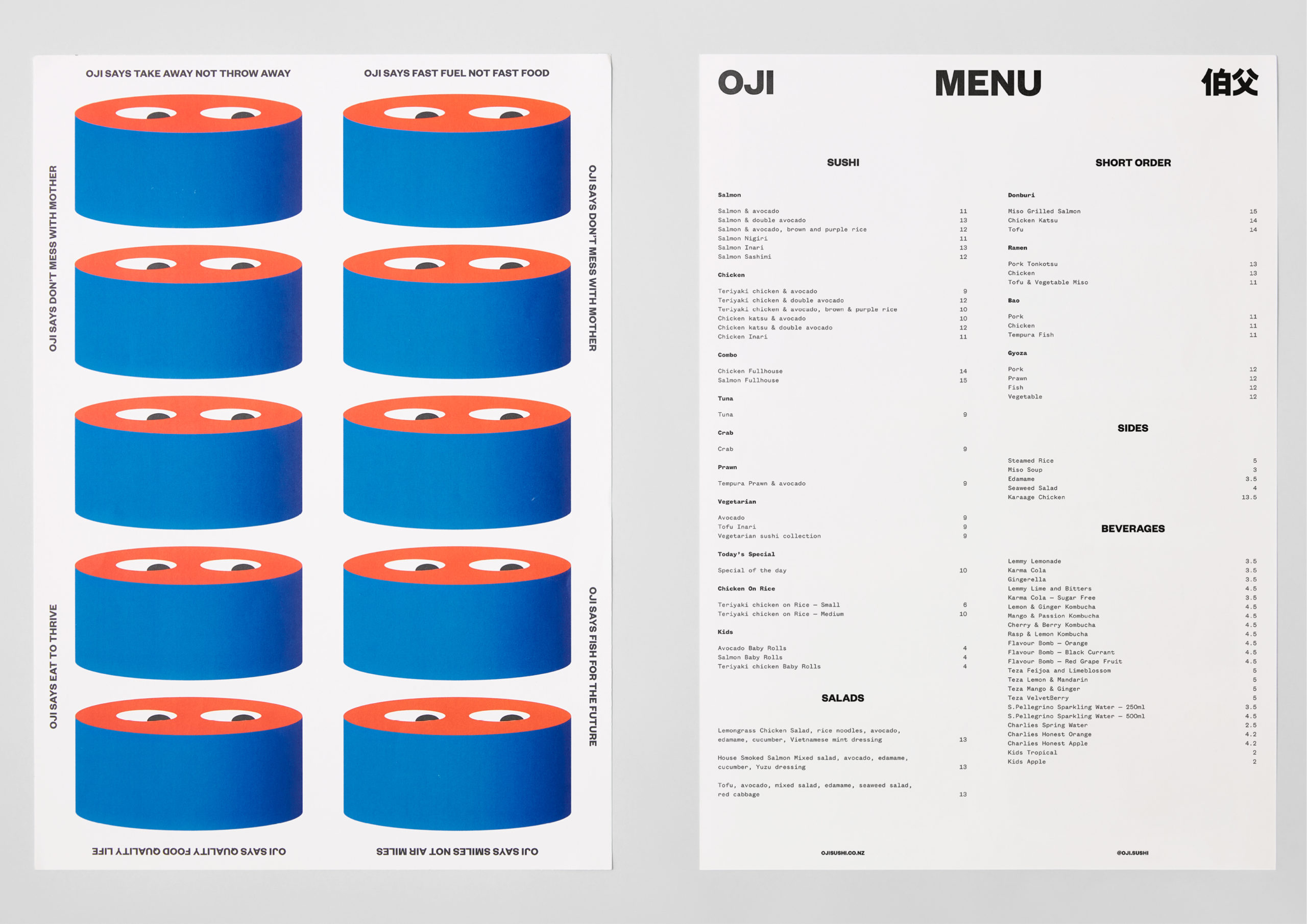
With a desire to attract attention, to be recognised as a fun and memorable brand and differentiate it from other sushi chains in the country, whilst channelling something of the Japanese culture, Oji worked with Seachange to create its brand identity. Following a trip to Japan, and inspired by colliding worlds of tranquility, craft and refinement, vibrancy, neon and pop, the studio developed a visual language of character and characters. These boldly link the biodegradable packaging with interior graphics, menus, signage and website.

Head chef Yukio Ozeki leads the Oji kitchen. He is a renowned figure in Japanese and fusion cuisine in Auckland, co-owning Azabu having risen up the ranks at Ebisu. Ozeki’s deep respect for Japanese traditions of sushi making gives Oji Sushi its authenticity.
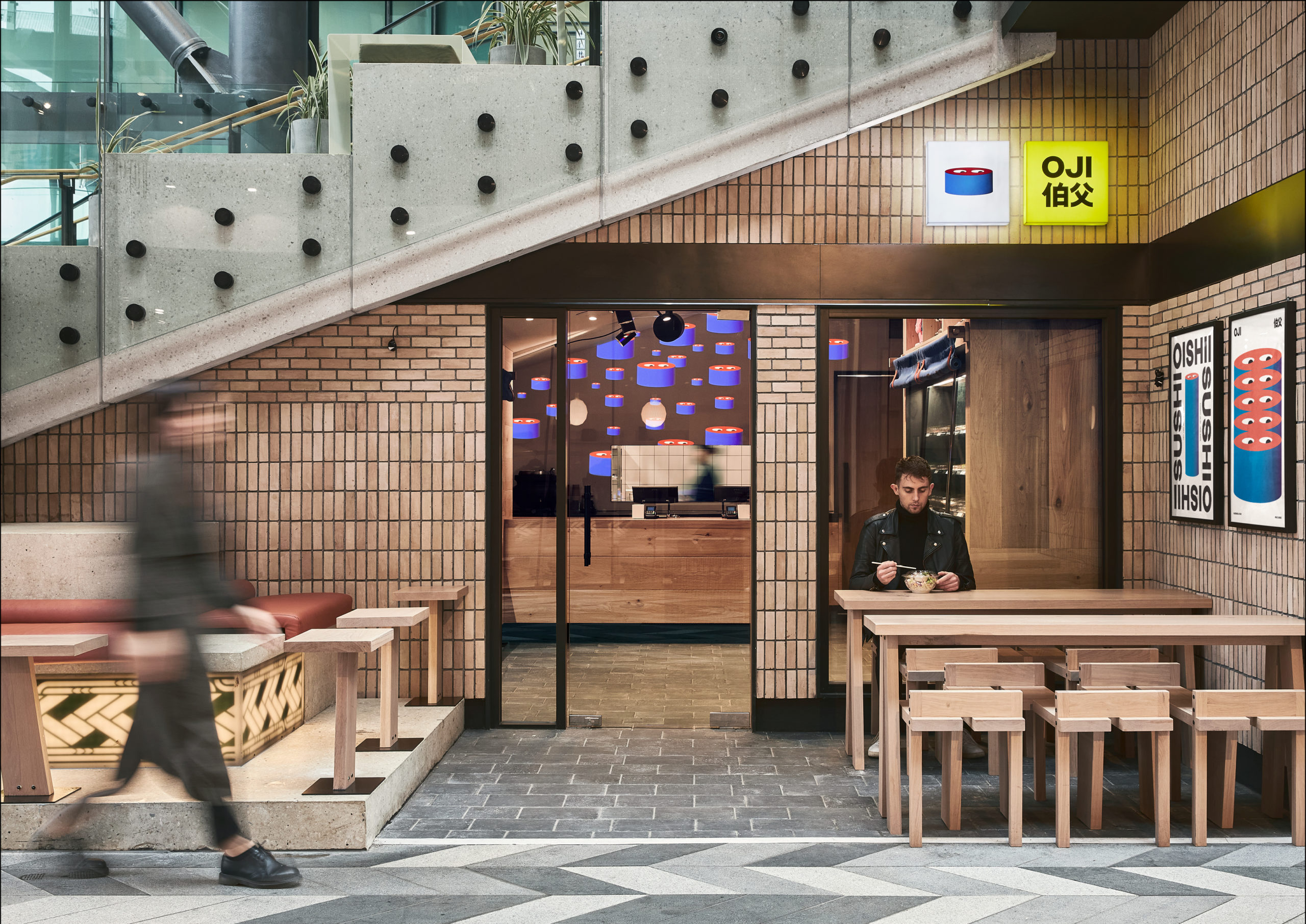
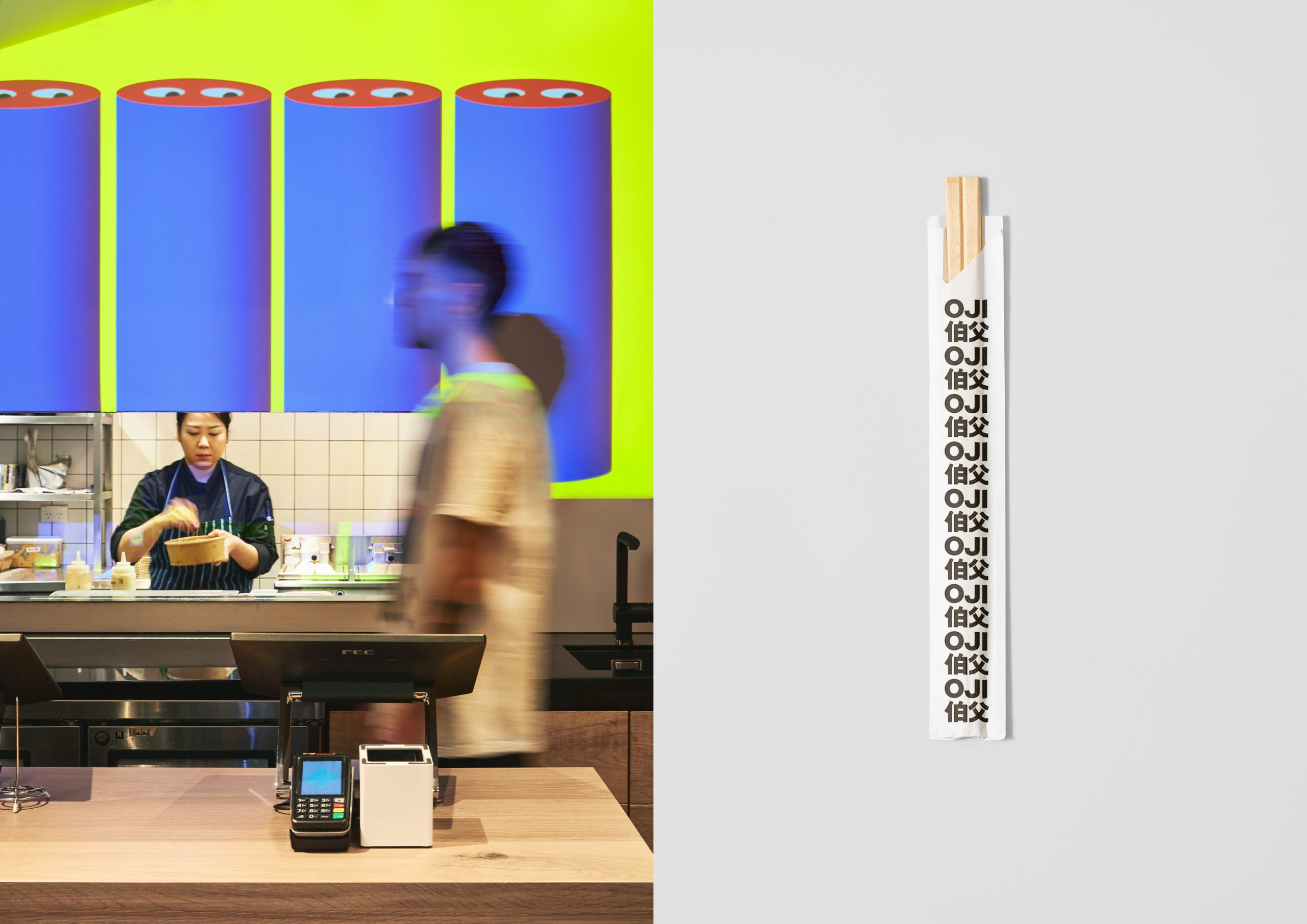
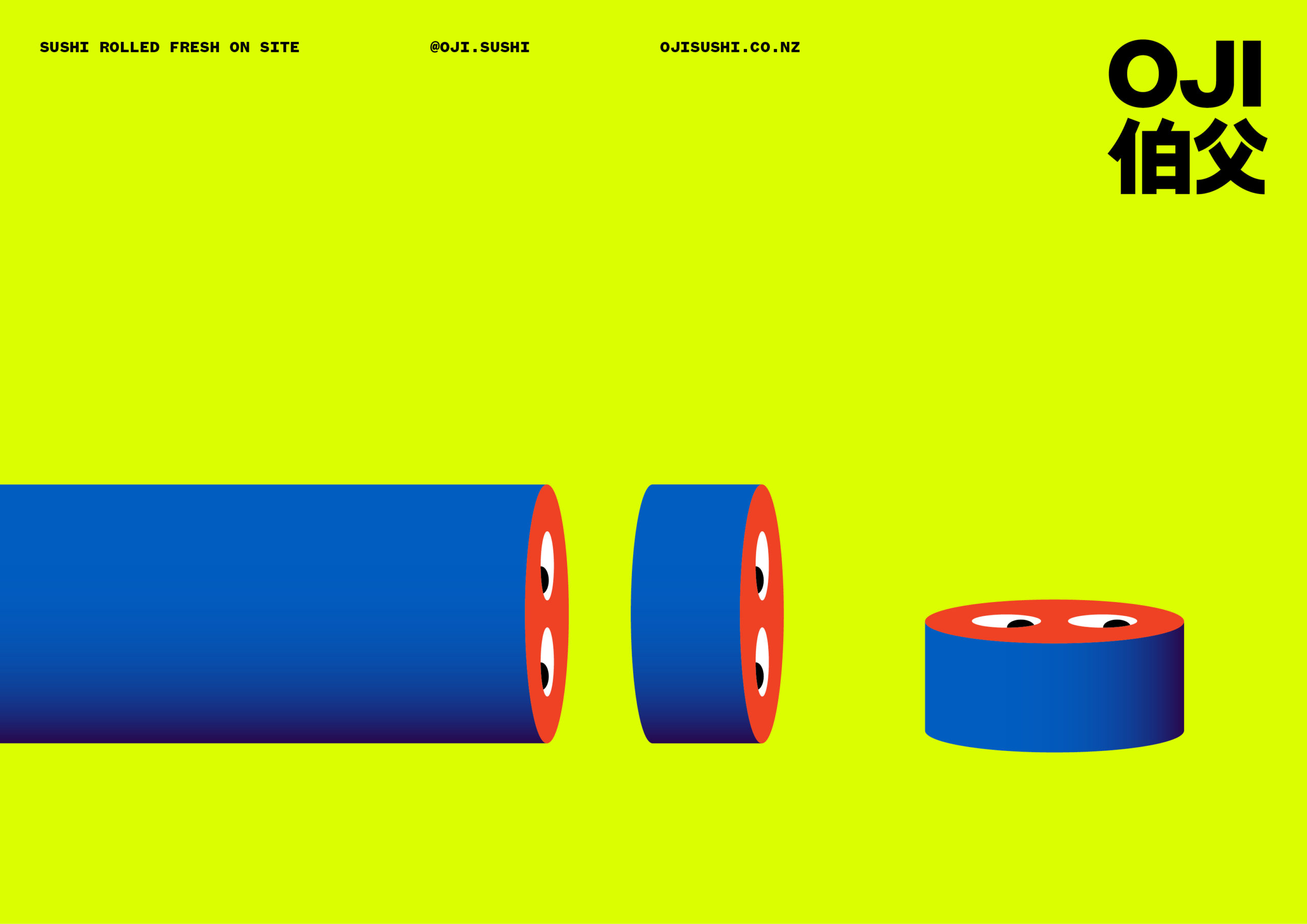
The visual identity is an intersection of illustrated and typographic characters. Drawing on the name Oji, which translates to Uncle in Japanese, Seachange created an iconic sushi character. This is supported by an “Oji says” tone of voice, anthropomorphising further, to deliver direct messaging around sustainability and quality, with simple alliteration to drive messaging home quickly. “Smiles not air miles” is also a neat little phrase.
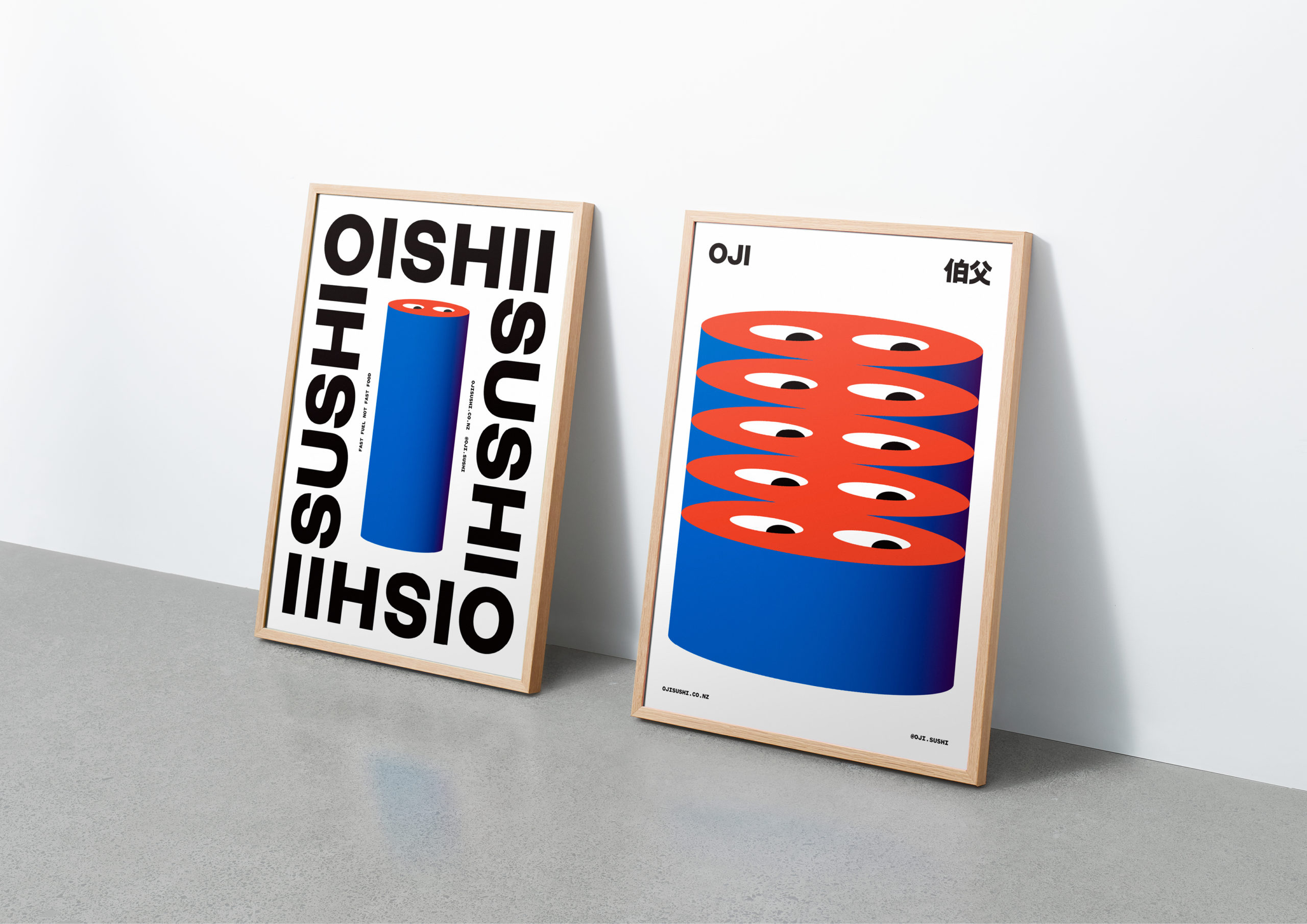
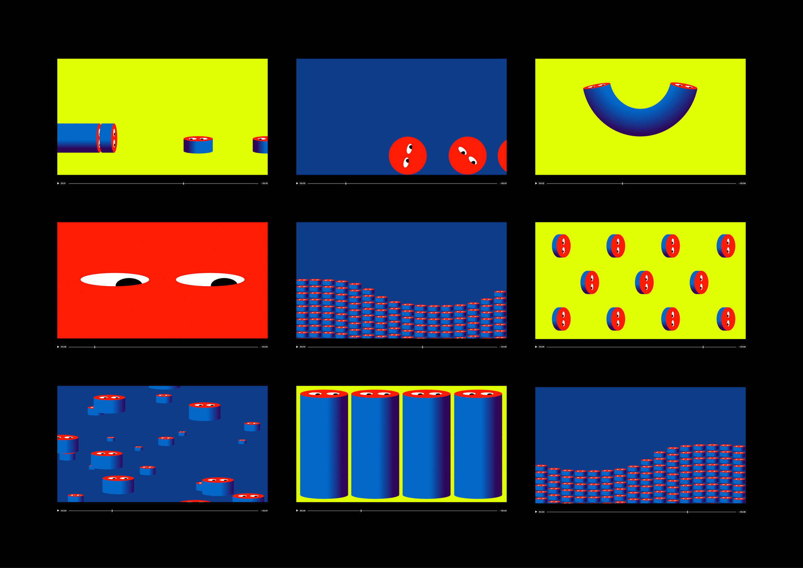
Simplicity and repetition, delivered through form, motion graphics and colour blocking, perfectly characterises the sushi experience and drawing out a playfulness and distinction. It takes a careful hand to be able to balance these without becoming overly simplified and absent of character. Also check out Seachange’s work for We Compost and Supertrash.
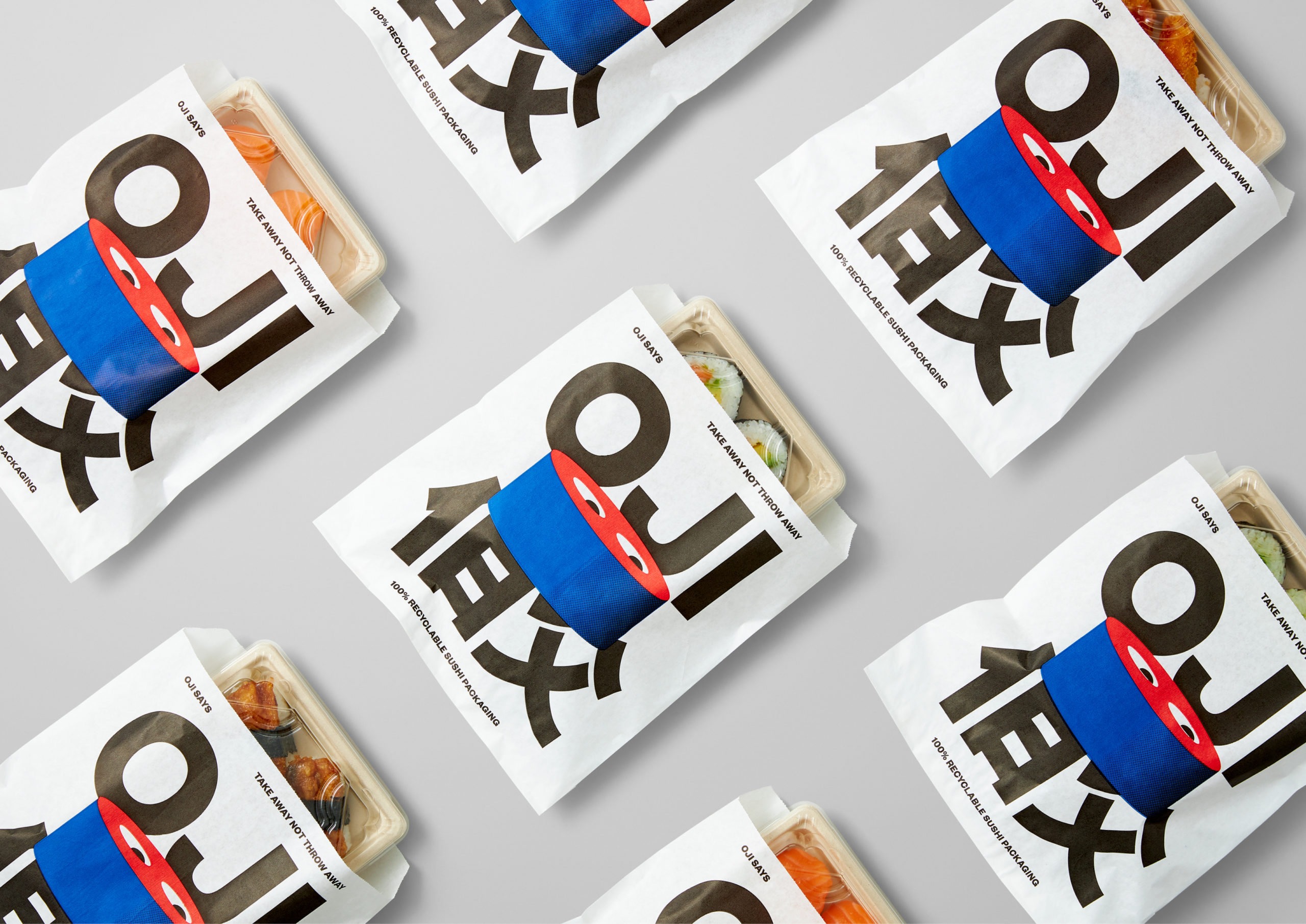
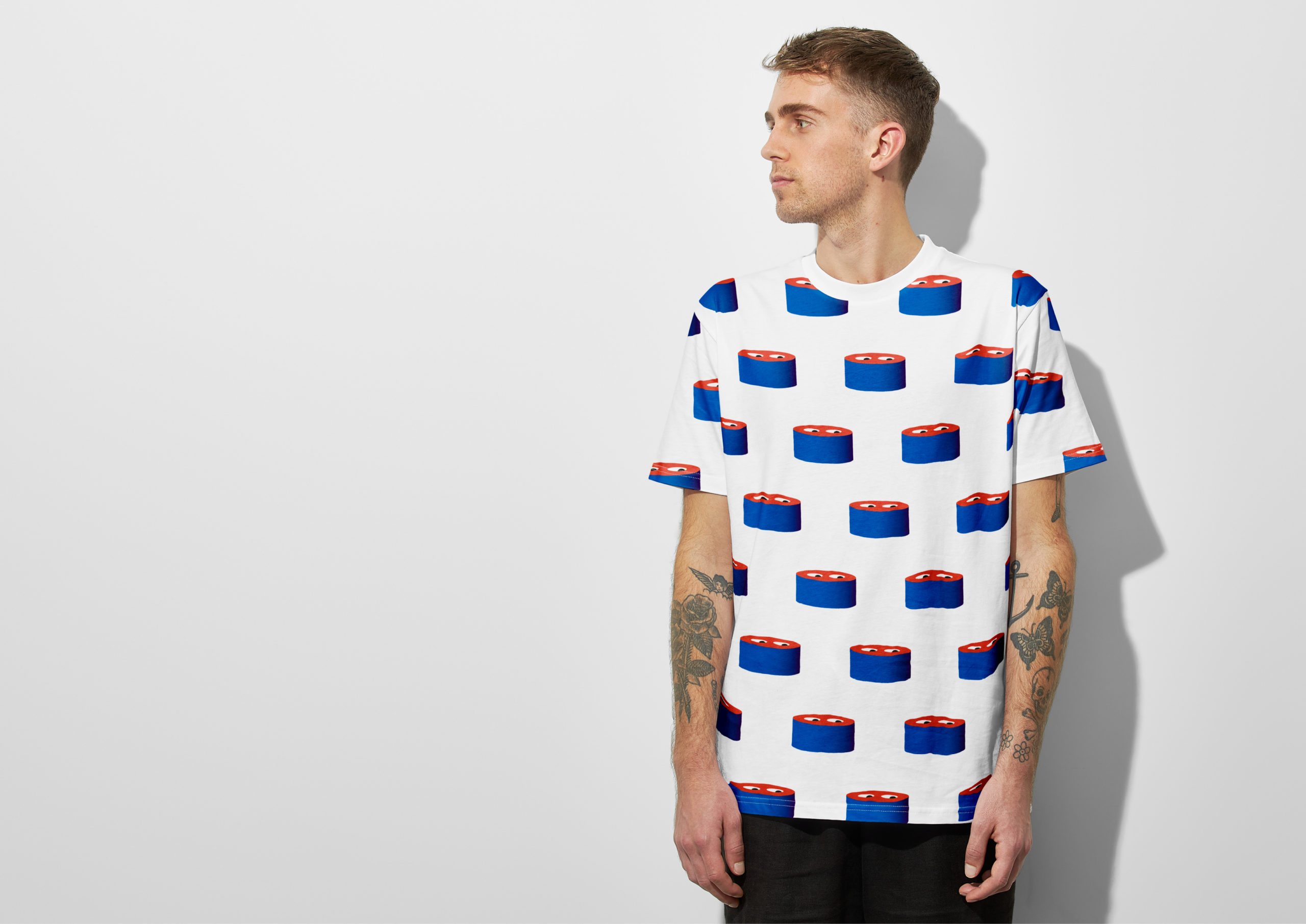
The simple form of the Oji character offers a flexibility and range of expressions. He takes the form of a sushi roll, can grow and morph to fill space, can wink, get sliced, create patterns, bend and dance. In conjunction with type and grid the work manages to derive quite a bit of range across various surfaces from a very simple form. Again, it is in the repetition of process used in sushi preparation and the form of sushi itself that give the character and associated visual language meaning and humour.
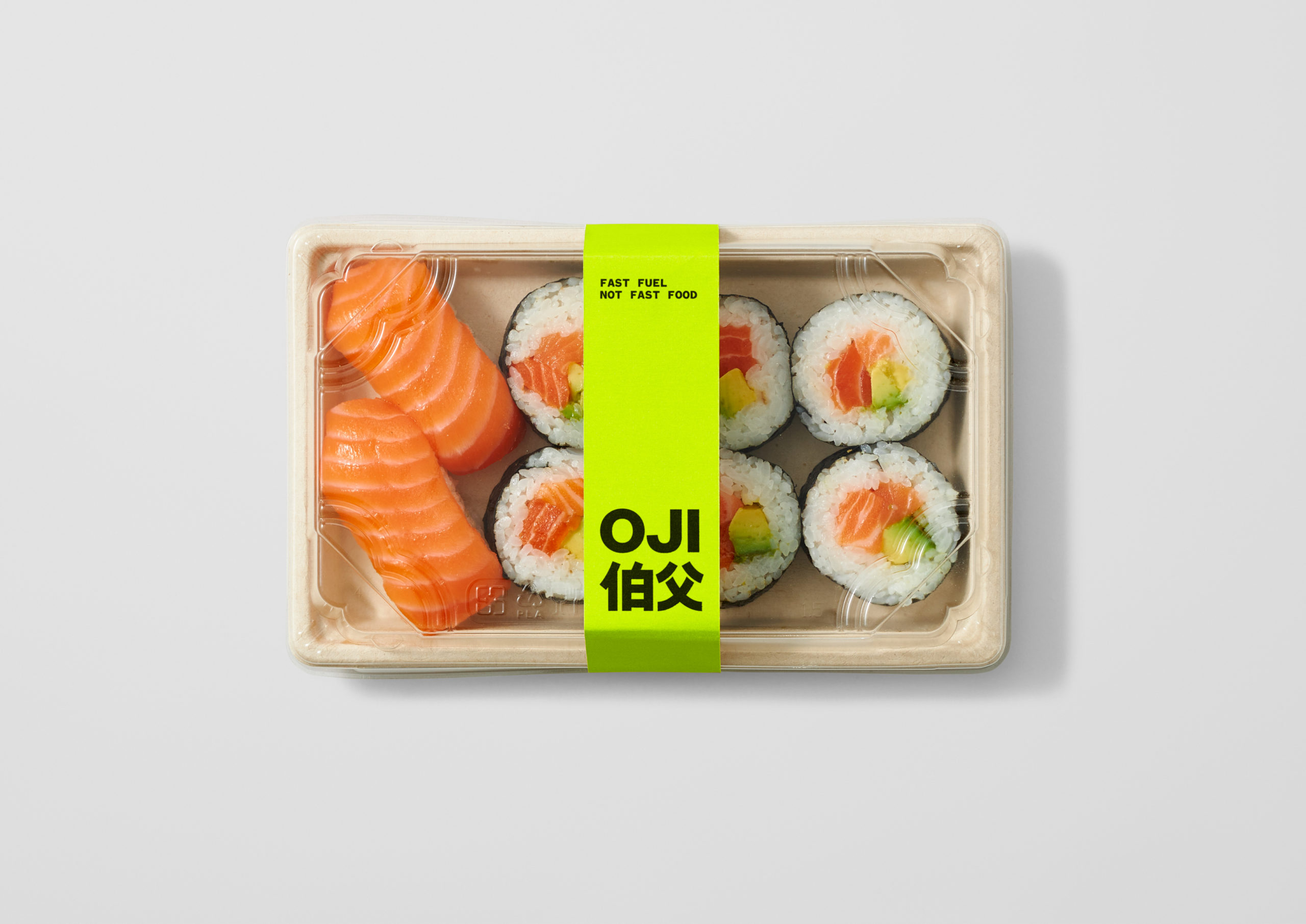
The associated material language of sustainability is apparent in the packaging, and this provides a communicative nuance, you feel the brand’s positioning in your hands, and is supported elsewhere through words and action. Further, material and graphic language creates contrasts, and a dialogue between modernity and tradition, craft and convenience. An interior design of oak, hand glazed Japanese tiles and traditional Japanese norens juxtaposed alongside bright neon signage, looping motion graphics and projected images of Oji on the wall takes a busy urban visual language of different periods, and distils these down into franchisable components, whilst maintaining a fun and recognisable character. There is enough range, rooted in the process and product, to keep it all interesting. More from Seachange on BP&O.
