Detour Beer Co. by Weave
Opinion by Richard Baird Posted 3 November 2022
Craft beer has become a hugely competitive market to enter. It seems a rather obvious thing to write, but it’s quite something to have been part of the generation that saw its rise. It’s also provided a lot of great imagery for design blogs, and moved freely between both brand building and just plain visual delight. To see large fridges within the bar space of the likes of badly-behaved Brewdog, both functional and part of the interior design language and packed full of brightly coloured ‘artworks’ has been a delight to witness. What hasn’t been tried at this point? What more can be created? What avenues are yet to be explored?
We’ve had our fair share of craft beer on BP&O. We’ve been spoilt for choice, but ultimately, focused on brand building, storytelling and ideas, rather than indulging in anything on a purely aesthetic basis, although that does play a part. It’s really just down to words. There’s plenty of beers we could have dedicated a couple of lines too, but far fewer that will get us past a couple of paragraphs. I’m on the second here, so it’s going well, but then again, I’ve not started the review of Detour Beer Co. by Weave. It could be one line, let’s see.
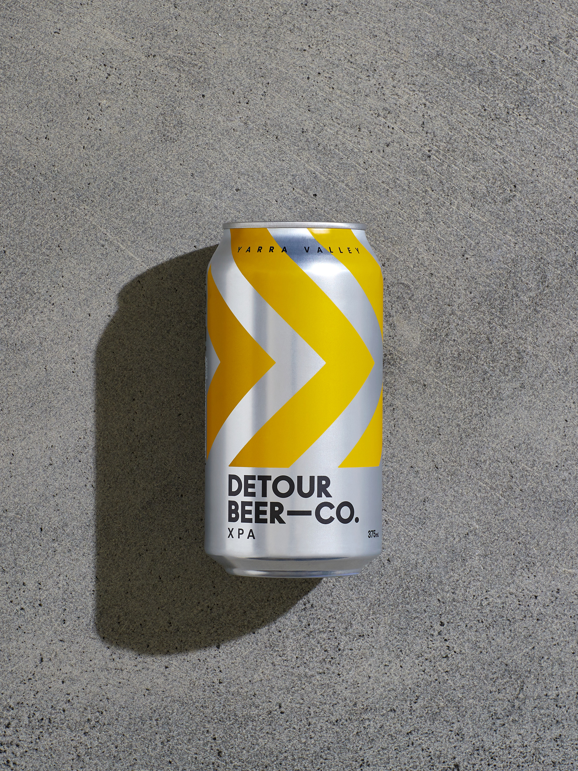
It’s perhaps not surprising that, after all the visual drama of the craft beer fridge that we’re seeing more of a reductionist / minimalist approach used as a way to stand out and ask for consideration, where before it’s been a fast grass roots to maximalist visual journey. Perhaps it makes more sense when you read that the Nepolean family, those behind this new beer brand, were previously in the wine-making business. It’s fair to say the visual and material sensitivities of wine and craft beer are quite different, but there are areas were they intersect.
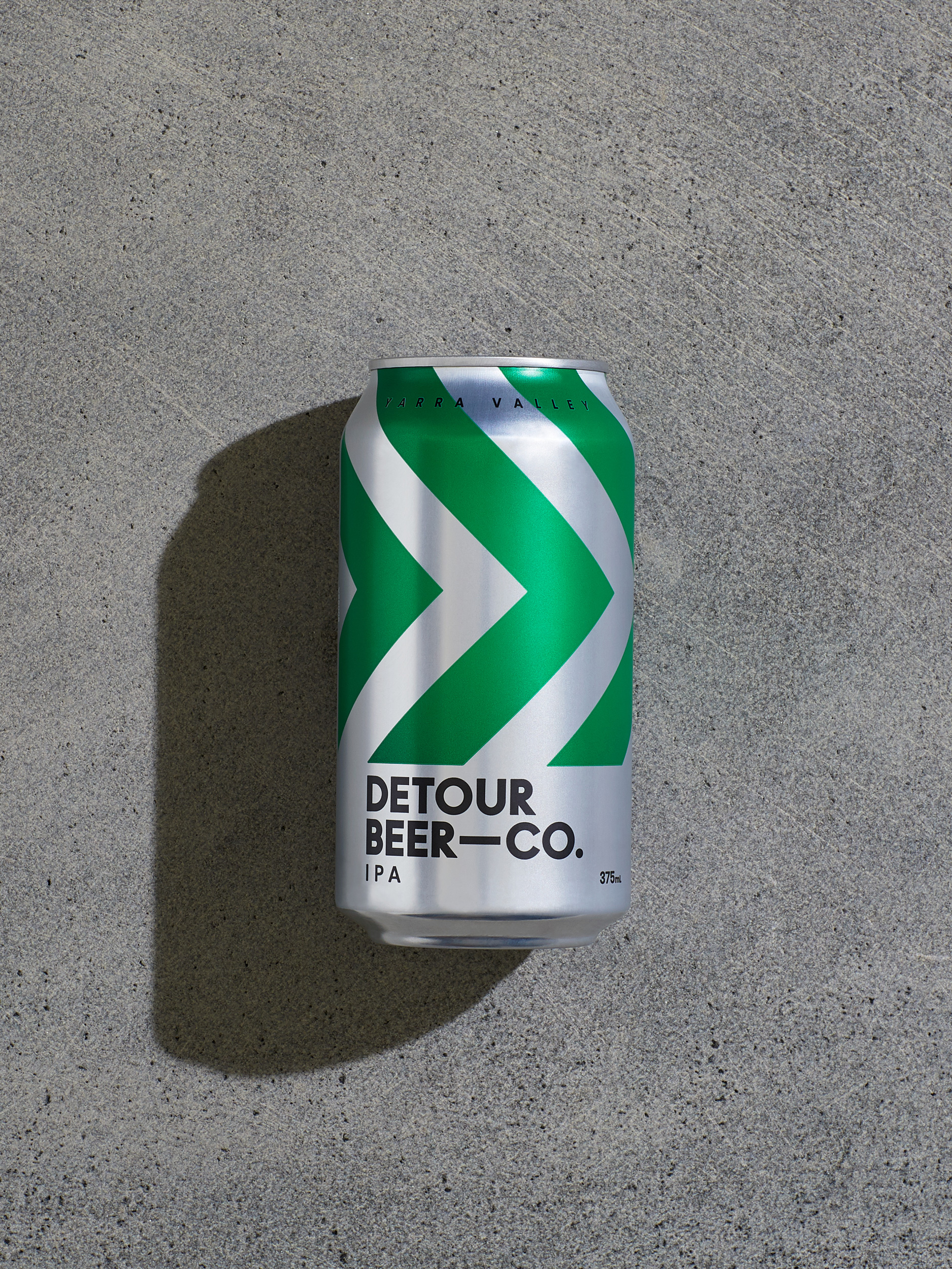
So where does Australian brewery Detour Beer Co. sit? It sits within a liminal space between industrial and agricultural, highways and hills. The narrative of the brand is, unsurprisingly, detours. The Nepoleone family, the owners of Detour Beer Co., first began growing apples for cider over 70 years ago, then grapes for wine and now crops for small batch craft beer. The name speaks of a family continually forging new directions, taking detours, but all fundamentally rooted in the produce of the land.
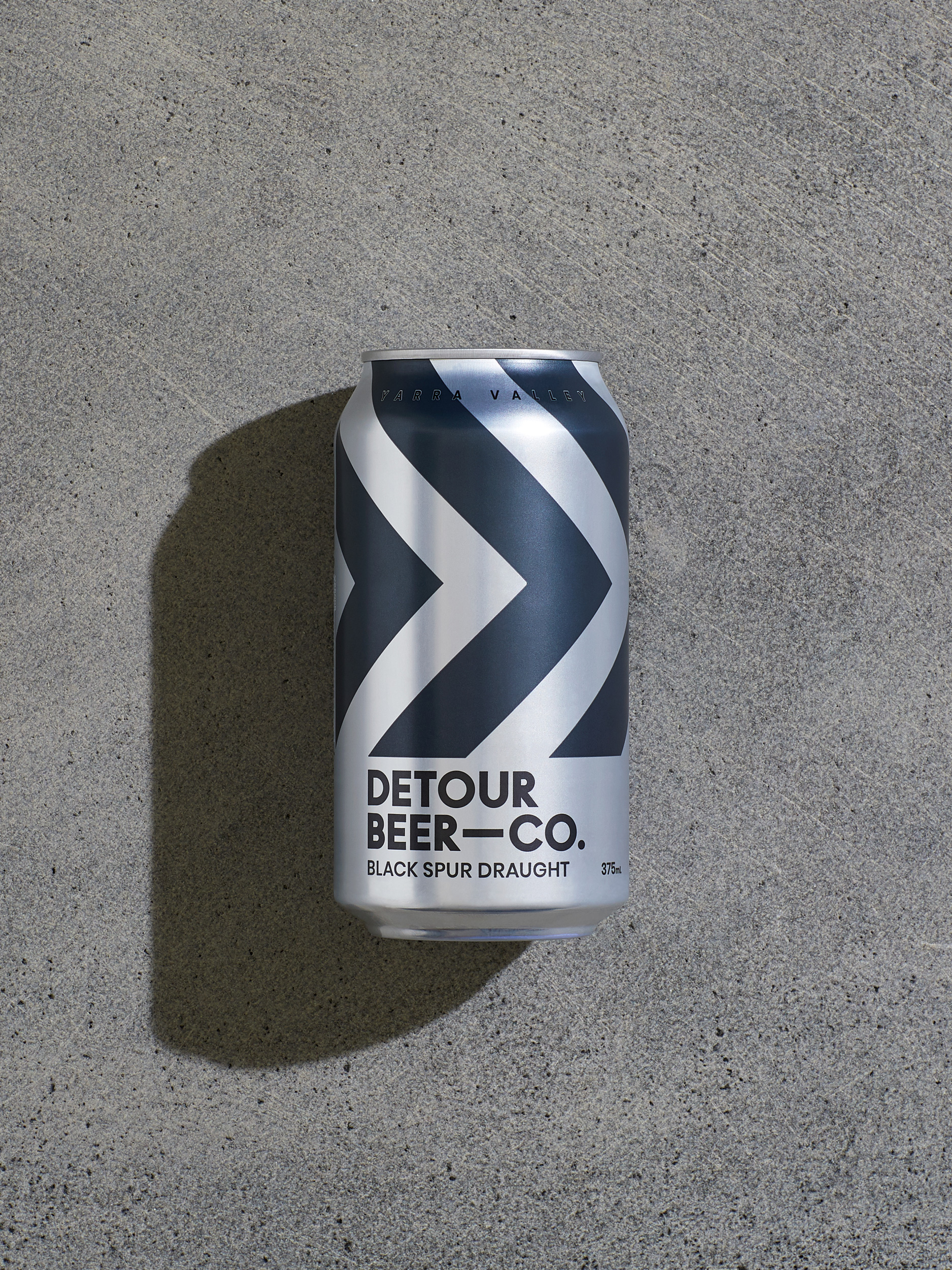
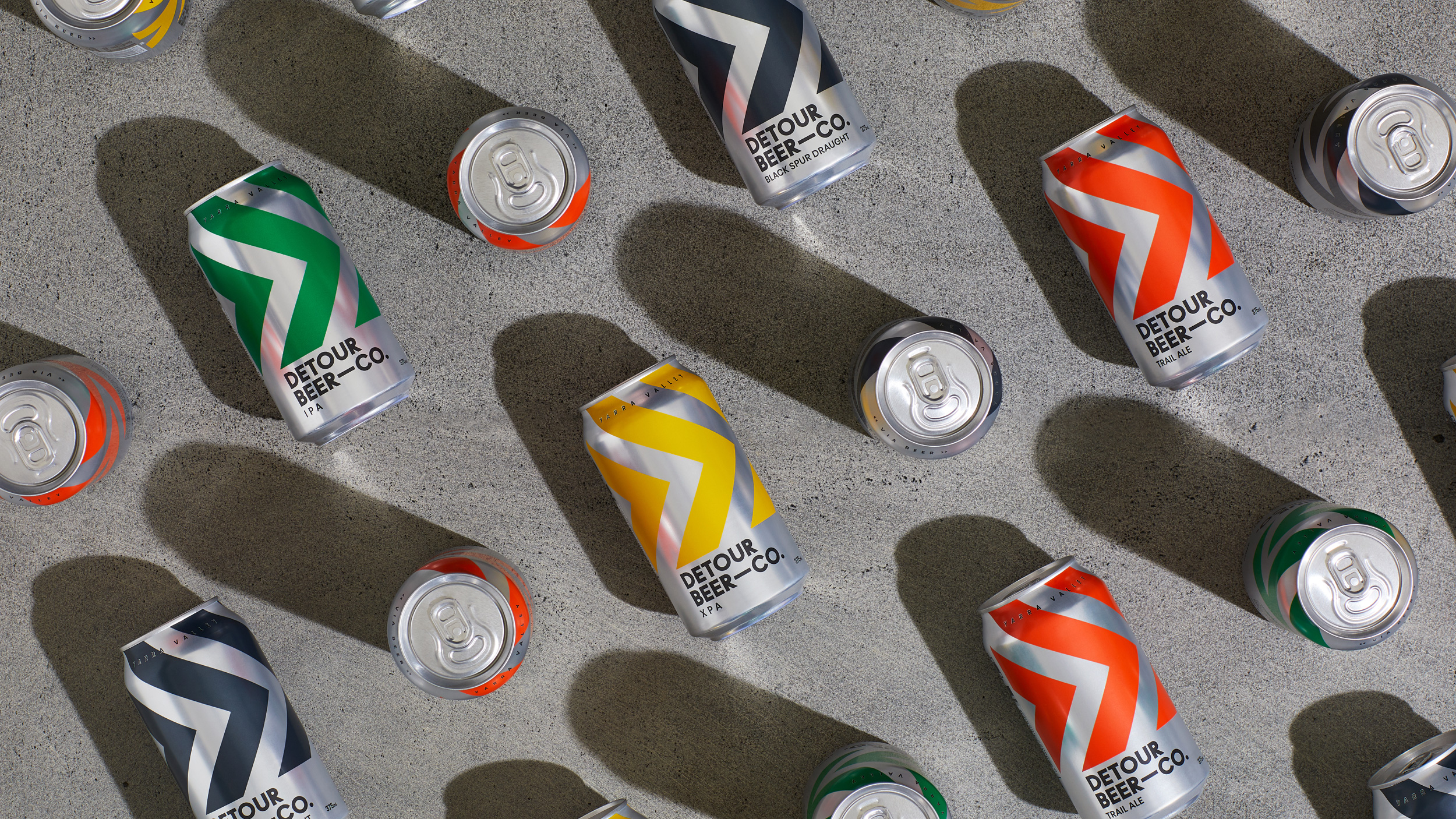
The packaging reflects this lineage, a meeting of sorts. Of industry, agriculture and the laneways that pass through the rolling hills of the Yarra Valley. The chevron design could easily be construed as either tractor and trailer tracks, particularly the Black Spur Draft, or laneway direction signs in red for the Trail Ale or Yellow for the XPA. Both references are raised in Weave’s case study. Whether it’s chevrons or tracks, there’s an immediacy to the image and use of colour, and one that likely works from a distance and up close.
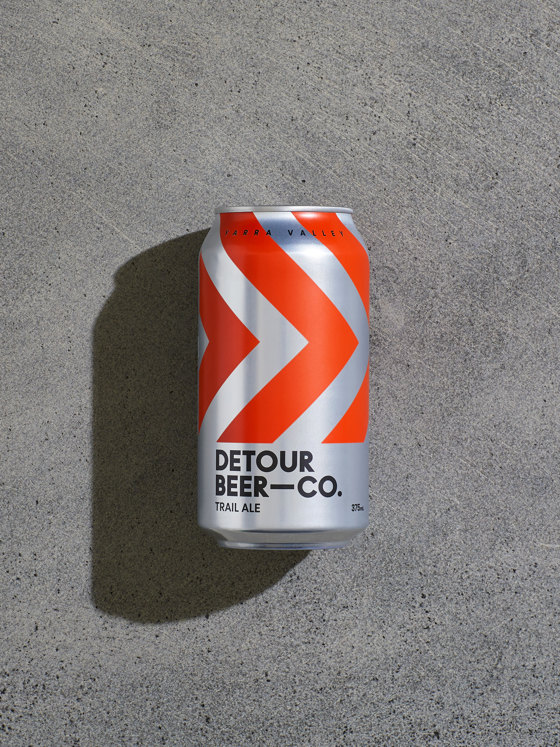
Colour functions as the delineating factor between varieties. In search of economies, much of today’s craft beers, still experimental and high risk ventures, have taken to short adhesive labels, a lower-risk packaging strategy. Here, the full silk screen print, partially revealing the industrial aluminium can beneath and integrating this into the chevrons, lend a sense of quality you might expect of wine or the industriousness of cider or beer brewing. Type is a pleasant if innocuous choice, contemporary, bold and sitting well with the chevron motif. That’s it. Nothing more. So, it’s back to the beginning again. Simple, immediate and rooted in a decent idea and story. The kind of stuff we love writing about.
