Norwich Castle by The Click
Opinion by Richard Baird Posted 13 April 2023

The competitive landscape for experiences has been significantly catalysed post-pandemic. Perhaps the sensory deprivation of stay-at-home orders created an intense need to make up for lost time, indulge in all manner of out-of-home activities and platform them. Times have changed. Old needs to feel new and fight on equal footing with what appears to be an endless stream of pop-up interactive spectacles. Universal Everything’s Life Forms was an incredible piece of work, the ‘immersive’ Van Gogh exhibition, less so.
Historical monuments and ancient site’s have to stand out from and function within this competitive landscape. They need to appear polished and consistent. Presenting visits as high quality and of value. They need to coral and hold together broadening programs that exist in and around these sites, whilst remaining historically authentic. And further, they need to be adaptive and flexible in order to market themselves (and appear appealing) on a variety of platforms and devices.
Museums and galleries, those with solid funding, have shown that robust systems and simple framing devices have given them the flexibility to move with the times, and cope with a diversification of offerings to draw more people in. Norwich Castle provides a look at how smaller venues, the estates, privately-owned castles and single sites, can begin to resolve their visual identities and marketing initiatives into consistent and compelling propositions. Helming the Norwich Castle project was The Click, a studio that has shown they have a deft hand at building simple, clear brand systems. The Click goes back to move forward, deconstructing what came before and using a universally recognisable architectural element, the ‘battlement’, to build out (and protect!) future interest in the castle.
This post includes Extended Insights for BP&O Plus members.
Find out more and sign-up here.
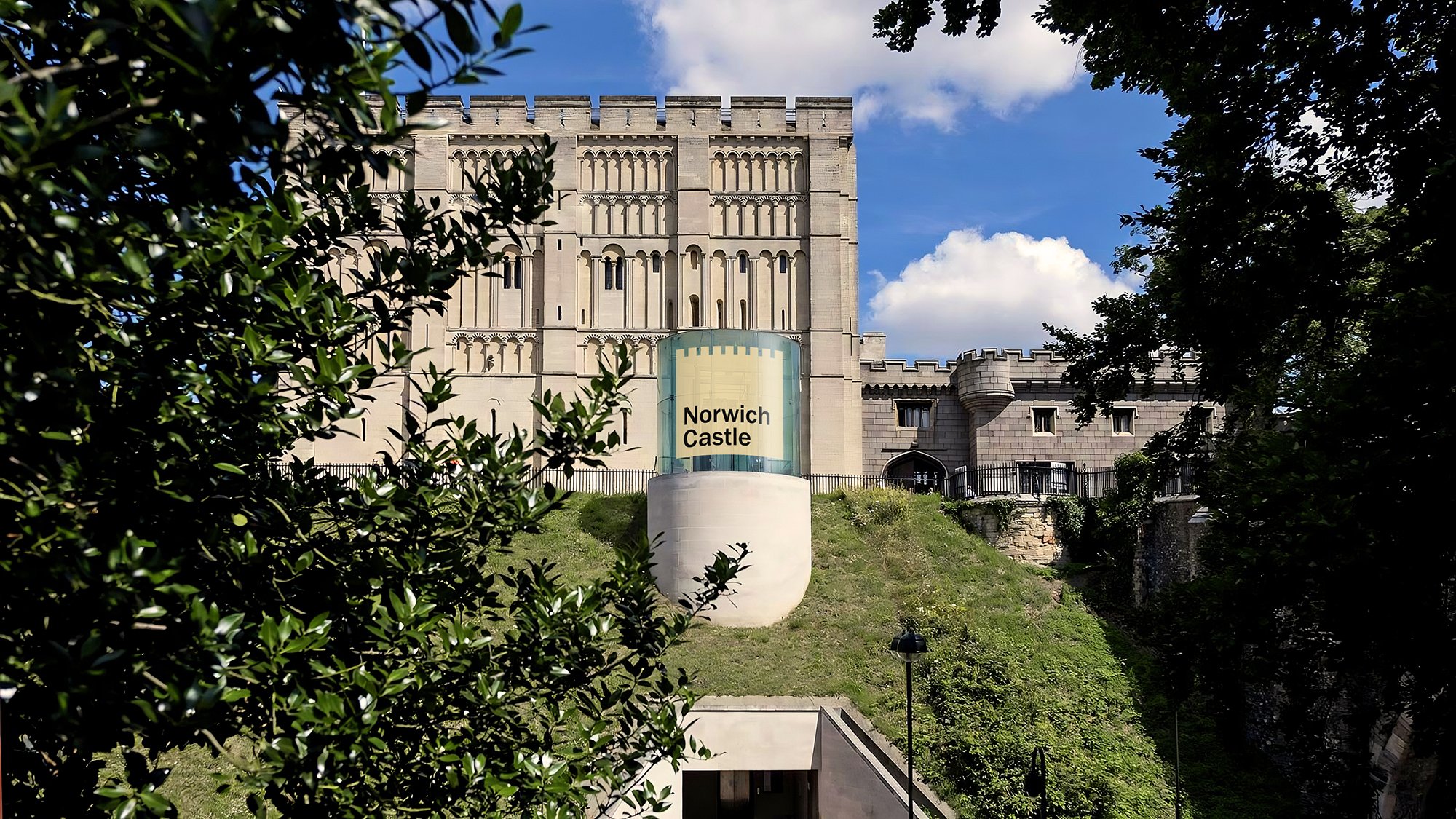
The H. G. Wells quote “what really matters is what you do with what you have” comes to mind here. The Click aren’t reinventing the castle, rather acknowledging what they had to work with was good, had a lot potential and could balance a necessary graphic immediacy with a systematic usefulness.
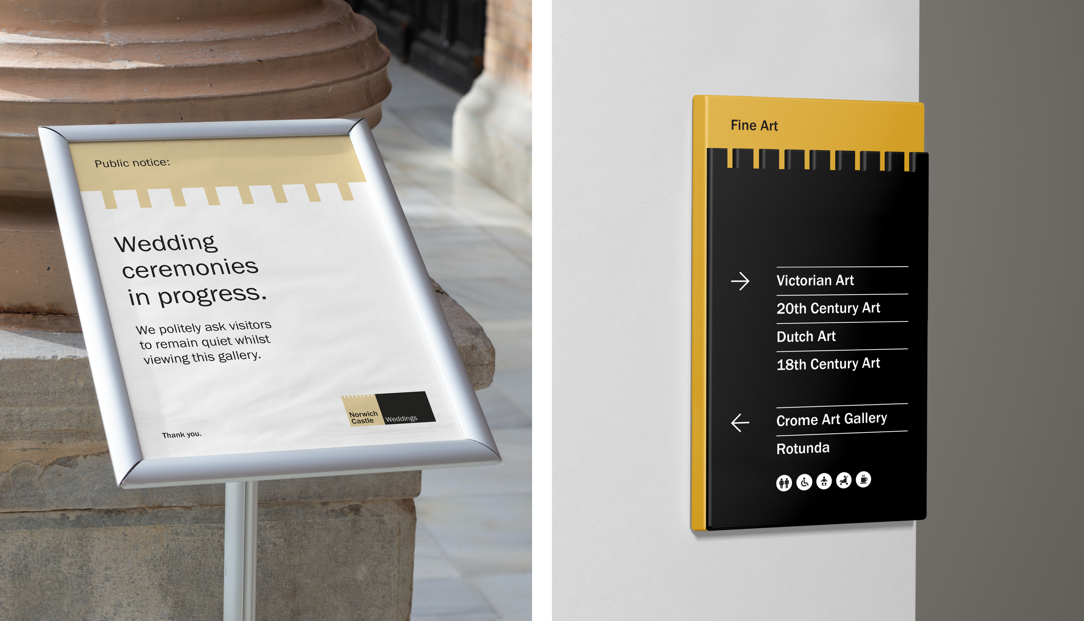
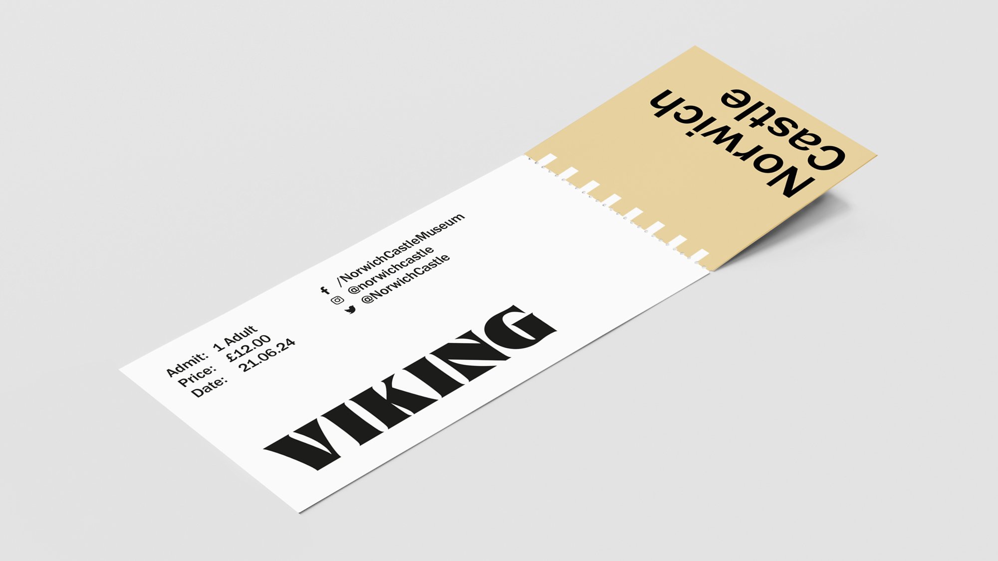
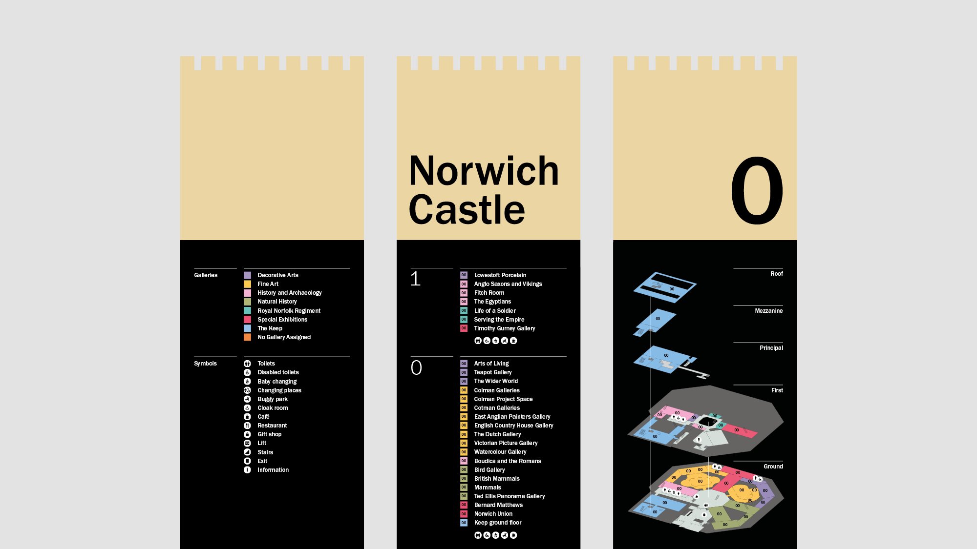
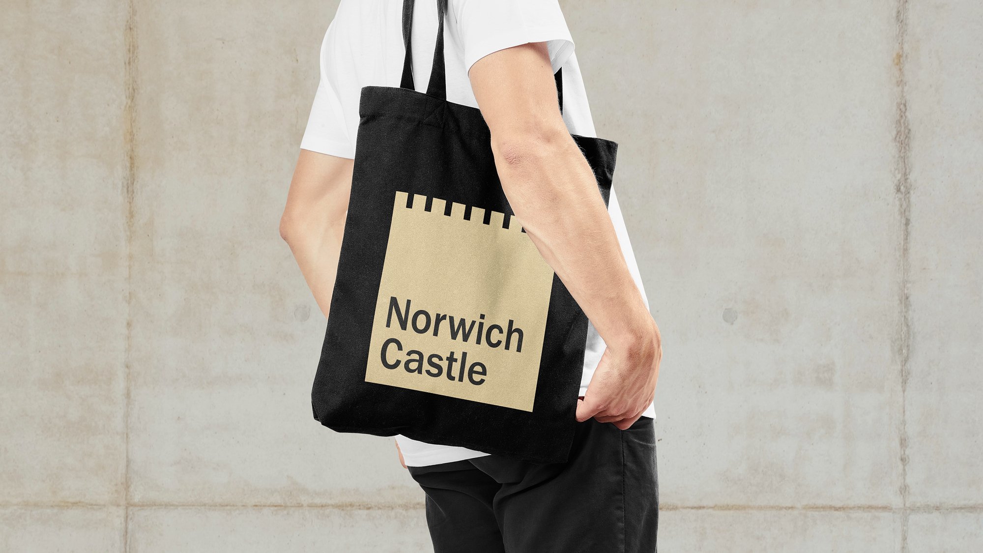
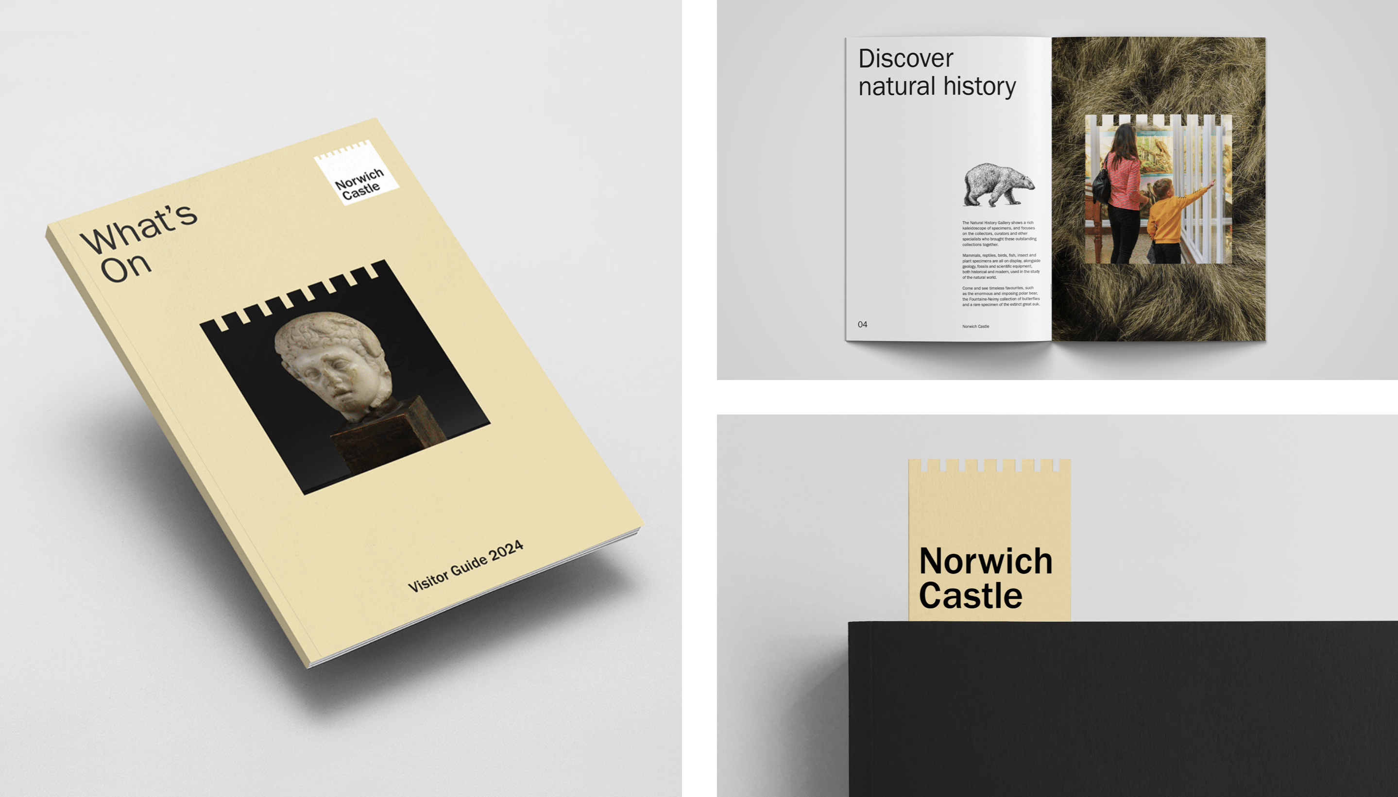
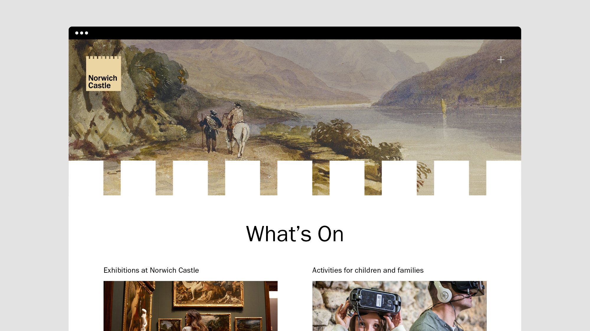
The logo, an abstraction of what came before, the universal motif of the ‘battlement’ formed into a square and holding the name, has been creatively rinsed in the best possible way. It informs the grid structure of banners, signage and brochures, it contains images, sets hierarchy, divides content and runs along the perforation of tickets. It expands and contracts, has been materialised as layered wayfinding, cut from wood and hung as a sign. You can see that once that simple square form was settled on, a lot of energy placed into developing lots of ideas, and proving that there was room for more.
The Click have shown the system to be robust in terms of use cases, and developed a distinctive visual treatment from an architectural detail that is common to many castles of the UK and Europe. Colour and colour blocking, and a versatile typeface (Franklin Gothic URW) support this simple idea in a flexible and useable manner to delineate between the myriad of Norwich Castle’s programming, with legs still in it for more. The battlement idea also brings with it a an underlying grid structure to the posters, with the ‘merlon’ acting as column and the ‘Crenel’ as the gutter. Nice.
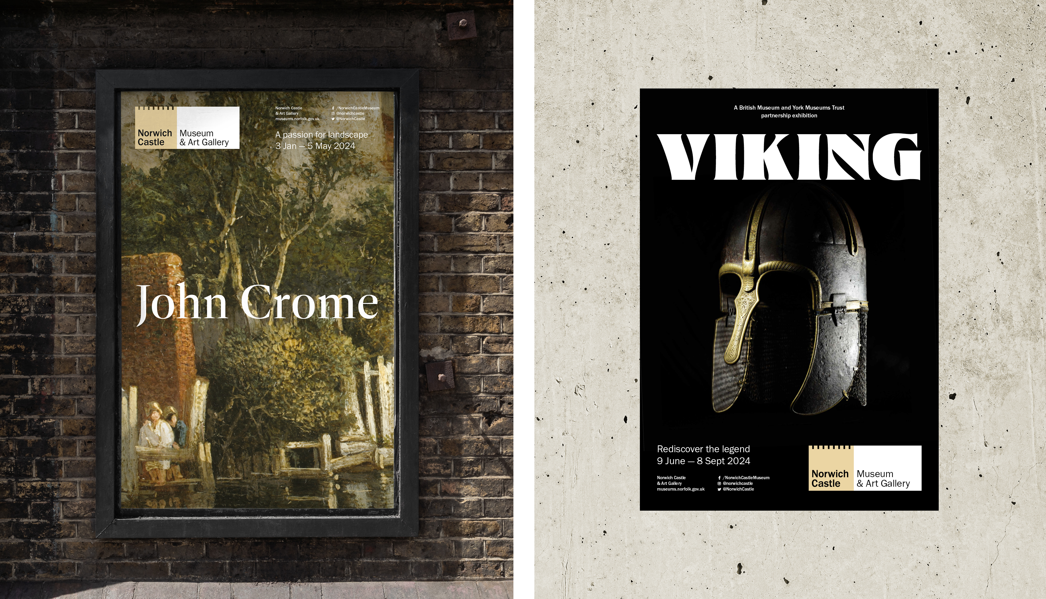
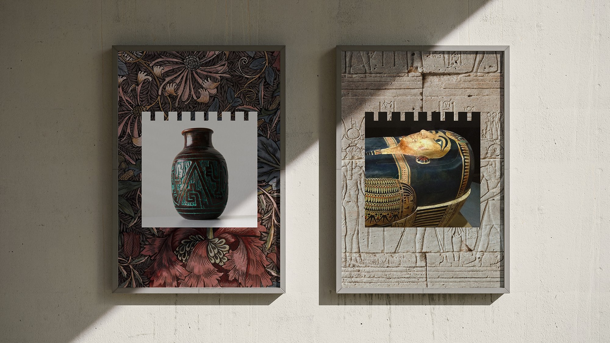
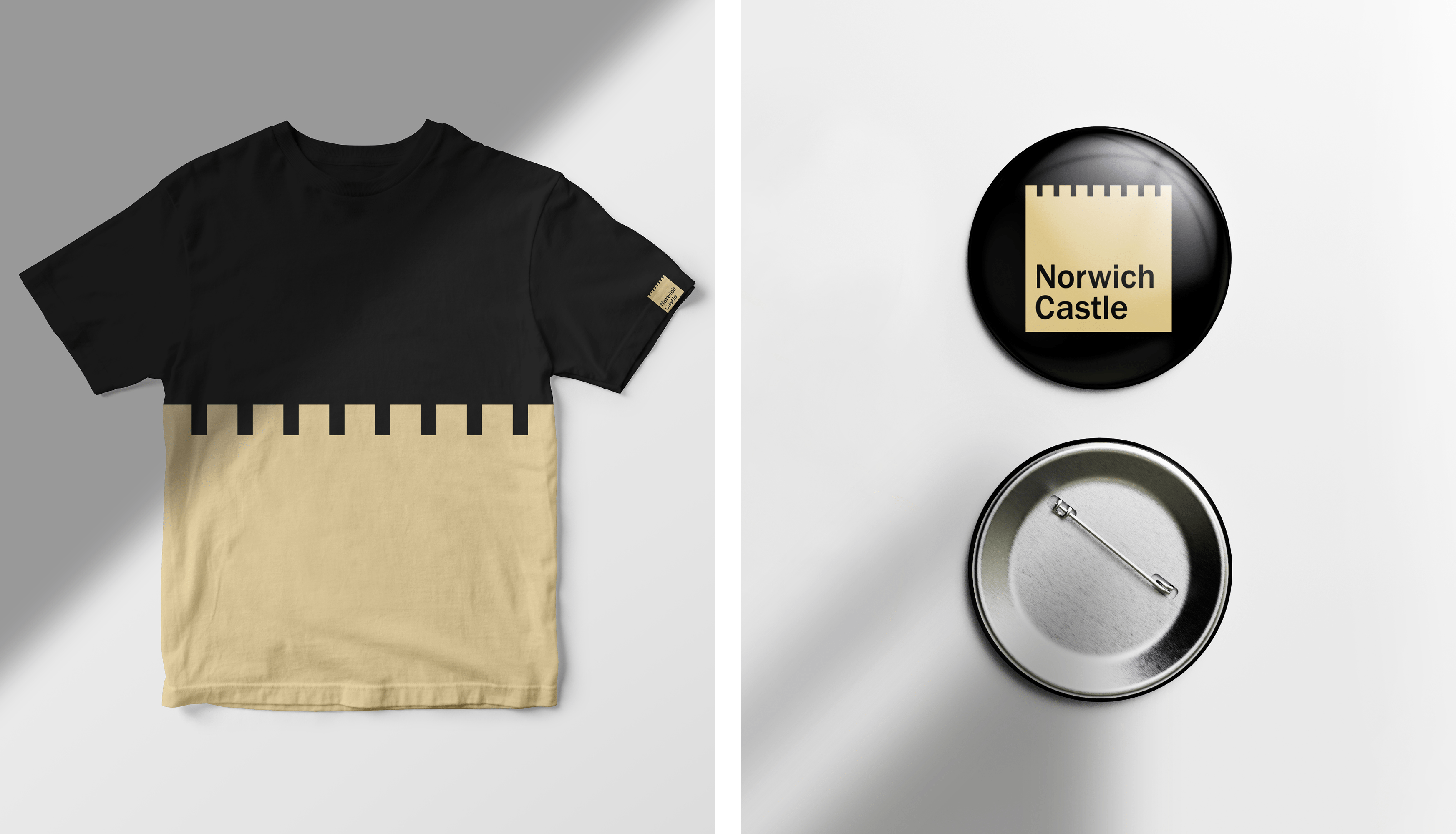
There are moments of restraint. The use of the ‘battlement’ could have gone too far. There are instances, such as wayfinding, where its prominence is reduced or removed in order to focus on information. In other instances, it’s boldly used to split tee-shirts with two colours, create juxtaposition between colour blocking and historical imagery, and used as a die cut across the top of bookmarks. The historical is constantly given a contemporary context, and sense of relevance and interest.
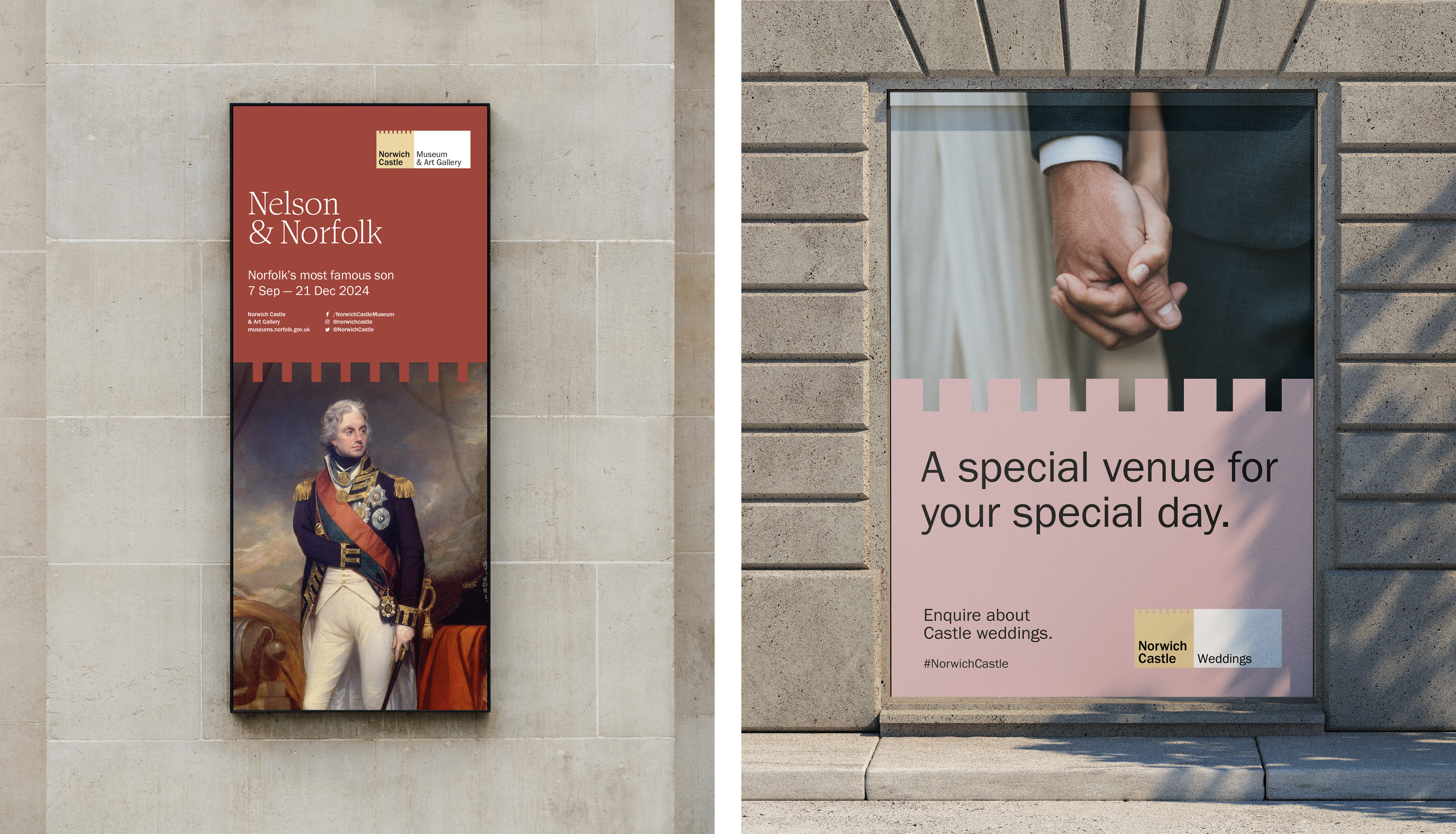
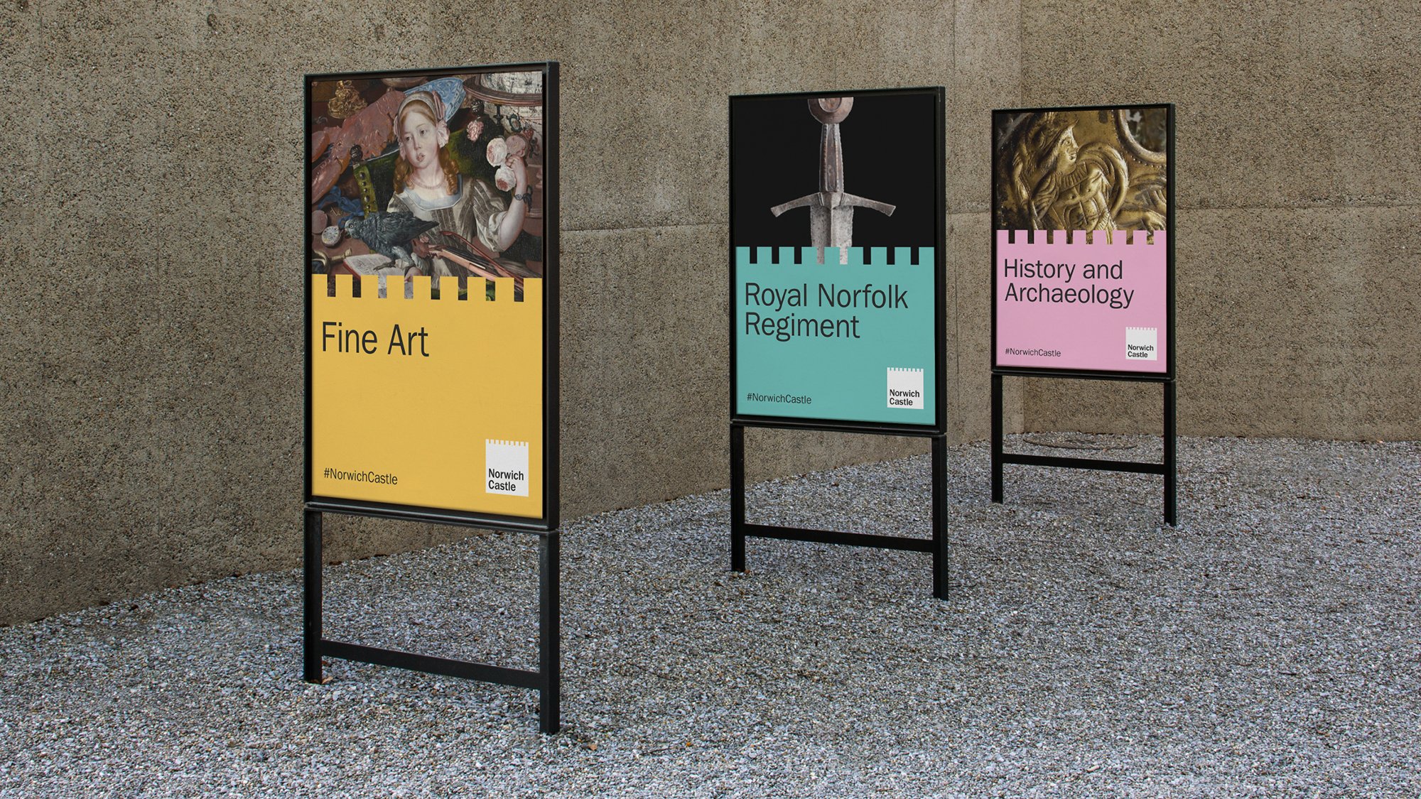
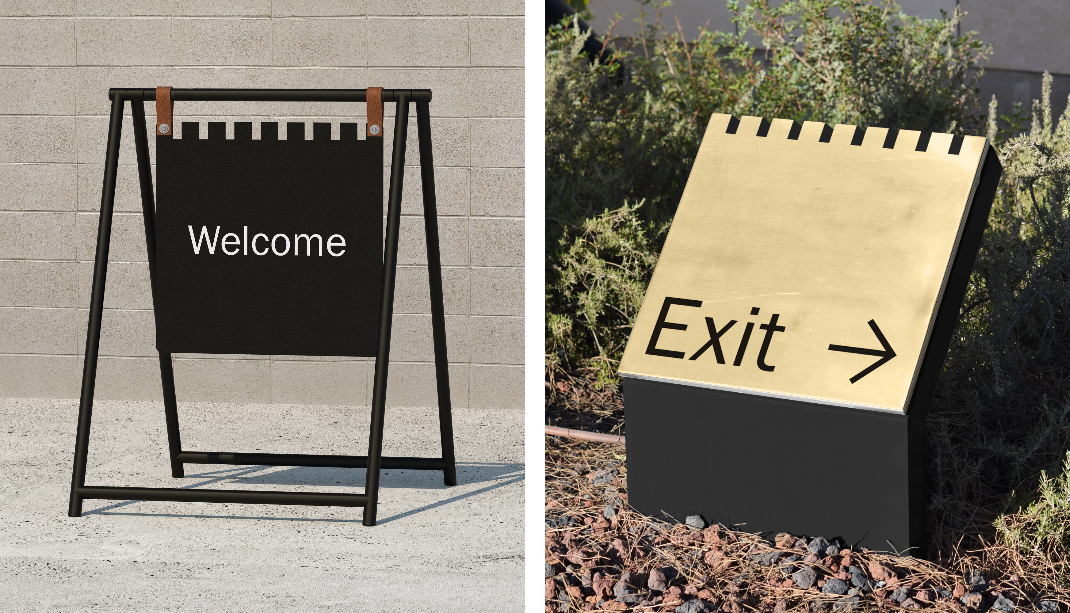
With all there is to see and do now (and the expense of getting further afield), and against the backdrop of the increasing interactive pyrotechnics of today’s exhibitions, sometimes you just need something robust and hardworking as a castle, beautiful in its functions as much as its powerful in its form.
Get more with BP&O Plus
Read Extended Insights, start bookmarking, switch between light/dark modes, article and ‘Gallery View’ and support our writers. Become a member by subscribing here.
