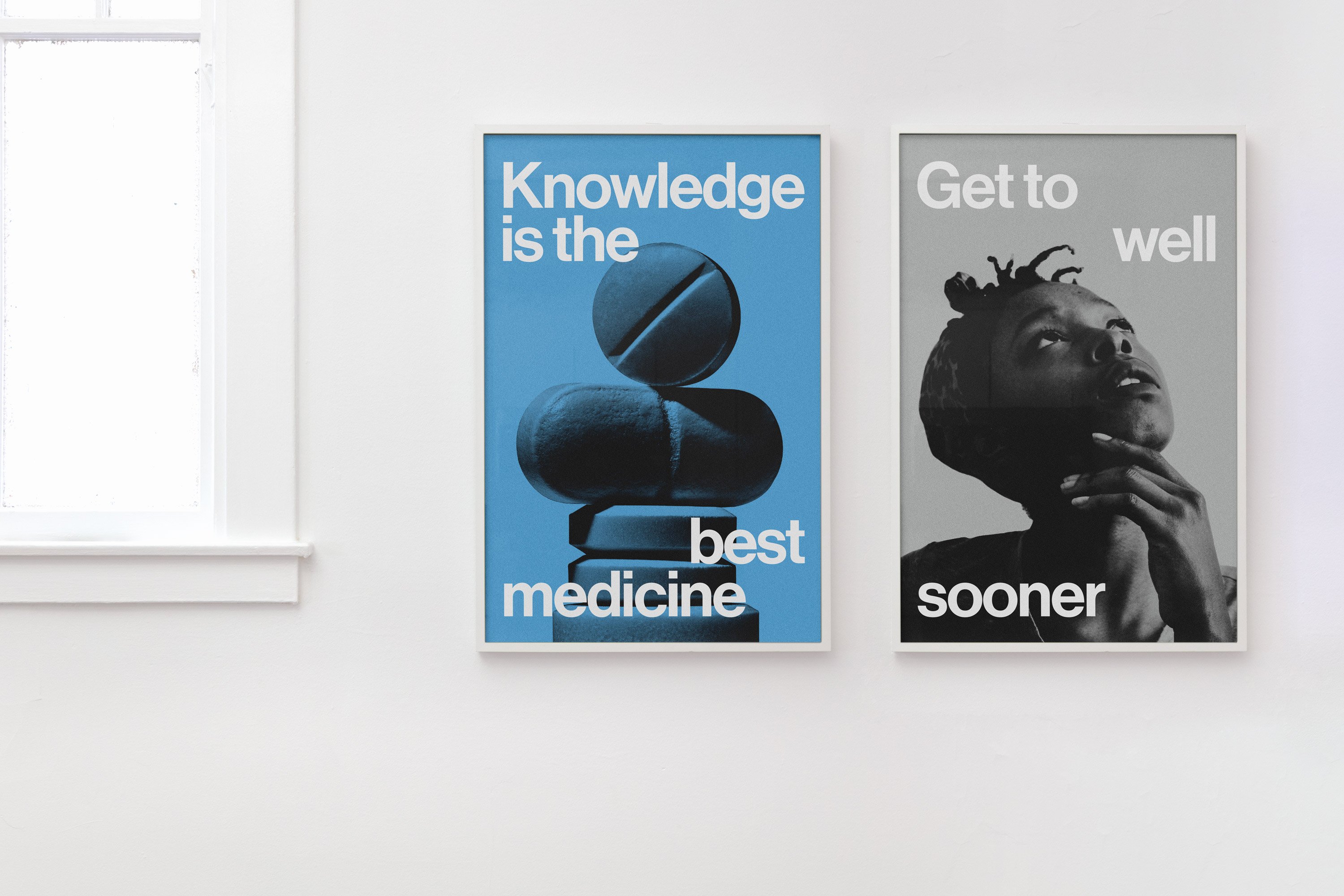
Ostro by Mucho
Opinion by Emily Gosling Posted 13 June 2023
Ostro isn’t the easiest of companies to make sense of. Billed as a ‘life science software company’, it straddles a number of different services that are both consumer and clinician-facing. In simple terms, though, it looks to help consumers and healthcare providers alike to navigate the complex, labyrinthine ins and outs of the complex US healthcare system; using software to help people find and access the right treatments.
Design studio Mucho was brought in to create a new identity for the platform; and worked across the brand’s digital platforms, illustration and naming. Before the rebrand, Ostro was known as RxDefine – a far less lyrical moniker that certainly conjures up the tech side of the company, but feels thoroughly divorced from the people side of things that’s integral to anything healthcare related.
With multiple product lines, as well as multiple stakeholders (patients, clinicians, and life science companies), Ostro was in need of a brand that concisely communicated who they were, what they do, and why they do it. As such, one of the main parts of the projects was to develop a simplified, easily understood brand architecture ‘to sort through their multiple products,’ as Mucho puts it. ‘Understanding Ostro needed to be as effortless as their platform makes navigating the healthcare system.’
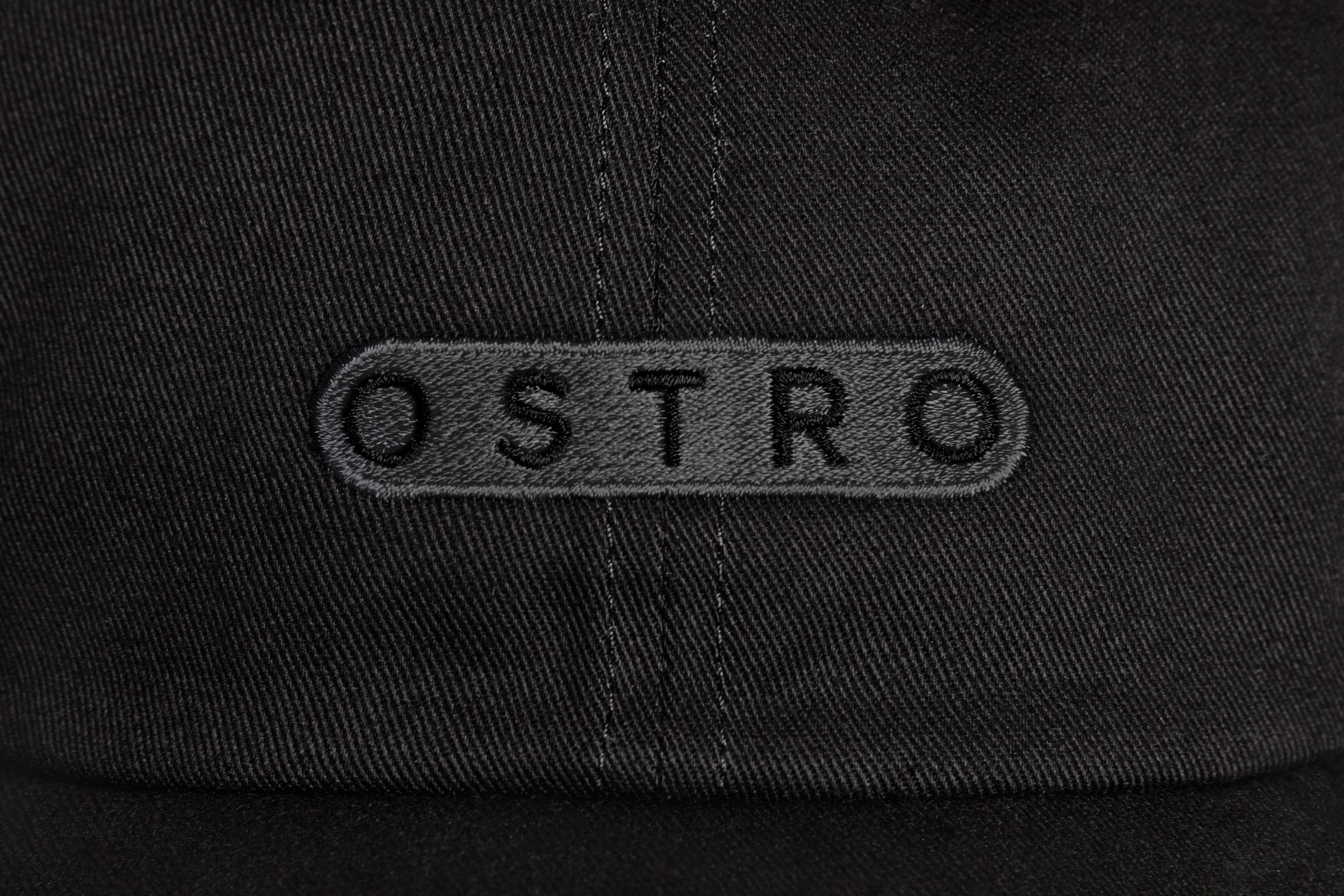
The agency worked with copywriting studio A Hundred Monkeys to create the new name, landing on Ostro, the traditional Italian name of a southerly wind in the Mediterranean Sea. According to Mucho, this name ‘hints at a sentiment of navigation, core to what the company does’; but as an outsider, it feels like a tenuous link. Sure, it’s a pretty word – and it’s certainly far better than RxDefine – but the ocean/wind connection to healthcare software feels somewhat oblique. And arguably, any digital-first brand is in some way about navigation.
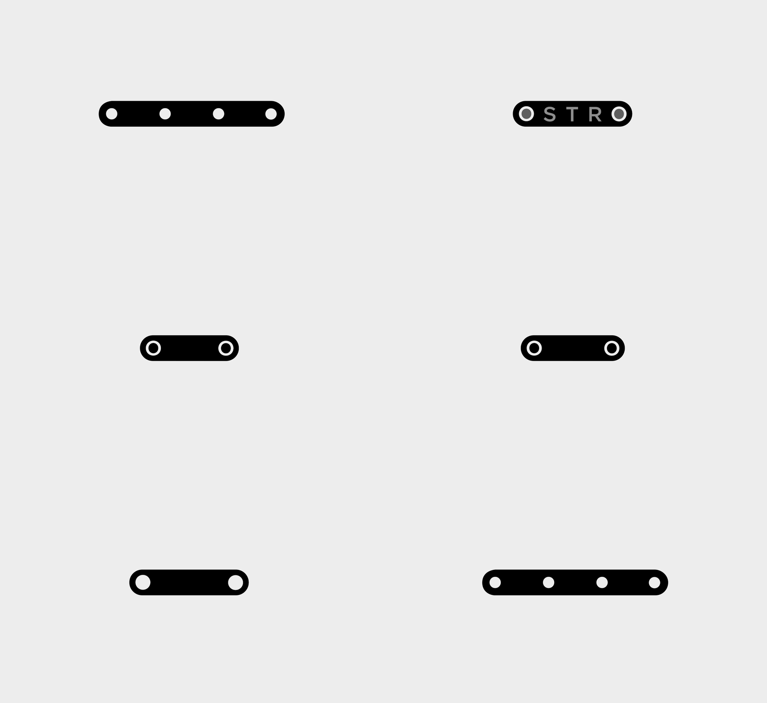
A more rational-seeming explanation for the name is that Mucho appreciated its symmetrical appearance: ending and starting in ‘O’, and anchored by a central ‘T’, it’s a word that’s pleasing to look at. These ‘o’ forms also proved to be nice little graphic devices that appear throughout the branding as part of the shapes that underpin the identity.

The links between Ostro’s services and its visual identity are thankfully far more obvious. According to Mucho, during the project’s discovery process, ‘we learned that at its core, Ostro is the technology that connects and links patients, clinicians, and life science companies’.
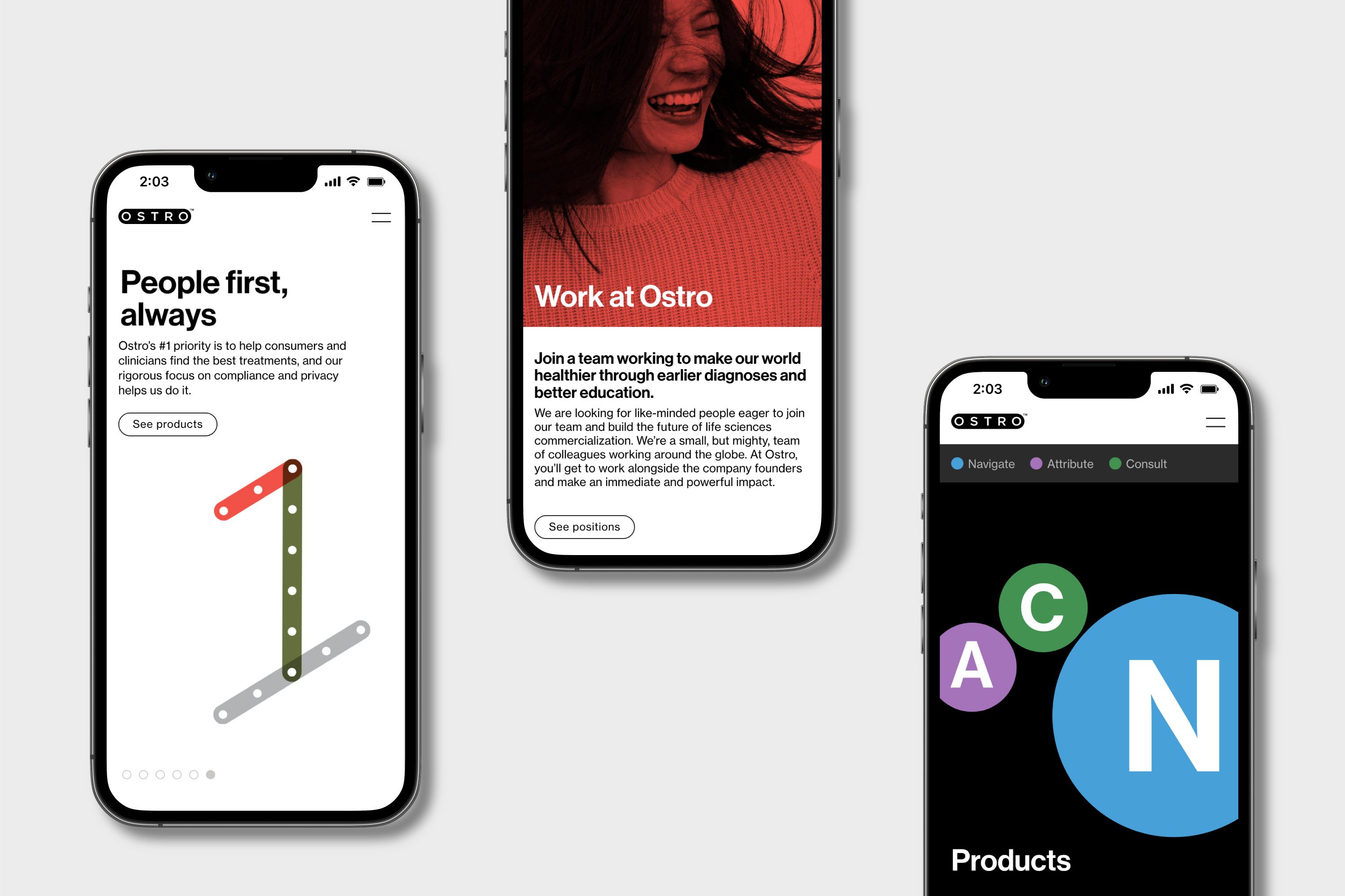
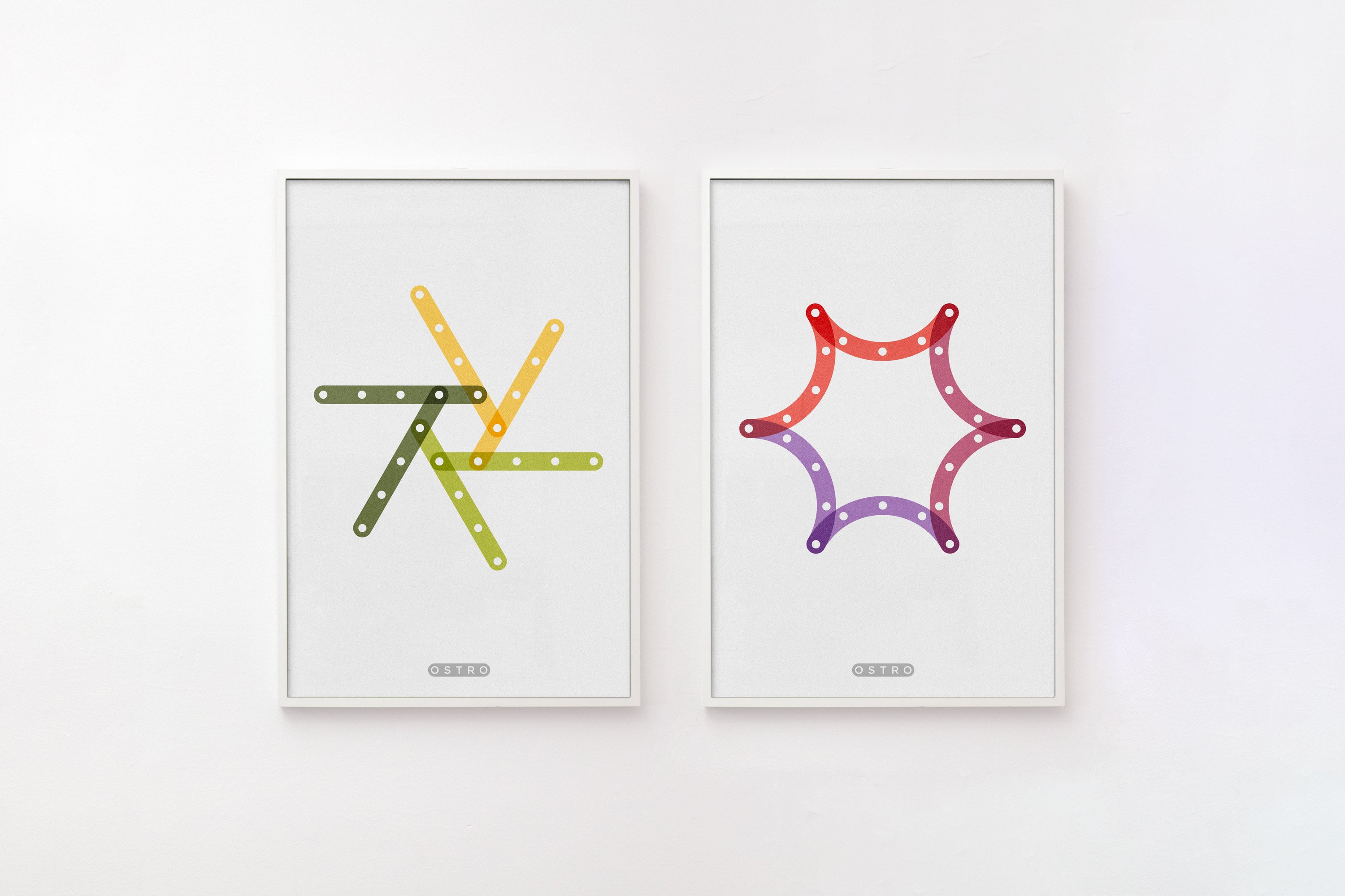
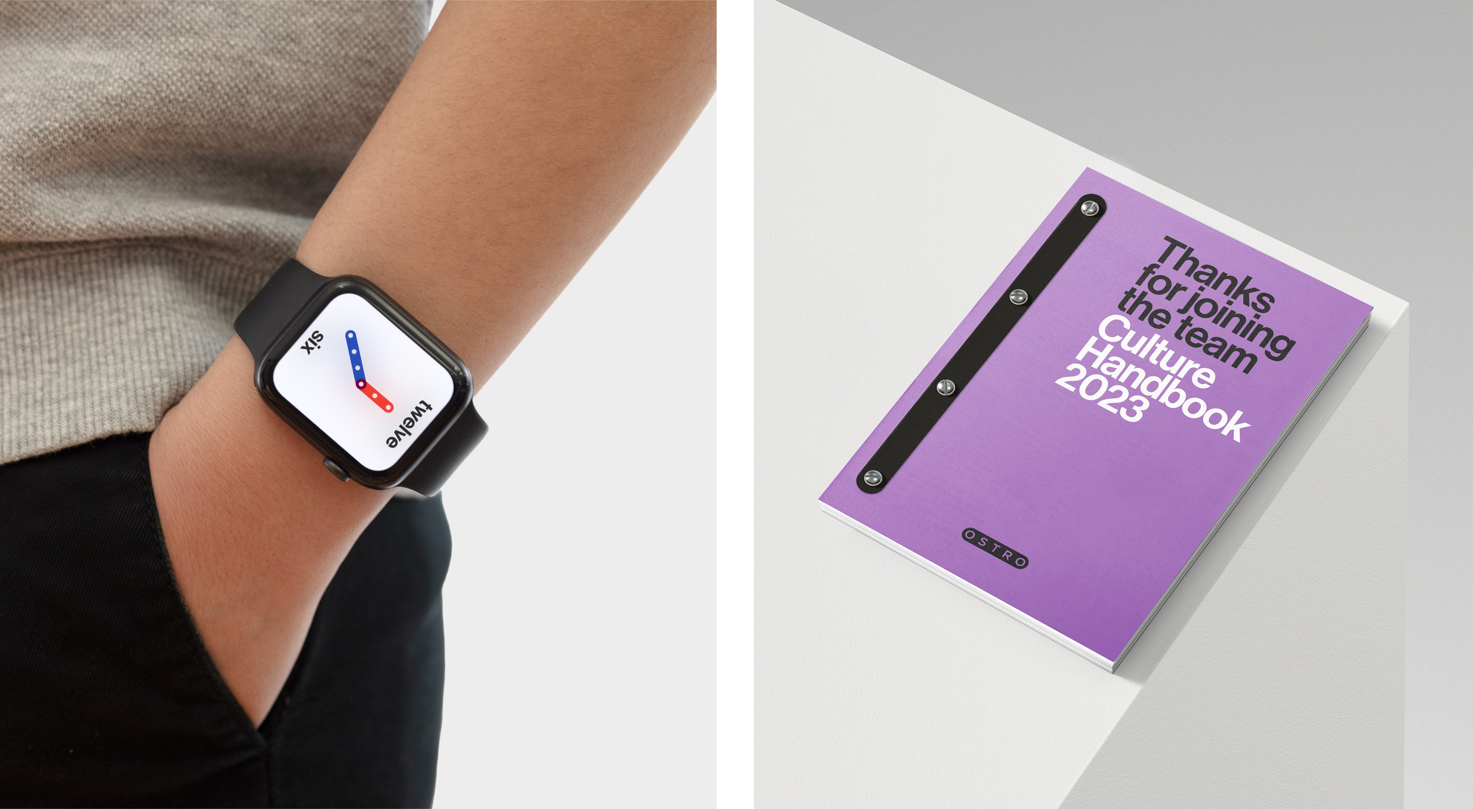
This idea of linking is manifested throughout the new branding, which uses shapes inspired by those of model construction system Meccano. The logo takes the form of a ‘lozenge’, and this is reflected and expanded throughout the rest of the identity. The simple shapes – long rectangles with rounded edges, complete with ‘holes’ – make for a friendly, approachable look and feel. ‘The connection points represent all the connection points that Ostro acts as within the healthcare navigation journey,’ Mucho explains.
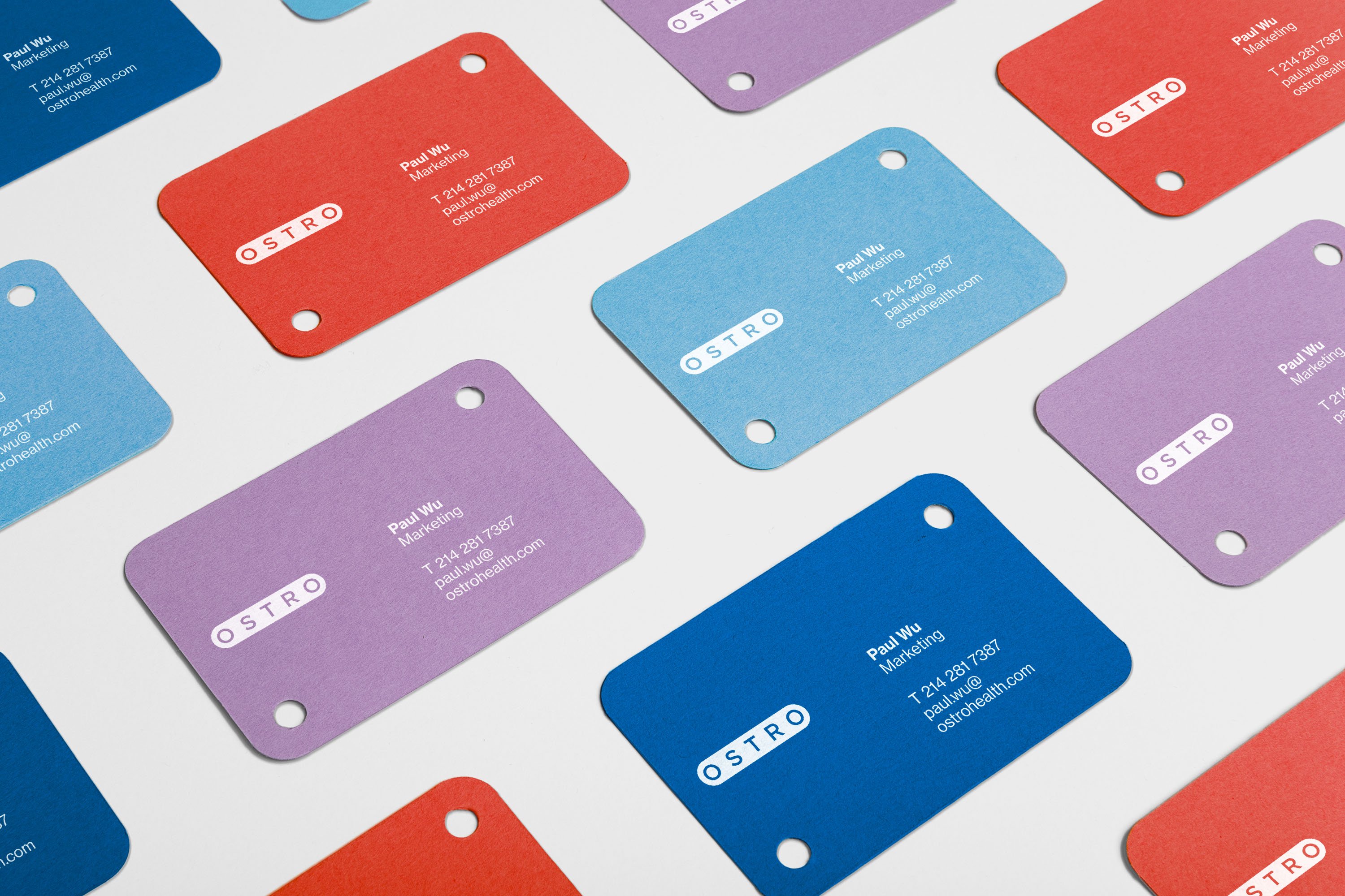
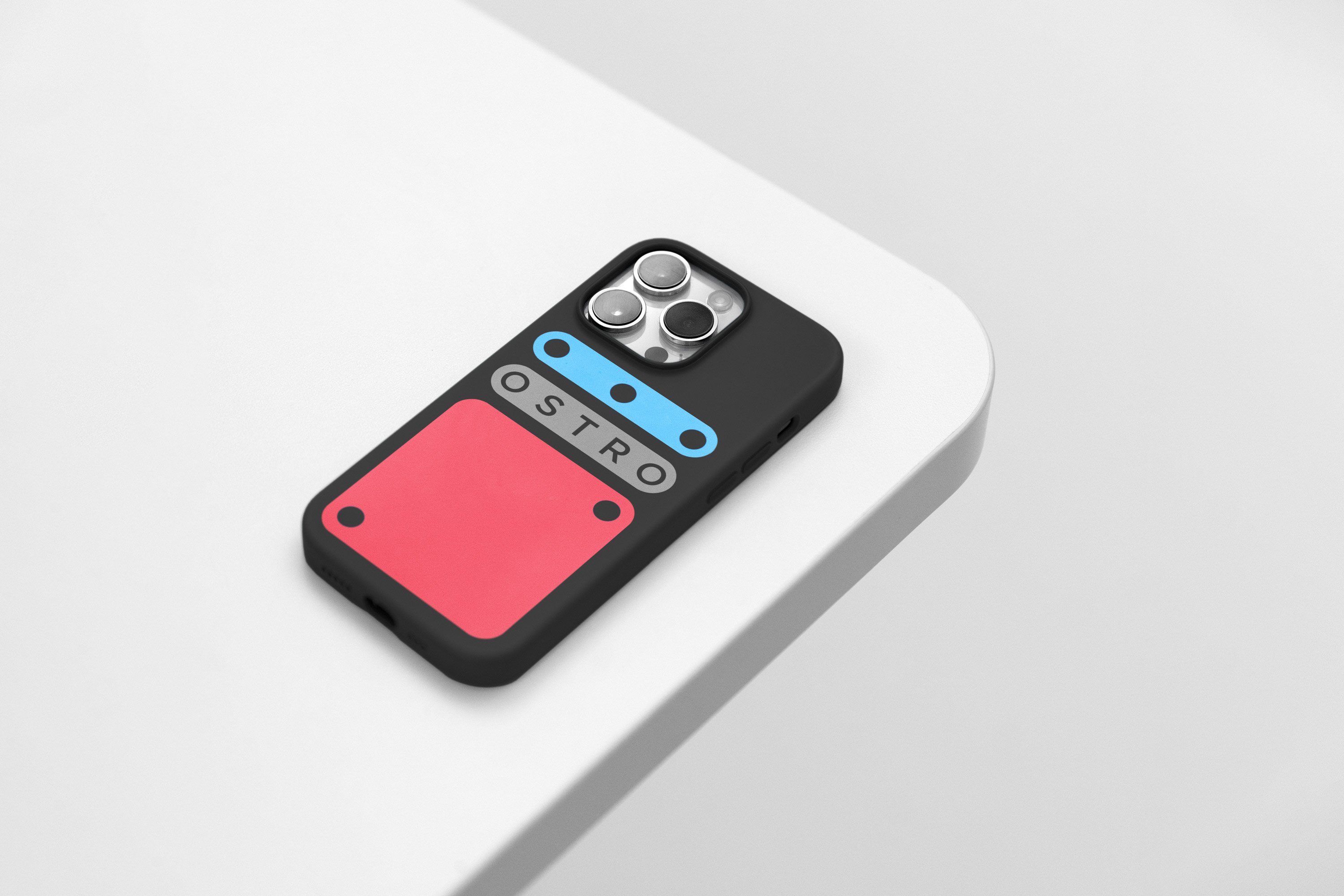
As with the construction of Meccano itself, the identity is modular, meaning it can be built upon, deconstructed and separated out into numerous different configurations depending on the application.
While there’s definitely a touch of pre-school about the forms, Mucho has deftly avoided making the branding look too childish: after all, healthcare is something that you have to take seriously, and brands in that space have to convey a huge amount of trustworthiness and authority.
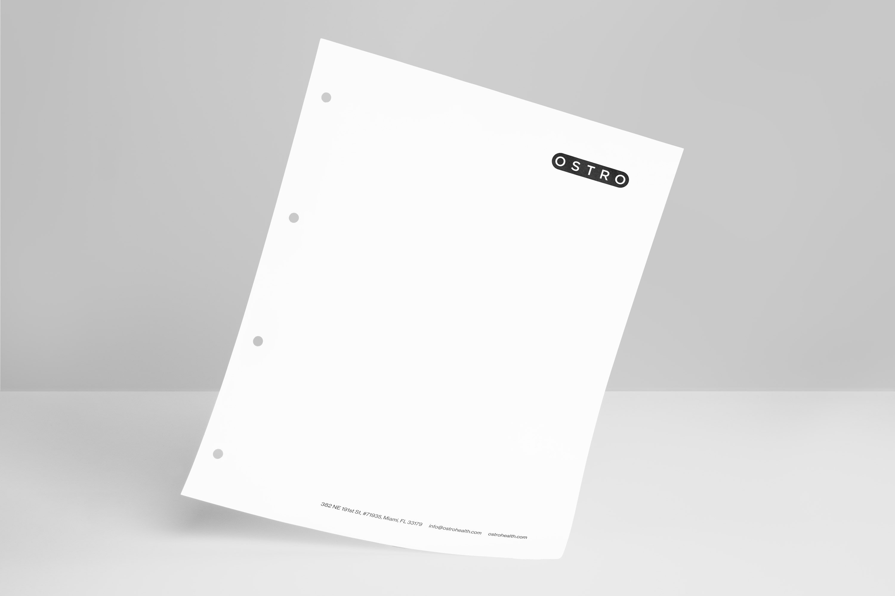
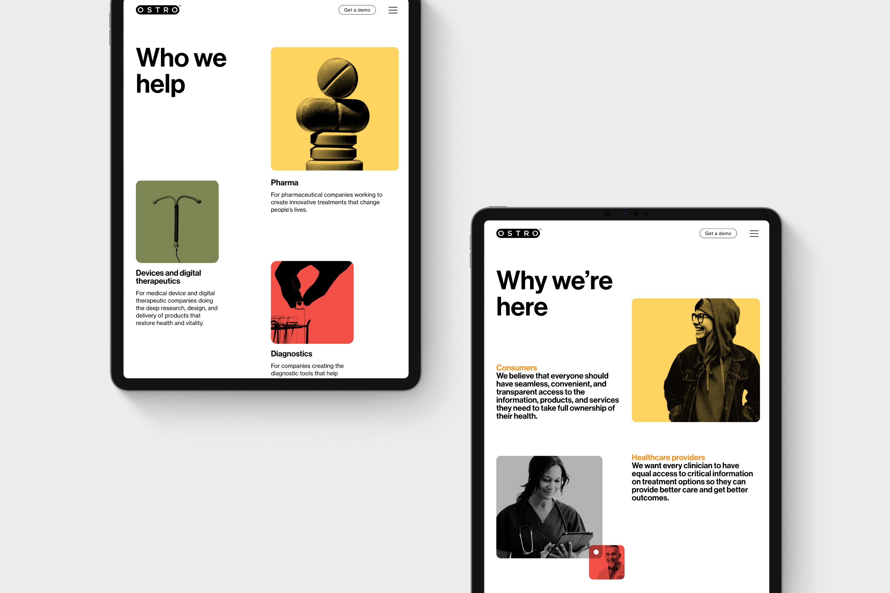
Mucho opted to use good old Helvetica (or Neue Haas Grotesk) as the brand typeface, looking to further demonstrate simplicity and clarity in the brand architecture and looking to make Ostro as easy to navigate as possible and cut through the complex jargon usually associated with healthcare brands.
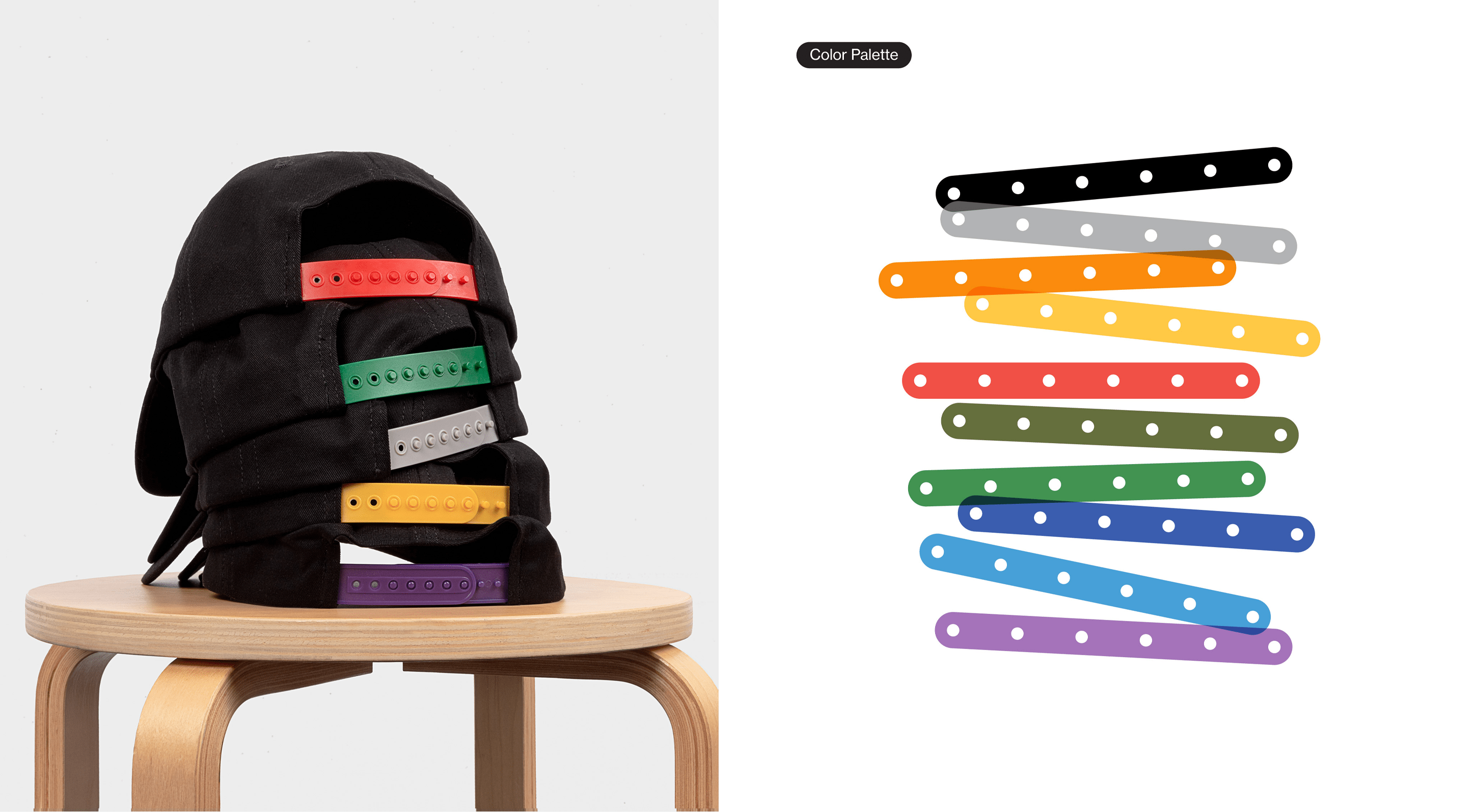
Unlike many brands in the healthcare space, which use minimal colours or a thoroughly serious palette (green and white, blue and white, shades of blue and grey, and so on); Ostro’s identity doesn’t shy away from colour. This makes for a refreshingly original approach to not only healthcare, but software; and once again demonstrates Mucho’s skill in delivering a serious brand with vibrant, playful visual nuances.
