Phil’s Finest by Gander
Opinion by Emily Gosling Posted 21 November 2023
It’s a moot point now that the last few years have seen an explosion in all things vegan and ‘plant-based’ (a term arguably used lightly, when you consider the ingredients in many no-meat, no-dairy, no-animal product alternatives). There’s vegan cheese that actually tastes nice, there’s mushroom and hemp ‘magic mince’, even vegan tuna. I’m writing this while eating a vegan Dunkin’ donut, purchased in an otherwise historically wurst- and wiener-heavy town in Austria. In short, it’s not hard to be vegan in 2023.
However, not everyone wants to be – and that’s totally fine. But whether or not you want to go the whole hog, there’s no getting around the fact that in this era of climate crisis, we all have to be making more conscious decisions about what we eat – what it’s made from, where it came from, and the implications of all that.
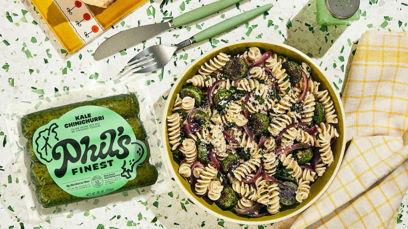
And the facts are, that consuming less meat is one of the best ways to lessen personal impact on the planet. That’s the ethos behind Phil’s Finest, a food brand that’s partnered with award-winning chefs to create products that pair fresh meats and vegetables into savoury chicken sausages and ground beef, and which claims to be ‘putting the “more” in omnivore’.
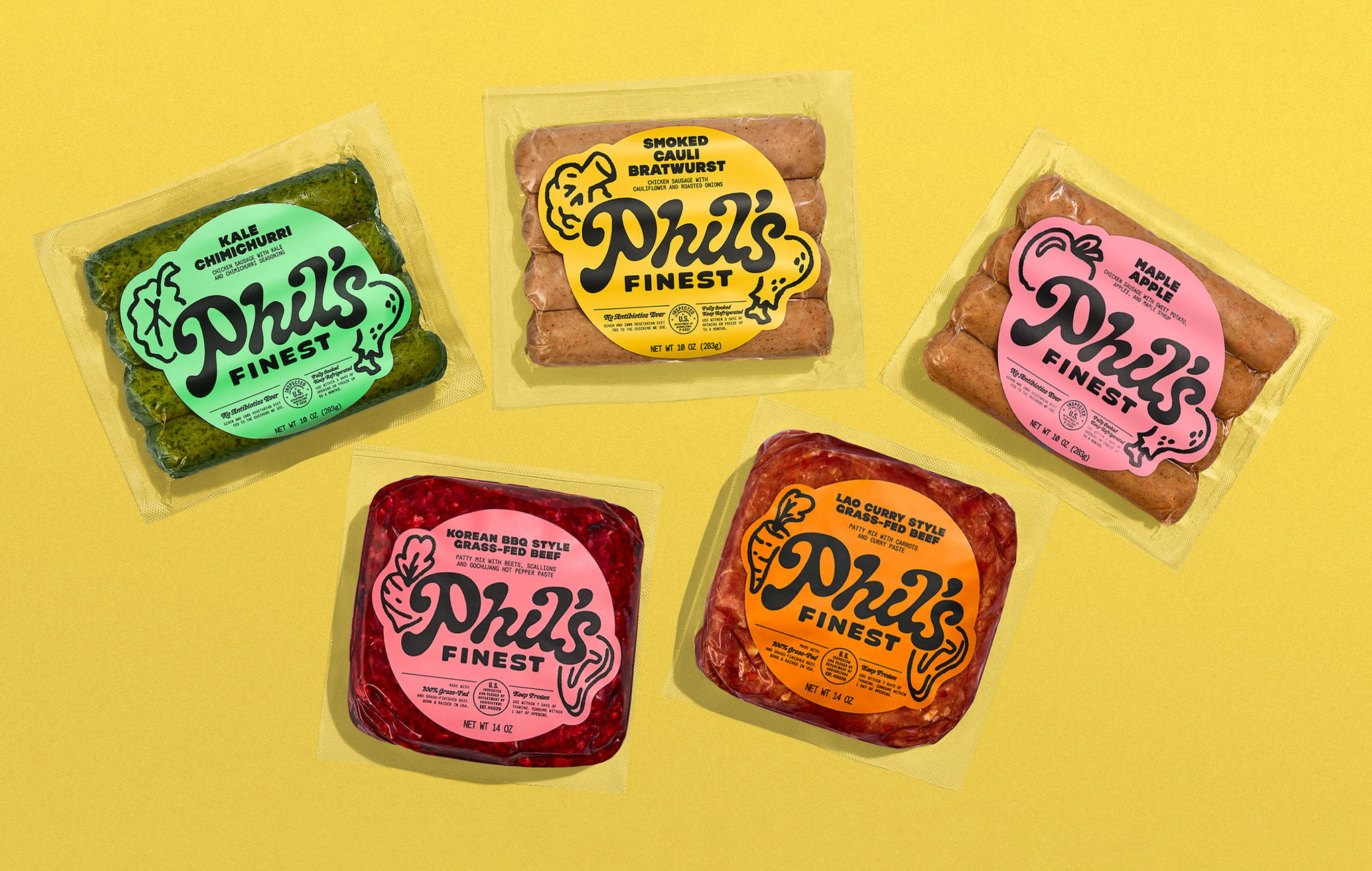
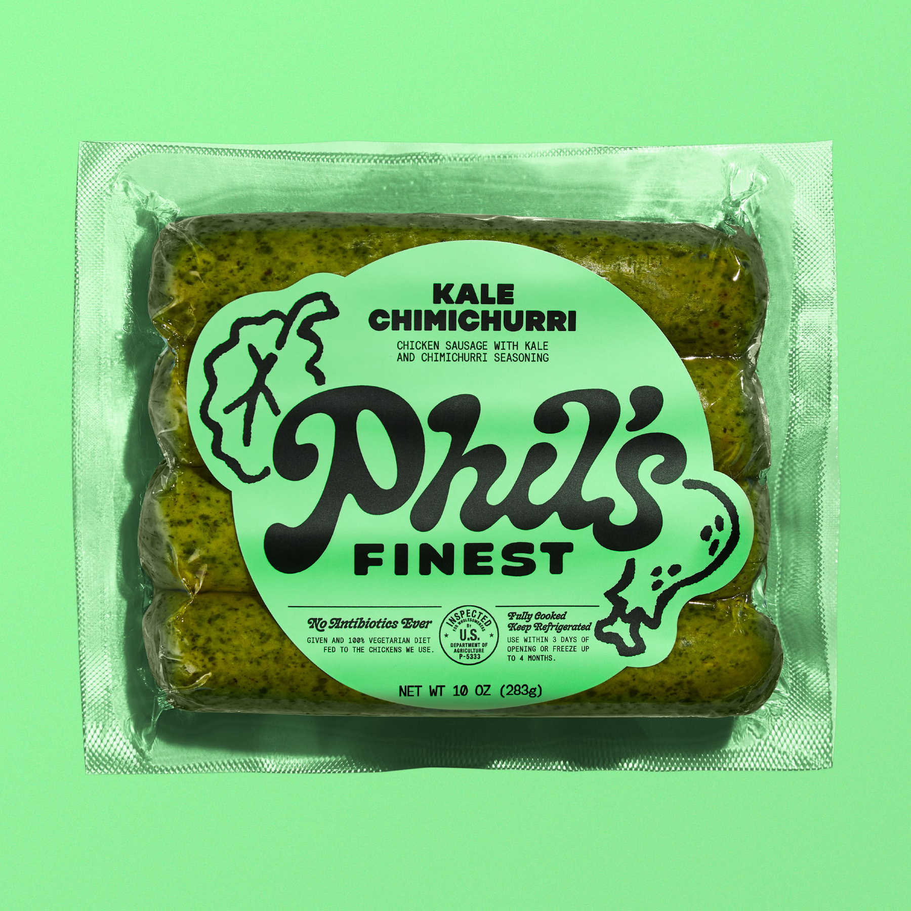
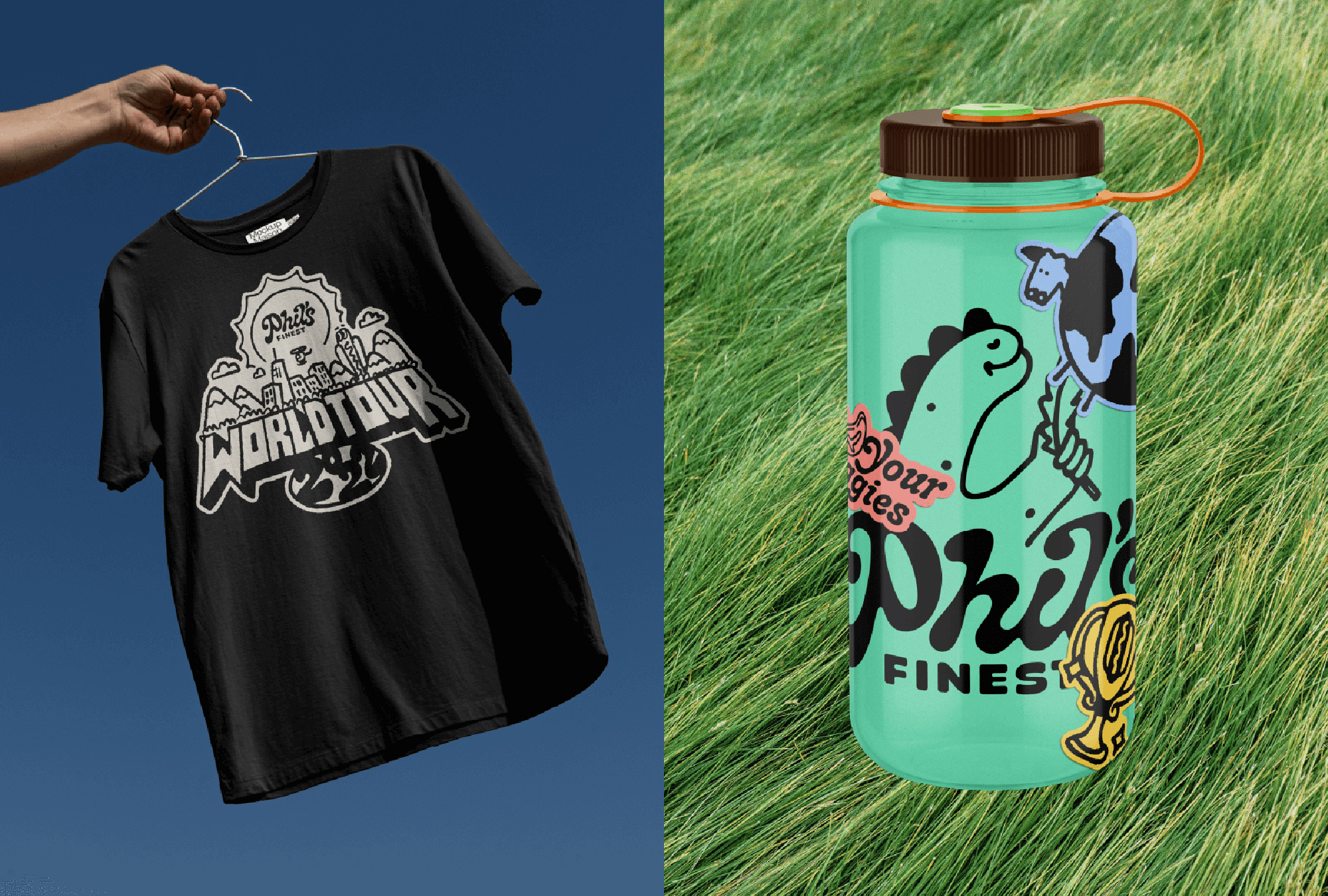
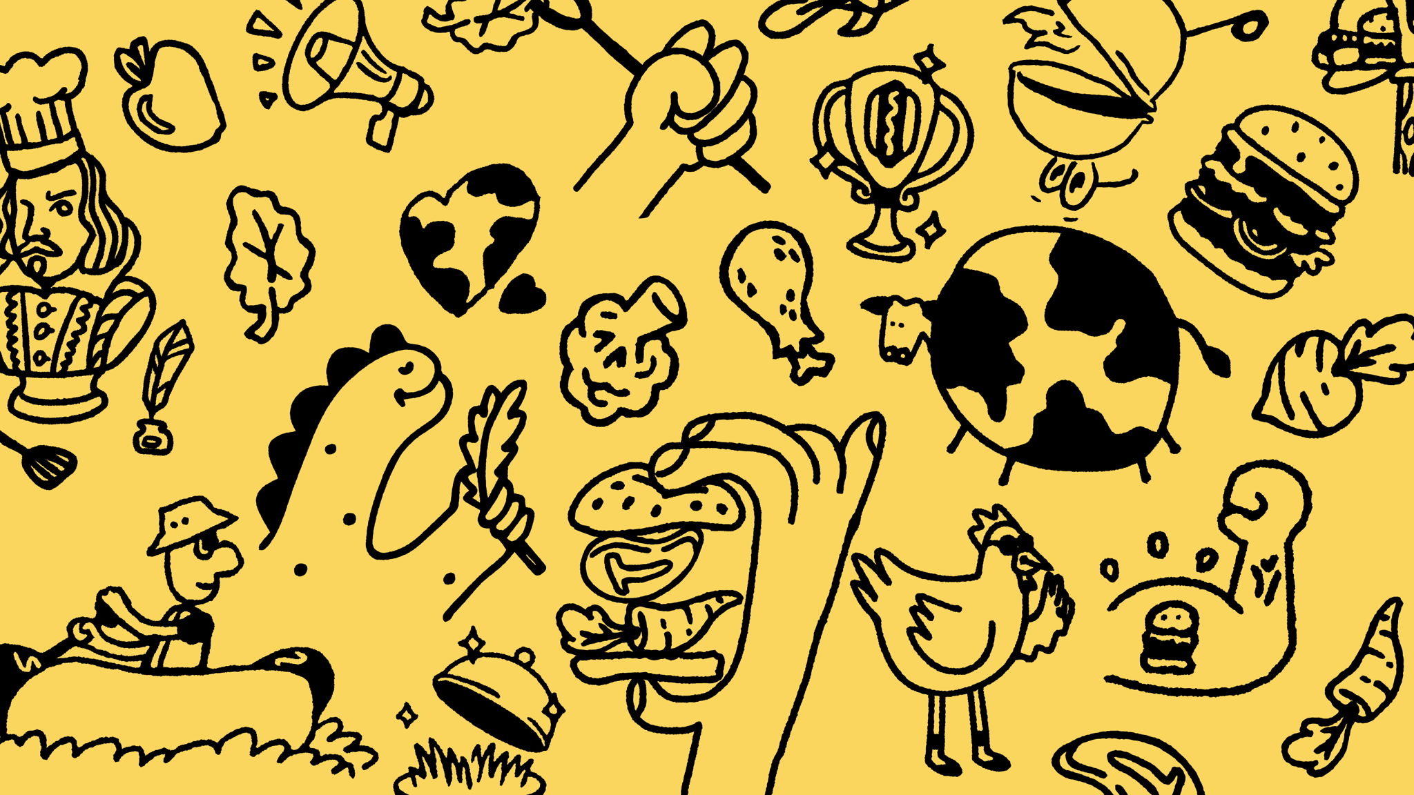
Founded in 2014, Phil’s Finest was formerly known as Misfit Foods. The new name came about recently as part of a comprehensive rebrand by Brooklyn-based agency Gander, which consists of a charming, holistic new visual identity which is heavy on thick, black linework illustrations; a gorgeously gloopy wordmark and ultra-bold typography that merges playfulness and no-nonsense messaging.
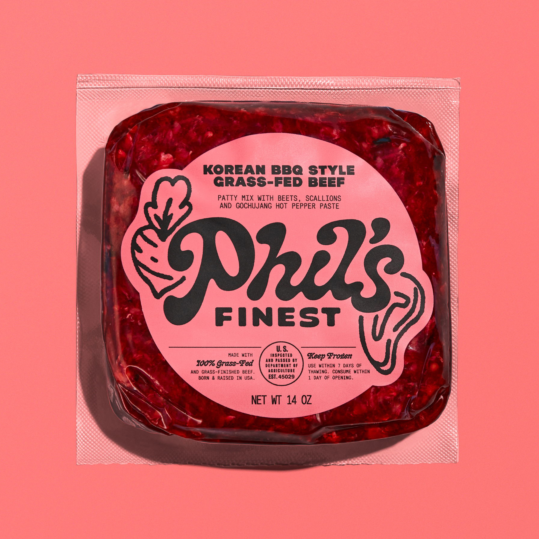
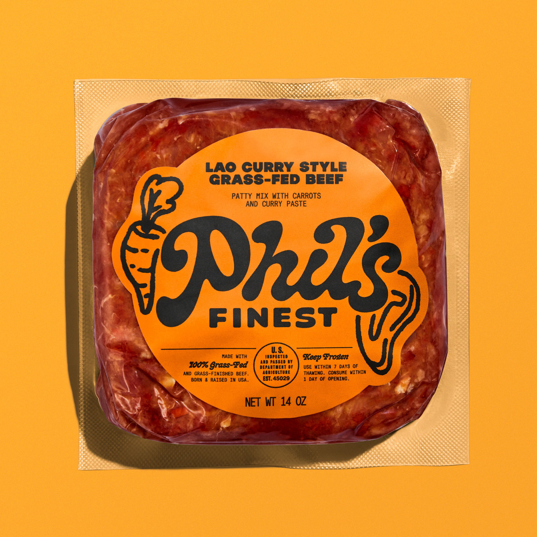
In all, Gander worked across Phil’s Finest’s strategy, branding, packaging, art direction, illustration, and web design. ‘Phil’s Finest sausages and ground beef make it easy for everyone to do right by the planet – as easy as shopping at the local market,’ says the agency. ‘Phil’s is meeting people where they are with a product that everyone – both meat-lovers and meat-reducers – can get on board with.’
The name change was one of the most important aspects of the project. Misfit Foods was so named because originally the business was based around juices that used produce discarded simply because it wasn’t deemed aesthetically pleasing enough to sell on shelves. Since the company’s pivot to meat products, however, ‘misfit’ wasn’t really fitting, and so the decision was made to rename the brand after its founder Phil Wong.
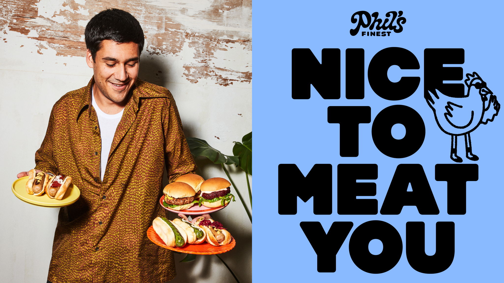
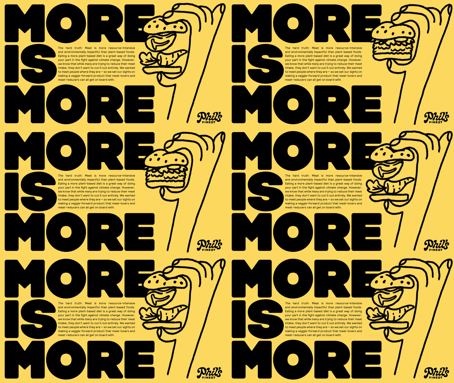
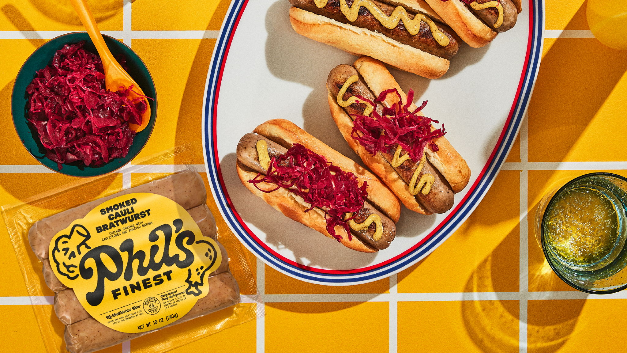
In the US at least, Phil’s Finest is a pretty big-name brand by now. Not only is it distributed in Whole Foods and Sprouts stores, as well as the Phil’s Finest website, but it also (successfully) appeared in the TVB show Shark Tank – the US equivalent of a show like Dragon’s Den – back in 2021. As such, it’s great to see this sort of design – slightly off-kilter, smart use of illustration; hipster-leaning but skilfully done over saturated, crisp photography styles; dynamic type choices – taken into mainstream environments.
Gander has a history of doing this: its work with Pop Up Grocer and Graza exemplify the agency’s predilection for slightly idiosyncratic design routes – but, crucially, ones that are commercially viable, and which answer the brief.
With Phil’s Finest, the branding really comes to life in motion: the illustration style and typography lend themselves brilliantly to moving posters and online applications. The Phil’s Finest website, for instance, does a great job with the blinking eyes on a burger and a carrot that, naturally, sit within a cityscape, like edible King Kongs.
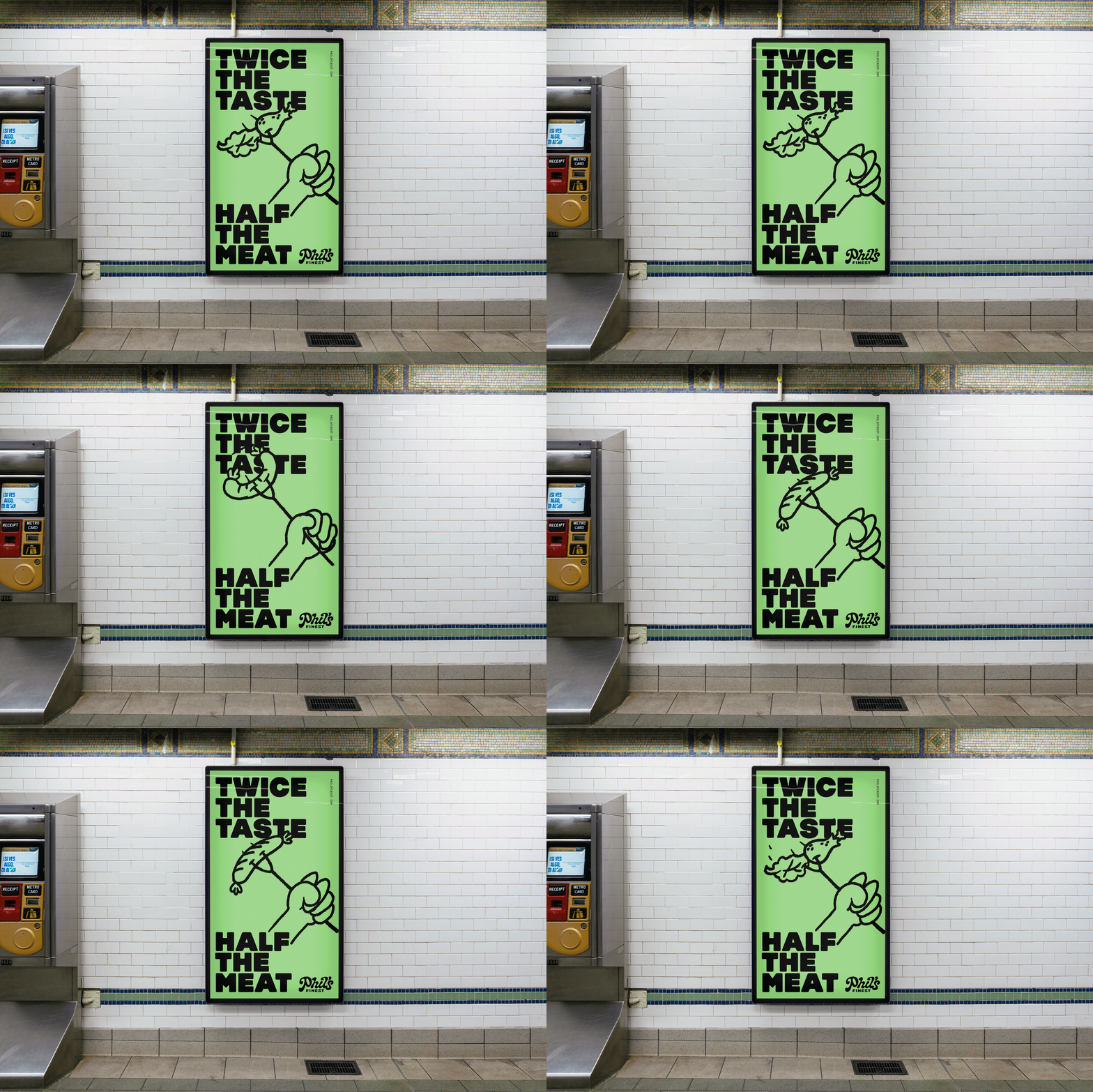
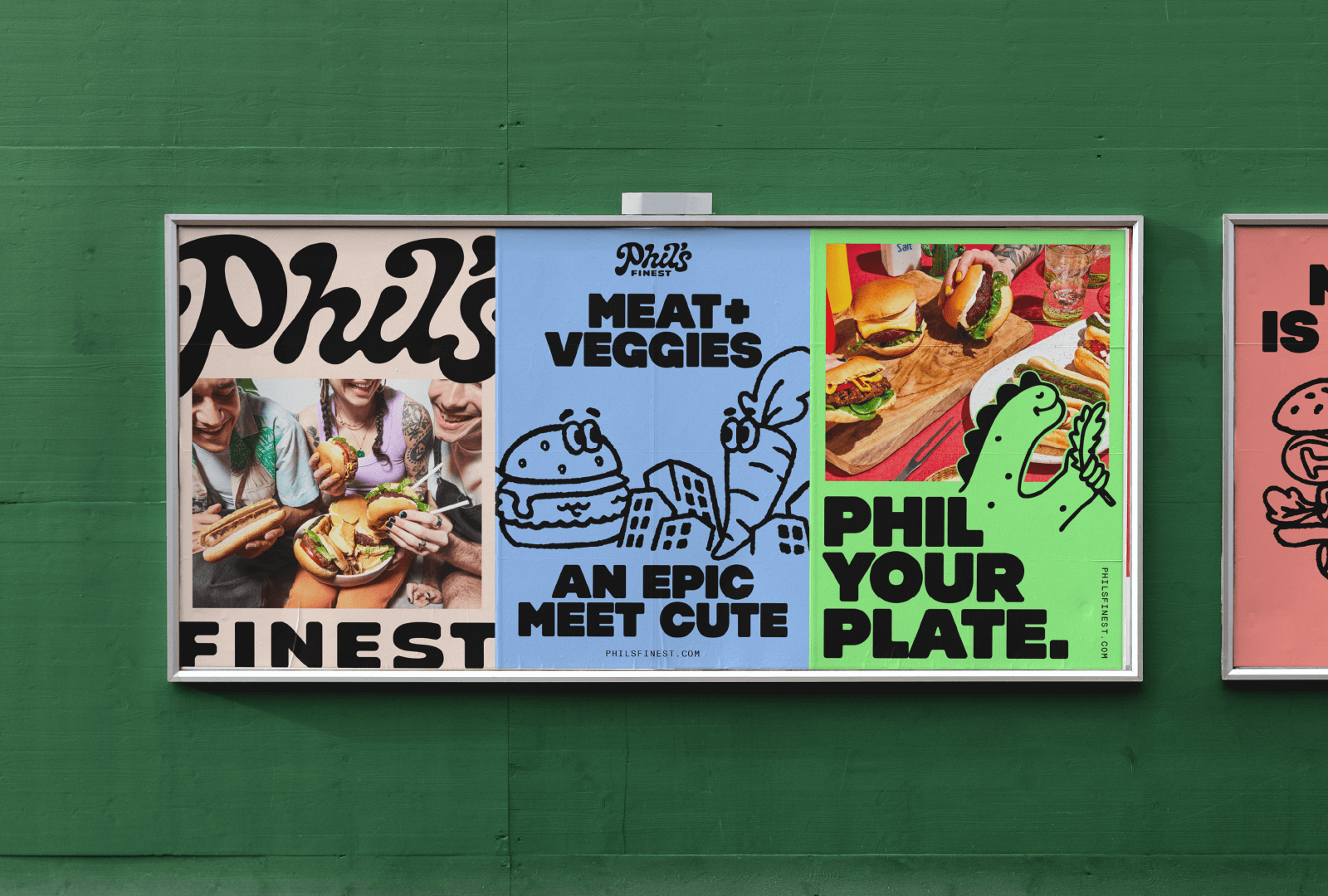
The illustration style reminds me a lot of the brilliant work of UK illustrator Adam Higton – slightly folksy, woodcut style blocky, cute but not twee. It seems to have been created in-house, since Gander doesn’t specify an illustrator (instead it does credit Faye Kahn with animation). What’s slightly confusing about the illustration, however, is the fuzzy edges: at first I thought the pages weren’t loading properly, or the images were too low-res. But it seems to be a deliberate design choice – albeit a rather odd one.
But that’s a non-criticism really: overall, the mix works superbly: excellent font choices; dynamic illustration; crisp photography that errs just on the right side of trendy for the sake of trendiness (the photography and video are by New York and Los Angeles-based Anisha Sisodia); and a logo that feels almost representative of the products in its squishiness, as well as just being a strong, distinctive brand asset.
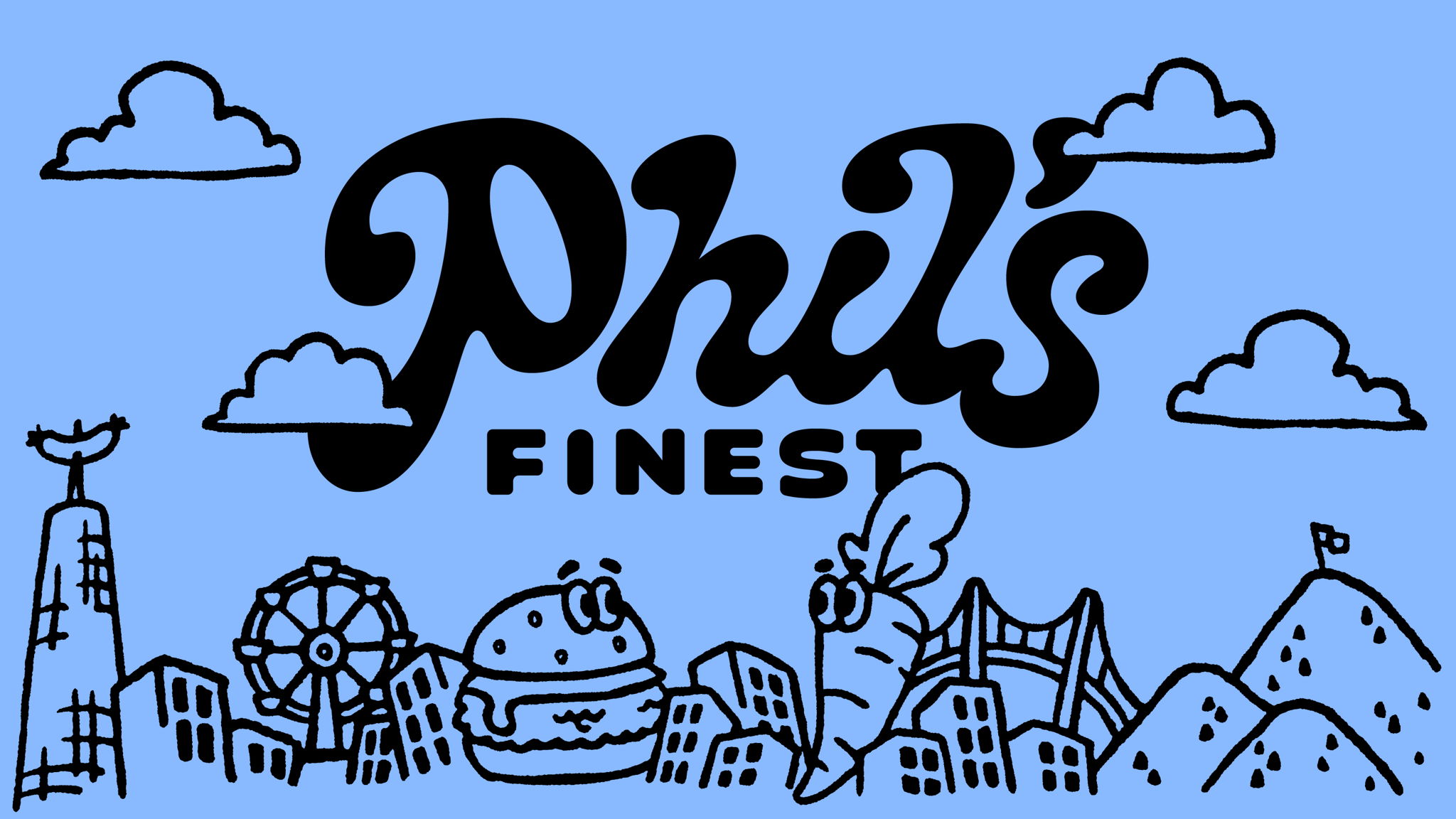
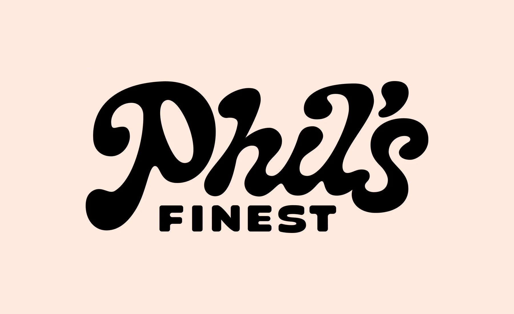
As for those font choices, the word mark and other headline applications use a modified version of Cooper Nouveau by House Industries. It feels like the perfect application of the font – a 1966 redraw of the classic Cooper font’s italic style but with ‘generous curves… an energetic pitch, simplified contours, and a plump friendly figure,’ as House Industries puts it. As the foundry continues, it was basically born for ‘lovely logos and strong captions’.
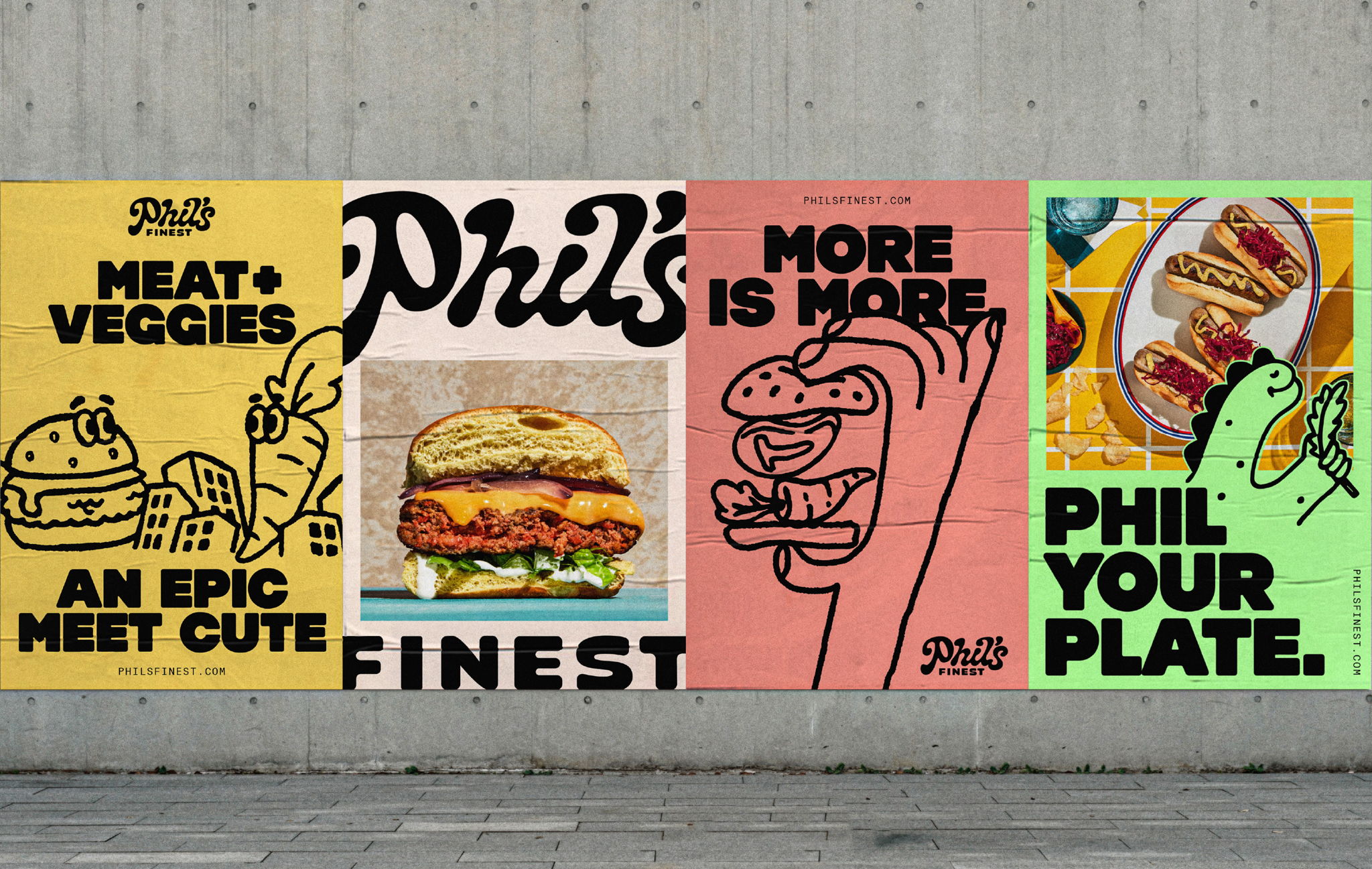
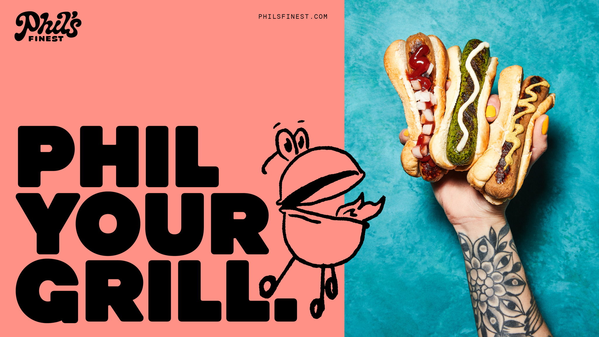
Cooper Nouveau is paired with Out of the Dark’s Hammer, a super-thick, caps-only font based on the 1908 Art Nouveau classic Schwere Block by Hermann Berthold. The pairing makes for an overall look and feel that will undoubtedly easily achieve on-shelf standout, but without ever looking like it’s trying too hard to get your attention.
