Hometree by How&How
Opinion by Emily Gosling Posted 14 December 2023
It’s all well and good for a design agency to make some wild, boundary-pushing, all-singing all-dancing work for things like Gen Z healthcare products; or ‘top shelf’ spirits; or craft beer. But most client projects aren’t going to be the sort of thing that merits bright orange and typography that dances around the boundaries of legibility. And arguably, it’s those less ‘showy’ projects that require the most creatively dextrous approaches.
Among the things that top the list of ‘not all that interesting’ are insurance and drainage; while ‘low-carbon home energy hardware’ has the double whammy of not only sounding slightly boring and rather complex, but reminding us of the doom of climate crisis, and potentially inducing our own anxieties about not ‘doing our bit’ as much as we could – be that through financial constraints, a lack of time and energy to contemplate things like boilers, or because we don’t really understand what we could do differently, or how.
Hometree is a brand that specialises in all of the above, making it something of a double-edged sword for design agency How&How, which recently worked on its new brand identity.
There are a number of challenges inherent to a project like this: you can’t go too wacky and out-there, since it’s just not really an appropriate route; yet the brand needs to be elevated as far away as possible from perceptions around it being boring or complex. And on the latter point, the designs have a vital role in explaining processes and products that to many of us, seem intimidatingly confusing.
Launched around eight years ago, Hometree offers insurance plans around home emergencies such as issues with boilers and central heating; plumbing and drainage; home electrics; pest control and home security. How&How, which has studios in London and Lisbon, was brought in to help the company’s expansion into helping people lower their carbon dioxide emissions, assisting them with the installation, financing, maintenance and insurance for their transitions to lower carbon solutions like heat pumps, solar panels, and batteries.
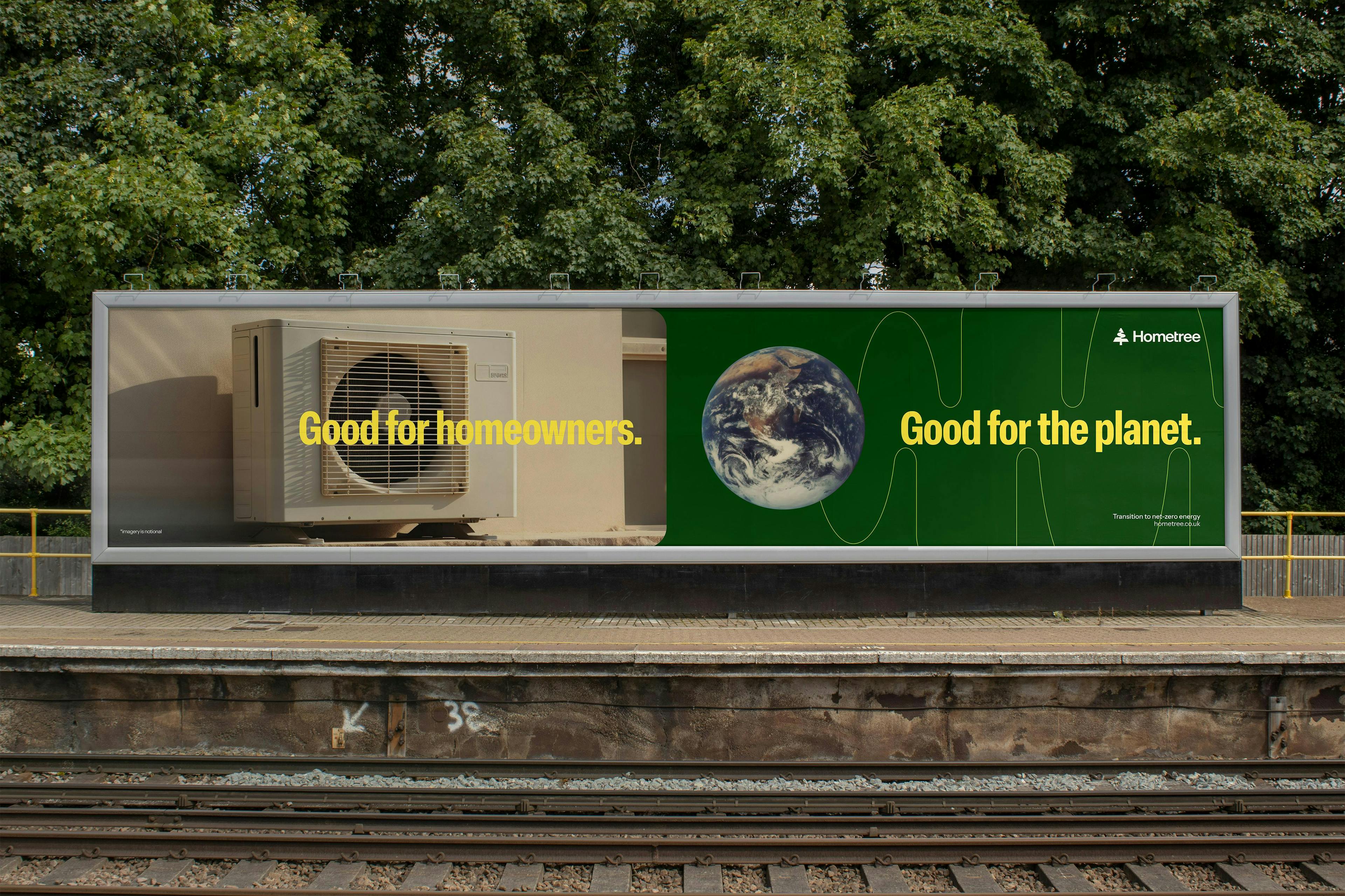
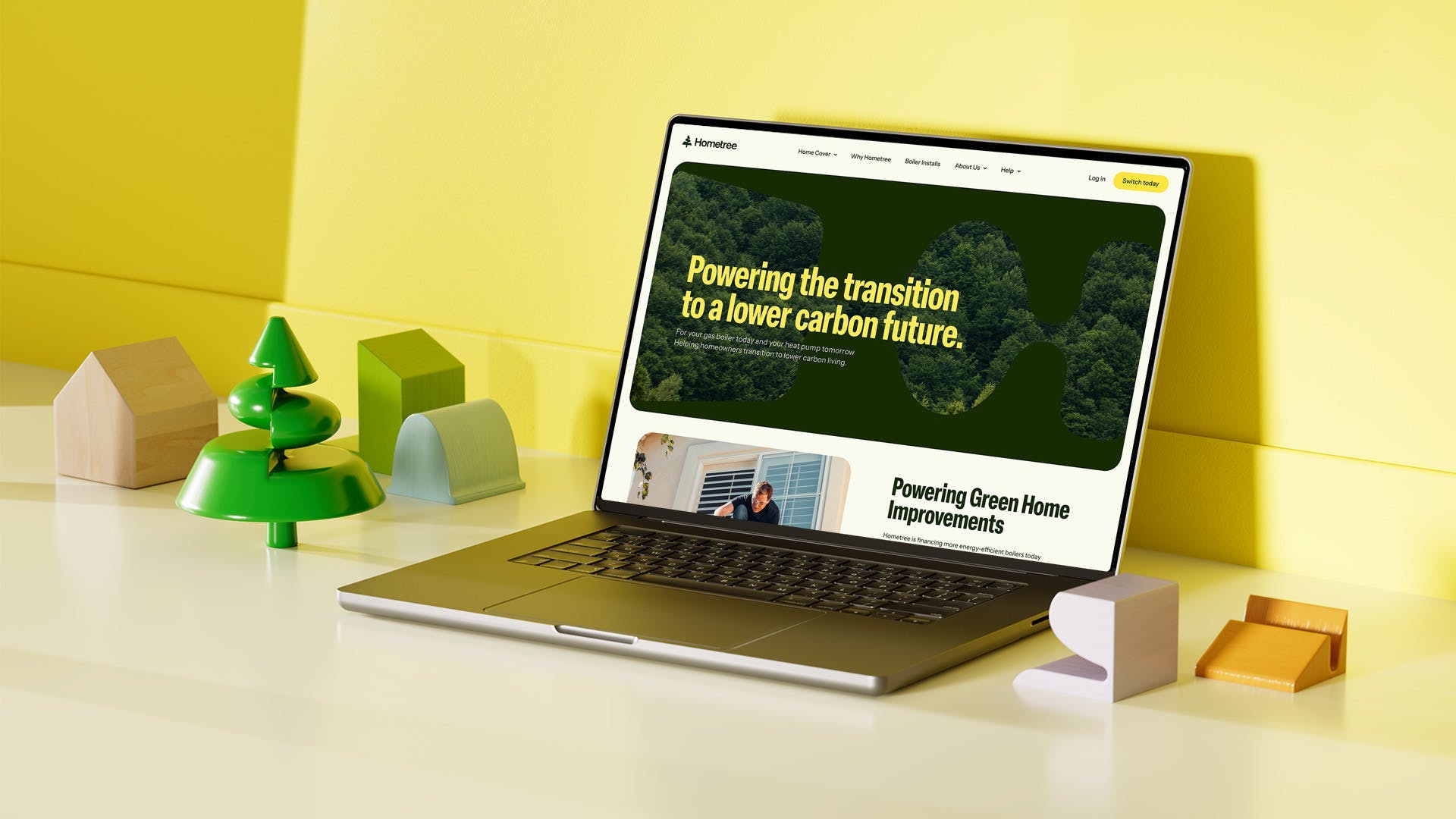
How&How’s work comprised brand strategy, narrative and architecture; creating a new verbal and visual identity, tone of voice, UX strategy, website design and a suite of illustrated icons and animations. ‘The home services industry is a complex ecosystem to navigate,’ says How&How. ‘Hometree came to us with a range of new services that help support the full energy lifecycle in the home and make the switch to renewables less daunting. They also needed new branding to reflect their future-focused business mission: to make the transition to net zero homes seamless and affordable.’
The studio came up with the brand idea ‘Transition Companion’ to guide the new designs; with the identity work based around the idea of partnership and centring Hometree as the calm and reassuring choice that empowers homeowners on their journey to transitioning to lower carbon living.
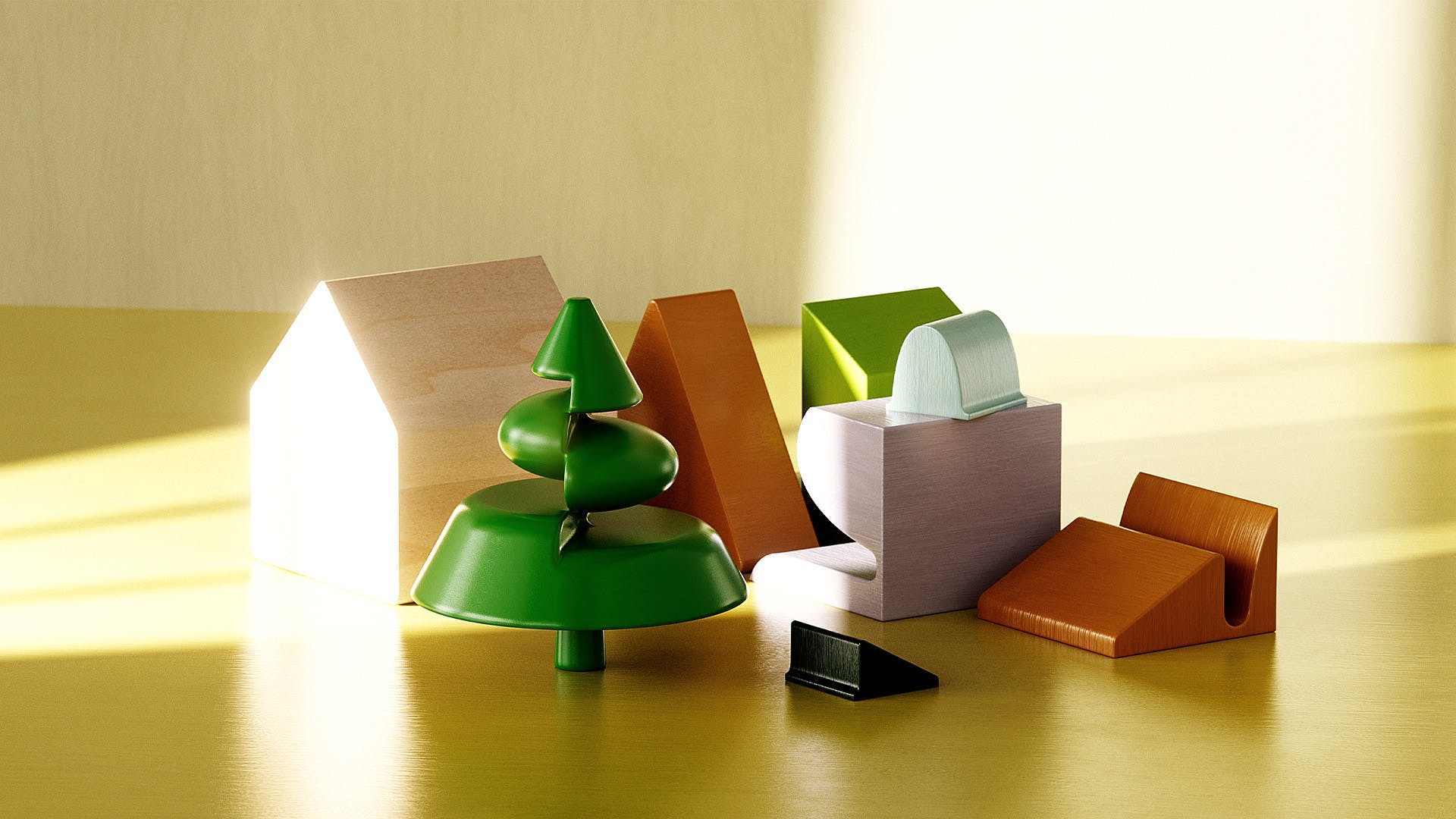
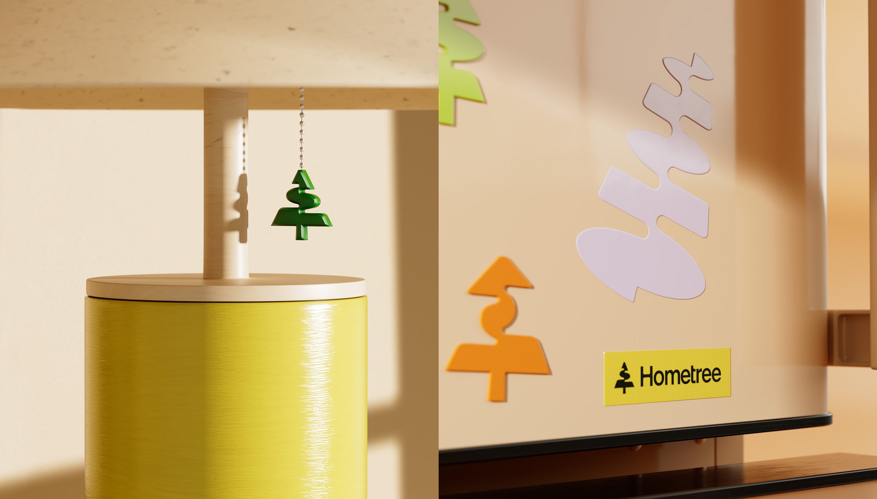
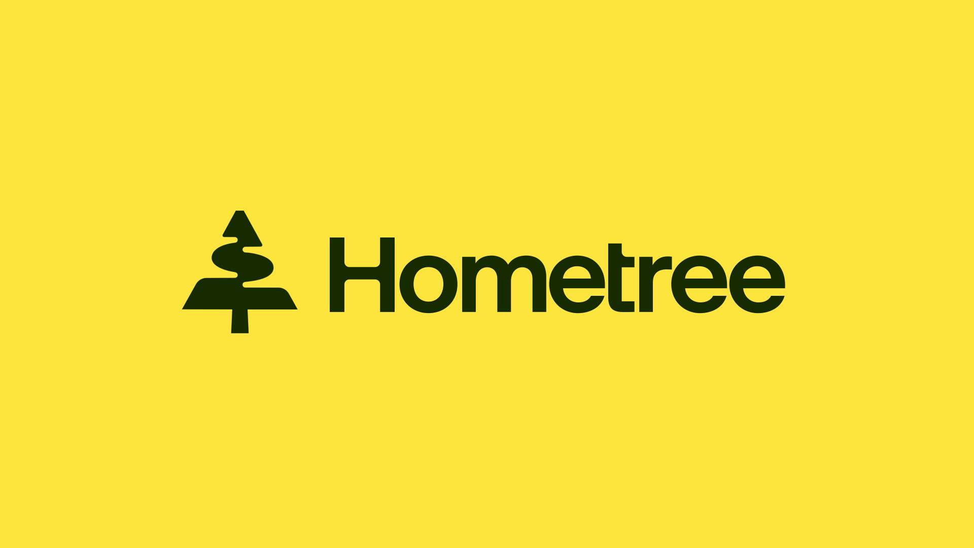
Where the former logo used an abstract swirl to represent the tree of the brand’s name, the new mark is a more defined shape that’s still figurative, but certainly more recognisably ‘tree’. How&How says that the logo also plays another role as an ‘interactive assistant’ named Maple.
According to the studio, Maple ‘connects you to your home services needs and helps you move forward towards a green energy transition’. It takes a form that ‘feels both grounded and alive in growth’.
While the new logo is definitely an improvement on the former branding, and we love the geometric take on Matisse-ish cut-out shapes that appear across the visual identity, the whole Maple thing is a little unclear. On the Hometree website, at least, there’s little to suggest its role as an assistant: the logo just sits rather small in the top left-hand corner.
The bright, breezy new colour palette, however, works brilliantly: it’s neither too po-faced nor too wild. The colours make the brand feel reassuring and energetic, centring on a fresh, bright yellow with other shades of yellow and green as supporting colours, finished off with nice contrasting purple accents.
The new wordmark is again an improvement on the former designs, using a sans serif with distinctly open counters and a mixture of rounded corners and sharper lines, nicely reflecting the forms of the shapes that run throughout the new branding, such as in the redrawn tree device.
The wordmark is supported by headline font Elza Condensed from São Paulo-based foundry Blackletra, which strikes a nice balance between boldness and zeitgeisty modernity, and no-nonsense communication. Body copy on the Hometree website uses Instrument Sans by Rodrigo Fuenzalida and Jordan Egstad.
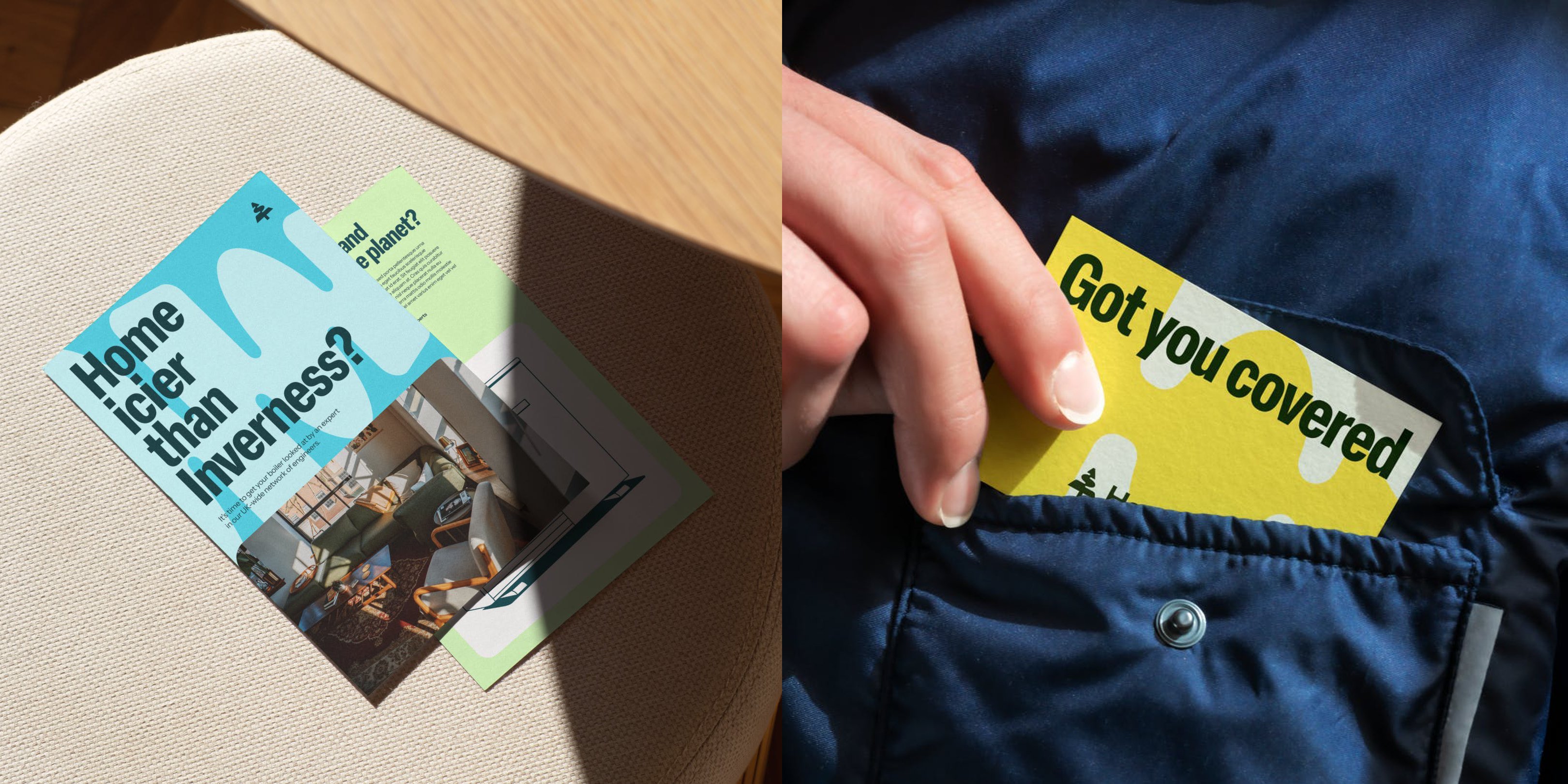
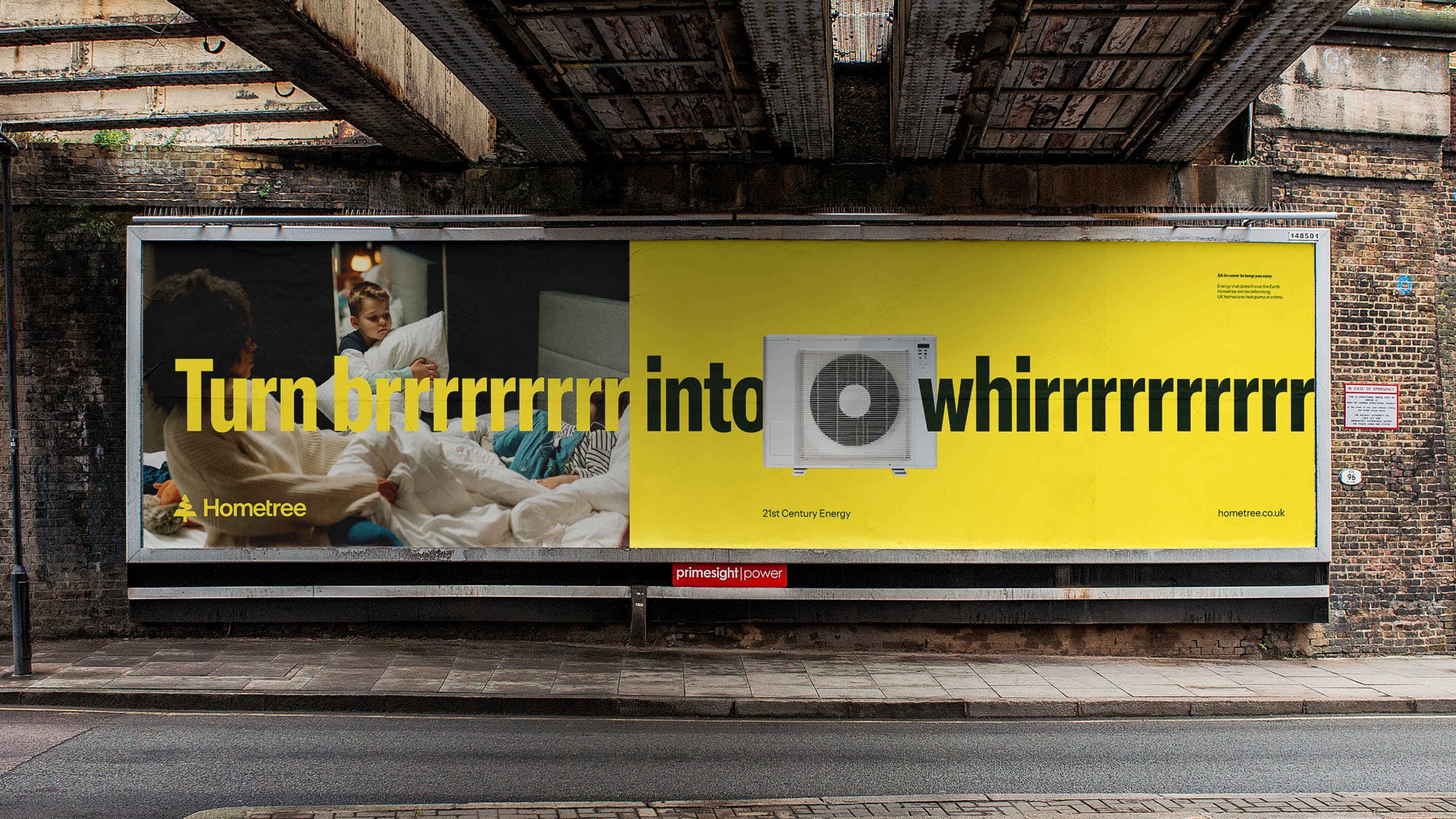
The new tone of voice and verbal identity strikes a great balance between openness and not trying to be too irritatingly chummy (a trend in brand copy we sincerely feel is on the way out) aiming to ‘create trust through truth’, it feels gently authoritative and straightforward, which is exactly what’s needed with a company dealing with things like insuring against home-based emergencies.
One of the strongest aspects of the new identity, however, is the charming series of black linework illustrations that act as icons and spot illustrations, and do a great job of communicating seemingly complex information around Hometree’s products and services.
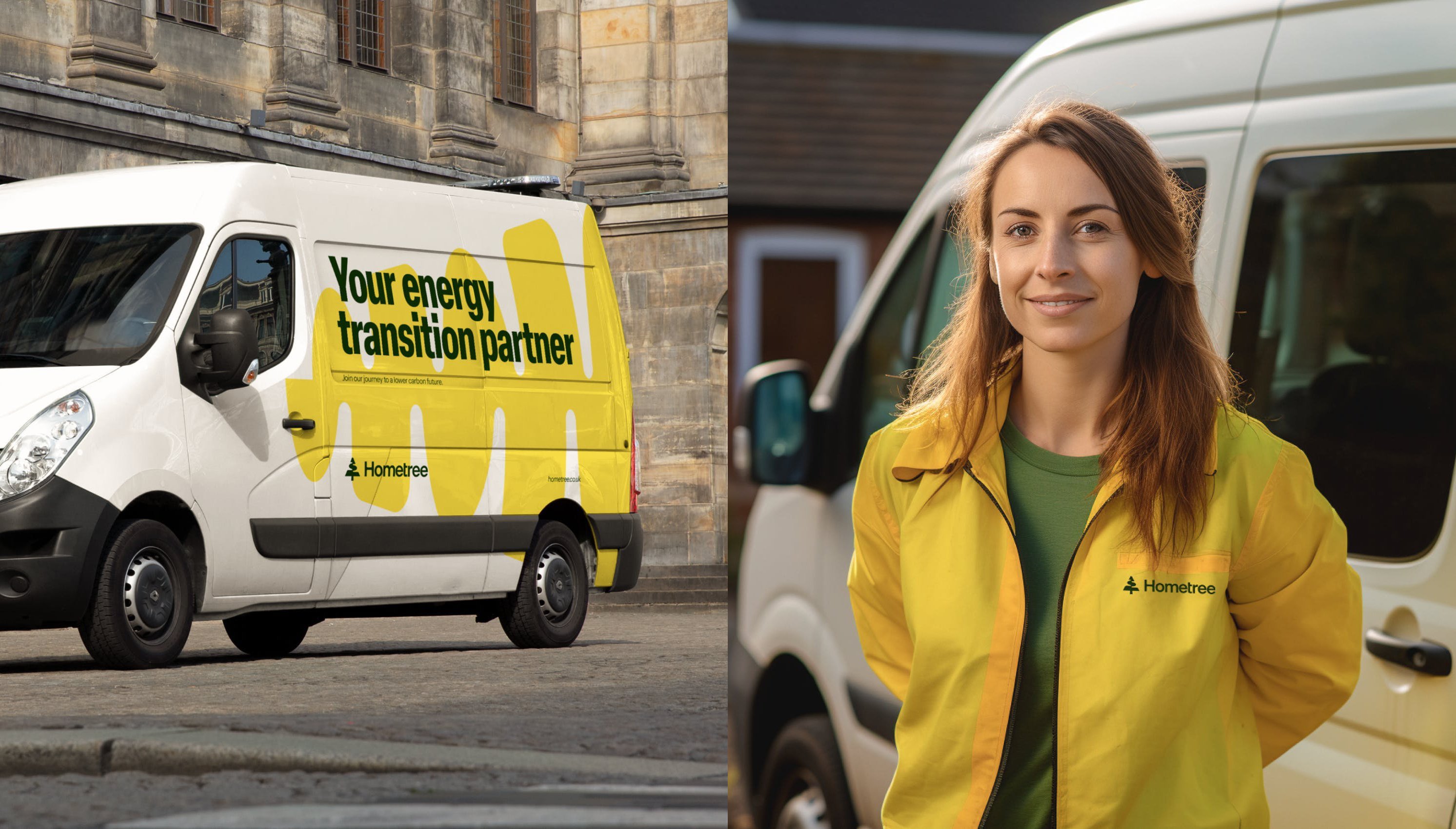
What’s impressive about this project is the way How&How has injected subtle elements of playfulness throughout: the tree shape is used on its side, and with unusual crops and zooms, to house content in bright, friendly colours as a frame or organisation device. It’s visually uplifting, while never trying too hard to make Hometree seem to be something it isn’t: there’s no point dressing up fun as functional when it’s just not appropriate, but as this work proves, there’s no need to just relent to boringness either.
