Gustini by Koto
Opinion by Emily Gosling Posted 12 March 2024

Like many a geriatric millennial, a lot of my childhood was joyfully spent in front of the telly absorbing cultural pillars like Zig and Zag, Stoppit and Tidyup, and, of course, Wales’ finest export after Charlotte Church, Fireman Sam.
Alongside the titular Sam, the show starred icons including ‘Naughty’ Norman Price (fun fact – my dad once mended the boiler of the woman who voiced his mother) and the indefatigable Italian Nonna of Pontypandy, Bella Lasagne. Obviously, she was called Bella Lasagne.
But why am I harping on about this? Thanks to Gustini – a brand name that feels charmingly not-quite-Italian. It sounds like a fictional hapless Florentine magician: ‘the Great Gustini’, who never quite manages to find a rabbit in his hat, or something. In short, it’s Italian-adjacent, but ultimately not hiding the fact its roots lie elsewhere.
Gustini is, in fact, German, and was founded in 2008 by Jens Depenau as an online marketplace selling selected Italian products from small, local manufacturers. The company was looking to rebrand after 15 years in business, and it’s perhaps not hard to understand why, when you see the previous identity.

Gustini’s former look was a predictably green, red and white confection centred on a not-great logo – a lozenge shaped, weirdly shiny vessel housing all-caps white type with a rather naff, very early-00s wee drop shadow. What it lacked in personality, it also lacked in communicating anything worth shouting about: ‘quality’, ‘provenance’, and ‘tasty’ et al do not spring to mind. The logo felt a bit like a poundshop version of Dolmio – cheerfully, blithely, ‘sort-of-Italian-but-who-really-cares’; with a distinct hint of 99Designs.
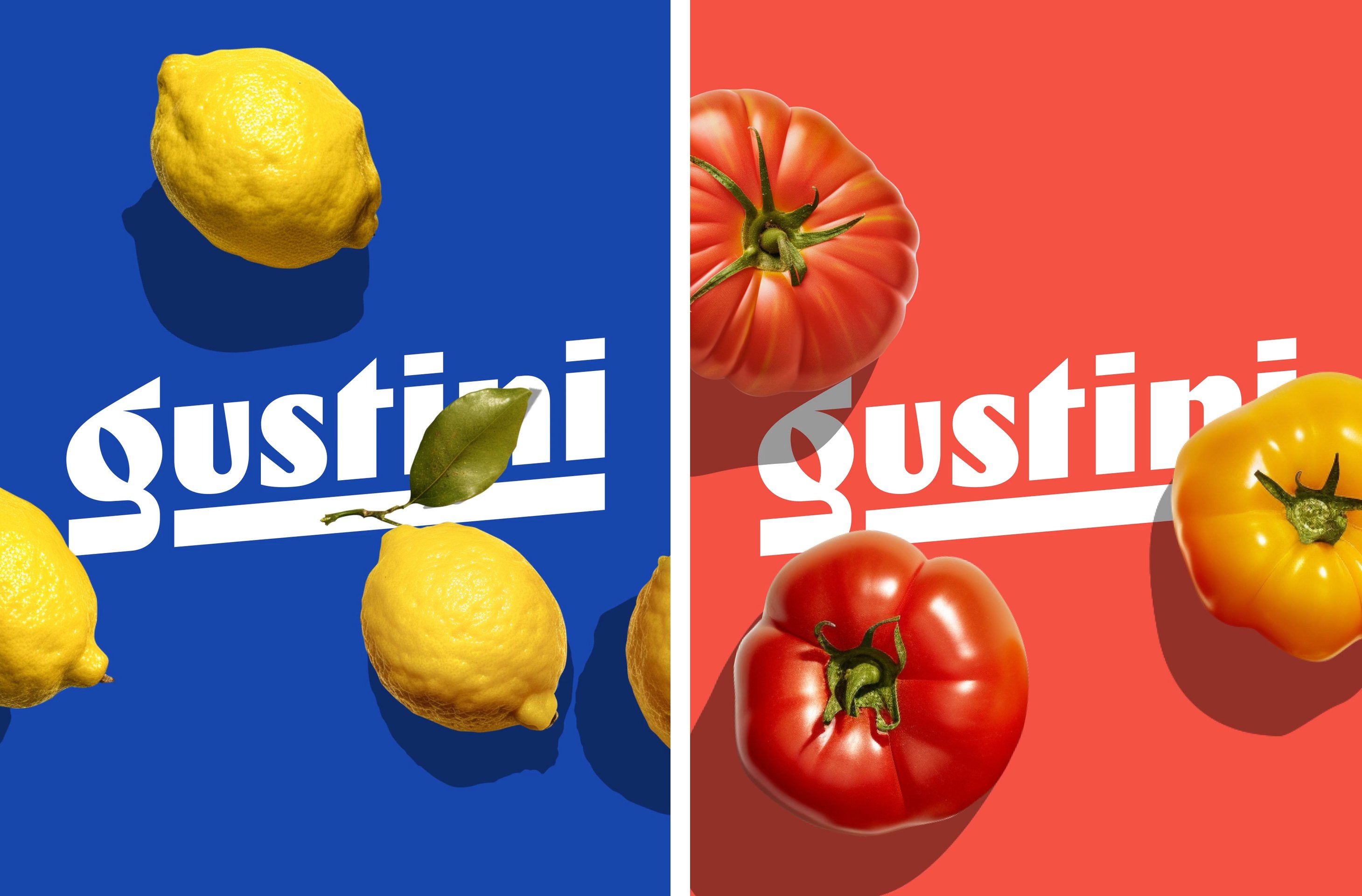
Thankfully, the new branding by London-based design agency Koto totally reverses all that with a gorgeous new look that finally takes Gustini into the realm of the artisanal and away from the more production line vibe of yesteryear.
Koto is an interesting choice for a company like Gustini. Since the agency was founded just shy of a decade ago, despite the breadth of its output it’s undoubtedly developed a distinctive house style of sorts – usually dealing in bold, punchy colours, typography and icons that err on the side of playfulness, uniquely maximal minimalism (just a quick glance at the agency’s own very, very yellow identity and you’ll know what I mean).
And yes, the Gustini work is bright, and its type feels very Koto (and newly all-lower-case), but the work feels like a refreshing new string to the agency’s bow. Perhaps that’s because it’s a slight departure from the more tech-focused brands it’s known for: Koto was behind Gumtree’s comprehensive (and much needed) redesign in 2016, as well as Deezer’s bombastic motion first new look last year, tech investment firm Partech’s designs, and the rebrand for online jobs platform Glassdoor.

Unlike these digital-first brands, Gustini’s new look takes the company back to its core proposition – Italian food. There’s a lot of tactility, and a lot of texture here. According to Koto, Gustini was looking to update its visual identity thanks to ‘competition heating up, and an evolving offer,’ so it needed a brand ‘as fresh as their line of products’.
The initial strategy was to tap into the ‘Italian ideology of bringing everyday delight to people’s lives’. And it’s great to see the brand finally feel Italian: based on the brand idea ‘the good life’, it feels artisanal without being pretentious or exclusive, and brings everything back to where it should be – the manufacturers, and the food.

The logotype uses bespoke type that I can’t get enough of. The more you look at those letterforms, the more you notice all their beautiful little quirks: narrow counter and exaggerated ear and narrow counter on the lowercase ‘g’, which shoots forward and gives the whole thing a sense of dynamism and energy right from the start. Then there’s the mismatched stroke weights from one side of the ‘u’ to the other; the curves of the ‘s’ and ‘g’ offset by the fierce angles of the ‘t’ and the parallelogram dots on each ‘i’.
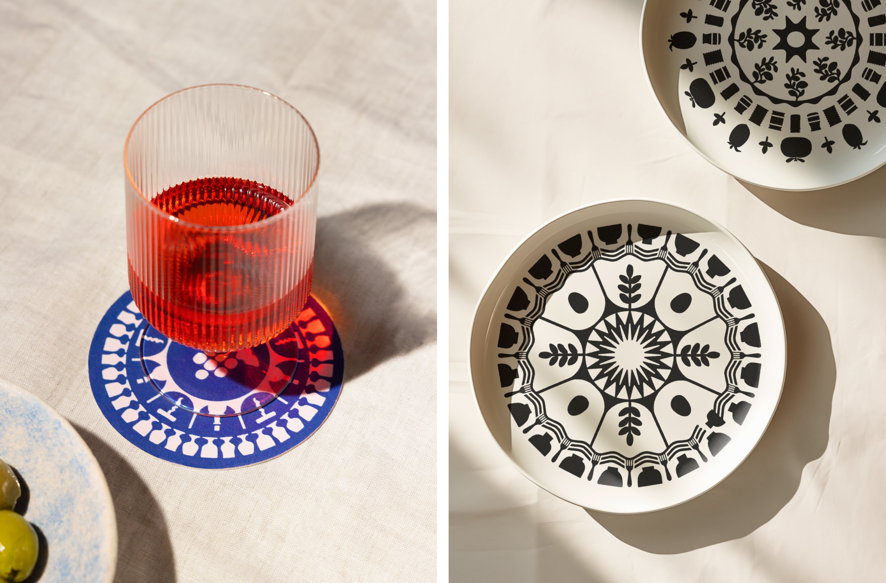
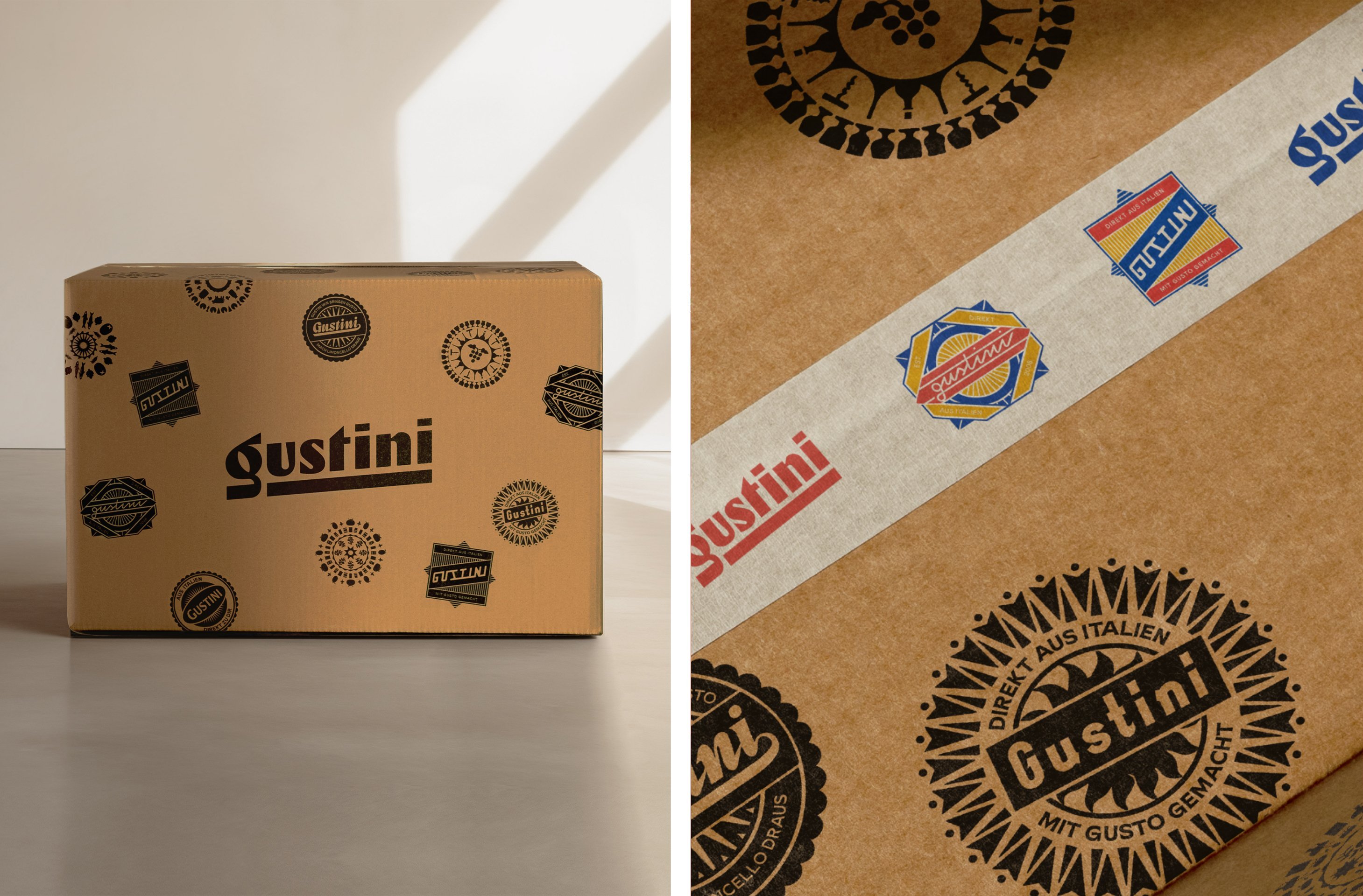
While this forms the main logotype, across various branding applications Koto seems to have had fun with the concept of the logo, creating a number of different versions of the Gustini name and applying them like coasters or traditional fruit stickers. It works really well, and again calls to mind the likes of Pirelli and Vespa: you could certainly imagine people wearing the designs as embroidered patches.

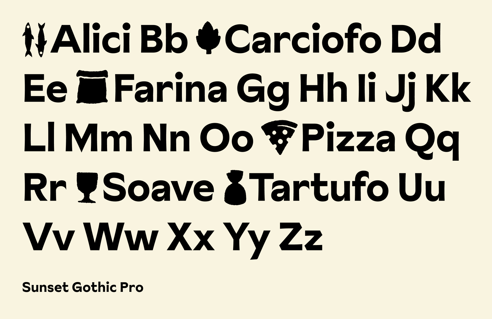
Koto chose Sunset Gothic Pro by London-based Colophon foundry as the main brand font. Described by Colophon as a ‘painterly sans-serif rendered in the tradition of Los Angeles sign-painters’, the font naturally has some charming irregularities and quirks that suit the rest of the Gustini look and feel perfectly. The suite of icons that Koto created also seem to chime with Sunset Gothic, echoing the letterforms somehow in their simplistic renditions of key Gustini products, such as ‘speciality cheeses’, olive oil, ‘balsamico’, antipasti and more.

The influence of traditional Italian food labels is clear across the identity, and Koto says it also looked to ‘classic fruit and vegetable tissue wrappers’ as references for the new brand illustrations.
If the type and the illustrations feel distinctly foodie, the colour palette feels like a hot relaxed summer evening: Koto has dubbed Gustini’s shades of blue, yellow, off-white and orangey-red as sky, sun, sea, sand and soil. Which somehow feels lovely, yet not twee; like the incongruity of the neon orange colour and sharp taste of a Campari spritz.
Koto has done a superb job in transforming Gustini into a brand that exudes effortless Italian charm: it’s contemporary but relaxed, ‘foodie’ but unpretentious. The whole thing makes you really, really want to go on holiday.


