Qasa by Bold
Opinion by Emily Gosling Posted 23 April 2024
Now that the likes of ed-tech (education technology) and fin-tech (financial technology) have become a natural part of everyday parlance, it was surely only a matter of time before prop-tech (property technology) entered the equation, too.
Proptech largely refers to platforms and services that use tech to help people buy, sell, research, market, and manage a property – ranging from websites that link renters to agencies, to property price estimation tools or even smart doorbells. Airbnb and Zoopla are probably some of the best known proptech brands, but the portmanteau feels a lot younger than either of those online stalwarts (to me at least).
AirBnb has certainly had its fair share of fanfare over the years around its branding – surely few in the design industry can have forgotten the hoo-ha around the 2014 DesignStudio logo, (which was compared variously to all the genitals, a paperclip, a bear’s nose and various existing marks), but it has undeniably lasted the test of time. But for the most part, the world of proptech doesn’t sound especially exciting, nor ripe for particularly interesting design. But perhaps that’ll be changing in the wake of some lovely new work for Qasa by Bold Scandinavia.
Qasa is among the fastest growing proptech companies, and is active across Sweden (where it was founded), Finland and France. According to Bold, it’s a ‘next-generation global home-rental experience’ that ‘breaks the transactional category norm and instead focuses on making the intangible feeling of home tangible’.
The company brought in Bold to create the new branding to help the brand continue its expansion across Europe in the coming few years; and its designs certainly stand out against other brands in the somewhat dry sector.
The agency began by conceptually exploring the abstract and emotional value of feeling at home. From there, it landed on the concept ‘Lovable all around’ – rather cheesy, and possibly the antithesis of what we know about real estate and the characters who operate within it, but still, it’s seemingly more an internal anchor than an external tagline – though it does appear in some of the brand copy.
The other copy somewhat lets the rest of the branding down, too: the website slogans like ‘renting made cushy and fuzzy’ or ‘feels like: a warm hug’ are so outside of both the tone and the experience of traditional property companies that it’s hard to tell just how tongue-in-cheek it is (if indeed, it is tongue in cheek at all).
Another slogan, however, does appeal to the type and design nerds in directly linking the font it’s written to the words it conveys. ‘Renting – but with all the laborious edges rounded off’ is rather fittingly set in a cute, no-frills, neat, legible sans serif. The font seems to be bespoke – Qasa Diatype Rounded, which is likely adapted from Swiss foundry Dinamo’s Diatype Rounded.
‘Loveable all around’, so says Bold, is at the root of the identity’s combination of ‘structural and organic forms’, which are then ‘harmonised… just like in a home’. Bold dubs the identity ‘expressive design language’ across the logotype and typography, to illustrations, UI components, and graphic elements.
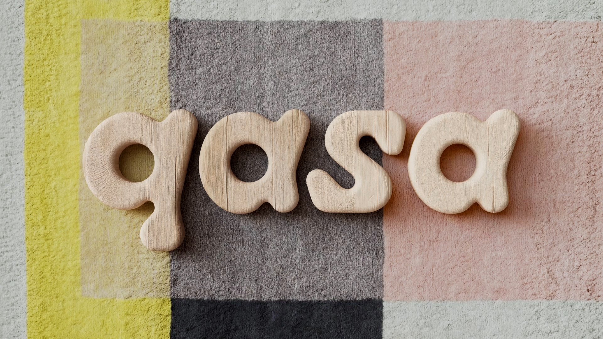
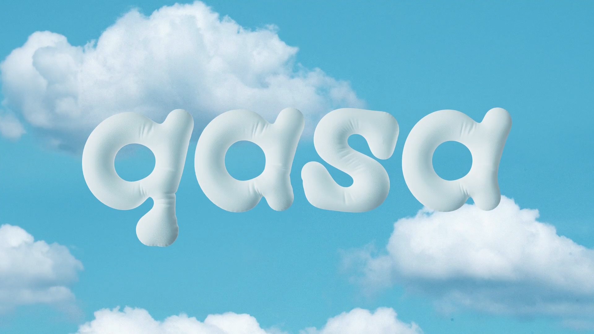
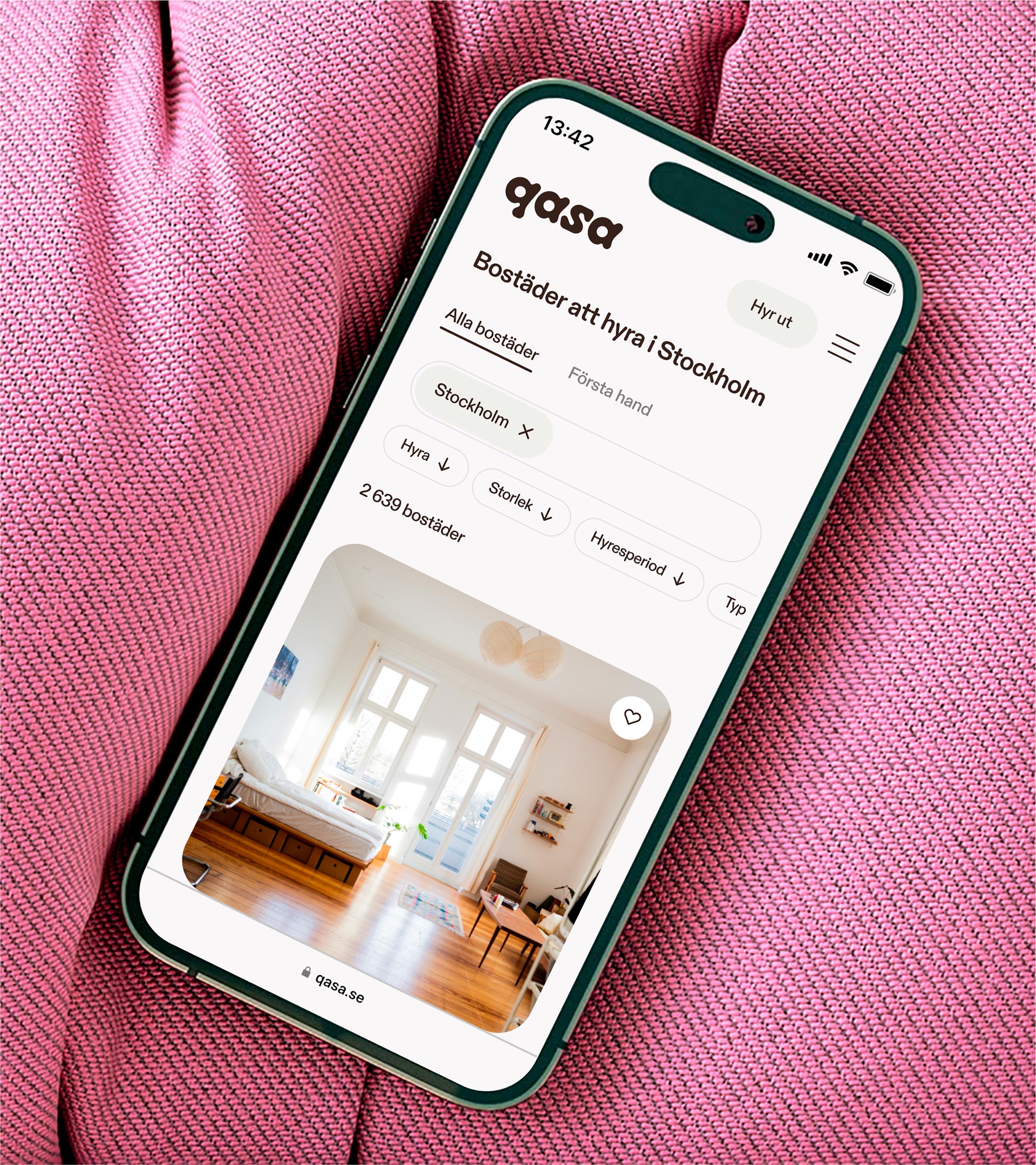
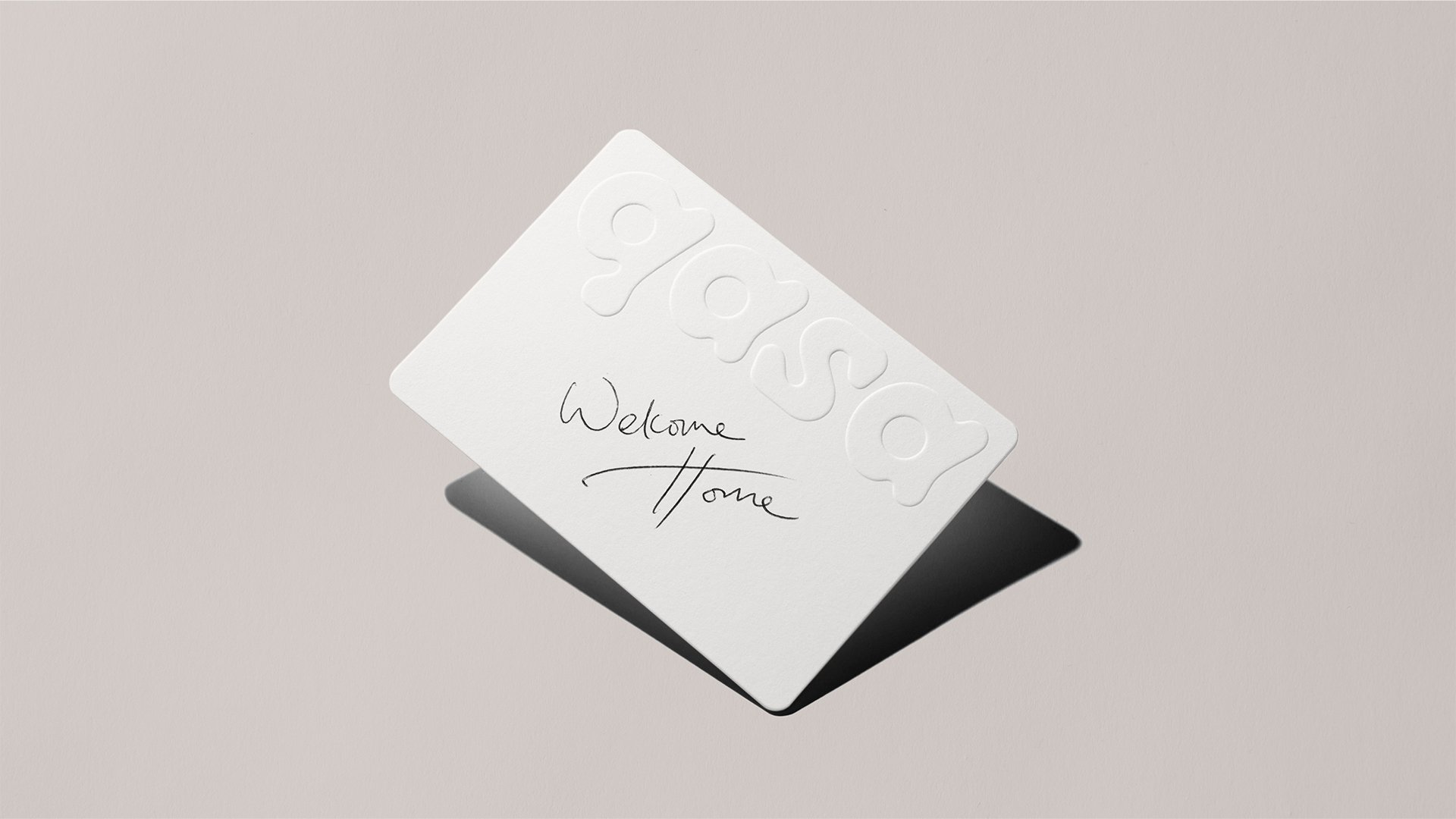
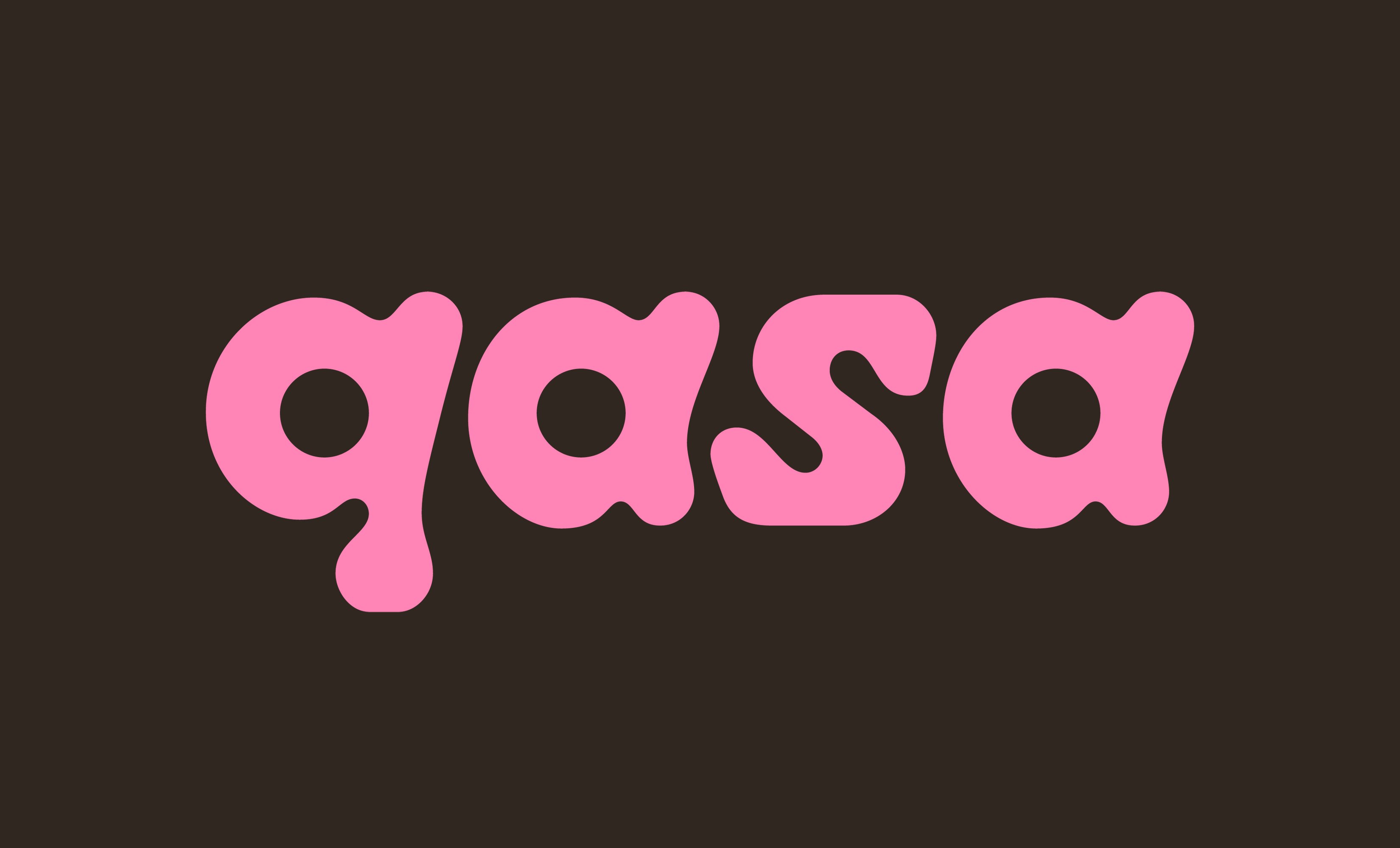
The main wordmark uses the four letters of Qasa (we’re guessing this is a reference to ‘Casa’ – the whole ‘mi casa su casa’ thing chimes with the ‘loveable all around’ idea, after all) in gloriously gloopy, playful, brightly coloured variations according to the application.
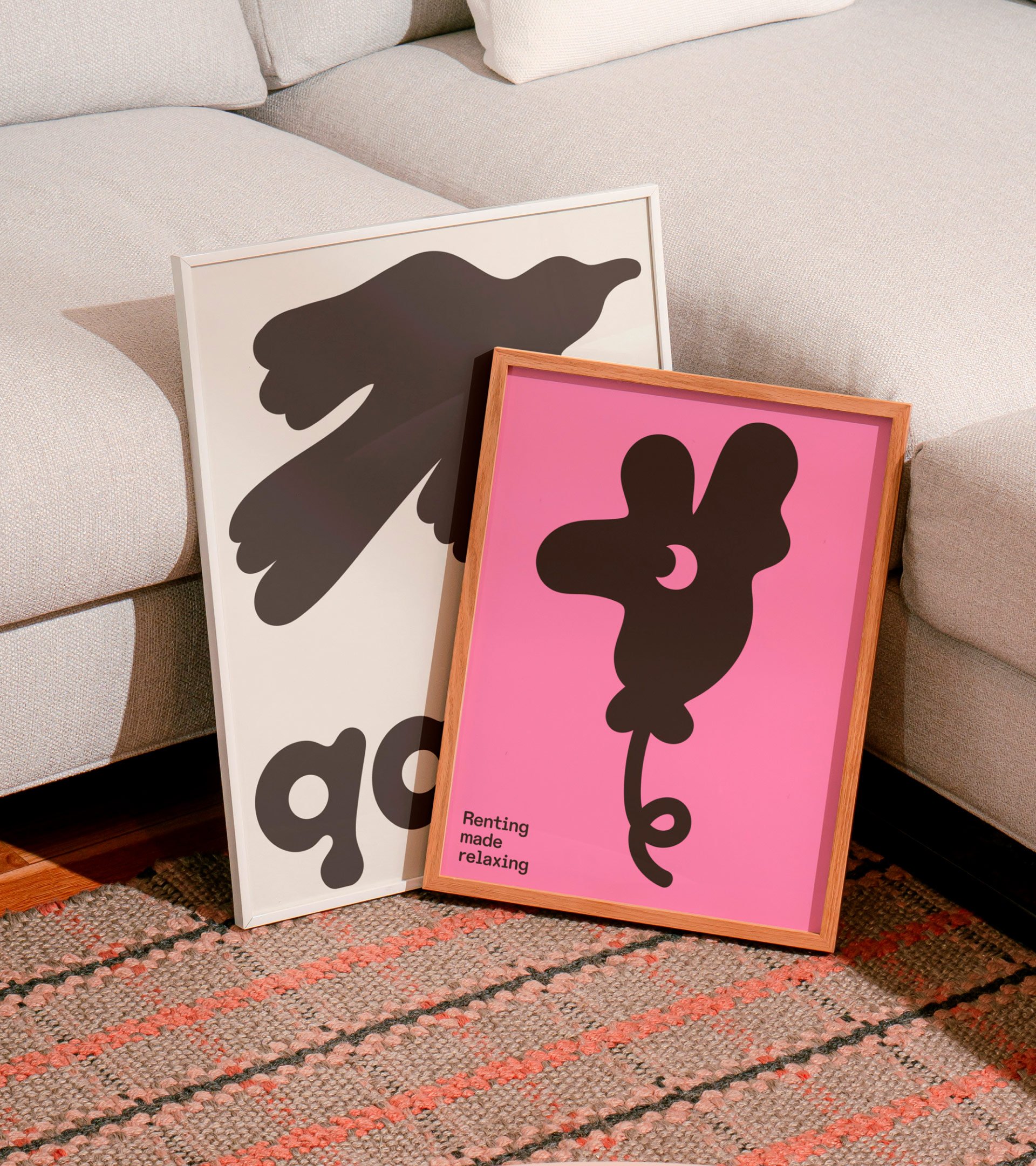
The logotype works beautifully in motion; with the letters morphing like a lava lamp. Texture is a big part of the identity, with some lovely moving 3D graphic elements such as fabric-like puffy key and heart devices. Elsewhere, illustrations mimic the liquidity of the wordmark in striking silhouetted graphic forms.
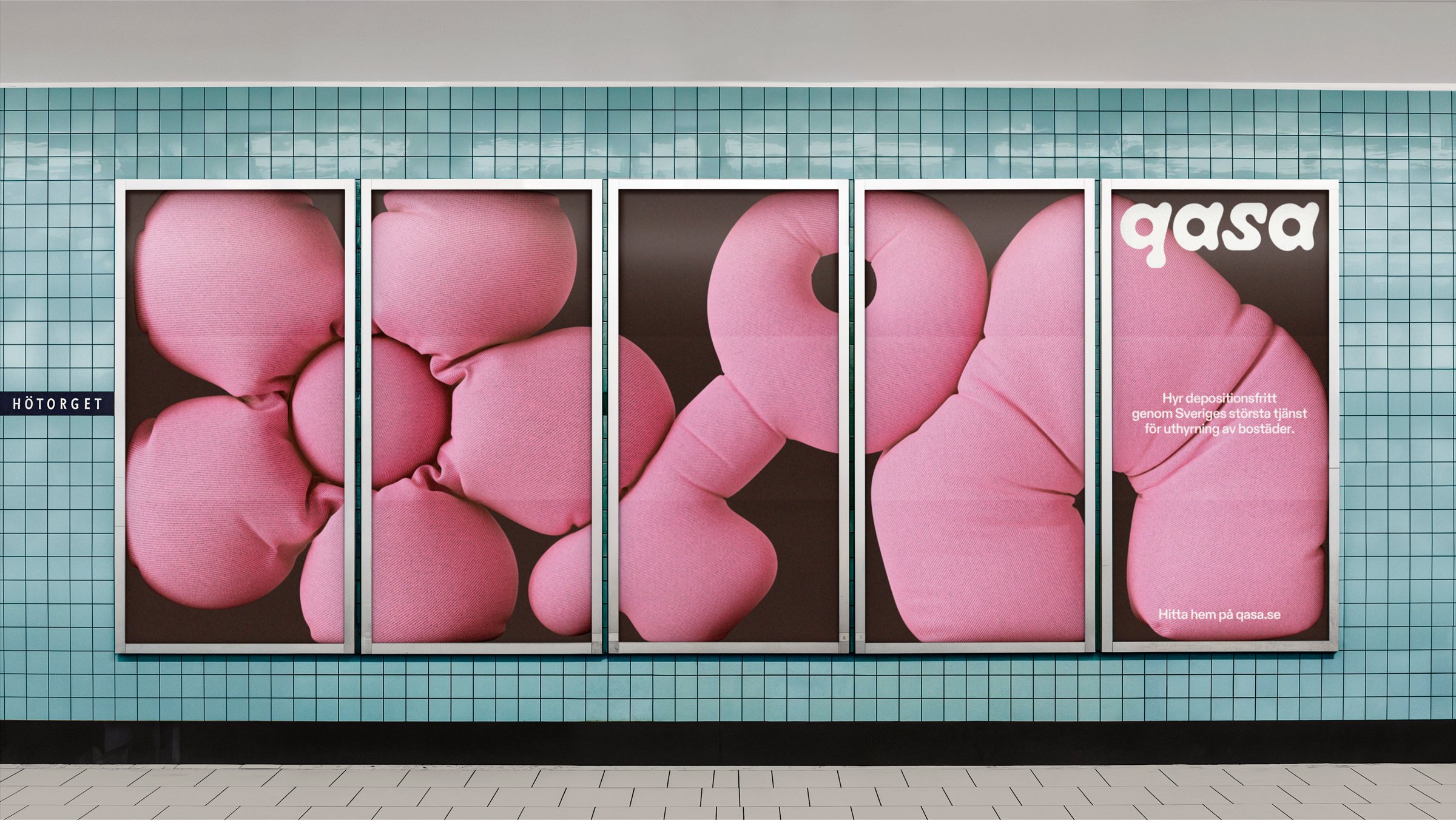
The design concept ‘extends from a simple and intuitive user experience to expressive out of home communication,’ Bold adds. ‘We wanted to create a brand experience that allows people to spend less time finding a place to live, and more on finding a home.’
Despite the rather icky copy elements (and, YET AGAIN, an all-lower-case wordmark), it’s hard not to like Qasa’s identity. The friendly but modern feel of the pink website; the category-defying playfulness of the wordmark; the suite of smart illustrations both in 3D and 2D. The branding is fun, striking, and breaks the mould of prop tech convention. Bold is certainly a fitting agency name for the designers that worked on a project like this.
Discover more Qasa brand assets, plus assets from many more brands at Brand Archive.
