The Gospel by DDMMYY
Opinion by Emily Gosling Posted 30 May 2024
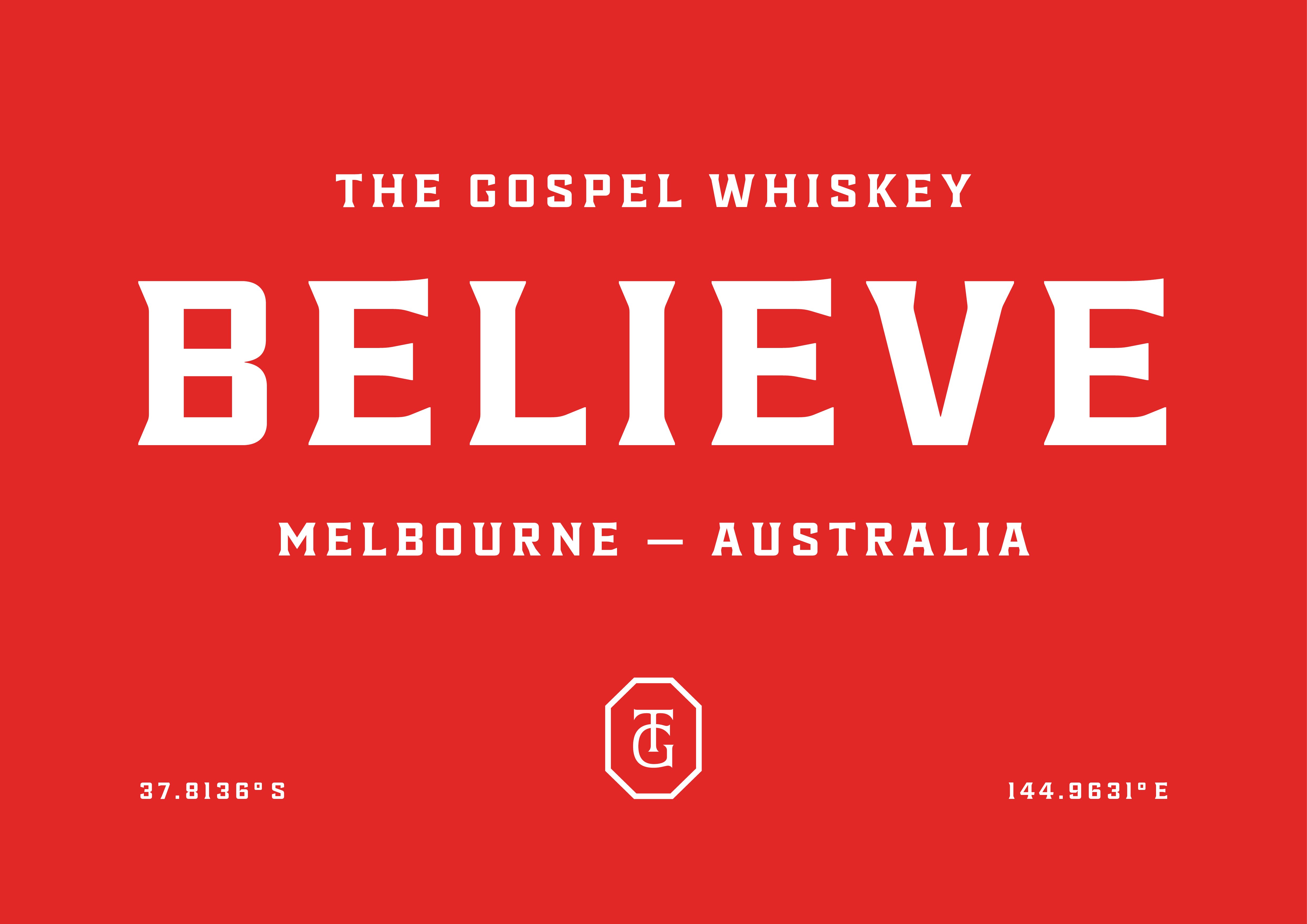
Not a new project, but one certainly worth revisiting; this work for whisky brand The Gospel scooped a fair few awards back in 2020, and it’s not hard to see why.
The design agency behind everything from strategy and naming to brand story, creative direction, packaging design, and more is DDMMYY, based in Auckland, New Zealand. The team was initially approached by The Gospel’s founders, based in Melbourne, Australia, in 2017 to create a brand and packaging system for a product range of rye whiskeys.
‘While rye whiskey is popular in other parts of the world, it’s less common in Australia’, says Kelvin Soh, executive creative director of DDMMYY. ‘They were building what is now the largest rye whiskey distillery in the Southern Hemisphere.’
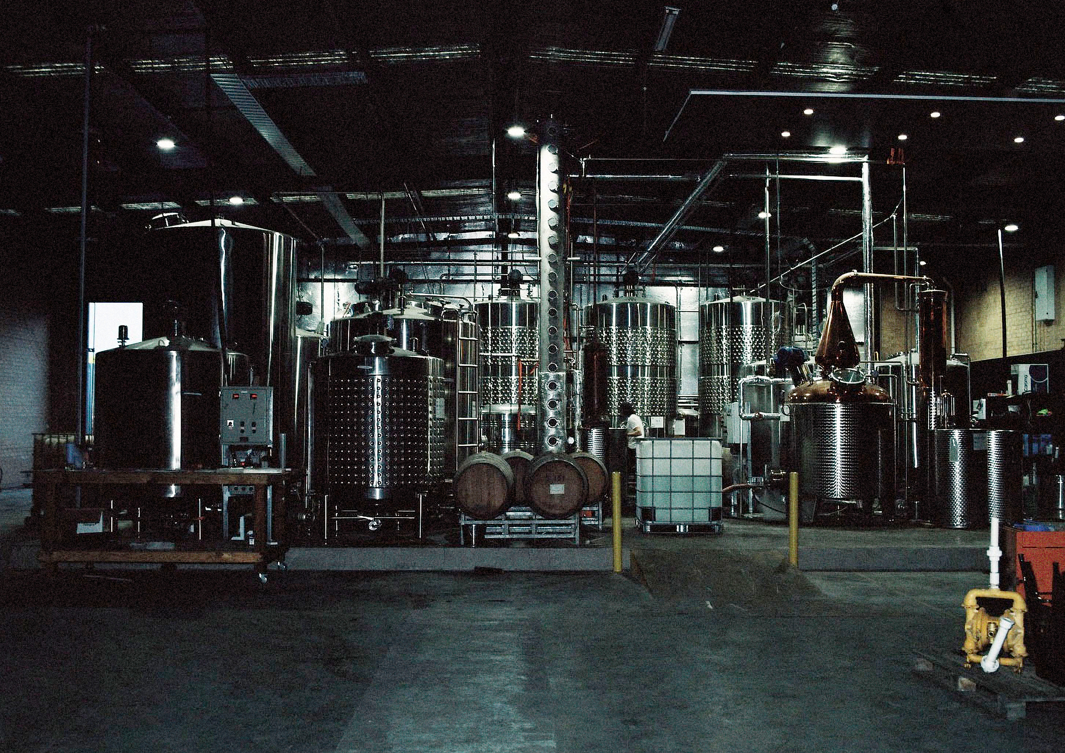
Having come into the project at such an early stage that the agency is a minority shareholder in The Gospel, DDMMYY initially spent a lot of time with the company’s founders. During that discovery phase, DDMMYY learned that the two founders were ‘passionate fans of stuff like restoring vintage cars parked in their distiller; touring hip-hop musicians; vinyl collecting; and last but not least, whiskey history and craft’. It was these myriad passions that went on to form the two ‘foundational concepts’ that underpinned the strategic and creative work.
One of those two aforementioned ‘foundational concepts’ was Old is Good – an idea that comes through very obviously in the design work, and is also very appropriate to the whisky category as a whole – usually, the older it is, the more valuable it is, in very simple terms. And much of the design work was based on the idea of ‘digging into the crates of history’, according to Soh – even the name itself leans on the stories around whisky’s origins in monasteries and apothecaries.
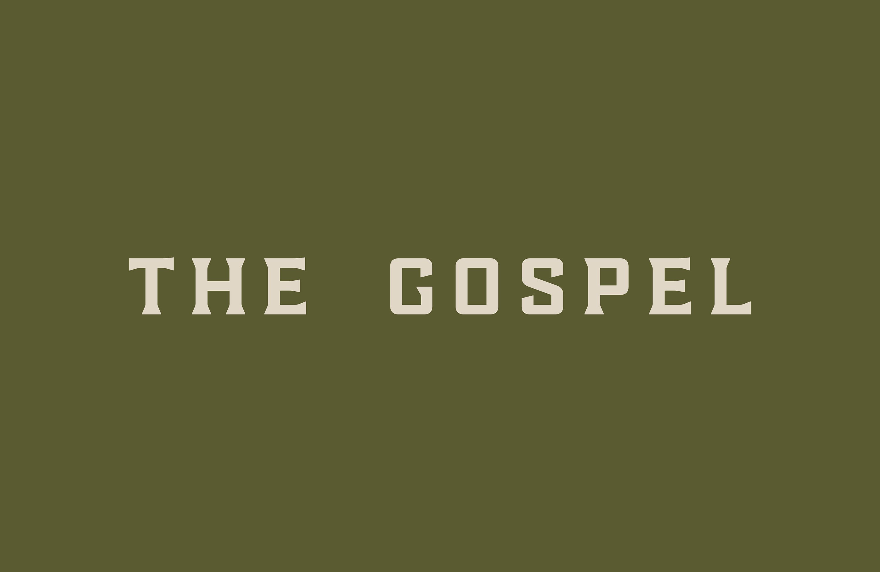
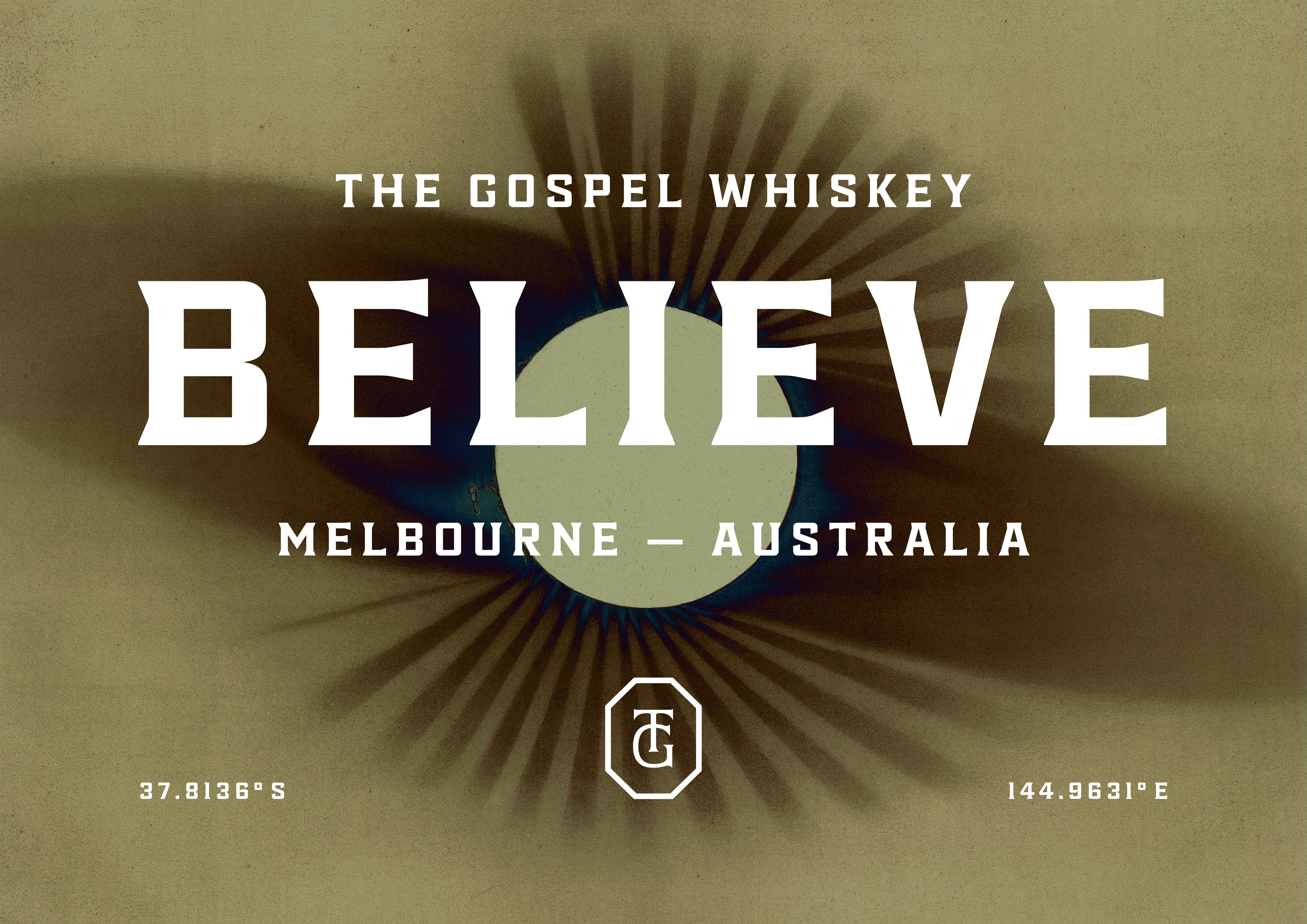
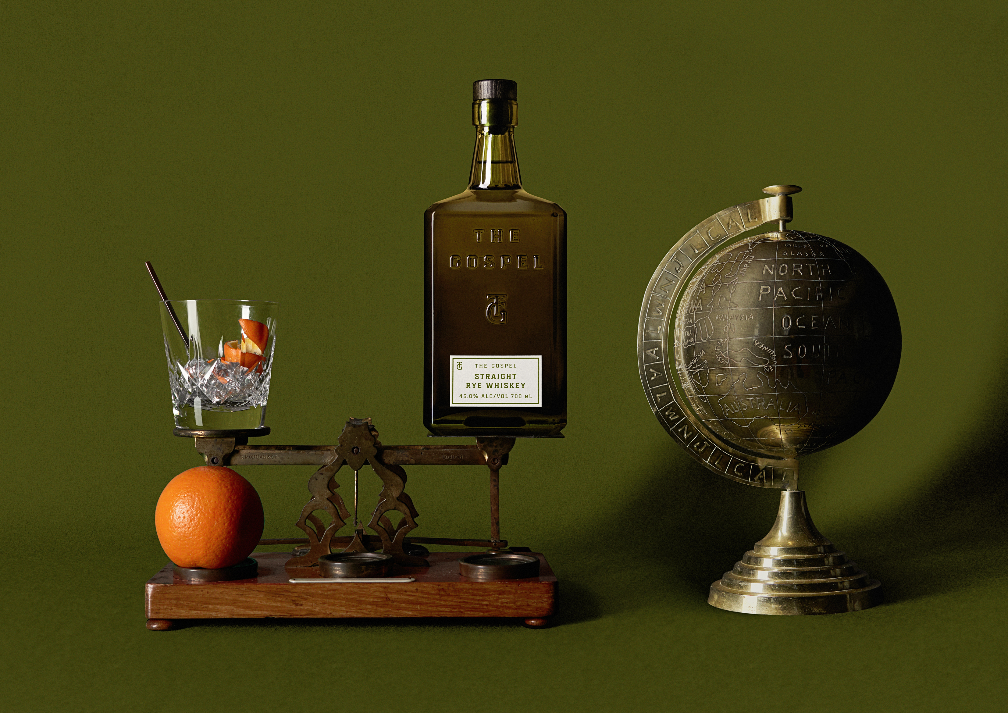

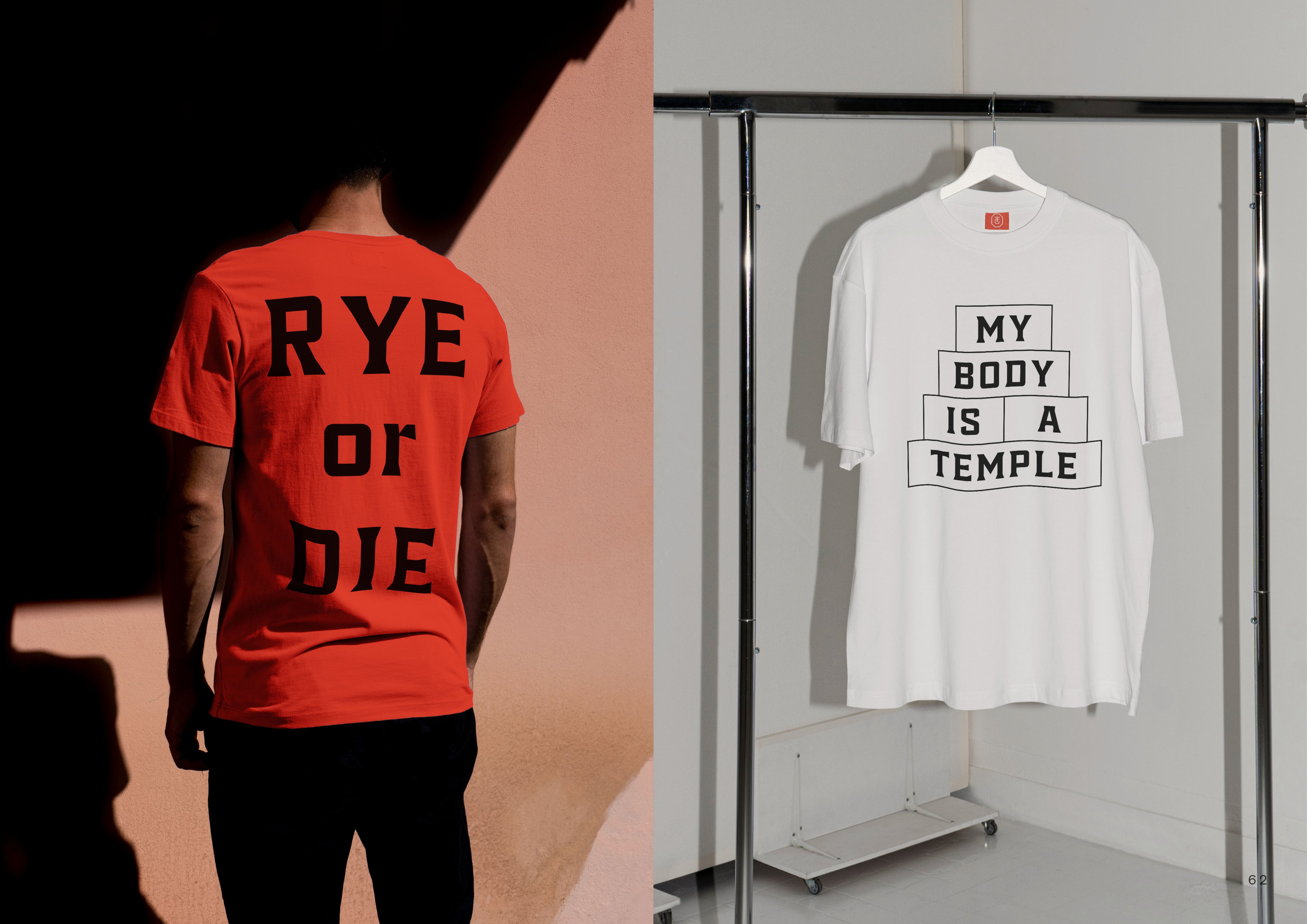
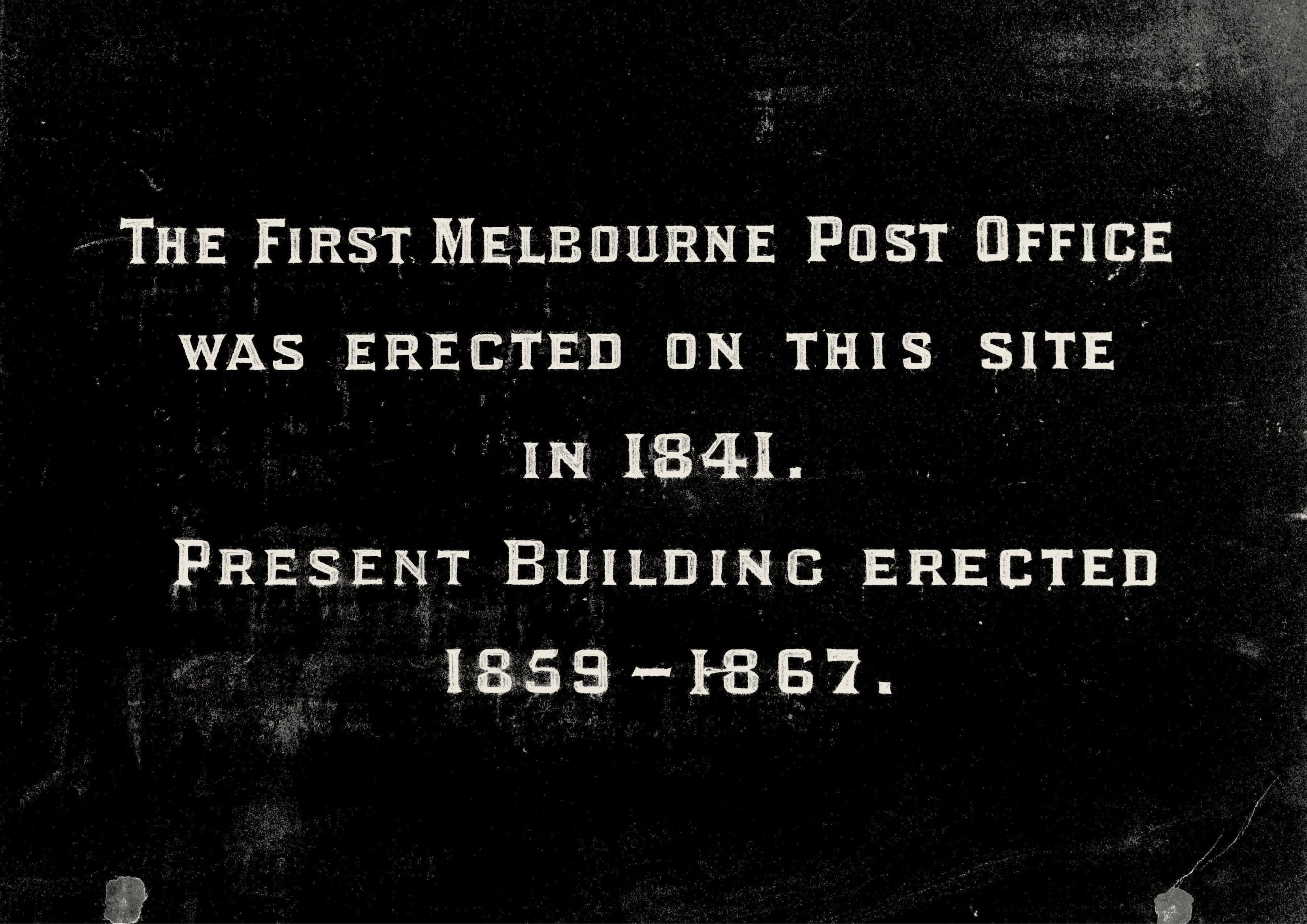
Having covered another DDMMYY project more than a decade ago (back in 2012), it seems that the agency has long been a dab hand at typography – and more specifically, typography that references rather unusual, but very specific moments from bygone eras. In the case of The Gospel, with such a stripped back, minimal approach, the typography really does a lot of leg work – and it does it beautifully.
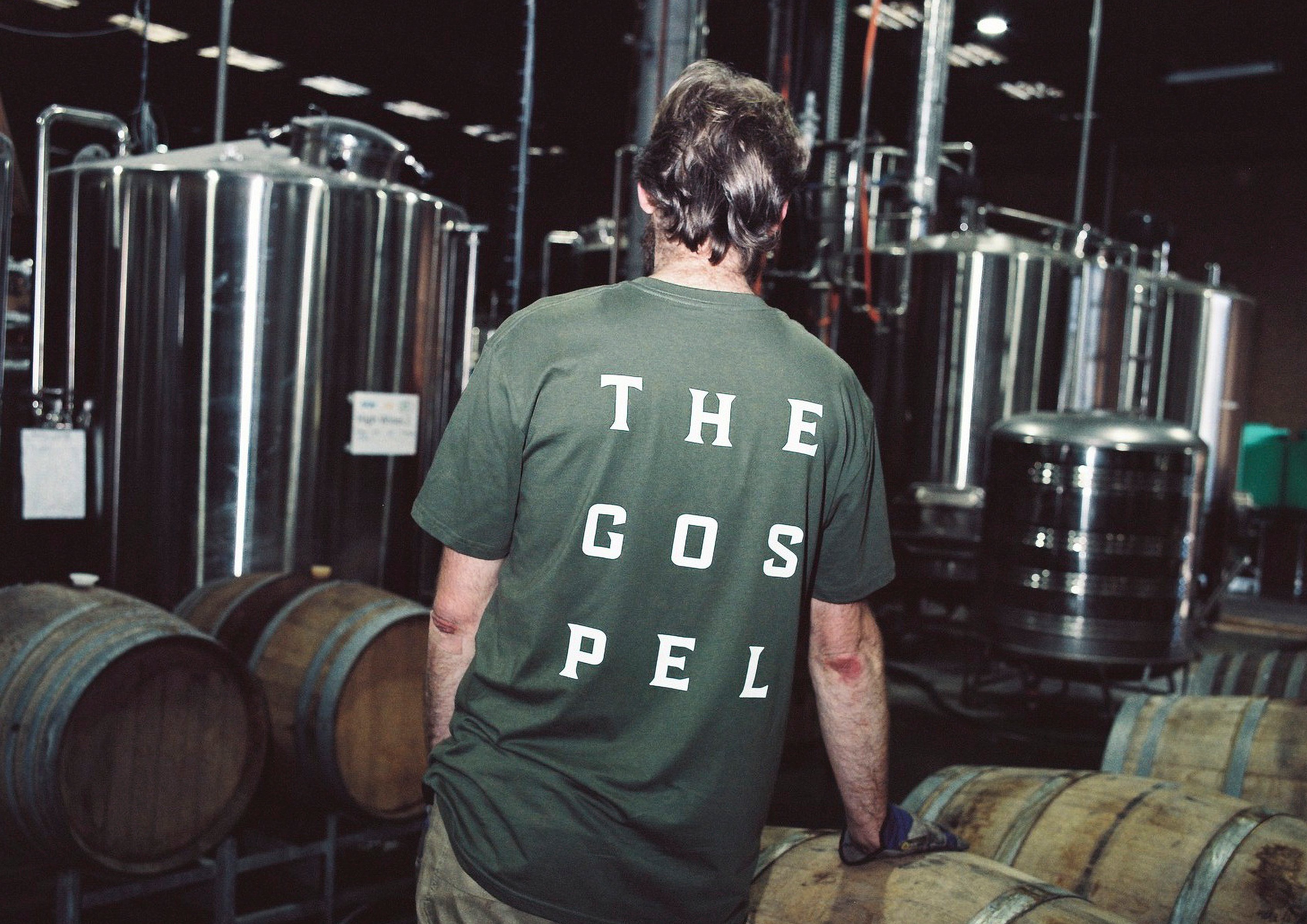
DDMMYY created a bespoke brand font for The Gospel in collaboration with typographer Alistair McCready, which is named GPO after its inspiration – the General Post Office building in Melbourne. The all-caps, deliciously slightly-off-kilter font works perfectly for The Gospel: it looks confident but ‘authentic’; punchy but not showy; contemporary but with very obvious nods to a past that suddenly seems so charming and alluring.
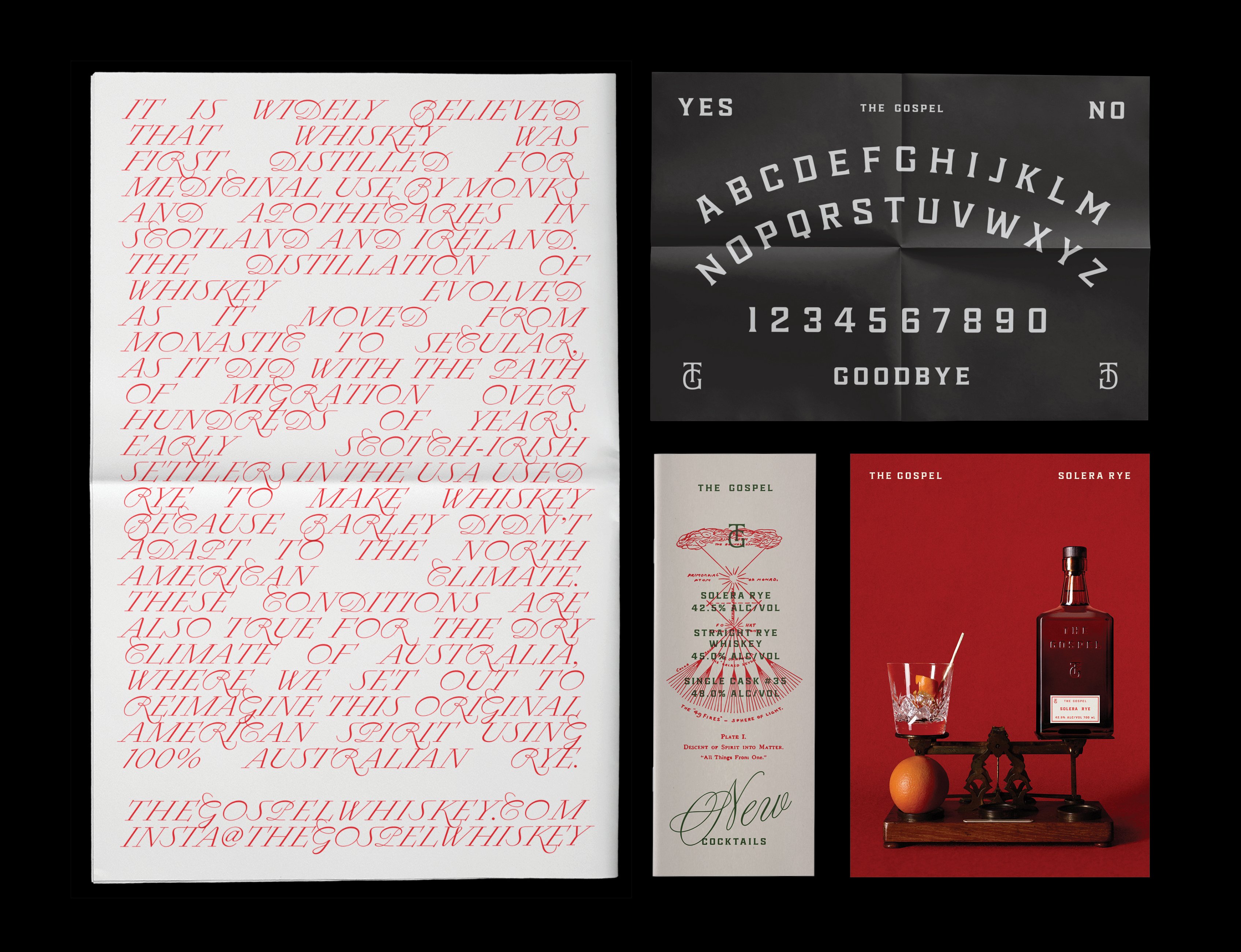
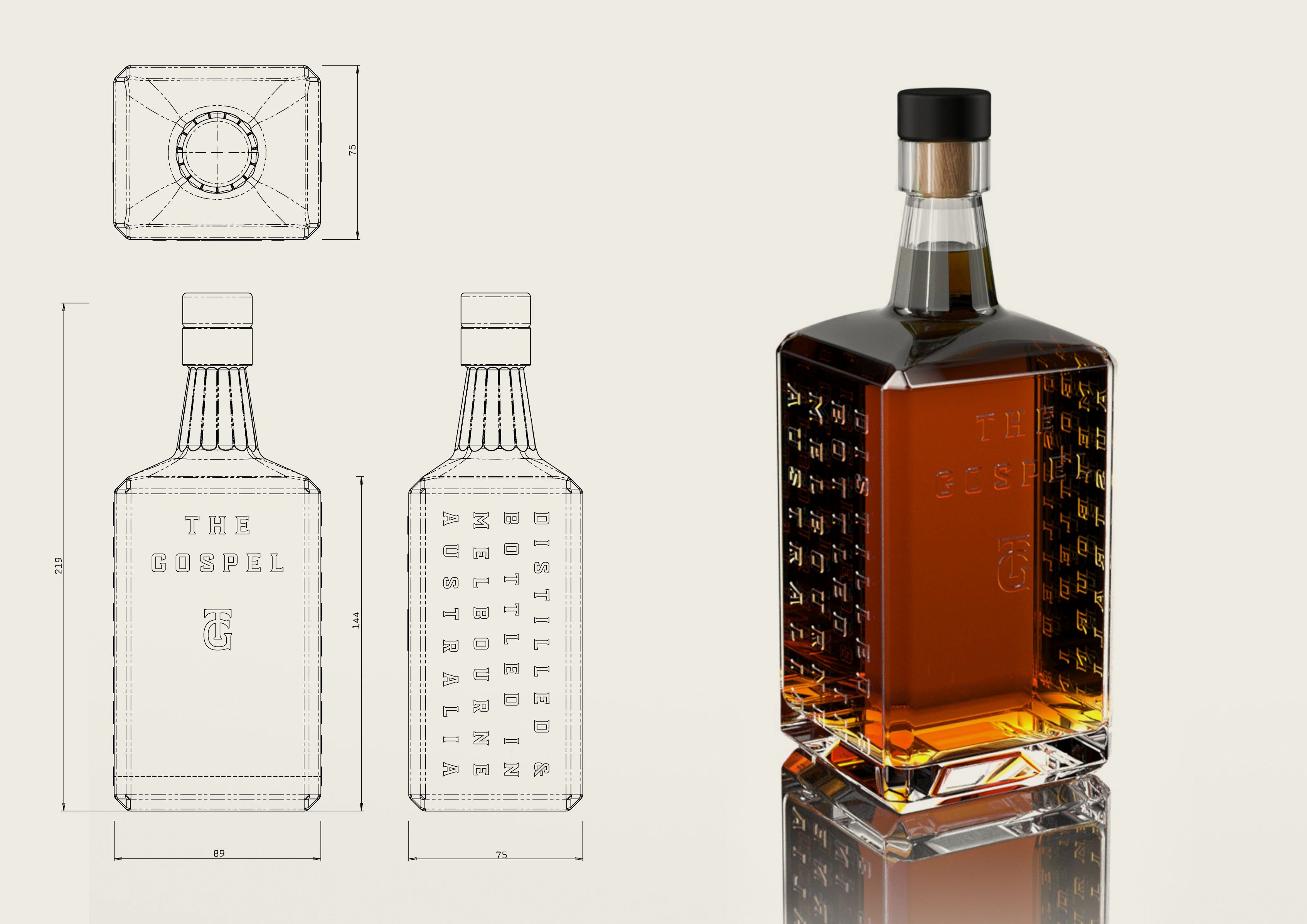

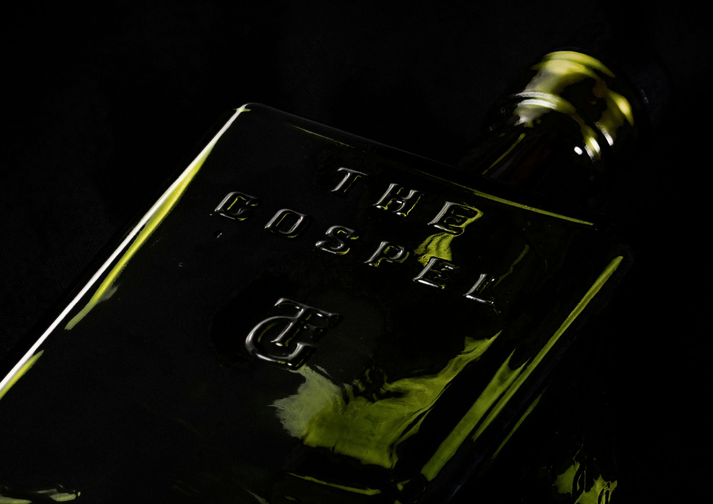
While The Gospel’s brand name often just appears written out in GPO, an expensive whisky (or indeed a high-end anything at all) wouldn’t cut it without a monogram. Here, the conjoined ‘T’ and ‘G’ once again scream class, but not fustiness – perhaps a product of its unusual inspiration point, another historical Melbourne reference taken from a 1950s record label.
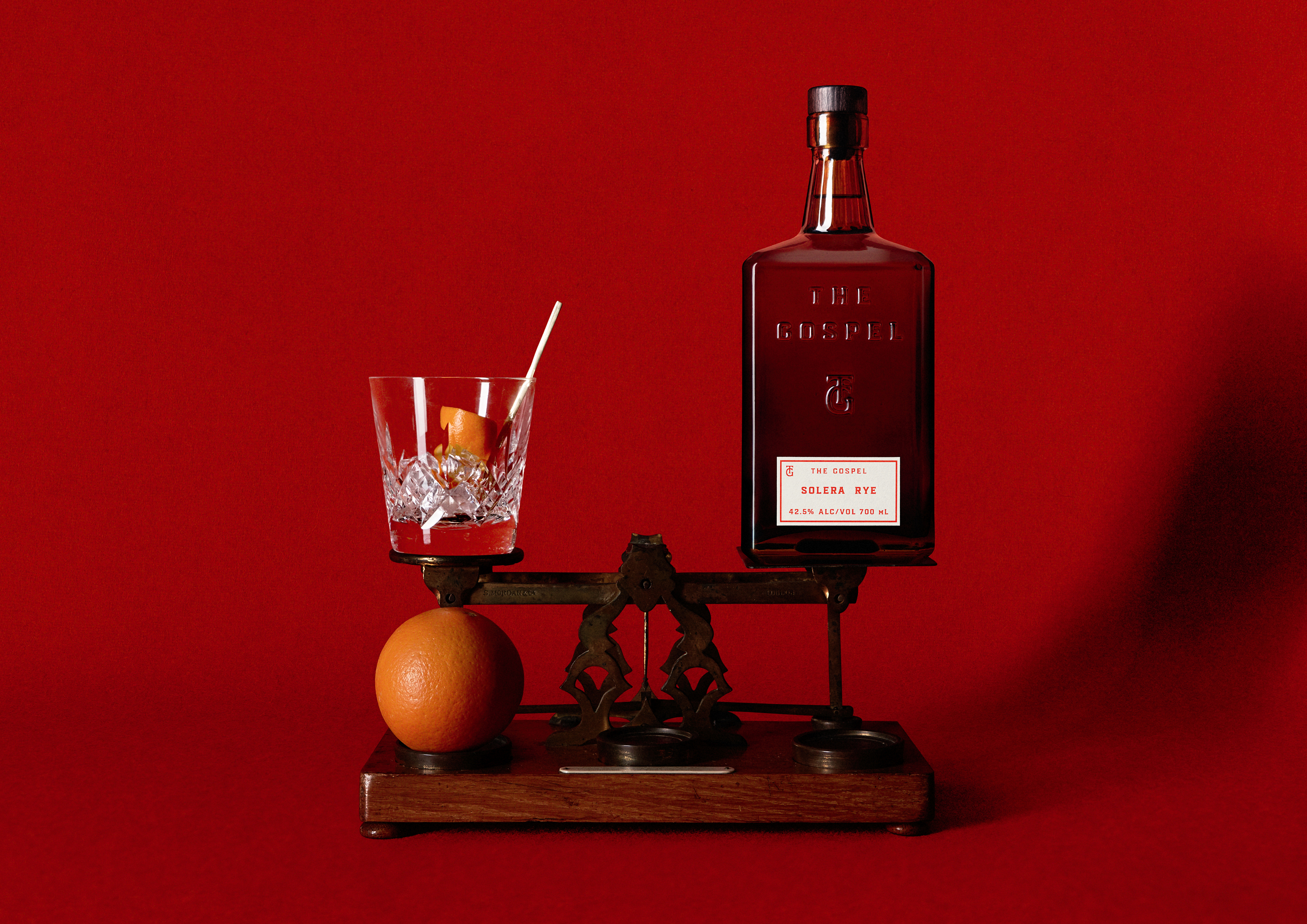
In a smart reflection of what might be dubbed the new cues of luxury – pared back simplicity, subtle quirks, an eschewal of ostentation and the historical miasma of shiny gold things and decoration – the structural packaging does as much as the label, here. The embossed glass and unusual shape make the bottle designs totally unmistakably ‘The Gospel’.
But simplicity doesn’t mean that there isn’t a raft of tiny details that make the branding work so well. Every single minute element, it seems, has been relentlessly pored over. The brand photography, for instance, was shot using a vintage film camera to produce ‘a quality of image that felt equally journalistic and ghostly’. For the brand’s limited edition whiskey releases, DDMMYY combed various public library archives to find artwork from as far back as the 1870s.
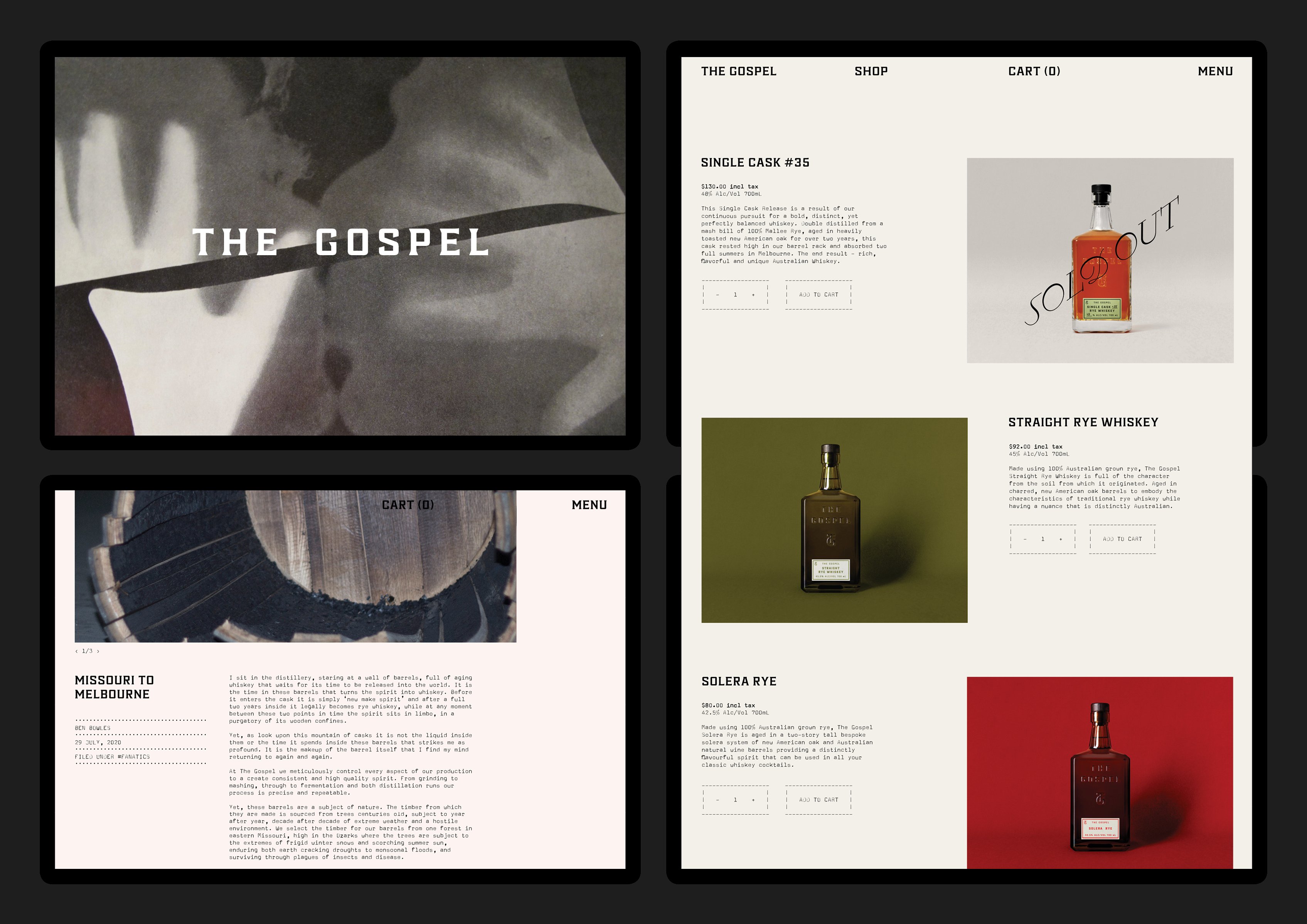
Other great little quirks that perhaps don’t strictly need to be there, but which elevate the entire identity to be as lovely as it is, include supporting imagery with idiosyncratic starting points that range from ‘explainer diagrams’ of things like ‘bodily energy fields’; drawings that attempt to explain UFO sightings; and, naturally, Ouija boards.
The idea was to layer various concepts themes and ideas, and while perhaps those starting points aren’t obvious, they aren’t meant to be: the identity feels cohesive, coherent, and corrals all these oddities into something that through the sleight of hand and skill of The Gospel’s designers, feels totally sophisticated.
