The Best Logo Designs of 2012
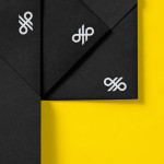
Nosive Strukture by Bunch
Nosive Strukture is a structural engineering firm who describe themselves as having a ‘unconventional attitude towards business, working environment and life itself.’ Inspired by their approach and a studio space of angled detail, independent design agency Bunch, “developed a stark, technical identity based around tensegrity structures and a black and white palette” executed across triplexed business cards, cardboard file folders, signage...
Crosskey by Kurppa Hosk
Crosskey is a Finnish company that develops and maintains systems and solutions for the Nordic banking sector and capital markets, making it ‘easier and more profitable for its customers to operate their banks’. Based around the idea “Banking Power!” design agency Kurppa Hosk developed a visual identity solution, which mixes a simple corporate typeface, iconic mark and an economical colour...
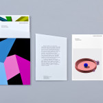
Sifang Art Museum by Foreign Policy
Sifang Art Museum is a gallery and creative space located in the Pukou region of Nanjing, China dedicated to art, architecture and international collaboration. Their visual identity, a bilingual logo-type set across a collateral of unusual trapezoidal cut detail and monochromatic colour palette—developed by Singapore-based creative and strategic design agency Foreign Policy—draws together the themes of architectural space, the dimensionality created by light and shadow,...
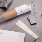
Townhouse by Koniak
Townhouse is a hotel designed and ‘curated’ by The Kastiel Family and located at the heart of the Tel Aviv. Based around tactile material and print finish, a mixed typographical approach in conjunction with a simple sans-serif logo-type and monogram, Townhouse’s visual identity, created by boutique design studio Koniak, frames the traditional crafted luxury of the hotel’s interior fixtures and fittings with a...
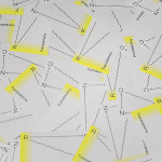
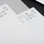
RNC Translations by Studio Constantine
Renata Noronha Cossio is a Brazilian-based provider of ‘sworn’ Portuguese, French and English translation services that cover official documents such as birth, marriage and academic certificates, passports and residential permits. Her visual identity, developed by creative design agency Studio Constantine, is a really interesting and unusual diagrammatic interpretation of a classic monogrammatic presentation of personal service. Its combination of fine line work,...
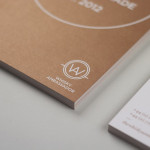
Krohn by Commando Group
Krohn is a young but experienced Oslo based furniture, interior and architecture design studio that develops holistic solutions that strengthen and add value to businesses through interior environments. Krohn’s visual identity, website and stationery—created by visual communications agency Commando Group—captures the multi-disciplinary nature of the studio and juxtaposes bold architectural structure and simple interior spaces with fine, high quality detailing, through an abstract,...
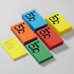
GR Communications by Ascend
GR Communications is a London based PR agency that is described as being made-up of a ‘close knit group of progressive and forward thinking experts’. Their visual identity, designed by independent brand, graphic and web design agency Ascend, captures the idea of unity, communication and creativity through a simple ligature detail, single quotation marks and a diverse, vibrant but complementary...
Whisky Ambassador by O Street
Whisky Ambassador is an Accredited, UK-based one-day training course that introduces bar staff and license holders to the techniques of effective Scotch whisky selling. Based around a simple monogram and sans serif logo-type combination delivered as an emboss and metallic spot colour treatment across tactile and uncoated material choices, design studio O Street’s visual identity for Whisky Ambassador – a recent start-up –...
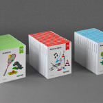
Ogopogo by Bunch
Ogopogo is a start-up that is introducing the boxed experience concept to the Croatian market. Their new brand identity, which include logo, print, packaging and website design developed by Bunch, juxtaposes the corporate formality and geometric consistency of a simple sans serif logo-type with the bespoke, crafted and playful qualities of bright folded paper photography....
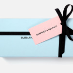
Surname & Surname by NB Studio
Surname & Surname is a new consumer focused brand communications agency formed by London-based PR specialist Blue Rubicon. Their visual identity, recently created by NB Studio, utilises a simple but well executed typographical solution to deliver an alternating union of language which conveys professionalism, communicative creativity at its most elemental, and a thoughtful, evolving brand personality....
ITI Computers and Diventa by Bunch
ITI Computers is a Croatian-based software company that specialises in the development of IT solutions for the leisure, tourism and hospitality sectors. Bound by a consistent typographic and monogrammatic design solution but divided by an organic and systematic contrast of context, creative agency Bunch developed a new logo and print solution for ITI and its leading management product Diventa, which delivers an interesting richness...
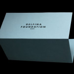
Delfina Foundation by Spin
“Delfina Foundation is an independent, non-profit foundation dedicated to facilitating artistic exchange and developing creative practice through residencies, partnerships and public programming, with a special focus on international collaborations with the greater Middle East & North Africa”. The foundation’s visual identity, developed by London-based design agency Spin, mixes a bold typographic solution and underline detail, a modern take on a...