HenshawFox by Parent
Opinion by Richard Baird Posted 4 February 2016

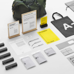
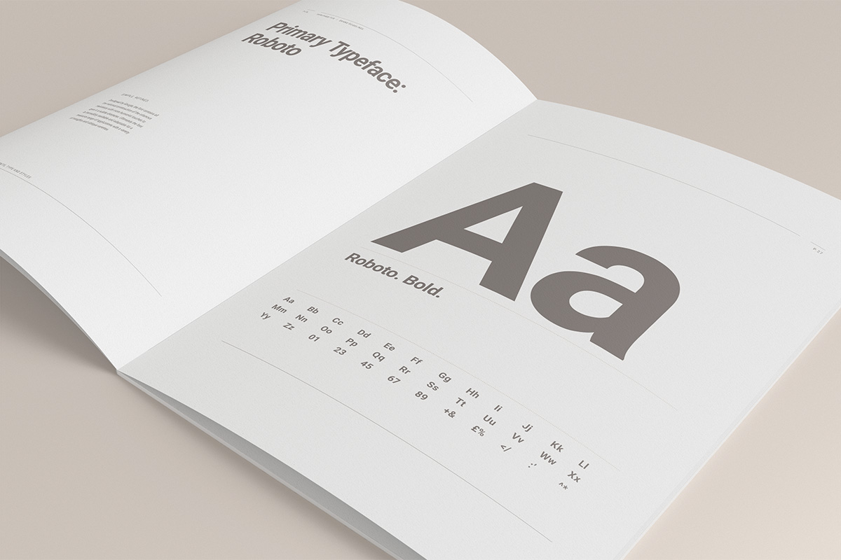
HenshawFox is a family run and independent estate agent with properties in and around the town of Romsey, United Kingdom. With a desire to move into the higher end of the market, from between £250k – £350k to £500k+, within the next two years, the estate agent commissioned graphic design studio Parent to develop their brand identity and interior design for their landmark office. This was to be more upmarket, aspirational and smart enough to compete with national brands. Alongside strategy and interior design, Parent developed and designed brand guidelines, brochures, signage and business cards.
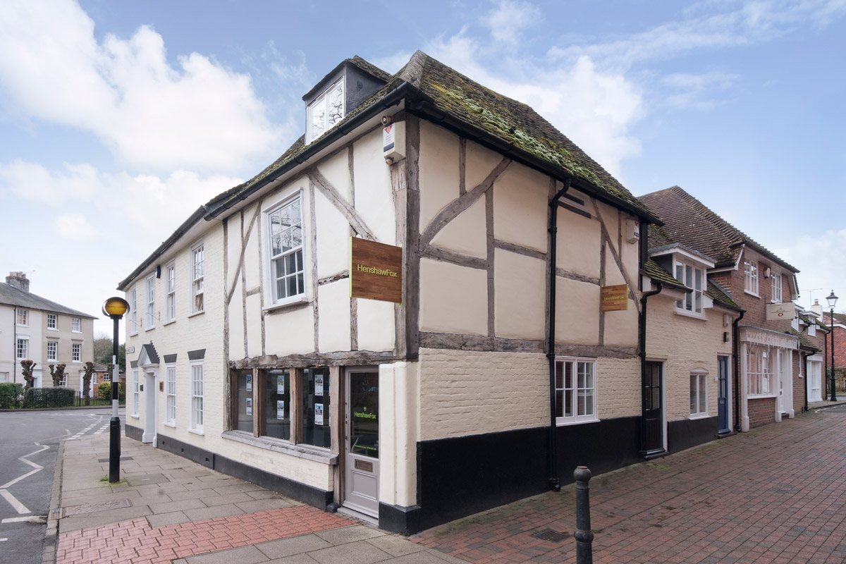
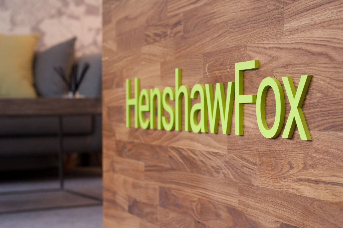
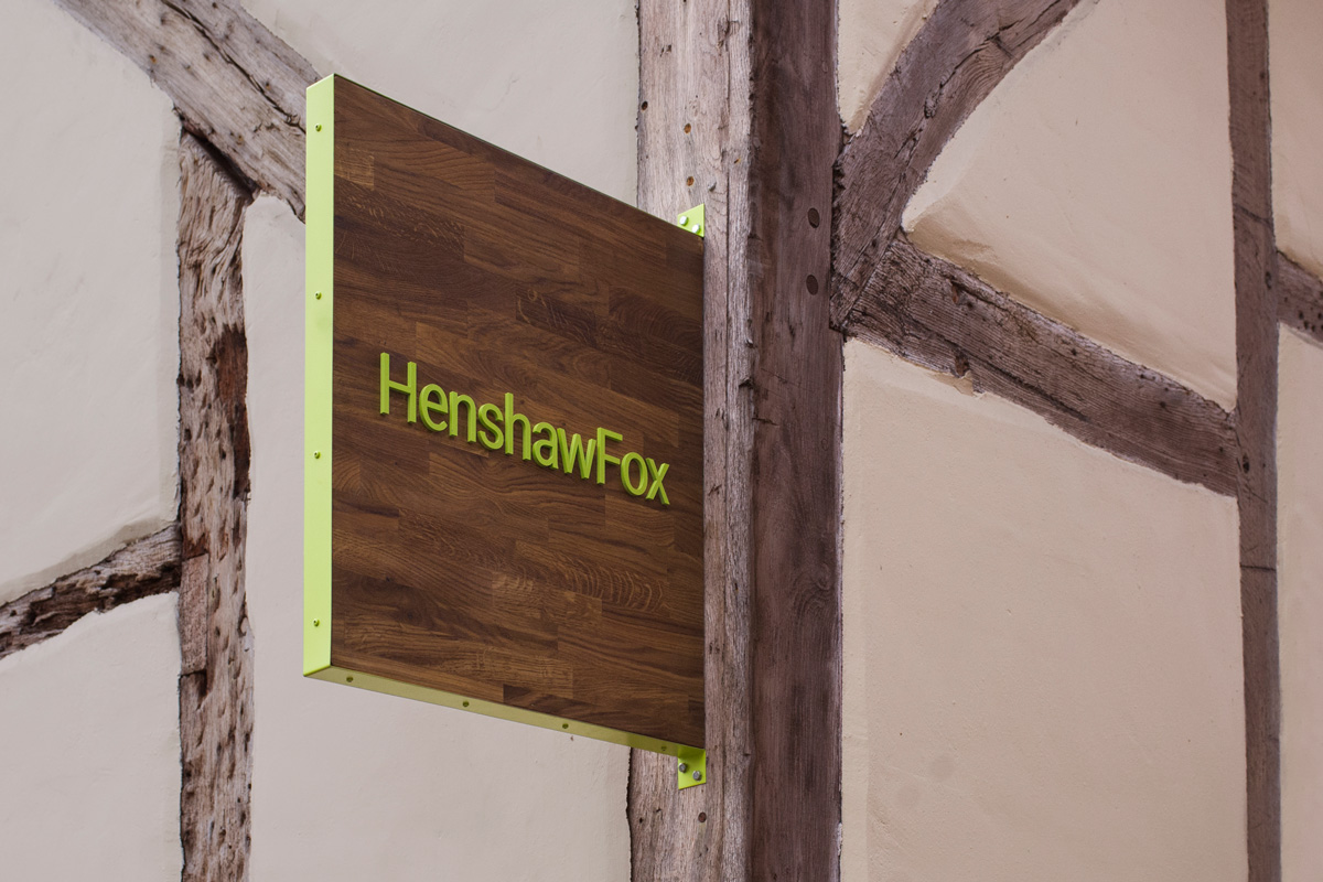
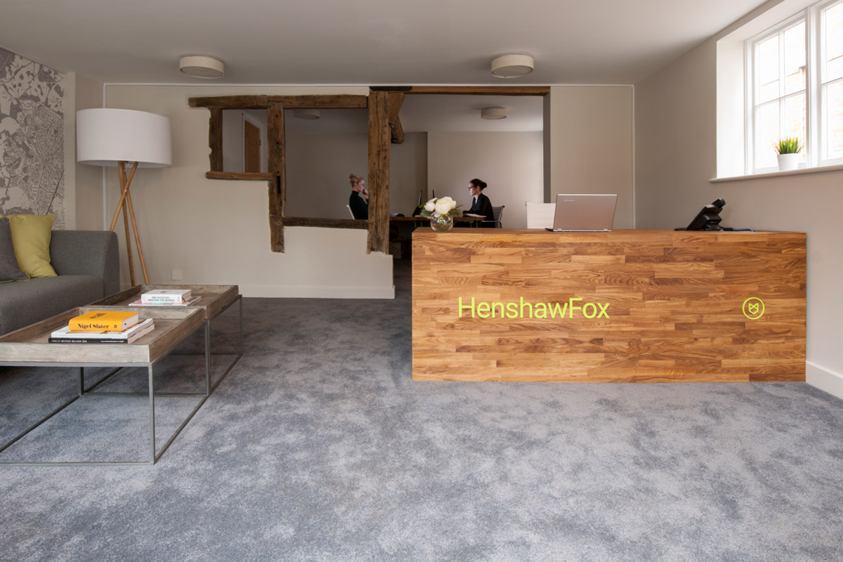
Parent’s solution finds a nice balance between the traditional and conservative, and a smart professionalism and modernity. This is expressed particularly well through interior design, which takes the very distinctive worn wood and irregular frame of the exterior, a distinct and memorable asset, and inside, employs precise lines across walls and furniture. There is a connection between building history and its recent renovation through exposed beams, the colour and materials of its furnishing and the extensive use of wood, but also through its visual identity.
Although the identity does not have the bold and expressive character of say Fox Real Estate by Parallax, it still draws a distinctive and contemporary quality from what can be a conservative and traditional industry.
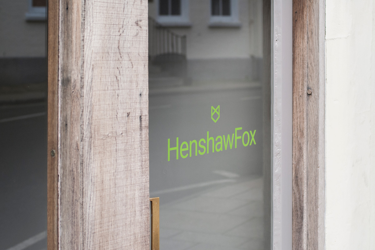
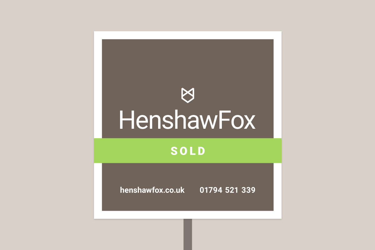
This really comes through in the choice of Roboto, a well-spaced and sensible sans-serif, the thoroughly current geometric and reductive line art fox, the pairing of a bright green and an aged wood colour, and the contrast of natural grain and the precise lines of type and logo within the context of signage, a particular highlight.

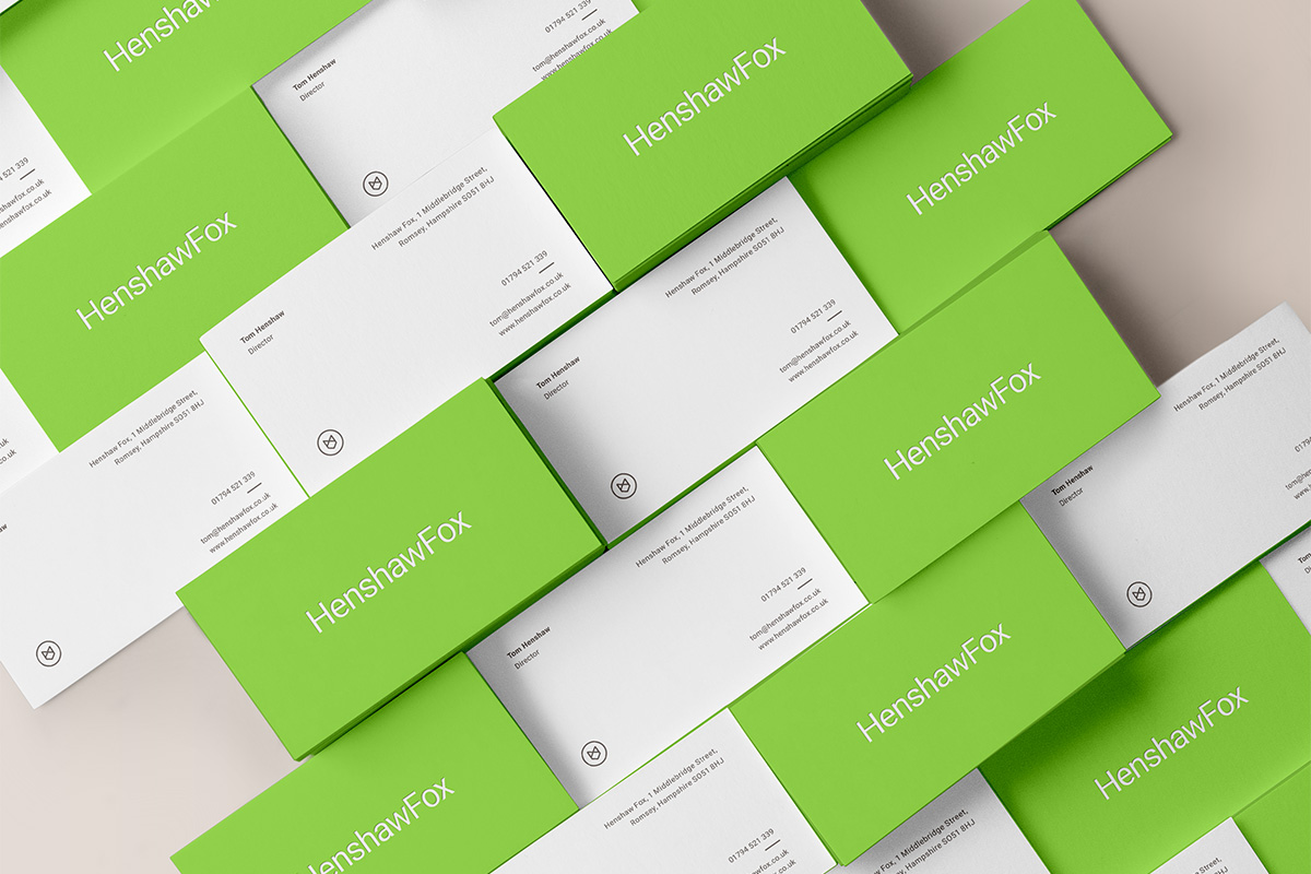
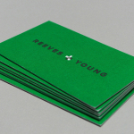
Business cards are bright and distinctive, perhaps a little adventurous with type size, but with a spacious and contemporary layout with a familiar and reassuringly professional quality.
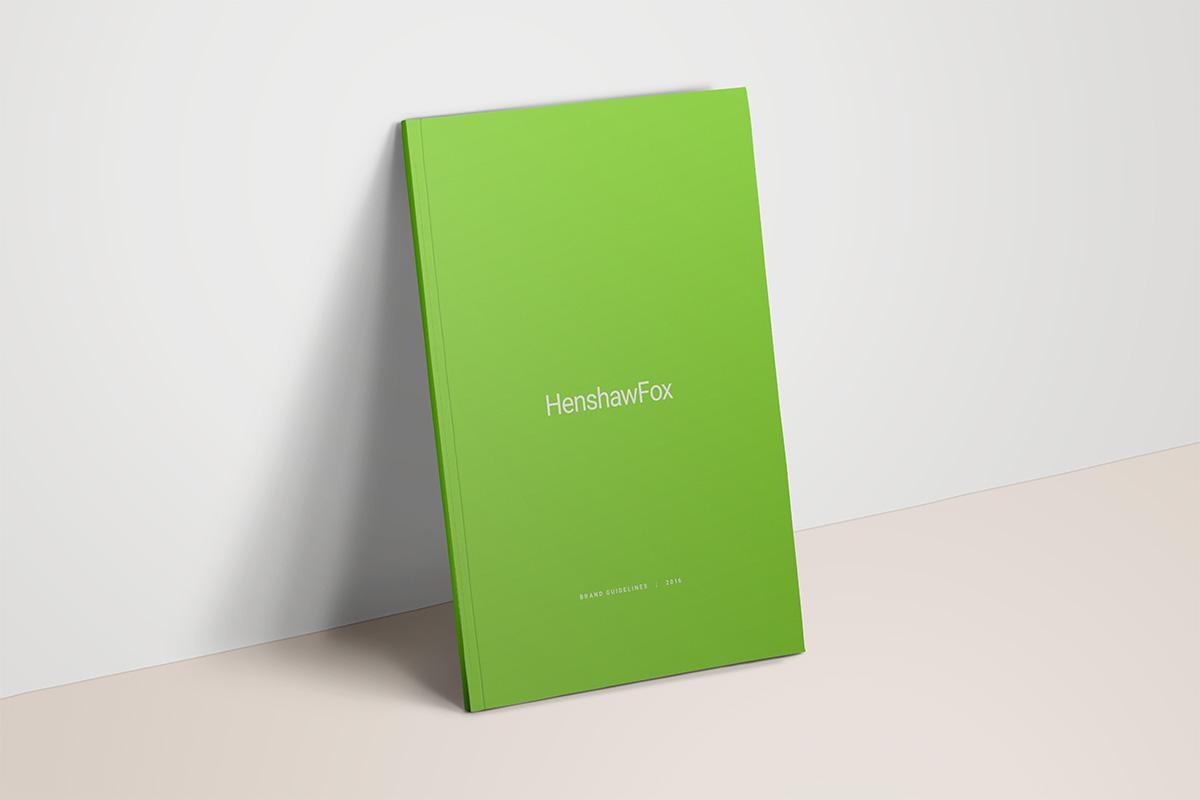
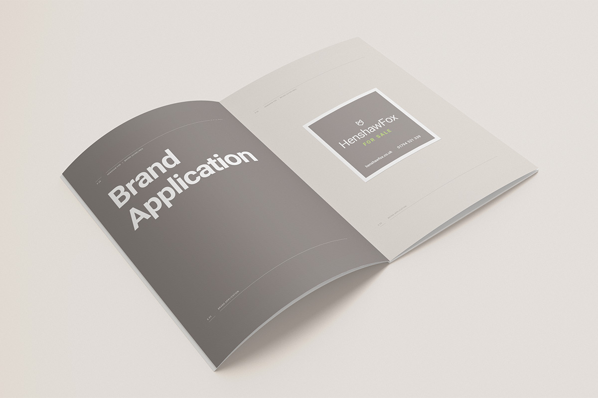
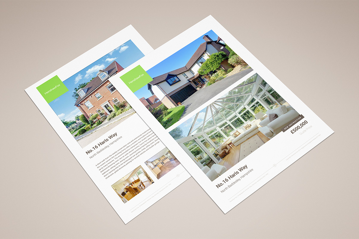
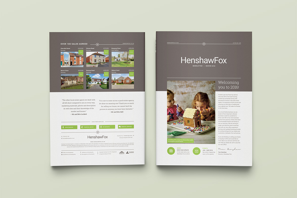
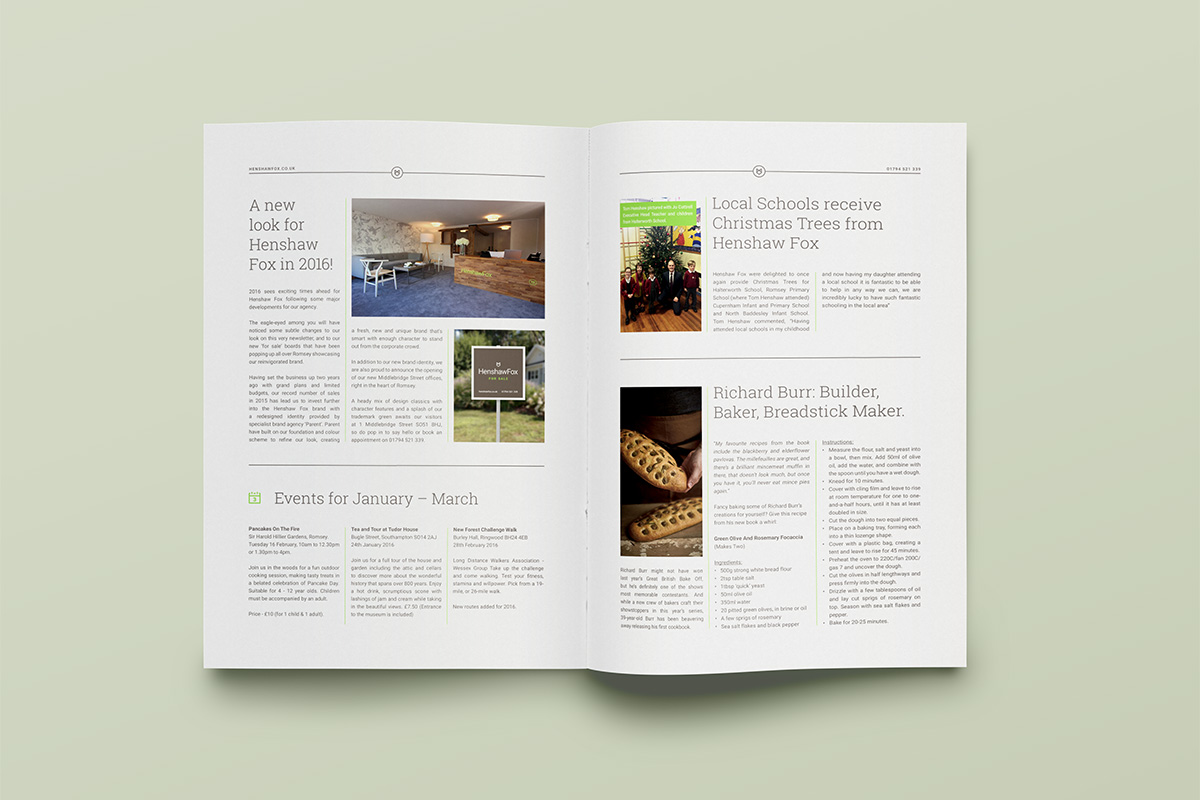
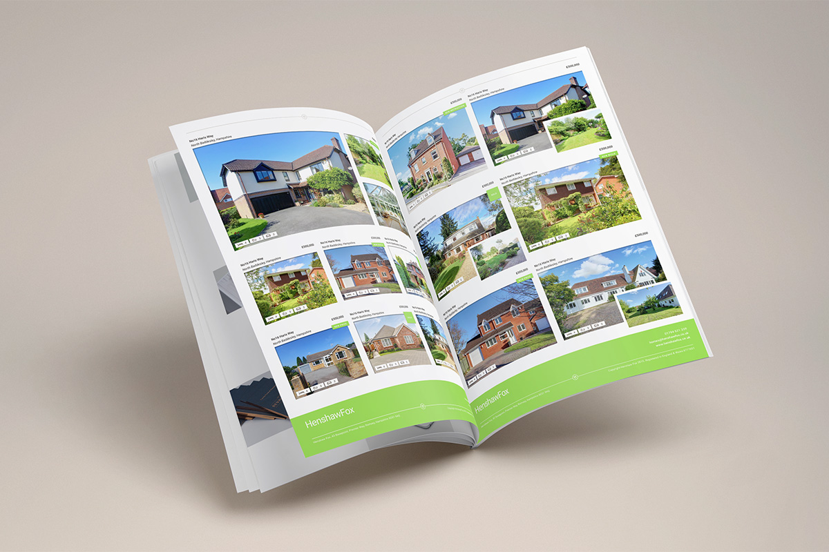
In print, convention and conservatism dominates but is sensitive to the expectations of the market and the nature of the properties. These are not modernistic wall-to-wall ceiling-to-ceiling glass boxes, but large family homes. Think warmth, ample room, brick and conservatories. As such, brochures are straightforward, well-structured, clear and concise, with layouts that are varied yet cohesive, with plenty of space between images and copy. The colour palette is effectively used to give identity to property sheets and internal pages where type is less character and more efficient. The website works with all of these assets, and although colour and logotype provide continuity, it does not appear as functional or as well-resolved.
BP&O looks to bring a variety of projects to the forefront. It is easy to forget that amongst the modernistic and minimal favoured by the design press there are some solid, well-thought out work being produced. Here, Parent’s approach to HenshawFox is not particularly challenging but it is reassuring, professional and grounded in very clear communicative intentions. There is a nice use of contrast, some lovely signage, a neat logo and a connection made between identity and office that secures character and distinction. More from Parent on BP&O.
Design: Parent. Opinion: Richard Baird. Fonts Used: Roboto.
