Kimski by Franklyn
Opinion by Richard Baird Posted 12 August 2016
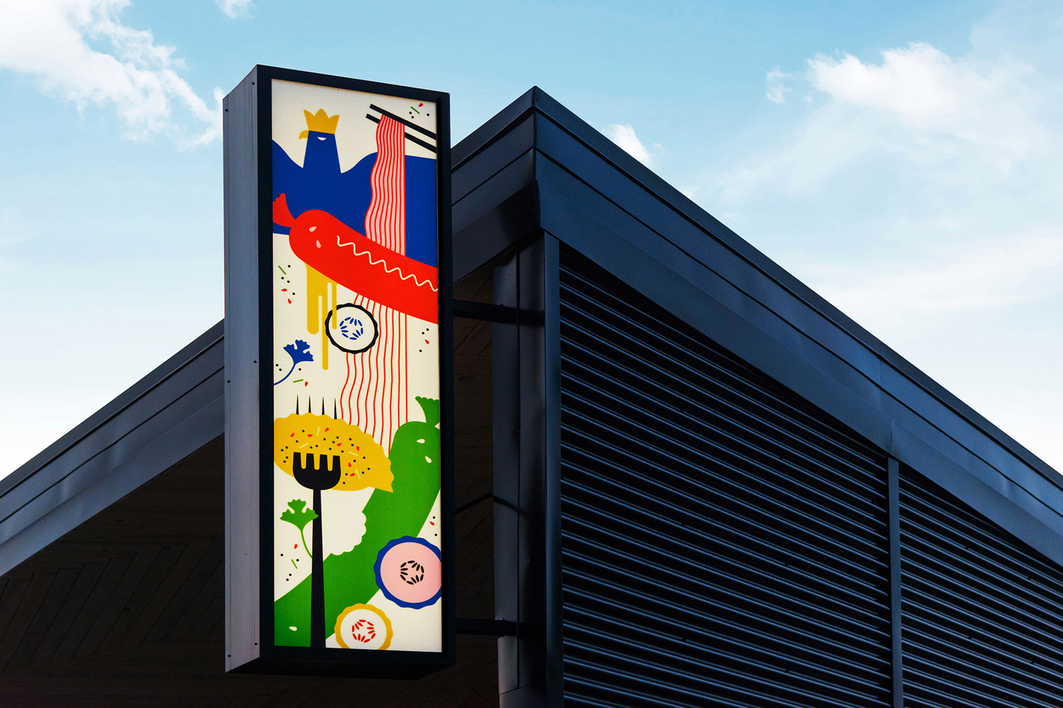
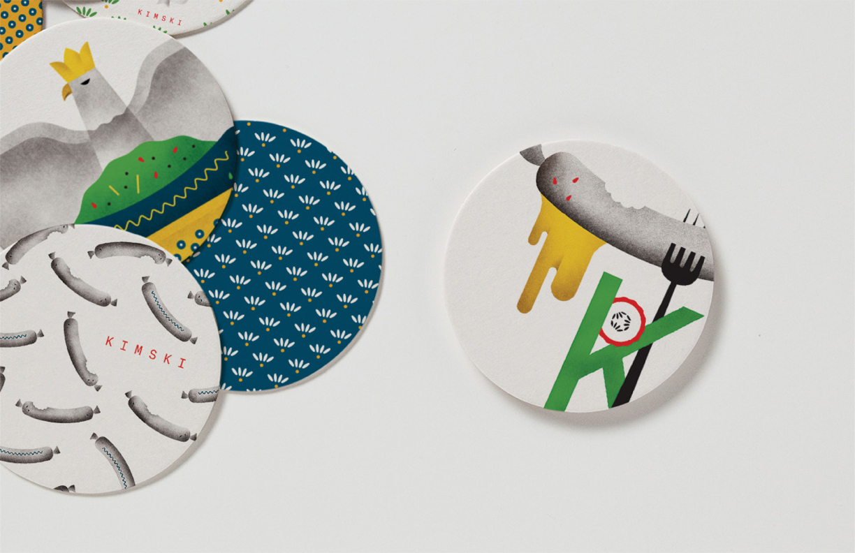
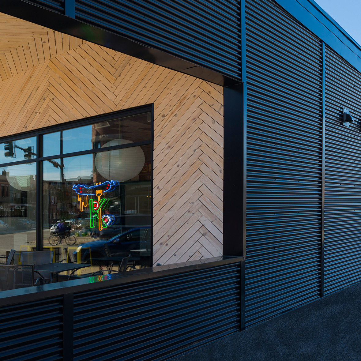
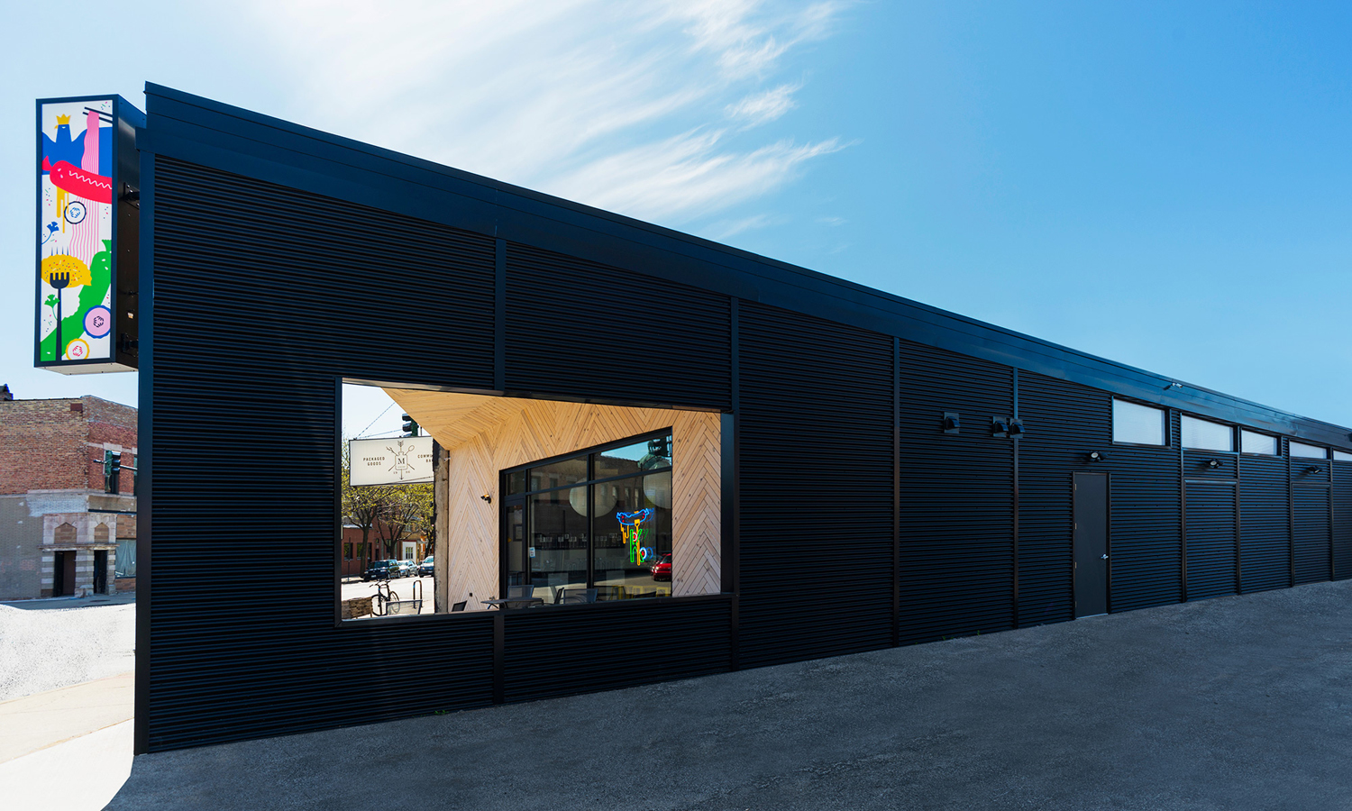
Kimski is a Korean-Polish street food restaurant, created by Ed Marszewski and chef Won Kim, located in the Bridgeport area of Chicago. The restaurant has a distinctive interior of geometric wood panelling, bright yellow stools, utilitarian booth seating, wood panelled ceiling and concrete floor with a warehouse quality in its space, shape and box-like exterior. In contrast, Kimski’s brand identity, developed by New York graphic design studio Franklyn and informed by the mash-up of culture, is a full of illustrative flourish, colour and character. This runs across menus, coasters, business cards and t-shirts, and punctuates dark exterior as backlit signage.
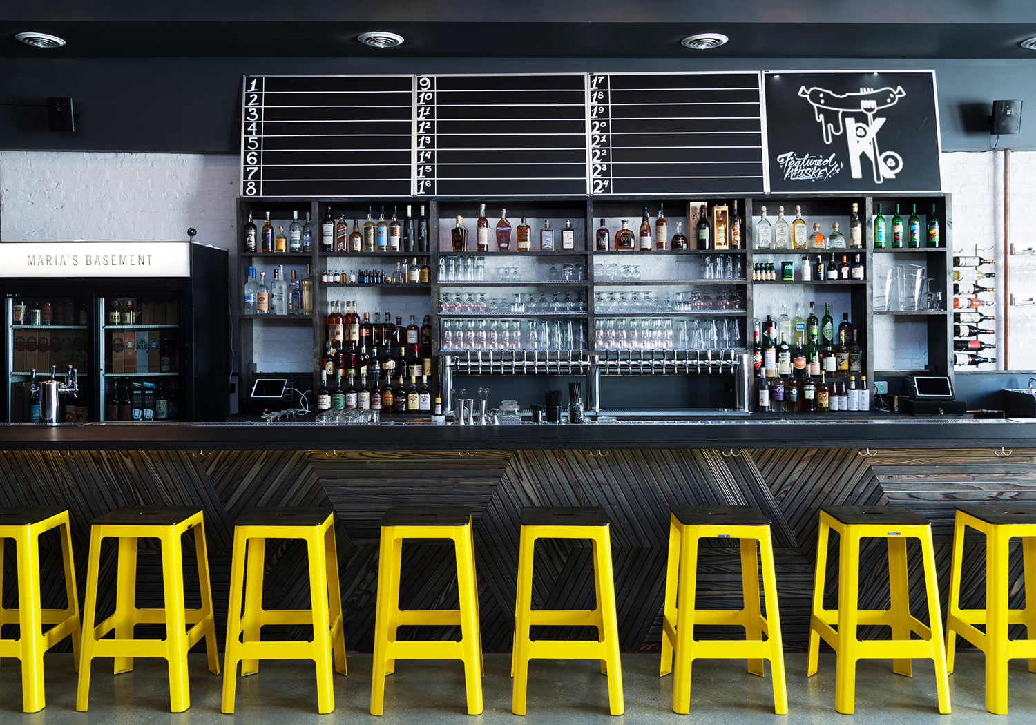

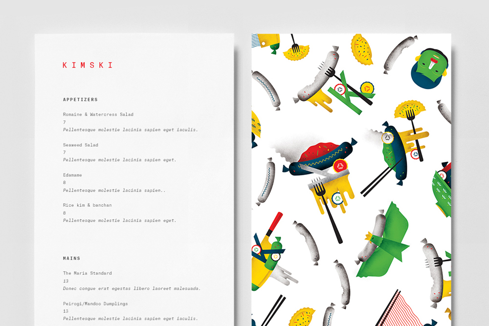
Although only a small part, the utility of some of Kimski’s interior surfaces and furnishings continues through to the mechanical monospaced nature of its logotype and the typography and typesetting of menus and business cards. Like the duality of Kimski’s dishes, typography forms one part of a two-part identity system, with the second being, in stark contrast, an abundance of idiosyncratic illustration. These themselves also and appropriately play up the unusual fusion qualities of the restaurant’s menu, which includes Polish sausages with kimchi sauerkraut and pierogi-potsticker, and, as described by Franklyn introduce an element of “graphic weirdness”.

Although the mash-up of two cultures is not unusual, fusion food has been around for a while, Franklyn benefitted from the unique meeting of two very different cultures and made the most of this with an unusual collision of illustrative styles.
Heavy forms and fine lines, reduction and detail, a strong sense of the geometric and the liner, texture and shading, space and image, a curious combination of colour and a mix of loose pattern and the more structured secure distinction, brand character rooted in its menu, and visual variety in a way that is playful but fairly sophisticated. These work well as flat panels in print, backlit and as neon signage, and on both black and white backgrounds.
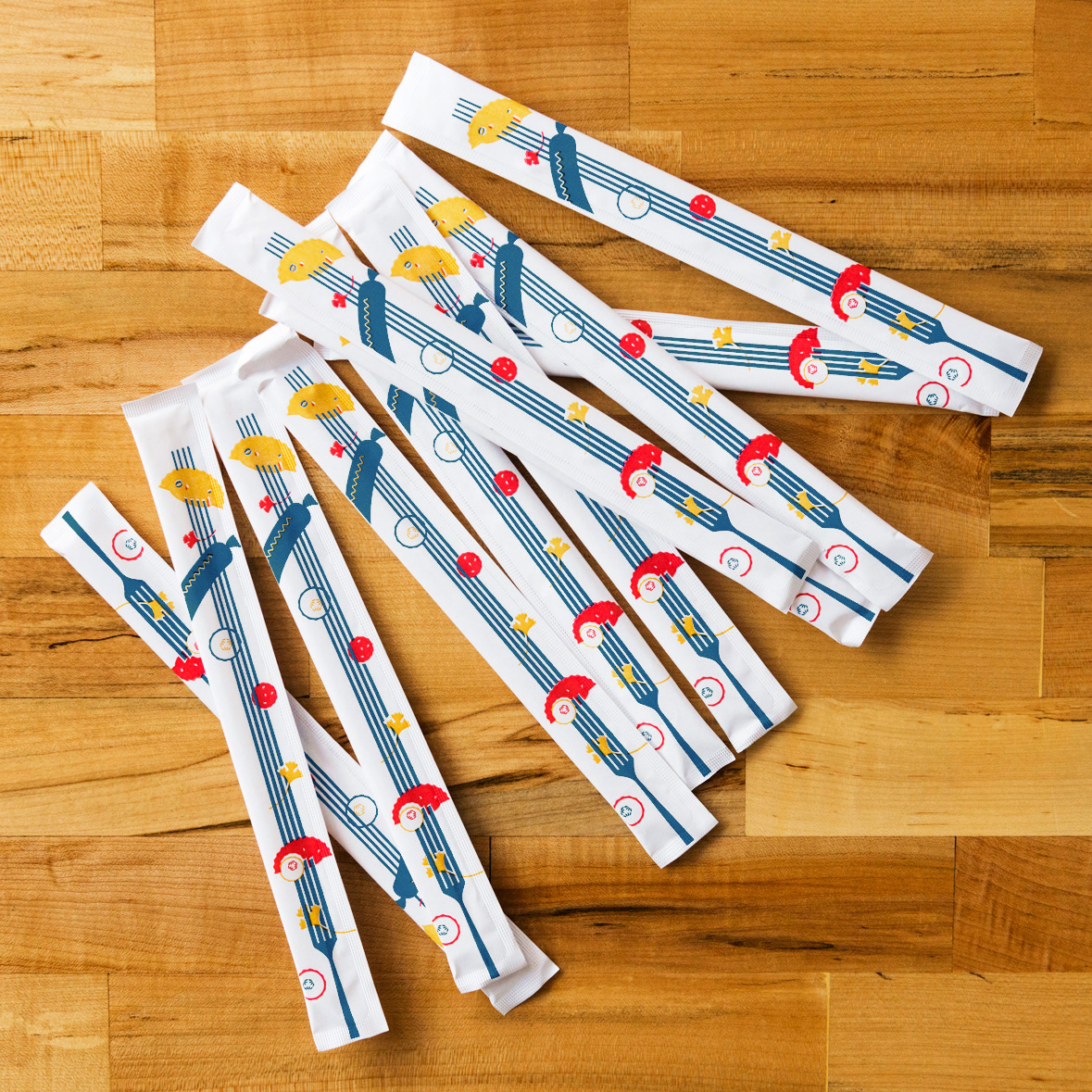
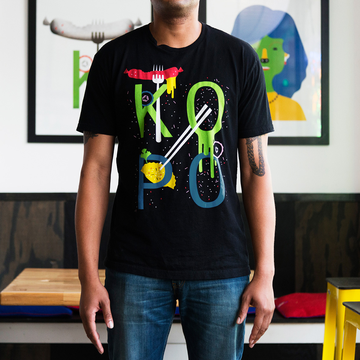
Highlights include the KO PO t-shirt, which really shows how well illustration works on black, the way illustration has been translated into neon signage without the loss of its distinctive character, a testament to the use of form, the long forks on the sides of chopstick packaging, and the tall exterior signage that punctuates dark exterior structure with colour, shunning the convention for logo.

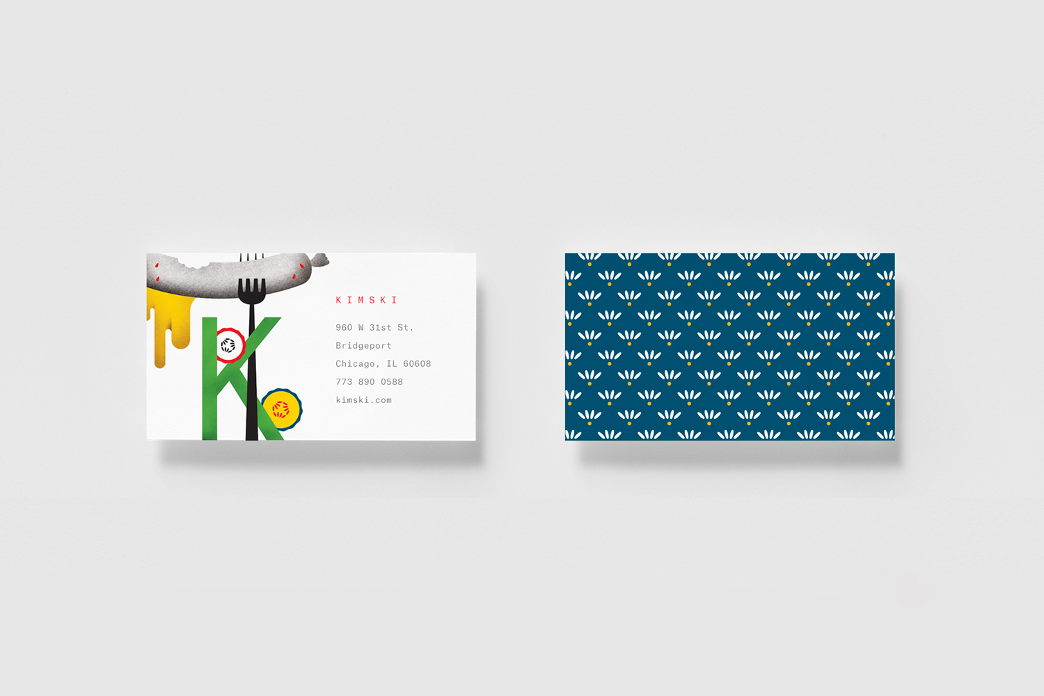
There is bags of character caught within illustration. There are references to street culture, contemporary graphic arts, and the East meeting the West. The iconographic sits alongside the literal and there is a pleasant contrast of colour and form. Steam and dripping sauce provides motion and direction, as does the irregular coverage across the menus. These are all effectively drawn out through the use of plenty of weight space and the utility and consistency of type. More from Franklyn on BP&O.
Design: Franklyn. Opinion: Richard Baird.
