Moi Helsinki by Bond
Opinion by Richard Baird Posted 20 September 2016
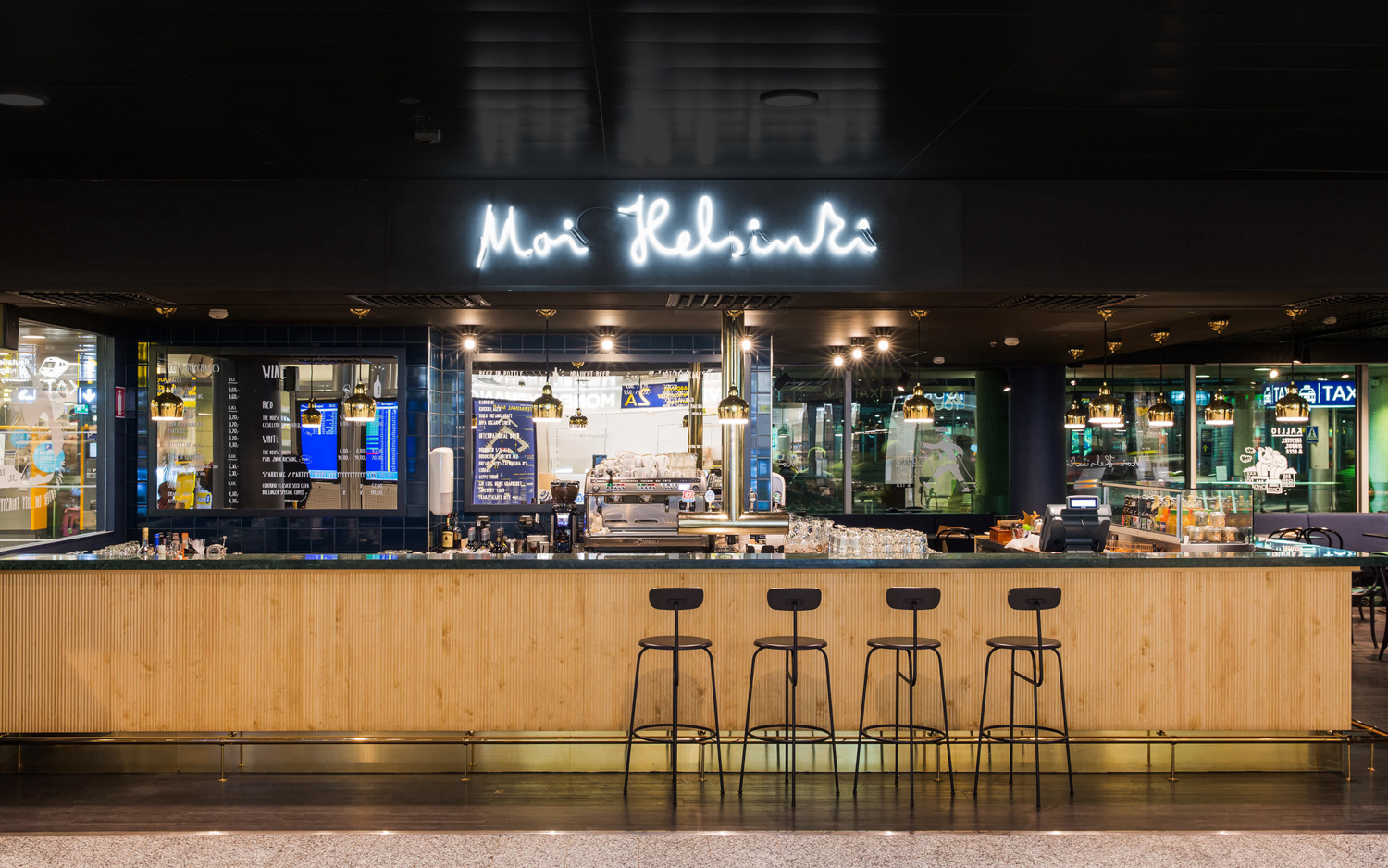
Moi Helsinki welcomes visitors to the Finnish city of Helsinki, and offers a place to relax after a long journey, with an extensive menu of beers and snacks from its location in the arrivals lobby at Helsinki-Vantaa Airport.
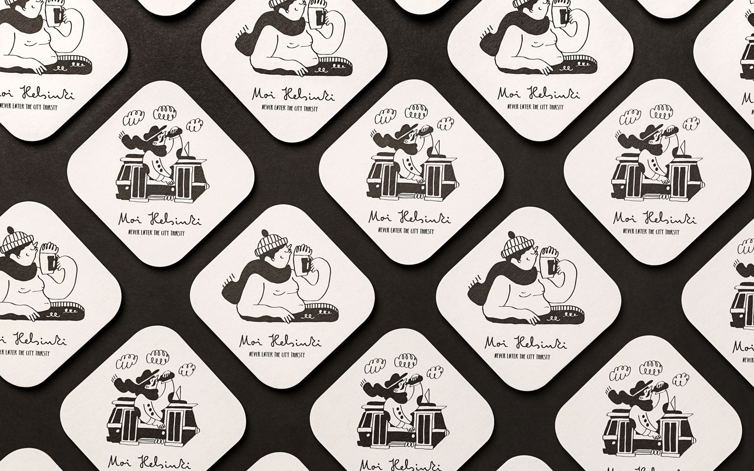
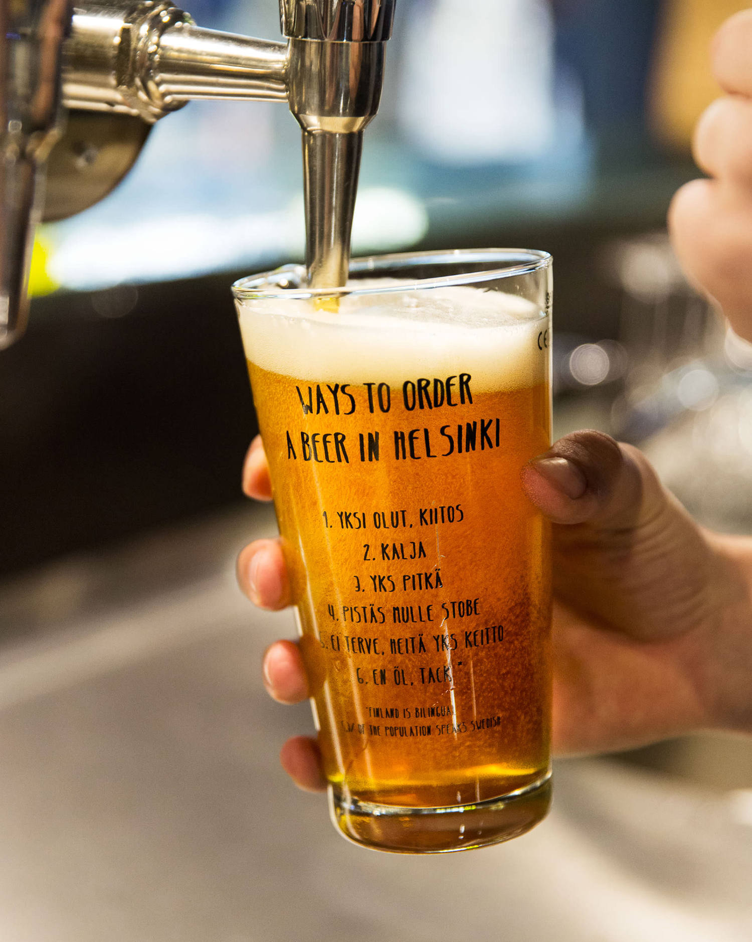
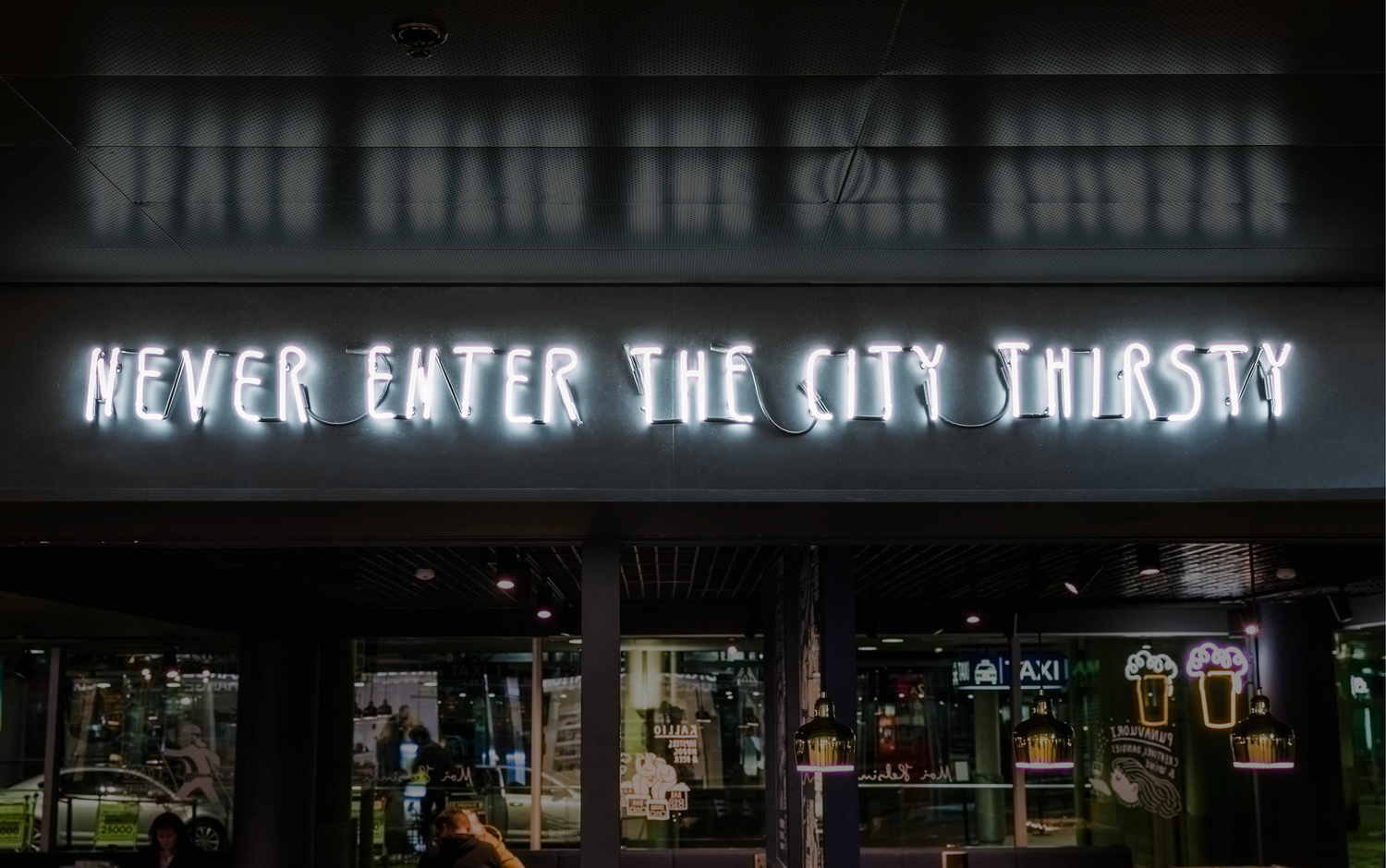
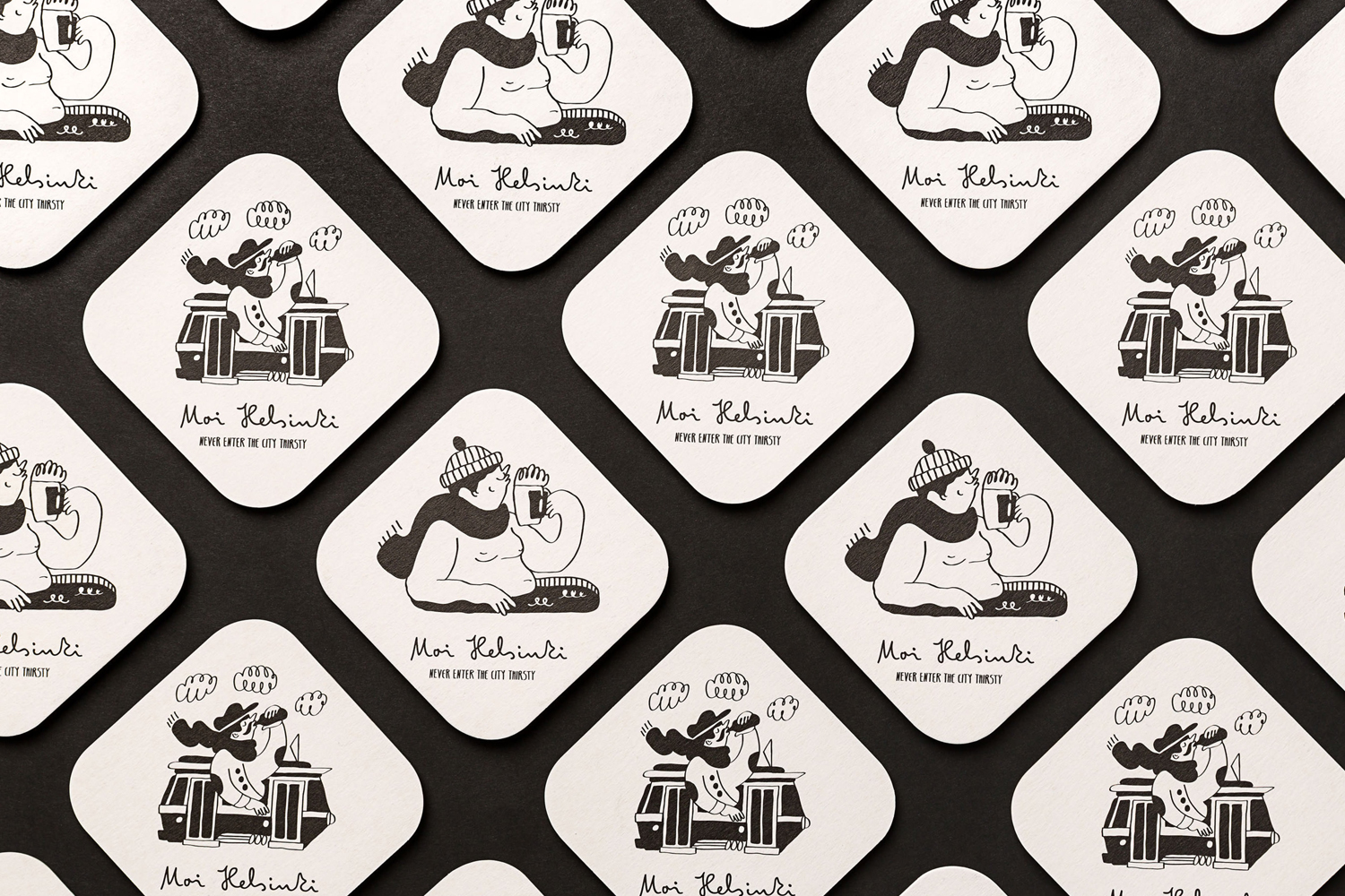
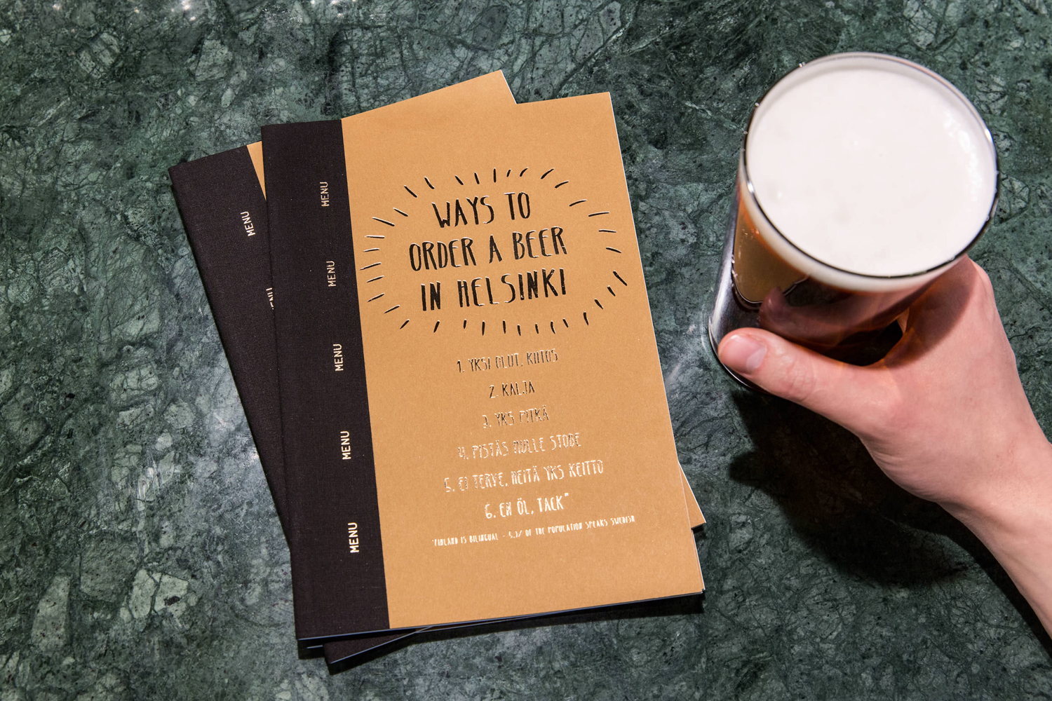
The bar features an interior design of light wood and bright neon signage, alongside dark walls, furniture and tiles. Where there are moments of utility in form and furnishing, brand identity, through lettering and illustration, offers something in the way of the personable with a strong sense of place. This extends across interior graphics, menus, branded beer glasses and coasters, all designed by local studio Bond.
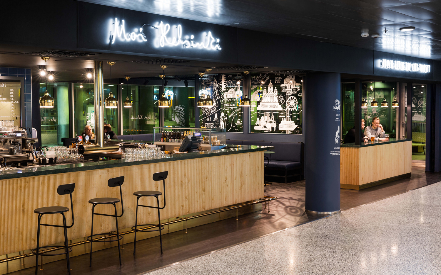
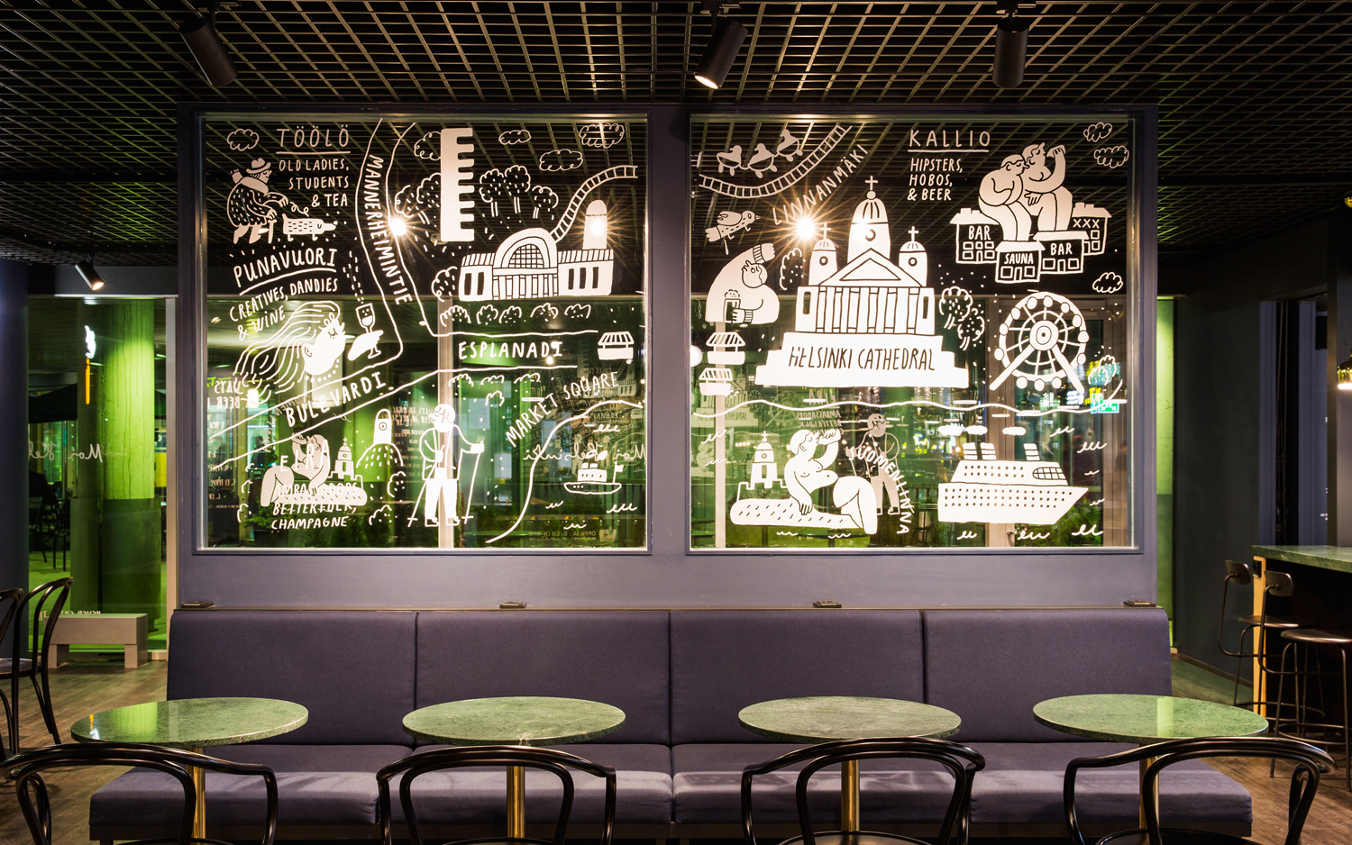
Moi Helsinki has a distinctive interior for an airport. Its dark purple walls and upholstery, green marble table surfaces, bentwood chairs and the more utilitarian bar stools exist somewhere between European cafe, bar and lounge. It is distinctive and cozy, but aside from the lighter woods, not particularly Scandinavian, or Finnish. Brand identity works to introduce this through the content of illustration and lettering. These lend the bar a stronger sense of place, and offer an introduction to the city with plenty of character.
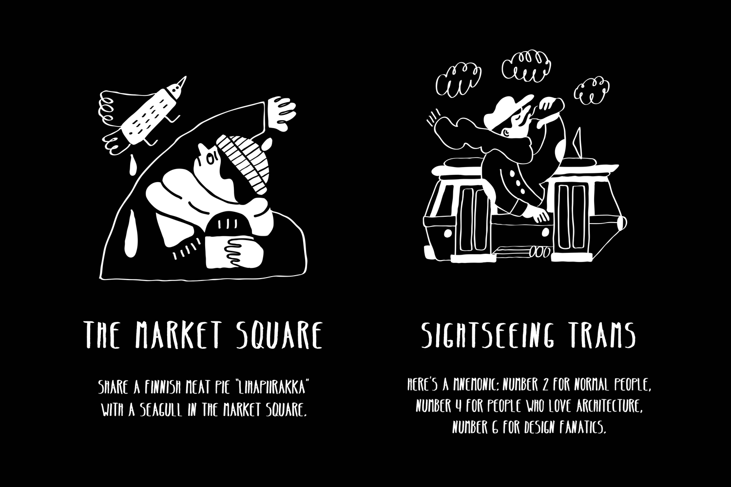
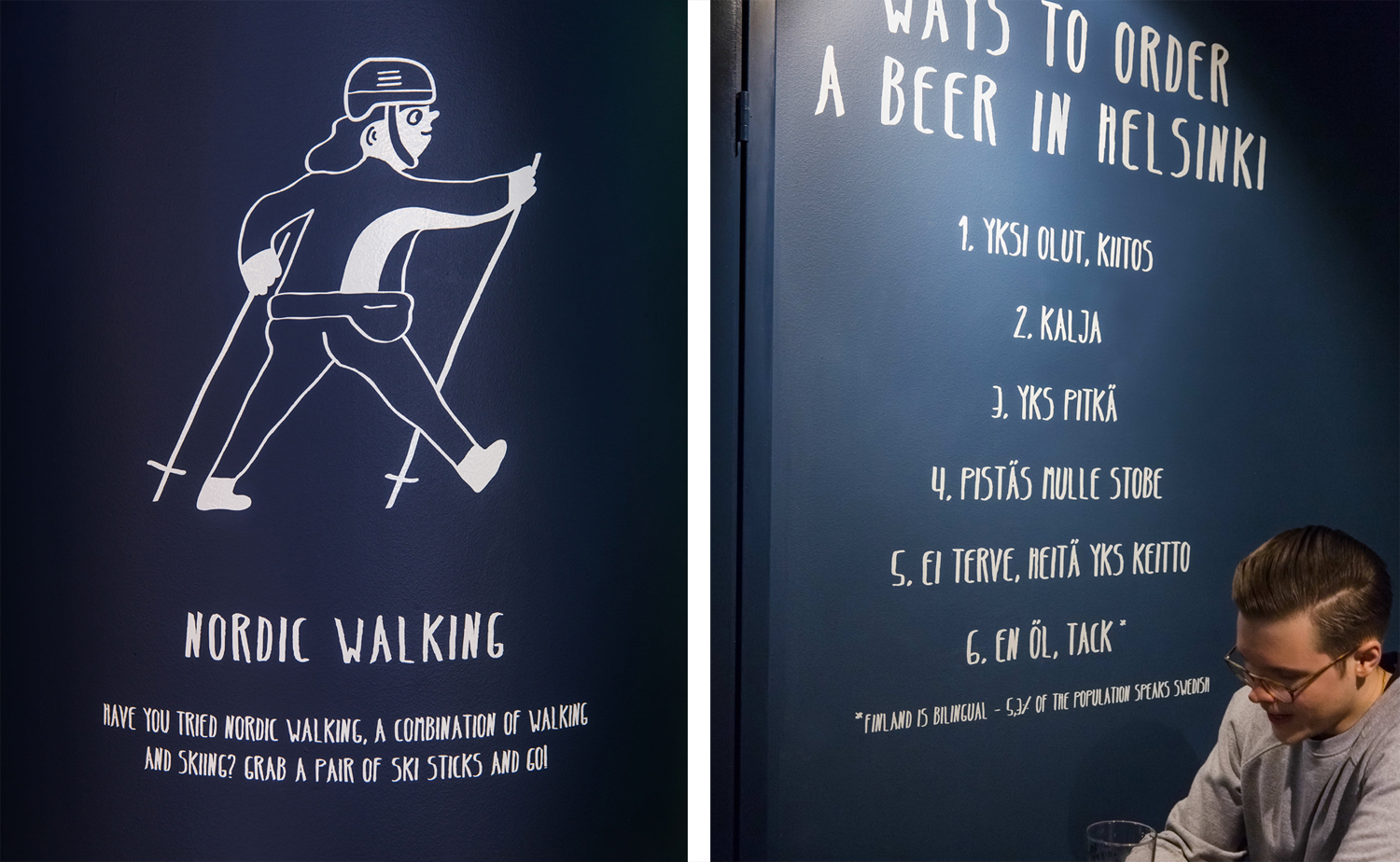
The approach to lettering is familiar but well-drawn with a strong sense of the personable, which illustration also shares in its loose irregular lines. Character work is idiosyncratic, often amusing in content. Both lettering and illustration are worked together well, applied as interior graphics, across menus and beer mats, with a youthful conviviality. These do a good job of creating an unmistakable continuity between space and printed assets with plenty of variety in lettering and illustration to keep it interesting and the city appear bustling.
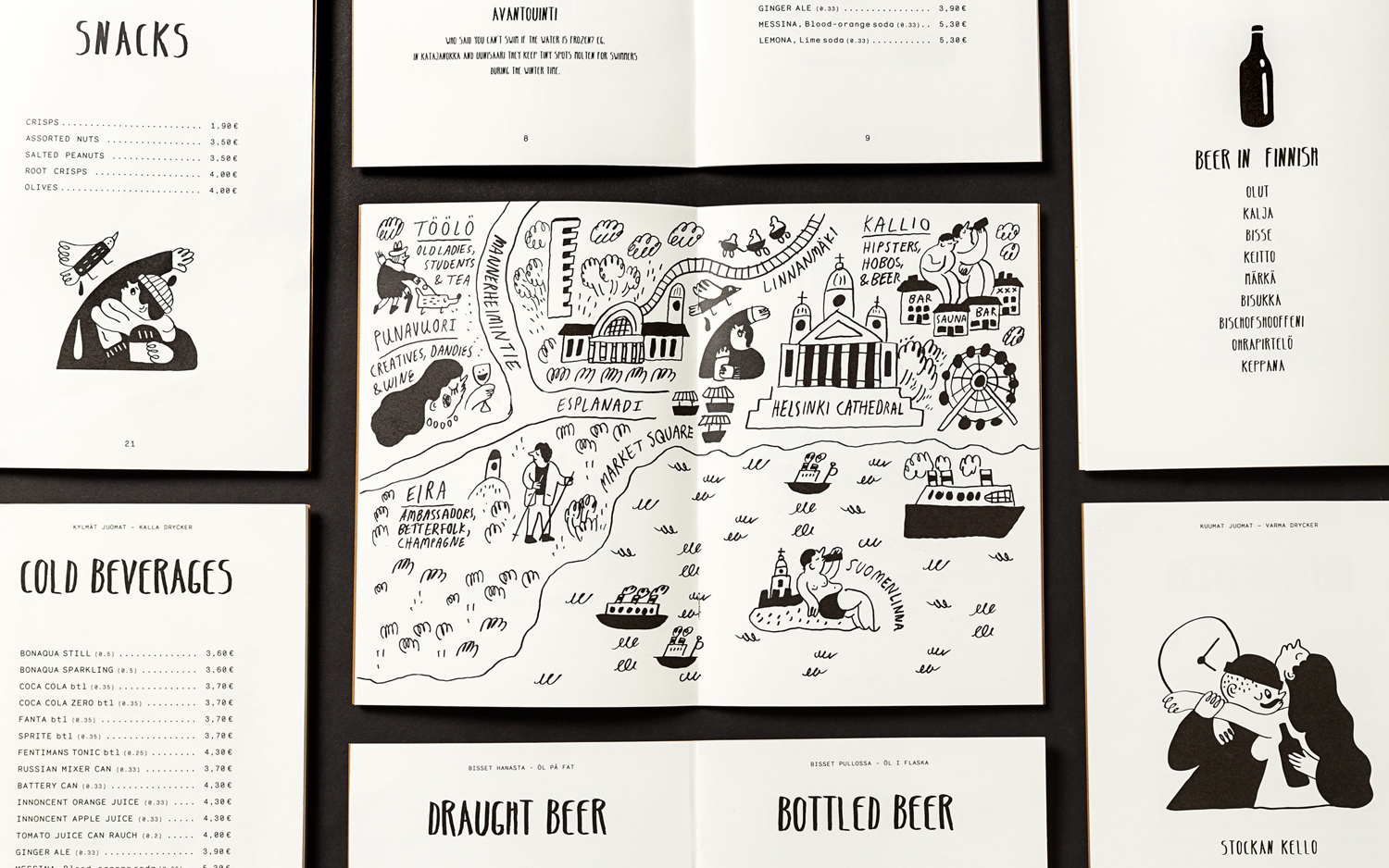
There are some nice ideas rolled into the work. These include how to order a beer in Finnish, and a guide to the best tram lines to take for people interested in architecture and design. These run across beer glasses, interior graphics and menus, but would have been nice implemented over something that could have been taken away like a beer mat. Other highlights include the contrast of gold block foiled hand lettering over an unbleached board, hand lettering as fluorescent tubes and the way illustration sits well within the beer mats.
Brand identity is clearly well-intentioned in its lively and personable tone, the way it is rooted in a sense of place and its visual variety, while interior is cozy and more period in its furnishing. Contrast is an effective tool, and it is clearly present here in the tone of interior and that of brand identity, however, it is difficult to really shake that sense of a slight disconnect, with identity filling in for what the interior is missing. More from Bond on BP&O.
Design: Bond. Opinion: Richard Baird.
