Fonts in Use: Apercu
Matheson Food Company by Wedge
If nostalgia is a powerful force, arguably ‘fauxstalgia’ – that sense of longing and yearning for something that we never actually experienced – is even more so. Fauxstalgia isn’t the same as trend cycles – the baffling realisation that Gen Z is suddenly, unironically, into Nu Metal, for instance – it’s an internal sensation rather than an external observation. It’s...
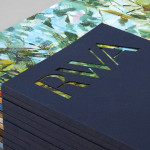
Rare Harvest by Marx Design
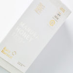
The True Honey Company (TTHC) dedicates itself to the production of mānuka honey, a monofloral variety produced in Australia and New Zealand from the nectar of the mānuka tree. It has a unique colour and texture and a high level of dietary Methyglyoxal, an organic compound with antibacterial and antiviral properties. With a price range starting at 60.00AUD and rising to 230.00AUD per jar,...
Åhléns by Happy FB
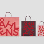
Åhléns began in 1899 as a small mail-order business. Aside from it being one of the oldest it has also grown to become one of the largest retail chains in Sweden. By carefully collating a variety of items across brands and price categories, the retailer maintains its relevance today, understanding and responding to the many ways in which its customers...
Royal West of England Academy by Spy
Royal West of England Academy brings world-class visual art from around the world to Bristol. It is the city’s first art gallery, the UK’s only regional Royal Academy of Art, and is located in a grand Grade II listed building. RWA worked with London-based graphic design studio Spy to develop a visual identity that would feel relevant and engaging, and re-establish confidence...
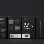
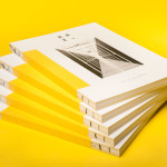
The True Honey Co. by Marx Design
The True Honey Company (TTHC) dedicates itself to the production of mānuka honey, a monofloral variety produced in Australia and New Zealand from the nectar of the mānuka tree. It has a unique colour and texture, and a high level of Dietary Methyglyoxal, an organic compound with antibacterial and antiviral properties. With a price range starting at 60.00AUD and rising to 230.00AUD per jar,...
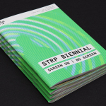
STRP Biennial 2015 by Raw Color
STRP brings together art, technology and experimental pop culture, and connects these to a broad audience, and through its light art, interactive art and robotic performances, lectures, workshops, music and film events, offers a glimpse into the future. This culminates with the STRP Biennial, an indoor art and technology festival that provides visitors with an opportunity to experience the extent to...
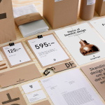
Designtorget by Kurppa Hosk
Designtorget is a Swedish design store and brand founded by architect Jerry Hellström in 1993 with the intention of making the very best contemporary furniture, arts and design from across the country available to the mass market. It now has 16 stores throughout Norway and Sweden and a broad catalogue of functional, high-quality products, selected by jury, produced by both unknown...
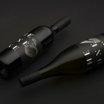
The Bone Line by Inhouse
The Bone Line is a New Zealand winery with a name that references the K—T Boundary, a thin band that runs close to The Bone Line’s location in the Waipara Valley, and that marks the end of the Mesozoic Era and the extinction of the dinosaurs. Auckland based graphic design studio Inhouse worked with the winery to establish a distinctive packaging and identity treatment. Like...
Folk by IYA Studio
Folk is a British contemporary menswear, womenswear and footwear brand, founded in 2001, with stores across London, one in Amsterdam and collections that are stocked internationally. Folk describes its pieces as simple everyday wear with subtle, innovative and playful detailing with a focus on custom fabrics and unique trims. These values are reflected throughout its brand identity, created by IYA Studio over the...
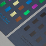
Raiffeisen Rechenzentrum by Moodley
The Raiffeisen Rechenzentrum is a customised IT infrastructure service provider and subsidiary of Raiffeisen Landesbank with a modern, ‘high availability’ and maximum security data centre located in Austria. Design agency Moodley recently developed RRZ’s brand identity—which included a logo, business cards, brochure and website—based around a single sans-serif, a contrast of humanistic and technological imagery and a white, black and bright...