Richard Baird
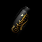
Carlsberg Black Gold by Kontrapunkt
Carlsberg is a Danish beer brand founded in 1847 by J.C. Jacobsen. It is part of the Carlsberg Group portfolio which also includes Tuborg, Kronenbourg and Somersby cider, as well as Carlsberg Export and Carlsberg Black Gold. Carlsberg has a significant heritage. And, like many other beer brands, has largely conveyed this using the visual language and associated legacy of the beer...
Kristin Jarmund Architects by Snøhetta
Kristin Jarmund Architects is an oslo-based architectural studio with a design philosophy that is focused on using a simplicity of form and a clarity of purpose to address complex problems, while at the same time, allowing for a contextual and human sensitivity. Reduction, as well as the duality inherent to the studio’s work, was the founding principles of their new...
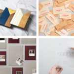
BP&O Collections — Material Thinking
A collection of brand identity and packaging design projects published on BP&O that feature a distinctive material component, be that in external shape or internal structure, choice of substrate or print finish. This post includes work by Bibliothèque, Bedow and Mucho, and covers a variety of print finishes, material choices and production techniques. Although many of the featured projects could be described as being stylistically...
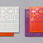
Highlights by Studio fnt
Highlights is an exhibition of works from French contemporary art museum The Collection of the Fondation Cartier pour l’art contemporain at the Seoul Museum of Art (SeMA). The exhibition runs from May 30th to August 15, 2017, features work by artists such as Ron Mueck, David Lynch and Sarah Sze, and also includes commissioned pieces and major artworks by Korean artists. Highlights is curated...
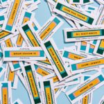
June’s by Föda
June’s is a cafe and bar located on the corner of South Congress Avenue, Austin, Texas. It offers breakfast, brunch, and grab-and-go pastries and coffee throughout the morning, and has an all day bistro menu that is served late into the evenings. The bistro menu is complemented by a changing wine and bar program managed by Master Sommelier June Rodil. June’s...
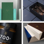
BP&O Collections — Modern Luxury
A continually updated collection of some of the best brand identity and packaging design work for luxury products and services, reviewed and published on BP&O. This post features work by Marx Design, UMA and Socio Design, and covers confectionery and cosmetic brands, fashion labels, apartments, resorts, and restaurants. These show how a strong concept and unusual structures can elevate the perception of...

REF by Kurppa Hosk
REF is an environmentally conscientious Swedish hair care brand with a range of products that are made from high quality organic ingredients. With a desire to enter the international market of the US and further into the Nordic regions, both dominated by well-established FMCG, Scandinavian design studio Kurppa Hosk were commissioned to rejuvenate REF’s visual identity. This included packaging design, art...
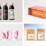
BP&O Collections — Coffee
A continually updated collection of some of the best brand identity, packaging and graphic design work for coffee shops, roasters and subscription services, reviewed and published on BP&O. This post features work by Bond, Triboro and Paul Belford Ltd, and covers packaging and coffee cups projects, and extends to broader brand identity programmes that include print communications, menus, signage and interior...
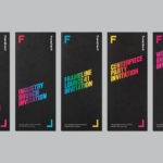
Frameline 41 by Mucho
Frameline is an American nonprofit arts organisation and the world’s longest running LGBTQ film festival. Frameline continues its mission, since its founding in 1977, to change the world through the power of gay cinema, and to connect filmmakers with audiences locally and internationally. Graphic design studio Mucho worked with Frameline on its visual identity and campaigns for its 40th and 41st LGBTQ...
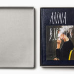
Anna Bjerger Book by Bedow
Anna Bjerger is a Swedish artist, born 1973 in Skallsjö, now living and working in Älmhult. Through a process of reconfiguring found imagery, bought from secondhand stores and garage sales, by transforming their context and reordering hierarchy with paint and a focus on dimension, Anna intends to intensify experience and create new narratives. Swedish design studio Bedow were commissioned to design...
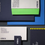
Enea by Clase bcn
Enea is a contemporary furniture manufacturer, located in Spain’s Basque Country, collaborating with respected designers such as Josep Lluscá, Gabriel Teixidó and the trio Lievore Alhterr Molina. Enea has a distinctive catalogue of versatile, comfortable and durable products, developed for both the private and commercial markets, with unique character in their play with form, colour and texture. With a desire to differentiate...
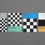
Endgame: Duchamp, Chess, and the Avant-Garde by Hey
Endgame: Duchamp, Chess, and the Avant-Garde was a temporary exhibition that took place at Barcelona’s Fundació Joan Miró between October 2016 and January 2017. It was curated by Manuel Segade, explored the history of modern art through the lens of its relationship to chess, and featured a variety of works by 20th century artist. These included Marcel Duchamp’s La Partie d’échecs, Max Ernst’s...