Richard Baird
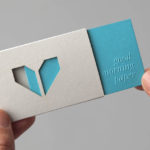
Minke by Atipo
Minke is a Spanish print production studio that favours ‘analogue splendour’ over mass manufacture, providing its clients with a variety of small-scale, mechanical and handcrafted processes. Their visual identity, developed by multidisciplinary design studio Atipo, reflects these services, processes and philosophy through a union of traditional and contemporary detail that exists across type, colour, material texture, print finish, pattern and die cut...

Massproductions by Britton Britton
Massproductions is a Stockholm-based furniture company – established in 2009 by designers Chris Martin and Magnus Elebäck – that develops ”high quality, tactile furniture in a modernist spirit’. The firm’s visual identity, developed by creative branding and communication agency Britton Britton, neatly mixes a structural, typographical authority with craft textures and confidently appropriates an upholstered colour palette of the past....
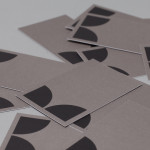
K2LD Architects by Studio Hi Ho
K2LD is a small Melbourne-based architecture and interior design firm with a project history that includes individual private homes, community precincts, multi-unit developments and large-scale commercial projects. The firm’s identity, an abstract, structural and modular amalgamation of initials (check the ideation animation here), uncoated materials and a monochromatic colour palette – developed by brand and communication studio Hi Ho – unapologetically embraces the established and reductionist cues of the industry....
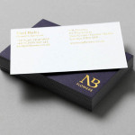
NB Flowers by Karoshi
NB Flowers is a florist – founded by Neil Birks and located at London’s New Covent Garden Market – that specialises in corporate and private events, delivering value through a combination of ‘beautiful flowers, creativity, and a personable service’. Multi-disciplinary design agency Karoshi were commissioned to ‘rebrand and reposition NB Flowers as one of London’s leading luxury event florists and capture the essence of the...
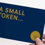
The Tokenhouse by Designers Anonymous
The Tokenhouse is a gastropub – run by hospitality brand Fuller’s – located on London’s Moorgate road. Designers Anonymous – the agency behind the branding of Fuller’s King’s Cross pub venture The Parcel Yard and fair-trade coffee range Brewer St. – developed a visual identity for the venue that appropriates 17th century history, gives it a contemporary vector treatment, a creative but cohesive diversity...

Madeleine Blanchfield by A Friend Of Mine
Madeleine Blanchfield is a Sydney-based architectural firm described by A Friend Of Mine, the design studio behind their new brand identity, as having a tactile and understated approach with an appreciation of light and detail. Qualities reflected through the subtle but tactile combination of material, print finish and ample space across the firm’s stationery....
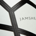
Jamsheed by Cloudy Co.
Melbourne-based design studio Cloudy Co. have recently developed the labels and visual identity for Yarra Valley boutique wine label Jamsheed, ‘named after a Persian king who according to ancient writings had a fondness for storing fresh grapes in jars, thus leading to the discovery of wine’. The packaging solution expands on the name and communicates a sense of bold flavour and craft through geometric, Persian pattern...
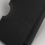
O Architecture by Heydays
O Architecture is a small, Lille-based multidisciplinary studio whose practices extend beyond traditional architectural services to include artistic installations, educational courses and editorial work. Their visual identity, ‘a solid circle with a disruption that creates a triangle reminiscent of an A’ – created by design agency Heydays – , unites the broad remit of the studio under a simple symbol with a revolving, holistic quality that...
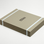
Milieu Property by Studio Hi Ho
According to Studio Hi Ho, the branding and communications partnership responsible for this project, Milieu Property is a Melbourne-based ‘boutique developer with an emphasis on creating spaces of influence’. The moniker ‘Milieu’ immediately positions the brand at the cerebral end of the property development spectrum. Indeed, for those without a thesaurus brain, the highfalutin’ vocabulary is even explained on the minimal...
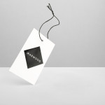
Marwood by Everything In Between
Marwood is London-based tie and neckwear brand founded in 2010. Its collections, handcrafted from British lace and cloth, are sold internationally to boutique stores such as Barneys New York, Tomorrowland Tokyo, Liberty London, and through online retailer Mr.Porter. Multi-disciplinary design studio Everything In Between (EIB) recently developed a new visual identity, label and packaging solution for Marwood that shares the tactile qualities of...
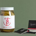
The Beaufort by The Company You Keep
Design agency The Company You Keep (TCYK) have recently finished working with bartender Dave Kerr on the naming, branding, collateral design and signage for The Beaufort, a themed dive bar located on Melbourne’s Rathdowne St. The agency’s visual identity solution, a combination of a quirky, well rendered, bespoke logo-type – built from unusual but original uppercase characters inspired by iron dock...
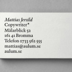
Mattias Jersild by BVD
Of all BVD’s recent projects, which includes their packaging for 7-Eleven – a blog favourite this and last week -, it is their work for Swedish copywriter Mattias Jersild that really stood out for me. It is an incredibly simple but wonderfully laid out, spaced and restrained solution that introduces variety through an interesting mix of lowercase, sentence case and uppercase typography set...