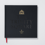
Ten Trinity Square by Pentagram
Ten Trinity Square is a super prime real estate project developed by the Chinese conglomerate Reignwood Group. It is made up of a private members club, residencies and a Four Seasons hotel, all set within the Port of London Authority building which is located at the centre of the city near the Tower of London and with views of the Thames....
Café Royal by Pentagram
Once recognised as having the greatest wine cellar in the world and understood to have introduced French gourmet food to London, Café Royal, located on Regent Street, has been described as being the place for the avante garde to meet and dine for over a century. This year, to coincide with its reopening and reposition as a luxury five-star hotel...
Folk by IYA Studio
Folk is a British contemporary menswear, womenswear and footwear brand, founded in 2001, with stores across London, one in Amsterdam and collections that are stocked internationally. Folk describes its pieces as simple everyday wear with subtle, innovative and playful detailing with a focus on custom fabrics and unique trims. These values are reflected throughout its brand identity, created by IYA Studio over the...
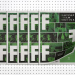
Flatpack Film Festival by Dot Dash
Flatpack is a film festival that sets up its projectors at interesting locations throughout the city of Birmingham during March and describes its events as a mixture of film, performance, contraption and surprises. Flatpack has been running annually for ten years whilst also developing year-round initiatives that include community archive projects, pedal-powered screenings, bespoke short film programmes, pub gigs and animation workshops. London...
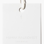
Minna Palmqvist by Bedow
Minna Palmqvist is described by Bedow, the studio behind her new visual identity as a “critical, Swedish fashion designer”. Following the completion of a masters degree at Stockholm’s Konstfack College of Arts in 2009 Minna launched her own label to further develop her ‘Intimately Social’ series, “an evolving constant challenging the traditional fashion seasons and exploring the obsession with the female body, by merging social...

Traveller Espresso Bar by TCYK
Traveller is the Melbourne based espresso bar of speciality coffee roaster and cafe operator Seven Seeds. Design agency The Company You Keep (TCYK) recently worked with Seven Seeds to develop a new visual identity solution for the Traveller that reflects an interior architecture of details such as ‘moulded plywood, vinyl and soft curves’ inspired by ‘the golden age of caravanning’, through period typography,...

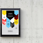
University of the Arts Helsinki by Bond
“The Finnish Academy of Fine Arts, Sibelius Academy and Theatre Academy Helsinki merged in the beginning of 2013 into the University of the Arts Helsinki. Bond created the complete branding solution for the new university. The strategy for the identity was to create a distinctive set of logotypes based on a common design language, and to introduce an anchor symbol...

Weekend by RoAndCo
Inspired by ‘cartoonish film titles from the 1980’s’, design agency RoAndCo recently developed the brand identity for Dallas coffee shop Weekend, an extension of their retail store “which has become a relaxing everyday haunt for vacationers”. Based around a tightly spaced Cooper Black logotype, a “minimal and refined typographic system” and a striking but restrained red and white colour palette, Ro&Co created a solution...
Platform by Pentagram
Platform is a not-for-profit organisation that aims to “increase the interest and participation of underrepresented groups in the fields of technology and entrepreneurship, with a particular focus on African-Americans, Latinos and women” and “to help influence and inspire the next generation of innovators, inventors and entrepreneurs” through its website, conferences and providing “access to current leaders and role models”. Platform’s visual identity, designed...
Insiders by Garbett
Insiders is the membership program of Sydney Opera House launched to nurture customer loyalty, increase market share and raise the frequency of attendance through priority booking, discounts, dress rehearsal ‘sneak peeks’ and invitations to meet staff and artists. Multidisciplinary design agency Garbett were commissioned to ‘evolve’ the Insiders visual identity, positioning it as a retail product with greater focus on communicating the value proposition for members,...
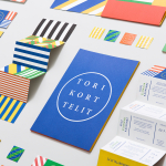
Torikorttelit by Kokoro & Moi
Torikorttelit is the old town district of Finland’s capital Helsinki. Its new visual identity, designed by Kokoro & Moi and based around bright colours, simple geometric patterns, a stacked typographic serif logo framed by a circle and paired with a modernist inspired secondary typeface neatly reflects the historic setting at the heart of a modern metropolis....

Cocolobo by Anagrama
Cocolobo is described by Anagrama – the multidisciplinary design agency behind their new visual identity – as a ‘high-end shopping boutique that caters exclusively to strong women with a confident and in vogue fashion sense’. For the name, Anagrama played with the patrons’ ‘characteristic duality’, with a ‘catchy and fun’ compounding of “Coco” (coconut in Spanish) and “lobo” (Spanish for...