The Very Best Packaging of 2018

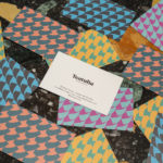
Strandgut – Vasas Flora Och Fauna by Bedow
Vasas Flora Och Fauna is a Finnish indie pop-group and trio of musicians. Their new album Strandgut is made up from eleven songs taken from the band’s first two albums, which were then re-recorded in German. This was released on both LP and CD by the record label Startracks. Swedish design studio Bedow worked with Vasas Flora Och Fauna to create...

Espelma by Commission
Espelma is a clean-burning natural wax candle company. They have an online store and have hosted pop-ups in London and New York. Each candle comes in a refillable glass vessel, designed by Espelma founders Clara and Claudia, and handmade on the Italian island of Murano. Espelma is distinguished by its mix of glass craft, distinctive colour and form, the clean-burning nature...

Heyday by Collins
Heyday is a range of 150 moderately-priced high-quality own-brand consumer tech products from American retailer Target and their first foray into the electronics and tech accessories sector. The range includes battery packs and chargers, cables, covers and wireless speakers amongst many other products. These share a form language that balances an everyday simplicity, robustness and utility with novelty and cheerfulness by...

Unfolded by Commission
Unfolded is a design and print festival that celebrates the creative work happening across Europe in the disciplines of design, printing and brand communication. This was held by and at The Gmund Paper Factory in Germany on the 9th November 2018. The event created a space for sharing ideas and fostering dialogue between creative individuals, providers of printing services, brand...
Teatulia by Here Design
Teatulia is a Bangladeshi single origin tea brand that recently moved into the UK market, opening a flagship store, tea shop and cocktail bar in London’s Covent Garden. It is a social enterprise creating jobs in a remote region of Bangladesh and has, so far, transformed 3,000 acres of barren land into an organic tea garden. Drawing on Teatulia’s single-source positioning—common...

Anton&Anton Kioski by Bond
Anton&Anton (A&A) is an alternative to and antithesis of the large supermarket chains. Staff are described as relaxed, smiley and proud. Their ranges (mostly) organic, some homecooked and also available online for home delivery. With a desire to express an approachable, playful yet credible positioning, and a need to develop a cohesive set of packaging and communications assets A&A worked...
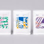
Felt Coffee by Studio fnt
Felt is a coffee shop in Seoul with their own brand of speciality coffee which has been sourced by way of direct trade and roasted in Gyeonggi-do, a populous (relevant later) province of South Korea. They opened their first store in September 2015 and a second in October 2018. The team at Felt see every part of the coffee experience;...

DOIY Honom by Folch
Honom is a new “male-oriented” range from Barcelona-based DOIY, a product design company creating objects that move between the practical, the ornamental and the more whimsical. Honom veers heavily towards the former with objects that include a wallet, multitool, bottle opener, keyring and bike bell. In their design, materials and build these find a balance between everyday utility and premium positioning....

Garden 13, Graanmarkt 13 by Base
Graanmarkt 13 is a restaurant, high-end concept store and apartment in Antwerp. It is described by Base, the studio behind its graphic identity, as a special house, a crossover place full of surprises. This was articulated through a story that positioned Graanmarkt 13 as a haven for people in search of objects and experiences with soul and meaning. Garden 13...

Piccolo by Here Design
Piccolo is an Italian seed brand with a particular favour for those that are ideal for urban growers, people with small balcony gardens or working with limited space. It is a brand with character, with product naming that includes Slim Jim Aubergine and Spacemaster Cucumber expressing the space-smart dwarf varieties of the range. Piccolo worked with UK-based studio Here Design to develop a...
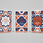
Riso D’uomo by Here Design
Riso D’uomo is a Milanese Carnaroli rice brand, cultivated from the same stock over hundreds of years, and grown within sight of the historic Duomo di Milano. Carnaroli is often referred to as ‘the king of rice’, and is known for its high-quality nutritional properties, cooking consistency and a ‘bite’ that makes it ideal for risotto. Taking inspiration from Riso D’uomo’s provenance, specifically the ornate...

A.N Other by Socio Design
A. N Other gives its perfumers the creative room to craft limited edition, luxury and high concentration fragrances free from the pressures of consumer trends, market segmentation and budgetary constraints. These are then sold direct-to-consumer through its website. A.N Other places greater value on the internal composition of each of its fragrances, and the inspirations and aspirations of its creators, than...