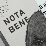
Nota Bene by Blok
Nota Bene is a restaurant, located on Toronto’s Queen Street West, with a menu made from locally-sourced and seasonal ingredients. It was opened by chef David Lee and business partners Yannick Bigourdan and Franco Prevedello in 2008, and was awarded “Best New Restaurant” by Toronto Life and enRoute Magazine soon after. To coincide with the restaurant’s 2016 relaunch—which saw David Lee take...
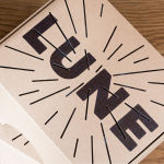
Lune Croissanterie by A Friend Of Mine
Lune Croissanterie is a Melbourne based bakery dedicated to the craft of Viennoiserie. After gaining a cult following and amassing long cues it quickly outgrew its small shop and moved into a larger warehouse space in the suburb of Fitzroy which features a distinctive interior design by Studio Esteta. To coincide with this move, Lune Croissanterie worked with the Australian graphic design studio A Friend Of Mine to...
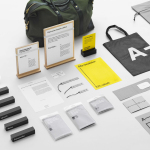
A-TO-B by Stockholm Design Lab
A-TO-B is a retail destination dedicated to all things travel. It curates and sells smart practical products for the modern traveller, complimented by insight and advice. Whether it be an around the world trip or the daily commute, a preference for small private labels or well-known bag brands, A-TO-B has it covered. Venue Retail Group—owners of A-TO-B and over 150 shoe, bag and...
Teabox by Pentagram
Teabox is an e-commerce tea business, established in 2012 and located at the heart of India’s tea-growing regions, that looks to revolutionise the experience of buying and enjoying one of the oldest drinks in history by bringing it directly to consumers. It is based on the popular monthly subscription model, and uses data science to match teas to subscriber’s personal tastes. Teabox worked with Pentagram partner...
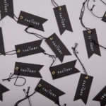
The Factory by Ghost
The Factory is an Oklahoma based fashion retailer, inspired by the energy and attitude of the people of Manhattan, Los Angeles and Tokyo, that mixes streetware with high fashion garments, shoes and accessories. Think ripped jeans, vintage purse and Louboutins. American graphic design studio Ghost worked with The Factory to develop a brand identity concept, which went on to include logotype and...
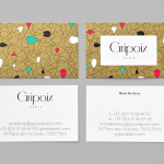
Gripoix Paris by Mind
Gripoix is a Parisian costume jewellery manufacturer with a significant history, one that stretches back to the late 19th Century and the Art Nouveau period. Gridpoix’s pieces are created using a traditional kilncasting technique, known as pate de verre, which sees molten glass poured into a thin linear framework, giving each a luxury and uniquely crafted quality. This traditional process, and the period in which...
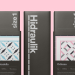
Hidraulik by Huaman
Hidraulik is a Barcelona based business producing rugs for contemporary spaces. These are inspired by cement panels hydraulically pressed, rather than fired, with a layer of coloured pigment. Hydraulic panels originated in the 1850’s and experienced a resurgence in the mid 20th century, these would often feature brightly coloured and detailed patterns, and were popular during an era of personalisation and interior expression....
Melba at The Savoy by Pentagram
Melba is a pâtisserie and cafe, located on the corner of The Strand and Savoy Place in London’s North Bank, and is one of nine places to eat and drink at The Savoy hotel. The patisserie is described as offering a glimpse into the exclusive and luxury world of The Savoy, and is the first time that the hotel, accessed via private...
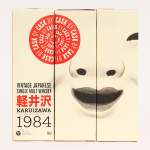
Karuizawa 1984 by The Metric System
Karuizawa 1984 is a vintage Japanese single malt and single cask whisky imported and bottled exclusively for the Norwegian market. The first batch, a run of 577 bottles, sold out immediately. Karuizawa’s packaging, created by Scandinavian graphic design studio Metric Design, effectively conveys the age and provenance of the whisky, is sensitive to the Western market, and aware of and largely...
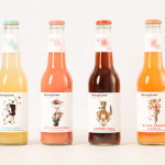
StrangeLove by Marx Design
StrangeLove is an Australian energy drink creator with a four flavour range made up of Ginger Beer, Blood Orange & Chilli, Smoked Cola and Bitter Grapefruit. Although mass-produced, each variety has been crafted to taste homemade using high quality organic ingredients, and developed in response to other energy drink brands who have failed to live up to their premium positioning. Keen to avoid...
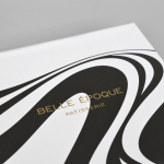
Belle Epoque by Mind Design
Belle Epoque is a French patisserie, located on Islington’s Upper Street, crafting cakes, chocolates, breads, viennoseries, tarts and quiches from high-quality ingredients in a kitchen designed to complement the unrivalled expertise of their chef. Originally commissioned to develop Belle Epoque’s website, Mind Design managed to expand the scope of the project into a full brand identity exercise that went on to include still life...
Teahouse Exclusives by Peter Schmidt Group
Teahouse Exclusives is a German company with a portfolio of high-quality black, green, fruit, and herbal teas, a philosophy that revolves around sophistication, quality and modern lifestyle values, and describes itself online as being trend-conscious. Based around the concept of individuality and strong character, integrated brand consulting business Peter Schmidt Group worked with Teahouse Exclusives to develop a new packaging treatment for its...