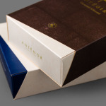
Antéoise by UMA
Antéoise is a creme dacquoise range from Anténor, a Japanese patisserie established in 1966 that creates French style cakes, cookies, tarts and variety of other confectionery. Antéoise’s brand identity and packaging treatment, developed by Osaka based graphic design studio UMA, draws on the range’s flagship positioning, high quality ingredients and the craft employed in its creation, the heritage and experience of Anténor, the streets of Kobe, and the...
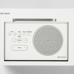
John Lewis Spectrum by Pentagram
Spectrum is a recently redesigned consumer electronics range created by and sold through British department store John Lewis. The range includes DAB radios, alarm clocks, speakers and iPad covers. These are bound by a cohesive aesthetic of soft plastic, geometric forms, bright colours and a packaging treatment created by international design studio Pentagram, led by partner Harry Pearce....
Café Royal by Pentagram
Once recognised as having the greatest wine cellar in the world and understood to have introduced French gourmet food to London, Café Royal, located on Regent Street, has been described as being the place for the avante garde to meet and dine for over a century. This year, to coincide with its reopening and reposition as a luxury five-star hotel...
Daebeté Scented Tea by Victor Design
Daebeté is a floral infused tea range that uses a high-grade Taiwanese oolong variety, made using a unique process of withering, oxidation, curling and twisting, that has then been given a floral hint using ancient baking methods. This process creates a subtle yet sweet flavour profile that carefully balances the aroma of flowers with the flavour of tea. The packaging for the...
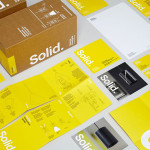
Terence Woodgate by Charlie Smith Design
Terence Woodgate is a lighting design and manufacturing business, founded by industrial designer Terence Woodgate in 2014, that looks to “fully optimise the benefits of LED technology”. Charlie Smith Design recently worked with Terence Woodgate to develop a visual identity for the business and modular packaging treatment for its first line of products as well as manuals, fitting instructions and website....
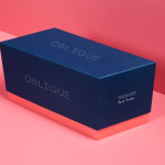
Oblique Paul Smith Edition by Graphical House
Graphical House and Derek Welsh Studio recently produced a special edition version of their distinctive domino set and collaborative project Oblique for Paul Smith. The dominoes, handcrafted in walnut using 45 processes, 8,400 hand drilled holes, 155m of walnut, 15m² of laminate, 75m² of 150 grit sandpaper, 20m² of 320 grit sandpaper and 18 hand files, come in a drawstring bag packed in...
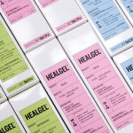
Healgel by Pentagram
HealGel is a range of high quality skin care products, originally created to aid the repair of post-operative scarring, developed by actress Natascha McElhone – a dermatological biochemist – and a team of cosmetic surgeons. Taking its cues from what looks like medical forms and stat charts, international design agency Pentagram, led by Domenic Lippa, developed a new packaging treatment that...
Simplified Sending by Designworks
Simplified Sending is a complete package and post solution from New Zealand’s postal authority that simplifies the process of sending parcels to anywhere in the country. Created by Designworks the result is an interesting mix of utilitarian functionality, contrasting illustrative flourish and a monochromatic colour palette that takes the expected black on white print treatment and confidently inverts it....
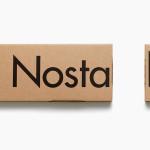
Nostalgi and Classic Racks by Bedow
Nostalgi is a hat and shoe rack, now considered a Swedish furniture classic, designed by Gunnar Bolin in 1937 and manufactured by Essem. Taking its cues from Essem’s functionalist past and artisanal manufacturing processes, Stockholm based graphic and product design studio Bedow, developed a packaging solution for Nostalgi that contrasts two vastly different sizes of Futura, reflecting the products bold,...
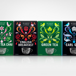
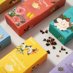
Higher Living Tea by B&B Studio
Higher Living is a UK based herbal tea company with over 45 years of brewing experience using only 100% natural and organic ingredients. This month sees the release of eight new herb and spice varieties with packaging designed by London based agency B&B that utilises a vibrant and striking illustrative style....