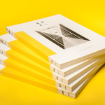
Raiffeisen Rechenzentrum by Moodley
The Raiffeisen Rechenzentrum is a customised IT infrastructure service provider and subsidiary of Raiffeisen Landesbank with a modern, ‘high availability’ and maximum security data centre located in Austria. Design agency Moodley recently developed RRZ’s brand identity—which included a logo, business cards, brochure and website—based around a single sans-serif, a contrast of humanistic and technological imagery and a white, black and bright...
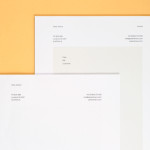
Peter Ahrens by Studio Jubilee
Independent London-based design agency Studio Jubilee have recently updated their website and portfolio. Their brand identity work for South Australian photographer Peter Ahrens—which included a new logo-type, website and stationery set—really stood out for its use of a weighty fluorescent white material choice and tactile print process to enhance a reductionist single font approach. The project is accompanied by a great write-up, published...
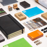
Haverstock by Spy
Haverstock is a UK based architectural practice that specialises in public-sector projects with a strong humanistic approach that enables “clients and the people who use the buildings to have a voice, and to shape the way their building ends up”. Following the retirement of Haverstock’s founding partners design studio Spy was commissioned to develop a new brand identity for the firm—which included a...
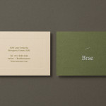
Brae by Studio Round
Brae is a restaurant, located in the Australian town of Birregurra, that describes itself as having a menu of unique and contemporary dishes built around a respect for nature and seasonality, and crafted from organic ingredients both locally sourced and grown on its own 30 acre site. Brae’s new brand identity—which included a new logo-type, menu, stationery set and website developed...

Intu by Heydays
Intu is a Norwegian accounting and consultation firm and real-time technological solutions provider located in the town of Bodø. Design agency Heydays developed a new brand identity solution for Intu—which included naming, logotype, business cards, print communication, custom typography and website design—based around the link between the firm’s two key services and the software it uses to deliver these efficiently....
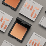
Maréna Beauté by We Are Bold
Maréna Beauté is a new Swedish cosmetics brand, founded in 2013 by make-up artist Diarry Maréna, that creates high quality products for people with dark skin types. Stockholm-based design studio We Are Bold were commissioned by Maréna to develop a brand identity solution for her range of foundations, powders and blushers—which included a monogram, logo-type and packaging design—that would appeal to a market currently...
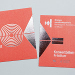
Norwegian Academy of Music by Neue
Located in the Majorstuen district of Oslo The Norwegian Academy of Music is Norway’s largest music academy. It offers both undergraduate and post-graduate courses, has educated some of Norway’s most prolific musicians, and, according to Wikipedia, ‘attempts to lay the foundation for research within the various fields of music’. Based around the concept of an ‘endless visual pulse’, design agency Neue developed a new generative...
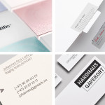
December’s Top 5 Projects 2013
This month’s highlights have included new packaging work from Believe In, Graphical House, Port Clarendon and Peter Gregson, brand identity projects by RoAndCo and For Brands, as well as a new visual identity and interior design solution by Savvy for Mexican seafood restaurant La Peñita De Jaltemba. However, five projects really stood out for me which have made it into BP&O’s...
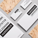
Hardhaus by Heydays
Hardhaus is a Norwegian specialist mountain sports retailer located in the alpine municipality of Sykkylven. Based around the concept of ‘technical durability’, Heydays developed a new brand identity solution for Hardhaus—which included a logo, stationery and website—that juxtaposes the utility of a heavy uppercase and stencil cut sans-serif—bold and ‘oversized’ in its execution in print—and the robust and hardy aesthetic of chipboard imagery, with...
Håndværk by Savvy
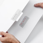
Håndværk is a New York based clothing brand that mixes craftmanship, minimal elegance, premium materials and innovative fabrics to produce high quality everyday essentials for both men and women. Designed by Savvy, Håndværk’s new brand identity—which includes a logo, swing tags and packaging solution with a blind emboss detail—conveys the brand’s elegant and elemental nature with what Savvy describe as clean lines and...
Mellbye by Heydays
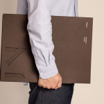
Mellbye is a Norwegian architecture firm founded in 1954 with a “mindset anchored in modernism”. Design studio Heydays created a new brand identity for the firm based around a geometric M symbol built from the initials of their two main services, architecture and interiors. Executed as a combination of blind deboss and die cut detail across a earthy and urban...

Candela by RoAndCo
“Candela is a women’s footwear and ready-to-wear line created by Gabriela Perezutti. Influenced in part by her childhood spent on a horse ranch in Uruguay, the collection embodies Gabi’s soft femininity, adventurous gaucho spirit and South American roots. We [RoAndCo] conveyed this spirit throughout all iterations of the company’s branding—from business cards and lookbooks to art direction and campaigns—through elements...