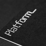
Platform by Pentagram
Platform is a not-for-profit organisation that aims to “increase the interest and participation of underrepresented groups in the fields of technology and entrepreneurship, with a particular focus on African-Americans, Latinos and women” and “to help influence and inspire the next generation of innovators, inventors and entrepreneurs” through its website, conferences and providing “access to current leaders and role models”. Platform’s visual identity, designed...
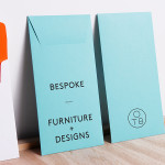
One To Be by Coast
One To Be is a Brussels based furniture design and manufacturing workshop that crafts custom wood pieces for residential refurbishments, bespoke kitchens, office and retail spaces, exhibitions, art installations and one-off pieces for private individuals. The workshop’s visual identity, a logo-centric solution executed across dyed uncoated paper choices by design agency Coast, is straightforward in its presentation of craft, functionality and...
More Than Human by Bedow
More Than Human is a Vancouver-based record label, established by Gareth Moses, that specialises in the release of limited edition vinyl from electronic musicians such as the Passenger, Plays:Four and Kemper Norton, who’s latest EP is described as “political, weird, epic, moving, captivating, disturbing, haunting and deep”. The label’s logo and record sleeves were developed by Swedish graphic and product...
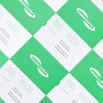
MediaCreator by Lundgren+Lindqvist
Media Creator is a Swedish print production and project management company that utilises a flexible web-based system that pairs a ‘intuitive computerized system’ and translation service, with ‘alert’ and ‘friendly’ staff to streamline their entire print process. Utilising a predominantly two-tone colour palette, san-serif typography and bright contemporary illustrative detail, MediaCreator’s new visual identity, which included a new logo, stationery set and...
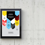
Insiders by Garbett
Insiders is the membership program of Sydney Opera House launched to nurture customer loyalty, increase market share and raise the frequency of attendance through priority booking, discounts, dress rehearsal ‘sneak peeks’ and invitations to meet staff and artists. Multidisciplinary design agency Garbett were commissioned to ‘evolve’ the Insiders visual identity, positioning it as a retail product with greater focus on communicating the value proposition for members,...

Daniel Juncadella by Mucho
Following his recent promotion to official Mercedes driver for the DTM (Deutsche Tourenwagen Masters) and test driver for The F1 Mercedes team, Daniel Juncadella recently commissioned design agency Mucho to “improve his personal brand and the way he communicated with his growing fan base and the press”....
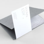
Ryan Edy by Founded
Ryan Edy is a UK based, award-winning advertising and editorial photographer whose clients have included Vodafone, Wilkinson & Wetherell and Innov-8. Design studio Founded worked with Ryan Edy to develop a brand identity treatment that, based around a simple, familiar but communicative framing device, also went on to include both print and digital portfolio design....
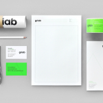
Griab by Kollor
Griab is a Swedish engineering firm, founded in 1957 and located in Helsingborg, Sweden, that specialises in delivering a holistic design and build service that includes land planning, wastewater management, architecture and construction. Developed by multidisciplinary design agency Kollor, Griab’s visual identity, “inspired by the the straight lines and shapes commonly seen in architecture” and created to help reinforce the firm’s environmental...
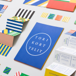
Torikorttelit by Kokoro & Moi
Torikorttelit is the old town district of Finland’s capital Helsinki. Its new visual identity, designed by Kokoro & Moi and based around bright colours, simple geometric patterns, a stacked typographic serif logo framed by a circle and paired with a modernist inspired secondary typeface neatly reflects the historic setting at the heart of a modern metropolis....
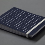
Bedre Kommunikasjon by Work In Progress
Bedre Kommunikasjon is a oslo-based consulting firm, run by communication specialist Nils M. Apeland, that offers personal, professional and independent advice to business, drawn from 20 years of analysis, strategy, promotion, media relations and crisis management experience. Multidisciplinary design agency Work In Progress recently worked with Nils to develop a new visual identity solution which included a logo, business card and stationery design...
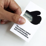
Designers Anonymous by Designers Anonymous
Designers Anonymous is London-based multidisciplinary design agency with global clients from a variety of sectors. The agency has appeared on BP&O on a number of occasions, with highlights including their packaging work for Zest and Patchett’s, and their identity work for Fuller’s hospitality brands The Parcel Yard, The Tokenhouse and Brewer St. Following the launch of their new website this...

Fika by Designers Anonymous
Fika is a bar and kitchen located on London’s Brick Lane with a rustic menu prepared on site and to order, all of which can be taken away. Created by Designers Anonymous, Fika’s visual identity, which extends on-line, in-print and as signage, is an illustrative and photographic mix of characters, cartoons and quirky compounded imagery bound by a consistent logo,...