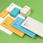
Dosatres by Comite Studio
Dosatres is a Spanish company that connects and manages a wide network of creative and strategic business centres that help brands to discover the best way to grow and communicate. Created by design studio Comite and based around the name ‘two to three’ — informed by the company’s ability to broaden communicative opportunities and paths to growth, and the concept of moving from two to three-dimensional...
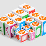
Kid O by Studio Lin
Kid O is a modern American toy company that creates products that engage and stimulate children through a rich variety of shapes, colours, and sizes. Designed by Studio Lin, Kid O’s new packaging treatment — which included over 50 boxes — takes the vivid colours of the industry, reduces these down to four, contains them within geometric boundaries and pairs...
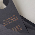
The Confidante by RE:
The Confidante is a group of CEOs who draw on their extensive networks to provide business leaders with tailored executive coaching and mentoring services. Designed by Re: Sydney, The Confidante’s new brand identity effectively visualises the confidential and discretionary nature of their work and the executive level of their service through a simple negative space keyhole logo that has been given...
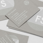
Fort Standard designed by Studio Lin
Fort Standard is a New York based industrial design studio using long-lasting natural materials and traditional production methods in an innovative way to produce products, lighting and furniture with a simplicity, high functionality and an attention to detail. As the studio explain online, their ability to act as both designers and manufacturers not only informs their process, but yields smarter products...
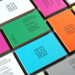
KVGD by Kerr Vernon
KVGD is a Glasgow based graphic design studio run by Kerr Vernon that works within the fields of brand identity design and print, has a ‘be nice, do good work’ philosophy, and a reputation for producing engaging, thoughtful and crafted projects. The studio’s client base is diverse, local and national, and includes businesses such as gallery, event and creative workspace The Whisky Bond,...
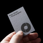
Peter Dibdin by O Street
Peter Dibdin is a photographer who brings creativity, technical knowledge, professionalism and a personal approach to both studio and location shoots for clients working within the commercial, private, arts and editorial sectors. Following a recent move to a studio in Edinburgh’s creative hub of Summerhall, Peter commissioned long-term collaborator O Street to refresh his brand identity in a way that would reflect his...

Casa Virginia by Savvy
Casa Virginia is a restaurant and culinary project in Mexico City, created by chef Mónica Patiño, that mixes the highest quality cuisine and meticulous processes with the familiarity of eating at home. This fusion of restaurant quality and easiness is perhaps most acutely manifested throughout its interior design, a space that juxtaposes the modesty and simplicity of wooden and basketweaved furniture...
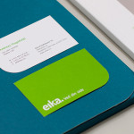
Eika by Mission
In response to the financial crash the Terra-Gruppen, a Norwegian financial group owned by and in alliance with 80 local banks, looked to take positive steps to reaffirm its commitment to local customers and the continued contribution it makes to the growth and development of the communities it serves. This came in the form of a rebranding exercise that led to the name Eika and...
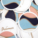
The Palomar Restaurant by Here
The Palomar Restaurant is located at the heart of London’s Soho district with a menu that is described as being reflective of the foods of modern-day Jerusalem and influenced by the cultures of Southern Spain, North Africa and the Levant. Its interior features a zinc kitchen bar, mosaic marble and reclaimed parquet floors, marble surfaces, oak panelled walls, a skylight providing natural light and royal blue...
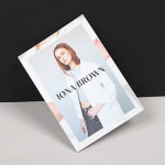
Iona Brown by Sam Flaherty
Iona Brown is a London based contemporary jewellery designer who favours classic simplicity, understated detail, precise finishes and minimalist lines, shapes and materials. Graphic designer and art director Sam Flaherty recently worked with Iona to develop a new visual identity for her expanding collection. Built around a customised logotype and a simple print and packaging treatment that uses few but good quality and contrasting...
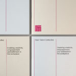
Rush Talent by Bunch
Design studio Bunch worked with Rush Talent, a London based public relations company, to develop a visual identity, this included monogram, logotype and stationery design. Rush Talent describes itself as at forefront of the factual and lifestyle television scene and represents emerging UK broadcasters working within the fields of fashion history, sports, science, architecture, food and art, and includes the likes of Amber...
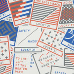
Lucky 21 by Blok
Lucky 21 is a film production company, located in the US city of Dallas, who bring a “contagious energy and tireless drive” to the industry and have a production team and director roster that includes the talents of Jeff Bednarz, The Chartrands, and Tom Ryan, some of whom have worked for big brands such as TGI Fridays, AIG and Home Depot. Lucky...