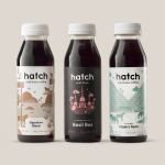
Hatch Cold Brew Coffee by Tung
Toronto-based Hatch is a coffee roaster producing ready-to-drink cold brew coffee from high quality natural ingredients using a craft-oriented twice-filtered manufacturing process and a unique bottling technology to seal in fresh flavour. Hatch intends to bring cold brew coffee from a niche but growing market into the mainstream and worked with Canadian graphic design studio Tung to help them achieve this through brand identity and packaging....
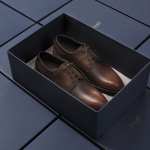
Faust by Snøhetta
Faust is a high-end shoemaker with its first signature store located in Oslo’s Barcode area. The shop is a small but impressive space consisting of five concrete niches and large carved wooden doors. Faust worked with Scandinavian studio Snøhetta to create both interior and brand identity. This was based around the The legend of Faust from the Renaissance, its basis for many literary, artistic, cinematic and musical...
Helsinki City Museum by Werklig
Helsinki City Museum, through its collection of objects and images, provides visitors with historical insight into the everyday lives and personal experiences of the people of Helsinki. It is free to enter and features 2400 sqm of exhibitions and public spaces, a cafe, inner courtyard, areas to relax and conference rooms. To coincide with a move to a new space;...

OpenView by Pentagram
OpenView is a Boston-based business dedicated to investing in and helping to grow what are described as expansion-stage companies that are working in the software development sector. OpenView has a unique hands-on approach, and worked with Pentagram’s Natasha Jen to express this through positioning, tone of voice and visual identity design. This included custom typography, stationery, business cards, website and...
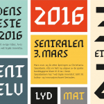
Sentralen by Metric Design
The former building of Norway’s first savings bank, which began as a social initiative to serve the working class people of Oslo, now houses Sentralen, a mixed-use cultural centre. Sentralen continues in the traditions of the bank, functioning as a hub for innovators concerned with and looking to address present day societal issues. The centre houses over 350 tenants working...
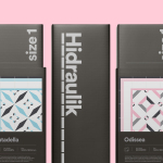
Hidraulik by Hey
Hidraulik is a Barcelona-based business producing floor mats, table mats and runners for contemporary spaces. These are inspired by cement panels hydraulically pressed, rather than fired, with a layer of coloured pigment. Hydraulic panels originated in the 1850’s and experienced a resurgence in the mid 20th century. At that time they would often feature brightly coloured and detailed patterns, and were popular during an era of...
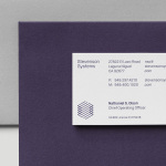
Stevenson Systems by Socio Design
Stevenson Systems is an American business that specialises in ‘space accounting’, an industry that measures architectural spaces using a variety of laser scanning and measuring devices, goes on to classify areas within larger spaces and produces reports and offers consultation on how to draw the most value from these. Stevenson Systems pride themselves on their ability to add value, rather than...
Primary by DIA
Primary is a new co-working space in New York that introduces health and wellness into the workplace. This can be seen in the approach to interior design; a mix of wood, contemporary soft furnishings and greenery, experienced in the fusion of office space, business events and relaxation classes, and expressed throughout Primary’s brand identity, created by graphic design studio DIA. DIA were tasked...

London Design Biennale by Pentagram
London Design Biennale is the world’s first purely design-focused biennale from the team behind London Design Festival. It will take place between the 7th and 21st of September at Somerset House. The theme of this year’s event, Utopia by Design, will include entries from 37 countries. These intend to interrogate the history of the utopian idea, engage with some of...
Francina Models by Mucho
Francina Models is a Barcelona-based fashion agency, led by Mireia Verdú, with over 30 years of experience. It was the first modeling agency in Spain to offer an acting and training academy and, over recent years, has began to diversify, committing itself to the discovery of new talent and the representation of a variety of fashion profiles and international models. With a desire to...
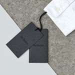
Helbers by Only
Helbers is a Parisian menswear label created by Paul Helbers, the former Head of Menswear at Maison Margiela and ex-Menswear Director at Louis Vuitton. The label has a carefully curated lookbook of garments and footwear with an unpolished elegance, and feature a subtle contrast of materials. Helbers has secured early acclaim for his AW16 collection, and is due to appear in stores around the world in the coming weeks. Paul worked with Leeds-based...
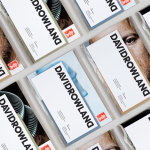
David Rowland by ico Design
David Rowland is an award-winning and straight-talking London-based photographer who has been capturing images for leading brands and agencies for over two decades. With a desire to remind existing and potential clients of his expertise and technical know-how David worked with graphic design studio and client ico Design to develop a new brand identity and supporting collateral. This included, alongside a new logotype, business...