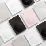
Meg’s Tailoring by Studio South
Meg’s is a tailoring service, established by Megan Kenny, that began as a single store on Garfield Street in 1995. Meg’s now has two locations in Auckland, New Zealand, provides a broad range of services; from hems to full garment design, and works on large projects with high-end designers and labels such as Hugo Boss, Prada and Gucci, and on smaller jobs from High Street drop-ins....
The International by Studio South
The International is a new apartment complex, located not far from Auckland’s Albert Park, with 88 luxury residencies. The building, a repurposed former office, is currently being transformed into an iconic structure with a contemporary exoskeleton of elongated beams. To promote the building and help sell apartments off-plan, the graphic designers at Studio South worked with the developer behind The International...
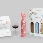
Sommos by Mucho
Summos is an online platform that gathers together and shares the knowledge of the six best sommeliers of the Netherlands and offers a seasonal subscription service that sends out a selection of some of the country’s best wines once every two months. Sommos worked with graphic design studio Mucho to develop name, brand identity and packaging. Based around the concept of group and innovation, and clearly informed...
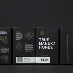
The True Honey Co. by Marx Design
The True Honey Company (TTHC) dedicates itself to the production of mānuka honey, a monofloral variety produced in Australia and New Zealand from the nectar of the mānuka tree. It has a unique colour and texture, and a high level of Dietary Methyglyoxal, an organic compound with antibacterial and antiviral properties. With a price range starting at 60.00AUD and rising to 230.00AUD per jar,...
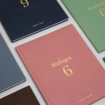
Rattis Books by The Counter Press
Rattis Books is a new London-based independent publisher that celebrates the convergence of traditional and modern print processes and has a firm belief that the book is an art object. To help convey this, the publisher worked with design studio, private press and typography workshop The Counter Press to create their brand identity, and the design for their first book Tiro, a collection of football writings....
M11 studio by Inhouse
M11 studio is a luxe salon, located in the heart of the fashion, shopping and entertainment district of Newmarket, Auckland, that references the refinery of a Tom Ford fashion boutique. It has a well-proportioned, spacious, linear and light filled interior of large mirrors, strip and spot lighting, white and black walls, gold fixtures, concrete surfaces and robust furniture developed by...
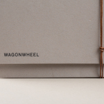
Wagon Wheel by Perky Bros
Wagon Wheel is a Nashville-based boutique real estate title and escrow company established by three partners with substantial experience working for larger corporate law offices who wanted to establish a company with a more casual corporate culture and client experience. This, and Wagon Wheel’s Nashville roots, is expressed throughout its new brand identity, designed by graphic design studio Perky Bros, using...
Arco by Raw Color
Arco is a family run contemporary furniture design and manufacturing company that currently rests in the hands of fourth generation family members, and has a respectable 110 year history. Arco has tables and chairs at the heart of its collection and specialises in woodwork, a reflection of its location in Winterswijk, an area of dense natural woodland in East Netherlands. Eindhoven-based graphic design studio Raw Color worked with Arco Creative...
Arde by IS Creative Studio
Arquitectura Diseño y Espacio, abbreviated to Arde, is a Peruvian architecture and design firm creating contemporary structures that have a strong sense of light and space, a preference for the geometric and often juxtapose exposed architectural surfaces with those that are natural and crafted. Lima-based IS Creative Studio recently worked with Arde on naming and visual identity that would link a variety of assets. These included stationery, business...
Learig by The District
Learig is a UK-based commercial and residential property developer managing projects end to end, from planning to design to build, and the financial considerations that link each of these stages. This end to end management, and Learig’s three tiers of expertise, is visually articulated by its new brand identity, designed by The District, through a logo of three stacked blogs which extend out...
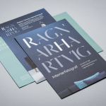
Ragnar Hartvig by Commando Group
Ragnar Hartvig is a renowned Norwegian photographer with over 20 years experience and a strong network of collaborators. Clients have included leading furniture manufacturers, magazines and books, as well as interior and product designers. Ragnar Hartvig worked with Oslo based graphic design studio Commando Group to develop a new brand identity that would convey some of his personality, skillset and experience...
Innovation Properties by 25AH
Innovation Properties is a Scandinavian developer creating modern, functional and timeless homes in and around Stockholm. The developer recently worked with graphic design studio 25AH to create a new brand identity that would run across business cards, stationery and project brochures, and in conjunction with a new website, also designed by 25AH....