Nordoff & Robbins by Pentagram
For decades, Pentagram has been one of the most famous and renowned design consultancies in the world; but when it comes to the charity sphere, music therapy organisation Nordoff & Robbins is far less starry – it’s not, say an Oxfam, or an RSPCA, or Médecins Sans Frontières. Arguably that’s all the more reason for it to bring in the...
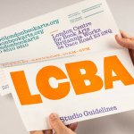
LCBA by Studio Bergini
Not a new project, but a lovely one nonetheless; it seems there couldn’t have been a more perfect fit for London Centre for Book Arts than Studio Bergini when it was looking for a design team to task with creating its new visual identity. Formed by two Central Saint Martins grads – Norwegian Kristian Hjorth Berge and Italian Francesco Corsini (hence...
Peerspace by Mother Design
Straight up, I’ll admit that I struggle to resist a condensed sans typeface set in uppercase. I’ll also confess that I’ve spent the last hour (no lie), trying to identify this one… Helvetica? Hell no. Railroad Gothic? The wrong track. Söhne? Sö not. Must be Knockout? Another blow. For Druk’s sake is it Druk? Well, whatever it is, it’s neatly...
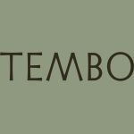
Tembo by Perky Bros
When I first caught Perky Bros’ latest project I misread it as ‘Tempo’, the speed at which music is played. Timing is everything, or so it is said. For real estate company Tembo this notion takes the form of patience; the time to grow gently and judiciously. Property development, momentarily paused during the pandemic, seems to have recovered and is again...

The Wool Pot by Seachange Studio
More plants, less plastic. A noble mission. Over the last decade, revelation has followed revelation with regards to the environmental impact of what seemed like the most innocuous of objects. Now it’s the turn of the humble flower pot. Yep, that. Stacked and sitting empty in the shed, or at the bottom of the garden. It turns out that these...

LBDO by Universal Favourite
Self-care is nothing new, but our understanding and appreciation of it as a society has grown enormously in the last half century, and especially recently when it became a trending topic during the isolation periods of coronavirus in 2020 and 2021 (70 million hashtags on Instagram, and counting). In the dawn of this enlightened thinking, products in this space have...
HUB Residential by DNCO
Property development continues to boom in London. It’s difficult to see how any of this is really benefitting those most in need, or whether housing is even being designed to be resided in at this point, acting as a ‘store of value’ for those much wealthier individuals. Recently developed areas appear like ghost towns at night. Having just moved, and...
Sing King by Nomad
I’m going to break with a decade of convention and jump right in. I love this. I was sold as soon as I saw the logo, it’s in the BP&O Gallery. It’s rare you see this kind of logo today. It’s mostly, and understandably, logotypes that prevail today. Those that are striped down to function well on multiple devices. Blanding?...
Future Factory by Dutchscot
‘Lead generation for creative agencies’. It’s one of those lines that makes complete sense to some but sounds like gobbledigook to everyone else. ‘Lead generation’ is a general mystery, unless your job depends on it. And what is a creative agency after all? But of course, so far as branding is concerned, ‘everyone else’ really doesn’t matter. Hitting the spot...
Baseline by Garbett
‘There’s better ways to build’ is Baseline’s opening gambit on its landing page. And Surrey Hills-based Garbett worked with the government and commercial builder to bring this and its core values of simplicity, precision, clarity and transparency to life. ‘Every successful build needs the right foundation’. This notion is expressed through a single unit that expands and grows into a dynamic system of blocks, not quite...
Skateyogi by Order
The skateboarding learning curve is really defined by the individual. There are lessons (passed down or shared online), but much of it is practice (and patience). Further, and perhaps more importantly, skateboarding is expressive, it’s fused with personal style. Timeless tricks are given an individual twist that keep it evolving and competitive. Iconic skateboarding brands have grown out of the...
NN North Sea Jazz Festival by Studio Dumbar/DEPT
After seeing Collins’ work for the San Francisco Symphony – a pioneering typographic and digital experiment with Swiss foundry Dinamo – I thought it would be some time before I’d be surprised by another visual identity in the music space. Sure, there’s an abundance of styles and artists to be inspired by within an art that has evolved in tandem...